
 Web Front-end
H5 Tutorial
How to use css3 attributes to enrich picture styles (rounded corners, shadows, gradients)_html5 tutorial skills
Web Front-end
H5 Tutorial
How to use css3 attributes to enrich picture styles (rounded corners, shadows, gradients)_html5 tutorial skills
How to use css3 attributes to enrich picture styles (rounded corners, shadows, gradients)_html5 tutorial skills
May 16, 2016 pm 03:50 PMIn CSS3, if box-shadow and border-radius are used directly on images, the browser cannot render them well. But if you use the image as a background-image, the added style browser can render it well. I will introduce how to use box-shadow, border-radius and transition to create different image style effects.
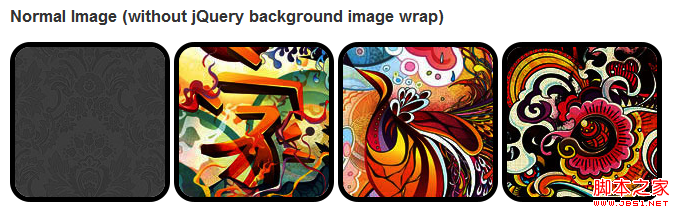
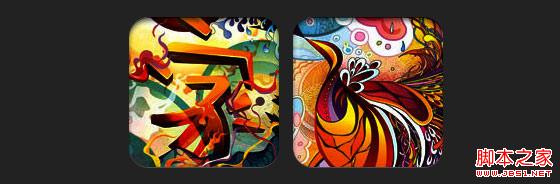
Problem
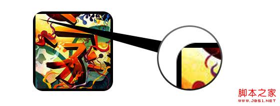
By looking at the demo, we can notice that we set border-radius and inline box-shadow for the first row of images. Firefox renders the border-radius of the image, but does not render the inline box-shadow. Both effects are not rendering in chrome and Safari.
.normal img {
border: solid 5px #000;
-webkit-border-radius: 20px;
-moz-border-radius: 20px;
border-radius: 20px;
-webkit-box-shadow: inset 0 1px 5px rgba(0,0,0,.5);
-moz-box-shadow: inset 0 1px 5px rgba(0,0,0,.5);
box-shadow: inset 0 1px 5px rgba(0,0,0,.5);
}
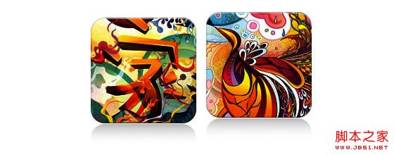
firefox effect:
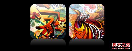
chrome/safari
Workaround
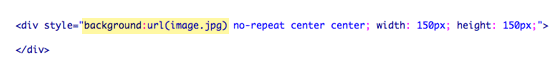
In order for border-radius and inline box-shadow to work properly, we need to convert the image into background-image.
Dynamic method
In order to complete this work dynamically, we need to use jquery to add a background image wrapper to each image. The following js code adds a span package to each image. The background image path of span is the path of the image.
The code is relatively simple, I think there is no need to explain it. If you are not sure, you can directly check the jquery API.
<script type="text/javascript " src="http://ajax.googleapis.com/ajax/libs/jquery/1.5/jquery.min.js"></script>
<script type="text/javascript">
$(document).ready(function(){
$("img").load(function() {
$(this).wrap(function(){
return '< ;span class="image-wrap ' $(this).attr('class') '" style="position:relative; display:inline-block; background:url(' $(this).attr('src' ) ') no-repeat center center; width: ' $(this).width() 'px; height: ' $(this).height() 'px;" />';
});
$(this).css("opacity","0");
});
});
</script>
Output
The above code will output the following results:
<span class="image-wrap " style="position:relative; display:inline-block; background:url(image.jpg) no-repeat center center; width: 150px; height: 150px;">
<img src="image.jpg" style="opacity: 0;">
</span>
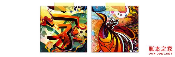
Circle image
Add that we use border-radius to achieve the effect of circular images, the effect is as follows:
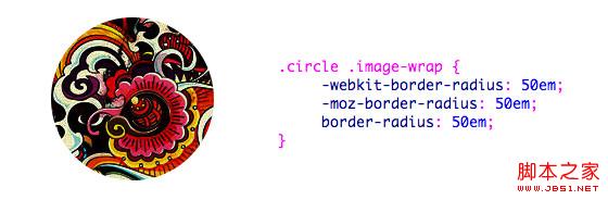
css:
.circle .image-wrap {
-webkit-border-radius: 50em;
-moz-border-radius: 50em;
border-radius: 50em;
}
Card style
The following is a card style picture, using multiple inline box-shadows.
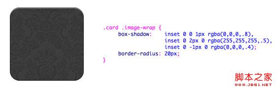
css:
.card .image-wrap {
-webkit-box-shadow: inset 0 0 1px rgba(0,0,0,.8), inset 0 2px 0 rgba(255,255,255,.5) , inset 0 -1px 0 rgba(0,0,0,.4);
-moz-box-shadow: inset 0 0 1px rgba(0,0,0,.8), inset 0 2px 0 rgba( 255,255,255,.5), inset 0 -1px 0 rgba(0,0,0,.4);
box-shadow: inset 0 0 1px rgba(0,0,0,.8), inset 0 2px 0 rgba(255,255,255,.5), inset 0 -1px 0 rgba(0,0,0,.4);
-webkit-border-radius: 20px;
-moz-border-radius: 20px;
border-radius: 20px;
}
Relief style
The following is the relief effect.
css:
.embossed .image-wrap {
-webkit-box-shadow: inset 0 0 2px rgba(0,0,0,.8), inset 0 2px 0 rgba(255,255,255,.5), inset 0 - 7px 0 rgba(0,0,0,.6), inset 0 -9px 0 rgba(255,255,255,.3);
-moz-box-shadow: inset 0 0 2px rgba(0,0,0,. 8), inset 0 2px 0 rgba(255,255,255,.5), inset 0 -7px 0 rgba(0,0,0,.6), inset 0 -9px 0 rgba(255,255,255,.3);
box- shadow: inset 0 0 2px rgba(0,0,0,.8), inset 0 2px 0 rgba(255,255,255,.5), inset 0 -7px 0 rgba(0,0,0,.6), inset 0 - 9px 0 rgba(255,255,255,.3);
-webkit-border-radius: 20px;
-moz-border-radius: 20px;
border-radius: 20px;
}
Soft relief style
Compared to the relief style, the new style adds a 1px blur attribute.
css:
.soft-embossed .image-wrap {
-webkit-box-shadow: inset 0 0 4px rgba(0,0,0,1), inset 0 2px 1px rgba(255,255,255,.5), inset 0 -9px 2px rgba(0,0,0,.6), inset 0 -12px 2px rgba(255,255,255,.3);
-moz-box-shadow: inset 0 0 4px rgba(0,0,0, 1), inset 0 2px 1px rgba(255,255,255,.5), inset 0 -9px 2px rgba(0,0,0,.6), inset 0 -12px 2px rgba(255,255,255,.3);
box- shadow: inset 0 0 4px rgba(0,0,0,1), inset 0 2px 1px rgba(255,255,255,.5), inset 0 -9px 2px rgba(0,0,0,.6), inset 0 -12px 2px rgba(255,255,255,.3);
-webkit-border-radius: 20px;
-moz-border-radius: 20px;
border-radius: 20px;
}
Cutout style
Use embedded box-shadow to achieve the cutout effect.
css:
.cut-out .image-wrap {
-webkit-box-shadow: 0 1px 0 rgba(255,255,255,.2), inset 0 4px 5px rgba(0,0,0,.6), inset 0 1px 0 rgba(0,0,0,.6);
-moz-box-shadow: 0 1px 0 rgba(255,255,255,.2), inset 0 4px 5px rgba(0,0,0,.6) , inset 0 1px 0 rgba(0,0,0,.6);
box-shadow: 0 1px 0 rgba(255,255,255,.2), inset 0 4px 5px rgba(0,0,0,.6) , inset 0 1px 0 rgba(0,0,0,.6);
-webkit-border-radius: 20px;
-moz-border-radius: 20px;
border-radius: 20px;
}
Deformation and glowing
In this example, we add the transition attribute to the image package. When the mouse slides over, it will change from rounded corners to Round. Then we use multiple box-shadows to achieve the glow effect.

css:
.morphing-glowing .image-wrap {
-webkit-transition: 1s;
-moz-transition: 1s;
transition: 1s;
-webkit-border-radius: 20px;
-moz-border-radius: 20px;
border-radius: 20px;
}
.morphing-glowing .image-wrap:hover {
-webkit-box-shadow: 0 0 20px rgba(255,255,255,.6), inset 0 0 20px rgba(255,255,255,1);
-moz-box-shadow: 0 0 20px rgba(255,255,255,.6), inset 255, 1);
box-shadow: 0 0 20px rgba(255,255,255,.6), inset 0 0 20px rgba(255,255,255,1);
-webkit-border-radius: 60em;
-moz- border-radius: 60em;
border-radius: 60em;
}
Highlight effect
The highlight effect is achieved by adding the :after pseudo-class to the element.

css:
.glossy .image-wrap {
-webkit-box-shadow: inset 0 -1px 0 rgba(0,0,0,.5);
-moz-box-shadow: inset 0 -1px 0 rgba(0,0,0,.5);
box-shadow: inset 0 -1px 0 rgba(0,0,0,.5);
-webkit-border-radius: 20px;
-moz-border-radius: 20px;
border-radius: 20px;
}
.glossy .image-wrap:after {
position: absolute;
content: ' ' ;
width: 100%;
height: 50%;
top: 0;
left: 0;
-webkit-border-radius: 20px;
-moz-border -radius: 20px;
border-radius: 20px;
background: -moz-linear-gradient(top, rgba(255,255,255,0.7) 0%, rgba(255,255,255,.1) 100%);
background: -webkit-gradient(linear, left top, left bottom, color-stop(0%,rgba(255,255,255,0.7)), color-stop(100%,rgba(255,255,255,.1)));
background: linear-gradient(top, rgba(255,255,255,0.7) 0%,rgba(255,255,255,.1) 100%);
}
Reflection effect
In this example, we move the highlight effect to the bottom to achieve the reflection effect.
css:
.reflection .image-wrap:after {
position: absolute;
content: ' ';
width: 100%;
height: 30px;
bottom: -31px;
left: 0;
-webkit-border-top-left-radius: 20px;
-webkit-border-top-right-radius: 20px;
-moz-border-radius-topleft: 20px;
-moz-border-radius-topright: 20px;
border-top-left-radius: 20px;
border-top-right-radius: 20px;
background: -moz- linear-gradient(top, rgba(0,0,0,.3) 0%, rgba(255,255,255,0) 100%);
background: -webkit-gradient(linear, left top, left bottom, color- stop(0%,rgba(0,0,0,.3)), color-stop(100%,rgba(255,255,255,0)));
background: linear-gradient(top, rgba(0,0 ,0,.3) 0%,rgba(255,255,255,0) 100%);
}
.reflection .image-wrap:hover {
position: relative;
top: -8px;
}
Highlight and Reflection
In this example we use :before and :after to combine the highlight and reflection effects.
css:
.glossy-reflection .image-wrap {
-webkit-box-shadow: inset 0 -1px 0 rgba(0,0,0,.5), inset 0 1px 0 rgba(255,255,255,.6);
-moz-box-shadow: inset 0 -1px 0 rgba(0,0,0,.5), inset 0 1px 0 rgba(255,255,255,.6);
box-shadow: inset 0 -1px 0 rgba(0,0,0,.5), inset 0 1px 0 rgba(255,255,255,.6);
-webkit-transition: 1s;
-moz-transition: 1s;
transition: 1s;
-webkit-border-radius: 20px;
-moz-border-radius: 20px;
border-radius: 20px;
}
.glossy-reflection .image-wrap :before {
position: absolute;
content: ' ';
width: 100%;
height: 50%;
top: 0;
left: 0;
-webkit-border-radius: 20px;
-moz-border-radius: 20px;
border-radius: 20px; ) 0%, rgba(255,255,255,.1) 100%);
background: -webkit-gradient(linear, left top, left bottom, color-stop(0%,rgba(255,255,255,0.7)), color- stop(100%,rgba(255,255,255,.1)));
background: linear-gradient(top, rgba(255,255,255,0.7) 0%,rgba(255,255,255,.1) 100%);
}
.glossy-reflection .image-wrap:after {
position: absolute;
content: ' ';
width: 100%;
height: 30px;
bottom: - 31px;
left: 0;
-webkit-border-top-left-radius: 20px;
-webkit-border-top-right-radius: 20px;
-moz-border-radius -topleft: 20px;
-moz-border-radius-topright: 20px;
border-top-left-radius: 20px;
border-top-right-radius: 20px;
background: -moz-linear-gradient(top, rgba(230,230,230,.3) 0%, rgba(230,230,230,0) 100%);
background: -webkit-gradient(linear, left top, left bottom, color-stop (0%,rgba(230,230,230,.3)), color-stop(100%,rgba(230,230,230,0)));
background: linear-gradient(top, rgba(230,230,230,.3) 0%, rgba(230,230,230,0) 100%);
}
Tape style
In this example, we use :after to achieve the tape effect.
css:
.tape .image-wrap {
-webkit-box-shadow: inset 0 0 2px rgba(0,0,0,.7), inset 0 2px 0 rgba(255,255,255,.3), inset 0 - 1px 0 rgba(0,0,0,.5), 0 1px 3px rgba(0,0,0,.4);
-moz-box-shadow: inset 0 0 2px rgba(0,0,0 ,.7), inset 0 2px 0 rgba(255,255,255,.3), inset 0 -1px 0 rgba(0,0,0,.5), 0 1px 3px rgba(0,0,0,.4);
box-shadow: inset 0 0 2px rgba(0,0,0,.7), inset 0 2px 0 rgba(255,255,255,.3), inset 0 -1px 0 rgba(0,0,0,.5) , 0 1px 3px rgba(0,0,0,.4);
}
.tape .image-wrap:after {
position: absolute;
content: ' ';
width: 60px;
height: 25px;
top: -10px;
left: 50%;
margin-left: -30px;
border: solid 1px rgba(137,130,48, .2);
background: -moz-linear-gradient(top, rgba(254,243,127,.6) 0%, rgba(240,224,54,.6) 100%);
background: -webkit-gradient (linear, left top, left bottom, color-stop(0%,rgba(254,243,127,.6)), color-stop(100%,rgba(240,224,54,.6)));
background: linear -gradient(top, rgba(254,243,127,.6) 0%,rgba(240,224,54,.6) 100%);
-webkit-box-shadow: inset 0 1px 0 rgba(255,255,255,.3), 0 1px 0 rgba(0,0,0,.2);
}
Transform and Colorize
In this example we use :after, achieves a radial gradient effect when the mouse passes over.
css:
.morphing-tinting .image-wrap {
position: relative;
-webkit-transition: 1s;
-moz-transition: 1s;
transition: 1s;
-webkit -border-radius: 20px;
-moz-border-radius: 20px;
border-radius: 20px; webkit-border-radius: 30em;
-moz-border-radius: 30em;
border-radius: 30em;
}
.morphing-tinting .image-wrap:after {
position: absolute;
content: ' ';
width: 100%;
height: 100%;
top: 0;
left: 0;
-webkit-transition: 1s;
-moz-transition: 1s;
transition: 1s;
-webkit-border-radius: 30em;
-moz-border-radius: 30em; 30em;
}
.morphing-tinting .image-wrap:hover:after {
background: -webkit-gradient(radial, 50% 50%, 40, 50% 50%, 80, from( rgba(0,0,0,0)), to(rgba(0,0,0,1)));
background: -moz-radial-gradient(50% 50%, circle, rgba(0, 0,0,0) 40px, rgba(0,0,0,1) 80px);
}
Feather edge circle
css:

Copy code
border-radius: 30em;
}
.feather .image-wrap:after {
position: absolute;
content: ' ';
width: 100%;
height: 100%;
top : 0;
left: 0;
background: -webkit-gradient(radial, 50% 50%, 50, 50% 50%, 70, from(rgba(255,255,255,0)), to(rgba( 255,255,255,1)));
background: -moz-radial-gradient(50% 50%, circle, rgba(255,255,255,0) 50px, rgba(255,255,255,1) 70px);
}
Browser Compatibility
Create your own implementation Use the :before and :after pseudo-classes to create many styles for images, and you can try to create new effects yourself.

Hot Article

Hot tools Tags

Hot Article

Hot Article Tags

Notepad++7.3.1
Easy-to-use and free code editor

SublimeText3 Chinese version
Chinese version, very easy to use

Zend Studio 13.0.1
Powerful PHP integrated development environment

Dreamweaver CS6
Visual web development tools

SublimeText3 Mac version
God-level code editing software (SublimeText3)
Hot Topics


 How to solve the problem of automatically saving pictures when publishing on Xiaohongshu? Where is the automatically saved image when posting?
Mar 22, 2024 am 08:06 AM
How to solve the problem of automatically saving pictures when publishing on Xiaohongshu? Where is the automatically saved image when posting?
Mar 22, 2024 am 08:06 AM
How to solve the problem of automatically saving pictures when publishing on Xiaohongshu? Where is the automatically saved image when posting?
 How to post pictures in TikTok comments? Where is the entrance to the pictures in the comment area?
Mar 21, 2024 pm 09:12 PM
How to post pictures in TikTok comments? Where is the entrance to the pictures in the comment area?
Mar 21, 2024 pm 09:12 PM
How to post pictures in TikTok comments? Where is the entrance to the pictures in the comment area?
 6 Ways to Make Pictures Sharper on iPhone
Mar 04, 2024 pm 06:25 PM
6 Ways to Make Pictures Sharper on iPhone
Mar 04, 2024 pm 06:25 PM
6 Ways to Make Pictures Sharper on iPhone
 How to make ppt pictures appear one by one
Mar 25, 2024 pm 04:00 PM
How to make ppt pictures appear one by one
Mar 25, 2024 pm 04:00 PM
How to make ppt pictures appear one by one
 How to convert pdf documents into jpg images with Foxit PDF Reader - How to convert pdf documents into jpg images with Foxit PDF Reader
Mar 04, 2024 pm 05:49 PM
How to convert pdf documents into jpg images with Foxit PDF Reader - How to convert pdf documents into jpg images with Foxit PDF Reader
Mar 04, 2024 pm 05:49 PM
How to convert pdf documents into jpg images with Foxit PDF Reader - How to convert pdf documents into jpg images with Foxit PDF Reader
 What should I do if the images on the webpage cannot be loaded? 6 solutions
Mar 15, 2024 am 10:30 AM
What should I do if the images on the webpage cannot be loaded? 6 solutions
Mar 15, 2024 am 10:30 AM
What should I do if the images on the webpage cannot be loaded? 6 solutions
 How to arrange two pictures side by side in wps document
Mar 20, 2024 pm 04:00 PM
How to arrange two pictures side by side in wps document
Mar 20, 2024 pm 04:00 PM
How to arrange two pictures side by side in wps document
 How to make Win11 automatically display a picture at startup
Dec 31, 2023 pm 10:54 PM
How to make Win11 automatically display a picture at startup
Dec 31, 2023 pm 10:54 PM
How to make Win11 automatically display a picture at startup
