

Bootstrap コンポーネントのパネル コンポーネントの簡単な分析 コンポーネント_JavaScript スキル

Bootstrap, from Twitter, is currently the most popular front-end framework. Bootstrap is based on HTML, CSS, and JAVASCRIPT. It is simple and flexible, making web development faster.
The main function of the panel component is to handle some functions that cannot be completed by other components. It has different source codes in different versions:
LESS: panels.less
SASS:_panels.scss
The basic panel is very simple. It is a div container that uses the .panel class style to generate a text display block with a border. Since the panel does not control the theme color, a theme that controls the color is added based on the .panel. Class .panel-default, add a div.panel-body inside to place the main content of the panel
.panel mainly has certain settings for borders, spacing, rounded corners, and left and right:
.panel {
margin-bottom: 20px;
background-color: #fff;
border: 1px solid transparent;
border-radius: 4px;
-webkit-box-shadow: 0 1px 1px rgba(0, 0, 0, .05);
box-shadow: 0 1px 1px rgba(0, 0, 0, .05);
}
.panel-body {
padding: 15px;
}Usage of basic panel:
<h1>基础面板</h1>
<div class="panel panel-default">
<div class="panel-body">这是一个基础面板,带默认主题样式风格</div>
</div>

Panel with header and tail
In order to enrich the functions of the panel, bootstrap specially adds the effects of panel header and panel tail to the panel,
.panel-heading: Set the panel header style
.panel-footer: Set the panel footer style
.panel-headingh and .panel-footer only set the spacing and rounded corners
.panel-heading {
padding: 10px 15px;
border-bottom: 1px solid transparent;
border-top-left-radius: 3px;
border-top-right-radius: 3px;
}
.panel-heading > .dropdown .dropdown-toggle {
color: inherit;
}
.panel-title {
margin-top: 0;
margin-bottom: 0;
font-size: 16px;
color: inherit;
}
.panel-title > a {
color: inherit;
}
.panel-footer {
padding: 10px 15px;
background-color: #f5f5f5;
border-top: 1px solid #ddd;
border-bottom-right-radius: 3px;
border-bottom-left-radius: 3px;
}Example:
<h1>带有头和尾的面板</h1>
<div class="panel panel-default">
<div class="panel-heading">这里是面板头部标题</div>
<div class="panel-body">这里是面板内容部分这里是面板内容部分这里是面板内容部分这里是面板内容部分这里是面板内容部分这里是面板内容部分这里是面板内容部分</div>
<div class="panel-footer">这里是面板尾部部分</div>
</div>

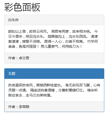
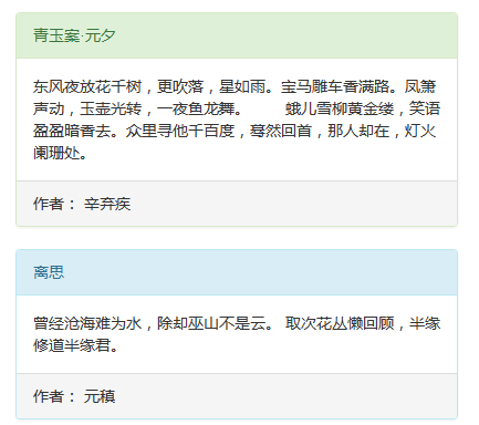
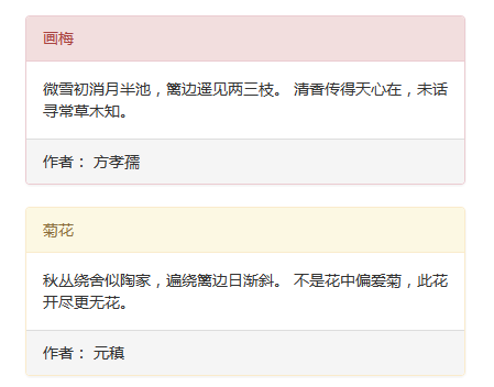
Color Panel
Since the .panel style does not set the theme color, the panel component in the bootstrap framework handles the default theme (.panel-default) style, and also includes the following theme styles:
.panel-primary: focus blue
.panel-success: success green
.panel-info: information blue (light)
.panel-warning: warning yellow
.panel-danger:danger red
These styles only change the background color, text, and border color of the panel
The method of use is very simple, just add the required theme class name to the .panel class name
Example:
<h1>彩色面板</h1>
<div class="panel panel-default">
<div class="panel-heading">白头吟</div>
<div class="panel-body">皑如山上雪,皎若云间月。
闻君有两意,故来相决绝。
今日斗酒会,明旦沟水头。
躞蹀御沟上,沟水东西流。
凄凄复凄凄,嫁娶不须啼。
愿得一人心,白首不相离。
竹竿何袅袅,鱼尾何簁簁!
男儿重意气,何用钱刀为!</div>
<div class="panel-footer">作者:卓文君</div>
</div>
<div class="panel panel-primary">
<div class="panel-heading">无题</div>
<div class="panel-body">昨夜星辰昨夜风,画楼西畔桂堂东。
身无彩凤双飞翼,心有灵犀一点通。
隔座送钩春酒暖,分曹射覆蜡灯红。
嗟余听鼓应官去,走马兰台类转蓬。</div>
<div class="panel-footer">作者:李商隐</div>
</div>
<div class="panel panel-success">
<div class="panel-heading">青玉案·元夕</div>
<div class="panel-body">东风夜放花千树,更吹落,星如雨。宝马雕车香满路。凤箫声动,玉壶光转,一夜鱼龙舞。
  蛾儿雪柳黄金缕,笑语盈盈暗香去。众里寻他千百度,蓦然回首,那人却在,灯火阑珊处。</div>
<div class="panel-footer">作者: 辛弃疾</div>
</div>
<div class="panel panel-info">
<div class="panel-heading">离思</div>
<div class="panel-body">曾经沧海难为水,除却巫山不是云。
取次花丛懒回顾,半缘修道半缘君。</div>
<div class="panel-footer">作者: 元稹</div>
</div>
<div class="panel panel-danger">
<div class="panel-heading">画梅</div>
<div class="panel-body">微雪初消月半池,篱边遥见两三枝。
清香传得天心在,未话寻常草木知。</div>
<div class="panel-footer">作者: 方孝孺</div>
</div>
<div class="panel panel-warning">
<div class="panel-heading">菊花</div>
<div class="panel-body">秋丛绕舍似陶家,遍绕篱边日渐斜。
不是花中偏爱菊,此花开尽更无花。</div>
<div class="panel-footer">作者: 元稹</div>
</div>
The effect is as follows:
Nested table in panel
Generally, the panel can be understood as an area. When using the panel, the required content will be placed in the .panel-body container. The content inside may be pictures, tables, lists, etc.; let’s take a look at the panel. The effect of nested tables and list groups in , here is an example of nested tables:
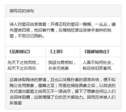
<h1>面板中嵌套表格</h1>
<div class="panel panel-default">
<div class="panel-heading">描写花的诗句</div>
<div class="panel-body">
<p>诗人对菊花由衷喜爱:开得正旺的菊花一簇簇、一丛丛,遍布屋舍四周,他沿着竹篱,忘情地欣赏这些亲手栽种的秋菊,不觉日已西斜。</p>
<table class="table table-bordered">
<thead>
<tr>
<th>不是花中偏爱菊,此花开尽更无花《菊花》</th>
<th>愿得一人心,白首不相离《白头吟》</th>
<th>床前明月光,疑是地上霜《静夜思》</th>
</tr>
</thead>
<tbody>
<tr>
<td>先天下之忧而忧,后天下之乐而乐《岳阳楼记》</td>
<td>我欲与君相知,长命无绝衰《上邪》</td>
<td>人面不知何处去,桃花依旧笑春风《题都城南庄》</td>
</tr>
</tbody>
</table>
</div>
<div class="panel-footer">这首诗取陶诗的意境,且也以淡雅朴素的语言吟咏,便不似陶公全用意象,蕴藉之至;而是在描绘具象之后,以自述的方式道出爱菊之由而又不一语说尽,留下了想象空间让人们去回味咀嚼,这就增强了它的艺术感染力。因而历来被人们所喜爱</div>
</div>
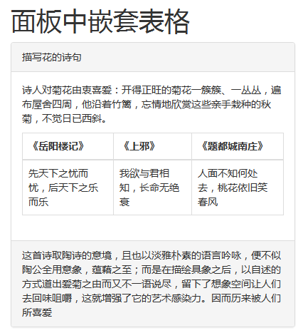
In actual application, there may be no need for any spacing between the table and the edge of the panel, but the .panel-body sets a padding value of 15px. In order to achieve this effect, the table can be extracted to Outside panel-body:
For example:
<div class="panel panel-default">
<div class="panel-heading">描写花的诗句</div>
<div class="panel-body">
<p>诗人对菊花由衷喜爱:开得正旺的菊花一簇簇、一丛丛,遍布屋舍四周,他沿着竹篱,忘情地欣赏这些亲手栽种的秋菊,不觉日已西斜。</p>
</div>
<table class="table table-bordered">
<thead>
<tr>
<th>《岳阳楼记》</th>
<th>《上邪》</th>
<th>《题都城南庄》</th>
</tr>
</thead>
<tbody>
<tr>
<td>先天下之忧而忧,后天下之乐而乐</td>
<td>我欲与君相知,长命无绝衰</td>
<td>人面不知何处去,桃花依旧笑春风</td>
</tr>
</tbody>
</table>
<div class="panel-footer">这首诗取陶诗的意境,且也以淡雅朴素的语言吟咏,便不似陶公全用意象,蕴藉之至;而是在描绘具象之后,以自述的方式道出爱菊之由而又不一语说尽,留下了想象空间让人们去回味咀嚼,这就增强了它的艺术感染力。因而历来被人们所喜爱</div>
</div>
Nested list group in panel
Example:
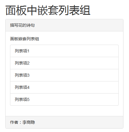
<h1>面板中嵌套列表组</h1>
<div class="panel panel-default">
<div class="panel-heading">描写花的诗句</div>
<div class="panel-body">
<p>面板嵌套列表组</p>
<ul class="list-group">
<li class="list-group-item">列表项1</li>
<li class="list-group-item">列表项2</li>
<li class="list-group-item">列表项3</li>
<li class="list-group-item">列表项4</li>
<li class="list-group-item">列表项5</li>
</ul>
</div>
<div class="panel-footer">作者:李商隐</div>
</div>
Panel nested list combinations are the same as nested tables. If you don’t need such spacing, you can extract the list group from the .panel-body
Example:
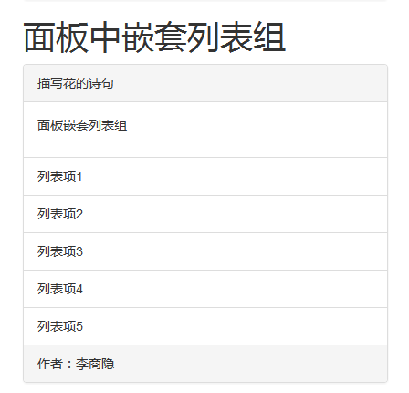
<h1>面板中嵌套列表组</h1>
<div class="panel panel-default">
<div class="panel-heading">描写花的诗句</div>
<div class="panel-body">
<p>面板嵌套列表组</p>
</div>
<ul class="list-group">
<li class="list-group-item">列表项1</li>
<li class="list-group-item">列表项2</li>
<li class="list-group-item">列表项3</li>
<li class="list-group-item">列表项4</li>
<li class="list-group-item">列表项5</li>
</ul>
<div class="panel-footer">作者:李商隐</div>
</div>
効果は次のとおりです:
上記は編集者が紹介したBootstrapコンポーネントのパネルコンポーネントです。ご参考になれば幸いです。

ホットAIツール

Undresser.AI Undress
リアルなヌード写真を作成する AI 搭載アプリ

AI Clothes Remover
写真から衣服を削除するオンライン AI ツール。

Undress AI Tool
脱衣画像を無料で

Clothoff.io
AI衣類リムーバー

AI Hentai Generator
AIヘンタイを無料で生成します。

人気の記事
ホットツール

メモ帳++7.3.1
使いやすく無料のコードエディター

SublimeText3 中国語版
中国語版、とても使いやすい

ゼンドスタジオ 13.0.1
強力な PHP 統合開発環境

ドリームウィーバー CS6
ビジュアル Web 開発ツール

SublimeText3 Mac版
神レベルのコード編集ソフト(SublimeText3)
ホットトピック
 7338
7338
 9
1627
14
1352
46
1265
25
1210
29
9
1627
14
1352
46
1265
25
1210
29

 JavaScriptの文字列文字を交換します
Mar 11, 2025 am 12:07 AM
JavaScriptの文字列文字を交換します
Mar 11, 2025 am 12:07 AM
JavaScript文字列置換法とFAQの詳細な説明 この記事では、javaScriptの文字列文字を置き換える2つの方法について説明します:内部JavaScriptコードとWebページの内部HTML。 JavaScriptコード内の文字列を交換します 最も直接的な方法は、置換()メソッドを使用することです。 str = str.replace( "find"、 "置換"); この方法は、最初の一致のみを置き換えます。すべての一致を置き換えるには、正規表現を使用して、グローバルフラグGを追加します。 str = str.replace(/fi
 カスタムGoogle検索APIセットアップチュートリアル
Mar 04, 2025 am 01:06 AM
カスタムGoogle検索APIセットアップチュートリアル
Mar 04, 2025 am 01:06 AM
このチュートリアルでは、カスタムGoogle検索APIをブログまたはWebサイトに統合する方法を示し、標準のWordPressテーマ検索関数よりも洗練された検索エクスペリエンスを提供します。 驚くほど簡単です!検索をyに制限することができます
 独自のAjax Webアプリケーションを構築します
Mar 09, 2025 am 12:11 AM
独自のAjax Webアプリケーションを構築します
Mar 09, 2025 am 12:11 AM
それで、あなたはここで、Ajaxと呼ばれるこのことについてすべてを学ぶ準備ができています。しかし、それは正確には何ですか? Ajaxという用語は、動的でインタラクティブなWebコンテンツを作成するために使用されるテクノロジーのゆるいグループ化を指します。 Ajaxという用語は、もともとJesse Jによって造られました
 例JSONファイルの例
Mar 03, 2025 am 12:35 AM
例JSONファイルの例
Mar 03, 2025 am 12:35 AM
この記事シリーズは、2017年半ばに最新の情報と新鮮な例で書き直されました。 このJSONの例では、JSON形式を使用してファイルに単純な値を保存する方法について説明します。 キー価値ペア表記を使用して、あらゆる種類を保存できます
 8見事なjQueryページレイアウトプラグイン
Mar 06, 2025 am 12:48 AM
8見事なjQueryページレイアウトプラグイン
Mar 06, 2025 am 12:48 AM
楽なWebページレイアウトのためにjQueryを活用する:8本質的なプラグイン jQueryは、Webページのレイアウトを大幅に簡素化します。 この記事では、プロセスを合理化する8つの強力なjQueryプラグイン、特に手動のウェブサイトの作成に役立ちます
 &#x27; this&#x27; JavaScriptで?
Mar 04, 2025 am 01:15 AM
&#x27; this&#x27; JavaScriptで?
Mar 04, 2025 am 01:15 AM
コアポイント これは通常、メソッドを「所有」するオブジェクトを指しますが、関数がどのように呼び出されるかに依存します。 現在のオブジェクトがない場合、これはグローバルオブジェクトを指します。 Webブラウザでは、ウィンドウで表されます。 関数を呼び出すと、これはグローバルオブジェクトを維持しますが、オブジェクトコンストラクターまたはそのメソッドを呼び出すとき、これはオブジェクトのインスタンスを指します。 call()、apply()、bind()などのメソッドを使用して、このコンテキストを変更できます。これらのメソッドは、与えられたこの値とパラメーターを使用して関数を呼び出します。 JavaScriptは優れたプログラミング言語です。数年前、この文はそうでした
 ソースビューアーでjQueryの知識を向上させます
Mar 05, 2025 am 12:54 AM
ソースビューアーでjQueryの知識を向上させます
Mar 05, 2025 am 12:54 AM
jQueryは素晴らしいJavaScriptフレームワークです。ただし、他のライブラリと同様に、何が起こっているのかを発見するためにフードの下に入る必要がある場合があります。おそらく、バグをトレースしているか、jQueryが特定のUIをどのように達成するかに興味があるからです
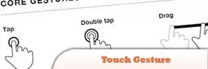 モバイル開発用のモバイルチートシート10個
Mar 05, 2025 am 12:43 AM
モバイル開発用のモバイルチートシート10個
Mar 05, 2025 am 12:43 AM
この投稿は、Android、BlackBerry、およびiPhoneアプリ開発用の有用なチートシート、リファレンスガイド、クイックレシピ、コードスニペットをコンパイルします。 開発者がいないべきではありません! タッチジェスチャーリファレンスガイド(PDF) Desigの貴重なリソース
