

CSSを使用してカウントダウンタイマーを作成する方法

カルロス・ムクホ著✏️
カウントダウン タイマーは多くの Web サイトで人気の機能であり、イベント、セール、ユーザー エンゲージメントの機能を強化しています。 JavaScript は Web 上の動的な動作によく使用されますが、CSS のみを使用して機能的で視覚的に魅力的なカウントダウン タイマーを作成することもできます。
このチュートリアルでは、基本的な JavaScript カウントダウン タイマーから始めて、CSS のみのカウントダウン タイマーに進む、両方のアプローチを検討します。最後に、Chrome DevTools を使用して両方のアプローチのパフォーマンスを比較し、それぞれの長所と短所について説明します。
基本的な JavaScript カウントダウン タイマーの作成
まず、毎秒更新される単純なカウントダウン タイマーを作成します。タイマーには、その動作を制御するための開始ボタンと一時停止ボタンが含まれます。
ディレクトリ構造の作成
JavaScript カウントダウン タイマーを作成する前に、このチュートリアル全体で構築するアプリケーションを保存するディレクトリを作成する必要があります。
ターミナル ウィンドウを開き、プロジェクトに適したディレクトリに移動し、次のコマンドを使用して countdown-timer という名前のディレクトリを作成します。
mkdir countdown-timer
次に、次のディレクトリに移動します:
cd countdown-timer
javascript-countdown と css-only-countdown という名前の 2 つのサブディレクトリを作成し、各サブディレクトリ内に public という名前のサブディレクトリを作成します。
mkdir javascript-countdown && mkdir javascript-countdown/public
mkdir css-only-countdown && mkdir css-only-countdown/public
アプリケーションサーバーの作成
次に、javascript-countdown サブディレクトリに移動し、デフォルト設定で新しいノード プロジェクトを初期化し、エクスプレス パッケージをインストールします。
cd javascript-countdown
npm init -y
npm install express
お気に入りのテキスト エディターを開き、server.js という名前のファイルを作成し、次のコードをそれに追加します。
const express = require('express');
const app = express();
const port = 3001

app.use(express.static('public'));
app.listen(port, () => {
  console.log(`Javascript countdown app server started on port ${port}`);
});
上記のコードは、ポート 3001 で JavaScript カウントダウン アプリケーションを提供するために使用される Express サーバーを作成します。
HTML構造
テキスト エディターで、javascript-countdown ディレクトリ内にある public サブディレクトリに次のファイルを作成します。
- HTML コードのindex.html
- CSS コードのstyles.css
- JavaScript コードのindex.js
次のコードをindex.htmlに追加します:
<!DOCTYPE html>
<html lang="en">
<head>
  <meta charset="UTF-8">
  <meta name="viewport" content="width=device-width, initial-scale=1.0">
  <link rel="stylesheet" href="styles.css">
  <title>Javascript Countdown Timer</title>
</head>

<body>
  <div class="container">
    <div class="controls">
      <button id="startBtn">Start</button>
      <button id="pauseBtn">Pause</button>
    </div>
    <div class="countdown-container">
      <div class="countdown"></div>
    </div>
  </div>
  <script src="index.js"></script>
</body>

</html>
この HTML ファイルは、コントロール ボタンとカウントダウン表示領域を保持するコンテナーを含む基本構造を設定します。
JavaScript を使用したカウントダウン ロジックの実装
次に、カウントダウン ロジックを管理するための JavaScript を追加します。次のコードをindex.jsに追加します:
window.addEventListener("load", () => {
  const startBtn = document.getElementById('startBtn');
  const pauseBtn = document.getElementById('pauseBtn');
  const countdownView = document.getElementsByClassName('countdown')[0];

  let totalTime = 10;
  let timeLeft;
  let countDownIntervalID;
  let isPaused = false;

  pauseBtn.style.display = 'none';
});
このコード ブロックでは、startBtn、pauseBtn、countdownView 要素をそれぞれの ID とクラスで初期化します。また、いくつかの初期変数 (totalTime、timeLeft、countDownIntervalID、isPaused) も設定します。さらに、一時停止ボタンは最初は非表示になるように設定しています。
次に、開始ボタンと一時停止ボタンのイベント リスナーを追加しましょう:
startBtn.addEventListener('click', startOrStopTimer);
pauseBtn.addEventListener('click', pauseOrResumeTimer);
これらの行は、クリック イベント リスナーを開始ボタンと一時停止ボタンに接続します。 startOrStopTimer 関数とpauseOrResumeTimer 関数は、ボタンのクリックを処理するために後で定義されます。
次のコードを追加して、startOrStopTimer 関数を定義します。
function startOrStopTimer() {
  startBtn.innerHTML = startBtn.innerHTML === 'Start' ? 'Stop' : 'Start';
  if (countDownIntervalID === undefined && !isPaused) {
    timeLeft = totalTime;
    startTimer();
    pauseBtn.style.display = 'inline';
  } else {
    stopTimer();
    countdownView.innerHTML = '';
    pauseBtn.style.display = 'none';
    isPaused = false;
    pauseBtn.innerHTML = 'Pause';
  }
}
この関数では、スタート ボタンのテキストを「開始」と「停止」の間で切り替えます。カウントダウンが実行中でなく、一時停止されていない場合は、timeLeft を totalTime に初期化し、タイマーを開始します。それ以外の場合は、タイマーを停止し、ビューをリセットします。
次に、startTimer 関数を定義します。
function startTimer() {
  countDownIntervalID = setInterval(() => {
    countdownView.innerHTML = timeLeft;

    if (timeLeft === 0) {
      stopTimer();
      startBtn.innerHTML = 'Start';
      pauseBtn.style.display = 'none';
      countdownView.innerHTML = '';
    } else {
      timeLeft = timeLeft - 1;
    }
  }, 1000);
}
この関数は、カウントダウンを毎秒更新する間隔を設定します。 timeLeft がゼロに達すると、タイマーを停止し、開始ボタンのテキストをリセットし、一時停止ボタンを非表示にします。
次に、stopTimer 関数を追加します。
function stopTimer() {
  if (countDownIntervalID !== undefined) {
    clearInterval(countDownIntervalID);
    countDownIntervalID = undefined;
  }
}
この関数はカウントダウン間隔をクリアし、countDownIntervalID をリセットします。最後に、pauseOrResumeTimer 関数を追加します:
function pauseOrResumeTimer() {
  isPaused = !isPaused;
  pauseBtn.innerHTML = isPaused ? 'Resume' : 'Pause';

  if (countDownIntervalID !== undefined) {
    stopTimer();
  } else {
    startTimer();
  }
}
この関数では、一時停止状態とボタンのテキストを一時停止と再開の間で切り替えます。カウントダウンが実行中の場合は、タイマーを停止します。それ以外の場合は、再度開始します。
CSS スタイル
次に、CSS を使用してカウントダウン タイマーのスタイルを設定しましょう。次のコードをstyles.cssに追加します:
body {
  background-color: black;
  font-family: Arial, sans-serif;
  height: 100%;
}

.container {
  display: flex;
  flex-direction: column;
  justify-content: center;
  align-items: center;
}

.controls {
  width: 20%;
  margin-top: 10%;
  display: flex;
  justify-content: space-between;
  flex-direction: row;
  flex-wrap: wrap;
}

.countdown-container {
  position: relative;
  width: 20vw;
  height: 20vw;
  margin-top: 2%;
  border: 0.4em solid #9b51e0;
}

button {
  font-size: 1.5em;
  border: none;
  padding: 0.3em;
  background-color: #9b51e0;
  border-radius: 0.4em;
  color: white;
}

.countdown {
  position: relative;
  width: 100%;
  height: 100%;
  list-style: none;
  padding: 0;
  margin: 0;
  display: flex;
  justify-content: center;
  align-items: center;
  font-size: 5em;
  color: #9b51e0;
}
この CSS は、カウントダウン タイマー インターフェイスのスタイルを定義します。本文の背景は黒に設定され、Arial をプライマリ フォントとして使用します。 .container クラスは、コンテンツを中央に配置し、要素間にスペースを設けるようにスタイル設定されています。 .controls クラスは、タイマーを開始および一時停止するためのボタンのスタイルを設定し、ボタンが均等な間隔で配置され、反応するようにします。 .countdown-container クラスは、境界線やマージンを含むカウントダウン表示のサイズと外観を定義します。
ターミナルに戻り、次のコマンドを実行して、JavaScript カウントダウン アプリケーションの提供を開始します。
node server.js
Open a new tab in your browser, navigate to http://localhost:3001, and you should see something similar to the following: 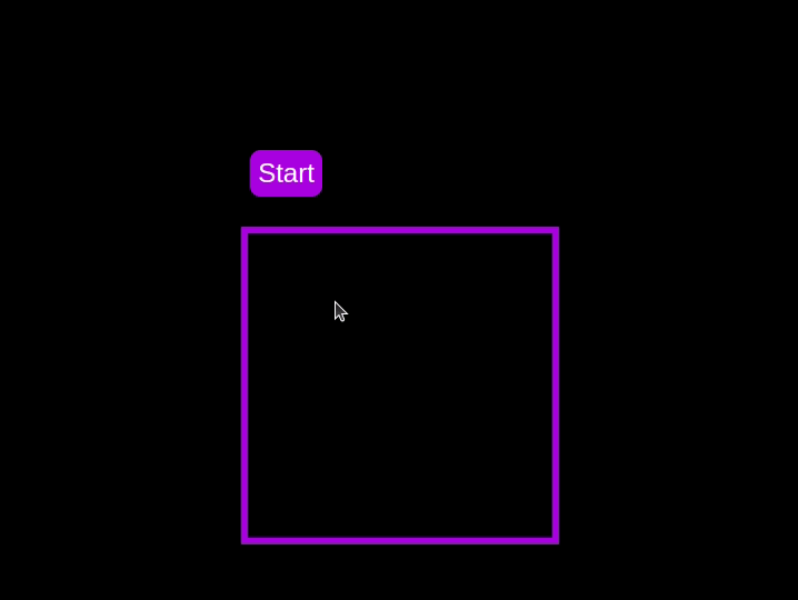 Test out the countdown timer and once you are done, terminate the server application and move to the next step.
Adding a circular progress indicator
To enhance the user experience of our countdown timer, let’s add a circular progress indicator to give the user a visual representation of the time remaining.
First, we need to modify our HTML code to include the circular progress element. In index.html, we add a span element with a class of circular-progress inside the countdown-container div. This span element will be used to create the circular progress indicator:
<div class="countdown-container">
  <span class="circular-progress"></span>
  <div class="countdown"></div>
</div>
Next, we need to define the CSS for the circular progress indicator. In styles.css, we add the following code:
.countdown-container {
  ...
  /* border : 0.4em solid #9b51e0; */
}
.circular-progress {
  width: 20vw;
  height: 20vw;
  border-radius: 50%;
  display: flex;
  justify-content: center;
  align-items: center;
  position: absolute;
  transition: 0.5s;
  background-color: #13171f;
}

.circular-progress::before {
  width: 18.5vw;
  height: 18.5vw;
  content: "";
  position: absolute;
  border-radius: 50%;
  background-color: black;
}
This code first removes the border from the countdown-container div, then sets the dimensions and shape of the circular progress indicator, as well as its position and background color. We also add a ::before pseudo-element to create the inner circle of the progress indicator.
Now we need to add the JavaScript code to animate the circular progress indicator.
Add the following code in the variables initialization block:
const circularProgressEl = document.getElementsByClassName("circular-progress")[0];
let circularProgress;
let circularProgressIntervalID;
This code initializes the circularProgressEl variable to target the circular progress element and creates two new variables, circularProgress and circularProgressIntervalID, that will be used to animate the progress indicator.
Add the following code below the pauseOrResumeTimer() function:
function startCircularProgressAnimation() {
  let start = totalTime - timeLeft;
  let degreesPerSecond = 360 / totalTime;
  let degreesPerInterval = degreesPerSecond / 20;
  circularProgress = degreesPerSecond * start;

  circularProgressIntervalID = setInterval(() => {
    if (Math.round(circularProgress) === 360) {
      clearInterval(circularProgressIntervalID);
    } else {
      circularProgress = circularProgress + degreesPerInterval;
      circularProgressEl.style.background = `conic-gradient(#9b51e0 ${circularProgress}deg, #13171f 0deg)`;
    }
  }, 50);
}
This code defines the startCircularProgressAnimation function, which calculates the starting point and degree of rotation for the circular progress indicator, and sets up an interval to animate the progress indicator.
Add the following code below the startCircularProgressAnimation:
function resumeCircularProgressAnimation() {
  startCircularProgressAnimation();
}

function pauseCircularProgressAnimation() {
  clearInterval(circularProgressIntervalID);
}

function stopCircularProgressAnimation() {
  clearInterval(circularProgressIntervalID);
  circularProgressEl.style.background = `conic-gradient(#9b51e0 0deg, #13171f 0deg)`;
}
This code defines the resumeCircularProgressAnimation, pauseCircularProgressAnimation, and stopCircularProgressAnimation functions, which are used to start, pause, and stop the circular progress animation.
Finally, we need to modify the startOrStopTimer and pauseOrResumeTimer functions to start and stop the circular progress animation along with the timer:
function startOrStopTimer() {
  // ...
  if (countDownIntervalID === undefined && !isPaused) {
    // ...
    startCircularProgressAnimation();
  } else {
    // ...
    stopCircularProgressAnimation();
  }
}

function pauseOrResumeTimer() {
  // ...
  if (countDownIntervalID !== undefined) {
    stopTimer();
    pauseCircularProgressAnimation();
  } else {
    startTimer();
    resumeCircularProgressAnimation();
  }
}
With these modifications, our countdown timer now includes a circular progress indicator that animates along with the timer.
Return to your terminal and run the following command to start serving the JavaScript countdown application:
node server.js
Go back to the tab in your browser where you visited the http://localhost:3001 URL, refresh the page, and you should see something similar to the following: 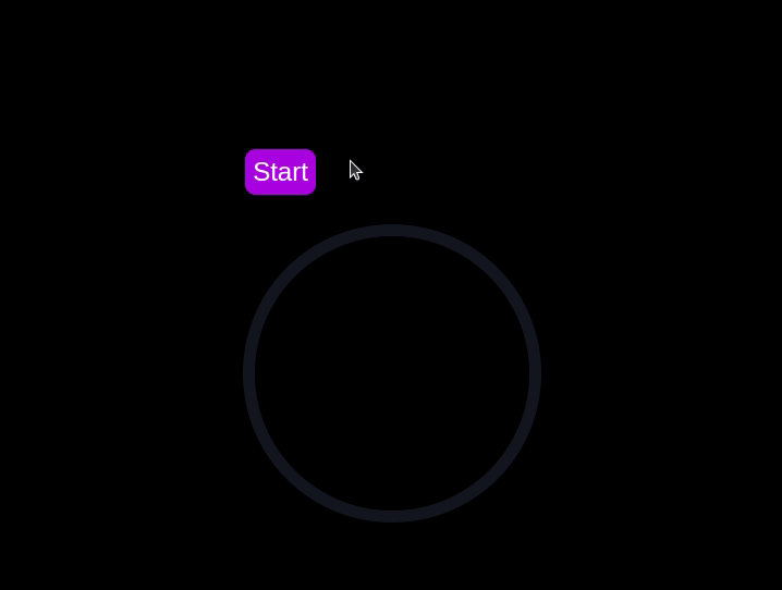
Implementing a CSS-only countdown timer
In this section, we'll dive into creating a countdown timer that updates every second and is made using only CSS. Our timer will be simple yet functional, featuring start and pause buttons to control its operation.
Creating the application server
Navigate to the css-only-countdown subdirectory, initialize a new node project, and install the express package:
cd ../css-only-countdown
npm init -y
npm install express
Then, return to your text editor, create a file named server.js, and add the following code to it:
const express = require('express');
const app = express();
const port = 3002
app.use(express.static('public'));

app.listen(port, () => {
  console.log(`Css-only countdown app server started on port ${port}`);
});
The code above creates an express server that will be used to serve the JavaScript countdown application in port 3002.
HTML structure
Still in your text editor, create the following files in the public subdirectory:
- index.html for the HTML code
- styles.css for the CSS code
Add the following code to the index.html file:
<!DOCTYPE html>
<html lang="en">
<head>
  <meta charset="UTF-8">
  <meta name="viewport" content="width=device-width, initial-scale=1.0">
  <link rel="stylesheet" href="styles.css">
  <title>CSS Countdown Timer</title>
</head>
<body>
  <div class="container">
    <div class="controls">
      <input type="checkbox" id="startBtn" class="checkbox-wrapper">
      <label for="startBtn" id="startLabel">
        <span>Stop</span>
        <span>Start</span>
      </label>
      <input type="checkbox" id="pauseBtn" class="checkbox-wrapper">
      <label for="pauseBtn" id="pauseLabel">
        <span>Resume</span>
        <span>Pause</span>
      </label>
      <div class="countdown-container">
        <ul class="countdown">
          <li>10</li>
          <li>9</li>
          <li>8</li>
          <li>7</li>
          <li>6</li>
          <li>5</li>
          <li>4</li>
          <li>3</li>
          <li>2</li>
          <li>1</li>
        </ul>
      </div>
    </div>
  </div>
</body>
</html>
This code sets up the basic structure of our countdown timer. It includes a container div that holds the controls for starting and pausing the timer, as well as the countdown display itself. The controls div contains two checkboxes with labels that will serve as our start and pause buttons. These buttons toggle their respective states using CSS, thanks to the checkbox hack.
The countdown-container div holds an unordered list (ul) of list items (li) representing the countdown numbers from 10 to one. These numbers will be displayed one by one as the timer counts down.
CSS styling
Now, let's style the countdown timer using CSS. Add the following code to styles.css:
body {
  background-color: black;
  font-family: Arial, sans-serif;
  height: 100%;
}

.container {
  display: flex;
  flex-direction: column;
  justify-content: center;
  align-items: center;
}

.controls {
  width: 20%;
  margin-top: 10%;
  display: flex;
  justify-content: space-between;
  flex-direction: row;
  flex-wrap: wrap;
}

.countdown-container {
  position: relative;
  width: 20vw;
  height: 20vw;
  margin-top: 12%;
  border : 0.4em solid #9b51e0;
}

#startLabel span {
  display: none;
}

label {
  cursor: pointer;
  font-size: 1.5em;
  padding: 0.3em;
  background-color: #9b51e0;
  border-radius: 0.4em;
  color: white;
}

#startBtn:checked~#startLabel span:nth-child(1) {
  display: inline;
}

#startBtn:not(:checked)~#startLabel span:nth-child(2) {
  display: inline;
}

#startBtn:not(:checked)~#pauseLabel,
#pauseBtn {
  display: none;
}

#pauseLabel span {
  display: none;
}

#pauseBtn:checked~#pauseLabel span:nth-child(1) {
  display: inline;
}

#pauseBtn:not(:checked)~#pauseLabel span:nth-child(2) {
  display: inline;
}

.checkbox-wrapper {
  display: none;
}
In this CSS file, we start by setting some basic styles for the body and container. The body has a black background and uses the Arial font. The container is centered using flexbox and has a margin to push it down from the top of the viewport.
The controls div is styled to be responsive and to ensure that the buttons are spaced out evenly. The countdown-container div is styled with a border, which will later be replaced by the circular progress indicator.
We use the checkbox hack to toggle the visibility of the labels for the start and pause buttons. Depending on whether the checkboxes are checked or not, different spans within the labels are displayed. This allows the labels to show different text (Start or Stop, Pause or Resume) based on the state of the checkboxes.
Now, add the following code to the bottom of the styles.css file:
.countdown {
  position: relative;
  width: 100%;
  height: 100%;
  list-style: none;
  padding: 0;
  margin: 0;
  display: flex;
  justify-content: center;
  align-items: center;
  font-size: 5em;
  color: #9b51e0;
}

.countdown li {
  position: absolute;
  opacity: 0;
  transition: opacity 1s linear;
}

#startBtn:checked~.countdown-container .countdown li:nth-child(1) {
  animation-delay: 0s;
}

#startBtn:checked~.countdown-container .countdown li:nth-child(2) {
  animation-delay: 1s;
}

#startBtn:checked~.countdown-container .countdown li:nth-child(3) {
  animation-delay: 2s;
}

#startBtn:checked~.countdown-container .countdown li:nth-child(4) {
  animation-delay: 3s;
}

#startBtn:checked~.countdown-container .countdown li:nth-child(5) {
  animation-delay: 4s;
}

#startBtn:checked~.countdown-container .countdown li:nth-child(6) {
  animation-delay: 5s;
}

#startBtn:checked~.countdown-container .countdown li:nth-child(7) {
  animation-delay: 6s;
}

#startBtn:checked~.countdown-container .countdown li:nth-child(8) {
  animation-delay: 7s;
}

#startBtn:checked~.countdown-container .countdown li:nth-child(9) {
  animation-delay: 8s;
}

#startBtn:checked~.countdown-container .countdown li:nth-child(10) {
  animation-delay: 9s;
}

@keyframes countdownAnimation {
  0%,
  10% {
    opacity: 1;
  }
  11%,
  100% {
    opacity: 0;
  }
}

#startBtn:checked~.countdown-container .countdown li {
  animation: countdownAnimation 10s steps(10) forwards;
}

#pauseBtn:checked~.countdown-container .countdown li {
  animation-play-state: paused;
}
With this code, we style the countdown list. The countdown class is positioned absolutely within the countdown-container, and its list items are initially hidden with opacity: 0.
We then use keyframes and the animation property to create the countdown effect. The list items are displayed one by one with a delay using the animation-delay property. The countdownAnimation keyframes control the visibility of each list item, making them visible for a short period before hiding them again.
We also pause the animation when the pause button is checked, using the animation-play-state property.
Go back to your terminal and run the following command to start serving the CSS-only countdown application:
node server.js
Open a new tab in your browser, navigate to http://localhost:3002 URL, and you should see something similar to the following: 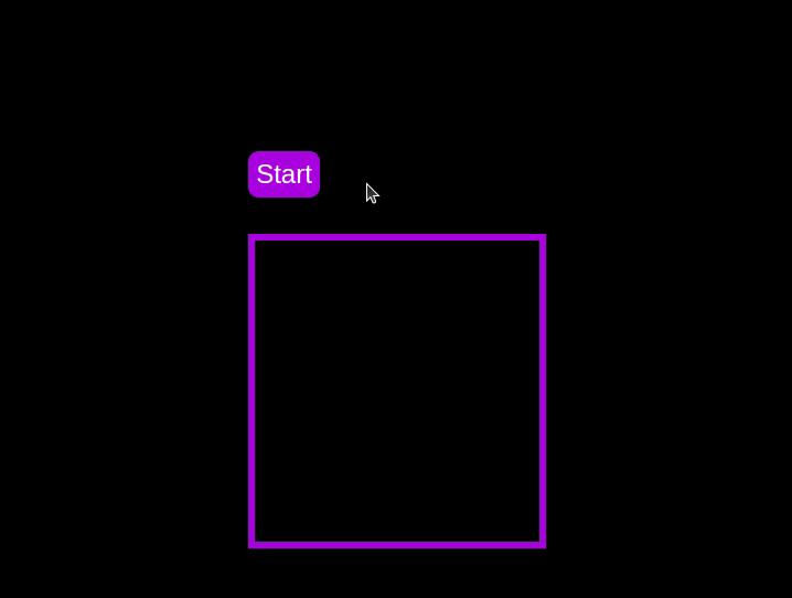 Test out the countdown timer and once you are done, terminate the server application and move to the next step.
Adding a circular progress indicator
To make the countdown timer more visually appealing, we can add a circular progress indicator that shows the remaining time. To do this, we will modify the HTML and CSS code as follows:
First, replace the countdown-container div in the index.html file with the following code:
<div class="countdown-container">
  <span class="circular-progress">
  </span>
  <ul class="countdown">
    <li>10</li>
    <li>9</li>
    <li>8</li>
    <li>7</li>
    <li>6</li>
    <li>5</li>
    <li>4</li>
    <li>3</li>
    <li>2</li>
    <li>1</li>
  </ul>
</div>
In this code, we add a span element with a class of circular-progress inside the countdown-container div.
Next, add the following code to the styles.css file:
.countdown-container {
  ...
  /* border : 0.4em solid #9b51e0; */
}

.circular-progress {
  width: 20vw;
  height: 20vw;
  border-radius: 50%;
  display: flex;
  justify-content: center;
  align-items: center;
  position: absolute;
  transition: 0.5s;
  background: conic-gradient(#9b51e0 var(--angle), #13171f 0deg);
}

.circular-progress::before {
  width: 18.5vw;
  height: 18.5vw;
  content: "";
  position: absolute;
  border-radius: 50%;
  background-color: black;
}

@keyframes circularProgressAnimation {
  to {
    --angle: 360deg;
  }
}

@property --angle {
  syntax: "<angle>";
  initial-value: 0deg;
  inherits: false;
}

#startBtn:checked~.countdown-container .circular-progress {
  opacity: 1;
  animation: circularProgressAnimation 10s linear;
}

#pauseBtn:checked~.countdown-container .circular-progress {
  animation-play-state: paused;
}
In this code, we first remove the border from the countdown-container div, and then add styles for the circular-progress class. The circular progress indicator is a span element that is absolutely positioned within the countdown-container. It uses a conic gradient to create the circular progress effect.
We also define a keyframe animation, circularProgressAnimation, that animates the progress indicator from 0 to 360 degrees over the duration of the countdown. The --angle CSS property is used to control the angle of the gradient.
Finally, we use the checkbox hack to start and pause the circular progress animation along with the countdown numbers. The animation is applied to the circular-progress span when the start button is checked and paused when the pause button is checked.
With these modifications, our countdown timer now includes a circular progress indicator that animates along with the timer.
Go back to your terminal and run the following command to start serving the CSS-only countdown application:
node server.js
Return to the tab in your browser where you visited the http://localhost:3002 URL, refresh the page, and you should see something similar to the following: 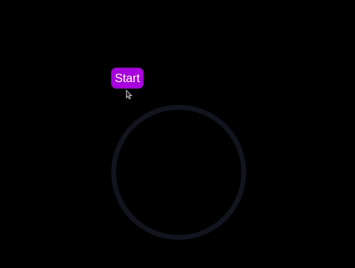
Using Chrome DevTools to compare timer performance
Now that we have implemented both the CSS-only and JavaScript countdown timers, let's compare their performance using Chrome DevTools.
To get started, open the Chrome browser and navigate to the webpage containing the countdown timers. Right-click anywhere on the page and select Inspect to open Chrome DevTools.
In the DevTools window, click on the Network tab and then refresh both the JavaScript and CSS-only countdown pages. This tab allows you to monitor all network requests made by the page, including HTML, CSS, JavaScript, and other resources: 
By analyzing the requests, you can determine how many resources are being loaded, their sizes, and the overall impact on page load time:
| CSS-only countdown timer | JavaScript countdown timer | |
|---|---|---|
| Number of requests | 2 | 3 |
| Total size | 4.5 KB | 4.7 KB |
| Page load | 24 ms | 27 ms |
Daripada keputusan ini, kita dapat melihat bahawa pemasa kira detik CSS sahaja memerlukan permintaan yang lebih sedikit dan mempunyai jumlah saiz yang lebih kecil sedikit berbanding pemasa kira detik JavaScript. Ini membawa kepada masa muat halaman yang sedikit lebih pantas untuk versi CSS sahaja, menjadikannya lebih cekap dari segi pemuatan awal.
Sekarang, dalam tetingkap DevTools, navigasi ke tab Prestasi dan mulakan sesi rakaman dengan mengklik butang Rekod. Untuk menilai pemasa undur JavaScript, klik pada butang Mula yang terletak pada halaman masing-masing dan benarkan pemasa menjalankan laluannya. Setelah pemasa berhenti, hentikan rakaman dalam tab Prestasi.
Lakukan proses ini untuk halaman kira detik JS dan CSS sahaja untuk mengumpulkan data prestasi bagi setiap pelaksanaan. Tab Prestasi menawarkan analisis komprehensif prestasi masa jalan halaman anda, merangkumi masa skrip, pemaparan dan lukisan. Dengan menganalisis metrik ini, anda boleh menentukan kawasan yang mungkin memerlukan pengoptimuman untuk meningkatkan prestasi aplikasi web anda:
| CSS-only countdown timer | JavaScript countdown timer | |
|---|---|---|
| Scripting | 2 ms | 49 ms |
| Rendering | 510 ms | 103 ms |
| Painting | 275 ms | 55 ms |
Mentafsir keputusan ini, kami mendapati bahawa masa skrip untuk pemasa kira detik CSS sahaja adalah jauh lebih rendah daripada pemasa kira detik JavaScript, menunjukkan overhed pelaksanaan yang minimum. Walau bagaimanapun, pemasa kira detik CSS sahaja mempunyai masa pemaparan dan lukisan yang lebih tinggi. Ini kerana animasi CSS kadangkala memerlukan lebih banyak usaha daripada penyemak imbas untuk membuat persembahan, terutamanya untuk gaya atau peralihan yang kompleks.
Sebaliknya, pemasa kira detik JavaScript menunjukkan masa skrip yang lebih tinggi disebabkan oleh logik yang terlibat dalam mengemas kini kira detik, tetapi ia mendapat manfaat daripada masa pemaparan dan pengecatan yang lebih rendah. Ini menunjukkan bahawa walaupun JavaScript menambah beberapa overhed dari segi pelaksanaan skrip, ia boleh menjadi lebih cekap dari segi mengemas kini DOM dan membuat perubahan.
Secara keseluruhannya, pemasa kira detik CSS sahaja adalah lebih cekap untuk senario yang meminimumkan masa pelaksanaan skrip adalah kritikal, manakala pemasa JavaScript mungkin berprestasi lebih baik dalam kes di mana masa pemaparan dan pengecatan menjadi kebimbangan utama.
Kebaikan dan keburukan setiap pendekatan
Setelah meneroka kedua-dua pemasa kira detik CSS sahaja dan JavaScript, mari kita timbang kelebihan dan kekurangannya untuk menentukan pendekatan yang paling sesuai dengan keperluan anda.
Pemasa kira detik CSS sahaja
Pemasa kira detik CSS sahaja memanfaatkan CSS tulen untuk mencapai kesan kira detik, memberikan penyelesaian yang ringan dan mudah.
Kebaikannya termasuk yang berikut:
- Overhed skrip minimum: Seperti yang dilihat dalam analisis prestasi kami, pemasa CSS sahaja memerlukan skrip yang sangat sedikit, menyebabkan penggunaan CPU yang lebih rendah untuk pelaksanaan skrip. Ini boleh memberi manfaat untuk meningkatkan prestasi halaman keseluruhan, terutamanya pada peranti dengan kuasa pemprosesan terhad
- Pangkalan kod ringkas: Dengan menggunakan CSS untuk animasi, kod kekal lebih bersih dan lebih boleh diselenggara. Pendekatan ini mengurangkan kerumitan pelaksanaan dan boleh memudahkan pembangun memahami dan mengurus kod
Keburukan pendekatan ini termasuk:
- Masa pemaparan dan pengecatan yang lebih tinggi: Pemasa CSS sahaja cenderung mempunyai masa pemaparan dan pengecatan yang lebih tinggi. Ini disebabkan oleh sifat animasi CSS, yang boleh menjadi lebih menuntut pada enjin pemaparan penyemak imbas. Ini boleh memberi kesan kepada prestasi pada halaman dengan berbilang animasi atau reka letak yang kompleks
- Interaktiviti terhad: Animasi CSS sememangnya kurang fleksibel berbanding JavaScript. Melaksanakan lebih banyak ciri interaktif, seperti kemas kini dinamik atau logik bersyarat, boleh mencabar dan mungkin memerlukan JavaScript tambahan, menafikan sebahagian kelebihan kesederhanaan
Pemasa kira detik JavaScript
Pemasa kira detik JavaScript, sebaliknya, menggunakan JavaScript untuk mengurus logik kira detik dan kemas kini DOM. Pendekatan ini menawarkan kawalan dan fleksibiliti yang lebih besar.
Kebaikan pendekatan ini termasuk:
- Kawalan dan fleksibiliti dipertingkat: JavaScript menyediakan kawalan terperinci ke atas logik kira detik dan manipulasi DOM. Ini membolehkan interaksi yang lebih kompleks, tingkah laku bersyarat dan kemas kini dinamik, menjadikannya sesuai untuk aplikasi yang lebih canggih
- Perenderan dan pengecatan yang cekap: Seperti yang ditunjukkan oleh analisis prestasi kami, pemasa JavaScript mendapat manfaat daripada masa pemaparan dan pengecatan yang lebih rendah. JavaScript boleh mengoptimumkan kemas kini pada DOM, menghasilkan animasi yang lebih lancar dan prestasi yang lebih baik dalam senario yang melibatkan kemas kini yang kerap
Keburukan termasuk:
- Overhed skrip yang lebih tinggi: Kelemahan utama pemasa kira detik JavaScript ialah peningkatan masa skrip. Logik JavaScript memperkenalkan overhed CPU tambahan, yang boleh memberi kesan kepada prestasi, terutamanya pada peranti dengan kuasa pemprosesan yang lebih rendah atau pada halaman dengan penggunaan skrip yang berat
- Meningkatkan kerumitan: Melaksanakan pemasa kira detik JavaScript melibatkan menulis dan mengurus lebih banyak kod, yang boleh meningkatkan kerumitan projek. Kerumitan tambahan ini boleh menjadikan pangkalan kod lebih sukar untuk diselenggara dan nyahpepijat
Pemasa CSS sahaja adalah ringan dan mudah difahami, menjadikannya pilihan yang baik untuk kira detik mudah dengan skrip yang minimum. Walau bagaimanapun, ia mungkin bergelut dengan animasi yang lebih kompleks dan ciri interaktif. Sebaliknya, pemasa JavaScript menawarkan kawalan dan fleksibiliti yang lebih besar, membolehkan interaksi yang lebih dinamik. Ini datang dengan kos overhed skrip yang lebih tinggi dan peningkatan kerumitan.
Akhirnya, pilihan antara kedua-dua pendekatan bergantung pada keperluan khusus projek anda dan pertukaran yang anda sanggup terima.
Kesimpulan
Dalam tutorial ini, kami meneroka dua kaedah untuk mencipta pemasa undur: menggunakan JavaScript dan hanya menggunakan CSS. Kami bermula dengan pemasa kira detik JavaScript asas, menambahkan fungsi dan penggayaan untuk menjadikannya mesra pengguna dan menarik secara visual. Kemudian, kami melaksanakan pemasa kira detik CSS sahaja, mempamerkan kuasa CSS untuk mencipta animasi yang mudah tetapi berkesan.
Sama ada anda memilih pendekatan CSS sahaja untuk kesederhanaannya atau pendekatan JavaScript untuk fleksibilitinya, anda kini mempunyai alatan dan pengetahuan untuk melaksanakan pemasa kira detik yang sesuai dengan keperluan projek anda.
Adakah bahagian hadapan anda memonopoli CPU pengguna anda?
Memandangkan bahagian hadapan web semakin kompleks, ciri tamak sumber menuntut lebih banyak lagi daripada penyemak imbas. Jika anda berminat untuk memantau dan menjejaki penggunaan CPU pihak pelanggan, penggunaan memori dan banyak lagi untuk semua pengguna anda dalam pengeluaran, cuba LogRocket.
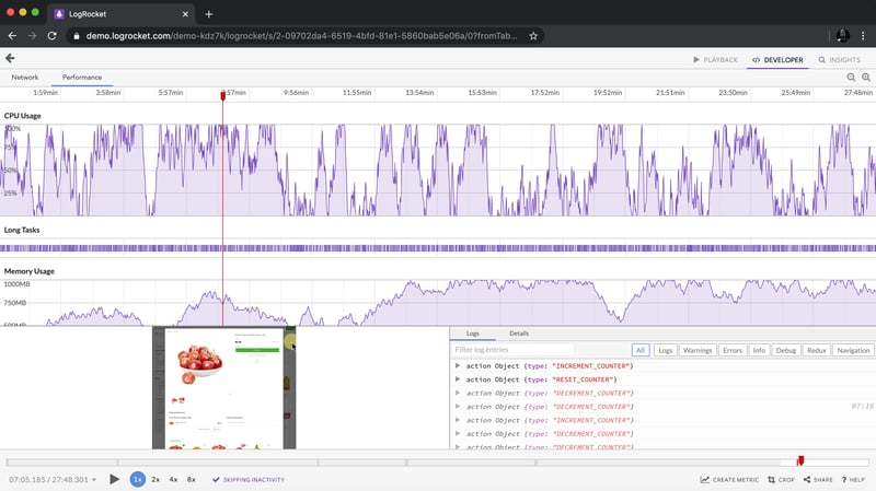
LogRocket adalah seperti DVR untuk apl web dan mudah alih, merakam semua yang berlaku dalam apl web, apl mudah alih atau tapak web anda. Daripada meneka sebab masalah berlaku, anda boleh mengagregat dan melaporkan metrik prestasi bahagian hadapan utama, memainkan semula sesi pengguna bersama-sama dengan keadaan aplikasi, log permintaan rangkaian dan secara automatik memaparkan semua ralat.
Modenkan cara anda menyahpepijat web dan apl mudah alih — mula memantau secara percuma.
以上がCSSを使用してカウントダウンタイマーを作成する方法の詳細内容です。詳細については、PHP 中国語 Web サイトの他の関連記事を参照してください。

ホットAIツール

Undresser.AI Undress
リアルなヌード写真を作成する AI 搭載アプリ

AI Clothes Remover
写真から衣服を削除するオンライン AI ツール。

Undress AI Tool
脱衣画像を無料で

Clothoff.io
AI衣類リムーバー

Video Face Swap
完全無料の AI 顔交換ツールを使用して、あらゆるビデオの顔を簡単に交換できます。

人気の記事
ホットツール

メモ帳++7.3.1
使いやすく無料のコードエディター

SublimeText3 中国語版
中国語版、とても使いやすい

ゼンドスタジオ 13.0.1
強力な PHP 統合開発環境

ドリームウィーバー CS6
ビジュアル Web 開発ツール

SublimeText3 Mac版
神レベルのコード編集ソフト(SublimeText3)
ホットトピック
 1664
1664
 14
1422
52
1316
25
1267
29
1239
24
14
1422
52
1316
25
1267
29
1239
24

 Googleフォント変数フォント
Apr 09, 2025 am 10:42 AM
Googleフォント変数フォント
Apr 09, 2025 am 10:42 AM
Google Fontsが新しいデザイン(ツイート)を展開したようです。最後の大きな再設計と比較して、これははるかに反復的です。違いをほとんど伝えることができません
 HTML、CSS、JavaScriptを使用してアニメーションカウントダウンタイマーを作成する方法
Apr 11, 2025 am 11:29 AM
HTML、CSS、JavaScriptを使用してアニメーションカウントダウンタイマーを作成する方法
Apr 11, 2025 am 11:29 AM
プロジェクトにカウントダウンタイマーが必要だったことはありますか?そのようなことのために、プラグインに手を伸ばすのは自然なことかもしれませんが、実際にはもっとたくさんあります

 SASSをより速くするための概念の証明
Apr 16, 2025 am 10:38 AM
SASSをより速くするための概念の証明
Apr 16, 2025 am 10:38 AM
新しいプロジェクトの開始時に、SASSコンピレーションは瞬く間に起こります。これは、特にbrowsersyncとペアになっている場合は素晴らしい気分です。
 SVGでタータンパターンを生成する静的サイトを作成する方法
Apr 09, 2025 am 11:29 AM
SVGでタータンパターンを生成する静的サイトを作成する方法
Apr 09, 2025 am 11:29 AM
タータンは、スコットランド、特にファッショナブルなキルトに通常関連する模様のある布です。 Tartanify.comでは、5,000を超えるTartanを集めました
 WordPressテーマでVueコンポーネントを構築する方法
Apr 11, 2025 am 11:03 AM
WordPressテーマでVueコンポーネントを構築する方法
Apr 11, 2025 am 11:03 AM
インラインテンプレートディレクティブにより、既存のWordPressマークアップに対する進行性の強化として、リッチVUEコンポーネントを構築できます。
 PHPはテンプレートのA-OKです
Apr 11, 2025 am 11:04 AM
PHPはテンプレートのA-OKです
Apr 11, 2025 am 11:04 AM
PHPテンプレートは、多くの場合、サブパーコードを促進するために悪いラップを取得しますが、そうである必要はありません。 PHPプロジェクトが基本を実施する方法を見てみましょう
 あなたが見ている間、CSSグラデーションは良くなりました
Apr 11, 2025 am 09:16 AM
あなたが見ている間、CSSグラデーションは良くなりました
Apr 11, 2025 am 09:16 AM
Lea verou&#039; conic-gradient()Polyfillの機能のリストに目を向けたことの1つが最後の項目でした。
