

なんてクソだ! 「シンプソンズ」キャラクターの純粋な CSS 描画 avatar_html/css_WEB-ITnose

この記事では、純粋にCSSで描かれた「ザ・シンプソンズ」のキャラクターアバターのセットを共有します。 『ザ・シンプソンズ』は、フォックス放送会社のためにマット・グレイニングによって制作されたアメリカのアニメーションコメディです。この劇は、ホーマー、マージ、バート、リサ、マギーの 5 人家族の生活を描くことで、アメリカの文化、社会、テレビ、人間の状況のさまざまな側面を面白い方法でセルフパロディしています。
注意喚起: 最良の結果を得るには、Chrome、Firefox、Safari などの最新のブラウザで閲覧してください。
ソース コードのダウンロード オンライン デモ
ホーマー
シンプソンズの父親は、一人で家族全員を支えます。彼のフルネームはホーマー・ジェイ・シンプソンです。
ホーマーキャラクターアバター HTML コード:
<div class="head"> <!-- Hair and top of head --> <div class="hair1"></div> <div class="hair2"></div> <div class="body head-top"></div> <div class="no-border body head-main"></div> <!-- The 'M' above the ear --> <div class="no-border m1"></div> <div class="no-border m2"></div> <div class="no-border m3"></div> <div class="no-border m4"></div> <!-- The neck parts --> <div class="no-border neck1"></div> <div class="body neck2"></div> <!-- The ear --> <div class="body ear"> <div class="no-border inner1"></div> <div class="no-border inner2"></div> <div class="no-border body clip"></div> </div> <!-- The mouth --> <div class="mouth"> <div class="mouth5"></div> <div class="mouth2"></div> <div class="mouth1"></div> <div class="mouth7"></div> <div class="no-border mouth3"></div> <div class="no-border mouth4"></div> <div class="no-border mouth6"></div> <div class="no-border mouth8"></div> </div> <!-- The right eye --> <div class="right-eye"> <div class="no-border right-eye-pupil"></div> <div class="no-border body eyelid-top"></div> <div class="no-border body eyelid-bottom"></div> </div> <!-- The nose --> <div class="body nose"></div> <div class="body nose-tip"></div> <!-- The left eye --> <div class="left-eye"> <div class="no-border left-eye-pupil"></div> <div class="no-border body eyelid-top"></div> <div class="no-border body eyelid-bottom"></div> </div></div>
ホーマーキャラクターアバター CSS コードは次のとおりです:
#homer *{ position: absolute; box-sizing:content-box; -moz-box-sizing:content-box;}#homer{ position: relative; width: 94px; height: 133px; margin: 0 auto;}#homer .head *{ border: 1px solid #110b00;}#homer .head .no-border{ border: none;}#homer .head .body{ background: #fbd800;}#homer .head .hair1{ top: 14px; left: 0px; height:13px; width:22px; border-radius: 22px 22px 0 0; -moz-border-radius: 22px 22px 0 0; -webkit-border-radius: 22px 22px 0 0; background: transparent; -webkit-transform: rotate(-44deg); -ms-transform: rotate(-44deg); transform: rotate(-44deg); border-bottom: none;}#homer .head .hair2{ top: 8px; left: 9px; height:16px; width:26px; border-radius: 32px 32px 0 0; -moz-border-radius: 32px 32px 0 0; -webkit-border-radius: 32px 32px 0 0; background: transparent; -webkit-transform: rotate(-27deg); -ms-transform: rotate(-27deg); transform: rotate(-27deg); border-bottom: none;}#homer .head .head-top{ top: 15px; left: 2px; width: 65px; height: 62px; border-bottom: none; -webkit-transform: rotate(-24deg); -ms-transform: rotate(-24deg); transform: rotate(-24deg); -moz-border-radius: 43% 44% 0 0; -webkit-border-radius: 43% 44% 0 0; border-radius: 43% 44% 0 0; -webkit-box-shadow: inset 8px 12px 0px -12px rgba(247,254,140,1), inset 13px 3px 0px -11px rgba(247,254,140,1), inset -2px 0px 0px 0px rgba(229,158,4,1); -moz-box-shadow: inset 8px 12px 0px -12px rgba(247,254,140,1), inset 13px 3px 0px -11px rgba(247,254,140,1), inset -2px 0px 0px 0px rgba(229,158,4,1); box-shadow: inset 8px 12px 0px -12px rgba(247,254,140,1), inset 13px 3px 0px -11px rgba(247,254,140,1), inset -2px 0px 0px 0px rgba(229,158,4,1);}#homer .head .head-main{ top: 40px; left: 17px; width: 48px; height: 62px; -webkit-transform: rotate(-24deg); -ms-transform: rotate(-24deg); transform: rotate(-24deg);}#homer .head .m1, #homer .head .m2, #homer .head .m3, #homer .head .m4{ width: 1px; height: 14px; background: #110b00;}#homer .head .m1{ top: 77px; left: 9px; -webkit-transform: rotate(-13deg); -ms-transform: rotate(-13deg); transform: rotate(-13deg);}#homer .head .m2{ top: 76px; left: 12px; height: 12px; -webkit-transform: rotate(-45deg); -ms-transform: rotate(-45deg); transform: rotate(-45deg);}#homer .head .m3{ top: 71px; left: 16px; height: 15px; -webkit-transform: rotate(1deg); -ms-transform: rotate(1deg); transform: rotate(1deg);}#homer .head .m4{ top: 70px; left: 21px; -webkit-transform: rotate(-39deg); -ms-transform: rotate(-39deg); transform: rotate(-39deg);}#homer .head .ear{ top: 90px; left: 14px; width: 11px; height: 13px; -moz-border-radius: 50%; -webkit-border-radius: 50%; border-radius: 50%;}#homer .head .ear .inner1{ top: 3px; left: 2px; width: 7px; height: 5px; -moz-border-radius: 50%; -webkit-border-radius: 50%; border-radius: 50%; border-top: 1px solid #110b00; -webkit-transform: rotate(-21deg); -ms-transform: rotate(-21deg); transform: rotate(-21deg);}#homer .head .ear .inner2{ top: 3px; left: 4px; width: 7px; height: 5px; -moz-border-radius: 50%; -webkit-border-radius: 50%; border-radius: 50%; border-top: 1px solid #110b00; -webkit-transform: rotate(-109deg); -ms-transform: rotate(-109deg); transform: rotate(-109deg);}#homer .head .ear .clip{ top: 1px; left: 8px; width: 5px; height: 10px;}#homer .head .right-eye{ top: 48px; left: 48px; width: 31px; height: 31px; -moz-border-radius: 50%; -webkit-border-radius: 50%; border-radius: 50%; background: #ffffff; box-shadow: -2px -1px 0px 0px rgba(247,254,140,1); overflow: hidden;}#homer .head .right-eye .right-eye-pupil{ top: 11px; left: 20px; width: 4px; height: 4px; -moz-border-radius: 50%; -webkit-border-radius: 50%; border-radius: 50%; background: #110b00;}#homer .head .left-eye{ top: 51px; left: 23px; width: 31px; height: 31px; -moz-border-radius: 50%; -webkit-border-radius: 50%; border-radius: 50%; background: #ffffff; box-shadow: -1px -1px 0px 0px rgba(247,254,140,1); overflow: hidden;}#homer .head .left-eye .left-eye-pupil{ top: 13px; left: 11px; width: 4px; height: 4px; -moz-border-radius: 50%; -webkit-border-radius: 50%; border-radius: 50%; background: #110b00;}#homer .head .left-eye .eyelid-top{ top: -21px; left: 0px; width: 30px; height: 20px; border-bottom: 1px solid #110b00; border-radius: 50% 50% 0 0; -webkit-animation-name: homerlefteyelidtop; -webkit-animation-duration: 10s; -webkit-animation-timing-function: linear; -webkit-animation-delay: 1s; -webkit-animation-iteration-count: infinite; -webkit-animation-play-state: running; animation-name: homerlefteyelidtop; animation-duration: 10s; animation-timing-function: linear; animation-delay: 1s; animation-iteration-count: infinite; animation-play-state: running;}#homer .head .left-eye .eyelid-bottom{ bottom: -11px; left: 0px; width: 30px; height: 10px; border-top: 1px solid #110b00; border-radius: 0 0 50% 50%; -webkit-animation-name: homerlefteyelidbottom; -webkit-animation-duration: 10s; -webkit-animation-timing-function: linear; -webkit-animation-delay: 1s; -webkit-animation-iteration-count: infinite; -webkit-animation-play-state: running; animation-name: homerlefteyelidbottom; animation-duration: 10s; animation-timing-function: linear; animation-delay: 1s; animation-iteration-count: infinite; animation-play-state: running;}@-webkit-keyframes homerlefteyelidtop{0% {top: -21px;}2% {top: 0px;}4% {top: -21px;}100% {top: -21px;}}@keyframes homerlefteyelidtop{0% {top: -21px;}2% {top: 0px;}4% {top: -21px;}100% {top: -21px;}}@-webkit-keyframes homerlefteyelidbottom{0% {bottom: -11px;}2% {bottom: 0px;}4% {bottom: -11px;}100% {bottom: -11px;}}@keyframes homerlefteyelidbottom{0% {bottom: -11px;}2% {bottom: 0px;}4% {bottom: -11px;}100% {bottom: -11px;}}#homer .head .right-eye .eyelid-top{ top: -18px; left: 0px; width: 30px; height: 17px; border-bottom: 1px solid #110b00; border-radius: 50% 50% 0 0; -webkit-animation-name: homerrighteyelidtop; -webkit-animation-duration: 10s; -webkit-animation-timing-function: linear; -webkit-animation-delay: 1s; -webkit-animation-iteration-count: infinite; -webkit-animation-play-state: running; animation-name: homerrighteyelidtop; animation-duration: 10s; animation-timing-function: linear; animation-delay: 1s; animation-iteration-count: infinite; animation-play-state: running;}#homer .head .right-eye .eyelid-bottom{ bottom: -11px; left: 0px; width: 30px; height: 10px; border-top: 1px solid #110b00; border-radius: 0 0 50% 50%; -webkit-animation-name: homerrighteyelidbottom; -webkit-animation-duration: 10s; -webkit-animation-timing-function: linear; -webkit-animation-delay: 1s; -webkit-animation-iteration-count: infinite; -webkit-animation-play-state: running; animation-name: homerrighteyelidbottom; animation-duration: 10s; animation-timing-function: linear; animation-delay: 1s; animation-iteration-count: infinite; animation-play-state: running;}@-webkit-keyframes homerrighteyelidtop{0% {top: -18px;}2% {top: 0px;}4% {top: -18px;}100% {top: -18px;}}@keyframes homerrighteyelidtop{0% {top: -18px;}2% {top: 0px;}4% {top: -18px;}100% {top: -18px;}}@-webkit-keyframes homerrighteyelidbottom{0% {bottom: -11px;}2% {bottom: 0px;}4% {bottom: -11px;}100% {bottom: -11px;}}@keyframes homerrighteyelidbottom{0% {bottom: -11px;}2% {bottom: 0px;}4% {bottom: -11px;}100% {bottom: -11px;}}#homer .head .nose{ top: 71px; left: 50px; width: 18px; height: 12px; border-left: none; border-right: none; -webkit-transform: rotate(-13deg); -ms-transform: rotate(-13deg); transform: rotate(-13deg);}#homer .head .nose-tip{ top: 69px; left: 60px; width: 14px; height: 12px; border-left: none; -moz-border-radius: 0 50% 50% 0%; -webkit-border-radius: 0 50% 50% 0; border-radius: 0 50% 50% 0; -webkit-transform: rotate(-13deg); -ms-transform: rotate(-13deg); transform: rotate(-13deg);}#homer .head .neck1{ top: 85px; left: 16px; width: 6px; height: 31px; background: transparent; border-right: 1px solid #110b00; border-radius: 50% 50% 25% 50%; -webkit-transform: rotate(-14deg); -ms-transform: rotate(-14deg); transform: rotate(-14deg); -webkit-box-shadow: 2px 0px 0px 0px rgba(247,254,140,1), 5px 0px 0px 0px rgba(251,216,0,1); -moz-box-shadow: 2px 0px 0px 0px rgba(247,254,140,1), 5px 0px 0px 0px rgba(251,216,0,1); box-shadow: 2px 0px 0px 0px rgba(247,254,140,1), 5px 0px 0px 0px rgba(251,216,0,1);}#homer .head .neck2{ top: 114px; left: 25px; width: 45px; height: 19px; border-top: none; border-bottom: none; -webkit-box-shadow: inset 2px 0px 0px 0px rgba(247,254,140,1); -moz-box-shadow: inset 2px 0px 0px 0px rgba(247,254,140,1); box-shadow: inset 2px 0px 0px 0px rgba(247,254,140,1);}#homer .head .mouth1{ top: 86px; left: 28px; width: 48px; height: 44px; background: #cfae67; -moz-border-radius: 46% 52% 44% 50%; -webkit-border-radius: 46% 52% 44% 50%; border-radius: 46% 52% 44% 50%; -webkit-box-shadow: inset -1px -1px 0px 0px rgba(152,110,36,1); -moz-box-shadow: inset -1px -1px 0px 0px rgba(152,110,36,1); box-shadow: inset -1px -1px 0px 0px rgba(152,110,36,1);}#homer .head .mouth2{ top: 101px; left: 43px; width: 48px; height: 12px; background: #cfae67; -moz-border-radius: 46% 52% 44% 50%; -webkit-border-radius: 46% 52% 44% 50%; border-radius: 46% 52% 44% 50%; -webkit-transform: rotate(-15deg); -ms-transform: rotate(-15deg); transform: rotate(-15deg); -webkit-box-shadow: inset -1px 0px 0px 0px rgba(152,110,36,1); -moz-box-shadow: inset -1px 0px 0px 0px rgba(152,110,36,1); box-shadow: inset -1px 0px 0px 0px rgba(152,110,36,1);}#homer .head .mouth3{ top: 102px; left: 35px; width: 48px; height: 12px; background: transparent; -moz-border-radius: 46% 52% 44% 50%; -webkit-border-radius: 46% 52% 44% 50%; border-radius: 46% 52% 44% 50%; border-bottom: 1px solid #110b00; -webkit-transform: rotate(-4deg); -ms-transform: rotate(-4deg); transform: rotate(-4deg);}#homer .head .mouth4{ top: 110px; left: 38px; width: 7px; height: 5px; -moz-border-radius: 50%; -webkit-border-radius: 50%; border-radius: 50%; border-top: 1px solid #110b00; -webkit-transform: rotate(-81deg); -ms-transform: rotate(-81deg); transform: rotate(-81deg);}#homer .head .mouth5{ top: 84px; left: 64px; width: 27px; height: 13px; background: transparent; -moz-border-radius: 46% 52% 44% 50%; -webkit-border-radius: 46% 52% 44% 50%; border-radius: 46% 52% 44% 50%; -webkit-transform: rotate(-131deg); -ms-transform: rotate(-131deg); transform: rotate(-131deg); border-top: none; -webkit-box-shadow: inset -1px -1px 0px 0px rgba(152,110,36,1); -moz-box-shadow: inset -1px -1px 0px 0px rgba(152,110,36,1); box-shadow: inset -1px -1px 0px 0px rgba(152,110,36,1);}#homer .head .mouth6{ top: 84px; left: 46px; width: 32px; height: 31px; background: #cfae67; -webkit-transform: rotate(-18deg); -ms-transform: rotate(-18deg); transform: rotate(-18deg); -moz-border-radius: 0 0 0px 22px; -webkit-border-radius: 0 0 0px 22px; border-radius: 0 0 0px 22px;}#homer .head .mouth7{ top: 104px; left: 62px; width: 17px; height: 12px; background: #cfae67; -moz-border-radius: 46% 52% 44% 50%; -webkit-border-radius: 46% 52% 44% 50%; border-radius: 46% 52% 44% 50%; border-left: none; border-bottom: none; -webkit-transform: rotate(6deg); -ms-transform: rotate(6deg); transform: rotate(6deg);}#homer .head .mouth8{ top: 79px; left: 71px; width: 15px; height: 30px; background: #cfae67; -moz-border-radius: 50%; -webkit-border-radius: 50%; border-radius: 50%; -webkit-transform: rotate(-30deg); -ms-transform: rotate(-30deg); transform: rotate(-30deg);}バート
いたずらでかわいい男の子、10 歳。フルネームはバーソロミュー・J・シンプソン。
Bart キャラクター アバター HTML コード:
<div class="bart" style="margin-top: 75px;"> <div class="head"> <div class="no-border body hair hair1"></div> <div class="no-border body hair hair2"></div> <div class="no-border body hair hair3"></div> <div class="no-border body hair hair4"></div> <div class="no-border body hair hair5"></div> <div class="no-border body hair hair6"></div> <div class="no-border body hair hair7"></div> <div class="no-border body hair hair8"></div> <div class="no-border body hair hair9"></div> <div class="body mouth-lip2"></div> <div class="no-border body head-left1"></div> <div class="no-border body head-left2"></div> <div class="no-border body head-left3"></div> <div class="no-border body head-left4"></div> <div class="no-border body head-left5"></div> <div class="no-border body head-left6"></div> <div class="no-border body head-left7"></div> <div class="body eyelid"></div> <div class="no-border body mouth"></div> <div class="body mouth-lip"></div> <div class="no-border body head-right2"></div> <div class="no-border body head-right1"></div> <div class="no-border body head-right3"></div> <!-- The ear --> <div class="body ear"> <div class="no-border inner1"></div> <div class="no-border inner2"></div> <div class="no-border body clip"></div> </div> <!-- The right eye --> <div class="right-eye"> <div class="no-border right-eye-pupil"></div> <div class="no-border body eyelid-top"></div> <div class="no-border body eyelid-bottom"></div> </div> <!-- The nose --> <div class="no-border body nose"></div> <div class="body nose-tip"></div> <!-- The left eye --> <div class="left-eye"> <div class="no-border left-eye-pupil"></div> <div class="no-border body eyelid-top"></div> <div class="no-border body eyelid-bottom"></div> </div> <div class="no-border mouth-smile"></div> </div></div>
Bart キャラクター アバター CSS コード:
.bart *{ position: absolute; box-sizing:content-box; -moz-box-sizing:content-box;}.bart{ position: relative; width: 80px; height: 130px; margin: 0 auto;}.bart .head *{ border: 1px solid #110b00;}.bart .head .no-border{ border: none;}.bart .head .body{ background: #fbd800;}.bart.green .head .body{ background: #a3f57a;}.bart.colourless .head .body { background: #ffffff;}.bart .head .hair{ border-top: 1px solid #110b00; border-left: 1px solid #110b00; -webkit-border-radius: 2px 0 0 0; -moz-border-radius: 2px 0 0 0; border-radius: 2px 0 0 0;}.bart .head .hair1{ top: 22px; left: 0px; width: 6px; height: 7px; -webkit-transform: rotate(-22deg) skew(-7deg, 51deg); -ms-transform: rotate(-22deg) skew(-7deg, 51deg); transform: rotate(-22deg) skew(-7deg, 51deg);}.bart .head .hair2{ top: 20px; left: 5px; width: 9px; height: 7px; -webkit-transform: rotate(25deg) skew(23deg, 16deg); -ms-transform: rotate(25deg) skew(23deg, 16deg); transform: rotate(25deg) skew(23deg, 16deg);}.bart .head .hair3{ top: 17px; left: 12px; width: 9px; height: 8px; -webkit-transform: rotate(27deg) skew(22deg, 16deg); -ms-transform: rotate(27deg) skew(22deg, 16deg); transform: rotate(27deg) skew(22deg, 16deg);}.bart .head .hair4{ top: 15px; left: 20px; width: 10px; height: 9px; -webkit-transform: rotate(35deg) skew(22deg, 16deg); -ms-transform: rotate(35deg) skew(22deg, 16deg); transform: rotate(35deg) skew(22deg, 16deg);}.bart .head .hair5{ top: 13px; left: 29px; width: 9px; height: 9px; -webkit-transform: rotate(37deg) skew(22deg, 16deg); -ms-transform: rotate(37deg) skew(22deg, 16deg); transform: rotate(37deg) skew(22deg, 16deg);}.bart .head .hair6{ top: 12px; left: 37px; width: 10px; height: 9px; -webkit-transform: rotate(50deg) skew(24deg, 16deg); -ms-transform: rotate(50deg) skew(24deg, 16deg); transform: rotate(50deg) skew(24deg, 16deg);}.bart .head .hair7{ top: 12px; left: 45px; width: 10px; height: 8px; -webkit-transform: rotate(51deg) skew(24deg, 10deg); -ms-transform: rotate(51deg) skew(24deg, 10deg); transform: rotate(51deg) skew(24deg, 10deg);}.bart .head .hair8{ top: 14px; left: 54px; width: 9px; height: 7px; -webkit-transform: rotate(51deg) skew(24deg, 10deg); -ms-transform: rotate(51deg) skew(24deg, 10deg); transform: rotate(51deg) skew(24deg, 10deg);}.bart .head .hair9{ top: 15px; left: 61px; width: 9px; height: 7px; -webkit-transform: rotate(79deg) skew(35deg, 10deg); -ms-transform: rotate(79deg) skew(35deg, 10deg); transform: rotate(79deg) skew(35deg, 10deg);}.bart .head .head-left1{ top: 24px; left: 1px; width: 17px; height: 15px; border-left: 1px solid #110b00; -webkit-transform: rotate(-13deg); -ms-transform: rotate(-13deg); transform: rotate(-13deg);}.bart .head .head-left2{ top: 33px; left: 3px; width: 17px; height: 18px; border-left: 1px solid #110b00; -webkit-transform: rotate(-11deg); -ms-transform: rotate(-11deg); transform: rotate(-11deg);}.bart .head .head-left3{ top: 46px; left: 5px; width: 17px; height: 16px; border-left: 1px solid #110b00; -webkit-transform: rotate(-9deg); -ms-transform: rotate(-9deg); transform: rotate(-9deg);}.bart .head .head-left4{ top: 61px; left: 7px; width: 17px; height: 16px; border-left: 1px solid #110b00; -webkit-transform: rotate(-7deg); -ms-transform: rotate(-7deg); transform: rotate(-7deg);}.bart .head .head-left5{ top: 76px; left: 9px; width: 20px; height: 16px; border-left: 1px solid #110b00; -webkit-transform: rotate(-8deg); -ms-transform: rotate(-8deg); transform: rotate(-8deg);}.bart .head .head-left6{ top: 90px; left: 11px; width: 28px; height: 31px; border-left: 1px solid #110b00; -webkit-transform: rotate(2deg); -ms-transform: rotate(2deg); transform: rotate(2deg);}.bart .head .head-left7{ top: 119px; left: 10px; width: 27px; height: 8px; border-left: 1px solid #110b00; border-right: 1px solid #110b00; -webkit-transform: rotate(6deg); -ms-transform: rotate(6deg); transform: rotate(6deg);}.bart .head .head-right1{ top: 20px; left: 19px; width: 50px; height: 37px; border-right: 1px solid #000000; -webkit-transform: rotate(-2deg); -ms-transform: rotate(-2deg); transform: rotate(-2deg);}.bart .head .head-right2{ top: 46px; left: 19px; width: 51px; height: 24px; -webkit-transform: rotate(-2deg); -ms-transform: rotate(-2deg); transform: rotate(-2deg);}.bart .head .head-right3{ top: 83px; left: 24px; width: 50px; height: 27px; border-right: 1px solid #000000; -webkit-transform: rotate(-8deg); -ms-transform: rotate(-8deg); transform: rotate(-8deg);}.bart .head .ear{ top: 88px; left: 5px; width: 11px; height: 13px; -moz-border-radius: 50%; -webkit-border-radius: 50%; border-radius: 50%;}.bart .head .ear .inner1{ top: 3px; left: 2px; width: 7px; height: 5px; -moz-border-radius: 50%; -webkit-border-radius: 50%; border-radius: 50%; border-top: 1px solid #110b00; -webkit-transform: rotate(-21deg); -ms-transform: rotate(-21deg); transform: rotate(-21deg);}.bart .head .ear .inner2{ top: 3px; left: 4px; width: 7px; height: 5px; -moz-border-radius: 50%; -webkit-border-radius: 50%; border-radius: 50%; border-top: 1px solid #110b00; -webkit-transform: rotate(-109deg); -ms-transform: rotate(-109deg); transform: rotate(-109deg);}.bart .head .ear .clip{ top: 1px; left: 9px; width: 3px; height: 10px;}.bart .head .eyelid{ top: 55px; left: 63px; width: 10px; height: 10px; -webkit-border-radius: 50%; -moz-border-radius: 50%; border-radius: 50%;}.bart .head .right-eye{ top: 60px; left: 51px; width: 27px; height: 27px; -moz-border-radius: 50%; -webkit-border-radius: 50%; border-radius: 50%; background: #ffffff; overflow: hidden;}.bart .head .right-eye .right-eye-pupil{ top: 11px; left: 8px; width: 4px; height: 4px; -moz-border-radius: 50%; -webkit-border-radius: 50%; border-radius: 50%; background: #110b00;}.bart .head .right-eye .eyelid-top{ top: -18px; left: 0px; width: 30px; height: 17px; border-bottom: 1px solid #110b00; border-radius: 50% 50% 0 0; -webkit-animation-name: bartrighteyelidtop; -webkit-animation-duration: 10s; -webkit-animation-timing-function: linear; -webkit-animation-delay: 2.5s; -webkit-animation-iteration-count: infinite; -webkit-animation-play-state: running; animation-name: bartrighteyelidtop; animation-duration: 10s; animation-timing-function: linear; animation-delay: 2.5s; animation-iteration-count: infinite; animation-play-state: running;}.bart .head .right-eye .eyelid-bottom{ bottom: -11px; left: 0px; width: 30px; height: 10px; border-top: 1px solid #110b00; border-radius: 0 0 50% 50%; -webkit-animation-name: bartrighteyelidbottom; -webkit-animation-duration: 10s; -webkit-animation-timing-function: linear; -webkit-animation-delay: 2.5s; -webkit-animation-iteration-count: infinite; -webkit-animation-play-state: running; animation-name: bartrighteyelidbottom; animation-duration: 10s; animation-timing-function: linear; animation-delay: 2.5s; animation-iteration-count: infinite; animation-play-state: running;}@-webkit-keyframes bartrighteyelidtop{0% {top: -18px;}2% {top: 0px;}4% {top: -18px;}100% {top: -18px;}}@keyframes bartrighteyelidtop{0% {top: -18px;}2% {top: 0px;}4% {top: -18px;}100% {top: -18px;}}@-webkit-keyframes bartrighteyelidbottom{0% {bottom: -11px;}2% {bottom: 0px;}4% {bottom: -11px;}100% {bottom: -11px;}}@keyframes bartrighteyelidbottom{0% {bottom: -11px;}2% {bottom: 0px;}4% {bottom: -11px;}100% {bottom: -11px;}}.bart .head .left-eye{ top: 60px; left: 24px; width: 30px; height: 30px; -moz-border-radius: 50%; -webkit-border-radius: 50%; border-radius: 50%; background: #ffffff; overflow: hidden;}.bart .head .left-eye .left-eye-pupil{ top: 13px; left: 9px; width: 4px; height: 4px; -moz-border-radius: 50%; -webkit-border-radius: 50%; border-radius: 50%; background: #110b00;}.bart .head .left-eye .eyelid-top{ top: -21px; left: 0px; width: 30px; height: 20px; border-bottom: 1px solid #110b00; border-radius: 50% 50% 0 0; -webkit-animation-name: bartlefteyelidtop; -webkit-animation-duration: 10s; -webkit-animation-timing-function: linear; -webkit-animation-delay: 2.5s; -webkit-animation-iteration-count: infinite; -webkit-animation-play-state: running; animation-name: bartlefteyelidtop; animation-duration: 10s; animation-timing-function: linear; animation-delay: 2.5s; animation-iteration-count: infinite; animation-play-state: running;}.bart .head .left-eye .eyelid-bottom{ bottom: -11px; left: 0px; width: 30px; height: 10px; border-top: 1px solid #110b00; border-radius: 0 0 50% 50%; -webkit-animation-name: bartlefteyelidbottom; -webkit-animation-duration: 10s; -webkit-animation-timing-function: linear; -webkit-animation-delay: 2.5s; -webkit-animation-iteration-count: infinite; -webkit-animation-play-state: running; animation-name: bartlefteyelidbottom; animation-duration: 10s; animation-timing-function: linear; animation-delay: 2.5s; animation-iteration-count: infinite; animation-play-state: running;}@-webkit-keyframes bartlefteyelidtop{0% {top: -21px;}2% {top: 0px;}4% {top: -21px;}100% {top: -21px;}}@keyframes bartlefteyelidtop{0% {top: -21px;}2% {top: 0px;}4% {top: -21px;}100% {top: -21px;}}@-webkit-keyframes bartlefteyelidbottom{0% {bottom: -11px;}2% {bottom: 0px;}4% {bottom: -11px;}100% {bottom: -11px;}}@keyframes bartlefteyelidbottom{0% {bottom: -11px;}2% {bottom: 0px;}4% {bottom: -11px;}100% {bottom: -11px;}}.bart .head .nose{ top: 83px; left: 55px; width: 12px; height: 12px; border-top: 1px solid #110b00;}.bart .head .nose-tip{ top: 82px; left: 60px; width: 14px; height: 12px; border-left: none; -moz-border-radius: 0 50% 50% 0%; -webkit-border-radius: 0 50% 50% 0; border-radius: 0 50% 50% 0; -webkit-transform: rotate(-6deg); -ms-transform: rotate(-6deg); transform: rotate(-6deg);}.bart .head .mouth{ top: 101px; left: 27px; width: 50px; height: 15px; border-bottom: 1px solid #110b00; -moz-border-radius: 50%; -webkit-border-radius: 50%; border-radius: 50%;}.bart .head .mouth-smile{ top: 111px; left: 28px; width: 7px; height: 5px; -moz-border-radius: 50%; -webkit-border-radius: 50%; border-radius: 50%; border-top: 1px solid #110b00; -webkit-transform: rotate(-52deg); -ms-transform: rotate(-52deg); transform: rotate(-52deg);}.bart .head .mouth-lip{ top: 101px; left: 26px; width: 50px; height: 14px; -moz-border-radius: 50%; -webkit-border-radius: 50%; border-radius: 50%;}.bart .head .mouth-lip2{ top: 106px; left: 17px; width: 30px; height: 14px; -moz-border-radius: 32%; -webkit-border-radius: 32%; border-radius: 32%;}Marge
寛容な母と妻、主婦、元警察官。 (以前は Marge Bouvier として知られていました)
Marge キャラクター アバター HTML コード:
<div id="marge"><div class="head"> <div class="no-border body head-main"></div> <div class="body mouth-lip2"></div> <div class="body mouth-lip"></div> <div class="no-border body neck"></div> <div class="no-border body mouth"></div> <div class="no-border body neck2"></div> <div class="no-border body neck3"></div> <div class="no-border mouth-smile"></div> <div class="hair hair1 hair-circle"></div> <div class="hair hair2 hair-circle"></div> <div class="hair hair3 hair-circle"></div> <div class="hair hair4 hair-circle"></div> <div class="hair hair5 hair-circle"></div> <div class="hair hair6 hair-circle"></div> <div class="hair hair7 hair-circle"></div> <div class="hair hair8 hair-circle"></div> <div class="hair hair9 hair-circle"></div> <div class="hair hair10 hair-circle"></div> <div class="hair hair11 hair-circle"></div> <div class="hair hair12 hair-circle"></div> <div class="hair hair13 hair-circle"></div> <div class="hair hair14 hair-circle"></div> <div class="hair hair15 hair-circle"></div> <div class="hair hair16 hair-circle"></div> <div class="hair hair17 hair-circle"></div> <div class="hair hair18 hair-circle"></div> <div class="hair hair19 hair-circle"></div> <div class="hair hair20 hair-circle"></div> <div class="hair hair21 hair-circle"></div> <div class="hair hair22 hair-circle"></div> <div class="hair hair23 hair-circle"></div> <div class="hair hair24 hair-circle"></div> <div class="hair hair25 hair-circle"></div> <div class="hair hair26 hair-circle"></div> <div class="hair hair27 hair-circle"></div> <div class="hair hair28 hair-circle"></div> <div class="hair hair29 hair-circle"></div> <div class="hair hair30 hair-circle"></div> <div class="no-border hair hair-main"></div> <div class="no-border hair hair-main2"></div> <div class="no-border hair hair-main3"></div> <div class="no-border hair hair-main4"></div> <div class="no-border hair hair-main5"></div> <div class="no-border hair hair-main6"></div> <div class="no-border hair hair-main7 hair-circle"></div> <!-- The ear --> <div class="body ear"> <div class="no-border inner1"></div> <div class="no-border inner2"></div> <div class="no-border body clip"></div> </div> <div class="no-border eyelash1 eyelash"></div> <div class="no-border eyelash2 eyelash"></div> <div class="no-border eyelash3 eyelash"></div> <div class="no-border eyelash4 eyelash"></div> <div class="no-border eyelash5 eyelash"></div> <div class="no-border eyelash6 eyelash"></div> <div class="no-border eyelash7 eyelash"></div> <div class="no-border eyelash8 eyelash"></div> <!-- The right eye --> <div class="right-eye"> <div class="no-border right-eye-pupil"></div> <div class="no-border body eyelid-top"></div> <div class="no-border body eyelid-bottom"></div> </div> <!-- The nose --> <div class="no-border body nose"></div> <div class="body nose-tip"></div> <!-- The left eye --> <div class="left-eye"> <div class="no-border left-eye-pupil"></div> <div class="no-border body eyelid-top"></div> <div class="no-border body eyelid-bottom"></div> </div></div></div>
Marge キャラクター アバター CSS コード:
#marge *{ position: absolute; box-sizing:content-box; -moz-box-sizing:content-box;}#marge{ position: relative; width: 140px; height: 205px; margin: 0 auto;}#marge .head *{ border: 1px solid #110b00;}#marge .head .no-border{ border: none;}#marge .head .body{ background: #fbd800;}#marge .head .hair{ background: #107dc0;}#marge .head .hair-circle{ border-radius: 50%; -webkit-border-radius: 50%; -moz-border-radius: 50%;}#marge .head .hair-main{ top: 7px; left: 29px; width: 67px; height: 133px; -webkit-transform: rotate(-18deg); -ms-transform: rotate(-18deg); transform: rotate(-18deg); border-radius: 19px 33px 0px 0px;}#marge .head .hair-main2{ top: 5px; left: 22px; width: 58px; height: 37px; -webkit-transform: rotate(7deg); -ms-transform: rotate(7deg); transform: rotate(7deg); border-radius: 50% 50% 50% 50%;}#marge .head .hair-main3{ top: 63px; left: 50px; width: 90px; height: 19px; -webkit-transform: rotate(71deg); -ms-transform: rotate(71deg); transform: rotate(71deg); border-radius: 50%;}#marge .head .hair-main4{ top: 114px; left: 88px; width: 43px; height: 12px; -webkit-transform: rotate(67deg); -ms-transform: rotate(67deg); transform: rotate(67deg); border-radius: 50%;}#marge .head .hair-main5{ top: 46px; left: 30px; width: 30px; height: 83px; -webkit-transform: rotate(-20deg); -ms-transform: rotate(-20deg); transform: rotate(-20deg);}#marge .head .hair-main6{ top: 140px; left: 51px; width: 17px; height: 34px; border-radius: 10px 22px 27px 10px; -webkit-border-radius: 10px 22px 27px 10px; -moz-border-radius: 10px 22px 27px 10px; -webkit-transform: rotate(-15deg); -ms-transform: rotate(-15deg); transform: rotate(-15deg);}#marge .head .hair-main7{ top: 179px; left: 62px; width: 7px; height: 7px;}#marge .head .hair1{ top: 1px; left: 37px; width: 17px; height: 10px; -webkit-transform: rotate(-5deg); -ms-transform: rotate(-5deg); transform: rotate(-5deg); -webkit-box-shadow: inset 0px 2px 0px 0px rgba(149,179,222,1); -moz-box-shadow: inset 0px 2px 0px 0px rgba(149,179,222,1); box-shadow: inset 0px 2px 0px 0px rgba(149,179,222,1);}#marge .head .hair2{ top: 3px; left: 54px; width: 15px; height: 10px; -webkit-transform: rotate(28deg); -ms-transform: rotate(28deg); transform: rotate(28deg); -webkit-box-shadow: inset 0px 2px 0px 0px rgba(149,179,222,1); -moz-box-shadow: inset 0px 2px 0px 0px rgba(149,179,222,1); box-shadow: inset 0px 2px 0px 0px rgba(149,179,222,1);}#marge .head .hair3{ top: 12px; left: 66px; width: 15px; height: 10px; -webkit-transform: rotate(53deg); -ms-transform: rotate(53deg); transform: rotate(53deg); -webkit-box-shadow: inset 0px 2px 0px 0px rgba(149,179,222,1); -moz-box-shadow: inset 0px 2px 0px 0px rgba(149,179,222,1); box-shadow: inset 0px 2px 0px 0px rgba(149,179,222,1);}#marge .head .hair4{ top: 24px; left: 75px; width: 15px; height: 10px; -webkit-transform: rotate(68deg); -ms-transform: rotate(68deg); transform: rotate(68deg); -webkit-box-shadow: inset 0px 2px 0px 0px rgba(149,179,222,1); -moz-box-shadow: inset 0px 2px 0px 0px rgba(149,179,222,1); box-shadow: inset 0px 2px 0px 0px rgba(149,179,222,1);}#marge .head .hair5{ top: 38px; left: 82px; width: 16px; height: 10px; -webkit-transform: rotate(68deg); -ms-transform: rotate(68deg); transform: rotate(68deg); -webkit-box-shadow: inset 0px 2px 0px 0px rgba(149,179,222,1); -moz-box-shadow: inset 0px 2px 0px 0px rgba(149,179,222,1); box-shadow: inset 0px 2px 0px 0px rgba(149,179,222,1);}#marge .head .hair6{ top: 52px; left: 88px; width: 16px; height: 10px; -webkit-transform: rotate(68deg); -ms-transform: rotate(68deg); transform: rotate(68deg); -webkit-box-shadow: inset 0px 2px 0px 0px rgba(149,179,222,1); -moz-box-shadow: inset 0px 2px 0px 0px rgba(149,179,222,1); box-shadow: inset 0px 2px 0px 0px rgba(149,179,222,1);}#marge .head .hair7{ top: 66px; left: 94px; width: 15px; height: 10px; -webkit-transform: rotate(66deg); -ms-transform: rotate(66deg); transform: rotate(66deg); -webkit-box-shadow: inset 0px 2px 0px 0px rgba(149,179,222,1); -moz-box-shadow: inset 0px 2px 0px 0px rgba(149,179,222,1); box-shadow: inset 0px 2px 0px 0px rgba(149,179,222,1);}#marge .head .hair8{ top: 80px; left: 99px; width: 14px; height: 10px; -webkit-transform: rotate(79deg); -ms-transform: rotate(79deg); transform: rotate(79deg); -webkit-box-shadow: inset 0px 2px 0px 0px rgba(149,179,222,1); -moz-box-shadow: inset 0px 2px 0px 0px rgba(149,179,222,1); box-shadow: inset 0px 2px 0px 0px rgba(149,179,222,1);}#marge .head .hair9{ top: 93px; left: 101px; width: 15px; height: 10px; -webkit-transform: rotate(65deg); -ms-transform: rotate(65deg); transform: rotate(65deg); -webkit-box-shadow: inset 0px 2px 0px 0px rgba(149,179,222,1); -moz-box-shadow: inset 0px 2px 0px 0px rgba(149,179,222,1); box-shadow: inset 0px 2px 0px 0px rgba(149,179,222,1);}#marge .head .hair10{ top: 107px; left: 104px; width: 16px; height: 10px; -webkit-transform: rotate(65deg); -ms-transform: rotate(65deg); transform: rotate(65deg); -webkit-box-shadow: inset 0px 2px 0px 0px rgba(149,179,222,1); -moz-box-shadow: inset 0px 2px 0px 0px rgba(149,179,222,1); box-shadow: inset 0px 2px 0px 0px rgba(149,179,222,1);}#marge .head .hair11{ top: 121px; left: 106px; width: 15px; height: 14px; -webkit-transform: rotate(95deg); -ms-transform: rotate(95deg); transform: rotate(95deg); -webkit-box-shadow: inset 0px 1px 0px 0px rgba(149,179,222,1); -moz-box-shadow: inset 0px 1px 0px 0px rgba(149,179,222,1); box-shadow: inset 0px 1px 0px 0px rgba(149,179,222,1);}#marge .head .hair12{ top: 134px; left: 109px; width: 13px; height: 10px; -webkit-transform: rotate(82deg); -ms-transform: rotate(82deg); transform: rotate(82deg); -webkit-box-shadow: inset 0px 1px 0px 0px rgba(149,179,222,1); -moz-box-shadow: inset 0px 1px 0px 0px rgba(149,179,222,1); box-shadow: inset 0px 1px 0px 0px rgba(149,179,222,1);}#marge .head .hair13{ top: 125px; left: 94px; width: 15px; height: 10px; -webkit-transform: rotate(7deg); -ms-transform: rotate(7deg); transform: rotate(7deg);}#marge .head .hair14{ top: 126px; left: 79px; width: 16px; height: 10px; -webkit-transform: rotate(-18deg); -ms-transform: rotate(-18deg); transform: rotate(-18deg);}#marge .head .hair15{ top: 131px; left: 64px; width: 16px; height: 10px; -webkit-transform: rotate(-18deg); -ms-transform: rotate(-18deg); transform: rotate(-18deg);}#marge .head .hair16{ top: 139px; left: 52px; width: 16px; height: 19px; -webkit-transform: rotate(-18deg); -ms-transform: rotate(-18deg); transform: rotate(-18deg);}#marge .head .hair17{ top: 154px; left: 59px; width: 11px; height: 13px; -webkit-transform: rotate(-18deg); -ms-transform: rotate(-18deg); transform: rotate(-18deg);}#marge .head .hair18{ top: 180px; left: 63px; width: 9px; height: 9px; -webkit-transform: rotate(-18deg); -ms-transform: rotate(-18deg); transform: rotate(-18deg);}#marge .head .hair19{ top: 170px; left: 54px; width: 12px; height: 14px; -webkit-transform: rotate(-18deg); -ms-transform: rotate(-18deg); transform: rotate(-18deg); -webkit-box-shadow: inset 4px 0px 0px 0px rgba(16,94,142,1); -moz-box-shadow: inset 4px 0px 0px 0px rgba(16,94,142,1); box-shadow: inset 4px 0px 0px 0px rgba(16,94,142,1);}#marge .head .hair20{ top: 156px; left: 49px; width: 12px; height: 16px; -webkit-transform: rotate(-11deg); -ms-transform: rotate(-11deg); transform: rotate(-11deg); -webkit-box-shadow: inset 4px 0px 0px 0px rgba(16,94,142,1); -moz-box-shadow: inset 4px 0px 0px 0px rgba(16,94,142,1); box-shadow: inset 4px 0px 0px 0px rgba(16,94,142,1);}#marge .head .hair21{ top: 139px; left: 44px; width: 15px; height: 18px; -webkit-transform: rotate(-11deg); -ms-transform: rotate(-11deg); transform: rotate(-11deg); -webkit-box-shadow: inset 4px 0px 0px 0px rgba(16,94,142,1); -moz-box-shadow: inset 4px 0px 0px 0px rgba(16,94,142,1); box-shadow: inset 4px 0px 0px 0px rgba(16,94,142,1);}#marge .head .hair22{ top: 122px; left: 40px; width: 15px; height: 18px; -webkit-transform: rotate(4deg); -ms-transform: rotate(4deg); transform: rotate(4deg); -webkit-box-shadow: inset 4px 0px 0px 0px rgba(16,94,142,1); -moz-box-shadow: inset 4px 0px 0px 0px rgba(16,94,142,1); box-shadow: inset 4px 0px 0px 0px rgba(16,94,142,1);}#marge .head .hair23{ top: 106px; left: 35px; width: 15px; height: 19px; -webkit-transform: rotate(4deg); -ms-transform: rotate(4deg); transform: rotate(4deg); -webkit-box-shadow: inset 4px 0px 0px 0px rgba(16,94,142,1); -moz-box-shadow: inset 4px 0px 0px 0px rgba(16,94,142,1); box-shadow: inset 4px 0px 0px 0px rgba(16,94,142,1);}#marge .head .hair24{ top: 90px; left: 30px; width: 15px; height: 19px; -webkit-transform: rotate(4deg); -ms-transform: rotate(4deg); transform: rotate(4deg); -webkit-box-shadow: inset 4px 0px 0px 0px rgba(16,94,142,1); -moz-box-shadow: inset 4px 0px 0px 0px rgba(16,94,142,1); box-shadow: inset 4px 0px 0px 0px rgba(16,94,142,1);}#marge .head .hair25{ top: 77px; left: 25px; width: 15px; height: 16px; -webkit-transform: rotate(4deg); -ms-transform: rotate(4deg); transform: rotate(4deg); -webkit-box-shadow: inset 4px 0px 0px 0px rgba(16,94,142,1); -moz-box-shadow: inset 4px 0px 0px 0px rgba(16,94,142,1); box-shadow: inset 4px 0px 0px 0px rgba(16,94,142,1);}#marge .head .hair26{ top: 62px; left: 19px; width: 15px; height: 17px; -webkit-transform: rotate(4deg); -ms-transform: rotate(4deg); transform: rotate(4deg); -webkit-box-shadow: inset 4px 0px 0px 0px rgba(16,94,142,1); -moz-box-shadow: inset 4px 0px 0px 0px rgba(16,94,142,1); box-shadow: inset 4px 0px 0px 0px rgba(16,94,142,1);}#marge .head .hair27{ top: 47px; left: 12px; width: 17px; height: 17px; -webkit-transform: rotate(4deg); -ms-transform: rotate(4deg); transform: rotate(4deg); -webkit-box-shadow: inset 4px 0px 0px 0px rgba(16,94,142,1); -moz-box-shadow: inset 4px 0px 0px 0px rgba(16,94,142,1); box-shadow: inset 4px 0px 0px 0px rgba(16,94,142,1);}#marge .head .hair28{ top: 33px; left: 8px; width: 17px; height: 17px; -webkit-transform: rotate(4deg); -ms-transform: rotate(4deg); transform: rotate(4deg); -webkit-box-shadow: inset 4px 0px 0px 0px rgba(16,94,142,1); -moz-box-shadow: inset 4px 0px 0px 0px rgba(16,94,142,1); box-shadow: inset 4px 0px 0px 0px rgba(16,94,142,1);}#marge .head .hair29{ top: 17px; left: 10px; width: 17px; height: 18px; -webkit-transform: rotate(4deg); -ms-transform: rotate(4deg); transform: rotate(4deg); -webkit-box-shadow: inset 10px 0px 0px 0px rgba(16,94,142,1); -moz-box-shadow: inset 10px 0px 0px 0px rgba(16,94,142,1); box-shadow: inset 10px 0px 0px 0px rgba(16,94,142,1);}#marge .head .hair30{ top: 5px; left: 20px; width: 23px; height: 18px; -webkit-transform: rotate(4deg); -ms-transform: rotate(4deg); transform: rotate(4deg); -webkit-box-shadow: inset 10px 0px 0px 0px rgba(16,94,142,1); -moz-box-shadow: inset 10px 0px 0px 0px rgba(16,94,142,1); box-shadow: inset 10px 0px 0px 0px rgba(16,94,142,1);}#marge .head .head-main{ top: 131px; left: 65px; width: 48px; height: 40px;}#marge .head .ear{ top: 167px; left: 61px; width: 11px; height: 11px; border-radius: 50%; -moz-border-radius: 50%; -webkit-border-radius: 50%; -webkit-box-shadow: inset 0px -5px 0px 0px rgba(221,170,42,1); -moz-box-shadow: inset 0px -5px 0px 0px rgba(221,170,42,1); box-shadow: inset 0px 0px -5px 0px rgba(221,170,42,1);}#marge .head .ear .inner1{ top: 3px; left: 3px; width: 6px; height: 5px; -moz-border-radius: 50%; -webkit-border-radius: 50%; border-radius: 50%; border-top: 1px solid #110b00; -webkit-transform: rotate(3deg); -ms-transform: rotate(3deg); transform: rotate(3deg);}#marge .head .ear .inner2{ top: 3px; left: 5px; width: 5px; height: 5px; -moz-border-radius: 50%; -webkit-border-radius: 50%; border-radius: 50%; border-top: 1px solid #110b00; -webkit-transform: rotate(-93deg); -ms-transform: rotate(-93deg); transform: rotate(-93deg);}#marge .head .ear .clip{ top: 1px; left: 9px; width: 3px; height: 8px; border-radius: 4px; -webkit-border-radius: 4px; -moz-border-radius: 4px;}#marge .head .eyelash{ width: 7px; height: 7px; background: transparent; border-left: 1px solid #110b00;}#marge .head .eyelash1{ top: 145px; left: 69px; -webkit-transform: rotate(-65deg); -ms-transform: rotate(-65deg); transform: rotate(-65deg);}#marge .head .eyelash2{ top: 139px; left: 74px; -webkit-transform: rotate(-40deg); -ms-transform: rotate(-40deg); transform: rotate(-40deg);}#marge .head .eyelash3{ top: 136px; left: 84px; -webkit-transform: rotate(-17deg); -ms-transform: rotate(-17deg); transform: rotate(-17deg);}#marge .head .eyelash4{ top: 139px; left: 93px; -webkit-transform: rotate(12deg); -ms-transform: rotate(12deg); transform: rotate(12deg);}#marge .head .eyelash5{ top: 136px; left: 103px; -webkit-transform: rotate(-20deg); -ms-transform: rotate(-20deg); transform: rotate(-20deg);}#marge .head .eyelash6{ top: 138px; left: 110px;}#marge .head .eyelash7{ top: 141px; left: 117px; -webkit-transform: rotate(19deg); -ms-transform: rotate(19deg); transform: rotate(19deg);}#marge .head .eyelash8{ top: 146px; left: 121px; -webkit-transform: rotate(39deg); -ms-transform: rotate(39deg); transform: rotate(39deg);}#marge .head .right-eye{ top: 142px; left: 96px; width: 24px; height: 24px; -moz-border-radius: 50%; -webkit-border-radius: 50%; border-radius: 50%; background: #ffffff; overflow: hidden;}#marge .head .right-eye .right-eye-pupil{ top: 11px; left: 13px; width: 4px; height: 4px; -moz-border-radius: 50%; -webkit-border-radius: 50%; border-radius: 50%; background: #110b00;}#marge .head .right-eye .eyelid-top{ top: -18px; left: 0px; width: 30px; height: 15px; border-bottom: 1px solid #110b00; border-radius: 50% 50% 0 0; -webkit-animation-name: margerighteyelidtop; -webkit-animation-duration: 10s; -webkit-animation-timing-function: linear; -webkit-animation-delay: 1.5s; -webkit-animation-iteration-count: infinite; -webkit-animation-play-state: running; animation-name: margerighteyelidtop; animation-duration: 10s; animation-timing-function: linear; animation-delay: 1.5s; animation-iteration-count: infinite; animation-play-state: running;}#marge .head .right-eye .eyelid-bottom{ bottom: -11px; left: 0px; width: 30px; height: 7px; border-top: 1px solid #110b00; border-radius: 0 0 50% 50%; -webkit-animation-name: margerighteyelidbottom; -webkit-animation-duration: 10s; -webkit-animation-timing-function: linear; -webkit-animation-delay: 1.5s; -webkit-animation-iteration-count: infinite; -webkit-animation-play-state: running; animation-name: margerighteyelidbottom; animation-duration: 10s; animation-timing-function: linear; animation-delay: 1.5s; animation-iteration-count: infinite; animation-play-state: running;}@-webkit-keyframes margerighteyelidtop{0% {top: -18px;}2% {top: 0px;}4% {top: -18px;}100% {top: -18px;}}@keyframes margerighteyelidtop{0% {top: -18px;}2% {top: 0px;}4% {top: -18px;}100% {top: -18px;}}@-webkit-keyframes margerighteyelidbottom{0% {bottom: -11px;}2% {bottom: 0px;}4% {bottom: -11px;}100% {bottom: -11px;}}@keyframes margerighteyelidbottom{0% {bottom: -11px;}2% {bottom: 0px;}4% {bottom: -11px;}100% {bottom: -11px;}}#marge .head .left-eye{ top: 143px; left: 74px; width: 25px; height: 25px; -moz-border-radius: 50%; -webkit-border-radius: 50%; border-radius: 50%; background: #ffffff; overflow: hidden;}#marge .head .left-eye .left-eye-pupil{ top: 11px; left: 9px; width: 4px; height: 4px; -moz-border-radius: 50%; -webkit-border-radius: 50%; border-radius: 50%; background: #110b00;}#marge .head .left-eye .eyelid-top{ top: -21px; left: 0px; width: 30px; height: 15px; border-bottom: 1px solid #110b00; border-radius: 50% 50% 0 0; -webkit-animation-name: margelefteyelidtop; -webkit-animation-duration: 10s; -webkit-animation-timing-function: linear; -webkit-animation-delay: 1.5s; -webkit-animation-iteration-count: infinite; -webkit-animation-play-state: running; animation-name: margelefteyelidtop; animation-duration: 10s; animation-timing-function: linear; animation-delay: 1.5s; animation-iteration-count: infinite; animation-play-state: running;}#marge .head .left-eye .eyelid-bottom{ bottom: -11px; left: 0px; width: 30px; height: 9px; border-top: 1px solid #110b00; border-radius: 0 0 50% 50%; -webkit-animation-name: margelefteyelidbottom; -webkit-animation-duration: 10s; -webkit-animation-timing-function: linear; -webkit-animation-delay: 1.5s; -webkit-animation-iteration-count: infinite; -webkit-animation-play-state: running; animation-name: margelefteyelidbottom; animation-duration: 10s; animation-timing-function: linear; animation-delay: 1.5s; animation-iteration-count: infinite; animation-play-state: running;}@-webkit-keyframes margelefteyelidtop{0% {top: -21px;}2% {top: 0px;}4% {top: -21px;}100% {top: -21px;}}@keyframes margelefteyelidtop{0% {top: -21px;}2% {top: 0px;}4% {top: -21px;}100% {top: -21px;}}@-webkit-keyframes margelefteyelidbottom{0% {bottom: -11px;}2% {bottom: 0px;}4% {bottom: -11px;}100% {bottom: -11px;}}@keyframes margelefteyelidbottom{0% {bottom: -11px;}2% {bottom: 0px;}4% {bottom: -11px;}100% {bottom: -11px;}}#marge .head .nose{ top: 161px; left: 93px; width: 12px; height: 12px; border-top: 1px solid #110b00; -webkit-transform: rotate(3deg); -ms-transform: rotate(3deg); transform: rotate(3deg);}#marge .head .nose-tip{ top: 161px; left: 103px; width: 12px; height: 9px; border-left: none; -moz-border-radius: 0 50% 50% 0%; -webkit-border-radius: 0 50% 50% 0; border-radius: 0 50% 50% 0; -webkit-transform: rotate(-2deg); -ms-transform: rotate(-2deg); transform: rotate(-2deg);}#marge .head .mouth{ top: 170px; left: 76px; width: 50px; height: 15px; border-bottom: 1px solid #110b00; -moz-border-radius: 50%; -webkit-border-radius: 50%; border-radius: 50%; -webkit-box-shadow: inset -2px 0px 0px 0px rgba(255,243,164,1); -moz-box-shadow: inset -2px 0px 0px 0px rgba(255,243,164,1); box-shadow: inset -2px 0px 0px 0px rgba(255,243,164,1);}#marge .head .mouth-smile{ top: 178px; left: 75px; width: 7px; height: 5px; -moz-border-radius: 50%; -webkit-border-radius: 50%; border-radius: 50%; border-top: 1px solid #110b00; -webkit-transform: rotate(-52deg); -ms-transform: rotate(-52deg); transform: rotate(-52deg);}#marge .head .mouth-lip{ top: 168px; left: 75px; width: 50px; height: 16px; -moz-border-radius: 50%; -webkit-border-radius: 50%; border-radius: 50%;}#marge .head .mouth-lip2{ top: 176px; left: 76px; width: 30px; height: 14px; -moz-border-radius: 32%; -webkit-border-radius: 32%; border-radius: 32%;}#marge .head .neck{ top: 168px; left: 69px; width: 28px; height: 23px; -webkit-transform: rotate(-4deg); -ms-transform: rotate(-4deg); transform: rotate(-4deg); -webkit-box-shadow: inset 5px 0px 0px 0px rgba(221,170,42,1); -moz-box-shadow: inset 5px 0px 0px 0px rgba(221,170,42,1); box-shadow: inset 5px 0px 0px 0px rgba(221,170,42,1);}#marge .head .neck2{ top: 191px; left: 70px; width: 30px; height: 13px; border-left: 1px solid #110b00; border-right: 1px solid #110b00; -webkit-transform: rotate(-1deg); -ms-transform: rotate(-1deg); transform: rotate(-1deg); -webkit-box-shadow: inset 5px 0px 0px 0px rgba(221,170,42,1); -moz-box-shadow: inset 5px 0px 0px 0px rgba(221,170,42,1); box-shadow: inset 5px 0px 0px 0px rgba(221,170,42,1);}#marge .head .neck3{ top: 163px; left: 109px; width: 12px; height: 18px; border-right: 1px solid #110b00; -webkit-transform: rotate(-39deg); -ms-transform: rotate(-39deg); transform: rotate(-39deg); -webkit-box-shadow: inset -2px 0px 0px 0px rgba(255,243,164,1); -moz-box-shadow: inset -2px 0px 0px 0px rgba(255,243,164,1); box-shadow: inset -2px 0px 0px 0px rgba(255,243,164,1);}Lisa
知識豊富な女の子、 8歳。彼女のフルネームはリサ・シンプソンです。
リサ キャラクター アバター HTML コード:
<div id="lisa"><div class="head"> <div class="no-border body head-main"></div> <div class="no-border body head-main2"></div> <div class="no-border body head-main3"></div> <div class="no-border hair9"></div> <div class="no-border hair10"></div> <div class="body hair hair1"></div> <div class="body hair hair2"></div> <div class="body hair hair3"></div> <div class="body hair hair4"></div> <div class="body hair hair5"></div> <div class="body hair hair6"></div> <div class="body hair hair7"></div> <div class="body hair hair8"></div> <div class="body mouth-lip2"></div> <div class="body mouth-lip"></div> <div class="no-border body neck"></div> <div class="no-border body mouth"></div> <div class="no-border body neck2"></div> <div class="no-border body neck3"></div> <div class="no-border mouth-smile"></div> <!-- The ear --> <div class="body ear"> <div class="no-border inner1"></div> <div class="no-border inner2"></div> <div class="no-border body clip"></div> </div> <div class="no-border eyelash1 eyelash"></div> <div class="no-border eyelash2 eyelash"></div> <div class="no-border eyelash3 eyelash"></div> <div class="no-border eyelash4 eyelash"></div> <div class="no-border eyelash5 eyelash"></div> <div class="no-border eyelash6 eyelash"></div> <div class="no-border eyelash7 eyelash"></div> <div class="no-border eyelash8 eyelash"></div> <!-- The right eye --> <div class="right-eye"> <div class="no-border right-eye-pupil"></div> <div class="no-border body eyelid-top"></div> <div class="no-border body eyelid-bottom"></div> </div> <!-- The nose --> <div class="no-border body nose"></div> <div class="body nose-tip"></div> <!-- The left eye --> <div class="left-eye"> <div class="no-border left-eye-pupil"></div> <div class="no-border body eyelid-top"></div> <div class="no-border body eyelid-bottom"></div> </div> <div class="necklace necklace1"></div> <div class="necklace necklace2"></div> <div class="necklace necklace3"></div> <div class="necklace necklace5"></div> <div class="necklace necklace4"></div></div></div>
リサ キャラクター アバター CSS コード:
#lisa *{ 位置: 絶対; ボックスのサイズ設定:コンテンツボックス; -moz-box-sizing:content-box;}#lisa{ 位置: 相対; 幅: 111ピクセル; 高さ: 120ピクセル; margin: 0 auto;}#lisa .head *{ border: 1px Solid #110b00;}#lisa .head .no-border{ border: none;}#lisa .head .body{ background: #fbd800;}#lisa 。 head .head-main{ トップ: 27px; 左: 21ピクセル; 幅: 69ピクセル; 高さ: 68ピクセル; 変換: 回転(5度); -ms-transform: 回転(5度); -webkit-transform: 回転(5度); -webkit-border-bottom-right-radius: 26px; -moz-border-radius-bottomright: 26px; border-bottom-right-radius: 26px;}#lisa .head .head-main2{ top: 46px; 左: 14px; 幅: 52ピクセル; 高さ: 36px; 変換: 回転(-1度); -ms-transform: 回転(-1度); -webkit-transform: 回転(-1度);}#lisa .head .head-main3{ トップ: 17px; 左: 32ピクセル; 幅: 52ピクセル; 高さ: 20ピクセル; 変換: 回転(-1度); -ms-transform: 回転(-1度); -webkit-transform:rotate(-1deg);}#lisa .head .hair{ border-right: none; ボーダーボトム: なし。 ボーダー左上の半径: 2px; -webkit-border-top-left-radius: 2px; -moz-border-radius-topleft: 2px;}#lisa .head .hair1{ トップ: 83px; 左: 24ピクセル; 幅: 16px; 高さ: 16px; 背景: #eeb011; 変換: 回転(-45度) スキュー(0度、14度); -ms-transform: 回転(-45度) スキュー(0度、14度); -webkit-transform: 回転(-112度) スキュー(0度, 14度);}#lisa .head .hair2{ トップ: 78px; 左: 12ピクセル; 幅: 13px; 高さ: 15px; 変換: 回転(-88度) スキュー(0度、14度); -ms-transform: 回転(-88度) スキュー(0度、14度); -webkit-transform: 回転(-88度) スキュー(0度、14度); -webkit-box-shadow: インセット 9px 8px 0px 0px rgba(238,176,17,1); -moz-box-shadow: インセット 9px 8px 0px 0px rgba(238,176,17,1); ボックスシャドウ: インセット 9px 8px 0px 0px rgba(238,176,17,1);}#lisa .head .hair3{ トップ: 57px; 左: 4px; 幅: 18px; 高さ: 18px; 変換: 回転(-47度) スキュー(0度、2度); -ms-transform: 回転(-47度) スキュー(0度、2度); -webkit-transform: 回転(-47度) スキュー(0度、2度); -webkit-box-shadow: インセット 9px 8px 0px 0px rgba(238,176,17,1); -moz-box-shadow: インセット 9px 8px 0px 0px rgba(238,176,17,1); ボックスシャドウ: インセット 9px 8px 0px 0px rgba(238,176,17,1);}#lisa .head .hair4{ トップ: 31px; 左: 8px; 幅: 19px; 高さ: 20ピクセル; 変換: 回転(-21度) スキュー(0度、2度); -ms-transform: 回転(-21度) スキュー(0度、2度); -webkit-transform: 回転(-21度) スキュー(0度、2度); -webkit-box-shadow: インセット 9px 4px 0px 0px rgba(238,176,17,1); -moz-box-shadow: インセット 9px 4px 0px 0px rgba(238,176,17,1); ボックスシャドウ: インセット 9px 4px 0px 0px rgba(238,176,17,1);}#lisa .head .hair5{ トップ: 12px; 左: 23ピクセル; 幅: 23px; 高さ: 20ピクセル; 変換: 回転(22度) スキュー(17度、0度); -ms-transform: 回転(22度) スキュー(17度、0度); -webkit-transform: 回転(22度) スキュー(17度、0度); ボーダー左上の半径: 6px; -webkit-border-top-left-radius: 6px; -moz-border-radius-topleft: 6px; -webkit-box-shadow: インセット 2px 0px 0px 0px rgba(238,176,17,1); -moz-box-shadow: インセット 2px 0px 0px 0px rgba(238,176,17,1); ボックスシャドウ: インセット 2px 0px 0px 0px rgba(238,176,17,1);}#lisa .head .hair6{ トップ: 6px; 左: 48ピクセル; 幅: 23px; 高さ: 20ピクセル; 変換: 回転(48 度) スキュー(14 度、0 度); -ms-transform: 回転(48度) スキュー(14度、0度); -webkit-transform: 回転(48度) スキュー(14度、0度); ボーダー左上の半径: 4px; -webkit-border-top-left-radius: 4px; -moz-border-radius-topleft: 4px; -webkit-box-shadow: インセット 0px 3px 0px 0px rgba(255,243,164,1); -moz-box-shadow: インセット 0px 3px 0px 0px rgba(255,243,164,1); ボックスシャドウ: インセット 0px 3px 0px 0px rgba(255,243,164,1);}#lisa .head .hair7{ トップ: 14px; 左: 72ピクセル; 幅: 21px; 高さ: 21px; 変換: 回転(94度) スキュー(11度、0度); -ms-transform: 回転(94度) スキュー(11度、0度); -webkit-transform: 回転(94度) スキュー(11度、0度); ボーダー左上の半径: 4px; -webkit-border-top-left-radius: 4px; -moz-border-radius-topleft: 4px; -webkit-box-shadow: インセット 3px 4px 0px 0px rgba(255,243,164,1); -moz-box-shadow: インセット 3px 4px 0px 0px rgba(255,243,164,1); box-shadow: inset 3px 4px 0px 0px rgba(255,243,164,1);}#lisa .head .hair8{ トップ: 36px; 左: 82ピクセル; 幅: 23px; 高さ: 20ピクセル; 変換: 回転(139 度) スキュー(22 度、0 度); -ms-transform: 回転(139度) スキュー(22度、0度); -webkit-transform: 回転(139 度) スキュー(22 度、0 度); ボーダー左上の半径: 4px; -webkit-border-top-left-radius: 6px; -moz-border-radius-topleft: 4px; -webkit-box-shadow: インセット 3px 0px 0px 0px rgba(255,243,164,1); -moz-box-shadow: インセット 3px 0px 0px 0px rgba(255,243,164,1); box-shadow: inset 3px 0px 0px 0px rgba(255,243,164,1);}#lisa .head .hair9{ トップ: 73px; 左
ホットAIツール

Undresser.AI Undress
リアルなヌード写真を作成する AI 搭載アプリ

AI Clothes Remover
写真から衣服を削除するオンライン AI ツール。

Undress AI Tool
脱衣画像を無料で

Clothoff.io
AI衣類リムーバー

AI Hentai Generator
AIヘンタイを無料で生成します。

人気の記事
ホットツール

メモ帳++7.3.1
使いやすく無料のコードエディター

SublimeText3 中国語版
中国語版、とても使いやすい

ゼンドスタジオ 13.0.1
強力な PHP 統合開発環境

ドリームウィーバー CS6
ビジュアル Web 開発ツール

SublimeText3 Mac版
神レベルのコード編集ソフト(SublimeText3)
ホットトピック
 7456
7456
 15
1376
52
77
11
17
10
15
1376
52
77
11
17
10

 Python を使用して写真をアニメ スタイルのアバターに変換します。
Apr 22, 2023 pm 10:22 PM
Python を使用して写真をアニメ スタイルのアバターに変換します。
Apr 22, 2023 pm 10:22 PM
最近、アバターをアニメ風に変換する必要があるという問題が発生し、最初に考えたのは既製のホイールを探すことでした。 ▲写真をピクセルスタイルに変換し、アバターをアニメスタイルに変換することは、元の画像情報とテクスチャの詳細を維持しながら、実際の写真をアニメ/漫画スタイルの非現実的な画像に変換することです。現在、Baidu API に加えて、Github には直接使用できるオープンソース ライブラリが多数あります。その中でも、AnimeGAN は武漢大学と湖北理工大学の研究であり、ニューラル スタイル転送 + 敵対的生成ネットワーク (GAN) の組み合わせを使用しており、その効果は私たちのニーズと非常に一致しています。 AnimeGAN は最初 Tensorflow フレームワークを使用しましたが、情報を照会した後、プロジェクトがすでに PyTorch をサポートしていることが判明しました。
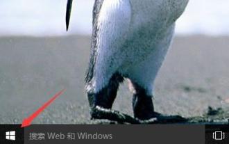
 win11のデフォルトアバターを復元するチュートリアル
Jan 02, 2024 pm 12:43 PM
win11のデフォルトアバターを復元するチュートリアル
Jan 02, 2024 pm 12:43 PM
システム アカウントのアバターを変更したが不要になった場合、win11 ではデフォルトのアバターを変更する方法が見つかりません。実際、デフォルトのアバターのフォルダーを見つけて復元するだけで済みます。 win11 でデフォルトのアバターを復元する 1. まず、下部のタスクバーにある「Windows ロゴ」をクリックします。 2. 次に、「設定」を見つけて開きます。 3. 次に、左の列に「アカウント」と入力します。 4. 次に、画面上の「アカウント情報」をクリックします。右 5. 開いたら、選択した写真の [ファイルの参照] をクリックします 6. 最後に、「C:\ProgramData\Microsoft\UserAccountPictures」パスを入力して、システムのデフォルトのアバター画像を見つけます。
 間取り図を建築pptに直接描くことはできますか?
Mar 20, 2024 am 08:43 AM
間取り図を建築pptに直接描くことはできますか?
Mar 20, 2024 am 08:43 AM
pptは、特に教育、建築など、多くの分野や仕事で広く使用されています。建築pptに関しては、まず建築図面のプレゼンテーションを考えなければなりませんが、専門的な図面ソフトウェアを使用しない場合、簡単な建築図面を直接描くことはできますか?実際には、ここで作業は完了します。以下に、アイデアを提供するために、比較的簡単な平面図を描きます。このアイデアに基づいて、より良い平面図を完成させることができれば幸いです。 1. まず、デスクトップ上で ppt ソフトウェアをダブルクリックして開き、新しいプレゼンテーションの空のドキュメントをクリックして作成します。 2. メニューバーに「挿入」→「図形」→「四角形」があります。 3. 長方形を描画した後、グラフィックをダブルクリックし、塗りつぶしの色のタイプを変更します。
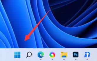
 Win10 でアカウント名とアバターを変更する方法 - 詳細なステップバイステップガイド
Jan 14, 2024 pm 01:45 PM
Win10 でアカウント名とアバターを変更する方法 - 詳細なステップバイステップガイド
Jan 14, 2024 pm 01:45 PM
win10 アカウントを登録した後、多くの友人がデフォルトのアバターの見た目があまり良くないと感じているため、アバターを変更したいと考えています。ここではアバターを変更する方法についてのチュートリアルを示します。見に来てください。 win10 アカウント名とアバターを変更する方法: 1. まず左下隅をクリックして開始します。 2. 次に、ポップアップ メニューで上のアバターをクリックします。 3. 入力後、「アカウント設定の変更」をクリックします。 4. 次に、アバターの下の「参照」をクリックします。 5. アバターとして使用したい写真を見つけて選択します。 6. 最後に、変更は正常に完了します。
 Javaを使用してOpenCVで矢印付きの線を描くにはどうすればよいですか?
Aug 20, 2023 pm 02:41 PM
Javaを使用してOpenCVで矢印付きの線を描くにはどうすればよいですか?
Aug 20, 2023 pm 02:41 PM
JavaOpenCV ライブラリの org.opencv.imgproc パッケージには、入力画像を処理するためのさまざまなメソッドを提供する Imgproc というクラスが含まれています。画像上に幾何学的形状を描画するための一連のメソッドを提供します。矢印付きの線を描画するには、このクラスの arrowedLine() メソッドを呼び出す必要があります。このメソッドは次のパラメータを受け入れます: 線が描画されるイメージを表す Mat オブジェクト。線間の 2 点を表す Point オブジェクト。線の色を表す Scalar オブジェクト。 (BGR) 線の太さを表す整数 (デフォルト: 1)。例 importorg.opencv.core.Core;importo
 上司の直接採用アバターをデフォルトに戻す方法
Feb 23, 2024 pm 04:07 PM
上司の直接採用アバターをデフォルトに戻す方法
Feb 23, 2024 pm 04:07 PM
上司直接採用のアバターをデフォルトに戻すにはどうすればよいですか? 上司直接採用のアバターは自由に調整できますが、ほとんどの友達は上司直接採用のアバターをデフォルトに戻す方法を知りません。エディターによってプレイヤーにアバターが提供されます。デフォルトの方法のチュートリアルに戻します。興味のあるプレイヤーは見に来てください。 Boss Direct Recruitment のアバターをデフォルトに戻す方法 1. まず Boss Direct Recruitment APP を開き、メイン ページの右下隅にある [My] エリアで上のアバターをクリックします; 2. 次に、個人情報を入力しますインターフェイスでアバターをクリックし続けます; 3. 次に [写真を撮る] と [アルバムから選択] を選択してデフォルトに戻します。
 Python を使用して画像上に幾何学的形状を描画する方法
Aug 18, 2023 pm 01:02 PM
Python を使用して画像上に幾何学的形状を描画する方法
Aug 18, 2023 pm 01:02 PM
Python を使用して画像上に幾何学的形状を描画する方法 はじめに: Python は強力なプログラミング言語として、データ処理や機械学習などの高度なテクノロジを実行できるだけでなく、画像処理やグラフィック描画も実行できます。画像処理では、画像上にさまざまな幾何学的図形を描画する必要がよくありますが、この記事では、Python を使用して画像上に幾何学的な図形を描画する方法を紹介します。 1. 環境の準備とライブラリのインストール 開始する前に、主に OpenCV など、Python に必要ないくつかのライブラリをインストールする必要があります。
 Python で 3D 地理グラフを描画する方法
Sep 28, 2023 am 10:19 AM
Python で 3D 地理グラフを描画する方法
Sep 28, 2023 am 10:19 AM
Python で 3D 地理グラフを描画する方法の概要: 3D 地理グラフを描画すると、地理データと空間分布をより直観的に理解するのに役立ちます。 Python は強力で使いやすいプログラミング言語として、さまざまな種類の地理図を描画するためのライブラリとツールを多数提供しています。この記事では、Python プログラミング言語と、Matplotlib や Basemap などのいくつかの人気のあるライブラリを使用して 3D 地理グラフを描画する方法を学びます。環境の準備: 開始する前に、次のことを確認する必要があります。
