

Pure HTML5+CSS3で誕生日ケーキを作る(コードは理解しやすい)

早速、まずレンダリングをお見せします: 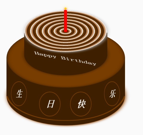
ケーキは、下のケーキ、上のケーキ、キャンドルの部分の 3 つの部分に分かれています。 HTML のレイアウト構造もこの 3 つの部分に従ってレイアウトされます。もう 1 つは、CSS の位置決めと CSS3 の回転、内側と外側のシャドウ、その他の効果を使用して、一部の DOM 要素のスタイルを調整することです。これは比較的単純なので、すべてのプログラマーは理解していると思います。
他のものについては詳しく説明しません。
完全なHTMLコードとCSSコードは以下にあります
<!DOCTYPE html>
<html>
<head lang="en">
    <meta charset="UTF-8">
    <title></title>
    <style>
        .birthday .container{
            width:600px;
            height:600px;
            margin:0px auto;
            background: #fafafa;
            border-radius:5px;
            position: relative;
        }
        /**
       ** 顶层的
       **/
        .birthday .top-one{
            position: absolute;
            width:280px;
            height: 280px;
            bottom: 200px;
            left:160px;
        }
        .birthday .top-one .bottom{
            position: absolute;
            width:280px;
            height: 280px;
            bottom:-30px;
            border:1px solid #3e2001;
            border-radius: 140px;
            transform: rotateX(60deg);
            z-index: 4;
            background: #3e2001;
            box-shadow: 0px 0px 20px #3e2001;
        }
        .birthday .top-one .top{
            position: absolute;
            width:280px;
            height: 280px;
            top:-50px;
            border-radius: 140px;
            background: #FFFFFF;
            transform: rotateX(60deg);
            box-shadow: 2px 2px 20px #b7b7b7;
            z-index: 6;
            background: -webkit-repeating-radial-gradient(circle, #783d01, #3e2001 10px, #914909 10px,white 20px);
            background: -moz-repeating-radial-gradient(circle, #783d01, #3e2001 10px,#914909 10px,white 20px);
        }
        .birthday .top-one .side{
            position: absolute;
            top:95px;
            width:280px;
            height: 70px;
            border:1px solid #3e2001;
            border-top-width: 0px;
            border-bottom-width: 0px;
            background: #FFFFFF;
            z-index: 5;
            background: #3e2001;
        }
        /**
        ** 底层的
        **/
        .birthday .bottom-one{
            position: absolute;
            width:400px;
            height: 400px;
            bottom: 0px;
            left:100px;
        }
        .birthday .bottom-one .bottom{
            position: absolute;
            width:400px;
            height: 400px;
            bottom:-30px;
            border:1px solid #914909;
            border-radius: 200px;
            transform: rotateX(60deg);
            box-shadow: 2px 2px 20px #914909;
            z-index: 1;
            background: #3e2001;
            overflow: hidden;
        }
        .birthday .bottom-one .line{
            position: absolute;
            width:400px;
            height: 400px;
            border-radius: 200px;
            z-index: 1;
        }
        .birthday .bottom-one .line1{
            bottom: 30px;
            border:5px solid #783d01;
            left:-5px;
            z-index: 1;
        }
        .birthday .bottom-one .top{
            position: absolute;
            width:400px;
            height: 400px;
            top:-100px;
            border:1px solid #3e2001;
            border-radius: 200px;
            background: #FFFFFF;
            transform: rotateX(60deg);
            z-index: 3;
            background: #783d01;
            box-shadow: inset 0px 0px 20px #3e2001;
        }
        .birthday .bottom-one .side{
            position: absolute;
            top:100px;
            width:400px;
            height: 130px;
            border:1px solid #3e2001;
            border-top-width: 0px;
            border-bottom-width: 0px;
            background: #3e2001;
            z-index: 2;
        }
        /**
        ** 底层的文字
        **/
        .birthday .flower{
            position: relative;
            text-align: justify;
            z-index: 9;
            top:200px;
            font-size: 32px;
            font-family: "Helvetica Neue", "Noto Sans CJK SC", "Source Han Sans CN";
            color:#FFFFFF;
            font-weight: bold;
        }
        .birthday .flower:after{
            content:"";
            display:inline-block;
            position: relative;
            width:100%;
        }
        .birthday .flower i{
            position: relative;
            width:80px;
            line-height: 80px;
            display: inline-block;
            border-radius: 50%;
            border:2px solid #783d01;
            text-align: center;
        }
        /**
        ** 顶层的文字
        **/
        .birthday .top-one .text{
            width:100%;
            text-align: center;
            position: absolute;
            top:165px;
            z-index: 9;
            margin:0px auto;
            font-size: 30px;
            color:#FFFFFF;
            transform: rotateX(60deg) skew(10deg,20deg);
        }
        /**
         ** 蜡烛
        **/
        .birthday .candle{
            width:10px;
            height:80px;
            margin:0px auto;
            position: absolute;
            left:295px;
            top:130px;
            z-index: 9;
        }
        .birthday .candle .body{
            width:10px;
            height:70px;
            margin:0px auto;
            background: red;
            border-bottom-width: 0px;
        }
        .birthday .candle .top{
            width:10px;
            height: 10px;
            border-radius: 5px;
            transform: rotateX(60deg);
            position: relative;
            top:5px;
            background: red;
        }
        .birthday .candle .bottom{
            width:10px;
            height: 10px;
            border-radius: 5px;
            transform: rotateX(60deg);
            position: relative;
            bottom:5px;
            background: red;
            box-shadow: 1px 1px 10px red;
        }
        .birthday .candle .fire{
            position: absolute;
            width:6px;
            height: 6px;
            left:2px;
            transform: rotate(45deg);
            background: #ffd507;
            box-shadow: 0px 0px 20px #ffff00, 2px 2px 10px red;
        }
    </style>
</head>
<body>
    <p class="birthday">
        <p class="container">
            <p class="candle">
                <p class="fire"></p>
                <p class="top"></p>
                <p class="body"></p>
                <p class="bottom"></p>
            </p>
            <p class="top-one">
                <p class="top"></p>
                <p class="side"></p>
                <p class="bottom"></p>
                <p class="text">
                    Happy Birthday
                </p>
            </p>
            <p class="bottom-one">
                <p class="top"></p>
                <p class="side"></p>
                <p class="bottom">
                    <p class="line line1"></p>
                </p>
                <p class="flower">
                    <i style="top:-20px;transform: rotateY(50deg)">生</i>
                    <i style="top:15px;transform: rotateY(30deg)">日</i>
                    <i style="top:15px;transform: rotateY(30deg)">快</i>
                    <i style="top:-20px;transform: rotateY(50deg)">乐</i>
                </p>
            </p>
        </p>
    </p>
</body>
</html>上記は純粋なHTML5 + CSS3で誕生日ケーキを作る内容です(コードは理解しやすいです)、さらに関連した内容については、注目してください。 PHP 中国語 Web サイト (www.php.cn)!

ホットAIツール

Undresser.AI Undress
リアルなヌード写真を作成する AI 搭載アプリ

AI Clothes Remover
写真から衣服を削除するオンライン AI ツール。

Undress AI Tool
脱衣画像を無料で

Clothoff.io
AI衣類リムーバー

Video Face Swap
完全無料の AI 顔交換ツールを使用して、あらゆるビデオの顔を簡単に交換できます。

人気の記事
ホットツール

メモ帳++7.3.1
使いやすく無料のコードエディター

SublimeText3 中国語版
中国語版、とても使いやすい

ゼンドスタジオ 13.0.1
強力な PHP 統合開発環境

ドリームウィーバー CS6
ビジュアル Web 開発ツール

SublimeText3 Mac版
神レベルのコード編集ソフト(SublimeText3)
ホットトピック
 7643
7643
 15
1392
52
91
11
33
151
15
1392
52
91
11
33
151

 HTMLの表の境界線
Sep 04, 2024 pm 04:49 PM
HTMLの表の境界線
Sep 04, 2024 pm 04:49 PM
HTML の表の境界線に関するガイド。ここでは、HTML でのテーブルの境界線の例を示しながら、テーブル境界線を定義する複数の方法について説明します。
 HTML のネストされたテーブル
Sep 04, 2024 pm 04:49 PM
HTML のネストされたテーブル
Sep 04, 2024 pm 04:49 PM
これは、HTML でのネストされたテーブルのガイドです。ここでは、テーブル内にテーブルを作成する方法をそれぞれの例とともに説明します。
 HTML 左マージン
Sep 04, 2024 pm 04:48 PM
HTML 左マージン
Sep 04, 2024 pm 04:48 PM
HTML マージン左のガイド。ここでは、HTML margin-left の概要とその例、およびそのコード実装について説明します。
 HTML テーブルのレイアウト
Sep 04, 2024 pm 04:54 PM
HTML テーブルのレイアウト
Sep 04, 2024 pm 04:54 PM
HTML テーブル レイアウトのガイド。ここでは、HTML テーブル レイアウトの値と例および出力について詳しく説明します。
 HTML入力プレースホルダー
Sep 04, 2024 pm 04:54 PM
HTML入力プレースホルダー
Sep 04, 2024 pm 04:54 PM
HTML 入力プレースホルダーのガイド。ここでは、コードと出力とともに HTML 入力プレースホルダーの例について説明します。
 HTML 内のテキストの移動
Sep 04, 2024 pm 04:45 PM
HTML 内のテキストの移動
Sep 04, 2024 pm 04:45 PM
HTML でのテキストの移動に関するガイド。ここでは、概要、マーキー タグが構文でどのように機能するか、および実装例について説明します。

 HTML の onclick ボタン
Sep 04, 2024 pm 04:49 PM
HTML の onclick ボタン
Sep 04, 2024 pm 04:49 PM
HTML オンクリック ボタンのガイド。ここでは、それらの紹介、動作、例、およびさまざまなイベントでの onclick イベントについてそれぞれ説明します。
