

HTML5実践~css3を使って画像スタイルを豊かにする方法を詳しく解説(1)

CSS3では、box-shadowやborder-radiusを画像に直接使用すると、ブラウザでうまくレンダリングできません。ただし、画像を background-image として使用すると、追加されたスタイル ブラウザで適切にレンダリングできます。 box-shadow、border-radius、transition を使ってさまざまな画像スタイルの効果を作成する方法を紹介します。
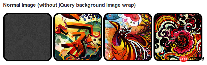
問題
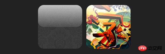
デモを見ると、画像の最初の行にborder-radiusとinline box-shadowを設定していることがわかります。 Firefox は画像の境界半径をレンダリングしますが、インライン ボックス シャドウはレンダリングしません。どちらの効果も Chrome と Safari ではレンダリングされません。
.normal img {
border: solid 5px #000;
-webkit-border-radius: 20px;
-moz-border-radius: 20px;  border-radius: 20px;
-webkit-box-shadow: inset 0 1px 5px rgba(0,0,0,.5);
-moz-box-shadow: inset 0 1px 5px rgba(0,0,0,.5);
box-shadow: inset 0 1px 5px rgba(0,0,0,.5);
}
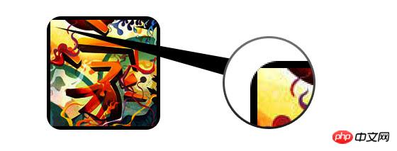
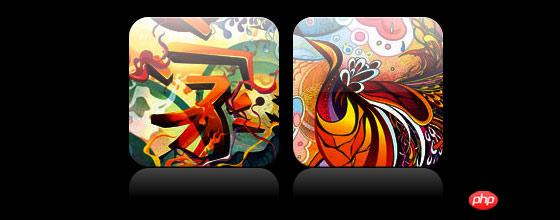
 Border-Radius と組み込みの Box-SHADO を有効にするため正常に動作するには、画像を変換する必要がありますから背景に-画像の方法。
jquery
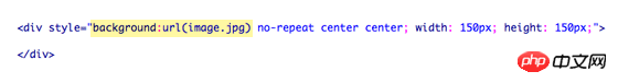
を使用して各画像に背景画像ラッパーを追加する必要があります。次の JS コードは、span パッケージを各画像に追加します。span の背景画像のパスは画像のパスです。 コードは比較的簡単なので説明する必要はないと思います。よくわからない場合は、jquery API を直接確認してください。<script type="text/javascript" src="http://ajax.googleapis.com/ajax/libs/jquery/1.5/jquery.min.js"></script>
<script type="text/javascript">
$(document).ready(function(){
$("img").load(function() {
$(this).wrap(function(){
return '<span class="image-wrap ' + $(this).attr('class') + '" style="position:relative;
display:inline-block; background:url(' + $(this).attr('src') + ') no-repeat center center;
width: ' + $(this).width() + 'px; height: ' + $(this).height() + 'px;" />';
});
$(this).css("opacity","0");
});
});</script><span class="image-wrap " style="position:relative;
display:inline-block; background:url(image.jpg) no-repeat center center;
width: 150px; height: 150px;">
<img src="image.jpg" style="opacity: 0;">
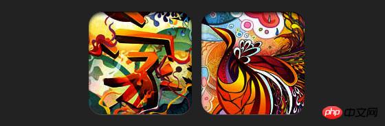
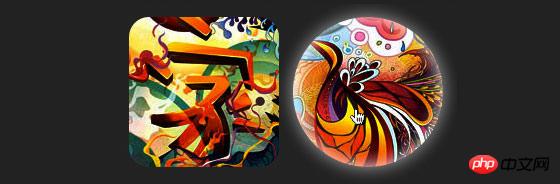
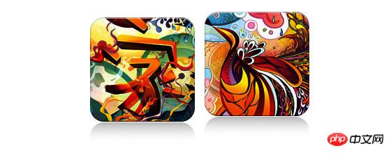
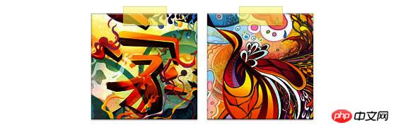
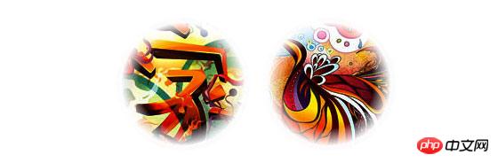
</span>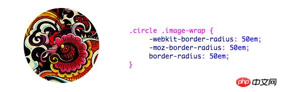 円形画像の効果を実現するためにborder-radiusを使用するように追加すると、効果は次のようになります:
.circle .image-wrap {
    -webkit-border-radius: 50em;
    -moz-border-radius: 50em;
    border-radius: 50em;
}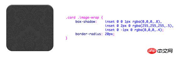 以下は、複数のインラインボックスシャドウを使用したカードスタイルの画像です。
.card .image-wrap {
    -webkit-box-shadow: inset 0 0 1px rgba(0,0,0,.8), inset 0 2px 0 rgba(255,255,255,.5), inset 0 -1px 0 rgba(0,0,0,.4);
    -moz-box-shadow: inset 0 0 1px rgba(0,0,0,.8), inset 0 2px 0 rgba(255,255,255,.5), inset 0 -1px 0 rgba(0,0,0,.4);
    box-shadow: inset 0 0 1px rgba(0,0,0,.8), inset 0 2px 0 rgba(255,255,255,.5), inset 0 -1px 0 rgba(0,0,0,.4);

    -webkit-border-radius: 20px;
    -moz-border-radius: 20px;
    border-radius: 20px;
} 以下は救済効果です。
.embossed .image-wrap {
    -webkit-box-shadow: inset 0 0 2px rgba(0,0,0,.8),
    inset 0 2px 0 rgba(255,255,255,.5),
    inset 0 -7px 0 rgba(0,0,0,.6),
    inset 0 -9px 0 rgba(255,255,255,.3);
    -moz-box-shadow: inset 0 0 2px rgba(0,0,0,.8),
    inset 0 2px 0 rgba(255,255,255,.5), inset 0 -7px 0 rgba(0,0,0,.6),
    inset 0 -9px 0 rgba(255,255,255,.3);
    box-shadow: inset 0 0 2px rgba(0,0,0,.8),
    inset 0 2px 0 rgba(255,255,255,.5),
    inset 0 -7px 0 rgba(0,0,0,.6), inset 0 -9px 0 rgba(255,255,255,.3);

    -webkit-border-radius: 20px;
    -moz-border-radius: 20px;
    border-radius: 20px;
} レリーフスタイルと比較して、新しいスタイルは1pxのぼかし属性を追加しています。
.soft-embossed .image-wrap {
    -webkit-box-shadow: inset 0 0 4px rgba(0,0,0,1),
    inset 0 2px 1px rgba(255,255,255,.5),
    inset 0 -9px 2px rgba(0,0,0,.6),
    inset 0 -12px 2px rgba(255,255,255,.3);
    -moz-box-shadow: inset 0 0 4px rgba(0,0,0,1),
    inset 0 2px 1px rgba(255,255,255,.5),
    inset 0 -9px 2px rgba(0,0,0,.6),
    inset 0 -12px 2px rgba(255,255,255,.3);
    box-shadow: inset 0 0 4px rgba(0,0,0,1),
    inset 0 2px 1px rgba(255,255,255,.5),
    inset 0 -9px 2px rgba(0,0,0,.6),
    inset 0 -12px 2px rgba(255,255,255,.3);

    -webkit-border-radius: 20px;
    -moz-border-radius: 20px;
    border-radius: 20px;
} 埋め込みボックスシャドウを使用して、カットアウト効果を実現します。
.cut-out .image-wrap {
    -webkit-box-shadow: 0 1px 0 rgba(255,255,255,.2),
    inset 0 4px 5px rgba(0,0,0,.6),
    inset 0 1px 0 rgba(0,0,0,.6);
    -moz-box-shadow: 0 1px 0 rgba(255,255,255,.2),
    inset 0 4px 5px rgba(0,0,0,.6),
    inset 0 1px 0 rgba(0,0,0,.6);
    box-shadow: 0 1px 0 rgba(255,255,255,.2),
    inset 0 4px 5px rgba(0,0,0,.6),
    inset 0 1px 0 rgba(0,0,0,.6);

    -webkit-border-radius: 20px;
    -moz-border-radius: 20px;
    border-radius: 20px;
} この例では、画像ラッパーにtransition属性を追加し、マウスをスライドさせると角丸から角丸に変化します。次に、複数のボックス シャドウを使用してグロー効果を実現します。
.morphing-glowing .image-wrap {
    -webkit-transition: 1s;
    -moz-transition: 1s;
    transition: 1s;

    -webkit-border-radius: 20px;
    -moz-border-radius: 20px;
    border-radius: 20px;
}.morphing-glowing .image-wrap:hover {
    -webkit-box-shadow: 0 0 20px rgba(255,255,255,.6),
    inset 0 0 20px rgba(255,255,255,1);
    -moz-box-shadow: 0 0 20px rgba(255,255,255,.6),
    inset 0 0 20px rgba(255,255,255,1);
    box-shadow: 0 0 20px rgba(255,255,255,.6),
    inset 0 0 20px rgba(255,255,255,1);

    -webkit-border-radius: 60em;
    -moz-border-radius: 60em;
    border-radius: 60em;
} ハイライト効果は要素に:after疑似クラスを追加することで実現します。
.glossy .image-wrap {
    -webkit-box-shadow: inset 0 -1px 0 rgba(0,0,0,.5);
    -moz-box-shadow: inset 0 -1px 0 rgba(0,0,0,.5);
    box-shadow: inset 0 -1px 0 rgba(0,0,0,.5);

    -webkit-border-radius: 20px;
    -moz-border-radius: 20px;
    border-radius: 20px;
}.glossy .image-wrap:after {
    position: absolute;
    content: ' ';
    width: 100%;
    height: 50%;
    top: 0;
    left: 0;

    -webkit-border-radius: 20px;
    -moz-border-radius: 20px;
    border-radius: 20px;

    background: -moz-linear-gradient(top, rgba(255,255,255,0.7) 0%, rgba(255,255,255,.1) 100%);
    background: -webkit-gradient(linear, left top, left bottom, color-stop(0%,rgba(255,255,255,0.7)), color-stop(100%,rgba(255,255,255,.1)));
    background: linear-gradient(top, rgba(255,255,255,0.7) 0%,rgba(255,255,255,.1) 100%);
} この例では、ハイライト効果を一番下に移動して反射効果を実現しています。
.reflection .image-wrap:after {
    position: absolute;
    content: ' ';
    width: 100%;
    height: 30px;
    bottom: -31px;
    left: 0;

    -webkit-border-top-left-radius: 20px;
    -webkit-border-top-right-radius: 20px;
    -moz-border-radius-topleft: 20px;
    -moz-border-radius-topright: 20px;
    border-top-left-radius: 20px;
    border-top-right-radius: 20px;

    background: -moz-linear-gradient(top, rgba(0,0,0,.3) 0%, rgba(255,255,255,0) 100%);
    background: -webkit-gradient(linear, left top, left bottom, color-stop(0%,rgba(0,0,0,.3)),
    color-stop(100%,rgba(255,255,255,0)));
    background: linear-gradient(top, rgba(0,0,0,.3) 0%,rgba(255,255,255,0) 100%);
}.reflection .image-wrap:hover {
    position: relative;
    top: -8px;
} この例では、:before と :after を使用して、ハイライトと反射の効果を組み合わせています。
.glossy-reflection .image-wrap {
    -webkit-box-shadow: inset 0 -1px 0 rgba(0,0,0,.5), inset 0 1px 0 rgba(255,255,255,.6);
    -moz-box-shadow: inset 0 -1px 0 rgba(0,0,0,.5), inset 0 1px 0 rgba(255,255,255,.6);
    box-shadow: inset 0 -1px 0 rgba(0,0,0,.5), inset 0 1px 0 rgba(255,255,255,.6);

    -webkit-transition: 1s;
    -moz-transition: 1s;
    transition: 1s;

    -webkit-border-radius: 20px;
    -moz-border-radius: 20px;
    border-radius: 20px;
}.glossy-reflection .image-wrap:before {
    position: absolute;
    content: ' ';
    width: 100%;
    height: 50%;
    top: 0;
    left: 0;

    -webkit-border-radius: 20px;
    -moz-border-radius: 20px;
    border-radius: 20px;

    background: -moz-linear-gradient(top, rgba(255,255,255,0.7) 0%, rgba(255,255,255,.1) 100%);
    background: -webkit-gradient(linear, left top, left bottom, color-stop(0%,rgba(255,255,255,0.7)), color-stop(100%,rgba(255,255,255,.1)));
    background: linear-gradient(top, rgba(255,255,255,0.7) 0%,rgba(255,255,255,.1) 100%);
}.glossy-reflection .image-wrap:after {
    position: absolute;
    content: ' ';
    width: 100%;
    height: 30px;
    bottom: -31px;
    left: 0;

    -webkit-border-top-left-radius: 20px;
    -webkit-border-top-right-radius: 20px;
    -moz-border-radius-topleft: 20px;
    -moz-border-radius-topright: 20px;
    border-top-left-radius: 20px;
    border-top-right-radius: 20px;

    background: -moz-linear-gradient(top, rgba(230,230,230,.3) 0%, rgba(230,230,230,0) 100%);
    background: -webkit-gradient(linear, left top, left bottom, color-stop(0%,rgba(230,230,230,.3)), color-stop(100%,rgba(230,230,230,0)));
    background: linear-gradient(top, rgba(230,230,230,.3) 0%,rgba(230,230,230,0) 100%);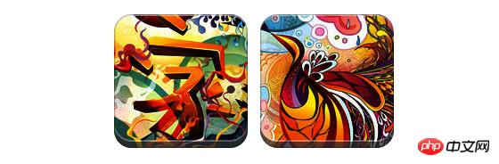
} この例では、:after を使用してテープの効果を実現しています。
.tape .image-wrap {
    -webkit-box-shadow: inset 0 0 2px rgba(0,0,0,.7),
    inset 0 2px 0 rgba(255,255,255,.3), inset 0 -1px 0 rgba(0,0,0,.5), 0 1px 3px rgba(0,0,0,.4);
    -moz-box-shadow: inset 0 0 2px rgba(0,0,0,.7),
    inset 0 2px 0 rgba(255,255,255,.3),
    inset 0 -1px 0 rgba(0,0,0,.5), 0 1px 3px rgba(0,0,0,.4);
    box-shadow: inset 0 0 2px rgba(0,0,0,.7), inset 0 2px 0 rgba(255,255,255,.3),
    inset 0 -1px 0 rgba(0,0,0,.5), 0 1px 3px rgba(0,0,0,.4);
}.tape .image-wrap:after {
    position: absolute;
    content: ' ';
    width: 60px;
    height: 25px;
    top: -10px;
    left: 50%;
    margin-left: -30px;
    border: solid 1px rgba(137,130,48,.2);

    background: -moz-linear-gradient(top, rgba(254,243,127,.6) 0%, rgba(240,224,54,.6) 100%);
    background: -webkit-gradient(linear, left top, left bottom, color-stop(0%,rgba(254,243,127,.6)), color-stop(100%,rgba(240,224,54,.6)));
    background: linear-gradient(top, rgba(254,243,127,.6) 0%,rgba(240,224,54,.6) 100%);
    -webkit-box-shadow: inset 0 1px 0 rgba(255,255,255,.3), 0 1px 0 rgba(0,0,0,.2);
}放射状のグラデーション効果を実現します。 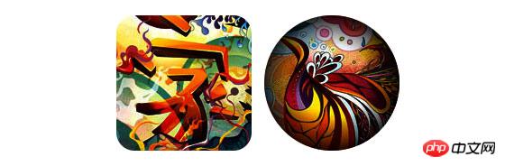
.morphing-tinting .image-wrap {
    position: relative;

    -webkit-transition: 1s;
    -moz-transition: 1s;
    transition: 1s;

    -webkit-border-radius: 20px;
    -moz-border-radius: 20px;
    border-radius: 20px;
}.morphing-tinting .image-wrap:hover {
    -webkit-border-radius: 30em;
    -moz-border-radius: 30em;
    border-radius: 30em;
}.morphing-tinting .image-wrap:after {
    position: absolute;
    content: ' ';
    width: 100%;
    height: 100%;
    top: 0;
    left: 0;

    -webkit-transition: 1s;
    -moz-transition: 1s;
    transition: 1s;

    -webkit-border-radius: 30em;
    -moz-border-radius: 30em;
    border-radius: 30em;
}.morphing-tinting .image-wrap:hover:after  {
    background: -webkit-gradient(radial, 50% 50%, 40, 50% 50%, 80, from(rgba(0,0,0,0)), to(rgba(0,0,0,1)));
    background: -moz-radial-gradient(50% 50%, circle, rgba(0,0,0,0) 40px, rgba(0,0,0,1) 80px);
} 放射状グラデーションを使用してマスクを生成し、フェザリング効果を実現することもできます。
.feather .image-wrap {
    position: relative;

    -webkit-border-radius: 30em;
    -moz-border-radius: 30em;
    border-radius: 30em;
}.feather .image-wrap:after  {
    position: absolute;
    content: ' ';
    width: 100%;
    height: 100%;
    top: 0;
    left: 0;

    background: -webkit-gradient(radial, 50% 50%, 50, 50% 50%, 70, from(rgba(255,255,255,0)), to(rgba(255,255,255,1)));
    background: -moz-radial-gradient(50% 50%, circle, rgba(255,255,255,0) 50px, rgba(255,255,255,1) 70px);
}浏览器兼容性
这种实现方式在大多数支持border-radius, box-shadow, :before and :after特性的浏览器中(例如Chrome, Firefox 和 Safari),都能很好的工作。在不支持新特性的浏览器中,只会显示原始图片。
创造你自己的实现
借助:before 和:after伪类能为图片创造很多种样式,你可以自己尝试创建出新的效果。
以上がHTML5実践~css3を使って画像スタイルを豊かにする方法を詳しく解説(1)の詳細内容です。詳細については、PHP 中国語 Web サイトの他の関連記事を参照してください。

ホットAIツール

Undresser.AI Undress
リアルなヌード写真を作成する AI 搭載アプリ

AI Clothes Remover
写真から衣服を削除するオンライン AI ツール。

Undress AI Tool
脱衣画像を無料で

Clothoff.io
AI衣類リムーバー

AI Hentai Generator
AIヘンタイを無料で生成します。

人気の記事
ホットツール

メモ帳++7.3.1
使いやすく無料のコードエディター

SublimeText3 中国語版
中国語版、とても使いやすい

ゼンドスタジオ 13.0.1
強力な PHP 統合開発環境

ドリームウィーバー CS6
ビジュアル Web 開発ツール

SublimeText3 Mac版
神レベルのコード編集ソフト(SublimeText3)
ホットトピック
 7562
7562
 15
1384
52
84
11
28
99
15
1384
52
84
11
28
99

 HTMLの表の境界線
Sep 04, 2024 pm 04:49 PM
HTMLの表の境界線
Sep 04, 2024 pm 04:49 PM
HTML の表の境界線に関するガイド。ここでは、HTML でのテーブルの境界線の例を示しながら、テーブル境界線を定義する複数の方法について説明します。
 HTML 左マージン
Sep 04, 2024 pm 04:48 PM
HTML 左マージン
Sep 04, 2024 pm 04:48 PM
HTML マージン左のガイド。ここでは、HTML margin-left の概要とその例、およびそのコード実装について説明します。
 HTML のネストされたテーブル
Sep 04, 2024 pm 04:49 PM
HTML のネストされたテーブル
Sep 04, 2024 pm 04:49 PM
これは、HTML でのネストされたテーブルのガイドです。ここでは、テーブル内にテーブルを作成する方法をそれぞれの例とともに説明します。
 HTML テーブルのレイアウト
Sep 04, 2024 pm 04:54 PM
HTML テーブルのレイアウト
Sep 04, 2024 pm 04:54 PM
HTML テーブル レイアウトのガイド。ここでは、HTML テーブル レイアウトの値と例および出力について詳しく説明します。
 HTML入力プレースホルダー
Sep 04, 2024 pm 04:54 PM
HTML入力プレースホルダー
Sep 04, 2024 pm 04:54 PM
HTML 入力プレースホルダーのガイド。ここでは、コードと出力とともに HTML 入力プレースホルダーの例について説明します。

 HTML 内のテキストの移動
Sep 04, 2024 pm 04:45 PM
HTML 内のテキストの移動
Sep 04, 2024 pm 04:45 PM
HTML でのテキストの移動に関するガイド。ここでは、概要、マーキー タグが構文でどのように機能するか、および実装例について説明します。
 HTML の onclick ボタン
Sep 04, 2024 pm 04:49 PM
HTML の onclick ボタン
Sep 04, 2024 pm 04:49 PM
HTML オンクリック ボタンのガイド。ここでは、それらの紹介、動作、例、およびさまざまなイベントでの onclick イベントについてそれぞれ説明します。
