
「ハッピーバースデートゥーユー、ハッピーバースデートゥーユー…」にはバースデーソングも必要ですが、バースデーケーキも必須です。この記事では主にプログラマーが純粋なHTML5+CSS3を使って作ったバースデーケーキを詳しく紹介しています。興味のある友人はそれを参照してください
フロントエンド開発者として、プログラマーの誕生日の喜びと悲しみを祝うために簡単なケーキを描きましょう。比較的簡単に書いておりますので、興味のある方はぜひご覧ください。
まずはレンダリングをお送りします
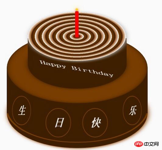
ケーキは下のケーキ、上のケーキ、キャンドルの部分の3つの部分に分かれています。 HTML のレイアウト構造もこの 3 つの部分に従ってレイアウトされます。もう 1 つは、CSS の位置決めと CSS3 の回転、内側と外側のシャドウ、その他の効果を使用して、一部の DOM 要素のスタイルを調整することです。これは比較的単純なので、すべてのプログラマーは理解していると思います。
他のものについては詳しく説明しません。
完全な HTML コードと CSS コードを以下に示します。
<!DOCTYPE html>
<html>
<head lang="en">
    <meta charset="UTF-8">
    <title></title>
    <style>
        .birthday .container{
            width:600px;
            height:600px;
            margin:0px auto;
            background: #fafafa;
            border-radius:5px;
            position: relative;
        }

        /**
       ** 顶层的
       **/

        .birthday .top-one{
            position: absolute;
            width:280px;
            height: 280px;
            bottom: 200px;
            left:160px;
        }

        .birthday .top-one .bottom{
            position: absolute;
            width:280px;
            height: 280px;
            bottom:-30px;
            border:1px solid #3e2001;
            border-radius: 140px;
            transform: rotateX(60deg);
            z-index: 4;
            background: #3e2001;
            box-shadow: 0px 0px 20px #3e2001;
        }
        .birthday .top-one .top{
            position: absolute;
            width:280px;
            height: 280px;
            top:-50px;
            border-radius: 140px;
            background: #FFFFFF;
            transform: rotateX(60deg);
            box-shadow: 2px 2px 20px #b7b7b7;
            z-index: 6;
            background: -webkit-repeating-radial-gradient(circle, #783d01, #3e2001 10px, #914909 10px,white 20px);
            background: -moz-repeating-radial-gradient(circle, #783d01, #3e2001 10px,#914909 10px,white 20px);
        }
        .birthday .top-one .side{
            position: absolute;
            top:95px;
            width:280px;
            height: 70px;
            border:1px solid #3e2001;
            border-top-width: 0px;
            border-bottom-width: 0px;
            background: #FFFFFF;
            z-index: 5;
            background: #3e2001;
        }


        /**
        ** 底层的
        **/
        .birthday .bottom-one{
            position: absolute;
            width:400px;
            height: 400px;
            bottom: 0px;
            left:100px;
        }
        .birthday .bottom-one .bottom{
            position: absolute;
            width:400px;
            height: 400px;
            bottom:-30px;
            border:1px solid #914909;
            border-radius: 200px;
            transform: rotateX(60deg);
            box-shadow: 2px 2px 20px #914909;
            z-index: 1;
            background: #3e2001;
            overflow: hidden;
        }
        .birthday .bottom-one .line{
            position: absolute;
            width:400px;
            height: 400px;
            border-radius: 200px;
            z-index: 1;
        }
        .birthday .bottom-one .line1{
            bottom: 30px;
            border:5px solid #783d01;
            left:-5px;
            z-index: 1;
        }

        .birthday .bottom-one .top{
            position: absolute;
            width:400px;
            height: 400px;
            top:-100px;
            border:1px solid #3e2001;
            border-radius: 200px;
            background: #FFFFFF;
            transform: rotateX(60deg);
            z-index: 3;
            background: #783d01;
            box-shadow: inset 0px 0px 20px #3e2001;

        }

        .birthday .bottom-one .side{
            position: absolute;
            top:100px;
            width:400px;
            height: 130px;
            border:1px solid #3e2001;
            border-top-width: 0px;
            border-bottom-width: 0px;
            background: #3e2001;
            z-index: 2;

        }


        /**
        ** 底层的文字
        **/
        .birthday .flower{
            position: relative;
            text-align: justify;
            z-index: 9;
            top:200px;
            font-size: 32px;
            font-family: "Helvetica Neue", "Noto Sans CJK SC", "Source Han Sans CN";
            color:#FFFFFF;
            font-weight: bold;
        }
        .birthday .flower:after{
            content:"";
            display:inline-block;
            position: relative;
            width:100%;
        }

        .birthday .flower i{
            position: relative;
            width:80px;
            line-height: 80px;
            display: inline-block;
            border-radius: 50%;
            border:2px solid #783d01;
            text-align: center;

        }

        /**
        ** 顶层的文字
        **/
        .birthday .top-one .text{
            width:100%;
            text-align: center;
            position: absolute;
            top:165px;
            z-index: 9;
            margin:0px auto;
            font-size: 30px;
            color:#FFFFFF;
            transform: rotateX(60deg) skew(10deg,20deg);
        }


        /**
         ** 蜡烛
        **/

        .birthday .candle{
            width:10px;
            height:80px;
            margin:0px auto;
            position: absolute;
            left:295px;
            top:130px;
            z-index: 9;
        }
        .birthday .candle .body{
            width:10px;
            height:70px;
            margin:0px auto;
            background: red;
            border-bottom-width: 0px;
        }

        .birthday .candle .top{
            width:10px;
            height: 10px;
            border-radius: 5px;
            transform: rotateX(60deg);
            position: relative;
            top:5px;
            background: red;
        }
        .birthday .candle .bottom{
            width:10px;
            height: 10px;
            border-radius: 5px;
            transform: rotateX(60deg);
            position: relative;
            bottom:5px;
            background: red;
            box-shadow: 1px 1px 10px red;
        }

        .birthday .candle .fire{
            position: absolute;
            width:6px;
            height: 6px;
            left:2px;
            transform: rotate(45deg);
            background: #ffd507;
            box-shadow: 0px 0px 20px #ffff00, 2px 2px 10px red;

        }


    </style>

</head>
<body>
    <p class="birthday">
        <p class="container">

            <p class="candle">
                <p class="fire"></p>
                <p class="top"></p>
                <p class="body"></p>
                <p class="bottom"></p>
            </p>

            <p class="top-one">
                <p class="top"></p>
                <p class="side"></p>
                <p class="bottom"></p>
                <p class="text">
                    Happy Birthday
                </p>
            </p>

            <p class="bottom-one">
                <p class="top"></p>
                <p class="side"></p>
                <p class="bottom">
                    <p class="line line1"></p>
                </p>
                <p class="flower">
                    <i style="top:-20px;transform: rotateY(50deg)">生</i>
                    <i style="top:15px;transform: rotateY(30deg)">日</i>
                    <i style="top:15px;transform: rotateY(30deg)">快</i>
                    <i style="top:-20px;transform: rotateY(50deg)">乐</i>
                </p>
            </p>
        </p>
    </p>
</body>
</html>OK、Qingsheng によって開発された小さなデモです。今後は Canvas キャンバスまたは SVG を使用して試してみてください。
以上が誕生日ケーキの作り方 - ただしHTML5+CSS3コードを使用しますの詳細内容です。詳細については、PHP 中国語 Web サイトの他の関連記事を参照してください。


![[Web フロントエンド] Node.js クイック スタート](https://img.php.cn/upload/course/000/000/067/662b5d34ba7c0227.png)


