

アニメキャラクターを作成するHTML - ドラえもん

誰もが子供の頃のドラえもん、小さなお腹にいっぱいの素晴らしいドラえもん、無力で悲しいときにそばにいてくれるドラえもん、無力で悲しいときにそばにいてくれるドラえもんを持っていると思います。いっぱい考えて、どら焼きを一緒に食べましょう~今日は心の中にドラえもんを描きます~

ドラえもんの容器を定義します
-
最初に同じものを定義します ドラえもんの大きな容器を描き、そのサイズと位置を決定します。
<!-- 哆啦A梦大容器 --><p class="doa"></p>
/*哆啦A梦*/
  .doa{position: relative;top: 100px;}
ログイン後にコピー
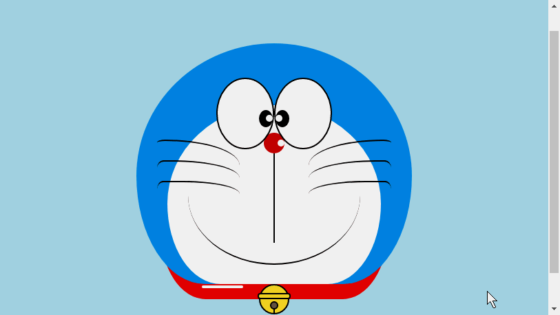
ドラえもんの頭を描きます (顔を含む、顔には目と鼻が含まれます)
頭にはいくつかの部分が含まれています: ドラえもんの顔と鼻、顔には目が 2 つあり、中には目玉と白目があります2 つの目なので、DOM のネストが複数の層になります。もちろん、基本的なグラフィックスはすべて p+border-radius で構成されます。
描画されたアイテムのさまざまな部分を、対応する位置に配置するだけです。
私が以前に描いたいくつかの絵を見れば、border-radius が非常に一般的に使用される属性であることがわかります。実際、border-radius の本当の顔は
border-radius: 300px 300px 300px 300px/300px 300px 300px 300px;であるはずです。紫 通常、スラッシュ以降の内容が書かれていない場合、スラッシュ部分は横の長さ、スラッシュ部分は縦の高さになります。 デフォルトでは、前部のスラッシュの後に何も書かれていない場合、横と縦のサイズは同じになります。 。私の言ったことは十分に詳しくないことは承知しています。Xinshen のブログ「When Will Autumn Moon Come?」を参照してください。CSS3 ボーダー半径についてどれくらい知っていますか?経験豊富なドライバーの指導により、数分で境界半径を完全に理解できるようになります。すぐにバスに乗ってはいかがでしょうか。<!-- 头 --> <p class="head"> <!-- 存放脸部的容器 --> <p class="face"> <!-- 左眼大圈儿 --> <p> <!-- 左眼眼珠(黑色部分) --> <p> <!-- 左眼眼白,黑色里面的白色部分 --> <p></p> </p> </p> <!-- 右眼大圈儿 --> <p> <!--右眼眼珠(黑色部分) --> <p> <!-- 右眼眼白,黑色里面的白色部分 --> <p></p> </p> </p> </p> <!-- 红鼻子部分 --> <p class="nose"> <!-- 红鼻子里面的白圈儿 --> <p></p> </p> <!-- 红鼻子下面的那根黑线,也属于鼻子部分 --> <p class="nose1"></p> </p> .head{ margin: 0 auto; /*头部定义大小并居中显示*/ width: 400px; height: 350px; background: #008ee3; /*头部定义背景颜色*/ position: relative; border-radius: 50% 50% 25% 25% / 55% 55% 45% 45%; /*头部定义四个方向圆角大小*/ } .face{ width: 310px; /*脸部定义大小*/ height: 260px; background: snow; /*脸部定义背景颜色*/ border-radius: 50% 50% 25% 25% / 55% 55% 45% 45%; /*脸部定义四个方向的圆角大小*/ position: relative; /*脸部定义位置,是相对于head的位置*/ top: 90px; left: 45px; } /*左眼眶*/ .face>p:first-child{ width: 80px; /*左眼框定义大小*/ height: 100px; border-radius: 50%; /*左眼框定义与圆角大小*/ border:2px #000 solid; /*定义外边框*/ background: snow; float: left; /*为了使左右两个眼睛能在一排显示*/ position: relative; /*位置是相对于face的位置*/ top:-40px; left: 71px; z-index: 50; } /*右眼眶,画法跟左眼一样*/ .face>p:last-child{ width: 80px; height: 100px; border-radius: 50%; border:2px #000 solid; background: snow; float: left; position: relative; top:-40px; left: 71px; z-index: 50; } /*左眼珠1*/ .face>p:first-child p{ width: 20px; /*定义眼珠的大小*/ height: 25px; background: #000; border-radius: 50%; position: absolute; /*定义眼珠的位置,相对于眼眶的位置*/ top: 45px; left: 60px; } /*左瞳孔*/ .face>p:first-child p p{ width: 10px; /*定义黑色瞳孔的大小*/ height: 10px; background: #ffffff; border-radius: 50%; position: absolute; /*定义黑色瞳孔的位置,相对于眼珠的位置*/ top: 7px; left: 10px; } /*右眼珠和左眼珠画法一样*/ .face>p:last-child p{ width: 20px; height: 25px; background: #000; border-radius: 50%; position: absolute; top: 45px; } /*右瞳孔和左瞳孔的画法一样*/ .face>p:last-child p p{ width: 10px; height: 10px; background: #ffffff; border-radius: 50%; position: absolute; top: 7px; } .nose{ width: 30px; /*定义红鼻子的大小*/ height: 30px; border-radius: 50%; background: #c70000; position: absolute; top: 130px; left: 50%; margin-left: -15px; z-index: 10; } .nose p{ width: 10px; /*定义红鼻子里面白色圈圈的大小*/ height: 10px; border-radius: 50%; position: absolute; background: #ffffff; top: 10px; margin-left: 20px; z-index: 10; } .nose1{ width: 2px; /*定义红鼻子下面的那一条黑线*/ height: 130px; background: #000; position: absolute; top: 160px; left: 50%; margin-left: -1px; z-index: 10; }ログイン後にコピー

ドラえもんの頭.png

ドラえもんの口を描きます
口は、border+border-radiusを使用して実装されていることが一目でわかります。
<p class="mouth"></p> .mouth{ width: 250px; /*定义嘴巴的大小*/ height: 200px; border-radius: 50%; background: snow; border-bottom: 2px #000 solid; margin: -230px auto; position: relative; /*定义嘴巴的位置*/ }ログイン後にコピードラえもんの口.png

ドラえもんのひげ部分を描く
HTMLを使ってアニメーションを作成するために、前回の記事で実際にひげ部分を描きました【連載3】 - 子猫の描き方ひげはスマイリーアニメーションでひげを描くときにすでに紹介されているので、ここでは詳しく説明しません。基本的な考え方は同じです。
<!-- 胡须 --> <p class="beard"> <!-- 左边胡须部分 --> <p class="left"> <!-- 第一根胡须 --> <p></p> <!-- 第二根胡须 --> <p></p> <!-- 第三根胡须 --> <p></p> </p> <p class="right"> <p></p> <p></p> <p></p> </p> <!-- 脖子部分的小白条部分 --> <span></span> </p>/*胡须样式*/.beard .left p:first-child{ width: 120px; height: 40px; border-top: 2px #000 solid; border-radius: 10% 90% 10% 90% / 10% 90% 10% 90%; position: absolute; left: 50%; top: 140px; margin-left: -170px; z-index: 100; } .beard .left p:nth-child(2){ width: 120px; height: 40px; border-top: 2px #000 solid; border-radius: 10% 90% 10% 90% / 30% 70% 40% 60%; position: absolute; left: 50%; top: 170px; margin-left: -170px; z-index: 100; } .beard .left p:last-child{ width: 120px; height: 40px; border-top: 2px #000 solid; border-radius: 10% 90% 10% 90% / 40% 60% 10% 90%; position: absolute; left: 50%; top: 200px; margin-left: -170px; z-index: 100; } .beard .right p:first-child{ width: 120px; height: 40px; border-top: 2px #000 solid; border-radius: 90% 10% 90% 10% / 90% 10% 90% 10%; position: absolute; left: 50%; top: 140px; margin-left: 50px; z-index: 100; } .beard .right p:nth-child(2){ width: 120px; height: 40px; border-top: 2px #000 solid; border-radius: 90% 10% 90% 10% / 70% 30% 60% 40%; position: absolute; left: 50%; top: 170px; margin-left: 50px; z-index: 100; } .beard .right p:last-child{ width: 120px; height: 40px; border-top: 2px #000 solid; border-radius: 90% 10% 90% 10% / 60% 40% 90% 10%; position: absolute; left: 50%; top: 200px; margin-left: 50px; z-index: 100; } .beard span{ display: block; width: 60px; height: 3.5px; background: #ffffff; border-radius: 4px; position: absolute; top: 352px; left: 50%; margin-left: -105px; }ログイン後にコピードラえもんのひげ.png

ドラえもんの首の部分を描きます(首の部分には鈴も含まれています)
首は基本変形後の形で、余分な部分は隠しています頭の下に。
ベル部分は非常にシンプルな基本グラフィックで構成されています。
<!-- 脖 --> <p class="neck"> <!-- 铃铛的圆形 --> <p></p> <!-- 铃铛的小圆角矩形 --> <p></p> <!-- 铃铛的小圆形 --> <p></p> <!-- 铃铛的小竖线 --> <p></p> </p> .neck{ width: 330px; height: 200px; border-radius: 50% 50% 20% 20% / 50% 50% 50% 50%; background: #e30000; margin: 80px auto; z-index: 100; } .neck p:first-child{ border: 2px #000 solid; border-radius: 50%; width: 40px; height: 40px; background: #ffdd2e; position: absolute; top: 350px; left: 50%; margin-left: -22px; transition: all 1s; } .neck p:nth-child(2){ border: 2px #000 solid; width: 44px; height: 5px; background: #ffdd2e; position: absolute; left: 50%; margin-left: -24px; top: 363px; border-radius: 5px; transition: all 1s; } .neck p:nth-child(3){ width: 8px; height: 8px; border: 2px #000 solid; position: absolute; background: #6c5844; border-radius: 50%; left: 50%; margin-left: -6px; top: 375px; transition: all 1s; } .neck p:nth-child(4){ width: 2px; height: 8px; background: #000; position: absolute; left: 50%; margin-left: -1px; top: 385px; transition: all 1s; }ログイン後にコピードラえもんの首.png

ドラえもんのダイナミックなエフェクトを完成させましょう
ドラえもんは動くともっとかわいいですよね、それなら動かしましょう(遷移属性)。
マウスを目の領域に移動し、左の眼球を左に移動します。
マウスを口に動かすと表情が変わります。
マウスをベル部分に移動すると、ベルが大きくなります。
/*眼睛动效*/.head:hover .face>p:first-child p{ left: 0px; transition: all 1s; } .head:hover .face>p:first-child p p{ left: 0px; transition: all 1s; }/*嘴巴动效,嘴巴的dom容器下面要加了个空的p容器*/.mouth p:first-child{ width: 82px; height: 2px; background: #000; position: absolute; z-index: 1000; top: -25px; left: 6px; display: none; } .mouth p:nth-child(2){ width: 82px; height: 2px; background: #000; position: absolute; z-index: 1000; top: -25px; left: 90px; display: none; } .mouth:hover{ border-radius: 0; width: 180px; height: 200px; } .mouth:hover p:first-child,.mouth:hover p:nth-child(2){ display: block; }/*铃铛动效*/.neck:hover p:first-child{ width: 60px; height: 60px; left: 50%; margin-left: -30px; } .neck:hover p:nth-child(2){ width: 66px; height: 7.5px; left: 50%; margin-left: -33px; } .neck:hover p:nth-child(3){ width: 12px; height: 12px; left: 50%; margin-left: -6px; top: 385px; } .neck:hover p:nth-child(4){ width: 2px; height: 12px; left: 50%; margin-left: 1px; top: 400px; }ログイン後にコピードラえもんanimation.gif
以上がアニメキャラクターを作成するHTML - ドラえもんの詳細内容です。詳細については、PHP 中国語 Web サイトの他の関連記事を参照してください。

ホットAIツール

Undresser.AI Undress
リアルなヌード写真を作成する AI 搭載アプリ

AI Clothes Remover
写真から衣服を削除するオンライン AI ツール。

Undress AI Tool
脱衣画像を無料で

Clothoff.io
AI衣類リムーバー

Video Face Swap
完全無料の AI 顔交換ツールを使用して、あらゆるビデオの顔を簡単に交換できます。

人気の記事
ホットツール

メモ帳++7.3.1
使いやすく無料のコードエディター

SublimeText3 中国語版
中国語版、とても使いやすい

ゼンドスタジオ 13.0.1
強力な PHP 統合開発環境

ドリームウィーバー CS6
ビジュアル Web 開発ツール

SublimeText3 Mac版
神レベルのコード編集ソフト(SublimeText3)
ホットトピック
 7715
7715
 15
1640
14
1395
52
1289
25
1232
29
15
1640
14
1395
52
1289
25
1232
29

 HTMLの表の境界線
Sep 04, 2024 pm 04:49 PM
HTMLの表の境界線
Sep 04, 2024 pm 04:49 PM
HTML の表の境界線に関するガイド。ここでは、HTML でのテーブルの境界線の例を示しながら、テーブル境界線を定義する複数の方法について説明します。
 HTML のネストされたテーブル
Sep 04, 2024 pm 04:49 PM
HTML のネストされたテーブル
Sep 04, 2024 pm 04:49 PM
これは、HTML でのネストされたテーブルのガイドです。ここでは、テーブル内にテーブルを作成する方法をそれぞれの例とともに説明します。
 HTML 左マージン
Sep 04, 2024 pm 04:48 PM
HTML 左マージン
Sep 04, 2024 pm 04:48 PM
HTML マージン左のガイド。ここでは、HTML margin-left の概要とその例、およびそのコード実装について説明します。
 HTML テーブルのレイアウト
Sep 04, 2024 pm 04:54 PM
HTML テーブルのレイアウト
Sep 04, 2024 pm 04:54 PM
HTML テーブル レイアウトのガイド。ここでは、HTML テーブル レイアウトの値と例および出力について詳しく説明します。
 HTML入力プレースホルダー
Sep 04, 2024 pm 04:54 PM
HTML入力プレースホルダー
Sep 04, 2024 pm 04:54 PM
HTML 入力プレースホルダーのガイド。ここでは、コードと出力とともに HTML 入力プレースホルダーの例について説明します。

 HTML 内のテキストの移動
Sep 04, 2024 pm 04:45 PM
HTML 内のテキストの移動
Sep 04, 2024 pm 04:45 PM
HTML でのテキストの移動に関するガイド。ここでは、概要、マーキー タグが構文でどのように機能するか、および実装例について説明します。
 HTML の onclick ボタン
Sep 04, 2024 pm 04:49 PM
HTML の onclick ボタン
Sep 04, 2024 pm 04:49 PM
HTML オンクリック ボタンのガイド。ここでは、それらの紹介、動作、例、およびさまざまなイベントでの onclick イベントについてそれぞれ説明します。
