
1 <style> 2 body{ 3 margin: 0 auto; 4 padding: 0; 5 } 6 nav{ 7 width: 100%; 8 height: 35px; 9 } 10 article{ 11 width: 100%; 12 background-color: #1983D1; 13 } 14 .div2{ 15 width: 100%; 16 height: 30px; 17 line-height: 30px; 18 background-color: #1983D1; 19 } 20 .div2>input{ 21 width: 78%; 22 height: 25px; 23 border: 0; 24 background-color: #2F8DD5; 25 /*border: 1px solid #2F8DD5;*/ 26 border-radius: 5px; 27 margin-left: 1vw;; 28 } 29 /*改变输入框 提示字体颜色*/ 30 input::placeholder{ 31 color: #8DC0E4; 32 } 33 .div2>button{ 34 width: 9%; 35 height: 25px; 36 background-color: #1983D1; 37 border: 0; 38 font-size: 3vw; 39 color: white; 40 } 41 .section1>ul{ 42 list-style: none; 43 display: flex; 44 justify-content:space-around; 45 align-items:center; 46 width: 100%; 47 height: 10vw; 48 margin-left: -30px; 49 } 50 .section1>ul>li{ 51 width: 24%; 52 color: white; 53 font-size: 2.5vw; 54 text-align: center; 55 margin-top: 2px; 56 } 57 .section2{ 58 background-color: white; 59 width: 100%; 60 } 61 62 .section2>ul{ 63 64 list-style: none; 65 display: flex; 66 justify-content:space-around; 67 align-items:center; 68 width: 100%; 69 height: 6rem; 70 margin-left: -30px; 71 } 72 .section2>ul>li{ 73 width: 24%; 74 /*color: white;*/ 75 font-size: 2vw; 76 text-align: center; 77 margin-top: 2px; 78 } 79 .section2>ul>li>span{ 80 font-size: 2.5rem; 81 } 82 .section3{ 83 width: 100%; 84 height: 90px; 85 line-height: 90px; 86 } 87 .section3 img{ 88 width: 20%; 89 height: 90px; 90 margin-top: -10px; 91 margin-left: 2vw; 92 border-radius: 15px; 93 } 94 .section4{ 95 margin-top: -4vw; 96 width: 100%; 97 height: 49vw; 98 } 99 .section4>img{100 width: 100%;101 height: 49vw;102 }103 footer>ul{104 width: 100%;105 height: 50px;106 /*line-height: 98px;*/107 list-style: none;108 display: flex;109 justify-content: space-between;110 margin-left: -1.5vw;111 }112 footer>ul>li{113 width: 24%;114 height: 48px;115 font-size: 3vw;116 text-align: center;117 color: #A9A9A9;118 margin-top: 3vw;119 }120 </style>
Bootstrap 模倣ボックス + Alipay ホームページ

タスクは完了していません。続けてください! 先ほどインターネットの調子が悪かったため、私が入力したすべての作業が無駄になってしまいました!
今日は主に、Bootstrap と HTML5 Case を組み合わせた単純な小さなプロジェクトについて話します。
まず第一に: タイトルからわかるように、これはモバイル端末なので、次のコード文字列が必要です:
Bootstrap モックアップ ボックスには、次のようなプラグインもあります:
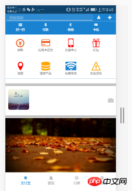
まず効果を見てみましょう。少し見苦しいので、提案しないでください。効果を確認するためにブラウザの WEB 応答形式を使用しました。ごめんなさい
模倣ボックスの効果をもう一度見てみましょう:

効果は次のとおりです。プラグインの準備ができたので、コードを入力しましょう!
まず CSS です。ここで少し思い出してください。私は Google Chrome を使用していますが、CSS3 スタイルは一部の下位バージョンのブラウザーと互換性がないため、さらに面倒です。互換性の問題については数日以内に記事を作成します
1 <style> 2 body{ 3 margin: 0 auto; 4 padding: 0; 5 } 6 nav{ 7 width: 100%; 8 height: 35px; 9 } 10 article{ 11 width: 100%; 12 background-color: #1983D1; 13 } 14 .div2{ 15 width: 100%; 16 height: 30px; 17 line-height: 30px; 18 background-color: #1983D1; 19 } 20 .div2>input{ 21 width: 78%; 22 height: 25px; 23 border: 0; 24 background-color: #2F8DD5; 25 /*border: 1px solid #2F8DD5;*/ 26 border-radius: 5px; 27 margin-left: 1vw;; 28 } 29 /*改变输入框 提示字体颜色*/ 30 input::placeholder{ 31 color: #8DC0E4; 32 } 33 .div2>button{ 34 width: 9%; 35 height: 25px; 36 background-color: #1983D1; 37 border: 0; 38 font-size: 3vw; 39 color: white; 40 } 41 .section1>ul{ 42 list-style: none; 43 display: flex; 44 justify-content:space-around; 45 align-items:center; 46 width: 100%; 47 height: 10vw; 48 margin-left: -30px; 49 } 50 .section1>ul>li{ 51 width: 24%; 52 color: white; 53 font-size: 2.5vw; 54 text-align: center; 55 margin-top: 2px; 56 } 57 .section2{ 58 background-color: white; 59 width: 100%; 60 } 61 62 .section2>ul{ 63 64 list-style: none; 65 display: flex; 66 justify-content:space-around; 67 align-items:center; 68 width: 100%; 69 height: 6rem; 70 margin-left: -30px; 71 } 72 .section2>ul>li{ 73 width: 24%; 74 /*color: white;*/ 75 font-size: 2vw; 76 text-align: center; 77 margin-top: 2px; 78 } 79 .section2>ul>li>span{ 80 font-size: 2.5rem; 81 } 82 .section3{ 83 width: 100%; 84 height: 90px; 85 line-height: 90px; 86 } 87 .section3 img{ 88 width: 20%; 89 height: 90px; 90 margin-top: -10px; 91 margin-left: 2vw; 92 border-radius: 15px; 93 } 94 .section4{ 95 margin-top: -4vw; 96 width: 100%; 97 height: 49vw; 98 } 99 .section4>img{100 width: 100%;101 height: 49vw;102 }103 footer>ul{104 width: 100%;105 height: 50px;106 /*line-height: 98px;*/107 list-style: none;108 display: flex;109 justify-content: space-between;110 margin-left: -1.5vw;111 }112 footer>ul>li{113 width: 24%;114 height: 48px;115 font-size: 3vw;116 text-align: center;117 color: #A9A9A9;118 margin-top: 3vw;119 }120 </style>ログイン後にコピー
1 <style> 2 body{ 3 margin: 0 auto; 4 padding: 0; 5 } 6 nav{ 7 width: 100%; 8 height: 35px; 9 } 10 article{ 11 width: 100%; 12 background-color: #1983D1; 13 } 14 .div2{ 15 width: 100%; 16 height: 30px; 17 line-height: 30px; 18 background-color: #1983D1; 19 } 20 .div2>input{ 21 width: 78%; 22 height: 25px; 23 border: 0; 24 background-color: #2F8DD5; 25 /*border: 1px solid #2F8DD5;*/ 26 border-radius: 5px; 27 margin-left: 1vw;; 28 } 29 /*改变输入框 提示字体颜色*/ 30 input::placeholder{ 31 color: #8DC0E4; 32 } 33 .div2>button{ 34 width: 9%; 35 height: 25px; 36 background-color: #1983D1; 37 border: 0; 38 font-size: 3vw; 39 color: white; 40 } 41 .section1>ul{ 42 list-style: none; 43 display: flex; 44 justify-content:space-around; 45 align-items:center; 46 width: 100%; 47 height: 10vw; 48 margin-left: -30px; 49 } 50 .section1>ul>li{ 51 width: 24%; 52 color: white; 53 font-size: 2.5vw; 54 text-align: center; 55 margin-top: 2px; 56 } 57 .section2{ 58 background-color: white; 59 width: 100%; 60 } 61 62 .section2>ul{ 63 64 list-style: none; 65 display: flex; 66 justify-content:space-around; 67 align-items:center; 68 width: 100%; 69 height: 6rem; 70 margin-left: -30px; 71 } 72 .section2>ul>li{ 73 width: 24%; 74 /*color: white;*/ 75 font-size: 2vw; 76 text-align: center; 77 margin-top: 2px; 78 } 79 .section2>ul>li>span{ 80 font-size: 2.5rem; 81 } 82 .section3{ 83 width: 100%; 84 height: 90px; 85 line-height: 90px; 86 } 87 .section3 img{ 88 width: 20%; 89 height: 90px; 90 margin-top: -10px; 91 margin-left: 2vw; 92 border-radius: 15px; 93 } 94 .section4{ 95 margin-top: -4vw; 96 width: 100%; 97 height: 49vw; 98 } 99 .section4>img{100 width: 100%;101 height: 49vw;102 }103 footer>ul{104 width: 100%;105 height: 50px;106 /*line-height: 98px;*/107 list-style: none;108 display: flex;109 justify-content: space-between;110 margin-left: -1.5vw;111 }112 footer>ul>li{113 width: 24%;114 height: 48px;115 font-size: 3vw;116 text-align: center;117 color: #A9A9A9;118 margin-top: 3vw;119 }120 </style><body>
<nav>
<img src="1.png" style="width: 100%;height: 35px;" />
</nav>
<div class="div1"></div>
<div class="div2">
<input type="search" placeholder=" 蚂蚁花呗" />
<button><span class="icon icon-user-tie"></span></button>
<button data-toggle="modal" data-target="#kuang" data-backdrop="true"><span class="icon icon-plus"></span></button>
</div>
<!--模态框-->
<div class="modal fade modal-sm" id="kuang" style="width: 30%; margin-left: 65%;">
<div class="modal-dialog modal-sm">
<div class="modal-content">
<!--体-->
<div class="modal-body">
<ul style="list-style: none; color:#6B6B6B;font-size: 2vw;">
<li><span class="icon icon-bubbles4" style="margin-left: -3vw;"></span> 发起群聊</li>
<li><span class="icon icon-user-plus" style="margin-left: -3vw;"></span> 添加朋友</li>
<li><span class="icon icon-qrcode" style="margin-left: -3vw;"></span> 扫 一 扫</li>
<li><span class="icon icon-coin-euro" style="margin-left: -3vw;"></span> 我要收款</li>
</ul>
</div>
</div>
</div>
</div>
<article>
<section class="section1">
<ul>
<li>
<span class="glyphicon glyphicon-qrcode"></span>
<div>扫一扫</div>
</li>
<li>
<span class="glyphicon glyphicon-usd"></span>
<div>付款</div>
</li>
<li>
<span class="glyphicon glyphicon-gbp"></span>
<div>收钱</div>
</li>
<li>
<span class="n glyphicon glyphicon-credit-card"></span>
<div>卡包</div>
</li>
</ul>
</section>
<section class="section2">
<ul>
<li>
<span class="icon icon-coin-yen" style="color: #EE4A02;"></span>
<div>转账</div>
</li>
<li>
<span class="icon icon-credit-card" style="color: #EE4A02;"></span>
<div>信用卡还贷</div>
</li>
<li>
<span class="icon icon-mobile" style="color: red;"></span>
<div>充值中心</div>
</li>
<li>
<span class="icon icon-gift" style="color: red;"></span>
<div>红包</div>
</li>
</ul>
<ul>
<li>
<span class="icon icon-location" style="color: red;"></span>
<div>地图</div>
</li>
<li>
<span class="icon icon-database" style="color: orange;"></span>
<div>理财产品</div>
</li>
<li>
<span class="icon icon-connection" style="background-color: #1983D1;color: white;"></span>
<div>免费无线</div>
</li>
<li>
<span class="icon icon-warning" style="color: orange;"></span>
<div>安全须知</div>
</li>
</ul>
</section>
</article>
<hr style="background-color: #C3C3C3;width: 100%; height: 10px;" />
<section class="section3">
<img src="2.png" class="img-responsive" />
<span class="icon icon-camera pull-right" style="margin-top: -11.5vw;font-size: 5vw;margin-right: 2vw;color:#C3C3C3;"></span>
</section>
<hr style="background-color: #C3C3C3;width: 100%; height: 10px;" />
<section class="section4">
<img src="3.png" class="img-responsive" />
</section>
<footer>
<ul>
<li style="color: #1983D1;">
<span class="icon icon-svg"></span>
<div>支付宝</div>
</li>
<li>
<span class="icon icon-users"></span>
<div>朋友</div>
</li>
<li>
<span class="icon icon-hipster"></span>
<div>口碑</div>
</li>
<li>
<span class="icon icon-coin-dollar"></span>
<div>我的</div>
</li>
</ul>
</footer>
<script src="../jquery-3.1.1.min.js?1.1.10"></script>
<script src="../dist/js/bootstrap.js?1.1.10"></script>
</body>
ログイン後にコピー
<body>
		<nav>
			<img src="1.png" style="width: 100%;height: 35px;" />
		</nav>
		<div class="div1"></div>
		<div class="div2">
			<input type="search" placeholder="   蚂蚁花呗" />
			<button><span class="icon icon-user-tie"></span></button>
			<button data-toggle="modal" data-target="#kuang" data-backdrop="true"><span class="icon icon-plus"></span></button>
		</div>
		<!--模态框-->
		<div class="modal fade modal-sm" id="kuang" style="width: 30%; margin-left: 65%;">
			<div class="modal-dialog modal-sm">
				<div class="modal-content">
					<!--体-->
					<div class="modal-body">
						<ul style="list-style: none; color:#6B6B6B;font-size: 2vw;">
							<li><span class="icon icon-bubbles4" style="margin-left: -3vw;"></span>  发起群聊</li>
							<li><span class="icon icon-user-plus" style="margin-left: -3vw;"></span>  添加朋友</li>
							<li><span class="icon icon-qrcode" style="margin-left: -3vw;"></span>  扫 一 扫</li>
							<li><span class="icon icon-coin-euro" style="margin-left: -3vw;"></span>  我要收款</li>
						</ul>
					</div>
				</div>
			</div>
		</div>
		<article>
			<section class="section1">
				<ul>
					<li>
						<span class="glyphicon glyphicon-qrcode"></span>
						<div>扫一扫</div>
					</li>
					<li>
						<span class="glyphicon glyphicon-usd"></span>
						<div>付款</div>
					</li>
					<li>
						<span class="glyphicon glyphicon-gbp"></span>
						<div>收钱</div>
					</li>
					<li>
						<span class="n glyphicon glyphicon-credit-card"></span>
						<div>卡包</div>
					</li>
				</ul>
			</section>

			<section class="section2">
				<ul>
					<li>
						<span class="icon icon-coin-yen" style="color: #EE4A02;"></span>
						<div>转账</div>
					</li>
					<li>
						<span class="icon icon-credit-card" style="color: #EE4A02;"></span>
						<div>信用卡还贷</div>
					</li>
					<li>
						<span class="icon icon-mobile" style="color: red;"></span>
						<div>充值中心</div>
					</li>
					<li>
						<span class="icon icon-gift" style="color: red;"></span>
						<div>红包</div>
					</li>
				</ul>
				<ul>
					<li>
						<span class="icon icon-location" style="color: red;"></span>
						<div>地图</div>
					</li>
					<li>
						<span class="icon icon-database" style="color: orange;"></span>
						<div>理财产品</div>
					</li>
					<li>
						<span class="icon icon-connection" style="background-color: #1983D1;color: white;"></span>
						<div>免费无线</div>
					</li>
					<li>
						<span class="icon icon-warning" style="color: orange;"></span>
						<div>安全须知</div>
					</li>
				</ul>
			</section>
		</article>
		<hr style="background-color: #C3C3C3;width: 100%; height: 10px;" />

		<section class="section3">
			<img src="2.png" class="img-responsive" />
			<span class="icon icon-camera pull-right" style="margin-top: -11.5vw;font-size: 5vw;margin-right: 2vw;color:#C3C3C3;"></span>
		</section>
		<hr style="background-color: #C3C3C3;width: 100%; height: 10px;" />
		<section class="section4">
			<img src="3.png" class="img-responsive" />
		</section>
		<footer>
			<ul>
				<li style="color: #1983D1;">
					<span class="icon icon-svg"></span>
					<div>支付宝</div>
				</li>
				<li>
					<span class="icon icon-users"></span>
					<div>朋友</div>
				</li>
				<li>
					<span class="icon icon-hipster"></span>
					<div>口碑</div>
				</li>
				<li>
					<span class="icon icon-coin-dollar"></span>
					<div>我的</div>
				</li>
			</ul>
		</footer>

		<script src="../jquery-3.1.1.min.js?1.1.10"></script>
		<script src="../dist/js/bootstrap.js?1.1.10"></script>
	</body>
以上です!
<script>
(function(doc) {
function changeSize() {
var size = doc.documentElement.clientWidth / 320 * 10;
doc.querySelector('html').style.fontSize = size + 'px';
}
window.onresize = changeSize;
changeSize();
})(document)
</script>OK! これが、Bootstrap 模倣ボックスと組み合わせた Alipay ホームページです
Bootstrap チュートリアル
] 何かわからないことがあれば、お気軽に質問してください。コメントを見たら一つ一つ答えていきます!
以上がBootstrap 模倣ボックス + Alipay ホームページの詳細内容です。詳細については、PHP 中国語 Web サイトの他の関連記事を参照してください。

ホットAIツール

Undresser.AI Undress
リアルなヌード写真を作成する AI 搭載アプリ

AI Clothes Remover
写真から衣服を削除するオンライン AI ツール。

Undress AI Tool
脱衣画像を無料で

Clothoff.io
AI衣類リムーバー

AI Hentai Generator
AIヘンタイを無料で生成します。

人気の記事
ホットツール

メモ帳++7.3.1
使いやすく無料のコードエディター

SublimeText3 中国語版
中国語版、とても使いやすい

ゼンドスタジオ 13.0.1
強力な PHP 統合開発環境

ドリームウィーバー CS6
ビジュアル Web 開発ツール

SublimeText3 Mac版
神レベルのコード編集ソフト(SublimeText3)
ホットトピック
 7540
7540
 15
1381
52
83
11
21
86
15
1381
52
83
11
21
86

 ブートストラップ検索バーを取得する方法
Apr 07, 2025 pm 03:33 PM
ブートストラップ検索バーを取得する方法
Apr 07, 2025 pm 03:33 PM
ブートストラップを使用して検索バーの値を取得する方法:検索バーのIDまたは名前を決定します。 JavaScriptを使用してDOM要素を取得します。要素の値を取得します。必要なアクションを実行します。
 ブートストラップの垂直センタリングを行う方法
Apr 07, 2025 pm 03:21 PM
ブートストラップの垂直センタリングを行う方法
Apr 07, 2025 pm 03:21 PM
ブートストラップを使用して垂直センタリングを実装します。FlexBoxメソッド:D-Flex、Justify-Content-Center、Align-Items-Centerクラスを使用して、FlexBoxコンテナに要素を配置します。 ALIGN-ITEMS-CENTERクラス方法:FlexBoxをサポートしていないブラウザの場合、親要素の高さが定義されている場合、Align-Items-Centerクラスを使用します。
 VueでBootstrapの使用方法
Apr 07, 2025 pm 11:33 PM
VueでBootstrapの使用方法
Apr 07, 2025 pm 11:33 PM
vue.jsでBootstrapを使用すると、5つのステップに分かれています。ブートストラップをインストールします。 main.jsにブートストラップをインポートしますブートストラップコンポーネントをテンプレートで直接使用します。オプション:カスタムスタイル。オプション:プラグインを使用します。
 ブートストラップにスプリットラインを書く方法
Apr 07, 2025 pm 03:12 PM
ブートストラップにスプリットラインを書く方法
Apr 07, 2025 pm 03:12 PM
ブートストラップスプリットラインを作成するには2つの方法があります。タグを使用して、水平方向のスプリットラインを作成します。 CSS Borderプロパティを使用して、カスタムスタイルのスプリットラインを作成します。

 ブートストラップに写真を挿入する方法
Apr 07, 2025 pm 03:30 PM
ブートストラップに写真を挿入する方法
Apr 07, 2025 pm 03:30 PM
ブートストラップに画像を挿入する方法はいくつかあります。HTMLIMGタグを使用して、画像を直接挿入します。ブートストラップ画像コンポーネントを使用すると、レスポンシブ画像とより多くのスタイルを提供できます。画像サイズを設定し、IMG-Fluidクラスを使用して画像を適応可能にします。 IMGボーダークラスを使用して、境界線を設定します。丸い角を設定し、IMGラウンドクラスを使用します。影を設定し、影のクラスを使用します。 CSSスタイルを使用して、画像をサイズ変更して配置します。背景画像を使用して、背景イメージCSSプロパティを使用します。
 ブートストラップのフレームワークをセットアップする方法
Apr 07, 2025 pm 03:27 PM
ブートストラップのフレームワークをセットアップする方法
Apr 07, 2025 pm 03:27 PM
Bootstrapフレームワークをセットアップするには、次の手順に従う必要があります。1。CDNを介してブートストラップファイルを参照してください。 2。独自のサーバーでファイルをダウンロードしてホストします。 3。HTMLにブートストラップファイルを含めます。 4.必要に応じてSASS/LESSをコンパイルします。 5。カスタムファイルをインポートします(オプション)。セットアップが完了したら、Bootstrapのグリッドシステム、コンポーネント、スタイルを使用して、レスポンシブWebサイトとアプリケーションを作成できます。
 ブートストラップの日付を表示する方法
Apr 07, 2025 pm 03:03 PM
ブートストラップの日付を表示する方法
Apr 07, 2025 pm 03:03 PM
回答:ブートストラップの日付ピッカーコンポーネントを使用して、ページで日付を表示できます。手順:ブートストラップフレームワークを紹介します。 HTMLで日付セレクター入力ボックスを作成します。ブートストラップは、セレクターにスタイルを自動的に追加します。 JavaScriptを使用して、選択した日付を取得します。
