

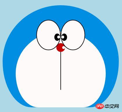
誰もが子供の頃、小さなお腹に素晴らしいドラえもんが詰まっていて、無力で悲しいときに一緒にいてくれるドラえもん、無力で悲しいときに一緒にいてくれるドラえもんを持っていると思います。思いつきでどら焼きを一緒に食べましょう〜 今日は心の中にドラえもんを描きます〜

ドラえもんを定義する容器
まず、ドラえもんを描く大きな容器を定義して決定しますその大きさと位置。
<!-- 哆啦A梦大容器 -->
<p class="doa"></p>
/*哆啦A梦*/
.doa{position: relative;top: 100px;}ドラえもんの頭を描きます (顔を含む、顔には目と鼻が含まれます)
頭にはいくつかの部分が含まれています: ドラえもんの顔と鼻、顔には目が 2 つあり、中には目玉と白目があります2 つの目なので、DOM のネストが複数の層になります。もちろん、基本的なグラフィックスはすべて p+border-radius で構成されます。
描画されたアイテムのさまざまな部分を、対応する位置に配置するだけです。
私が以前に描いたいくつかの絵を見ると、border-radius が非常に一般的に使用される属性であることがわかります。実際、border-radius の本当の顔は、p の変形と切り離せないものです。 -radius: 300px 300px 300px 300px/300px 300px 300px 300px; 通常、スラッシュ部分は水平方向の長さであり、スラッシュは垂直方向のサイズです。フロントバー以降に何も書かれていない場合も同様です。私の言ったことは十分に詳しくないことは承知しています。Xinshen のブログ「When Will Autumn Moon Come?」を参照してください。CSS3 ボーダー半径についてどれくらい知っていますか?経験豊富なドライバーの指導により、数分で境界半径を完全に理解できるようになります。すぐにバスに乗ってはいかがでしょうか。
<!-- 头 -->
  <p class="head">
 <!-- 存放脸部的容器 -->
 <p class="face">
 <!-- 左眼大圈儿 -->
 <p>
 <!-- 左眼眼珠(黑色部分) -->
 <p>
 <!-- 左眼眼白,黑色里面的白色部分 -->
 <p></p>
 </p>
 </p>
 <!-- 右眼大圈儿 -->
 <p>
 <!--右眼眼珠(黑色部分) -->
 <p>
 <!-- 右眼眼白,黑色里面的白色部分 -->
 <p></p>
 </p>
 </p>
 </p>
 <!-- 红鼻子部分 -->
 <p class="nose">
 <!-- 红鼻子里面的白圈儿 -->
 <p></p>
 </p>
 <!-- 红鼻子下面的那根黑线,也属于鼻子部分 -->
 <p class="nose1"></p>
 </p>
.head{
 margin: 0 auto; /*头部定义大小并居中显示*/
 width: 400px;
 height: 350px;
 background: #008ee3; /*头部定义背景颜色*/
 position: relative;
 border-radius: 50% 50% 25% 25% / 55% 55% 45% 45%; /*头部定义四个方向圆角大小*/
 }
 .face{
 width: 310px; /*脸部定义大小*/
 height: 260px;
 background: snow; /*脸部定义背景颜色*/
 border-radius: 50% 50% 25% 25% / 55% 55% 45% 45%; /*脸部定义四个方向的圆角大小*/
 position: relative; /*脸部定义位置,是相对于head的位置*/
 top: 90px;
 left: 45px;
 }
 /*左眼眶*/
 .face>p:first-child{
 width: 80px; /*左眼框定义大小*/
 height: 100px;
 border-radius: 50%; /*左眼框定义与圆角大小*/
 border:2px #000 solid; /*定义外边框*/
 background: snow;
 float: left; /*为了使左右两个眼睛能在一排显示*/
 position: relative; /*位置是相对于face的位置*/
 top:-40px;
 left: 71px;
 z-index: 50;
 }
 /*右眼眶,画法跟左眼一样*/
 .face>p:last-child{
 width: 80px;
 height: 100px;
 border-radius: 50%;
 border:2px #000 solid;
 background: snow;
 float: left;
 position: relative;
 top:-40px;
 left: 71px;
 z-index: 50;
 }
 /*左眼珠1*/
 .face>p:first-child p{
 width: 20px; /*定义眼珠的大小*/
 height: 25px;
 background: #000;
 border-radius: 50%;
 position: absolute; /*定义眼珠的位置,相对于眼眶的位置*/
 top: 45px;
 left: 60px;
 }
 /*左瞳孔*/
 .face>p:first-child p p{
 width: 10px; /*定义黑色瞳孔的大小*/
 height: 10px;
 background: #ffffff;
 border-radius: 50%;
 position: absolute; /*定义黑色瞳孔的位置,相对于眼珠的位置*/
 top: 7px;
 left: 10px;
 }
 /*右眼珠和左眼珠画法一样*/
 .face>p:last-child p{
 width: 20px;
 height: 25px;
 background: #000;
 border-radius: 50%;
 position: absolute;
 top: 45px;
 }
 /*右瞳孔和左瞳孔的画法一样*/
 .face>p:last-child p p{
 width: 10px;
 height: 10px;
 background: #ffffff;
 border-radius: 50%;
 position: absolute;
 top: 7px;
 }
 .nose{
 width: 30px; /*定义红鼻子的大小*/
 height: 30px;
 border-radius: 50%;
 background: #c70000;
 position: absolute;
 top: 130px;
 left: 50%;
 margin-left: -15px;
 z-index: 10;
 }
 .nose p{
 width: 10px; /*定义红鼻子里面白色圈圈的大小*/
 height: 10px;
 border-radius: 50%;
 position: absolute;
 background: #ffffff;
 top: 10px;
 margin-left: 20px;
 z-index: 10;
 }
 .nose1{
 width: 2px; /*定义红鼻子下面的那一条黑线*/
 height: 130px;
 background: #000;
 position: absolute;
 top: 160px;
 left: 50%;
 margin-left: -1px;
 z-index: 10;
 }
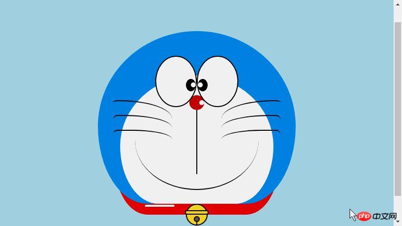
ドラえもんの頭.png
ドラえもんの口を描画します
口は非常にシンプルである必要があり、border+border-radius で実装されていることが一目でわかります。
<p class="mouth"></p>
.mouth{
 width: 250px; /*定义嘴巴的大小*/
 height: 200px;
 border-radius: 50%;
 background: snow;
 border-bottom: 2px #000 solid;
 margin: -230px auto;
 position: relative; /*定义嘴巴的位置*/
 }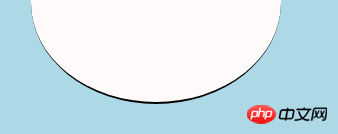
ドラえもんの口.png
ドラえもんのひげ部分を描く
前回の記事で実際にひげ部分を描いてアニメーションを作成しました【連載3】 - ひげの描き方はすでに子猫のスマイリーアニメーションでひげを描くときに導入したものなので、ここでは詳しく説明しません。基本的な考え方は同じです。
<!-- 胡须 -->
  <p class="beard">
 <!-- 左边胡须部分 -->
 <p class="left">
 <!-- 第一根胡须 -->
 <p></p>
 <!-- 第二根胡须 -->
 <p></p>
 <!-- 第三根胡须 -->
 <p></p>
 </p>
 <p class="right">
 <p></p>
 <p></p>
 <p></p>
 </p>
 <!-- 脖子部分的小白条部分 -->
 <span></span>
 </p>
/*胡须样式*/
.beard .left p:first-child{
 width: 120px;
 height: 40px;
 border-top: 2px #000 solid;
 border-radius: 10% 90% 10% 90% / 10% 90% 10% 90%;
 position: absolute;
 left: 50%;
 top: 140px;
 margin-left: -170px;
 z-index: 100;
 }
 .beard .left p:nth-child(2){
 width: 120px;
 height: 40px;
 border-top: 2px #000 solid;
 border-radius: 10% 90% 10% 90% / 30% 70% 40% 60%;
 position: absolute;
 left: 50%;
 top: 170px;
 margin-left: -170px;
 z-index: 100;
 }
 .beard .left p:last-child{
 width: 120px;
 height: 40px;
 border-top: 2px #000 solid;
 border-radius: 10% 90% 10% 90% / 40% 60% 10% 90%;
 position: absolute;
 left: 50%;
 top: 200px;
 margin-left: -170px;
 z-index: 100;
 }

 .beard .right p:first-child{
 width: 120px;
 height: 40px;
 border-top: 2px #000 solid;
 border-radius: 90% 10% 90% 10% / 90% 10% 90% 10%;
 position: absolute;
 left: 50%;
 top: 140px;
 margin-left: 50px;
 z-index: 100;
 }
 .beard .right p:nth-child(2){
 width: 120px;
 height: 40px;
 border-top: 2px #000 solid;
 border-radius: 90% 10% 90% 10% / 70% 30% 60% 40%;
 position: absolute;
 left: 50%;
 top: 170px;
 margin-left: 50px;
 z-index: 100;
 }
 .beard .right p:last-child{
 width: 120px;
 height: 40px;
 border-top: 2px #000 solid;
 border-radius: 90% 10% 90% 10% / 60% 40% 90% 10%;
 position: absolute;
 left: 50%;
 top: 200px;
 margin-left: 50px;
 z-index: 100;
 }
 .beard span{
 display: block;
 width: 60px;
 height: 3.5px;
 background: #ffffff;
 border-radius: 4px;
 position: absolute;
 top: 352px;
 left: 50%;
 margin-left: -105px;
 }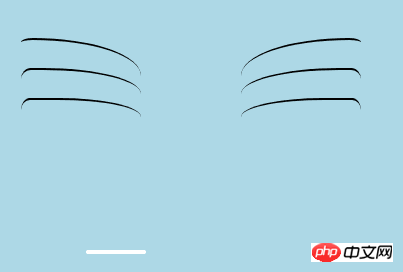
ドラえもんのひげ.png
ドラえもんの首の部分を描きます(首の部分には鈴も含まれています)
首は基本変形後の形で、余分なので部分的に隠すだけです頭。
ベル部分は非常にシンプルな基本グラフィックで構成されています。
<!-- 脖 -->
  <p class="neck">
 <!-- 铃铛的圆形 -->
 <p></p>
 <!-- 铃铛的小圆角矩形 -->
 <p></p>
 <!-- 铃铛的小圆形 -->
 <p></p>
 <!-- 铃铛的小竖线 -->
 <p></p>
 </p>
.neck{
 width: 330px;
 height: 200px;
 border-radius: 50% 50% 20% 20% / 50% 50% 50% 50%;
 background: #e30000;
 margin: 80px auto;
 z-index: 100;
 }
 .neck p:first-child{
 border: 2px #000 solid;
 border-radius: 50%;
 width: 40px;
 height: 40px;
 background: #ffdd2e;
 position: absolute;
 top: 350px;
 left: 50%;
 margin-left: -22px;
 transition: all 1s;
 }
 .neck p:nth-child(2){
 border: 2px #000 solid;
 width: 44px;
 height: 5px;
 background: #ffdd2e;
 position: absolute;
 left: 50%;
 margin-left: -24px;
 top: 363px;
 border-radius: 5px;
 transition: all 1s;
 }
 .neck p:nth-child(3){
 width: 8px;
 height: 8px;
 border: 2px #000 solid;
 position: absolute;
 background: #6c5844;
 border-radius: 50%;
 left: 50%;
 margin-left: -6px;
 top: 375px;
 transition: all 1s;
 }
 .neck p:nth-child(4){
 width: 2px;
 height: 8px;
 background: #000;
 position: absolute;
 left: 50%;
 margin-left: -1px;
 top: 385px;
 transition: all 1s;
 }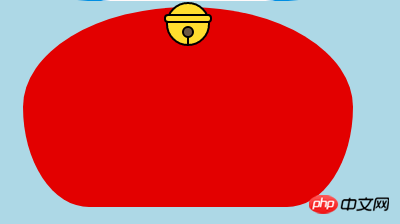
ドラえもんの首.png
ドラえもんのダイナミックなエフェクトを完成させましょう
では、動いてみましょう(遷移属性)。
マウスを目の領域に移動し、左の眼球を左に移動します。
マウスを口に動かすと表情が変わります。
マウスをベル部分に移動すると、ベルが大きくなります。
りー
以上がアニメーション ドラえもんを作成するための HTML サンプル コードを共有するの詳細内容です。詳細については、PHP 中国語 Web サイトの他の関連記事を参照してください。


![[Web フロントエンド] Node.js クイック スタート](https://img.php.cn/upload/course/000/000/067/662b5d34ba7c0227.png)


