

モバイル端末の横画面・縦画面に対応したモバイル端末の開発
この記事では主に、モバイル デバイスの水平画面と垂直画面を扱うモバイル Web 開発の基本を紹介します。window.orientation 属性と onorientationchange イベント、およびメディア クエリ メソッドは、開発プロセス中に注意する必要がある 2 つのソリューションです。必要な友達は次を参照してください
モバイル デバイスの画面の断片化に対処するため、モバイル Web アプリケーションを開発するときのベスト プラクティスの 1 つは、限られた画面スペースを確実に活用できるようにすることです。可能な限り最大限の範囲で。画面の方向性により、ユーザーが画面の方向を切り替えた後、いくつかの設計または実装の問題が明らかになります。少なくとも、現在の表示要素の幅の適応に対処する必要があります (もちろん、これ以上のことをしなければなりません)。多くの場合、さまざまな画面の向きに対応するアプリケーションの表示モードを設計する必要があります。このとき、デバイスの垂直画面の状態をリアルタイムで把握することが非常に重要です。
window.orientation属性与onorientationchange事件
onorientationchange: 画面の向きが水平との間で変わるたびに縦画面切り替え後、この window イベントがトリガーされます。使い方は従来のイベントと同様です
1: onorientationchange イベントのコールバック関数を使用して、orient という属性を body タグに動的に追加します。 、 body[orient=landspace] または Body[orient=portrait] メソッドを使用して、CSS で対応するスタイルを定義することで、異なる画面モードで異なるスタイルを表示できます。次のコード例:
<!Doctype html>
<html>
 <head>
  <meta charset="utf-8">
  <meta id="viewport" name="viewport" content="width=device-width,initial-scale=1.0;">
  <title>横竖屏切换检测</title>
  <style type="text/css">
   body[orient=landscape]{
    background-color: #ff0000;
   }

   body[orient=portrait]{
    background-color: #00ffff;
   }
  </style>
 </head>
 <body orient="landspace">
  <p>
   内容
  </p>
  <script type="text/javascript">
   (function(){
    if(window.orient==0){
     document.body.setAttribute("orient","portrait");
    }else{
     document.body.setAttribute("orient","landscape");
    }
   })();
   window.onorientationchange=function(){
    var body=document.body;
    var viewport=document.getElementById("viewport");
    if(body.getAttribute("orient")=="landscape"){
     body.setAttribute("orient","portrait");
    }else{
     body.setAttribute("orient","landscape");
    }
   };
  </script>
 </body>
</html><!Doctype html>
<html>
<head>
<meta charset="utf-8">
<meta id="viewport" name="viewport" content="width=device-width,initial-scale=1.0;">
<title>横竖屏切换检测</title>
<style type="text/css">
.landscape body {
background-color: #ff0000;
}
.portrait body {
background-color: #00ffff;
}
</style>
</head>
<body orient="landspace">
<p>
内容
</p>
<script type="text/javascript">
(function(){
var init=function(){
var updateOrientation=function(){
var orientation=window.orientation;
switch(orientation){
case 90:
case -90:
orientation="landscape";
break;
default:
orientation="portrait";
break;
}
document.body.parentNode.setAttribute("class",orientation);
};
window.addEventListener("orientationchange",updateOrientation,false);
updateOrientation();
};
window.addEventListener("DOMContentLoaded",init,false);
})();
</script>
</body>
</html>メディア クエリ メソッドを使用します
これは、便利な方法として、次のコードのデモに示すように、純粋な CSS を使用して対応する機能を実装できます:
<!Doctype html>
<html>
 <head>
  <meta charset="utf-8">
  <meta id="viewport" name="viewport" content="width=device-width,initial-scale=1.0;">
  <title>横竖屏切换检测</title>
  <style type="text/css">
   @media all and (orientation : landscape) {
    body {
     background-color: #ff0000;
    }
   }

   @media all and (orientation : portrait){
    body {
     background-color: #00ff00;
    }
   }
  </style>
 </head>
 <body>
  <p>
   内容
  </p>
 </body>
</html> ターゲットのモバイル ブラウザがメディア クエリをサポートしておらず、window.orientation がサポートしている場合存在しない場合は、別の方法を使用してそれを実現する必要があります。タイマーを使用して、現在のウィンドウの高さ (window.innerHeight) と幅 (window.innerWidth) の比率を「疑似リアルタイム」で比較し、現在の水平および垂直画面のステータス。次のコードに示すように:
<!Doctype html>
<html>
 <head>
  <meta charset="utf-8">
  <meta id="viewport" name="viewport" content="width=device-width,initial-scale=1.0;">
  <title>按键</title>
  <style type="text/css">
   .landscape body {
    background-color: #ff0000;
   }

   .portrait body {
    background-color: #00ffff;
   }
  </style>
  <script type="text/javascript">
   (function(){
    var updateOrientation=function(){
     var orientation=(window.innerWidth > window.innerHeight)? "landscape" : "portrait";
     document.body.parentNode.setAttribute("class",orientation);
    };

    var init=function(){
     updateOrientation();
     window.setInterval(updateOrientation,5000);
    };
    window.addEventListener("DOMContentLoaded",init,false);
   })();
  </script>
 </head>
 <body>
  <p>
   内容
  </p>
 </body>
</html> 次のコードに示すように、上記の 2 つのソリューションを統合することで、クロスブラウザ ソリューションを実現できます:
<!Doctype html>
<html>
 <head>
  <meta charset="utf-8">
  <meta id="viewport" name="viewport" content="width=device-width,initial-scale=1.0;">
  <title>横竖屏切换检测</title>
  <style type="text/css">
   .landscape body {
    background-color: #ff0000;
   }

   .portrait body {
    background-color: #00ffff;
   }
  </style>
  <script type="text/javascript">
   (function(){
    var supportOrientation=(typeof window.orientation == "number" && typeof window.onorientationchange == "object");

    var updateOrientation=function(){
     if(supportOrientation){
      updateOrientation=function(){
       var orientation=window.orientation;
       switch(orientation){
        case 90:
        case -90:
         orientation="landscape";
         break;
        default:
         orientation="portrait";
       }
       document.body.parentNode.setAttribute("class",orientation);
      };
     }else{
      updateOrientation=function(){
       var orientation=(window.innerWidth > window.innerHeight)? "landscape":"portrait";
       document.body.parentNode.setAttribute("class",orientation);
      };
     }
     updateOrientation();
    };

    var init=function(){
     updateOrientation();
     if(supportOrientation){
      window.addEventListener("orientationchange",updateOrientation,false);
     }else{
      window.setInterval(updateOrientation,5000);
     }
    };
    window.addEventListener("DOMContentLoaded",init,false);
   })();
  </script>
 </head>
 <body>
  <p>
   内容
  </p>
 </body>
</html>以上がモバイル端末の横画面・縦画面に対応したモバイル端末の開発の詳細内容です。詳細については、PHP 中国語 Web サイトの他の関連記事を参照してください。

ホットAIツール

Undresser.AI Undress
リアルなヌード写真を作成する AI 搭載アプリ

AI Clothes Remover
写真から衣服を削除するオンライン AI ツール。

Undress AI Tool
脱衣画像を無料で

Clothoff.io
AI衣類リムーバー

Video Face Swap
完全無料の AI 顔交換ツールを使用して、あらゆるビデオの顔を簡単に交換できます。

人気の記事
ホットツール

メモ帳++7.3.1
使いやすく無料のコードエディター

SublimeText3 中国語版
中国語版、とても使いやすい

ゼンドスタジオ 13.0.1
強力な PHP 統合開発環境

ドリームウィーバー CS6
ビジュアル Web 開発ツール

SublimeText3 Mac版
神レベルのコード編集ソフト(SublimeText3)
ホットトピック
 7722
7722
 15
1642
14
1396
52
1289
25
1233
29
15
1642
14
1396
52
1289
25
1233
29

 Samsung Galaxy S25 Ultra携帯電話がリーク:6.86インチ、横画面対本体比率94.1%
Aug 17, 2024 pm 01:49 PM
Samsung Galaxy S25 Ultra携帯電話がリーク:6.86インチ、横画面対本体比率94.1%
Aug 17, 2024 pm 01:49 PM
8月17日のニュースによると、情報源@ibinguniverseが本日Weiboに投稿したところによると、Apple iPhone 16 Pro Maxの正確なサイズは6.88インチで、Galaxy S25 Ultraの正確なサイズはどちらも6.9インチとみなせるとのこと。 。情報源によると、Samsung Galaxy S25 UltraはS24 Ultraよりも本体が狭く、画面が広く、水平方向の画面対本体の比率が94.1%であるのに対し、S24 Ultraの水平方向の画面対本体の比率は91.5%です。 Fenye氏は情報源の関連するWeiboをチェックし、新たに公開されたiPhone 16 Pro Maxの写真についてコメントし、この携帯電話は実際にはストレートスクリーン+2.5Dガラスであると信じていました。
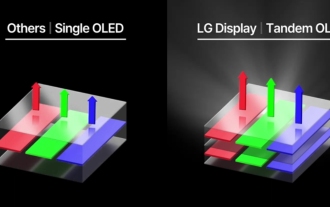 Appleが普及させた「タンデムOLED」はOLEDよりも何が優れているのでしょうか?
Aug 19, 2024 am 04:42 AM
Appleが普及させた「タンデムOLED」はOLEDよりも何が優れているのでしょうか?
Aug 19, 2024 am 04:42 AM
近年、Apple はイノベーションの欠如を批判されていますが、Apple は常に立ち止まっていたわけではありません。少なくともハードウェア設計に関しては、Apple 製品の単価の高さに支えられ、エンジニアはコストの問題をあまり考慮せずに、いくつかの新しいテクノロジーを簡単に試すことができます。たとえば、iPad Proは、Appleのお気に入りの「ディスプレイ技術」テストフィールドとして、2021年のminiLEDから2024年のタンデムOLEDに至るまで、ポータブルスマートデバイスのディスプレイ技術の最前線に立ってきました。 iPad Pro は、miniLED スクリーンを備えた最初のポータブル スマート デバイスではありませんが (MSI は Apple より 1 年早く miniLED ラップトップをリリースしました)、2 つのパラメータを比較すると、それらが同じではないことがすぐにわかります。
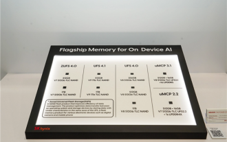 Hynix は UFS 4.1 フラッシュ メモリを初めて実証しました: V9 TLC NAND 粒子に基づく
Aug 09, 2024 pm 03:33 PM
Hynix は UFS 4.1 フラッシュ メモリを初めて実証しました: V9 TLC NAND 粒子に基づく
Aug 09, 2024 pm 03:33 PM
8月9日のニュースによると、SK HynixはFMS2024サミットで、仕様がまだ正式にリリースされていないUFS4.1ユニバーサルフラッシュメモリを含む最新のストレージ製品をデモした。 JEDEC Solid State Technology Associationの公式Webサイトによると、現在発表されている最新のUFS仕様は2022年8月のUFS4.0です。理論上のインターフェース速度は46.4Gbpsと高速で、UFS4.1ではさらに伝送速度が向上すると予想されています。レート。 1. Hynix は、321 層 V91TbTLCNAND フラッシュ メモリをベースとした 512GB および 1TBUFS4.1 の汎用フラッシュ メモリ製品をデモしました。 SK Hynixは3.2GbpsV92TbQLC粒子と3.6GbpsV9H1TbTLC粒子も展示した。 Hynix が V7 ベースを披露
 初の1.5Kアンダースクリーンカメラ! Nubia Z70 Ultra が登場: 世界初の Snapdragon 8 Gen4 を搭載した真のフルスクリーン スマートフォン
Aug 19, 2024 pm 03:47 PM
初の1.5Kアンダースクリーンカメラ! Nubia Z70 Ultra が登場: 世界初の Snapdragon 8 Gen4 を搭載した真のフルスクリーン スマートフォン
Aug 19, 2024 pm 03:47 PM
8月19日のニュースによると、NubiaはZ50 Ultraのリリース以来、真のフルスクリーンデザインにこだわり、高ピクセルスクリーン下でのプロアクティブな写真撮影の分野を継続的に模索し続けている。本日、デジタルブロガーの Wisdom Pikachu が、今年後半にリリースされる Nubia Z70 Ultra が、業界最高解像度の UDC ソリューションである 1.5K アンダースクリーン カメラ テクノロジーを搭載してデビューするというニュースを発表しました。遠い。 ZTEのアンダースクリーンプロアクティブソリューションは第6世代に進化したと報告されています。最新の画面下プロアクティブ ソリューションは、Nubia Z60 Ultra および Red Magic 9S Pro シリーズで利用できます。画面解像度は 2480x1116 で、解像度は 1080P から 1.5K の間です。今回、Nubia は既存の解像度の限界を打ち破り、業界に新たなベンチマークを設定します。
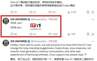 GoogleのGemini Nano AIモデルをローカルで実行するために、Samsung Galaxy S25 Ultra携帯電話には16GBのメモリが搭載されていることが明らかになりました
Jul 31, 2024 pm 05:55 PM
GoogleのGemini Nano AIモデルをローカルで実行するために、Samsung Galaxy S25 Ultra携帯電話には16GBのメモリが搭載されていることが明らかになりました
Jul 31, 2024 pm 05:55 PM
7月31日のニュースによると、情報元の@ibinguniverse氏が16GBのメモリを搭載していることについてツイートした。 Samsung 携帯電話のメモリ容量のアップデート Samsung は、Galaxy S20 Ultra および Galaxy S21 Ultra 携帯電話に 16GB メモリを搭載することを開始しました。最新の主力携帯電話である Galaxy S24 Ultra を含む Galaxy S22 Ultra 以降、Samsung 携帯電話のメモリ容量は 12GB に制限されています。次期Samsung Galaxy S25およびGalaxy S25+は12GB LPDDを使用すると報告されています
 Apple と Huawei は両方ともボタンのない携帯電話を作りたがっていましたが、Xiaomi が最初にそれを作りましたか?
Aug 29, 2024 pm 03:33 PM
Apple と Huawei は両方ともボタンのない携帯電話を作りたがっていましたが、Xiaomi が最初にそれを作りましたか?
Aug 29, 2024 pm 03:33 PM
Smartprix の報道によると、Xiaomi はコードネーム「Suzaku」というボタンのない携帯電話を開発中です。このニュースによると、コードネームZhuqueというこの携帯電話は、統合コンセプトで設計され、画面下カメラを使用し、Qualcomm Snapdragon 8gen4プロセッサを搭載する予定で、計画が変更されなければ、2025年に登場する可能性が高いとのことです。 。このニュースを見たとき、2019 年に戻ったような気がしました。当時、Xiaomi は Mi MIX Alpha コンセプトフォンをリリースしました。サラウンドスクリーンのボタンのないデザインは非常に素晴らしかったです。ボタンのない携帯電話の魅力を初めて知りました。 「魔法のガラス」が欲しいなら、まずボタンを殺さなければならない、ジョブズはかつて「スティーブ・ジョブズの伝記」の中で、携帯電話が「魔法のガラス」のようなものになりたいと述べた。
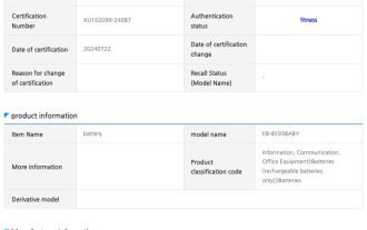 寧徳新エネルギー技術会社が製造、Samsung Galaxy S25 Ultra 携帯電話のバッテリーが露出
Jul 31, 2024 pm 04:57 PM
寧徳新エネルギー技術会社が製造、Samsung Galaxy S25 Ultra 携帯電話のバッテリーが露出
Jul 31, 2024 pm 04:57 PM
7月31日のニュースによると、テクノロジーメディアSamMobileは昨日(7月30日)ブログ記事を公開し、SafetyKorea認証ウェブサイトでSamsung Galaxy S25 Ultra携帯電話に適したバッテリー情報を発見したとのこと。公開情報によれば、今回公開されたバッテリーのモデルはEB-BS938ABYとEB-BS938ABEとなっているが、この2つのモデルの違いはまだ明らかになっていない。 fenye Samsung Galaxy S25 Ultra 携帯電話は、Galaxy Z Fold6 および Galaxy Z Flip 6 折りたたみ式携帯電話のデュアル バッテリー ソリューションを使用せず、シングル バッテリー設計を採用します。以前に報じられたところによると、サムスンはGalaxy S25 Ultra携帯電話のバッテリー仕様をアップグレードおよび最適化せず、引き続きバッテリー仕様を使用する予定です。
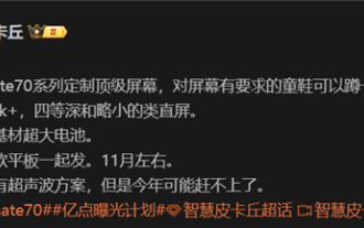 Huawei Mate 70シリーズの構成がリーク:全シリーズに1.5Kスクリーンと超大型バッテリーが搭載
Aug 08, 2024 pm 10:21 PM
Huawei Mate 70シリーズの構成がリーク:全シリーズに1.5Kスクリーンと超大型バッテリーが搭載
Aug 08, 2024 pm 10:21 PM
8月8日のニュースによると、Huawei Mate70シリーズの携帯電話の詳細な構成情報が最近公開され、このシリーズの携帯電話は2024年の第4四半期に発売される予定です。 1. レポートによると、Mate70 シリーズ全体は、画面の鮮明さに対するユーザーの要件を満たすために、カスタマイズされたトップレベルの 1.5K 解像度画面を使用する予定です。 Huawei Mate70Proと特大カップバージョンには4番目の奥行きのスクリーンが装備されると予想されていますが、標準のMate70はわずかに小さいストレートスクリーンデザインを採用する可能性があります。画面のアップグレードに加えて、Huawei Mate70シリーズには、新しいベース素材を使用した超大容量バッテリーも搭載され、Huawei Mateシリーズ携帯電話のバッテリー寿命の画期的な進歩を予告します。ファーウェイは超音波指紋ロック解除技術を開発しているが、今年のMate70シリーズにはこの機能は搭載されない。これ
