

ブートストラップの .nav と .navbar の違いの詳細な説明

ナビゲーション バーは、Bootstrap Web サイトの優れた機能であり、顕著な機能です。ナビゲーション バーは、アプリまたは Web サイトのナビゲーション ヘッダーの応答性の高い基本コンポーネントとして機能します。ナビゲーション バーは、モバイル ビューポートでは折りたたまれ、使用可能なビューポートの幅が増加するにつれて水平に広がります。 Bootstrap ナビゲーション バーの中核となるナビゲーション バーには、サイト名と基本的なナビゲーション定義スタイルが含まれています。この記事では、ブートストラップ ナビゲーション バーの .nav と .navbar の違いについて詳しく説明します。これが非常に優れていると思います。皆さんの参考になれば幸いです。
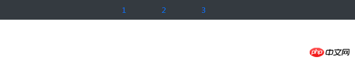
1. ul と li で構成される単純なナビゲーション:
<ul class="nav nav-pills justify-content-center bg-dark nav-dark">
    <li class="nav-item">
      <a href="#" rel="external nofollow" rel="external nofollow" rel="external nofollow" rel="external nofollow" rel="external nofollow" rel="external nofollow" rel="external nofollow" rel="external nofollow" rel="external nofollow" rel="external nofollow" rel="external nofollow" rel="external nofollow" rel="external nofollow" rel="external nofollow" rel="external nofollow" rel="external nofollow" rel="external nofollow" rel="external nofollow" rel="external nofollow" rel="external nofollow" class="nav-link">1</a>
    </li>
    <li class="nav-item">
      <a href="#" rel="external nofollow" rel="external nofollow" rel="external nofollow" rel="external nofollow" rel="external nofollow" rel="external nofollow" rel="external nofollow" rel="external nofollow" rel="external nofollow" rel="external nofollow" rel="external nofollow" rel="external nofollow" rel="external nofollow" rel="external nofollow" rel="external nofollow" rel="external nofollow" rel="external nofollow" rel="external nofollow" rel="external nofollow" rel="external nofollow" class="nav-link">2</a>
    </li>
    <li class="nav-item">
      <a href="#" rel="external nofollow" rel="external nofollow" rel="external nofollow" rel="external nofollow" rel="external nofollow" rel="external nofollow" rel="external nofollow" rel="external nofollow" rel="external nofollow" rel="external nofollow" rel="external nofollow" rel="external nofollow" rel="external nofollow" rel="external nofollow" rel="external nofollow" rel="external nofollow" rel="external nofollow" rel="external nofollow" rel="external nofollow" rel="external nofollow" class="nav-link">3</a>
    </li>
  </ul>


//解析:.nav .nav-item .nav-link表示ul li是导航——.nav-pills表示胶囊状导航——.bg-dark/.nav-dark表示黑底白字——.justify-content-center表示导航栏在浏览器上居中显示
はブラウザ上で次のように表示されます:
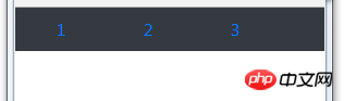
ブラウザ ウィンドウが縮小されると、次のように表示されます:
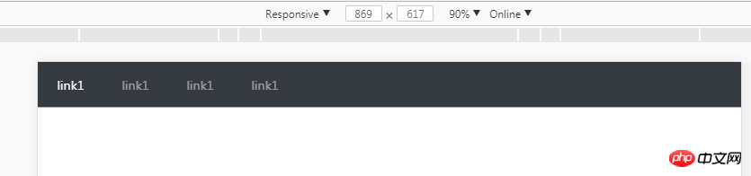
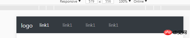
2. ナビゲーション バー - < ;nav> ラベルの Class="navbar navbar-expand-sm" —
- の class="navbar-nav" —
- の class="nav-item"
コードは次のとおりです。
<nav class="navbar navbar-expand-sm bg-dark navbar-dark">
  <ul class="navbar-nav">
    <li class="nav-item active">
      <a href="#" rel="external nofollow" rel="external nofollow" rel="external nofollow" rel="external nofollow" rel="external nofollow" rel="external nofollow" rel="external nofollow" rel="external nofollow" rel="external nofollow" rel="external nofollow" rel="external nofollow" rel="external nofollow" rel="external nofollow" rel="external nofollow" rel="external nofollow" rel="external nofollow" rel="external nofollow" rel="external nofollow" rel="external nofollow" rel="external nofollow" class="nav-link">link1</a>
    </li>
    <li class="nav-item">
      <a href="#" rel="external nofollow" rel="external nofollow" rel="external nofollow" rel="external nofollow" rel="external nofollow" rel="external nofollow" rel="external nofollow" rel="external nofollow" rel="external nofollow" rel="external nofollow" rel="external nofollow" rel="external nofollow" rel="external nofollow" rel="external nofollow" rel="external nofollow" rel="external nofollow" rel="external nofollow" rel="external nofollow" rel="external nofollow" rel="external nofollow" class="nav-link">link1</a>
    </li>
  </ul>
</nav>
通常のウィンドウ 次のように表示されます:
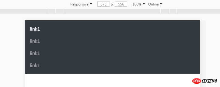
縮小されたウィンドウが 576 ピクセル未満の場合:
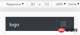
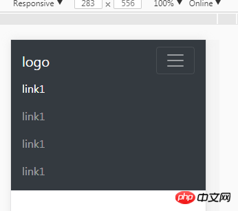
3. ナビゲーション バーを折りたたむ
ウィンドウが 576 ピクセル未満の場合、単なるプログラミング垂直ウィンドウではありませんナビゲーション; ボタン ボタンとして表示されます。ナビゲーション リンク 非表示にする場合は、ボタンをクリックしてください:
<nav class="navbar navbar-expand-sm bg-dark navbar-dark fixed-top">
  <a href="#" rel="external nofollow" rel="external nofollow" rel="external nofollow" rel="external nofollow" rel="external nofollow" rel="external nofollow" rel="external nofollow" rel="external nofollow" rel="external nofollow" rel="external nofollow" rel="external nofollow" rel="external nofollow" rel="external nofollow" rel="external nofollow" rel="external nofollow" rel="external nofollow" rel="external nofollow" rel="external nofollow" rel="external nofollow" rel="external nofollow" class="navbar-brand">
      <img src="" alt="logo" style="width:70px;height:30px;">
  </a>
  <button class="navbar-toggler" type="button" data-toggle="collapse" data-target="#collapsible">
    <span class="navbar-toggler-icon"></span>
  </button>
  <p class="collapse navbar-collapse" id="collapsible">
  <ul class="navbar-nav">
    <li class="nav-item active">
      <a href="#" rel="external nofollow" rel="external nofollow" rel="external nofollow" rel="external nofollow" rel="external nofollow" rel="external nofollow" rel="external nofollow" rel="external nofollow" rel="external nofollow" rel="external nofollow" rel="external nofollow" rel="external nofollow" rel="external nofollow" rel="external nofollow" rel="external nofollow" rel="external nofollow" rel="external nofollow" rel="external nofollow" rel="external nofollow" rel="external nofollow" class="nav-link">link1</a>
    </li>
    <li class="nav-item">
      <a href="#" rel="external nofollow" rel="external nofollow" rel="external nofollow" rel="external nofollow" rel="external nofollow" rel="external nofollow" rel="external nofollow" rel="external nofollow" rel="external nofollow" rel="external nofollow" rel="external nofollow" rel="external nofollow" rel="external nofollow" rel="external nofollow" rel="external nofollow" rel="external nofollow" rel="external nofollow" rel="external nofollow" rel="external nofollow" rel="external nofollow" class="nav-link">link1</a>
    </li>
    <li class="nav-item">
      <a href="#" rel="external nofollow" rel="external nofollow" rel="external nofollow" rel="external nofollow" rel="external nofollow" rel="external nofollow" rel="external nofollow" rel="external nofollow" rel="external nofollow" rel="external nofollow" rel="external nofollow" rel="external nofollow" rel="external nofollow" rel="external nofollow" rel="external nofollow" rel="external nofollow" rel="external nofollow" rel="external nofollow" rel="external nofollow" rel="external nofollow" class="nav-link">link1</a>
    </li>
    <li class="nav-item">
      <a href="#" rel="external nofollow" rel="external nofollow" rel="external nofollow" rel="external nofollow" rel="external nofollow" rel="external nofollow" rel="external nofollow" rel="external nofollow" rel="external nofollow" rel="external nofollow" rel="external nofollow" rel="external nofollow" rel="external nofollow" rel="external nofollow" rel="external nofollow" rel="external nofollow" rel="external nofollow" rel="external nofollow" rel="external nofollow" rel="external nofollow" class="nav-link">link1</a>
    </li>
  </ul>

</nav>
//注: .navbar-brand は、ウィンドウが 576 より大きい場合です。 、次のように表示されます:
ウィンドウが 576 より小さい場合、次のように表示されます:
 コードは以下の通りです:
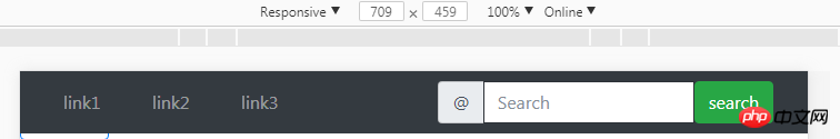
<nav class="navbar navbar-expand-sm bg-dark navbar-dark fixed-top">
  <a href="#" rel="external nofollow" rel="external nofollow" rel="external nofollow" rel="external nofollow" rel="external nofollow" rel="external nofollow" rel="external nofollow" rel="external nofollow" rel="external nofollow" rel="external nofollow" rel="external nofollow" rel="external nofollow" rel="external nofollow" rel="external nofollow" rel="external nofollow" rel="external nofollow" rel="external nofollow" rel="external nofollow" rel="external nofollow" rel="external nofollow" class="navbar-brand">
      <img src="" alt="logo" style="width:70px;height:30px;">
  </a>
  <button class="navbar-toggler" type="button" data-toggle="collapse" data-target="#collapsible">
    <span class="navbar-toggler-icon"></span>
  </button>
  <p class="collapse navbar-collapse" id="collapsible">
  <ul class="navbar-nav">
    <li class="nav-item active">
      <a href="#" rel="external nofollow" rel="external nofollow" rel="external nofollow" rel="external nofollow" rel="external nofollow" rel="external nofollow" rel="external nofollow" rel="external nofollow" rel="external nofollow" rel="external nofollow" rel="external nofollow" rel="external nofollow" rel="external nofollow" rel="external nofollow" rel="external nofollow" rel="external nofollow" rel="external nofollow" rel="external nofollow" rel="external nofollow" rel="external nofollow" class="nav-link">link1</a>
    </li>
    <li class="nav-item">
      <a href="#" rel="external nofollow" rel="external nofollow" rel="external nofollow" rel="external nofollow" rel="external nofollow" rel="external nofollow" rel="external nofollow" rel="external nofollow" rel="external nofollow" rel="external nofollow" rel="external nofollow" rel="external nofollow" rel="external nofollow" rel="external nofollow" rel="external nofollow" rel="external nofollow" rel="external nofollow" rel="external nofollow" rel="external nofollow" rel="external nofollow" class="nav-link">link1</a>
    </li>
    <li class="nav-item">
      <a href="#" rel="external nofollow" rel="external nofollow" rel="external nofollow" rel="external nofollow" rel="external nofollow" rel="external nofollow" rel="external nofollow" rel="external nofollow" rel="external nofollow" rel="external nofollow" rel="external nofollow" rel="external nofollow" rel="external nofollow" rel="external nofollow" rel="external nofollow" rel="external nofollow" rel="external nofollow" rel="external nofollow" rel="external nofollow" rel="external nofollow" class="nav-link">link1</a>
    </li>
    <li class="nav-item">
      <a href="#" rel="external nofollow" rel="external nofollow" rel="external nofollow" rel="external nofollow" rel="external nofollow" rel="external nofollow" rel="external nofollow" rel="external nofollow" rel="external nofollow" rel="external nofollow" rel="external nofollow" rel="external nofollow" rel="external nofollow" rel="external nofollow" rel="external nofollow" rel="external nofollow" rel="external nofollow" rel="external nofollow" rel="external nofollow" rel="external nofollow" class="nav-link">link1</a>
    </li>
  </ul>
  <form class="form-inline">
        <p class="input-group">
          <span class="input-group-addon">@</span>
          <input list="dl" type="text" class="form-control" placeholder="Search"/>
          <datalist id="dl">
            <option value="IE"></option>
            <option value="Firefox"></option>
            <option value="chrome"></option>
            <option value="safari"></option>
          </datalist>
        </p>

        <button class="btn btn-success" type="submit">search</button>
      </form>
</nav>
写真のように、ナビゲーションバーのフォームを右揃えにして一番右に移動させるにはどうすればよいでしょうか? ? ? ? ? float:eight も機能するはずです。 。
emmmm....私は上記の解決策を知っています。グリッドシステムを使用して、ulとliをそれぞれ左側に、フォームを右側に配置してから、フォームFloatを追加します。そうです、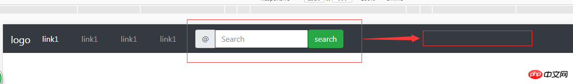 コードは次のとおりです:
<p class="container-fluid">
  <p class="row">
    <!-- 导航栏 -->
    <nav class="navbar fixed-top navbar-expand-sm bg-dark navbar-dark">
      <p class="col-lg-4">
      <ul class="navbar-nav">
        <li class="nav-item">
          <a class="nav-link" href="#" rel="external nofollow" rel="external nofollow" rel="external nofollow" rel="external nofollow" rel="external nofollow" rel="external nofollow" rel="external nofollow" rel="external nofollow" rel="external nofollow" rel="external nofollow" rel="external nofollow" rel="external nofollow" rel="external nofollow" rel="external nofollow" rel="external nofollow" rel="external nofollow" rel="external nofollow" rel="external nofollow" rel="external nofollow" rel="external nofollow" >link1</a>
        </li>
        <li class="nav-item">
          <a class="nav-link" href="#" rel="external nofollow" rel="external nofollow" rel="external nofollow" rel="external nofollow" rel="external nofollow" rel="external nofollow" rel="external nofollow" rel="external nofollow" rel="external nofollow" rel="external nofollow" rel="external nofollow" rel="external nofollow" rel="external nofollow" rel="external nofollow" rel="external nofollow" rel="external nofollow" rel="external nofollow" rel="external nofollow" rel="external nofollow" rel="external nofollow" >link2</a>
        </li>
        <li class="nav-item">
          <a class="nav-link" href="#" rel="external nofollow" rel="external nofollow" rel="external nofollow" rel="external nofollow" rel="external nofollow" rel="external nofollow" rel="external nofollow" rel="external nofollow" rel="external nofollow" rel="external nofollow" rel="external nofollow" rel="external nofollow" rel="external nofollow" rel="external nofollow" rel="external nofollow" rel="external nofollow" rel="external nofollow" rel="external nofollow" rel="external nofollow" rel="external nofollow" >link3</a>
        </li>
      </ul>
      </p>
<!-- 导航栏表单与按钮 -->
    <p class="col-lg-8">
      <form class="form-inline" style="float:right;">
        <p class="input-group">
          <span class="input-group-addon">@</span>
          <input list="dl" type="text" class="form-control" placeholder="Search"/>
          <datalist id="dl">
            <option value="IE"></option>
            <option value="Firefox"></option>
            <option value="chrome"></option>
            <option value="safari"></option>
          </datalist>
          <button class="btn btn-success" type="submit">search</button>
        </p>
      </form>
      </p>
    </nav>
    </p>
      </p>
 関連する推奨事項:
ブートストラップナビゲーションバーの各要素(フォーム、ボタン、テキスト)の操作方法_JavaScriptスキル
ブートストラップの使い方の詳細な説明ドロップダウン検索プラグイン
以上がブートストラップの .nav と .navbar の違いの詳細な説明の詳細内容です。詳細については、PHP 中国語 Web サイトの他の関連記事を参照してください。

ホットAIツール

Undresser.AI Undress
リアルなヌード写真を作成する AI 搭載アプリ

AI Clothes Remover
写真から衣服を削除するオンライン AI ツール。

Undress AI Tool
脱衣画像を無料で

Clothoff.io
AI衣類リムーバー

Video Face Swap
完全無料の AI 顔交換ツールを使用して、あらゆるビデオの顔を簡単に交換できます。

人気の記事
ホットツール

メモ帳++7.3.1
使いやすく無料のコードエディター

SublimeText3 中国語版
中国語版、とても使いやすい

ゼンドスタジオ 13.0.1
強力な PHP 統合開発環境

ドリームウィーバー CS6
ビジュアル Web 開発ツール

SublimeText3 Mac版
神レベルのコード編集ソフト(SublimeText3)
ホットトピック
 7862
7862
 15
1649
14
1404
52
1300
25
1242
29
15
1649
14
1404
52
1300
25
1242
29

 VueでBootstrapの使用方法
Apr 07, 2025 pm 11:33 PM
VueでBootstrapの使用方法
Apr 07, 2025 pm 11:33 PM
vue.jsでBootstrapを使用すると、5つのステップに分かれています。ブートストラップをインストールします。 main.jsにブートストラップをインポートしますブートストラップコンポーネントをテンプレートで直接使用します。オプション:カスタムスタイル。オプション:プラグインを使用します。
 ブートストラップ検索バーを取得する方法
Apr 07, 2025 pm 03:33 PM
ブートストラップ検索バーを取得する方法
Apr 07, 2025 pm 03:33 PM
ブートストラップを使用して検索バーの値を取得する方法:検索バーのIDまたは名前を決定します。 JavaScriptを使用してDOM要素を取得します。要素の値を取得します。必要なアクションを実行します。
 ブートストラップの垂直センタリングを行う方法
Apr 07, 2025 pm 03:21 PM
ブートストラップの垂直センタリングを行う方法
Apr 07, 2025 pm 03:21 PM
ブートストラップを使用して垂直センタリングを実装します。FlexBoxメソッド:D-Flex、Justify-Content-Center、Align-Items-Centerクラスを使用して、FlexBoxコンテナに要素を配置します。 ALIGN-ITEMS-CENTERクラス方法:FlexBoxをサポートしていないブラウザの場合、親要素の高さが定義されている場合、Align-Items-Centerクラスを使用します。
 ブートストラップにスプリットラインを書く方法
Apr 07, 2025 pm 03:12 PM
ブートストラップにスプリットラインを書く方法
Apr 07, 2025 pm 03:12 PM
ブートストラップスプリットラインを作成するには2つの方法があります。タグを使用して、水平方向のスプリットラインを作成します。 CSS Borderプロパティを使用して、カスタムスタイルのスプリットラインを作成します。
 ブートストラップのフレームワークをセットアップする方法
Apr 07, 2025 pm 03:27 PM
ブートストラップのフレームワークをセットアップする方法
Apr 07, 2025 pm 03:27 PM
Bootstrapフレームワークをセットアップするには、次の手順に従う必要があります。1。CDNを介してブートストラップファイルを参照してください。 2。独自のサーバーでファイルをダウンロードしてホストします。 3。HTMLにブートストラップファイルを含めます。 4.必要に応じてSASS/LESSをコンパイルします。 5。カスタムファイルをインポートします(オプション)。セットアップが完了したら、Bootstrapのグリッドシステム、コンポーネント、スタイルを使用して、レスポンシブWebサイトとアプリケーションを作成できます。
 ブートストラップに写真を挿入する方法
Apr 07, 2025 pm 03:30 PM
ブートストラップに写真を挿入する方法
Apr 07, 2025 pm 03:30 PM
ブートストラップに画像を挿入する方法はいくつかあります。HTMLIMGタグを使用して、画像を直接挿入します。ブートストラップ画像コンポーネントを使用すると、レスポンシブ画像とより多くのスタイルを提供できます。画像サイズを設定し、IMG-Fluidクラスを使用して画像を適応可能にします。 IMGボーダークラスを使用して、境界線を設定します。丸い角を設定し、IMGラウンドクラスを使用します。影を設定し、影のクラスを使用します。 CSSスタイルを使用して、画像をサイズ変更して配置します。背景画像を使用して、背景イメージCSSプロパティを使用します。
 ブートストラップボタンの使用方法
Apr 07, 2025 pm 03:09 PM
ブートストラップボタンの使用方法
Apr 07, 2025 pm 03:09 PM
ブートストラップボタンの使用方法は?ブートストラップCSSを導入してボタン要素を作成し、ブートストラップボタンクラスを追加してボタンテキストを追加します

