

Angular でモーダル ボックスをポップアップする 2 つの方法

この記事では、Angular でモーダル ボックスをポップアップする 2 つの方法を主に紹介します。これは非常に優れており、必要な方は参考にしていただければ幸いです。
ブログを始める前に、まず ngx-bootstrap-modal をインストールする必要があります
npm install ngx-bootstrap-modal --save
そうしないと、モーダル ボックスの効果が見づらくなり、吐きたくなるでしょう
1. ポップアップ方法 1 (この方法は、 https://github .com/cipchk/ngx-bootstrap-modal)
1.アラートポップアップボックス
(1)デモディレクトリ
--------app.component.ts
- ------- app.component.html
--------app.module.ts
--------詳細(フォルダ)
------ -----detail .component.ts
---------------detail.component.html
(2)デモコード
app.module.tsは、必要なBootstrapModalModuleとModalModuleをインポートします。そして登録します
//app.module.ts
import { BrowserModule } from '@angular/platform-browser';
import { NgModule } from '@angular/core';
//这种模态框只需要导入下面这两个
import { BootstrapModalModule } from 'ngx-bootstrap-modal';
import { ModalModule } from 'ngx-bootstrap/modal';
import { AppComponent } from './app.component';
import { DetailComponent } from './detail/detail.component';
@NgModule({
 declarations: [
 AppComponent,
 DetailComponent
 ],
 imports: [
 BrowserModule,
 BootstrapModalModule
 ],
 providers: [],
 entryComponents: [
 DetailComponent
 ],
 bootstrap: [AppComponent]
})
export class AppModule { }app.component.html モーダルボックスをポップアップできるボタンを作成します
<p class="container">
 <p class="row">
 <button type="button" class="btn btn-primary" (click)="showAlert()">alert模态框</button>
 </p>
</p>
app.component.ts このボタンのアクションを記述します showAlert()
import { Component } from '@angular/core';
import { DialogService } from "ngx-bootstrap-modal";
import { DetailComponent } from './detail/detail.component'
@Component({
 selector: 'app-root',
 templateUrl: './app.component.html',
 styleUrls: ['./app.component.css']
})
export class AppComponent {
 title = 'app';
 constructor(public dialogService: DialogService) {
 }
 showAlert() {
  this.dialogService.addDialog(DetailComponent, { title: 'Alert title!', message: 'Alert message!!!' });
 }
}detail.component.html レイアウトを記述しますアラート ポップアップ ボックスの
<p class="modal-dialog">
 <p class="modal-content">
  <p class="modal-header">
   <button type="button" class="close" (click)="close()" >×</button>
   <h4 class="modal-title">{{title}}</h4>
  </p>
  <p class="modal-body">
   这是alert弹框
  </p>
  <p class="modal-footer">
   <button type="button" class="btn btn-primary" (click)="close()">取消</button>
   <button type="button" class="btn btn-default">确定</button>
  </p>
 </p>
</p>detail.component .ts を使用してモーダル ボックス コンポーネントを作成するには、コンポーネントを作成する必要があります。その後、ngx-bootstrap-model が起動をガイドします
このコンポーネントについては、次のことを継承する必要がありますDialogComponent
T 外部パラメーターはモーダル ボックスのタイプに渡されます。
T1 モーダル ボックスの戻り値の型。
したがって、DialogService は DialogComponent のコンストラクター パラメーターである必要があります。
import { Component } from '@angular/core';
import { DialogComponent, DialogService } from 'ngx-bootstrap-modal';
export interface AlertModel {
 title: string;
 message: string;
}
@Component({
 selector: 'alert',
 templateUrl: './detail.component.html',
 styleUrls: ['./detail.component.css']
})
export class DetailComponent extends DialogComponent<AlertModel, null> implements AlertModel {
 title: string;
 message: string;
 constructor(dialogService: DialogService) {
 super(dialogService);
 }
}2.ポップアップボックスの確認
(1)デモディレクトリ
--------app.component.ts
--------app.component.html
--- -- ---app.module.ts
----------confirm(フォルダ)
-------------confirm.component.ts
-------- - ---confirm.component.html
(2)デモコード
app.module.ts は必要な BootstrapModalModule と ModalModule をインポートして登録します。これらはアラート ポップアップ ボックスと同じです。メソッド 1 のポップアップ メソッド
//app.module.ts
import { BrowserModule } from '@angular/platform-browser';
import { NgModule } from '@angular/core';
//这种模态框只需要导入下面这两个
import { BootstrapModalModule } from 'ngx-bootstrap-modal';
import { ModalModule } from 'ngx-bootstrap/modal';
import { AppComponent } from './app.component';
import { DetailComponent } from './detail/detail.component';
@NgModule({
 declarations: [
 AppComponent,
 DetailComponent
 ],
 imports: [
 BrowserModule,
 BootstrapModalModule
 ],
 providers: [],
 entryComponents: [
 DetailComponent
 ],
 bootstrap: [AppComponent]
})
export class AppModule { }app.component.html モーダル ボックスをポップアップできるボタンを作成します
<p class="container">
 <p class="row">
 <button type="button" class="btn btn-primary" (click)="showConfirm()">modal模态框</button>
 </p>
</p>
app.component.ts このボタンのアクション showconfirm() を記述します
import { Component } from '@angular/core';
import { DialogService } from "ngx-bootstrap-modal";
import { ConfirmComponent } from './confirm/confirm.component'
@Component({
 selector: 'app-root',
 templateUrl: './app.component.html',
 styleUrls: ['./app.component.css']
})
export class AppComponent {
 title = 'app';
 constructor(public dialogService: DialogService,private modalService: BsModalService) {
 }
 showConfirm() {
  this.dialogService.addDialog(ConfirmComponent, {
   title: 'Confirmation',
   message: 'bla bla'
  })
   .subscribe((isConfirmed) => {
   });
 }
}confirm.component .html 確認ポップアップボックスのレイアウトを記述します
<p class="modal-dialog">
 <p class="modal-content">
  <p class="modal-header">
   <button type="button" class="close" (click)="close()" >×</button>
   <h4 class="modal-title">{{title}}</h4>
  </p>
  <p class="modal-body">
   这是confirm弹框
  </p>
  <p class="modal-footer">
   <button type="button" class="btn btn-primary" (click)="close()">取消</button>
   <button type="button" class="btn btn-default">确定</button>
  </p>
 </p>
</p>verify.component.ts はモーダルボックスコンポーネントを作成します
(1)デモディレクトリ
---- ----app.component.ts
------ -app.component.html
(2)デモコード
ポップアップ ボックスには 3 つの形式のアラート確認プロンプトも含まれており、すべていくつかの組み込みスタイルが含まれています
app .module.ts
import { Component } from '@angular/core';
import { DialogComponent, DialogService } from 'ngx-bootstrap-modal';
export interface ConfirmModel {
 title:string;
 message:any;
}
@Component({
 selector: 'confirm',
 templateUrl: './confirm.component.html',
 styleUrls: ['./confirm.component.css']
})
export class ConfirmComponent extends DialogComponent<ConfirmModel, boolean> implements ConfirmModel {
 title: string;
 message: any;
 constructor(dialogService: DialogService) {
 super(dialogService);
 }
 confirm() {
 // on click on confirm button we set dialog result as true,
 // ten we can get dialog result from caller code
 this.close(true);
 }
 cancel() {
 this.close(false);
 }
}app.component.html は非常にシンプルで、ボタン 1 つだけです
import { BrowserModule } from '@angular/platform-browser';
import { NgModule } from '@angular/core';
import { BootstrapModalModule } from 'ngx-bootstrap-modal';
import { ModalModule } from 'ngx-bootstrap/modal';
import { AppComponent } from './app.component';
@NgModule({
 declarations: [
 AppComponent
 ],
 imports: [
 BrowserModule,
 BootstrapModalModule,
 ModalModule.forRoot()
 ],
 providers: [],
 bootstrap: [AppComponent]
})
export class AppModule { }app.component。 ts は非常にシンプルで、コンポーネントのレイアウトを記述する必要さえありません。アイコンやサイズなどのパラメーターを渡すだけです。
<p class="container">
 <p class="row">
 <button type="button" class="btn btn-default" (click)="show()">内置</button>
 </p>
</p>
2. ポップアップ メソッド 2 (このメソッドは https:/ からのものです) /valor-software.com/ngx-bootstrap/#/modals)
前の方法と同じですが、最初に ngx-bootstrap-modal をインストールしてから、ブートストラップ スタイルの Table
1.demo ディレクトリをインポートします
-- ------app.component.ts
----------app.component.html--------app.module.ts
2.デモコード
app.module .ts は対応するモジュールをインポートして登録します
import { Component } from '@angular/core';
import { DialogService, BuiltInOptions } from "ngx-bootstrap-modal";
@Component({
 selector: 'app-root',
 templateUrl: './app.component.html',
 styleUrls: ['./app.component.css']
})
export class AppComponent {
 title = 'app';
 constructor(public dialogService: DialogService) {
 }
 show(){
  this.dialogService.show(<BuiltInOptions>{
   content: '保存成功',
   icon: 'success',
   size: 'sm',
   showCancelButton: false
  })
 }
}app.component.ts
//app.module.ts
import { BrowserModule } from '@angular/platform-browser';
import { NgModule } from '@angular/core';
import { ModalModule } from 'ngx-bootstrap/modal';
import { AppComponent } from './app.component';
@NgModule({
 declarations: [
 AppComponent
 ],
 imports: [
 BrowserModule,
 ModalModule.forRoot()
 ],
 providers: [],
 entryComponents: [
 ],
 bootstrap: [AppComponent]
})
export class AppModule { }app.component.html
import { Component,TemplateRef } from '@angular/core';
import { BsModalService } from 'ngx-bootstrap/modal';
import { BsModalRef } from 'ngx-bootstrap/modal/modal-options.class';
@Component({
 selector: 'app-root',
 templateUrl: './app.component.html',
 styleUrls: ['./app.component.css']
})
export class AppComponent {
 title = 'app';
 public modalRef: BsModalRef;
 constructor(private modalService: BsModalService) {
 }
 showSecond(template: TemplateRef<any>){//传入的是一个组件
  this.modalRef = this.modalService.show(template,{class: 'modal-lg'});//在这里通过BsModalService里面的show方法把它显示出来
 };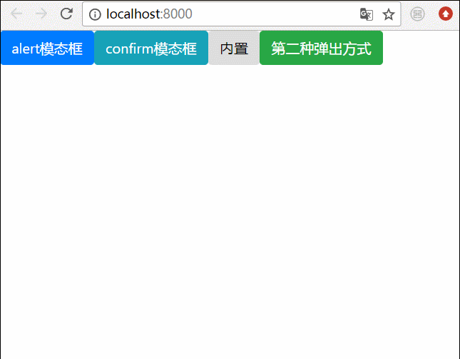
}3. 最終的な効果
上記をすべて結合します。すべてのポップアップ ボックスを一緒に書き込みます。効果は次のとおりです
 関連する推奨事項:
以上がAngular でモーダル ボックスをポップアップする 2 つの方法の詳細内容です。詳細については、PHP 中国語 Web サイトの他の関連記事を参照してください。

ホットAIツール

Undresser.AI Undress
リアルなヌード写真を作成する AI 搭載アプリ

AI Clothes Remover
写真から衣服を削除するオンライン AI ツール。

Undress AI Tool
脱衣画像を無料で

Clothoff.io
AI衣類リムーバー

Video Face Swap
完全無料の AI 顔交換ツールを使用して、あらゆるビデオの顔を簡単に交換できます。

人気の記事
ホットツール

メモ帳++7.3.1
使いやすく無料のコードエディター

SublimeText3 中国語版
中国語版、とても使いやすい

ゼンドスタジオ 13.0.1
強力な PHP 統合開発環境

ドリームウィーバー CS6
ビジュアル Web 開発ツール

SublimeText3 Mac版
神レベルのコード編集ソフト(SublimeText3)
ホットトピック
 7755
7755
 15
1643
14
1399
52
1293
25
1234
29
15
1643
14
1399
52
1293
25
1234
29

 Ubuntu 24.04 に Angular をインストールする方法
Mar 23, 2024 pm 12:20 PM
Ubuntu 24.04 に Angular をインストールする方法
Mar 23, 2024 pm 12:20 PM
Angular.js は、動的アプリケーションを作成するための無料でアクセスできる JavaScript プラットフォームです。 HTML の構文をテンプレート言語として拡張することで、アプリケーションのさまざまな側面を迅速かつ明確に表現できます。 Angular.js は、コードの作成、更新、テストに役立つさまざまなツールを提供します。さらに、ルーティングやフォーム管理などの多くの機能も提供します。このガイドでは、Ubuntu24 に Angular をインストールする方法について説明します。まず、Node.js をインストールする必要があります。 Node.js は、ChromeV8 エンジンに基づく JavaScript 実行環境で、サーバー側で JavaScript コードを実行できます。ウブにいるために
 Angular Learning State Manager NgRx の詳細な説明
May 25, 2022 am 11:01 AM
Angular Learning State Manager NgRx の詳細な説明
May 25, 2022 am 11:01 AM
この記事では、Angular のステートマネージャー NgRx について深く理解し、NgRx の使用方法を紹介します。
 Angular のサーバーサイド レンダリング (SSR) について説明する記事
Dec 27, 2022 pm 07:24 PM
Angular のサーバーサイド レンダリング (SSR) について説明する記事
Dec 27, 2022 pm 07:24 PM
Angular Universal をご存知ですか?これは、Web サイトがより優れた SEO サポートを提供するのに役立ちます。
 フロントエンド開発に PHP と Angular を使用する方法
May 11, 2023 pm 04:04 PM
フロントエンド開発に PHP と Angular を使用する方法
May 11, 2023 pm 04:04 PM
インターネットの急速な発展に伴い、フロントエンド開発テクノロジーも常に改善され、反復されています。 PHP と Angular は、フロントエンド開発で広く使用されている 2 つのテクノロジーです。 PHP は、フォームの処理、動的ページの生成、アクセス許可の管理などのタスクを処理できるサーバー側スクリプト言語です。 Angular は、単一ページ アプリケーションの開発やコンポーネント化された Web アプリケーションの構築に使用できる JavaScript フレームワークです。この記事では、PHPとAngularをフロントエンド開発に使用する方法と、それらを組み合わせる方法を紹介します。
 Angular で Monaco エディターを使用する方法の簡単な分析
Oct 17, 2022 pm 08:04 PM
Angular で Monaco エディターを使用する方法の簡単な分析
Oct 17, 2022 pm 08:04 PM
Angularでモナコエディタを使用するにはどうすればよいですか?以下の記事は、最近業務で使用したangularでのmonaco-editorの使い方を記録したものですので、皆様のお役に立てれば幸いです。
 Angular の独立したコンポーネントの簡単な分析とその使用方法を説明します。
Jun 23, 2022 pm 03:49 PM
Angular の独立したコンポーネントの簡単な分析とその使用方法を説明します。
Jun 23, 2022 pm 03:49 PM
この記事では、Angular の独立コンポーネント、Angular で独立コンポーネントを作成する方法、および既存のモジュールを独立コンポーネントにインポートする方法について説明します。
 プロジェクトが大きすぎる場合はどうすればよいですか? Angular プロジェクトを合理的に分割するにはどうすればよいでしょうか?
Jul 26, 2022 pm 07:18 PM
プロジェクトが大きすぎる場合はどうすればよいですか? Angular プロジェクトを合理的に分割するにはどうすればよいでしょうか?
Jul 26, 2022 pm 07:18 PM
Angular プロジェクトが大きすぎます。適切に分割するにはどうすればよいですか?次の記事では、Angular プロジェクトを合理的に分割する方法を紹介します。
 Angular と Node を使用したトークンベースの認証
Sep 01, 2023 pm 02:01 PM
Angular と Node を使用したトークンベースの認証
Sep 01, 2023 pm 02:01 PM
認証は、Web アプリケーションの最も重要な部分の 1 つです。このチュートリアルでは、トークンベースの認証システムと、それが従来のログイン システムとどのように異なるかについて説明します。このチュートリアルを終えると、Angular と Node.js で書かれた完全に動作するデモが表示されます。従来の認証システム トークンベースの認証システムに進む前に、従来の認証システムを見てみましょう。ユーザーはログイン フォームにユーザー名とパスワードを入力し、[ログイン] をクリックします。リクエストを行った後、データベースにクエリを実行してバックエンドでユーザーを認証します。リクエストが有効な場合、データベースから取得したユーザー情報を使用してセッションが作成され、セッション情報が応答ヘッダーで返され、セッション ID がブラウザに保存されます。対象となるアプリケーションへのアクセスを提供します。
