

愛バージョンの読み込み効果を達成するための CSS

この記事では、純粋な CSS で愛バージョンの読み込みエフェクトを記述するためのサンプル コードに関する関連情報を主に紹介します。編集者が非常に優れていると考えたので、参考として共有します。編集者をフォローして見てみましょう。皆さんのお役に立てれば幸いです。
愛を持って待つことの効果は次のとおりです:
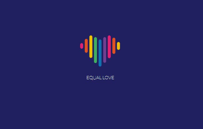
インターネット時代には非常に多くの Web サイトがあり、それぞれに独自のスタイルがありますが、どのようなスタイルがユーザーを滞在させて視聴させることができるでしょうか?読み込みに関する限り、多くの読み込み効果は同じスタイルです。ユーザーは Web サイトに頻繁にアクセスすることに慣れている可能性があります。読み込み時間が他の Web サイトよりも長いにもかかわらず、効果が同じであれば、Web サイトを閉じて移動する可能性があります。ただし、ローディング効果が独特で特徴的であれば、ユーザーがローディング効果を見たときに Web サイトが開かれる可能性があるため、ユーザーはすぐに Web サイトを閉じることはありません。
今日の愛バージョンの読み込みエフェクトは、純粋な CSS コードで記述されています。少しの労力と少量のコードだけでユーザーを維持できるので、ぜひ実行してみてください。
記事を共有する前に、編集者が私のフロントエンド学習グループをお勧めします: 542827633。このグループにはフロントエンドを学習している人がたくさんいます。クールな特殊効果を作成してフロントエンドの知識を学びたい場合は、編集者が参加することを歓迎します。 。エディターは、私が注意深くコンパイルしたフロントエンド チュートリアルなど、役立つソース コードをグループ内で随時共有します。興味のある友人の皆様を歓迎します。
html コード:
<p class="flex-container">
  <p class="unit">
    <p class="heart">
      <p class="heart-piece-0"></p>
      <p class="heart-piece-1"></p>
      <p class="heart-piece-2"></p>
      <p class="heart-piece-3"></p>
      <p class="heart-piece-4"></p>
      <p class="heart-piece-5"></p>
      <p class="heart-piece-6"></p>
      <p class="heart-piece-7"></p>
      <p class="heart-piece-8"></p>
    </p>
    <p>equal love</p>
  </p>
</p>css コード:
<style>
@import url("https://fonts.googleapis.com/css?family=Lato:100");
html,
body {
width: 100%;
height: 100%;
}
.flex-container {
width: 100%;
height: 100%;
position: relative;
display: -webkit-box;
display: -ms-flexbox;
display: flex;
-ms-flex-wrap: wrap;
flex-wrap: wrap;
-webkit-box-pack: center;
-ms-flex-pack: center;
justify-content: center;
-webkit-box-align: center;
-ms-flex-align: center;
align-items: center;
}
body {
background-color: #262e6f;
}
.unit {
text-align: center;
}
.unit p {
margin-top: 100px;
font-family: 'Lato', sans-serif;
font-weight: 100;
text-transform: uppercase;
color: #fff;
}
.heart {
position: relative;
font-size: 0;
width: 138px;
}
[class*="heart-piece-"] {
position: absolute;
top: -5px;
width: 10px;
height: 10px;
border-radius: 5px;
}
.heart-piece-4 {
-webkit-animation: piece-4 3.2s infinite;
animation: piece-4 3.2s infinite;
}
.heart-piece-3,
.heart-piece-5 {
-webkit-animation: piece-3 3.2s infinite;
animation: piece-3 3.2s infinite;
}
.heart-piece-2,
.heart-piece-6 {
-webkit-animation: piece-2 3.2s infinite;
animation: piece-2 3.2s infinite;
}
.heart-piece-1,
.heart-piece-7 {
-webkit-animation: piece-1 3.2s infinite;
animation: piece-1 3.2s infinite;
}
.heart-piece-0,
.heart-piece-8 {
-webkit-animation: piece-0 3.2s infinite;
animation: piece-0 3.2s infinite;
}
.heart-piece-0 {
left: 0px;
-webkit-animation-delay: 0s;
animation-delay: 0s;
background-color: #ec2d73;
}
.heart-piece-1 {
left: 16px;
-webkit-animation-delay: 0.15s;
animation-delay: 0.15s;
background-color: #eb5324;
}
.heart-piece-2 {
left: 32px;
-webkit-animation-delay: 0.3s;
animation-delay: 0.3s;
background-color: #fdc800;
}
.heart-piece-3 {
left: 48px;
-webkit-animation-delay: 0.45s;
animation-delay: 0.45s;
background-color: #47b264;
}
.heart-piece-4 {
left: 64px;
-webkit-animation-delay: 0.6s;
animation-delay: 0.6s;
background-color: #1470bd;
}
.heart-piece-5 {
left: 80px;
-webkit-animation-delay: 0.75s;
animation-delay: 0.75s;
background-color: #76469a;
}
.heart-piece-6 {
left: 96px;
-webkit-animation-delay: 0.9s;
animation-delay: 0.9s;
background-color: #ec2d73;
}
.heart-piece-7 {
left: 112px;
-webkit-animation-delay: 1.05s;
animation-delay: 1.05s;
background-color: #eb5324;
}
.heart-piece-8 {
left: 128px;
-webkit-animation-delay: 1.2s;
animation-delay: 1.2s;
background-color: #fdc800;
}
@-webkit-keyframes piece-4 {
0%, 10%, 90%, 100% {
height: 10px;
top: -5px;
}
45%, 55% {
height: 94px;
top: -23px;
}
}
@keyframes piece-4 {
0%, 10%, 90%, 100% {
height: 10px;
top: -5px;
}
45%, 55% {
height: 94px;
top: -23px;
}
}
@-webkit-keyframes piece-3 {
0%, 10%, 90%, 100% {
height: 10px;
top: -5px;
}
45%, 55% {
height: 90px;
top: -31px;
}
}
@keyframes piece-3 {
0%, 10%, 90%, 100% {
height: 10px;
top: -5px;
}
45%, 55% {
height: 90px;
top: -31px;
}
}
@-webkit-keyframes piece-2 {
0%, 10%, 90%, 100% {
height: 10px;
top: -5px;
}
45%, 55% {
height: 80px;
top: -37px;
}
}
@keyframes piece-2 {
0%, 10%, 90%, 100% {
height: 10px;
top: -5px;
}
45%, 55% {
height: 80px;
top: -37px;
}
}
@-webkit-keyframes piece-1 {
0%, 10%, 90%, 100% {
height: 10px;
top: -5px;
}
45%, 55% {
height: 60px;
top: -31px;
}
}
@keyframes piece-1 {
0%, 10%, 90%, 100% {
height: 10px;
top: -5px;
}
45%, 55% {
height: 60px;
top: -31px;
}
}
@-webkit-keyframes piece-0 {
0%, 10%, 90%, 100% {
height: 10px;
top: -5px;
}
45%, 55% {
height: 30px;
top: -15px;
}
}
@keyframes piece-0 {
0%, 10%, 90%, 100% {
height: 10px;
top: -5px;
}
45%, 55% {
height: 30px;
top: -15px;
}
}
</style> 関連する推奨事項:
以上が愛バージョンの読み込み効果を達成するための CSSの詳細内容です。詳細については、PHP 中国語 Web サイトの他の関連記事を参照してください。

ホットAIツール

Undresser.AI Undress
リアルなヌード写真を作成する AI 搭載アプリ

AI Clothes Remover
写真から衣服を削除するオンライン AI ツール。

Undress AI Tool
脱衣画像を無料で

Clothoff.io
AI衣類リムーバー

AI Hentai Generator
AIヘンタイを無料で生成します。

人気の記事
ホットツール

メモ帳++7.3.1
使いやすく無料のコードエディター

SublimeText3 中国語版
中国語版、とても使いやすい

ゼンドスタジオ 13.0.1
強力な PHP 統合開発環境

ドリームウィーバー CS6
ビジュアル Web 開発ツール

SublimeText3 Mac版
神レベルのコード編集ソフト(SublimeText3)
ホットトピック
 7552
7552
 15
1382
52
83
11
22
93
15
1382
52
83
11
22
93

 HTML、CSS、およびJavaScriptの役割:コアの責任
Apr 08, 2025 pm 07:05 PM
HTML、CSS、およびJavaScriptの役割:コアの責任
Apr 08, 2025 pm 07:05 PM
HTMLはWeb構造を定義し、CSSはスタイルとレイアウトを担当し、JavaScriptは動的な相互作用を提供します。 3人はWeb開発で職務を遂行し、共同でカラフルなWebサイトを構築します。
 VueでBootstrapの使用方法
Apr 07, 2025 pm 11:33 PM
VueでBootstrapの使用方法
Apr 07, 2025 pm 11:33 PM
vue.jsでBootstrapを使用すると、5つのステップに分かれています。ブートストラップをインストールします。 main.jsにブートストラップをインポートしますブートストラップコンポーネントをテンプレートで直接使用します。オプション:カスタムスタイル。オプション:プラグインを使用します。
 ブートストラップにスプリットラインを書く方法
Apr 07, 2025 pm 03:12 PM
ブートストラップにスプリットラインを書く方法
Apr 07, 2025 pm 03:12 PM
ブートストラップスプリットラインを作成するには2つの方法があります。タグを使用して、水平方向のスプリットラインを作成します。 CSS Borderプロパティを使用して、カスタムスタイルのスプリットラインを作成します。

 ブートストラップのフレームワークをセットアップする方法
Apr 07, 2025 pm 03:27 PM
ブートストラップのフレームワークをセットアップする方法
Apr 07, 2025 pm 03:27 PM
Bootstrapフレームワークをセットアップするには、次の手順に従う必要があります。1。CDNを介してブートストラップファイルを参照してください。 2。独自のサーバーでファイルをダウンロードしてホストします。 3。HTMLにブートストラップファイルを含めます。 4.必要に応じてSASS/LESSをコンパイルします。 5。カスタムファイルをインポートします(オプション)。セットアップが完了したら、Bootstrapのグリッドシステム、コンポーネント、スタイルを使用して、レスポンシブWebサイトとアプリケーションを作成できます。
 ブートストラップに写真を挿入する方法
Apr 07, 2025 pm 03:30 PM
ブートストラップに写真を挿入する方法
Apr 07, 2025 pm 03:30 PM
ブートストラップに画像を挿入する方法はいくつかあります。HTMLIMGタグを使用して、画像を直接挿入します。ブートストラップ画像コンポーネントを使用すると、レスポンシブ画像とより多くのスタイルを提供できます。画像サイズを設定し、IMG-Fluidクラスを使用して画像を適応可能にします。 IMGボーダークラスを使用して、境界線を設定します。丸い角を設定し、IMGラウンドクラスを使用します。影を設定し、影のクラスを使用します。 CSSスタイルを使用して、画像をサイズ変更して配置します。背景画像を使用して、背景イメージCSSプロパティを使用します。
 ブートストラップボタンの使用方法
Apr 07, 2025 pm 03:09 PM
ブートストラップボタンの使用方法
Apr 07, 2025 pm 03:09 PM
ブートストラップボタンの使用方法は?ブートストラップCSSを導入してボタン要素を作成し、ブートストラップボタンクラスを追加してボタンテキストを追加します
 ブートストラップの日付を表示する方法
Apr 07, 2025 pm 03:03 PM
ブートストラップの日付を表示する方法
Apr 07, 2025 pm 03:03 PM
回答:ブートストラップの日付ピッカーコンポーネントを使用して、ページで日付を表示できます。手順:ブートストラップフレームワークを紹介します。 HTMLで日付セレクター入力ボックスを作成します。ブートストラップは、セレクターにスタイルを自動的に追加します。 JavaScriptを使用して、選択した日付を取得します。
