

css3で自転車のアニメーション効果を実現
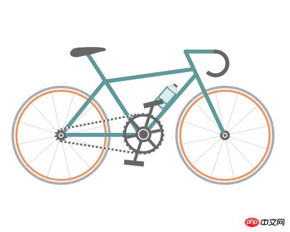
今回は、css3を使用して自転車のアニメーション効果を実現する方法について説明します。css3を使用して自転車のアニメーション効果を実現するための注意事項を以下に示します。
まず、実装されたレンダリング (静的) を見てみましょう:
ソースコードの例:
<!DOCTYPE html>
<html>
 <head>
  <meta charset="UTF-8">
  <title>自行车</title>
  <style type="text/css">
   * {
    margin: 0;
    padding: 0
   }

   ol,
   ul {
    list-style: none/*去掉圆点或数字*/
   }

   .cycle-outer {
    width: 534px;
    height: 260px;
    position: absolute;
    /*绝对定位*/
    top: 50%;
    /*距离顶部*/
    margin: -160px 0 0 -267px;
    /*距离外边距*/
    left: 50%;
   }

   .cycle-wrapper {
    width: 534px;
    height: 260px;
    margin: 0 auto;
    position: relative;
    /*相对定位*/
   }

   .cycle-wheel-front {
    /*前轮*/
    margin: 100px 0 0 330px;
   }

   .cycle-wheel-back {
    /*后轮*/
    margin: 100px 0 0 0px;
   }

   .cycle-wheel-outer {
    background: transparent;
    border: 5px solid #aaa;
    border-radius: 50%;
    /*画外轮圆圈*/
    width: 190px;
    height: 190px;
    position: absolute;
    margin-top: 5px;
    animation: wheel-rotate 2s linear infinite;
    /*定义动画*/
   }
   /*轮胎开始旋转*/
   @keyframes wheel-rotate {
    from {
     transform: rotate(0deg);
    }
    to {
     transform: rotate(360deg);
    }
   }

   .cycle-wheel-outer:after {
    /*插入内轮胎圆圈*/
    background: transparent;
    border: 4px solid #EF9058;
    border-radius: 50%;
    width: 176px;
    height: 176px;
    position: absolute;
    margin: 3px;
    content: "";
   }

   .spoke {
    /*开始画车轮线条*/
    position: absolute;
    width: 1px;
    height: 200px;
    background: #ccc;
    margin: -5px 0 0 95px;
    z-index: 0;
   }

   .spoke:after {
    /*在后面插入两条*/
    content: "";
    position: absolute;
    width: 1px;
    height: 200px;
    background: #ccc;
    transform: rotate(120deg);
   }

   .spoke:before {
    /*在前面插入两条*/
    content: "";
    position: absolute;
    width: 1px;
    height: 200px;
    background: #ccc;
    transform: rotate(240deg);
   }
   /*轮胎线条完成*/

   .spoke-container li:nth-child(2) {
    /*中心点旋转*/
    transform: rotate(30deg);
   }

   .inner-disc {
    /*画中心轴圆点*/
    background: #666;
    width: 20px;
    height: 20px;
    border-radius: 50%;
    position: absolute;
    left: 50%;
    margin: -10px 0 0 -10px;
    top: 50%;
   }
   /*.cycle-wheel-back .inner-disc:after {
    content: "";
    background: #666;
    width: 20px;
    height: 20px;
    border-radius: 50%;
    position: absolute;
    left: 50%;
    margin: -10px 0 0 -10px;
    top: 50%;
   }*/

   .inner-disc-2 {
    /*画轮胎中心轴的圆圈*/
    background: transparent;
    width: 6px;
    height: 6px;
    border: 2px solid #FFF;
    border-radius: 50%;
    position: absolute;
    left: 50%;
    margin: -5px 0 0 -5px;
    top: 50%;
   }

   .cycle-wheel-back .inner-disc-2:after {
    /*插入后轮轴心齿轮*/
    content: "";
    background: transparent;
    width: 18px;
    height: 18px;
    border-radius: 50%;
    position: absolute;
    left: 50%;
    margin: -13px 0 0 -13px;
    top: 50%;
    border: 4px dotted #666;
   }
   .cycle-body {
    margin-left: 125px;
   }
   .front-wheel-frame {/*前叉*/
    background: #5E999B;
    width: 8px;
    height: 180px;
    position: absolute;
    z-index: 2;
    transform: rotate(-25deg);
    margin: -72px 0 0 260px;
   }
   .top-frame {/*上管*/
    background: #5E999B;
    width: 180px;
    height: 8px;
    position: absolute;
    z-index: 2;
    margin: -20px 0 0 62px;
    transform: rotate(-8deg);
   }
   .front-frame {/*下管*/
    background: #5E999B;
    width: 8px;
    height: 160px;
    position: absolute;
    z-index: 2;
    transform: rotate(41deg);
    margin: -36px 0 0 189px;
   }
   .center-frame { /*坐杆*/
    background: #5E999B;
    width: 8px;
    height: 205px;
    position: absolute;
    z-index: 2;
    transform: rotate(-33deg);
    margin: -84px 0 0 75px;
   }
   .back-frame {/*后管*/
    background: #5E999B;
    width: 8px;
    height: 136px;
    position: absolute;
    z-index: 2;
    transform: rotate(39deg);
    margin: -23px 0 0 19px;
   }
   .bottom-frame {/*后叉or平管*/
    background: #5E999B;
    width: 159px;
    height: 8px;
    position: absolute;
    z-index: 2;
    margin: 100px 0 0 -16px;
   }
   .handlebar-front {/*车把*/
    width: 60px;
    height: 8px;
    background: #5E999B;
    z-index: 2;
    position: absolute;
    margin: -68px 0 0 222px;
    border-top-left-radius: 3px;
    border-bottom-left-radius: 3px;
   }
   .handlebar-curve {/*车把手*/
    width: 40px;
    height: 40px;
    border: 8px solid #666;
    border-top-right-radius: 100%;
    border-bottom-right-radius: 100%;
    border-bottom-left-radius: 100%;
    background: transparent;
    position: absolute;
    margin: -68px 0 0 258px;
    border-left: 8px solid transparent;
    border-top: 8px solid #666;
    border-bottom: 8px solid #666;
   }
   /*座垫*/
   .seat {
    width: 50px;
    height: 10px;
    background: #666;
    border-radius: 44%;
    position: absolute;
    margin: -73px 0 0 15px;
   }

   .seat:after {
    width: 0px;
    height: 0px;
    border-style: solid;
    border-width: 0 40px 16px 40px;
    border-color: transparent transparent #666 transparent;
    content: "";
    position: absolute;
    z-index: 3;
    transform: rotate(-12deg);
    position: absolute;
    border-radius: 100%;
    margin: 0 0 0 -26px;
   }
   .seat:before {
    width: 0px;
    height: 0px;
    border-style: solid;
    border-width: 0 40px 16px 40px;
    border-color: transparent transparent #666 transparent;
    content: "";
    position: absolute;
    z-index: 3;
    transform: rotate(179deg);
    position: absolute;
    border-radius: 100%;
    margin: 0 0 0 -26px;
   }
   .seat span {
    width: 32px;
    height: 19px;
    background: #666;
    border-radius: 100%;
    position: absolute;
    margin: 1px 0 0 -22px;
    transform: rotate(-11deg);
   }
   /*去掉中心轴的*/
   .chain-rotation {
    position: absolute;
    z-index: 16;
   }
   /*中心轴*/
   .chain-disc-inner {
    background: #666;
    width: 18px;
    height: 18px;
    border-radius: 50%;
    position: absolute;
    margin: 2px;
    z-index: 4;
   }
   .chain-disc-outer {
    background: #FFF;
    width: 22px;
    height: 22px;
    border: 5px solid #666;
    border-radius: 50%;
    position: absolute;
    margin: 87px 0 0 250px;
    z-index: 3;
    content: "";
   }
   /*牙盘*/
   .chain-rods {
    height: 70px;
    width: 6px;
    background: #666;
    position: absolute;
    margin: 67px 0 0 263px;
    z-index: 15;
    animation: wheel-rotate 2s linear infinite;
   }
   .chain-rods:before {
    content: "";
    height: 70px;
    width: 6px;
    background: #666;
    position: absolute;
    transform: rotate(120deg);
   }
   .chain-rods:after {
    content: "";
    height: 70px;
    width: 6px;
    background: #666;
    position: absolute;
    transform: rotate(240deg);
    -webkit-transform: rotate(240deg);
    -moz-transform: rotate(240deg);
   }
   .outer-axle {
    height: 70px;
    width: 70px;
    border-radius: 50%;
    background: transparent;
    border: 5px solid #666;
    position: absolute;
    margin: 62px 0 0 226px;
    z-index: 3;
   }

   .outer-axle:after {
    content: "";
    height: 74px;
    width: 74px;
    border-radius: 50%;
    background: transparent;
    border: 5px dotted #666;
    margin: -7px;
    position: absolute;
    z-index: 3;
    animation: wheel-rotate 2s linear infinite;
   }
   /*车链子*/
   .chain-up {
    background-color: transparent;
    background-size: 8px 2px;
    background-position: 0 0, 30px 30px;
    width: 155px;
    height: 4px;
    position: absolute;
    z-index: 9;
    background: #EEE;
    transform: rotate(-11deg);
    margin: 76px 0 0 98px;
   }
   .chain-up:before {
    content: "";
    background-color: transparent;
    background-image: linear-gradient(90deg, #666 25%, transparent 25%, transparent 75%, #666 75%, #666);
    background-size: 8px 2px;
    background-position: 0 0, 30px 30px;
    width: 155px;
    height: 4px;
    animation: chainUp 2s linear infinite;
    position: absolute;
    z-index: 10;
   }
   .chain-bottom {
    background-color: transparent;
    background-size: 8px 2px;
    background-position: 0 0, 30px 30px;
    width: 155px;
    height: 4px;
    position: absolute;
    z-index: 9;
    background: #EEE;
    -webkit-transform: rotate(9deg);
    -moz-transform: rotate(9deg);
    transform: rotate(9deg);
    margin: 127px 0 0 98px;
   }

   .chain-bottom:before {
    content: "";
    background-color: transparent;
    background-image: linear-gradient(90deg, #666 25%, transparent 25%, transparent 75%, #666 75%, #666);
    background-size: 8px 2px;
    background-position: 0 0, 30px 30px;
    width: 155px;
    height: 4px;
    animation: chainDown 2s linear infinite;
    position: absolute;
    z-index: 10;
   }
   /*脚踏*/
   .pedal-rod {
    height: 120px;
    width: 6px;
    background: #666;
    position: absolute;
    margin: -25px 0 0 0px;
   }

   .pedal-rod:before {
    width: 40px;
    height: 10px;
    background: #666;
    position: absolute;
    margin: 10px;
    content: "";
    margin: -7px -17px;
    animation: pedal1 2s linear infinite;
   }

   .pedal-rod:after {
    width: 40px;
    height: 10px;
    background: #666;
    position: absolute;
    margin: 10px;
    content: "";
    margin: 119px -17px;
    animation: pedal2 2s linear infinite;
   }
   /*水壶架*/
   .bottle-holder {
    width: 20px;
    height: 36px;
    background: #daeded;
    border: 3px solid #5E999B;
    position: absolute;
    margin: 54px 0 0 -25px;
   }

   .bottle-holder:after {
    width: 20px;
    height: 3px;
    content: "";
    background: #5E999B;
    position: absolute;
    margin: 24px 0 0 0px;
   }
   /*水壶*/
   .bottle-holder:before {
    background-color: #daeded;
    width: 18px;
    height: 10px;
    border-radius: 30% / 100%;
    border-bottom-left-radius: 0;
    border-bottom-right-radius: 0;
    content: "";
    position: absolute;
    margin-top: -13px;
    border: 1px solid #98baba;
    border-bottom: 0;
   }
   .bottle-holder span {
    position: absolute;
    width: 9px;
    height: 4px;
    background: #666;
    margin: -17px 0 0 5px;
   }
   /*车链子动画*/
   @keyframes chainUp {
    0% {
     background-position: 0 25%;
    }
    100% {
     background-position: 100% 0;
    }
   }
   @keyframes chainDown {
    0% {
     background-position: 100% 0;
    }
    100% {
     background-position: 0 25%;
    }
   }
   /*脚踏动画*/
   @keyframes pedal1 {
    0% {
     transform: rotate(00deg);
    }
    25% {
     transform: rotate(-140deg);
    }
    50% {
     transform: rotate(-180deg);
    }
    75% {
     transform: rotate(-240deg);
    }
    100% {
     transform: rotate(-360deg);
    }
   }
   @keyframes pedal2 {
    0% {
     transform: rotate(00deg);
    }
    25% {
     transform: rotate(-60deg);
    }
    50% {
     transform: rotate(-180deg);
    }
    75% {
     transform: rotate(-340deg);
    }
    100% {
     transform: rotate(-360deg);
    }
   }
  </style>
 </head>
 <body>
  <p class="cycle-outer">
   <p class="cycle-wrapper">
    <!--
                 描述:车架
                -->
    <p class="cycle-body">
     <p class="seat">
      <span></span>
     </p>
     <p class="front-wheel-frame"></p>

     <p class="top-frame"></p>
     <p class="front-frame">
      <p class="bottle-holder">
       <span></span>
      </p>
     </p>
     <p class="center-frame"></p>
     <p class="back-frame"></p>
     <p class="bottom-frame"></p>
     <p class="handlebar-front"></p>
     <p class="handlebar-curve"></p>
    </p>
    <!--
                 描述:后轮
                -->
    <p class="cycle-wheel cycle-wheel-back">
     <p class="cycle-wheel-outer">
      <p class="cycle-wheel-inner">
       <p class="cycle-wheel-inner-padding">
        <ul class="spoke-container">
         <li class="spoke"></li>
         <li class="spoke"></li>
        </ul>
        <p class="inner-disc"></p>
        <p class="inner-disc-2"></p>
       </p>
      </p>
     </p>
    </p>
    <!--
                 描述:前轮
                -->
    <p class="cycle-wheel cycle-wheel-front">
     <p class="cycle-wheel-outer">
      <p class="cycle-wheel-inner">
       <p class="cycle-wheel-inner-padding">
        <ul class="spoke-container">
         <li class="spoke"></li>
         <li class="spoke"></li>
        </ul>
        <p class="inner-disc"></p>
        <p class="inner-disc-2"></p>
       </p>
      </p>
     </p>
    </p>
    <!--
                 描述:中心轴  车链子 牙盘 水壶架  水壶   脚踏
                -->
    <p class="chain-up"></p>
    <p class="chain-bottom"></p>
    <p class="chain-rotation">
     <p class="outer-axle"></p>
     <p class="chain-disc-outer">
      <p class="chain-disc-inner"></p>
     </p>
    </p>
    <p class="chain-rods">
     <p class="pedal-rod"></p>
    </p>
   </p>
  </p>
  <p style="text-align:center;clear:both;">
 </body>
</html>この記事のケースを読んだ後は、この方法を習得したと思います。さらにエキサイティングな内容については、php 中国語 Web サイトに注目してください。その他の関連記事もご覧ください。
推奨読書:
以上がcss3で自転車のアニメーション効果を実現の詳細内容です。詳細については、PHP 中国語 Web サイトの他の関連記事を参照してください。

ホットAIツール

Undresser.AI Undress
リアルなヌード写真を作成する AI 搭載アプリ

AI Clothes Remover
写真から衣服を削除するオンライン AI ツール。

Undress AI Tool
脱衣画像を無料で

Clothoff.io
AI衣類リムーバー

AI Hentai Generator
AIヘンタイを無料で生成します。

人気の記事
ホットツール

メモ帳++7.3.1
使いやすく無料のコードエディター

SublimeText3 中国語版
中国語版、とても使いやすい

ゼンドスタジオ 13.0.1
強力な PHP 統合開発環境

ドリームウィーバー CS6
ビジュアル Web 開発ツール

SublimeText3 Mac版
神レベルのコード編集ソフト(SublimeText3)
ホットトピック
 7563
7563
 15
1385
52
84
11
28
99
15
1385
52
84
11
28
99

 VueでBootstrapの使用方法
Apr 07, 2025 pm 11:33 PM
VueでBootstrapの使用方法
Apr 07, 2025 pm 11:33 PM
vue.jsでBootstrapを使用すると、5つのステップに分かれています。ブートストラップをインストールします。 main.jsにブートストラップをインポートしますブートストラップコンポーネントをテンプレートで直接使用します。オプション:カスタムスタイル。オプション:プラグインを使用します。
 HTML、CSS、およびJavaScriptの役割:コアの責任
Apr 08, 2025 pm 07:05 PM
HTML、CSS、およびJavaScriptの役割:コアの責任
Apr 08, 2025 pm 07:05 PM
HTMLはWeb構造を定義し、CSSはスタイルとレイアウトを担当し、JavaScriptは動的な相互作用を提供します。 3人はWeb開発で職務を遂行し、共同でカラフルなWebサイトを構築します。
 ブートストラップにスプリットラインを書く方法
Apr 07, 2025 pm 03:12 PM
ブートストラップにスプリットラインを書く方法
Apr 07, 2025 pm 03:12 PM
ブートストラップスプリットラインを作成するには2つの方法があります。タグを使用して、水平方向のスプリットラインを作成します。 CSS Borderプロパティを使用して、カスタムスタイルのスプリットラインを作成します。

 HTML、CSS、およびJavaScriptの理解:初心者向けガイド
Apr 12, 2025 am 12:02 AM
HTML、CSS、およびJavaScriptの理解:初心者向けガイド
Apr 12, 2025 am 12:02 AM
webdevelopmentReliesOnhtml、css、andjavascript:1)htmlStructuresContent、2)cssStylesit、および3)Javascriptaddsinteractivity、形成、
 ブートストラップのフレームワークをセットアップする方法
Apr 07, 2025 pm 03:27 PM
ブートストラップのフレームワークをセットアップする方法
Apr 07, 2025 pm 03:27 PM
Bootstrapフレームワークをセットアップするには、次の手順に従う必要があります。1。CDNを介してブートストラップファイルを参照してください。 2。独自のサーバーでファイルをダウンロードしてホストします。 3。HTMLにブートストラップファイルを含めます。 4.必要に応じてSASS/LESSをコンパイルします。 5。カスタムファイルをインポートします(オプション)。セットアップが完了したら、Bootstrapのグリッドシステム、コンポーネント、スタイルを使用して、レスポンシブWebサイトとアプリケーションを作成できます。
 ブートストラップに写真を挿入する方法
Apr 07, 2025 pm 03:30 PM
ブートストラップに写真を挿入する方法
Apr 07, 2025 pm 03:30 PM
ブートストラップに画像を挿入する方法はいくつかあります。HTMLIMGタグを使用して、画像を直接挿入します。ブートストラップ画像コンポーネントを使用すると、レスポンシブ画像とより多くのスタイルを提供できます。画像サイズを設定し、IMG-Fluidクラスを使用して画像を適応可能にします。 IMGボーダークラスを使用して、境界線を設定します。丸い角を設定し、IMGラウンドクラスを使用します。影を設定し、影のクラスを使用します。 CSSスタイルを使用して、画像をサイズ変更して配置します。背景画像を使用して、背景イメージCSSプロパティを使用します。
 ブートストラップボタンの使用方法
Apr 07, 2025 pm 03:09 PM
ブートストラップボタンの使用方法
Apr 07, 2025 pm 03:09 PM
ブートストラップボタンの使用方法は?ブートストラップCSSを導入してボタン要素を作成し、ブートストラップボタンクラスを追加してボタンテキストを追加します
