jQuery LigerUI usage tutorial form (1)_jquery
The first example
Introduction
ligerGrid is the core control of the ligerui series of plug-ins. Users can quickly create a beautiful and powerful table that supports sorting, paging, multiple headers, fixed columns, etc.
Supports local data and server data (configuration data or url)
Supports sorting and paging (including Javascript sorting and paging)
Supports "show/hide" of columns
Supports multiple table headers
Support fixed columns
Support detail rows
Support summary rows
Support cell templates
Support table editing (three editing modes, cell editing, row editing, detail editing)
Support tree table
Support grouping
Code
First introduce basic css and js files
Then you can use liger Grid
Effect
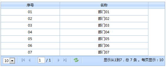
Data structure
Table data structure
Table data has two attributes, one is Rows and the other is Total. Among them, Rows is a data array and Total is the total number of records.
In fact, Total does not need to provide it when using local data. The format we use local data can be like this:
{
Rows: [
{ id: '01', name: 'Department 01' },
{ id: '02', name: 'Department 02' },
{ id: '03', name: 'Department 03' },
{ id: '04', name: 'Department 04' },
{ id: '05', name: 'Department 05' },
{ id: '06', name: 'Department 06' },
{ id: '07', name: 'Department 07' }
]
}
id, name both It is a record attribute, which can be customized at will. When configuring columns, you do not have to configure the corresponding columns, you only need to configure the corresponding displayed columns. In subsequent operations, these properties can be obtained. For example, the method getSelected(). Custom cell function render.
Tree table data structure
The tree structure engineer adds a children parameter based on the table data, such as:
{
Rows: [
{ id: '01', name: 'Department 01', children: [
{ id : '0101', name: 'Department 0101' },
{ id: '0102', name: 'Department 0102' },
{ id: '0103', name: 'Department 0103' }
]
},
{ id: '02', name: 'Department 02' },
{ id: '03', name: 'Department 03' },
{ id: ' 04', name: 'Department 04' },
{ id: '05', name: 'Department 05' },
{ id: '06', name: 'Department 06' },
{ id: '07', name: 'Department 07' }
]
}
Two ways to bind data
ligerGrid has two ways to bind data, One is to use local data, and the other is to use server data.
In the first example, we configured the data parameter, this way is the local way. Another way is to configure url parameters and use remote data.
Configure column
How many columns are displayed in the table, column width, and the content to be displayed in the column cells are all configured by the columns attribute. The following are the configuration parameters of column:
{
display: 'serial number', //The text displayed in the header column, supports html
//Custom function for header content
headerRender: function (column) {
return "" column.display "";
},
name: 'id', //The row data attribute of cell mapping
align: 'center' , //Cell content alignment: left/center/right
hide: false, //Whether to hide
width: 100, //The width of the column
minWidth: 50, //The minimum width of the column
isSort: true, //Whether this column is allowed to be sorted, the default is to allow sorting
isAllowHide: true, //Whether hiding is allowed, if allowed, it will appear in the [Show/Hide column right-click menu]
type: 'string', //Type, used for sorting
//Custom cell renderer
render: function (record, rowindex, value, column) {
//This here points to grid
//record row data
//rowindex row index
//value current value, corresponding to record[column.name]
//column column information
return value; //return this HTML content displayed in the cell (generally organized according to value and row content)
},
//Column summary
totalSummary: {
align: 'center', //Summary cell content Alignment: left/center/right
type: 'count', //Summary type sum, max, min, avg, count. Can multiple types at the same time
render: function (e) { //Summary renderer, return html to load into the cell
//e Summary Object (including sum, max, min, avg, count)
return "
}
},
//Cell editor
editor: {
type: ' text'
},
//Multiple table headers support
columns: null
},
The columns of the table provide a very complete interface that can be expanded. Whether it is content cells or header cells, the content, layout, and size can be customized.
Custom header
For example, in the header, we can set the display directly to a piece of html:
{
display: 'Department', //The text displayed in the header column, Support html
name: 'name',
align: 'left'
},
or use headerRender:
//Header content custom function
headerRender: function (column) {
return "< b>" column.display "";
},
Rendering

Custom cell
The name of column is the attribute that defines which cell is linked to the row data. For example, in the first line of the above example, if name is configured as id, then it should be displayed as "01". If it is configured as name, then it should be displayed as "department 01". There is also the align parameter, which determines the alignment of the cells.
If render is not configured, the content displayed in the cell will be determined by name.
{ name: 'id', display: 'Serial number', width: 200 },
{ name: 'name', display: 'name', width: 300 }

The above is the cell The default display mode. In addition to this method, formatters and custom functions can also be used.
Display rules for cell content:
, if render is configured, use render
. If the type parameter of column extends the corresponding formatter, then use the formatter for rendering. For example, the formatter
that defines the currency format is finally used. The default display mode
formatter
is implemented by extending $.ligerDefaults.Grid.formatters['columntype']. columntype is the column configuration. The type parameter. For example, if you want to format a currency format now:
$.ligerDefaults.Grid.formatters['currency'] = function (num, column) {
//num current value
//column column information
if (!num ) return "$0.00";
num = num.toString().replace(/$|,/g, '');
if (isNaN(num))
num = "0.00";
sign = (num == (num = Math.abs(num)));
num = Math.floor(num * 100 0.50000000001);
cents = num % 100;
num = Math .floor(num / 100).toString();
if (cents < 10)
cents = "0" cents;
for (var i = 0; i < Math.floor(( num.length - (1 i)) / 3); i )
num = num.substring(0, num.length - (4 * i 3)) ','
num.substring(num.length - (4 * i 3));
return "$" (((sign) ? '' : '-') '' num '.' cents);
};
In this way, as long as the column type is configured as currency. This function will be used to customize cell content
{ display: 'UnitPrice', name: 'UnitPrice', align: 'right' ,type:'currency' }
Rendering
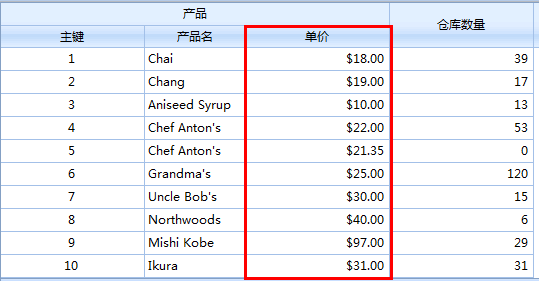
Custom cell function
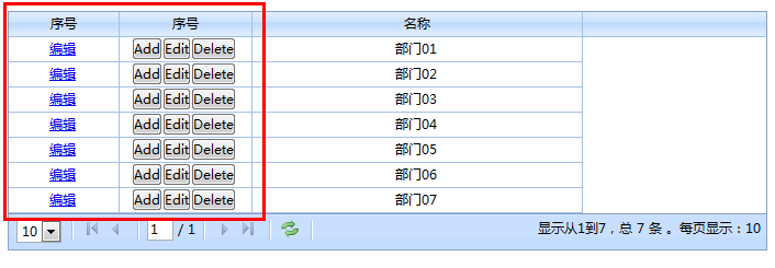
Custom cell function refers to configuring the render of column. We can organize arbitrary html.
var grid = $("#maingrid").ligerGrid ({
columns: [
{ name: 'id', display: 'serial number', width: 100,
render: function (record, rowindex, value, column) {
//this This points to grid
//record row data
//rowindex row index
//value current value, corresponding to record[column.name]
//column column information
return "< ;a href='edit.htm?id=" value "'>Edit";
}
},
{ name: 'id', display: 'serial number', width: 120,
render: function (record, rowindex, value, column) {
return '';
}
},
{ name: 'name', display: 'name', width: 300 }
],
data: { Rows: griddata }
});
Rendering
Cell Editor
All editor constructs are defined in $.ligerDefaults.Grid.editors, such as
editor: { type: 'spinner' }
will use $ .ligerDefaults.Grid.editors['spinner'] to create editors to build.
ligerGrid provides built-in editors such as check boxes, text boxes, dates, numeric adjusters, and drop-down boxes.
Rendering

There are many parameters for column. I will not list them all here. I only introduce a few commonly used parameters
For more, you can view the API: http:// api.ligerui.com
Sort and paging
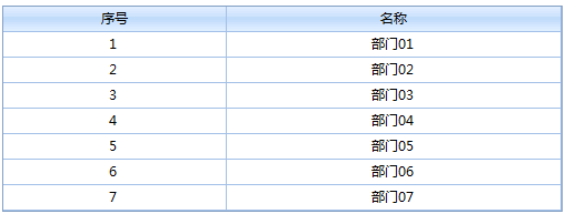
There are also two ways of sorting and paging. One is local sorting and paging. One is server sorting and paging. Only local methods are introduced here.
The default situation. Sorting and paging are enabled. If you want to cancel the paging function, as follows:
usePager: false
效果图
事件和方法
事件
| 事件名 | 参数 | 描述 |
| onAfterAddRow | (e) | 增加行后事件 |
| onAfterBeginEdit | (e) | 开始编辑后事件 |
| onAfterChangeColumnWidth | (column, newwidth) | 改变列宽度事件 |
| onAfterShowData | (data) | 显示完数据事件 |
| onAfterSubmitEdit | (e) | 提交编辑 事件 |
| onBeforeChangeColumnWidth | (column, newwidth) | 验证 改变列宽度 是否通过 |
| onBeforeCheckAllRow | (checked, grid element) | 选择前事件,可以通过return false阻止操作(复选框 全选/全不选) |
| onBeforeEdit | (e) | 编辑前事件 |
| onBeforeShowData | (data) | 显示数据前事件,可以通过reutrn false阻止操作 |
| onBeforeSubmitEdit | (e) | 验证编辑器结果是否通过 |
| onBeginEdit | (e) | 验证 开始编辑 是否通过 |
| onCancelEdit | (e) | 取消编辑 事件 |
| onChangeSort | () | 改变排序事件 |
| onCheckAllRow | (checked, grid element) | 选择事件(复选框 全选/全不选) |
| onCheckRow | (checked, rowdata, rowindex, rowDomElement) | 选择事件(复选框) |
| onContextmenu | (parm, e) | 右击事件 |
| onDblClickRow | (rowdata, rowindex, rowDomElement) | 双击行事件 |
| onDragCol | (node) | 拖动列事件 |
| onError | () | 错误事件 |
| onLoaded | () | 加载完函数 |
| onLoading | () | 加载时函数 |
| onReload | () | 刷新事件,可以通过return false来阻止操作 |
| onSelectRow | (rowdata, rowindex, rowDomElement) | 选择行事件 |
| onSubmit | () | 提交前事件 |
| onSuccess | () | 成功事件 |
| onToFirst | () | 第一页,可以通过return false来阻止操作 |
| onToggleCol | () | 切换列事件 |
| onToLast | () | 最后一页,可以通过return false来阻止操作 |
| onToNext | () | 下一页,可以通过return false来阻止操作 |
| onToPrev | () | 上一页,可以通过return false来阻止操作 |
| onUnSelectRow | (rowdata, rowindex, rowDomElement) | 取消选择行事件 |
Example
var grid = $("#maingrid").ligerGrid({
columns: [
{ name: 'id', display: 'serial number', width: 200 },
{ name: 'name', display : 'name', width: 300 }
],
data: { Rows: griddata },
onSelectRow: function (rowdata, rowindex) {
//Row records for data rows
//Row index, starting from 0
alert(rowdata.name);
}
});
grid.bind('SelectRow', function (rowdata, rowindex) {
//this This here all points to the grid
//The row record is for the data row
//The row index starts from 0
alert(rowdata.name);
});
方法
| 方法 | 参数 | 描述 |
| addEditRow | (rowdata) |
|
| addRow | (rowdata, rowParm, isBefore, parentRow) |
|
| addRows | (rowdataArr) |
|
| appendRow | (rowData, targetRow, nearRow, isBefore) |
|
| beginEdit | (rowParm) |
|
| cancelEdit | (rowParm) |
|
| changeHeaderText | (columnparm, headerText) |
|
| changePage | (ctype) |
|
| changeSort | (columnName, sortOrder) |
|
| collapse | (targetRow) |
|
| collapseDetail | (rowParm) |
|
| deleteRow | (rowParm) |
|
| deleteSelectedRow | () |
|
| demotion | (targetRow) |
|
| endEdit | (rowParm) |
|
| expand | (targetRow) |
|
| extendDetail | (rowParm) |
|
| formatRecord | (record) |
|
| getAdded | () |
|
| getCheckedRowObjs | () |
|
| getCheckedRows | () |
|
| getChidren | (rowParm) |
|
| getColumn | (columnpam) |
|
| getColumns | (columnLevel) |
|
| getColumnType | (columnname) |
|
| getData | (status, removeStatus) |
|
| getDeleted | () |
|
| getParent | (rowParm) |
|
| getRowObj | (rowParm) |
|
| getSelected | () |
|
| getSelectedRow | () |
|
| getSelectedRowObj | () |
|
| getSelectedRowObjs | () |
|
| getSelectedRows | () |
|
| getSelecteds | () |
|
| getUpdated | () |
|
| hasChildren | (rowParm) |
|
| isLeaf | (rowParm) |
|
| isTotalSummary | () |
|
| loadData | (loadDataParm) |
|
| loadServerData | (param, clause) |
|
| reRender | (e) |
|
| setColumnWidth | (columnparm, value) |
|
| setOptions | (parms) |
|
| SubmitEdit | (rowParm) |
|
| toggle | (targetRow) |
|
| toggleCol | (columnparm, visible) |
|
| updateCell | (cell, value, rowParm) |
|
| updateRow | (newRowData, rowDom) |
|
| upgrade | (targetRow) |
|
var grid = $("#maingrid").ligerGrid({
columns: [
{ name: 'id ', display: 'serial number', width: 200 },
{ name: 'name', display: 'name', width: 300 }
]
});
grid .set({ data: { Rows: griddata} });
function selectRow(index) {
grid.select(index);
}
function getSelectRow() {
var rows = grid.getSelecteds();
for (var i in rows) {
alert(rows[i].name);
}
}

Hot AI Tools

Undresser.AI Undress
AI-powered app for creating realistic nude photos

AI Clothes Remover
Online AI tool for removing clothes from photos.

Undress AI Tool
Undress images for free

Clothoff.io
AI clothes remover

Video Face Swap
Swap faces in any video effortlessly with our completely free AI face swap tool!

Hot Article

Hot Tools

Notepad++7.3.1
Easy-to-use and free code editor

SublimeText3 Chinese version
Chinese version, very easy to use

Zend Studio 13.0.1
Powerful PHP integrated development environment

Dreamweaver CS6
Visual web development tools

SublimeText3 Mac version
God-level code editing software (SublimeText3)

Hot Topics
 What should I do if I encounter garbled code printing for front-end thermal paper receipts?
Apr 04, 2025 pm 02:42 PM
Frequently Asked Questions and Solutions for Front-end Thermal Paper Ticket Printing In Front-end Development, Ticket Printing is a common requirement. However, many developers are implementing...
 Demystifying JavaScript: What It Does and Why It Matters
Apr 09, 2025 am 12:07 AM
JavaScript is the cornerstone of modern web development, and its main functions include event-driven programming, dynamic content generation and asynchronous programming. 1) Event-driven programming allows web pages to change dynamically according to user operations. 2) Dynamic content generation allows page content to be adjusted according to conditions. 3) Asynchronous programming ensures that the user interface is not blocked. JavaScript is widely used in web interaction, single-page application and server-side development, greatly improving the flexibility of user experience and cross-platform development.
 Who gets paid more Python or JavaScript?
Apr 04, 2025 am 12:09 AM
There is no absolute salary for Python and JavaScript developers, depending on skills and industry needs. 1. Python may be paid more in data science and machine learning. 2. JavaScript has great demand in front-end and full-stack development, and its salary is also considerable. 3. Influencing factors include experience, geographical location, company size and specific skills.
 Is JavaScript hard to learn?
Apr 03, 2025 am 12:20 AM
Learning JavaScript is not difficult, but it is challenging. 1) Understand basic concepts such as variables, data types, functions, etc. 2) Master asynchronous programming and implement it through event loops. 3) Use DOM operations and Promise to handle asynchronous requests. 4) Avoid common mistakes and use debugging techniques. 5) Optimize performance and follow best practices.
 How to achieve parallax scrolling and element animation effects, like Shiseido's official website?
or:
How can we achieve the animation effect accompanied by page scrolling like Shiseido's official website?
Apr 04, 2025 pm 05:36 PM
Discussion on the realization of parallax scrolling and element animation effects in this article will explore how to achieve similar to Shiseido official website (https://www.shiseido.co.jp/sb/wonderland/)...
 How to merge array elements with the same ID into one object using JavaScript?
Apr 04, 2025 pm 05:09 PM
How to merge array elements with the same ID into one object in JavaScript? When processing data, we often encounter the need to have the same ID...
 The Evolution of JavaScript: Current Trends and Future Prospects
Apr 10, 2025 am 09:33 AM
The latest trends in JavaScript include the rise of TypeScript, the popularity of modern frameworks and libraries, and the application of WebAssembly. Future prospects cover more powerful type systems, the development of server-side JavaScript, the expansion of artificial intelligence and machine learning, and the potential of IoT and edge computing.
 The difference in console.log output result: Why are the two calls different?
Apr 04, 2025 pm 05:12 PM
In-depth discussion of the root causes of the difference in console.log output. This article will analyze the differences in the output results of console.log function in a piece of code and explain the reasons behind it. �...


