This article mainly introduces Bootstrap Transition effectTransition modal box (Modal), which is very good and has reference value. Friends who need it can refer to it
You can switch the hidden content of the modal plug-in:
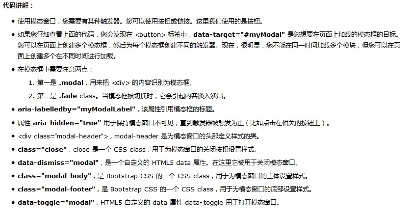
1. Through the data attribute: on the controller element (such as button or link) Set the attribute data-toggle="modal", and also set data-target="#identifier" or href="#identifier" rel="external nofollow" To specify the specific modal box to switch (with id="identifier")
2. Through Javascript: Using this technology, you can use a simple line of Javascript to Call the modal box with id="identifier":
$('#identifier').modal(options)
<!DOCTYPE html>
<html>
  <head>
    <title>Bootstrap-模态框Modal</title>
    <meta charset="utf-8">
    <link rel="stylesheet" href="css/bootstrap.min.css" rel="external nofollow" >
  </head>
  <body>
  <p class="container">
    <h2>创建模态框(Modal)</h2>
    <!-- 按钮触发模态框 -->
    <button class="btn btn-primary btn-lg" data-toggle="modal" data-target="#myModal">开始演示模态框</button>
    <!-- 模态框(Modal) -->
    <p class="modal fade" id="myModal" tabindex="-1" role="dialog" aria-labelledby="myModalLabel" aria-hidden="true">
      <p class="modal-dialog">
        <p class="modal-content">
          <p class="modal-header">
            <button type="button" class="close"data-dismiss="modal" aria-hidden="true">×</button>
            <h4 class="modal-title" id="myModalLabel"> 模态框(Modal)标题 </h4>
          </p>
          <p class="modal-body">
            在这里添加一些文本
          </p>
          <p class="modal-footer">
            <button type="button" class="btn btn-default"data-dismiss="modal">关闭</button>
            <button type="button" class="btn btn-primary">提交更改</button>
          </p>
        </p><!-- /.modal-content -->
      </p><!-- /.modal -->
    </p>
  <script src="js/jquery.min.js"></script>
  <script src="js/bootstrap.min.js"></script>
  </body>
</html>
Note:
aria-labelledby="myModalLabel" aria-hidden="true"
Official API means that the role settings set for blind people or some readable devices tell the device that this is a pop-up box aria-labelledby=".." which contains the description information, and then aria-hidden="true" Hide it so that most people won't use it. It's more standard to write it this way
Enhance the accessibility of the modal box
Be sure to add role="dialog" to .modal and aria-labelledby="..." Attributes used to point to the title bar of the modal box; add aria-hidden="true" to .modal-dialog Attributes.
In addition, you should also add descriptive information to the modal box .modal through the aria-describedby attribute.
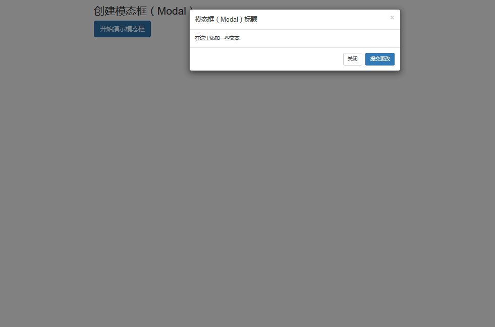
Rendering

Related articles:
Detailed explanation of how to implement basic layout with Bootstrap
BootStrap table usage analysis
JS component Bootstrap Table table row drag effect implementation code
The above is the detailed content of How to use Bootstrap transition effect Transition modal box (Modal). For more information, please follow other related articles on the PHP Chinese website!
 What is the inscription brc20
 Laravel Tutorial
 How to use localstorage
 direct3d function is not available
 Introduction to service providers with cost-effective cloud server prices
 A complete list of idea shortcut keys
 There is no network adapter in device manager
 Usage of source command in linux
 How about Ouyi Exchange?


