 Web Front-end
 JS Tutorial
 Mobile terminal - responsive, rem/em, using Js to dynamically implement mobile terminal adaptation
Mobile terminal - responsive, rem/em, using Js to dynamically implement mobile terminal adaptation
With the popularity of 3G, more and more people are using mobile phones to access the Internet. Mobile devices are surpassing desktop devices as the most common terminal for accessing the Internet. As a result, web designers have to face a difficult problem: How to render the same web page on devices of different sizes? This article will describe the concepts and methods of adaptive web design, allowing web developers to maintain the same web page code to make the website have a better reading experience on multiple devices. This article introduces the implementation method of adaptive web pages in detail, hoping to help you who are confused.
1. Add a meta tag to the head of HTML
Add a meta tag to the head of HTML, that is, the head tag, to tell the browser that the web page width is equal to the device screen width, and does not proceed. Zoom, the code is as follows:
##
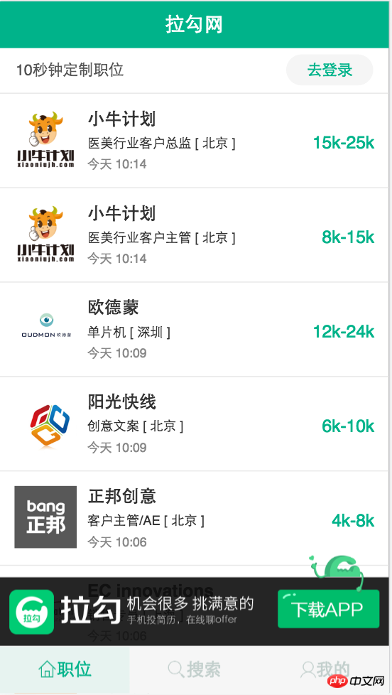
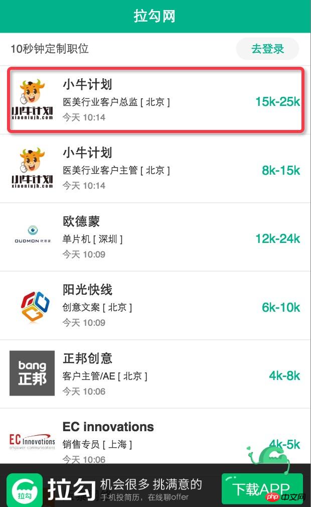
Briefly analyze the meaning of this line of code: width=device-width means that the width of the web page is equal to The width of the device screen, initial-scale=1.0 means setting the initial zoom ratio of the page to 1, user-scalable=no means prohibiting the user from zooming, maximum-scale=1.0 and minimum-scale=1.0 means setting the largest and smallest pages scaling ratio. Because major browsers parse meta tags to different degrees, we must try our best to be compatible with all browsers. 2. Percent layout In page layout, combining relative width and absolute width for layout will be more conducive to the maintainability of the web page. The following pictures are the layouts of Lagou.com under iPhone5, iPhone6 and iPhone 6 Plus. It can be seen that with the different screen widths of the devices, even the font size and spacing displayed by the same set of webpage codes are different. All different. The part inside the red line box uses percentage layout, which will make the maintainability of the web page better.


media query, the other is grid layout under bootstrap. I will introduce grid layout when I introduce bootstrap later. Here I will mainly talk about how to use media queries to implement responsive layout.
Media queries, namely @media queries,Media queries can set different styles for different screen sizes, especially if you need to design responsive pages, @media is very useful . When you reset the browser size, the page will also be re-rendered based on the browser's width and height. Because it is setting the style, just put the media query related code at the bottom of the css file.
In order to understand the usage of responsiveness more clearly, I have listed two cases below. The first case is relatively simple and realizes the function of changing the background color of the body in different page widths. The second case uses a specific project as an example to make it more convenient for usersExample 1:If the page width is less than 300 pixels, modify the background color of the body to red:If the page width is greater than 300 pixels and less than 600 pixels, modify the background color of the body to green:@media screen and (max-width: 300px) { body { background-color:red; } }Copy after login@media screen and (min-width: 300px) and (max-width:600px) { body { background-color:green; } }Copy after login如果页面宽度大于 600 像素,则修改body的背景颜色为蓝色:
@media screen and (min-width: 600px) {
    body {
         background-color:blue;
    }
}
Copy after login
代码解释:
screen 表示电脑屏幕,平板电脑,智能手机等,min-width和max-width 用于定义设备中页面的最小和最大宽度。
实例2:视觉中国首页的响应式实现
首先来看该页面在不同窗口中的展示效果:
在窗口宽度大于1200px时候的页面样式如下:
在窗口宽度大于900px并且小于1200px时候页面样式如下:
当页面宽度小于900px时候页面样式如下:
接下来我们来看具体的代码实现:
html代码如下:注意有几张图片则写几个col
<p class="group_wrap">
    <p class="group">
        <p class="col">
            <p class="img_logo">
                <img src="img/8.jpg" alt="">
            </p>
        </p>
        <p class="col">
            <p class="img_logo">
                <img src="img/9.jpg" alt="">
            </p>
        </p>
    </p>
</p>
Copy after login
css代码如下,默认是页面宽度大于1200px时候的页面:
.group_wrap{
    width: 100%;
    overflow: hidden;
}
.group{
    width: 1200px;
    margin: 0 auto;
    overflow: hidden;
}
.col{
    width: 280px;
    margin: 10px;
    float: left;
}
.img_logo{
    padding: 10px;
    background: white;
}
Copy after login实现响应式代码如下,放在css文件的最下方即可:
/*当页面的宽度在900px ~ 1200px之间的时候*/
@media screen and (min-width: 900px) and (max-width: 1200px){
    .group{
        width: 900px;
    }
}
/*当页面的宽度在600px ~ 900px之间的时候*/
@media screen and (min-width:600px) and (max-width: 900px){
    .group{
        width: 600px;
    }
}
Copy after login
总结:实际上响应式页面的实现非常简单,只要认真学,经常练,一定可以熟练掌握的!
四. 页面使用相对字体
在我们平常的网页布局过程中经常使用绝对单位像素(px)来进行布局,这样的布局不适合我们自适应网页的实现,所以我们现在来介绍两种常见的绝对单位em和rem。rem(font size of the root element)是指相对于根元素的字体大小的单位。简单的说它就是一个相对单位。看到rem大家一定会想起em单位,em(font size of the element)是指相对于父元素的字体大小的单位。它们之间其实很相似,只不过一个计算的规则是依赖根元素一个是依赖父元素计算。
1. 相对长度单位em
em的特点 : ① em的值并不是固定的; ② em始终会继承父级元素的字体大小。
废话不多说,直接上代码:
html代码:
<p class="one">
    <span>第一层</span>
    <p class="two">
        <span>第二层</span>
        <p class="three">
            <span>第三层</span>
        </p>
    </p>
</p>
Copy after login
css代码:
Copy after login
The above is the detailed content of Mobile terminal - responsive, rem/em, using Js to dynamically implement mobile terminal adaptation. For more information, please follow other related articles on the PHP Chinese website!

Hot AI Tools

Undresser.AI Undress
AI-powered app for creating realistic nude photos

AI Clothes Remover
Online AI tool for removing clothes from photos.

Undress AI Tool
Undress images for free

Clothoff.io
AI clothes remover

Video Face Swap
Swap faces in any video effortlessly with our completely free AI face swap tool!

Hot Article

Hot Tools

Notepad++7.3.1
Easy-to-use and free code editor

SublimeText3 Chinese version
Chinese version, very easy to use

Zend Studio 13.0.1
Powerful PHP integrated development environment

Dreamweaver CS6
Visual web development tools

SublimeText3 Mac version
God-level code editing software (SublimeText3)

Hot Topics
 1677
1677
 14
14
 1430
1430
 52
52
 1333
1333
 25
25
 1278
1278
 29
29
 1257
1257
 24
24
 Recommended: Excellent JS open source face detection and recognition project
Apr 03, 2024 am 11:55 AM
Face detection and recognition technology is already a relatively mature and widely used technology. Currently, the most widely used Internet application language is JS. Implementing face detection and recognition on the Web front-end has advantages and disadvantages compared to back-end face recognition. Advantages include reducing network interaction and real-time recognition, which greatly shortens user waiting time and improves user experience; disadvantages include: being limited by model size, the accuracy is also limited. How to use js to implement face detection on the web? In order to implement face recognition on the Web, you need to be familiar with related programming languages and technologies, such as JavaScript, HTML, CSS, WebRTC, etc. At the same time, you also need to master relevant computer vision and artificial intelligence technologies. It is worth noting that due to the design of the Web side
 How to create a stock candlestick chart using PHP and JS
Dec 17, 2023 am 08:08 AM
How to use PHP and JS to create a stock candle chart. A stock candle chart is a common technical analysis graphic in the stock market. It helps investors understand stocks more intuitively by drawing data such as the opening price, closing price, highest price and lowest price of the stock. price fluctuations. This article will teach you how to create stock candle charts using PHP and JS, with specific code examples. 1. Preparation Before starting, we need to prepare the following environment: 1. A server running PHP 2. A browser that supports HTML5 and Canvas 3
 Essential tools for stock analysis: Learn the steps to draw candle charts with PHP and JS
Dec 17, 2023 pm 06:55 PM
Essential tools for stock analysis: Learn the steps to draw candle charts in PHP and JS. Specific code examples are required. With the rapid development of the Internet and technology, stock trading has become one of the important ways for many investors. Stock analysis is an important part of investor decision-making, and candle charts are widely used in technical analysis. Learning how to draw candle charts using PHP and JS will provide investors with more intuitive information to help them make better decisions. A candlestick chart is a technical chart that displays stock prices in the form of candlesticks. It shows the stock price
 How to use JS and Baidu Maps to implement map pan function
Nov 21, 2023 am 10:00 AM
How to use JS and Baidu Map to implement map pan function Baidu Map is a widely used map service platform, which is often used in web development to display geographical information, positioning and other functions. This article will introduce how to use JS and Baidu Map API to implement the map pan function, and provide specific code examples. 1. Preparation Before using Baidu Map API, you first need to apply for a developer account on Baidu Map Open Platform (http://lbsyun.baidu.com/) and create an application. Creation completed
 How to use JS and Baidu Map to implement map click event processing function
Nov 21, 2023 am 11:11 AM
Overview of how to use JS and Baidu Maps to implement map click event processing: In web development, it is often necessary to use map functions to display geographical location and geographical information. Click event processing on the map is a commonly used and important part of the map function. This article will introduce how to use JS and Baidu Map API to implement the click event processing function of the map, and give specific code examples. Steps: Import the API file of Baidu Map. First, import the file of Baidu Map API in the HTML file. This can be achieved through the following code:
 How to use JS and Baidu Maps to implement map heat map function
Nov 21, 2023 am 09:33 AM
How to use JS and Baidu Maps to implement the map heat map function Introduction: With the rapid development of the Internet and mobile devices, maps have become a common application scenario. As a visual display method, heat maps can help us understand the distribution of data more intuitively. This article will introduce how to use JS and Baidu Map API to implement the map heat map function, and provide specific code examples. Preparation work: Before starting, you need to prepare the following items: a Baidu developer account, create an application, and obtain the corresponding AP
 PHP and JS Development Tips: Master the Method of Drawing Stock Candle Charts
Dec 18, 2023 pm 03:39 PM
With the rapid development of Internet finance, stock investment has become the choice of more and more people. In stock trading, candle charts are a commonly used technical analysis method. It can show the changing trend of stock prices and help investors make more accurate decisions. This article will introduce the development skills of PHP and JS, lead readers to understand how to draw stock candle charts, and provide specific code examples. 1. Understanding Stock Candle Charts Before introducing how to draw stock candle charts, we first need to understand what a candle chart is. Candlestick charts were developed by the Japanese
 The relationship between js and vue
Mar 11, 2024 pm 05:21 PM
The relationship between js and vue: 1. JS as the cornerstone of Web development; 2. The rise of Vue.js as a front-end framework; 3. The complementary relationship between JS and Vue; 4. The practical application of JS and Vue.


