picker rolling selector currently supports three selectors, distinguished by mode, which are ordinary selectors (mode=selector) and time selectors ( mode=time), date selector (mode=date), the default is a normal selector.
In this article, we will share with you a simple usage example of the WeChat applet picker component.
The specific function description is as follows:
Normal selector: mode=selector
| Type | Default value | Description | |
|---|---|---|---|
| Array | [] | When mode is selector, range is valid | |
| Number | 0 | When mode is selector, it is a number, indicating which number in the range is selected, starting from 0. | |
| EventHandle | The change event is triggered when the value changes, | event.detail= { value:value } |
| Type | Default value | Description | |
|---|---|---|---|
| String | represents the selected time, the format is " | hh:mm" | ## start|
| represents the beginning of the valid time range, the string format is " | hh:mm | "end | |
| represents the end of the valid time range, the string format is " | hh:mm | "bindchange | |
| The change event is triggered when the value changes, | event.detail= { value:value} | |
| Default value | Description | ##value | |
|---|---|---|---|
| represents the selected date, the format is " | yyyy-MM-dd | "start | String|
| represents the beginning of the valid date range, the string format is " | yyyy-MM-dd | "end | String|
| represents the end of the valid date range, the string format is " | yyyy-MM-dd | "fields | String|
| Valid values are year, month, day, indicating the granularity of the selector | bindchange | EventHandle | |
| The change event is triggered when the value changes, | event.detail= { value:value} |
|
<view class="section">
 <view class="section__title">地区选择器</view>
 <picker bindchange="bindPickerChange" value="{{index}}" range="{{array}}">
 <view class="picker">
  当前选择:{{array[index]}}
 </view>
 </picker>
</view>
<view class="section">
 <view class="section__title">时间选择器</view>
 <picker mode="time" value="{{time}}" start="09:01" end="21:01" bindchange="bindTimeChange">
 <view class="picker">
  当前选择: {{time}}
 </view>
 </picker>
</view>
<view class="section">
 <view class="section__title">日期选择器</view>
 <picker mode="date" value="{{date}}" start="2015-09-01" end="2017-09-01" bindchange="bindDateChange">
 <view class="picker">
  当前选择: {{date}}
 </view>
 </picker>
</view>
picker .js:
Page({
 data: {
 array: ['美国', '中国', '巴西', '日本'],
 index: 0,
 date: '2016-09-01',
 time: '12:01'
 },
 bindPickerChange: function(e) {
 console.log('picker发送选择改变,携带值为', e.detail.value)
 this.setData({
  index: e.detail.value
 })
 },
 bindDateChange: function(e) {
 this.setData({
  date: e.detail.value
 })
 },
 bindTimeChange: function(e) {
 this.setData({
  time: e.detail.value
 })
 }
})
Simple style layout picker.wxss:
.section {
 display: flex;
 flex-direction: column;
 padding: 20rpx 0rpx;
 color: #333;
}
.section__title{
 font-size: 40rpx;
 margin: 10rpx 0rpx;
}
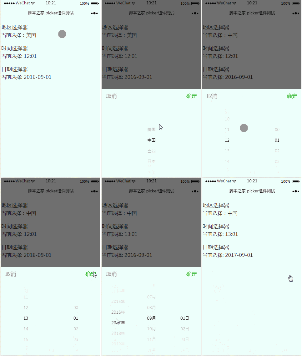
Operation effect:
The above content is a simple usage example of the WeChat applet picker component. I hope it can help everyone.
Related recommendations: 
picker rolling selector
WeChat applet picker-view component detailed example code
WeChat applet picker date and time picker
The above is the detailed content of Simple usage example of WeChat applet picker component. For more information, please follow other related articles on the PHP Chinese website!


