
This article mainly introduces the use of jQuery Tree Multiselect in detail. This plug-in allows users to present list check box selections in the form of a tree. It is mostly used in permission management to assign different permissions. It has certain Reference value, interested friends can refer to it, I hope it can help everyone.
How to use the tree permission management plug-in jQuery Tree Multiselect, the specific content is as follows
1. Get to know jQuery Tree Multiselect
This plug-in allows users to Present list check box selections in a tree format. It is mostly used in permission management to allocate different permissions.
2. Running environment
2.1. It is necessary to introduce jquery.v1.8+ version and jquery ui.js 2.2. It can only be run in versions above IE8
3. Rendering display:
When assigning permissions to roles, there are two buttons in the operation bar: Modify And authorization
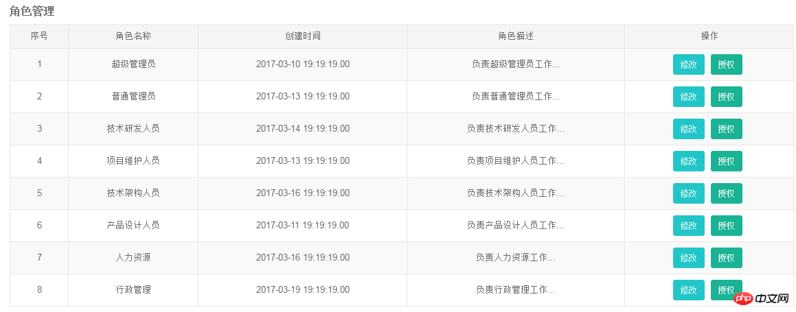
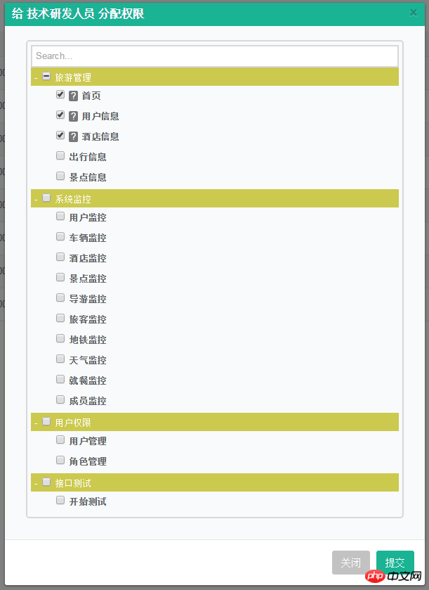
Click the authorization button, the effect is as shown below:
Intuitive menu presentation:
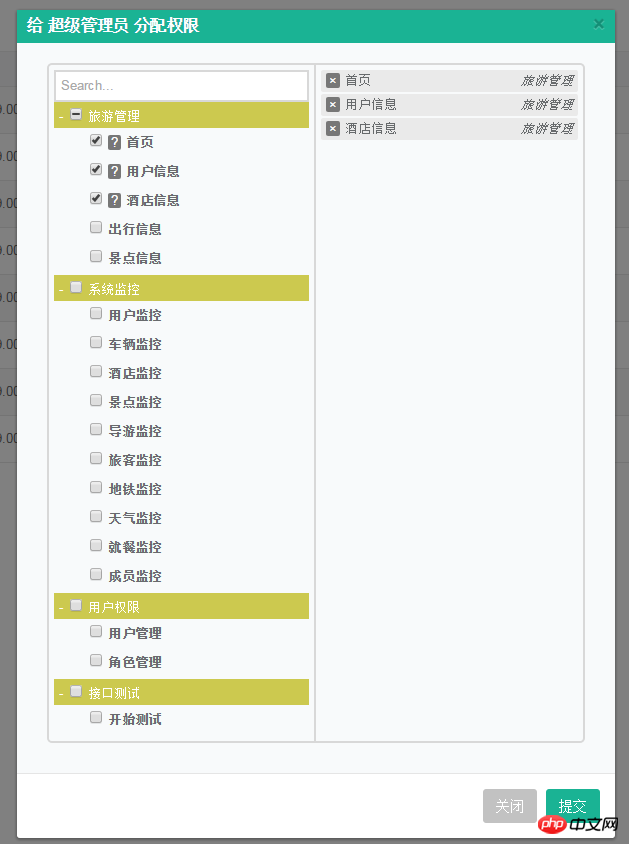
With option logo on the right:
4. Usage method and parameter description
4.1. Initialization method: $("select ").treeMultiselect();4.2. Use the selected attribute name:

##selected:When adding the selected attribute to option, that is, , change the check box to the selected state by default;
data-section:That is, when adding the data-section attribute to the option, the parent-child hierarchical relationship is displayed :
'<option value="monitor_index" data-section="旅游管理" data-description="首页描述" selected>首页</option>' + '<option value="manage_logs" data-section="旅游管理" data-description="用户日志描述" selected>用户信息</option>' + '<option value="interface_logs" data-section="旅游管理" data-description="接口调用日志描述" selected>酒店信息</option>' + '<option value="abnormal_logs" data-section="旅游管理">出行信息</option>' + '<option value="empty_logs" data-section="旅游管理">景点信息</option>'
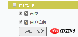
data-description:That is, when adding the data-description attribute to the option, there will be an icon in the form of a question mark behind the check box. Put the mouse on it to display the description information. As shown in the figure:
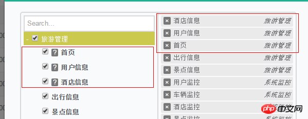
data-index:That is, when adding the data-index attribute to option, it is mainly used to display the order of option options, which is the most intuitive The performance of can be observed in the p area on the right.
By setting "Home Page": data-index = 3, "User Information": data-index = 2, "Hotel Information": data-index = 1, the sorting on the right is as shown in the figure:At the same time Will make the option selected.
Usage methods are as follows :$("#authorifyselect").treeMultiselect({ searchable: true, startCollapsed: false });
The parameters:
searchable, collapsible, hideSidePanel, onChange, startCollapsed are more commonly used and important, other parameters Users can add according to their own needs.

allowBatchSelection: Used to show and hide the parent menu check box. When the default is true, a check box appears in front of the parent menu, and a detailed selection list appears on the right; as shown in the figure:


collapsible: is used to set the expansion and contraction of the parent menu.
When the default is true, a small horizontal line will appear in front of the parent menu, which can be retracted; as shown in the figure: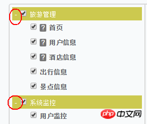
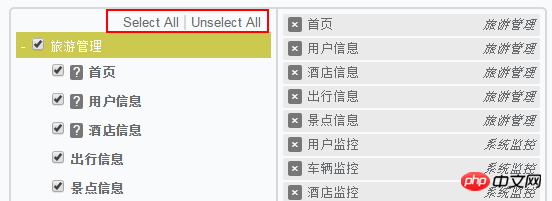
enableSelectAll, supports the selection of any option; the default is false; is set to When true, the "Select All" and "Unselect All" options appear, which can realize the functions of selecting all and unselecting all, as shown in the figure:
selectAllText,当enableSelectAll可用时,可选中所有;
unselectAllText,当enableSelectAll可用时,可不选中所有;
freeze,默认为false,表示对选项禁用选择;设置为true时,效果如图:

hideSidePanel:用户隐藏右边的选项面板;默认为false,表示不隐藏;设置为true时,即隐藏;
onChange:默认为null,表示选择选项时触发的回调函数;默认包含四个参数(text:属性文本,value:值,initialIndex,section)
$("#authorifyselect").treeMultiselect({ onChange: function(text, value, initialIndex, section) {
 console.log(text);
 console.log(value);
 console.log(initialIndex);
 console.log(section);
} });当我点击某个选项时,输出结果如图:
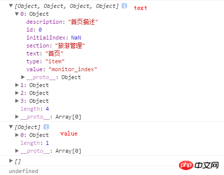
即text会输出所有选中的复选框的信息;value会输出你当时点击的那个复选框的信息;这里initialIndex和section的值为空。
onlyBatchSelection:只进行部分检查,只能设置为false.
sortable:默认为false,设置为true时,选择的选项可以通过拖动排序(需要jQuery UI);
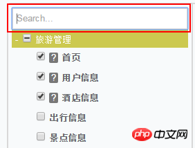
searchable,默认为false,设置为true时,菜单顶部会出现搜索框,用于快捷搜索菜单。效果如图:
searchParams: ['value', 'text', 'description', 'section'],用于设置搜索设置项。
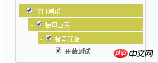
sectionDelimiter:意思是data-section="value1/value2/value3",可以通过“/”来分隔值,实现多层列表效果。
showSectionOnSelected:默认为true,当选中选项时,显示section name;
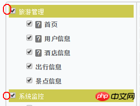
startCollapsed:默认为false,设置为true时,菜单默认进来显示为折叠效果,如图:

总结:当你在开发用户权限管理的后台系统时,你不妨选择这个插件用于权限的分配。小巧且简单。
相关推荐:
有关对bootstrap中multiselect下拉列表功能的讲解
jQuery插件实现select下拉框左右选择_交换内容(multiselect2side)
jquery multiSelect 多选下拉框_jquery
The above is the detailed content of How to use jQuery Tree Multiselect correctly. For more information, please follow other related articles on the PHP Chinese website!


