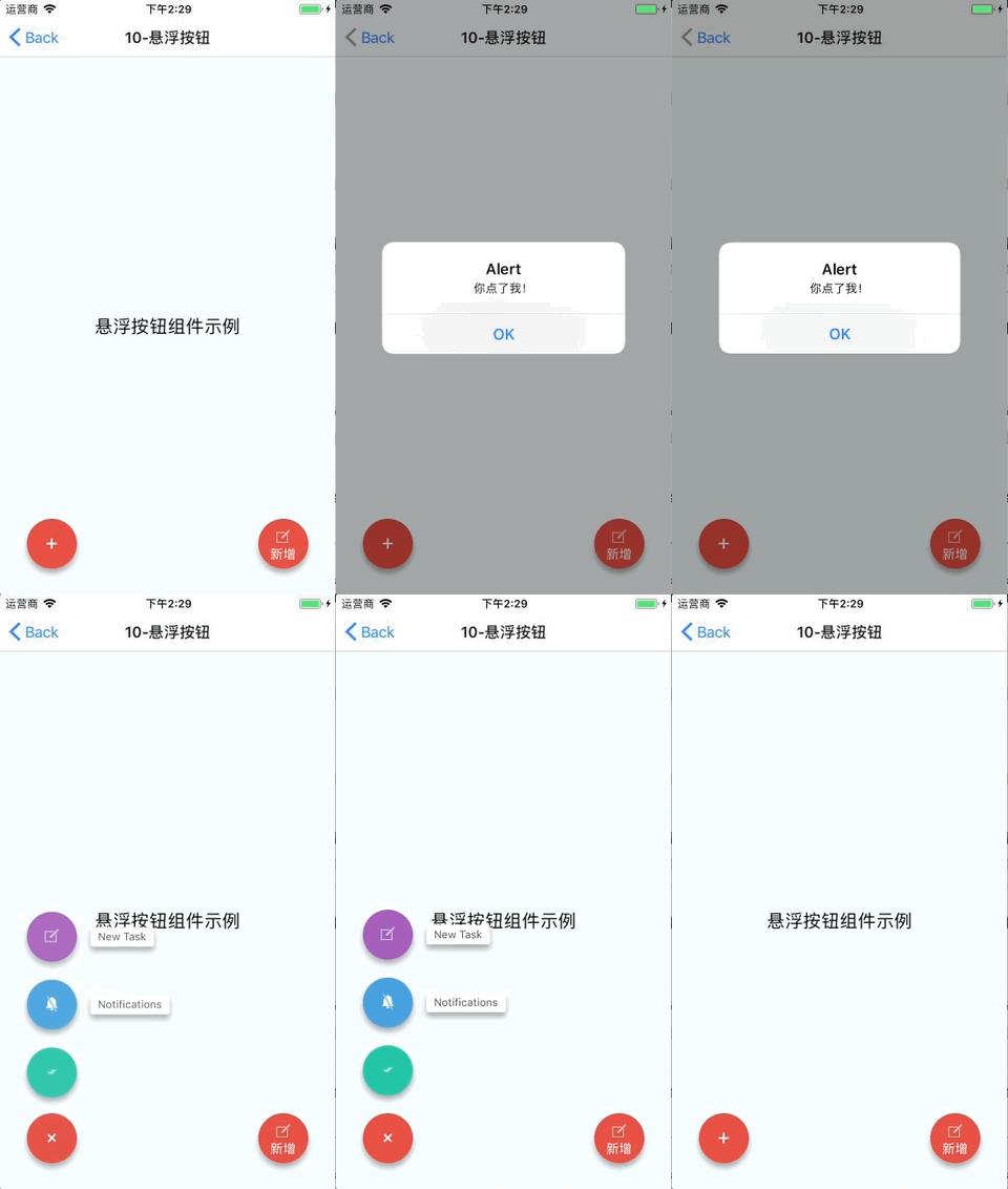
This time I will bring you the react native floating button group picture and text tutorial, what are the precautions when using the react native floating button component, the following is a practical case, let's go together take a look.
React Native floating button component: react-native-action-button, a pure JS component, supports Android and IOS dual platforms, supports setting sub-buttons, and supports custom positions, styles and icons.Rendering

Installation method
npm i react-native-action-button --save
react-native link react-native-vector-icons
Sample code
<View style={styles.container}>
<Text style={styles.welcome}>
悬浮按钮组件示例
</Text>
<ActionButton buttonColor="rgba(231,76,60,1)" position='left' verticalOrientation='up'>
<ActionButton.Item buttonColor='#9b59b6' title="New Task" onPress={() => console.log("notes tapped!")}>
<Icon name="ios-create-outline" style={styles.actionButtonIcon} />
</ActionButton.Item>
<ActionButton.Item buttonColor='#3498db' title="Notifications" onPress={() => {}}>
<Icon name="ios-notifications-off" style={styles.actionButtonIcon} />
</ActionButton.Item>
<ActionButton.Item buttonColor='#1abc9c' onPress={() => {}}>
<Icon name="ios-done-all-outline" style={styles.actionButtonIcon} />
</ActionButton.Item>
</ActionButton>
<ActionButton
buttonColor="rgba(231,76,60,1)"
onPress={() => { alert('你点了我!')}}
renderIcon={() => (<View style={styles.actionButtonView}><Icon name="ios-create-outline" style={styles.actionButtonIcon} />
<Text style={styles.actionButtonText}>新增</Text>
</View>)}
/>
</View>Main parameter description
ActionButton
ActionButton.Item
Full example
Full code: GitHub - forrest23/ReactNativeComponents: React Native component collectionThis sample code is in the Component10 folder.
Component address
GitHub - mastermoo/react-native-action-button: customizable multi-action-button component for react-native I believe you have mastered the method after reading the case in this article. For more exciting information, please pay attention to other related articles on the php Chinese website! Recommended reading:Detailed explanation of using webpack hot module replacement
Detailed explanation of the use of three types of $() in jQuery
The above is the detailed content of react native floating button component graphic tutorial. For more information, please follow other related articles on the PHP Chinese website!


