How to use React Form to complete component encapsulation
This time I will show you how to use React Form to complete component encapsulation, and what are the precautions for using React Form to complete component encapsulation. The following is a practical case, let's take a look.
Preface
For web systems, form submission is a very common way to interact with users, such as when submitting an order. , you need to enter the recipient, mobile phone number, address and other information, or when setting up the system, you need to fill in some personal preference information. Form submission is a structured operation that can simplify development by encapsulating some common functions. This article will discuss the design ideas of FormForm component, and introduce the specific implementation method in conjunction with the ZentForm component. The code involved in this article is based on React v15.
Form component functions
Generally speaking, the functions of the Form component include the following points:
Form Layout
Form Field
EncapsulationForm Validation&Error Prompt
Form submission
The implementation of each part will be introduced in detail below.
Form layout
There are generally 3 ways of commonly used form layout:
Inline layout

Horizontal layout

##Vertical layout

<form class="form">
  <label class="label"/>
  <field class="field"/>
</form>
<!--行内布局-->
<form class="form inline">
  <label class="label"/>
  <field class="field"/>
</form>
<!--水平布局-->
<form class="form horizontal">
  <label class="label"/>
  <field class="field"/>
</form>
<!--垂直布局-->
<form class="form vertical">
  <label class="label"/>
  <field class="field"/>
</form>
.inline .label {
  display: inline-block;
  ...
}
.inline .field {
  display: inline-block;
  ...
}
.horizontal .label {
  display: inline-block;
  ...
}
.horizontal .field {
  display: inline-block;
  ...
}
.vertical .label {
  display: block;
  ...
}
.vertical .field {
  display: block;
  ...
}Form field encapsulation
The field encapsulation part generally encapsulates the components of the component library for Form, such as Input component, Select component, Checkbox component, etc. When existing fields cannot meet your needs, you can customize fields. The fields of the form generally include two parts, one is the title and the other is the content. ZentForm encapsulates the structure and style through the high-order function getControlGroup. Its input parameter is the component to be displayed:export default Control => {
render() {
return (
<p className={groupClassName}>
<label className="zent-formcontrol-label">
{required ? <em className="zent-formrequired">*</em> : null}
{label}
</label>
<p className="zent-formcontrols">
<Control {...props} {...controlRef} />
{showError && (
<p className="zent-formerror-desc">{props.error}</p>
)}
{notice && <p className="zent-formnotice-desc">{notice}</p>}
{helpDesc && <p className="zent-formhelp-desc">{helpDesc}</p>}
</p>
</p>
);
}
}<Field
label="预约门店:"
name="dept"
component={CustomizedComp}
validations={{
required: true,
}}
validationErrors={{
required: '预约门店不能为空',
}}
required
/>class FieldForm extends React.Component {
render() {
return (
<Form>
<Field
name="name"
component={CustomizedComp}
</Form>
)
}
}
export default createForm()(FieldForm);/**
* createForm高阶函数
*/
const createForm = (config = {}) => {
...
return WrappedForm => {
return class Form extends Component {
constructor(props) {
super(props);
this.fields = [];
}
getChildContext() {
return {
zentForm: {
attachToForm: this.attachToForm,
detachFromForm: this.detachFromForm,
}
}
}
attachToForm = field => {
if (this.fields.indexOf(field) < 0) {
this.fields.push(field);
}
};
detachFromForm = field => {
const fieldPos = this.fields.indexOf(field);
if (fieldPos >= 0) {
this.fields.splice(fieldPos, 1);
}
};
render() {
return createElement(WrappedForm, {...});
}
}
}
}
/**
* Field组件
*/
class Field extends Component {
componentWillMount() {
this.context.zentForm.attachToForm(this);
}
componentWillUnmount() {
this.context.zentForm.detachFromForm(this);
}
render() {
const { component } = this.props;
return createElement(component, {...});
}
}/**
* createForm高阶函数
*/
const createForm = (config = {}) => {
...
return WrappedForm => {
return class Form extends Component {
getFormValues = () => {
return this.fields.reduce((values, field) => {
const name = field.getName();
const fieldValue = field.getValue();
values[name] = fieldValue;
return values;
}, {});
};
}
}
}
/**
* Field组件
*/
class Field extends Component {
getValue = () => {
return this.state._value;
};
}Form validation & error prompt
表单验证是一个重头戏,只有验证通过了才能提交表单。验证的时机也有多种,如字段变更时、鼠标移出时和表单提交时。ZentForm提供了一些常用的验证规则,如非空验证,长度验证,邮箱地址验证等。当然还能自定义一些更复杂的验证方式。自定义验证方法可以通过两种方式传入ZentForm,一种是通过给createForm传参:
createForm({
  formValidations: {
    rule1(values, value){
    },
    rule2(values, value){
    },
  }
})(FormComp);另一种方式是给Field组件传属性:
<Field
validations={{
rule1(values, value){
},
rule2(values, value){
},
}}
validationErrors={{
rule1: 'error1',
rule2: 'error2'
}}
/>使用createForm传参的方式,验证规则是共享的,而Field的属性传参是字段专用的。validationErrors指定校验失败后的提示信息。这里的错误信息会显示在前面getControlGroup所定义HTML中{showError && (<p className="zent-formerror-desc">{props.error}</p>)}
ZentForm的核心验证逻辑是createForm的runRules方法,
runRules = (value, currentValues, validations = {}) => {
  const results = {
    errors: [],
    failed: [],
  };
  function updateResults(validation, validationMethod) {
    // validation方法可以直接返回错误信息,否则需要返回布尔值表明校验是否成功
    if (typeof validation === 'string') {
      results.errors.push(validation);
      results.failed.push(validationMethod);
    } else if (!validation) {
      results.failed.push(validationMethod);
    }
  }
  Object.keys(validations).forEach(validationMethod => {
    ...
    // 使用自定义校验方法或内置校验方法(可以按需添加)
    if (typeof validations[validationMethod] === 'function') {
      const validation = validations[validationMethod](
        currentValues,
        value
      );
      updateResults(validation, validationMethod);
    } else {
      const validation = validationRules[validationMethod](
        currentValues,
        value,
        validations[validationMethod]
      );
    }
  });

  return results;
};默认的校验时机是字段值改变的时候,可以通过Field的validate<a href="http://www.php.cn/wiki/1464.html" target="_blank">OnChange</a>和validateOnBlur来改变校验时机。
<Field
validateOnChange={false}
validateOnBlur={false}
validations={{
required: true,
matchRegex: /^[a-zA-Z]+$/
}}
validationErrors={{
required: '值不能为空',
matchRegex: '只能为字母'
}}
/>对应的,在Field组件中有2个方法来处理change和blur事件:
class Field extends Component {
  handleChange = (event, options = { merge: false }) => {
    ...
    this.setValue(newValue, validateOnChange);
    ...
  }

  handleBlur = (event, options = { merge: false }) => {
    ...
    this.setValue(newValue, validateOnBlur);
    ...
  }

  setValue = (value, needValidate = true) => {
    this.setState(
      {
        _value: value,
        _isDirty: true,
      },
      () => {
        needValidate && this.context.zentForm.validate(this);
      }
    );
 };
}当触发验证的时候,ZentForm是会对表单对所有字段进行验证,可以通过指定relatedFields来告诉表单哪些字段需要同步进行验证。
表单提交
表单提交时,一般会经历如下几个步骤
表单验证
表单提交
提交成功处理
提交失败处理
ZentForm通过handleSubmit高阶函数定义了上述几个步骤,只需要传入表单提交的逻辑即可:
const handleSubmit = (submit, zentForm) => {
  const doSubmit = () => {
    ...
    result = submit(values, zentForm);
    ...
    return result.then(
      submitResult => {
        ...
        if (onSubmitSuccess) {
          handleOnSubmitSuccess(submitResult);
        }
        return submitResult;
      },
      submitError => {
        ...
        const error = handleSubmitError(submitError);
        if (error || onSubmitFail) {
          return error;
        }
        throw submitError;
      }
    );
  }

  const afterValidation = () => {
    if (!zentForm.isValid()) {
      ...
      if (onSubmitFail) {
       handleOnSubmitError(new SubmissionError(validationErrors));
      }
    } else {
      return doSubmit();
    }
  };
  const allIsValidated = zentForm.fields.every(field => {
    return field.props.validateOnChange || field.props.validateOnBlur;
  });
  if (allIsValidated) {
    // 不存在没有进行过同步校验的field
    afterValidation();
  } else {
    zentForm.validateForm(true, afterValidation);
  }
}使用方式如下:
const { handleSubmit } = this.props;
<Form onSubmit={handleSubmit(this.submit)} horizontal>ZentForm不足之处
ZentForm虽然功能强大,但仍有一些待改进之处:
父组件维护了所有字段的实例,直接调用实例的方法来取值或者验证。这种方式虽然简便,但有违React声明式编程和函数式编程的设计思想,并且容易产生副作用,在不经意间改变了字段的内部属性。
大部分的组件重使用了shouldComponentUpdate,并对state和props进行了深比较,对性能有比较大的影响,可以考虑使用PureComponent。
太多的情况下对整个表单字段进行了校验,比较合理的情况应该是某个字段修改的时候只校验本身,在表单提交时再校验所有的字段。
表单提交操作略显繁琐,还需要调用一次handleSubmit,不够优雅。
结语
本文讨论了Form表单组件设计的思路,并结合有赞的ZentForm组件介绍具体的实现方式。ZentForm的功能十分强大,本文只是介绍了其核心功能,另外还有表单的异步校验、表单的格式化和表单的动态添加删除字段等高级功能都还没涉及到,感兴趣的朋友可点击前面的链接自行研究。
相信看了本文案例你已经掌握了方法,更多精彩请关注php中文网其它相关文章!
推荐阅读:
The above is the detailed content of How to use React Form to complete component encapsulation. For more information, please follow other related articles on the PHP Chinese website!

Hot AI Tools

Undresser.AI Undress
AI-powered app for creating realistic nude photos

AI Clothes Remover
Online AI tool for removing clothes from photos.

Undress AI Tool
Undress images for free

Clothoff.io
AI clothes remover

Video Face Swap
Swap faces in any video effortlessly with our completely free AI face swap tool!

Hot Article

Hot Tools

Notepad++7.3.1
Easy-to-use and free code editor

SublimeText3 Chinese version
Chinese version, very easy to use

Zend Studio 13.0.1
Powerful PHP integrated development environment

Dreamweaver CS6
Visual web development tools

SublimeText3 Mac version
God-level code editing software (SublimeText3)

Hot Topics
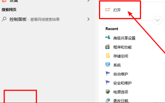 How to install the Windows 10 old version component DirectPlay
Dec 28, 2023 pm 03:43 PM
Many users always encounter some problems when playing some games on win10, such as screen freezes and blurred screens. At this time, we can solve the problem by turning on the directplay function, and the operation method of the function is also Very simple. How to install directplay, the old component of win10 1. Enter "Control Panel" in the search box and open it 2. Select large icons as the viewing method 3. Find "Programs and Features" 4. Click on the left to enable or turn off win functions 5. Select the old version here Just check the box
 PHP, Vue and React: How to choose the most suitable front-end framework?
Mar 15, 2024 pm 05:48 PM
PHP, Vue and React: How to choose the most suitable front-end framework? With the continuous development of Internet technology, front-end frameworks play a vital role in Web development. PHP, Vue and React are three representative front-end frameworks, each with its own unique characteristics and advantages. When choosing which front-end framework to use, developers need to make an informed decision based on project needs, team skills, and personal preferences. This article will compare the characteristics and uses of the three front-end frameworks PHP, Vue and React.
 Angular components and their display properties: understanding non-block default values
Mar 15, 2024 pm 04:51 PM
The default display behavior for components in the Angular framework is not for block-level elements. This design choice promotes encapsulation of component styles and encourages developers to consciously define how each component is displayed. By explicitly setting the CSS property display, the display of Angular components can be fully controlled to achieve the desired layout and responsiveness.
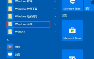 How to open the settings of the old version of win10 components
Dec 22, 2023 am 08:45 AM
Win10 old version components need to be turned on by users themselves in the settings, because many components are usually closed by default. First we need to enter the settings. The operation is very simple. Just follow the steps below. Where are the win10 old version components? Open 1. Click Start, then click "Win System" 2. Click to enter the Control Panel 3. Then click the program below 4. Click "Enable or turn off Win functions" 5. Here you can choose what you want to open
 Integration of Java framework and front-end React framework
Jun 01, 2024 pm 03:16 PM
Integration of Java framework and React framework: Steps: Set up the back-end Java framework. Create project structure. Configure build tools. Create React applications. Write REST API endpoints. Configure the communication mechanism. Practical case (SpringBoot+React): Java code: Define RESTfulAPI controller. React code: Get and display the data returned by the API.
 Vue component development: implementation method of progress bar component
Nov 24, 2023 am 08:56 AM
Vue component development: Progress bar component implementation method Preface: In Web development, the progress bar is a common UI component, often used to display the progress of operations in scenarios such as data requests, file uploads, and form submissions. In Vue.js, we can easily implement a progress bar component by customizing components. This article will introduce an implementation method and provide specific code examples. I hope it will be helpful to Vue.js beginners. Component structure and style First, we need to define the basic structure and style of the progress bar component.
 Vue.js vs. React: Project-Specific Considerations
Apr 09, 2025 am 12:01 AM
Vue.js is suitable for small and medium-sized projects and fast iterations, while React is suitable for large and complex applications. 1) Vue.js is easy to use and is suitable for situations where the team is insufficient or the project scale is small. 2) React has a richer ecosystem and is suitable for projects with high performance and complex functional needs.
 UniApp error: Solution to failed introduction of 'xxx' component
Nov 25, 2023 pm 12:58 PM
UniApp is a cross-platform development framework based on Vue.js, which can develop applications on multiple platforms at the same time. However, just like other development tools, you may encounter some problems and errors while using UniApp. One of the common problems is errors when component introduction fails. This article will introduce some ways to solve this problem. The first step is to check your code for spelling errors. In UniApp, components are introduced by using the import statement in the page or component. When a component is introduced


