This article provides you with a detailed analysis of the relevant skills and knowledge points of Vue component development through code examples. Readers in need may refer to it.
As I near graduation, I wrote a simple personal blog. The project address is click me to visit the project address (please ask for a star by the way). This article is the first in a series of summaries. Next, I will imitate a low-profile version of Element's dialog box and pop-up components step by step.
Vue single file component development
When using vue-cli to initialize a project, you will find that there are A HelloWorld.vue file, this is the basic development model of single-file components.
// 注册
Vue.component('my-component', {
template: '<p>A custom component!</p>'
})
// 创建根实例
new Vue({
el: '#example'
})Next, start writing a dialog component.
Dialog
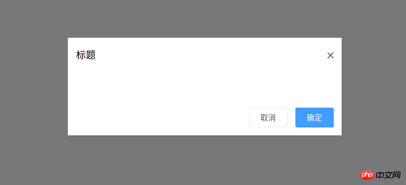
The basic style of the target dialog component is as shown in the figure:

According to the target style, it can be summarized Out:
The dialog component needs a titleprops to indicate the pop-up window title
The dialog component needs to emit an OK event when the OK button is pressed ( That is, tell the parent component that it is confirmed)
Similarly, the dialog component needs to emit a cancellation event
The dialog component needs to provide a slot to facilitate Custom content
Then, the encoding is as follows:
<template>
<p class="ta-dialog__wrapper">
<p class="ta-dialog">
<p class="ta-dialog__header">
<span>{{ title }}</span>
<i class="ios-close-empty" @click="handleCancel()"></i>
</p>
<p class="ta-dialog__body">
<slot></slot>
</p>
<p class="ta-dialog__footer">
<button @click="handleCancel()">取消</button>
<button @click="handleOk()">确定</button>
</p>
</p>
</p>
</template>
<script>
export default {
name: 'Dialog',
props: {
title: {
type: String,
default: '标题'
},
},
methods: {
handleCancel() {
this.$emit('cancel')
},
handleOk() {
this.$emit('ok')
},
},
}
</script>This completes the development of the dialog component. The usage method is as follows:
<ta-dialog
 title="弹窗标题"
 @ok="handleOk"
 @cancel="handleCancel">
 <p>我是内容</p>
</ta-dialog>
At this time, I found One problem, when using v-if or v-show to control the display of the pop-up window, there is no animation! ! ! , looks very stiff. Coach, I want to add animation. At this time, the transition component comes into play. Using the transition component combined with css can create many animations with good effects. Next, enhance the dialog component animation. The code is as follows:
<template>
<transition name="slide-down">
<p class="ta-dialog__wrapper" v-if="isShow">
// 省略
</p>
</transition>
</template>
<script>
export default {
data() {
return {
isShow: true
}
},
methods: {
handleCancel() {
this.isShow = false
this.$emit('cancel')
},
handleOk() {
this.isShow = true
this.$emit('ok')
},
},
}
</script> You can see that the transition component receives a nameprops, so how to write css to complete the animation? A very simple way, just write two
key class (css className) styles:
.slide-down-enter-active {
 animation: dialog-enter ease .3s;
}

.slide-down-leave-active {
 animation: dialog-leave ease .5s;
}

@keyframes dialog-enter {
 from {
 opacity: 0;
 transform: translateY(-20px);
 }

 to {
 opacity: 1;
 transform: translateY(0);
 }
}

@keyframes dialog-leave {
 from {
 opacity: 1;
 transform: translateY(0);
 }

 to {
 opacity: 0;
 transform: translateY(-20px);
 }
}It is so simple to develop a good dynamic effect. Note that the name of the transition component is slide-down, and the key className of the animation written is slide-down-enter-active and slide-down-leave-active.
Encapsulate Dialog to make MessageBox
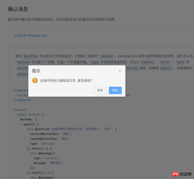
The method of using Element's MessageBox is as follows:
this.$confirm('此操作将永久删除该文件, 是否继续?', '提示', {
 confirmButtonText: '确定',
 cancelButtonText: '取消',
 type: 'warning'
}).then(() => {
 this.$message({
 type: 'success',
 message: '删除成功!'
 });
}).catch(() => {
 this.$message({
 type: 'info',
 message: '已取消删除'
 });
});When I saw this code, I felt so magical. So magical, so magical (exclamation three times in a row). Take a closer look, this component is actually an encapsulated dialog,

#Next, I will also encapsulate such a component. First, let’s sort out our thoughts:
The usage method of Element is this.$confirm. Isn’t this just a matter of hanging it on Vue’s prototype?
Element's then means OK, catch means cancel, just promise.
After sorting out my thoughts, I started coding:
import Vue from 'vue'
import MessgaeBox from './src/index'

const Ctur = Vue.extend(MessgaeBox)
let instance = null

const callback = action => {
 if (action === 'confirm') {
 if (instance.showInput) {
  instance.resolve({ value: instance.inputValue, action })
 } else {
  instance.resolve(action)
 }
 } else {
 instance.reject(action)
 }

 instance = null
}

const showMessageBox = (tip, title, opts) => new Promise((resolve, reject) => {
 const propsData = { tip, title, ...opts }

 instance = new Ctur({ propsData }).$mount()
 instance.reject = reject
 instance.resolve = resolve
 instance.callback = callback

 document.body.appendChild(instance.$el)
})


const confirm = (tip, title, opts) => showMessageBox(tip, title, opts)

Vue.prototype.$confirm = confirmAt this point, you may be wondering what to do As for callback, I actually wrote an encapsulated dialog and named it MessageBox.
In its code, there are two methods:
onCancel() {
 this.visible = false
 this.callback && (this.callback.call(this, 'cancel'))
},

onConfirm() {
 this.visible = false
 this.callback && (this.callback.call(this, 'confirm'))
},Yes, it is callback when confirming and canceling . I would also like to talk about Vue.extend, which introduces MessageBox into the code.
Instead of using new MessageBox directly, I use new Ctur because this can define data (not just props), for example:
instance = new Ctur({ propsData }).$mount()At this time, there is actually no MessageBox on the page. We need to execute:
document.body.appendChild(instance.$el)
If you do this directly, you may find that there is no animation when the MessageBox is opened, but there is animation when it is closed. The solution is also very simple, make it still invisible when
appendChild, and then use code like this:
Vue.nextTick(() => instance.visible = true)
This way there will be animation.
Achieve good animation through transition and css. Among them, the name of the transition component determines the two key classes for writing css, named [name]-enter-active and [name]-leave-active
Inherit one through Vue.extend The constructor of the component (I don’t know how to say it properly, let’s just say it like this), and then through this constructor, you can customize the related properties of the component (usage scenario: js calls the component)
When js calls a component, in order to maintain the animation effect of the component, you can first document.body.appendChild and then Vue.nextTick(() => instance.visible = true)
The above is I compiled it for everyone, I hope it will be helpful to everyone in the future.
Related articles:
postman json springmvc test batch addition instance
JS and Canvas implement image preview compression and upload function
Two ways for Vue single-page application to reference separate style files
The above is the detailed content of Tips on Vue component development (detailed tutorial). For more information, please follow other related articles on the PHP Chinese website!


