This article mainly introduces simpler implementation examples of expand, collapse, and other effects in projects such as vue and react. It has certain reference value. Interested friends can refer to it
Preface
Although the title of this article contains vue and react, it is not related to vue and react, but some basic knowledge of html5 and css3. The reason why I write vue is because I A similar effect has been used in recent projects. I used vue related knowledge to achieve it which is not elegant, but using html5 and css3 to achieve it is even more perfect.
Project case
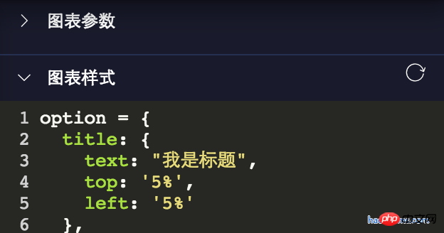
The project has the following effects:

There are many expand and collapse, for the implementation of this , I initially used some relatively frustrating dom operations in vue, which is a class name of the parent element toggleClass to display and hide child elements.
Since this method is a universal method, it is used in many places in the project. The code is roughly as follows:
toggleShow() {
 let target = window.event.srcElement;
 if (target.nodeName == "SPAN") {
  target.parentNode.parentNode.classList.toggle("toggleclass");
  target.classList.toggle("el-icon-arrow-right");
 } else {
  target.parentNode.classList.toggle("toggleclass");
  target.children[0].classList.toggle("el-icon-arrow-right");
 }
}Written like this, it is unfriendly and difficult to maintain later. When I refactored the project recently, I refactored all these places and used the method introduced today! For more refactoring points, please click on the article Refactoring Technical Points of Vue Project.
html5 and css3 implement expand and collapse
The code is as follows:
<details class="haorooms" open>
  <summary>图表参数</summary>
  <content>这里是包含的p等其他展示元素</content>
</details>
css code
.haorooms{position:relative}
.haorooms summary{
  -webkit-user-select: none;
  -moz-user-select: none;
  -ms-user-select: none;
  user-select: none;
  outline: 0;
}
/* 自定义的三角 */
.haorooms summary::after {
  content: '';
  position: absolute;
  left:0;
  top:0;
  width: 15px; height: 15px;
  background: url(./haorooms.png) no-repeat; /* 自定义的三角图片 */
  background-size: 100% 100%;
  transition: transform .2s;
}
.haorooms:not([open]) summary::after {
  transform: rotate(90deg);
}
/* 隐藏默认三角 */
.haorooms ::-webkit-details-marker {
  display: none;
}
.haorooms ::-moz-list-bullet {
  font-size: 0;
}Code explanation
The detail and summary of html5 itself have an expansion and collapse effect. If you don't understand, you can check .
Hide the default triangle as follows:
.haorooms ::-webkit-details-marker {
  display: none;
}
.haorooms ::-moz-list-bullet {
  font-size: 0;
}UI optimization of details and summary
Zhang Xinxu has an article that introduces details and summary in great detail
Corresponding to the optimization of its UI, the main aspects are as follows:
1. Optimization of small triangles, including color, hiding, position, and replacement.
2. Outline removal
Modify the color of the small triangle
.haorooms ::-webkit-details-marker {
  color: gray;
}
.haorooms ::-moz-list-bullet {
  color: gray;
}Modify the position of the small triangle-display on the right
.haorooms summary {
  width: -moz-fit-content;
  width: fit-content;
  direction: rtl;
}
.haorooms ::-webkit-details-marker {
  direction: ltr;
}
.haorooms ::-moz-list-bullet {
  direction: ltr;
}Outline removal
I used
-webkit-user-select: none;
    -moz-user-select: none;
    -ms-user-select: none;
    user-select: none;
outline: 0;above. This is very unfriendly to accessibility. For optimization solutions, you can look at Zhang Xinxu’s approach.
details and summary other applications
1. More effects
<details>
  <summary>
    <p>测试内容测试内容</p>
    <p class="more">
      <p>haorooms测试内容测试内容...</p>
    </p>
    <a>更多</a>
  </summary>
</details>css code
::-webkit-details-marker {
  display: none;
}
::-moz-list-bullet {
  font-size: 0;
  float: left;
}
summary {
  user-select: none;
  outline: 0;
}
.more {
  display: none;
}
[open] .more {
  display: block;
}
[open] summary a {
  font-size: 0;
}
[open] summary a::before {
  content: '收起';
  font-size: 14px;
}2. Suspended menu effect
CSS code:
/* 隐藏默认三角 */
::-webkit-details-marker {
  display: none;
}
::-moz-list-bullet {
  font-size: 0;
  float: left;
}
summary {
  display: inline-block;
  padding: 5px 28px;
  text-indent: -15px;
  user-select: none;
  position: relative;
  z-index: 1;
}
summary::after {
  content: '';
  position: absolute;
  width: 12px; height: 12px;
  margin: 4px 0 0 .5ch;
  background: url(./arrow-on.svg) no-repeat;
  background-size: 100% 100%;
  transition: transform .2s;
}
[open] summary,
summary:hover {
  background-color: #fff;
  box-shadow: inset 1px 0 #ddd, inset -1px 0 #ddd;
}
[open] summary::after {
  transform: rotate(180deg);
}
.box {
  position: absolute;
  border: 1px solid #ddd;
  background-color: #fff;
  min-width: 100px;
  padding: 5px 0;
  margin-top: -1px;
}
.box a {
  display: block;
  padding: 5px 10px;
  color: inherit;
}
.box a:hover {
  background-color: #f0f0f0;
}
.box sup {
  position: absolute;
  color: #cd0000;
  font-size: 12px;
  margin-top: -.25em;
}HTML code:
<p class="bar">
  <details>
    <summary>我的消息</summary>
    <p class="box">
      <a href>我的回答<sup>12</sup></a>
      <a href>我的私信</a>
      <a href>未评价订单<sup>2</sup></a>
      <a href>我的关注</a>
    </p>
  </details>
</p>
<p>这里放一段文字表明上面的是悬浮效果。</p>3. Tree menu effect
CSS code:
/* 隐藏默认三角 */
::-webkit-details-marker {
  display: none;
}
::-moz-list-bullet {
  font-size: 0;
  float: left;
}
details {
  padding-left: 20px;
}
summary::before {
  content: '';
  display: inline-block;
  width: 12px; height: 12px;
  border: 1px solid #999;
  background: linear-gradient(to right, #999, #999) no-repeat center, linear-gradient(to top, #999, #999) no-repeat center;
  background-size: 2px 10px, 10px 2px;
  vertical-align: -2px;
  margin-right: 6px;
  margin-left: -20px;
}
[open] > summary::before {
  background: linear-gradient(to right, #999, #999) no-repeat center;
  background-size: 10px 2px;
}HTML code:
<details>
  <summary>我的视频</summary>
  <details>
    <summary>爆肝工程师的异世界狂想曲</summary>
    <p>tv1-720p.mp4</p>
    <p>tv2-720p.mp4</p>
    ...
    <p>tv10-720p.mp4</p>
  </details>
  <details>
    <summary>七大罪</summary>
    <p>七大罪B站00合集.mp4</p>
  </details>
  <p>珍藏动漫网盘地址.txt</p>
  <p>我们的小美好.mp4</p>
</details>The above is what I compiled for everyone. I hope it will be helpful to everyone in the future.
Related articles:
How to deal with display issues before vue rendering (detailed tutorial)
By using ueditor in the vue project (Detailed tutorial)
What are the steps to introduce noVNC remote desktop into the vue project
The above is the detailed content of Use vue and react to achieve effects such as expansion and collapse. For more information, please follow other related articles on the PHP Chinese website!


