
This article mainly introduces a brief discussion of React Native Flexbox layout (summary). Now I will share it with you and give you a reference.
Flex is the abbreviation of Flexible Box, which means "flexible layout" and is used to provide maximum flexibility for the box model.
Basic concepts
Elements that adopt Flex layout are called Flex containers (flex containers), or "containers" for short. All its child elements automatically become container members, called Flex items (flex items), or "items" for short.
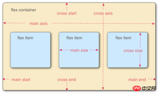
Containers have two axes by default: the horizontal main axis (main axis) and the vertical cross axis (cross axis). The starting position of the main axis (the intersection with the border) is called main start, and the ending position is called main end; the starting position of the cross axis is called cross start, and the ending position is called cross end.
Items are arranged along the main axis by default. The main axis space occupied by a single item is called main size, and the cross axis space occupied by a single item is called cross size.
Container properties
The following 6 properties are set on the container.
flex-direction
flex-wrap
flex-flow
justify-content
align-items
flex-direction property
The flex-direction property determines the direction of the main axis (that is, the arrangement direction of items).
 {
 flex-direction: row | row-reverse | column | column-reverse;
}
flex-wrap property
By default, items are arranged on a line (also called the "axis"). The flex-wrap attribute defines how to wrap the line if one axis cannot fit.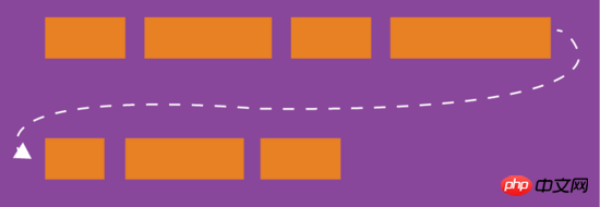
{
 flex-wrap: nowrap | wrap | wrap-reverse;
}


flex-flow
The flex-flow property is the abbreviation of the flex-direction property and the flex-wrap property, with the default value for row nowrap.{
flex-flow: <flex-direction> || <flex-wrap>;
}justify-content property
justify-content property defines the alignment of the item on the main axis.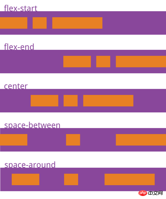
align-items attribute
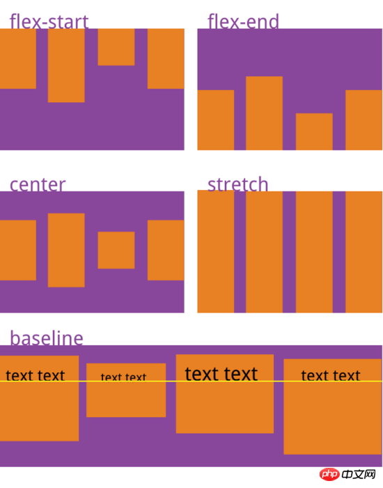
align-items attribute defines the item How to align on the cross axis.{
align-items: flex-start | flex-end | center | baseline | stretch;
}
align-content attribute
align- The content attribute defines the alignment of multiple axes. This property has no effect if the project has only one axis.{
align-content: flex-start | flex-end | center | space-between | space-around | stretch;
}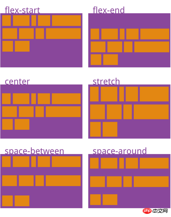
space-between:与交叉轴两端对齐,轴线之间的间隔平均分布
space-around:每根轴线两侧的间隔都相等。所以,轴线之间的间隔比轴线与边框的间隔大一倍
stretch(默认值):轴线占满整个交叉轴
项目的属性
以下6个属性设置在项目上。
order
flex-grow
flex-shrink
flex-basis
flex
align-self
order属性
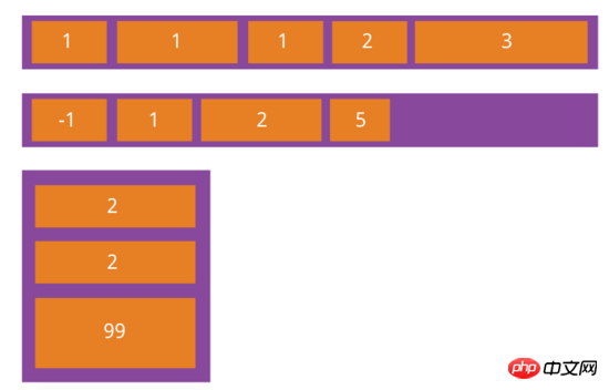
order属性定义项目的排列顺序。数值越小,排列越靠前,默认为0。
{
 order: <integer>;
}
flex-grow属性
flex-grow属性定义项目的放大比例,默认为0,即如果存在剩余空间,也不放大
{
 flex-grow: <number>; /* default 0 */
}
如果所有项目的flex-grow属性都为1,则它们将等分剩余空间(如果有的话)。如果一个项目的flex-grow属性为2,其他项目都为1,则前者占据的剩余空间将比其他项多一倍。
flex-shrink属性
flex-shrink属性定义了项目的缩小比例,默认为1,即如果空间不足,该项目将缩小。
{
 flex-shrink: <number>; /* default 1 */
}
如果所有项目的flex-shrink属性都为1,当空间不足时,都将等比例缩小。如果一个项目的flex-shrink属性为0,其他项目都为1,则空间不足时,前者不缩小。
负值对该属性无效。
flex-basis属性
flex-basis属性定义了在分配多余空间之前,项目占据的主轴空间(main size)。浏览器根据这个属性,计算主轴是否有多余空间。它的默认值为auto,即项目的本来大小。
{
 flex-basis: <length> | auto; /* default auto */
}它可以设为跟width或height属性一样的值(比如350px),则项目将占据固定空间。
flex属性
flex属性是flex-grow, flex-shrink 和 flex-basis的简写,默认值为0 1 auto。后两个属性可选。
{
flex: none | [ <'flex-grow'> <'flex-shrink'>? || <'flex-basis'> ]
}该属性有两个快捷值:auto (1 1 auto) 和 none (0 0 auto)。
align-self属性
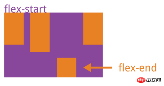
align-self属性允许单个项目有与其他项目不一样的对齐方式,可覆盖align-items属性。默认值为auto,表示继承父元素的align-items属性,如果没有父元素,则等同于stretch。
 {
 align-self: auto | flex-start | flex-end | center | baseline | stretch;
}
上面是我整理给大家的,希望今后会对大家有帮助。
相关文章:
The above is the detailed content of Detailed interpretation of React Native Flexbox layout. For more information, please follow other related articles on the PHP Chinese website!


