The concept of flexbox was introduced in React. Flexbox is a layout scheme for CSS in the web front-end field. The following article mainly introduces you to the relevant information about the basic introduction of React Native and the preliminary use of Flexbox layout. The article uses sample code The introduction is very detailed, friends who need it can refer to it
Preface
In the previous article, the author shared part of the installation and debugging of React Native A little experience in the application process. If you haven't seen it yet, please click "React Native Basics & Introductory Tutorial: A Small Step for Debugging React Native Applications".
In this article, let us take a look at what Flexbox layout is and how to use it.
1. Unit of length
Before starting any layout, let us first know that when writing React Native component styles, The length is unit-less and represents "logical pixels independent of device pixel density".
How do you understand this?
We know that a smallest luminous point on the screen corresponds to a pixel.
Suppose the following three rectangles represent three devices with the same screen size, but they have different resolutions:
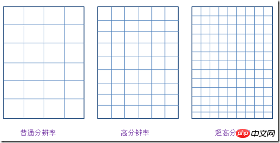
Figure 1 .Same size devices with different resolutions
Each small grid on the picture actually represents a pixel. It can be seen that the size of a pixel is different on these three devices with the same physical size but different resolutions.
If we set the size of an interface element in pixels, for example, a height of 2px, then the device with a length of 2px will look like this:

Figure 2. Actual height of 2px at different resolutions
The actual displayed lengths are different.
We want a unit of length. On screens of the same physical size (no matter who has a higher resolution or a lower resolution, as long as the physical size is the same), the physical size represented by 1 unit of length it's the same. This kind of unit should be independent of resolution. Give it a name called density-independent pixels, or dp for short. This is actually the length unit used in the Android system.
For example, content that is 2dp wide and 2dp high will display the same physical size on devices with different resolutions but the same screen size. (A digression: Some Android developers recommend that all clickable buttons should have a width and height of no less than 48dp.)

Figure 3. 2dp * 2dp size content The physical size occupied by the screen of the same size is the same
The font size in Android uses another unit called scale independent pixels, referred to as sp. This unit is very similar to dp, but it is usually used to set font size. The font set through it can change according to the system font size.
There is a formula between pixel and dp: px = dp * (dpi/160).
dpi means dot per inch, which is the pixels per inch. It also has its own calculation formula, which will not be expanded upon here. Just know that the reason why we want to use a unit that is independent of device resolution is mainly to make the application look consistent on devices with different resolutions.
In RN, there is also a length unit similar to dp. If we want to know how many units our screen is measured in terms of this length, we can get it by introducing Dimensions in the react-native package, and we can also check the pixel ratio of the native machine.
import {
  Text,
  View,
  Dimensions,
  PixelRatio
} from 'react-native';
const { height, width } = Dimensions.get('window');
const pxRatio = PixelRatio.get();
<View style={styles.container}>
  <Text style={styles.welcome}>
    {`width: ${width}, height: ${height}`}
  </Text>
  <Text style={styles.welcome}>
    {`pixel radio: ${pxRatio}`}
  </Text>
</View>
Copy after login
The display is as follows:

##Figure 4. Current mobile phone screen information
It reflects that the current width of the mobile phone screen occupies 360 units and the height occupies 640 units. The pixel ratio is 3, which is actually a 1080 * 1920 pixel mobile phone. Among them, 1080 = width * pixelRadio, 1920 = height * pixelRatio
2. Flexbox layout
Flexbox layout, which is the flexible box model layout. Friends who have experience in Android development may still remember layout methods such as LinearLayout, RelativeLayout, and FrameLayout, but for web developers who know more about CSS, using flexbox layout will definitely make them feel more comfortable in the development experience.
RN中的flexbox布局,其实源于CSS中的flexbox(弹性盒子)布局规范。其实它在CSS中还处于Last Call Working Draft(最终征求意见稿)阶段,但是主流浏览器对它都有了良好的支持。在RN中,几乎完全借鉴了其中的布局语义,同时更没有浏览器兼容的烦恼,用起来是很方便的。RN中只是把CSS的属性用camelCase写法代替连字符写法。后面还还会看到,默认的flex方向也不同。
理解弹性盒模型布局,首先要知道四个最基本的概念:Flex Container(容器),Flex Item(项),Flex Direction(方向)和Axis(轴)。
1.Flex Container
就是包裹内容的容器,需要把它的display设置为‘flex'(或者'inline-flex')。
以下6个属性设置在容器上。
alignItems 指定item在侧轴上的对齐方式
alignContent 指定item在多条轴上的对齐方式
flexDirection 指定主轴方向
flexWrap 指定item在主轴方向如何换行
flexFlow flexDirection属性和flexWrap属性的简写形式
justifyContent 指定item在主轴上的分布方式
2.Flex Item
容器做直接包裹的元素。所谓弹性盒布局,通常想要布局的东西就是它们。
以下6个属性设置在项目上。
alignSelf 每个item可以单独设置对齐方式 覆盖Flex Container给设置的alignItems
order 指定item排列顺序 数字越小越靠前
flexGrow 指定item的拉伸比例
flexShrink 指定item的压缩比例
flexBasis 指定item在分配多余空间之前,占主轴的大小
flex 其实是 flexGrow flexShrink flexBasis的简写
3.Flex Direction and Axis
在弹性盒子中,项目默认沿着main axis(主轴)排列,和主轴垂直的轴叫做cross axis,叫做侧轴,或者交叉轴。
在盒子中,排列项目又四个方向:水平的正反两个,垂直的正反两个。
结构代码:
<View>
 <View style={styles.row}>
 <Text style={styles.item}>1</Text>
 <Text style={styles.item}>2</Text>
 <Text style={styles.item}>3</Text>
 </View>
 <View style={styles.rowReverse}>
 <Text style={styles.item}>1</Text>
 <Text style={styles.item}>2</Text>
 <Text style={styles.item}>3</Text>
 </View>
 <View style={styles.column}>
 <Text style={styles.item}>1</Text>
 <Text style={styles.item}>2</Text>
 <Text style={styles.item}>3</Text>
 </View>
 <View style={styles.columnReverse}>
 <Text style={styles.item}>1</Text>
 <Text style={styles.item}>2</Text>
 <Text style={styles.item}>3</Text>
 </View>
</View>
Copy after login
样式代码:
row: {
backgroundColor: '#ffe289',
flexDirection: 'row'
},
rowReverse: {
flexDirection: 'row-reverse'
},
column: {
backgroundColor: '#ffe289',
flexDirection: 'column'
},
columnReverse: {
flexDirection: 'column-reverse'
},
Copy after login
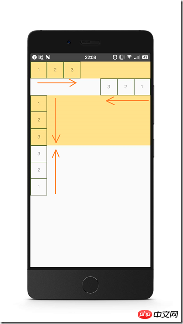
图5. flexDirection
由于网上关于flex布局讲解的资源挺丰富的,读者可以参考最后给出的连接,或者自行上网搜索,CSS中的和RN是相通的。
这里主要分享个人在学习过程中,觉得容易引起混淆的两个小点。
首先,justify-content和align-content这两个属性,可能比较容易搞错它们作用的方向。
其中,justify-content是设置items沿着主轴上是如何分布的。align-content是设置items沿着侧轴如何对齐的。
还是拿之前的例子,默认情况下,flex的方向是column(这个与移动端与web页面不同,在web页面用CSS设置flex布局,默认的fiex-direction是row,即水平从左往右)。
在移动端,主轴默认是垂直方向,从上往下。让我们把它的高度设置高一点,放3个item在里面:
结构代码:
<View>
 <View style={styles.defaultFlex}>
 <Text style={styles.item}>1</Text>
 <Text style={styles.item}>2</Text>
 <Text style={styles.item}>3</Text>
 </View>
</View>
Copy after login
样式代码:
defaultFlex: {
height: 300,
backgroundColor: '#ffe289',
display: 'flex'
}
Copy after login

图6. 默认的flex
justify-content设置items在主轴方向的如何分布,比如,如果我们加上justifyContent: 'space-between'
defaultFlex: {
height: 300,
backgroundColor: '#ffe289',
display: 'flex',
justifyContent: 'space-between'
}
Copy after login
items就沿主轴分开了。

图7. justifyContent: 'space-between'
如果我们设置alignItems: 'center',项目就沿侧轴(这里就是水平轴)居中了。注意这两个属性是可以同时起作用的。

图8. justifyContent: 'space-between' 以及 alignItems: 'center'
然后,值得指出的是,flex这个属性,其实是flexGrow, flexShrink, flexBasis(对应的CSS属性flex-grow, flex-shrink和flex-basis)三个属性的结合。
我们通常在移动端看到的flex:1这个设置,其实是对flex-grow的设置。后者的默认值为0。使用把flex-grow设置为正整数的方法,可以让item按比例分布,或者在其他item为固定大小时撑满剩余的盒子空间,就仿佛具有弹性一样。
结构代码:
<View style={styles.container}>
 <View style={styles.flex1}></View>
 <View style={styles.flex2}></View>
 <View style={styles.flex3}></View>
</View>
Copy after login
样式代码:
container: {
flex: 1
},
flex1: {
// height: 99,
flexGrow: 1,
backgroundColor: 'orange',
},
flex2: {
flexGrow: 2,
backgroundColor: 'lightblue',
},
flex3: {
flexGrow: 3,
backgroundColor: 'green',
},
Copy after login

图9. 按比例分布
需要注意的是,如果父容器的尺寸为零(即没有设置宽高,或者没有设定flex),即使子组件如果使用了flex,也是无法显示的。
所以这里最外层的使用了flex布局的,flex:1,表示让它占据了垂直的整个空间。
三、小小实战演练
让我们来简单使用flex布局,对之前的例子稍加调整,实现一个头部,底部固定高度,中间内容占满剩下的屏幕的布局:
第一步,调整结构:
<View style={styles.container}>
 <View style={styles.header}></View>
 <View style={styles.body}></View>
 <View style={styles.footer}></View>
</View>
Copy after login
调整样式:
container: {
flex: 1
},
header: {
height: 60,
backgroundColor: 'orange',
},
body: {
flexGrow: 1,
backgroundColor: 'lightblue',
},
footer: {
height: 60,
backgroundColor: 'green',
}
Copy after login

图10. 有头尾的布局
第二部,给header添加标题。
我们让头部的分成3部分,左边模拟一个返回按钮,中间显示标题文字,右边模拟一把小叉:
<View style={styles.header}>
 <Text style={styles.back}>返回</Text>
 <Text style={styles.title}>这是一个标题</Text>
 <Text style={styles.exit}>×</Text>
</View>
Copy after login
需要把header的flexDirection设置为水平方向:
header: {
height: 60,
backgroundColor: 'orange',
flexDirection: 'row',
alignItems: 'center'
},
back: {
color: 'white',
marginLeft: 15
},
title: {
flexGrow: 1,
fontSize: 20,
color: 'white',
textAlign: 'center'
},
exit: {
marginRight: 20,
fontSize: 20,
color: 'white'
}
Copy after login

图11. header有了标题
第三步,我们可以把footer三等分,模拟成菜单的样子:
<View style={styles.footer}>
 <Text style={styles.firstMenu}>添加</Text>
 <Text style={styles.menu}>删除</Text>
 <Text style={styles.menu}>修改</Text>
</View>
Copy after login
添加样式:
footer: {
height: 60,
backgroundColor: 'green',
flexDirection: 'row',
alignItems: 'center'
},
menu: {
flexGrow: 1,
textAlign: 'center',
borderColor: 'white',
borderLeftWidth: 1,
color: 'white'
},
firstMenu: {
flexGrow: 1,
textAlign: 'center',
color: 'white'
},
Copy after login

图12. footer三等分 模拟菜单
最后,让我们在body里也填入几个带按钮的输入框。
引入TextInput和Button组件,然后把它们分三组放入body中,
<View style={styles.body}>
 <View style={styles.inputRow}>
  <TextInput style={styles.textInput}></TextInput>
  <Button style={styles.btn} onPress={() => {}} title="确定"></Button>
 </View>
 <View style={styles.inputRow}>
  <TextInput style={styles.textInput}></TextInput>
  <Button style={styles.btn} onPress={() => {}} title="非常确定"></Button>
 </View>
 <View style={styles.inputRow}>
  <TextInput style={styles.textInput}></TextInput>
  <Button style={styles.btn} onPress={() => {}} title="确定一定以及肯定"></Button>
 </View>
</View>
Copy after login
添加样式:
body: {
flexGrow: 1,
backgroundColor: 'lightblue',
},
inputRow: {
flexDirection: 'row',
alignItems: 'center',
marginLeft: 10,
marginRight: 10
},
textInput: {
flex: 1
},
btn: {
minWidth: 60
}
Copy after login

flex布局的一个常用实践是,部分内容固定宽高,让剩下的内容自适应。
像上面这样,我们给Button有一个最小宽度,且TextInput的flexGrow为1,这样的做法可以实现,TextInput总是占满剩下的宽度,且可伸缩。
看了上面的例子,是否觉得在React Native中使用Flexbox布局也挺简单呢?
希望这是个不错的开始。
以上就是本文的全部内容,希望对大家的学习有所帮助,更多相关内容请关注PHP中文网!
相关推荐:
基于React和Redux的SSR的实现方法
echarts同一页面中四个图表切换的js数据交互方法
The above is the detailed content of Introduction to React Native using Flexbox layout. For more information, please follow other related articles on the PHP Chinese website!


![[Web front-end] Node.js quick start](https://img.php.cn/upload/course/000/000/067/662b5d34ba7c0227.png)


