
Tailwind CSS는 다양한 클래스를 제공하는 인기 있는 CSS 프레임워크 중 하나입니다. 이 수업은 웹 개발 작업 흐름을 간소화하고 향상시키는 데 도움이 됩니다. 다양한 클래스 중에는 개발자가 아직 들어보지 못했거나 과소평가했거나 상대적으로 새로운 클래스도 있습니다.
이러한 클래스는 개발 작업 흐름을 간소화하고, 웹 인터페이스의 미학을 향상시키며, 생산성을 높일 수 있는 엄청난 잠재력을 가지고 있습니다.
이 튜토리얼에서는 컨테이너 클래스, 크기 유틸리티, 공간 유틸리티, 라인 클램프 유틸리티, 링 유틸리티, 자르기 유틸리티 등 6가지 클래스를 살펴보겠습니다. 이 튜토리얼에서는 Tailwind의 CDN을 사용하겠습니다.
컨테이너 클래스를 사용하면 브라우저에 따라 크기가 조정되는 컨테이너를 만들 수 있습니다. 현재 중단점의 최소 너비와 일치하도록 요소의 최대 너비를 설정하여 다양한 화면 크기에 반응하도록 설계되었습니다.
이러한 반응성은 뷰포트 크기에 따라 컨테이너의 너비를 조정하여 컨테이너 내의 콘텐츠가 다양한 기기에서 적절하게 표시되도록 함으로써 달성됩니다.
정교하게 말하면 Tailwind CSS는 특정 최소 너비에 해당하는 sm, MD, lg, xl, 2xl과 같은 사전 정의된 중단점 세트를 사용합니다. 이러한 중단점은 다양한 화면 크기에 다양한 스타일을 적용하므로 사용자 지정 미디어 쿼리를 작성하지 않고도 반응형 디자인을 더 쉽게 만들 수 있습니다.
컨테이너 클래스는 이러한 중단점을 활용하여 최대 너비를 적절하게 조정하여 컨테이너 내의 콘텐츠 크기가 브라우저의 뷰포트 크기에 맞게 조정되도록 합니다.
이렇게 하면 각 중단점에 대해 맞춤 CSS를 작성할 필요 없이 모든 기기에서 콘텐츠가 반응하고 보기 좋게 표시됩니다. 프로젝트 전반에 걸쳐 일관된 레이아웃 구조를 제공하여 시간을 절약합니다.
다음은 컨테이너 클래스를 보여주는 예입니다.
<div class="container mx-auto px-4 border-2 border-gray-300 rounded-lg">
  <h1 class="text-4xl font-bold mb-4">Container Class</h1>
  <p class="text-lg">
    This is a demonstration of the container class in Tailwind CSS. The
    container is centered and scales its size based on the viewport size.
  </p>
  <div class="mt-8">
    <button
      class="bg-blue-500 hover:bg-blue-700 text-white font-bold py-2 px-4 rounded"
    >
      Click Me
    </button>
  </div>
</div>
브라우저에서 결과를 확인하면 다음과 같이 나타나야 합니다.
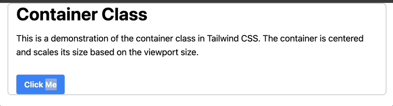
컨테이너 너비가 현재 중단점에 따라 자동으로 조정되어 콘텐츠가 다양한 기기에서 적절하게 표시되는 것을 확인할 수 있습니다.
크기 유틸리티를 사용하면 요소의 너비와 높이를 동시에 제어할 수 있습니다. 이 기능은 정사각형 요소를 만들거나 프로젝트 전체에서 요소의 크기가 일관되도록 하는 데 특히 유용합니다.
크기 유틸리티는 특정 픽셀 크기에 대한 size-48과 같은 고정 픽셀 크기와 배율에 따라 너비와 높이를 적용하는 size-2와 같은 Tailwind 설정의 사전 정의된 크기를 포함한 다양한 옵션을 제공합니다. Tailwind 구성에 정의되어 있습니다.
크기 유틸리티를 사용하는 방법은 다음과 같습니다.
<div class="container mx-auto px-4 py-8">
  <div class="grid grid-cols-3 gap-1">
    <div class="size-48 bg-green-500 flex items-center justify-center">
      <p class="text-white text-2xl font-semibold">Size 48</p>
    </div>
    <div class="size-64 bg-blue-500 flex items-center justify-center">
      <p class="text-white text-2xl font-semibold">Size 64</p>
    </div>
    <div class="size-80 bg-red-500 flex items-center justify-center">
      <p class="text-white text-2xl font-semibold">Size 80</p>
    </div>
  </div>
</div>
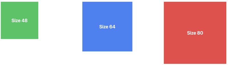
첫 번째 상자의 경우 size-48은 너비와 높이를 모두 간격 척도 48로 설정합니다. 두 번째와 세 번째 상자는 비슷한 구조를 따르며, size-64 및 size-80 클래스는 크기를 설정합니다.
브라우저에서 결과를 확인하면 다음과 같이 나타나야 합니다.
공간 유틸리티는 요소 사이의 간격을 제어하도록 설계되어 일관된 간격으로 시각적으로 매력적인 레이아웃을 더 쉽게 만들 수 있습니다.
Tailwind는 공간 관리를 위한 두 가지 기본 클래스, 즉 가로 간격을 위한 space-x와 세로 간격을 위한 space-y를 제공합니다. 이러한 클래스를 컨테이너 요소에 적용하여 직계 하위 요소 사이에 간격을 자동으로 적용할 수 있습니다.
이는 디자인 전체에서 일관된 간격을 유지하는 데 중요합니다. 간격을 위해 맞춤 CSS를 작성할 필요가 없으므로 시간이 절약되므로 디자인의 다른 측면에 집중할 수 있습니다.
다음은 공간 유틸리티를 사용하여 Flex 컨테이너 내의 버튼 사이에 가로 간격을 추가하는 방법의 예입니다.
<div class="container mx-auto px-4 py-8">
  <div class="grid grid-cols-3 gap-4">
    <div
      class="p-6 max-w-sm mx-auto bg-white rounded-xl shadow-lg flex flex-col items-center space-y-4"
    >
      <div>
        <p class="text-xl text-black font-medium">Card 1 Title</p>
        <p class="text-base text-gray-500">
          Card 1 description or additional information.
        </p>
      </div>
    </div>
    <div
      class="p-6 max-w-sm mx-auto bg-white rounded-xl shadow-lg flex flex-col items-center space-y-4"
    >
      <div>
        <p class="text-xl text-black font-medium">Card 2 Title</p>
        <p class="text-base text-gray-500">
          Card 2 description or additional information.
        </p>
      </div>
    </div>
    <div
      class="p-6 max-w-sm mx-auto bg-white rounded-xl shadow-lg flex flex-col items-center space-y-4"
    >
      <div>
        <p class="text-xl text-black font-medium">Card 3 Title</p>
        <p class="text-base text-gray-500">
          Card 3 description or additional information.
        </p>
      </div>
    </div>
  </div>
</div>
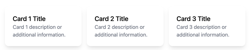
위 코드에서 space-y-4 유틸리티는 각 카드의 하위 요소 사이에 수직 간격을 적용하여 각 카드 내부에 일관된 간격 요소를 만듭니다.
브라우저에서 결과를 확인하면 다음과 같이 나타나야 합니다.
line-clamp 유틸리티는 텍스트 오버플로를 제어하는 강력한 도구입니다. 고정된 줄 수 이후의 텍스트를 시각적으로 자르는 데 도움이 됩니다. 특히 원하는 표시 영역을 초과할 수 있는 동적 콘텐츠를 처리할 때 깔끔하고 균일한 레이아웃을 유지하는 데 특히 유용합니다.
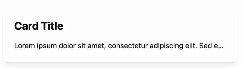
Below is an example of a card that uses the line-clamp utility to control text:
<div class="max-w-sm rounded overflow-hidden shadow-lg m-4">
  <img class="w-full" src="https://via.placeholder.com/150" alt="Card image" />
  <div class="px-6 py-4">
    <div class="font-bold text-xl mb-2">Card Title</div>
    <p class="text-gray-700 line-clamp-3">
      Lorem ipsum dolor sit amet, consectetur adipiscing elit. Donec nec dolor
      et velit aliquam efficitur. Sed velit nisi, lacinia eu nisl id, lacinia
      lacinia nisl.
    </p>
  </div>
  <div class="px-6 pt-4 pb-2">
    <span
      class="inline-block bg-gray-200 rounded-full px-3 py-1 text-sm font-semibold text-gray-700 mr-2 mb-2"
      >#tag1</span
    >
    <span
      class="inline-block bg-gray-200 rounded-full px-3 py-1 text-sm font-semibold text-gray-700 mr-2 mb-2"
      >#tag2</span
    >
  </div>
</div>
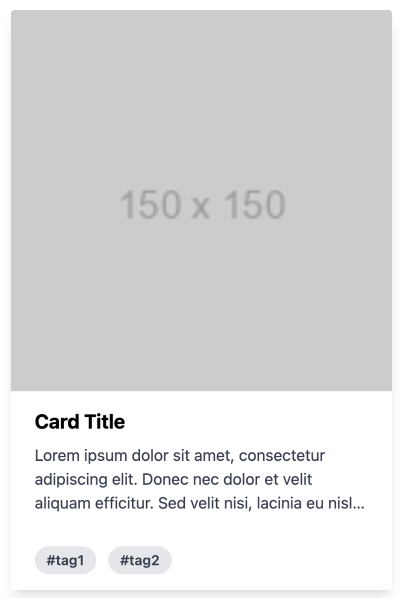
The description text is controlled using the line-clamp-3 class, which limits the text to three lines. If the text exceeds three lines, it will be truncated, and an ellipsis will be added to indicate the truncation.
This ensures that the card remains visually clean and that users can quickly understand the content without being overwhelmed by too much text.
When you check the result in your browser, you should have something like this:
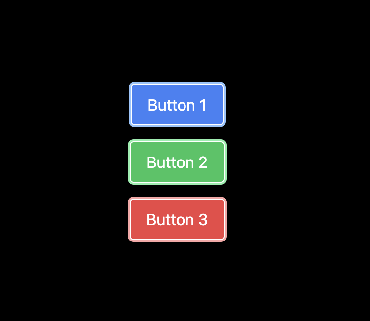
The ring utility is used to apply a border around an element. It also provides a way to add outline shadows or focus rings to elements. This is a nice alternative to the older shadow-outline and shadow-xs classes, allowing for more customizable focus states.
It enhances the user experience by providing visual feedback on interactive elements, such as buttons or input fields, without the need for custom CSS. The ring utility is highly customizable, allowing you to control the width, color, and opacity of the ring.
Below is an example of how you can use the ring utility:
<div class="bg-black min-h-screen flex items-center justify-center">
  <div class="flex flex-col items-center space-y-4">
    <button
      class="bg-blue-500 text-white px-4 py-2 rounded ring-2 ring-blue-300 border border-white hover:ring-blue-500 mr-2 focus:ring-4 focus:ring-blue-500"
    >
      Button 1
    </button>
    <button
      class="bg-green-500 text-white px-4 py-2 rounded ring-2 ring-green-300 border border-white hover:ring-green-500 mr-2 focus:ring-4 focus:ring-green-500"
    >
      Button 2
    </button>
    <button
      class="bg-red-500 text-white px-4 py-2 rounded ring-2 ring-red-300 border border-white hover:ring-red-500 mr-2 focus:ring-4 focus:ring-red-500"
    >
      Button 3
    </button>
  </div>
</div>
In the code above, the ring utility is used to apply a ring outline around the button elements, which can be customized in terms of width and color.
Additionally, it's combined with other utilities to change the ring's appearance based on different states, such as hover or focus.
This approach allows for interactive and accessible designs by providing visual feedback to users when they interact with the buttons.
When you check the result in your browser, you should have something like this:
The truncate utility is one of Tailwind's text overflow utilities used to truncate text that overflows its container by hiding the extra content and replacing it with an ellipsis (...).
This ensures that text does not spill out of its designated area, maintaining a clean and professional appearance. It saves time by preventing layout issues caused by overflowing text.
Below is an example showing how to use the truncate utility:
<div class="w-full max-w-lg bg-white shadow-lg rounded-lg p-6 mt-10">
  <h2 class="text-2xl font-bold mb-4">Card Title</h2>
  <p class="truncate">
    Lorem ipsum dolor sit amet, consectetur adipiscing elit. Sed euismod, nunc
    at cursus pellentesque, nisl eros pellentesque quam, a faucibus nisl nunc id
    nisl.
  </p>
</div>
The truncate class is applied to the
tag to truncate the text with an ellipsis if it overflows its container.
When you check the result in your browser, you should have something like this:
And that's a wrap!
In this article, we examined six utility classes that can boost productivity and provided an example for each.
Understanding these utility classes can help you focus more on creating unique and functional designs rather than spending excessive time on repetitive CSS coding tasks.
위 내용은 생산성을 향상시키는 6가지 Tailwind CSS 유틸리티 클래스의 상세 내용입니다. 자세한 내용은 PHP 중국어 웹사이트의 기타 관련 기사를 참조하세요!


![[웹 프런트엔드] Node.js 빠른 시작](https://img.php.cn/upload/course/000/000/067/662b5d34ba7c0227.png)


