

Excel에서 피벗 차트를 작성하고 사용자 정의하는 방법

The tutorial shows how to quickly create, filter and customize pivot charts in Excel, so you can make the most of your data.
If you've ever felt overwhelmed by a large and cluttered spreadsheet, you're not alone. Fortunately, Excel pivot charts provide an easy way to create stunning visualizations of your data. Pivot charts are like magic: they let you summarize, analyze and explore your data with just a few clicks. By the end of this tutorial, you'll be able to make your own pivot graphs and impress your boss, your colleagues and even yourself with your data skills. Ready to get started? Let's dive in!
What is pivot chart?
Pivot Chart is a dynamic visualization tool that works together with Excel PivotTables. While PivotTables provide a way to summarize and analyze large datasets, PivotCharts offer a graphical representation of that summarized data, making trends and patterns easier to spot.
The beauty of pivot charts lies in their interactivity and flexibility. Like pivot tables, pivot charts are dynamic, meaning they can be easily manipulated to display different aspects of the data.
Pivot graphs are particularly useful for presenting complex data in a clear and concise manner. They enable users to identify trends, compare data points, and draw insights quickly. For example, with a pivot chart, you can easily visualize how sales vary across different geographical regions, product categories, or specific time periods.
You can create different types of charts, such as pie, bar, line or scatter, and customize them to suit your needs. You can also change their layout and appearance by applying different filters, fields, and formats. A pivot chart is linked to the pivot table that it is based on, so any changes you make to the pivot table will be reflected in the graph.
In essence, a pivot chart serves as a visual storyteller, transforming raw data into meaningful insights that are easy to understand and act upon.

How to make a pivot chart in Excel
Before you start creating a pivot chart, it's important to make sure your data is well-organized and structured. Each column should represent a different variable or category, and each row should contain a unique record. Don't forget to remove any blank rows or columns and double-check your data for errors or inconsistencies.
Tip. If you want your graph to automatically include new records, then format your source data as a table.
With your source data ready, follow these steps to create a pivot chart:
Step 1. Insert a pivot chart
- Select any cell in your dataset.
- On the Insert tab, in the Charts group, click PivotChart.

- The Create PivotChart dialog window will pop up, automatically selecting the entire data range or table. It will then prompt you to choose where to insert your visual - either in a new worksheet or an existing one. Select your preferred location and click OK.


Note. Inserting a pivot chart will automatically include a pivot table alongside it, as these two things are closely related.
Step 2. Configure pivot chart
Now that you have a blank pivot table and pivot chart ready, it's time to set them up to display your data trends. In the PivotChart pane that appears on the left, you'll find a list of all the fields from your dataset. Select the fields you want to display in the graph, and then drag and drop them into the corresponding areas:
- Filters - add filters to display or hide certain data.
- Axis (Categories) – define what data categories to display along the horizontal axis (placed in pivot table rows).
- Legend (Series) – indicate what data series to display (placed in pivot table columns).
- Values – define the values that will be depicted in the chart.
For example, to visualize the total revenue for different project types and statuses, you could drag the "Status" field to the Legend area, "Project type" to the Axis area, and "Total revenue" to the Values area.

Tip. With a Copilot subscription, you can use the AI to create a desired graph simply by expressing your request in a natural language. For more details, see How to visualize with Copilot.
How to create a chart from a pivot table
If you already have a pivot table set up, here's how you can easily create a graph from it:
- Select any cell within your PivotTable.
- Navigate to the Insert tab on the Excel ribbon and click on the PivotChart button.
- In the dialog box that appears, choose the type of graph you want to create. Here are some recommendations:
- Bar charts are ideal for comparing values across different categories or time periods.
- Line charts work well for illustrating trends over time or continuous data series.
- Pie charts are effective for showing the proportion of each category in a dataset.
- Scatter plots are useful for visualizing the relationship between two variables and identifying any correlations or patterns.
- Once you've selected your desired type, click OK.


You will find the visual in the same worksheet next to your PivotTable. You can move it to a different location by dragging and change its size using the resize handles, just as you would with any other graph in Excel.

Pivot chart shortcut key
To swiftly make a graph based on a pivot table, you can use the following keyboard shortcuts:
- Select any cell within the pivot table.
- Press the F11 key to create a graph in a new Chart sheet.
- Alternatively, use the Alt + F1 shortcut to insert a chart on the active sheet.
The newly created pivot chart will automatically use the default type. From there, you can easily modify it to suit your preferences by selecting a different chart type.
How to filter a pivot chart in Excel
By default, a pivot chart comes with a filter at the bottom, allowing you to filter the Axis data categories. In some cases, an additional filter may be available on the right side for the Legend, enabling you to hide or show different data series.
To add more filters to a pivot chart, follow these steps:
- Click anywhere within your graph to display the Fields pane.
- Drag the desired fields to the Filter area.
The added filters will appear at the top of the chart, as illustrated in the image below:

It's important to note that default and custom filters offer different options. The built-in filter automatically included for data categories provides all sorting and filtering options available in Excel:

On the other hand, the custom filter that you add to the Filter area only provides basic filter functionality. By default, it allows selecting just one item. To select multiple items, check the corresponding box at the bottom of the filter window:

Tips:
- To simplify filtering, try using slicers - interactive buttons that let you change the data displayed in the chart with a click.
- To filter your graph by different time periods, such as years, quarters, months, or days, consider adding a timeline.
- Since the pivot table and pivot chart are closely interconnected, any filters applied to the pivot table will automatically be reflected in the graph, and vice versa.
How to modify a pivot chart
Pivot charts are not just powerful visualization tools; they're also incredibly flexible, allowing you to tweak nearly every aspect to suit your needs.
To show, hide or format graph elements like axes, labels, and legend, simply click the Chart Elements button (a plus sign) at the upper right corner of the graph:

For changing the chart style, click the Style icon at the upper right corner and choose from various predefined styles:

For more options to adjust colors and styles, explore the Design and Format tabs on the ribbon. These tabs offer additional settings and tools to fine-tune your pivot chart to perfection.

For more information, please refer to How to customize Excel graphs.
How to change pivot chart type
You can change the type of your pivot graph at any time after you make it. Here are the steps:
- Click anywhere within your graph to activate the pivot chats tabs on the ribbon.
- On the Design tab, in the Type group, click Change Chart Type.
- Select the desired chart type from the options provided, and then click OK.


With these simple steps, you can quickly change the appearance of your pivot graph to better suit your data visualization goals.
How to remove fields buttons from pivot chart
When you create a pivot chart in Excel, it automatically includes the so-called "field buttons" to help you interact with your data:
- Value field button in the upper left
- Axis field button in the lower left for filtering data categories
- Legend filed button on the right for filtering data series

By hiding unnecessary field buttons, you can get a cleaner and more focused visualization of your data.
To remove a specific field button, right click that button and then select "Hide Value Fields Buttons on Chart" or "Hide Axis Fields Buttons" or "Hide Legend Fields Buttons", depending on which button you clicked.
If you want to remove all field buttons at once, simply right-click on any button and choose Hide All Field Buttons on Chart.

Another way to hide and show field buttons in a pivot chart is through the Field Buttons options on the PivotChart Analyze tab, in the Show/Hide group:
- To hide a specific field button, click on the corresponding item in the dropdown list to remove the checkmark.
- To show a hidden field button, click on the unchecked item in the dropdown list.
- To hide all field buttons in the pivot chart, click Hide All. To make all field buttons, click Hide All once again.

Change how to summarize values in pivot chart
By default, numeric values in a pivot chart are summed, while non-numeric values are counted. To adjust how data is summarized, Excel offers the following customization option:
- Right-click the Value field button.
- Choose Value Field Settings… from the context menu.
- Select the desired summary function.

How to change pivot chart data source
When dealing with large datasets in Excel, you may have multiple pivot tables covering different regions or time periods. Imagine you've meticulously set up a pivot chart for one table with specific design and formatting. It would be nice to replicate that visual for another table without redoing all the work. The solution lies in changing the source data for a graph.
- If you wish to preserve the original chart, then copy the worksheet containing it.
- On the copied sheet, select the graph.
- On the PivotChart Analyze tab, in the Data group, click Change Data Source.
- In the dialog box that pops up, choose the Select a table or a range option, then select the new source data for your graph, and click OK.


In some cases, the pivot chart may appear broken as the fields used in the original graph do not exist in the new data source. For example, when changing from Q1 source data to Q2 data, you may get a blank visual.
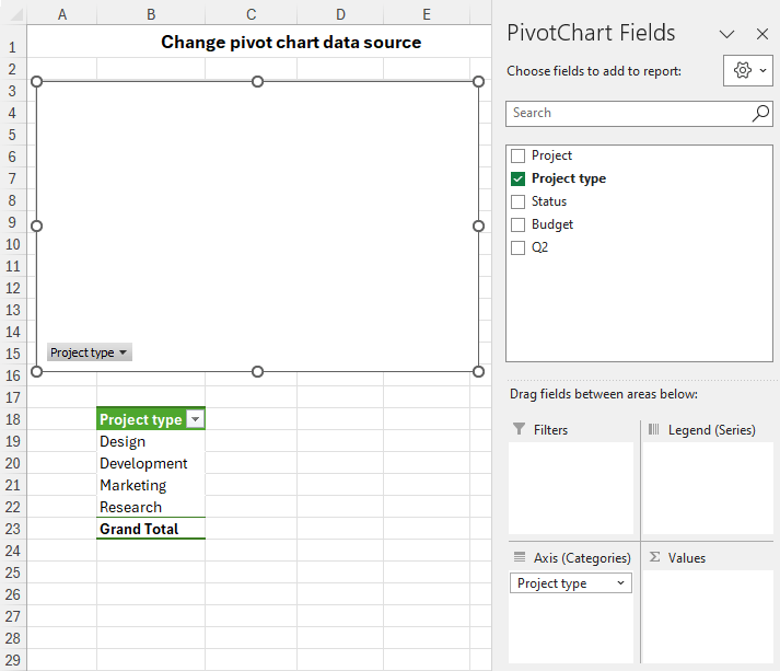
To fix this, simply select the Q2 field and drag it to the Values area. Your nicely formatted pivot graph will now display the Q2 data.

To confirm this change, select the graph, click the Change Data Source button on the Analyze tab, and you will see that it is now based on the Q2 table.
Note. Changing the pivot chart data source also alters the data source for the related pivot table.
Move pivot chart to new sheet
Similar to a standard graph, you can relocate your Excel pivot chart to another worksheet. Here's how:
- Right-click the pivot graph and select Move Chart from the context menu. Alternatively, click the Move Chart button on the Analyze tab, in the Actions group.
- In the dialog window that appears, choose one of the following options:
- New sheet - this will create a new Chart sheet and move the visual there.
- Object in – this will move the graph as an object to any existing worksheet.
- Click OK.
You can also easily move your graph back to its original sheet using the same steps.

How to refresh pivot chart in Excel
Refreshing a pivot chart is just like refreshing a pivot table. There are two main methods:
Refresh pivot chart manually
To manually refresh a pivot chart, you have several options:
- Select the graph to activate its ribbon tabs. Then, navigate to the PivotChart Analyze tab and click the Refresh button.
- Alternatively, press ALT + F5 to refresh the worksheet containing the chart.
- Another way is to right-click the graph, and then click Refresh from the context menu.
Choose the method that suits you best to ensure your graph displays the latest data.

Refresh pivot chart automatically when opening the workbook
To ensure your graph stays up-to-date every time you open your workbook, follow these steps:
- Right-click the graph and choose PivotChart Options… from the context menu.
- In the dialog box that appears, go to the Data tab, and check the box labeled Refresh data when opening the file.

Note. The settings you select in this dialog will apply to both the chart and the associated pivot table.
That's how you can create, filter and modify pivot charts in Excel. Experiment with different graph types, layouts, and customization options to find the visualization that suits your data best. With a little practice, you'll be able to create dynamic and informative pivot graphs that effectively communicate your insights.
Practice workbook for download
Excel PivotChart - examples (.xlsx file)
위 내용은 Excel에서 피벗 차트를 작성하고 사용자 정의하는 방법의 상세 내용입니다. 자세한 내용은 PHP 중국어 웹사이트의 기타 관련 기사를 참조하세요!

핫 AI 도구

Undresser.AI Undress
사실적인 누드 사진을 만들기 위한 AI 기반 앱

AI Clothes Remover
사진에서 옷을 제거하는 온라인 AI 도구입니다.

Undress AI Tool
무료로 이미지를 벗다

Clothoff.io
AI 옷 제거제

Video Face Swap
완전히 무료인 AI 얼굴 교환 도구를 사용하여 모든 비디오의 얼굴을 쉽게 바꾸세요!

인기 기사
뜨거운 도구

메모장++7.3.1
사용하기 쉬운 무료 코드 편집기

SublimeText3 중국어 버전
중국어 버전, 사용하기 매우 쉽습니다.

스튜디오 13.0.1 보내기
강력한 PHP 통합 개발 환경

드림위버 CS6
시각적 웹 개발 도구

SublimeText3 Mac 버전
신 수준의 코드 편집 소프트웨어(SublimeText3)
뜨거운 주제
 7771
7771
 15
1644
14
1399
52
1296
25
1234
29
15
1644
14
1399
52
1296
25
1234
29

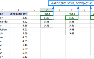 열 또는 행에서 상위 3, 5, 10 값을 찾는 Excel 공식
Apr 01, 2025 am 05:09 AM
열 또는 행에서 상위 3, 5, 10 값을 찾는 Excel 공식
Apr 01, 2025 am 05:09 AM
이 튜토리얼은 데이터 세트 내에서 상단 N 값을 효율적으로 찾아 Excel 공식을 사용하여 관련 데이터를 검색하는 방법을 보여줍니다. 최고, 최저 또는 특정 기준을 충족하는 경우이 안내서는 솔루션을 제공합니다. findi
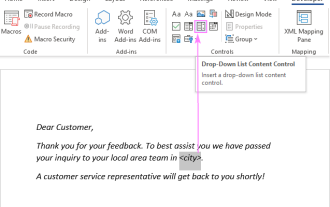 Outlook 이메일 템플릿에 드롭 다운 목록을 추가하십시오
Apr 01, 2025 am 05:13 AM
Outlook 이메일 템플릿에 드롭 다운 목록을 추가하십시오
Apr 01, 2025 am 05:13 AM
이 자습서는 여러 선택 및 데이터베이스 모집단을 포함하여 Outlook 이메일 템플릿에 드롭 다운 목록을 추가하는 방법을 보여줍니다. Outlook은 드롭 다운을 직접 지원하지 않지만이 안내서는 창의적인 해결 방법을 제공합니다. 이메일 템플릿 저장
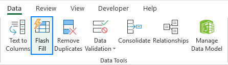 플래시 채우기를 사용하는 방법 예제와 함께 Excel
Apr 05, 2025 am 09:15 AM
플래시 채우기를 사용하는 방법 예제와 함께 Excel
Apr 05, 2025 am 09:15 AM
이 튜토리얼은 데이터 입력 작업을 자동화하기위한 강력한 도구 인 Excel의 Flash Clone 기능에 대한 포괄적 인 안내서를 제공합니다. 정의 및 위치에서 고급 사용 및 문제 해결에 이르기까지 다양한 측면을 다룹니다. Excel의 FLA 이해
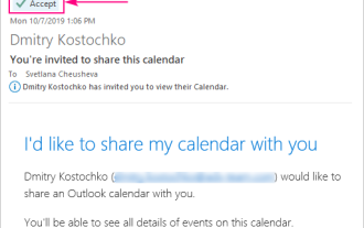 Outlook에 캘린더를 추가하는 방법 : 공유, 인터넷 캘린더, ical 파일
Apr 03, 2025 am 09:06 AM
Outlook에 캘린더를 추가하는 방법 : 공유, 인터넷 캘린더, ical 파일
Apr 03, 2025 am 09:06 AM
이 기사에서는 Outlook Desktop 응용 프로그램 내에서 ICalendar 파일 가져 오기를 포함하여 공유 캘린더에 액세스하고 활용하는 방법을 설명합니다. 이전에는 Outlook 캘린더를 공유했습니다. 이제 공유 된 캘린더를 보는 방법을 살펴 보겠습니다
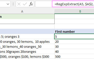 Excel에서 문자열을 추출하는 동정인 (하나 또는 모두 일치)
Mar 28, 2025 pm 12:19 PM
Excel에서 문자열을 추출하는 동정인 (하나 또는 모두 일치)
Mar 28, 2025 pm 12:19 PM
이 튜토리얼에서는 Excel에서 일반 표현식을 사용하여 주어진 패턴과 일치하는 하위 문자열을 찾아 추출하는 방법을 배웁니다. Microsoft Excel은 셀에서 텍스트를 추출하는 여러 기능을 제공합니다. 이러한 기능은 대부분에 대처할 수 있습니다
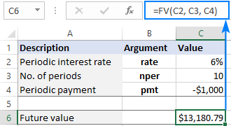 미래의 값을 계산하기위한 엑셀 기능
Apr 01, 2025 am 04:57 AM
미래의 값을 계산하기위한 엑셀 기능
Apr 01, 2025 am 04:57 AM
이 튜토리얼은 Excel의 FV 기능을 사용하여 정기적 인 지불과 덩어리 험 예금을 모두 포함하는 미래의 투자 가치를 결정하는 방법을 설명합니다. 효과적인 재무 계획은 투자 성장 이해에 달려 있으며이 안내서
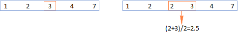 Excel의 중간 공식 - 실제 예
Apr 11, 2025 pm 12:08 PM
Excel의 중간 공식 - 실제 예
Apr 11, 2025 pm 12:08 PM
이 튜토리얼은 중간 기능을 사용하여 Excel에서 수치 데이터의 중앙값을 계산하는 방법을 설명합니다. 중앙 경향의 주요 척도 인 중앙값은 데이터 세트의 중간 값을 식별하여 Central Tenden의보다 강력한 표현을 제공합니다.
 Excel 셀에서 텍스트 및 숫자를 제거 / 분할하는 방법
Apr 01, 2025 am 05:07 AM
Excel 셀에서 텍스트 및 숫자를 제거 / 분할하는 방법
Apr 01, 2025 am 05:07 AM
이 튜토리얼은 내장 기능과 사용자 정의 VBA 기능을 모두 사용하여 Excel 셀 내에서 텍스트와 숫자를 분리하는 몇 가지 방법을 보여줍니다. 텍스트를 제거하는 동안 숫자를 추출하는 방법을 배웁니다.
