

Android App_php 스킬에서 DrawerLayout 서랍 효과 메뉴 작성 예

서랍 효과가 적용된 탐색 메뉴
여러 앱을 살펴보니 이 옆 슬라이딩 서랍 효과 메뉴가 참 좋은 것 같아요.

다른 페이지로 전환하거나 메뉴의 하드웨어 버튼을 누를 필요가 없습니다. 인터페이스의 버튼을 클릭하기만 하면 메뉴가 슬라이드되어 나오며, 많은 것을 담을 수 있는 것처럼 느껴집니다.
도서관 참조:
우선 DrawerLayout 클래스가 Support Library에 있고, android-support-v4.jar 패키지를 추가해야 합니다.
그런 다음 android.support.v4.widget.DrawerLayout을 가져옵니다.
이 클래스를 찾을 수 없는 경우 먼저 SDK Manager를 사용하여 Android 지원 라이브러리를 업데이트한 다음 Android SDKextrasandroidsupportv4 경로에서 android-support-v4.jar을 찾아 프로젝트의 libs 경로에 복사한 후 추가하세요. 경로를 구축합니다.
코드 1
레이아웃:
<RelativeLayout xmlns:android="http://schemas.android.com/apk/res/android"
  xmlns:tools="http://schemas.android.com/tools"
  android:layout_width="match_parent"
  android:layout_height="match_parent" >

  <android.support.v4.widget.DrawerLayout
    xmlns:android="http://schemas.android.com/apk/res/android"
    android:id="@+id/drawer_layout"
    android:layout_width="match_parent"
    android:layout_height="match_parent" >

    <!-- The main content view -->
    <!-- main content must be the first element of DrawerLayout because it will be drawn first and drawer must be on top of it -->

    <FrameLayout
      android:id="@+id/content_frame"
      android:layout_width="match_parent"
      android:layout_height="match_parent" />

    <!-- The navigation drawer -->

    <ListView
      android:id="@+id/left_drawer"
      android:layout_width="240dp"
      android:layout_height="match_parent"
      android:layout_gravity="left"
      android:background="#111"
      android:choiceMode="singleChoice"
      android:divider="@android:color/transparent"
      android:dividerHeight="0dp" />
  </android.support.v4.widget.DrawerLayout>

</RelativeLayout>
DrawerLayout의 첫 번째 자식 요소는 메인 콘텐츠, 즉 서랍이 열리지 않을 때 표시되는 레이아웃입니다. 여기에는 아무것도 포함되지 않은 FrameLayout이 사용됩니다.
DrawerLayout의 두 번째 하위 요소는 서랍의 콘텐츠입니다. 즉, 여기에서는 서랍 레이아웃이 사용됩니다.
주요 활동(공식 사례에서 발췌):
package com.example.hellodrawer;
import android.os.Bundle;
import android.app.Activity;
import android.content.res.Configuration;
import android.view.MenuItem;
import android.view.View;
import android.widget.AdapterView;
import android.widget.AdapterView.OnItemClickListener;
import android.widget.ArrayAdapter;
import android.widget.ListView;
import android.support.v4.app.ActionBarDrawerToggle;
import android.support.v4.view.GravityCompat;
import android.support.v4.widget.DrawerLayout;
public class HelloDrawerActivity extends Activity
{
private String[] mPlanetTitles;
private DrawerLayout mDrawerLayout;
private ActionBarDrawerToggle mDrawerToggle;
private ListView mDrawerList;
@Override
public void onCreate(Bundle savedInstanceState)
{
super.onCreate(savedInstanceState);
setContentView(R.layout.activity_hello_drawer);
mDrawerLayout = (DrawerLayout) findViewById(R.id.drawer_layout);
// init the ListView and Adapter, nothing new
initListView();
// set a custom shadow that overlays the main content when the drawer
// opens
mDrawerLayout.setDrawerShadow(R.drawable.drawer_shadow,
GravityCompat.START);
mDrawerToggle = new ActionBarDrawerToggle(this, mDrawerLayout,
R.drawable.ic_drawer, R.string.drawer_open,
R.string.drawer_close)
{
/** Called when a drawer has settled in a completely closed state. */
public void onDrawerClosed(View view)
{
invalidateOptionsMenu(); // creates call to
// onPrepareOptionsMenu()
}
/** Called when a drawer has settled in a completely open state. */
public void onDrawerOpened(View drawerView)
{
invalidateOptionsMenu(); // creates call to
// onPrepareOptionsMenu()
}
};
// Set the drawer toggle as the DrawerListener
mDrawerLayout.setDrawerListener(mDrawerToggle);
// enable ActionBar app icon to behave as action to toggle nav drawer
getActionBar().setDisplayHomeAsUpEnabled(true);
// getActionBar().setHomeButtonEnabled(true);
// Note: getActionBar() Added in API level 11
}
private void initListView()
{
mDrawerList = (ListView) findViewById(R.id.left_drawer);
mPlanetTitles = getResources().getStringArray(R.array.planets_array);
// Set the adapter for the list view
mDrawerList.setAdapter(new ArrayAdapter<String>(this,
R.layout.list_item, mPlanetTitles));
// Set the list's click listener
mDrawerList.setOnItemClickListener(new OnItemClickListener()
{
@Override
public void onItemClick(AdapterView<?> parent, View view,
int position, long id)
{
// Highlight the selected item, update the title, and close the
// drawer
mDrawerList.setItemChecked(position, true);
setTitle(mPlanetTitles[position]);
mDrawerLayout.closeDrawer(mDrawerList);
}
});
}
@Override
protected void onPostCreate(Bundle savedInstanceState)
{
super.onPostCreate(savedInstanceState);
// Sync the toggle state after onRestoreInstanceState has occurred.
mDrawerToggle.syncState();
}
@Override
public void onConfigurationChanged(Configuration newConfig)
{
super.onConfigurationChanged(newConfig);
mDrawerToggle.onConfigurationChanged(newConfig);
}
@Override
public boolean onOptionsItemSelected(MenuItem item)
{
// Pass the event to ActionBarDrawerToggle, if it returns
// true, then it has handled the app icon touch event
if (mDrawerToggle.onOptionsItemSelected(item))
{
return true;
}
// Handle your other action bar items...
return super.onOptionsItemSelected(item);
}
}
더 혼란스러운 것은 레벨 11의 API를 사용하므로 minSdkVersion이 제한되어 너무 낮을 수 없다는 것입니다.
사진 리소스는 안드로이드 공식 홈페이지 샘플에서 다운로드 가능합니다.
프로그램 실행 후 효과는 다음과 같습니다.
서랍을 열기 전:

서랍을 연 후:

코드 2
오늘 DrawerLayout 클래스를 다시 살펴보았고 직접 사용할 수 있는 메소드가 많다는 것을 발견했습니다.
사실 위처럼 번거로울 필요는 없습니다. 서랍 열기를 제어하는 버튼만 정의하면 됩니다.
레이아웃:
<RelativeLayout xmlns:android="http://schemas.android.com/apk/res/android"
  xmlns:tools="http://schemas.android.com/tools"
  android:layout_width="match_parent"
  android:layout_height="match_parent"
  android:paddingBottom="@dimen/activity_vertical_margin"
  android:paddingLeft="@dimen/activity_horizontal_margin"
  android:paddingRight="@dimen/activity_horizontal_margin"
  android:paddingTop="@dimen/activity_vertical_margin"
  tools:context=".DrawerActivity" >

  <android.support.v4.widget.DrawerLayout
    android:id="@+id/drawer_layout"
    android:layout_width="match_parent"
    android:layout_height="match_parent" >

    <!-- The main content view -->

    <FrameLayout
      android:id="@+id/content_frame"
      android:layout_width="match_parent"
      android:layout_height="match_parent" >

      <Button
        android:id="@+id/btn"
        android:layout_width="match_parent"
        android:layout_height="wrap_content"
        android:text="open"
        />
    </FrameLayout>

    <!-- The navigation drawer -->

    <ListView
      android:id="@+id/left_drawer"
      android:layout_width="240dp"
      android:layout_height="match_parent"
      android:layout_gravity="start"
      android:background="#111"
      android:choiceMode="singleChoice"
      android:divider="@android:color/transparent"
      android:dividerHeight="0dp" />
  </android.support.v4.widget.DrawerLayout>

</RelativeLayout>
주요 코드:
package com.example.hellodrawer;

import android.os.Bundle;
import android.app.Activity;
import android.support.v4.widget.DrawerLayout;
import android.view.Gravity;
import android.view.View;
import android.view.View.OnClickListener;
import android.widget.Button;

public class DrawerActivity extends Activity
{
  private DrawerLayout mDrawerLayout = null;

  @Override
  protected void onCreate(Bundle savedInstanceState)
  {
    super.onCreate(savedInstanceState);
    setContentView(R.layout.activity_drawer);

    mDrawerLayout = (DrawerLayout) findViewById(R.id.drawer_layout);

    Button button = (Button) findViewById(R.id.btn);
    button.setOnClickListener(new OnClickListener()
    {

      @Override
      public void onClick(View v)
      {
        // 按钮按下,将抽屉打开
        mDrawerLayout.openDrawer(Gravity.LEFT);

      }
    });
  }

}
Toolbar DrawerLayout을 사용하여 고급 메뉴 슬라이딩을 빠르게 구현
최신 머티리얼 디자인 디자인 사양을 따르는 일부 애플리케이션에 주의를 기울이고 있다면(그렇지 않다면 그렇다고 가정하겠습니다!) 매우 편안하고 우아해 보이는 측면 슬라이딩 메뉴 애니메이션 효과를 사용하는 경우가 많습니다. 예는 다음과 같습니다(참조 2를 통해):

오늘은 이러한 유형의 효과를 빠르게 달성하기 위해 공식 지원 라이브러리를 사용해 보겠습니다. 자세한 단계는 다음과 같습니다. (이 두 위젯을 모른다면 먼저 Google에서 검색해 보세요~)
먼저 appcompat-v7 지원을 추가해야 합니다.
Android Studio 1.0 RC4에서 프로젝트를 생성한 경우 appcompat-v7 지원이 기본적으로 추가되어 있습니다. AS 최신 버전이 아닌 경우 build.gradle에 다음 코드를 추가해야 합니다.
dependencies {
  ...//其他代码
  compile 'com.android.support:appcompat-v7:21.0.2'
}
추가 후 Gradle을 동기화해야 합니다
툴바 추가:
Toolbar는 View에서 상속되므로 다른 표준 컨트롤과 마찬가지로 기본 레이아웃 파일에 Toolbar를 직접 추가할 수 있습니다. 그러나 Toolbar의 재사용 효율성을 높이기 위해 다음과 같이 레이아웃에 custom_toolbar.xml 코드를 생성할 수 있습니다.
<?xml version="1.0" encoding="utf-8"?>
<android.support.v7.widget.Toolbar xmlns:android="http://schemas.android.com/apk/res/android"
xmlns:app="http://schemas.android.com/apk/res-auto"
android:id="@+id/tl_custom"
android:layout_width="match_parent"
android:layout_height="wrap_content"
android:background="?attr/colorPrimary"
android:minHeight="?attr/actionBarSize"
android:popupTheme="@style/ThemeOverlay.AppCompat.Light"
app:theme="@style/ThemeOverlay.AppCompat.ActionBar">
</android.support.v7.widget.Toolbar>
설명:
android.support.v7.widget.Toolbar - 물론 Lollipop에서만 툴바를 사용한다면 v7 지원을 추가하지 않고도 툴바를 바로 사용할 수 있습니다.
xmlns:app - 사용자 정의된 xml 명명 제어, res-auto는 전체 패키지 이름을 사용하지 않고 AS에서 직접 지정할 수 있습니다.
android:Background 및 android:minHeight는 모두 styles.xml에서 선언할 수 있습니다
DrawerLayout 추가:
툴바와 유사하게 코드 재사용 효율성을 높이기 위해 다음과 같이 레이아웃에 custom_drawerlayout.xml 코드를 생성할 수 있습니다.
<?xml version="1.0" encoding="utf-8"?>
<android.support.v4.widget.DrawerLayout xmlns:android="http://schemas.android.com/apk/res/android"
android:id="@+id/dl_left"
android:layout_width="match_parent"
android:layout_height="match_parent">
<!--主布局-->
<LinearLayout
android:layout_width="match_parent"
android:layout_height="match_parent">
<ImageView
android:id="@+id/iv_main"
android:layout_width="100dp"
android:layout_height="100dp" />
</LinearLayout>
<!--侧滑菜单-->
<LinearLayout
android:layout_width="match_parent"
android:layout_height="match_parent"
android:background="#fff"
android:layout_gravity="start">
<ListView
android:id="@+id/lv_left_menu"
android:layout_width="match_parent"
android:layout_height="match_parent"
android:divider="@null"
android:text="DrawerLayout" />
</LinearLayout>
</android.support.v4.widget.DrawerLayout>
Drawerlayout 태그에는 두 개의 하위 노드가 있습니다. 하나는 왼쪽 메뉴이고 다른 하나는 기본 레이아웃입니다. 또한 왼쪽 메뉴의 시작 위치는 android:layout_gravity="start"로 설정되어야 합니다.
activity_main.xml 구현:
<LinearLayout xmlns:android="http://schemas.android.com/apk/res/android"
  xmlns:tools="http://schemas.android.com/tools"
  android:layout_width="match_parent"
  android:layout_height="match_parent"
  android:orientation="vertical"
  tools:context=".MainActivity">
    <!--Toolbar-->
    <include layout="@layout/custom_toolbar" />
    <!--DrawerLayout-->
    <include layout="@layout/custom_drawerlayout" />
</LinearLayout>
include 태그를 직접적으로 간결하고 명확하게 사용하세요
Java 코드 개선:
public class MainActivity extends ActionBarActivity {
  //声明相关变量
  private Toolbar toolbar;
  private DrawerLayout mDrawerLayout;
  private ActionBarDrawerToggle mDrawerToggle;
  private ListView lvLeftMenu;
  private String[] lvs = {"List Item 01", "List Item 02", "List Item 03", "List Item 04"};
  private ArrayAdapter arrayAdapter;
  private ImageView ivRunningMan;
  private AnimationDrawable mAnimationDrawable;
  @Override
  protected void onCreate(Bundle savedInstanceState) {
    super.onCreate(savedInstanceState);
    setContentView(R.layout.activity_main);
    findViews(); //获取控件
    //京东RunningMan动画效果,和本次Toolbar无关
    mAnimationDrawable = (AnimationDrawable) ivRunningMan.getBackground();
    mAnimationDrawable.start();
    toolbar.setTitle("Toolbar");//设置Toolbar标题
    toolbar.setTitleTextColor(Color.parseColor("#ffffff")); //设置标题颜色
    setSupportActionBar(toolbar);
    getSupportActionBar().setHomeButtonEnabled(true); //设置返回键可用
    getSupportActionBar().setDisplayHomeAsUpEnabled(true);
    //创建返回键,并实现打开关/闭监听
    mDrawerToggle = new ActionBarDrawerToggle(this, mDrawerLayout, toolbar, R.string.open, R.string.close) {
      @Override
      public void onDrawerOpened(View drawerView) {
        super.onDrawerOpened(drawerView);
        mAnimationDrawable.stop();
      }
      @Override
      public void onDrawerClosed(View drawerView) {
        super.onDrawerClosed(drawerView);
        mAnimationDrawable.start();
      }
    };
    mDrawerToggle.syncState();
    mDrawerLayout.setDrawerListener(mDrawerToggle);
    //设置菜单列表
    arrayAdapter = new ArrayAdapter(this, android.R.layout.simple_list_item_1, lvs);
    lvLeftMenu.setAdapter(arrayAdapter);
  }
  private void findViews() {
    ivRunningMan = (ImageView) findViewById(R.id.iv_main);
    toolbar = (Toolbar) findViewById(R.id.tl_custom);
    mDrawerLayout = (DrawerLayout) findViewById(R.id.dl_left);
    lvLeftMenu = (ListView) findViewById(R.id.lv_left_menu);
  }
}
물론 더 중요한 것은 styles.xml과 colors.xml이며, 세부 내용은 다음과 같습니다.
<resources>
<style name="AppTheme" parent="Theme.AppCompat.Light.NoActionBar">
<!--状态栏颜色-->
<item name="colorPrimaryDark">@color/Indigo_colorPrimaryDark</item>
<!--Toolbar颜色-->
<item name="colorPrimary">@color/Indigo_colorPrimary</item>
<!--返回键样式-->
<item name="drawerArrowStyle">@style/AppTheme.DrawerArrowToggle</item>
</style>
<style name="AppTheme.DrawerArrowToggle" parent="Base.Widget.AppCompat.DrawerArrowToggle">
<item name="color">@android:color/white</item>
</style>
</resources>
<?xml version="1.0" encoding="utf-8"?>
<resources>
<color name="Indigo_colorPrimaryDark">#303f9f</color>
<color name="Indigo_colorPrimary">#3f51b5</color>
<color name="Indigo_nav_color">#4675FF</color>
</resources>
이 시점에서 가오다오에서 사이드 슬라이딩 메뉴가 구현되었으며 최종 효과는 다음과 같습니다. 프레임 레이트 때문에 시간이 걸리니까 우선 이렇게 볼까요~)


핫 AI 도구

Undresser.AI Undress
사실적인 누드 사진을 만들기 위한 AI 기반 앱

AI Clothes Remover
사진에서 옷을 제거하는 온라인 AI 도구입니다.

Undress AI Tool
무료로 이미지를 벗다

Clothoff.io
AI 옷 제거제

AI Hentai Generator
AI Hentai를 무료로 생성하십시오.

인기 기사
뜨거운 도구

메모장++7.3.1
사용하기 쉬운 무료 코드 편집기

SublimeText3 중국어 버전
중국어 버전, 사용하기 매우 쉽습니다.

스튜디오 13.0.1 보내기
강력한 PHP 통합 개발 환경

드림위버 CS6
시각적 웹 개발 도구

SublimeText3 Mac 버전
신 수준의 코드 편집 소프트웨어(SublimeText3)
뜨거운 주제
 7523
7523
 15
1378
52
81
11
54
19
21
74
15
1378
52
81
11
54
19
21
74

 새로운 보고서는 소문난 삼성 갤럭시 S25, 갤럭시 S25 플러스, 갤럭시 S25 울트라 카메라 업그레이드에 대한 비판적인 평가를 제공합니다.
Sep 12, 2024 pm 12:23 PM
새로운 보고서는 소문난 삼성 갤럭시 S25, 갤럭시 S25 플러스, 갤럭시 S25 울트라 카메라 업그레이드에 대한 비판적인 평가를 제공합니다.
Sep 12, 2024 pm 12:23 PM
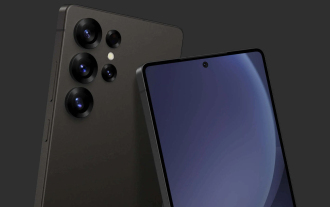
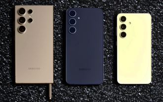
최근 아이스 유니버스는 삼성의 차기 플래그십 스마트폰으로 널리 알려진 갤럭시 S25 울트라에 대한 세부 정보를 꾸준히 공개해 왔습니다. 무엇보다도 유출자는 삼성이 카메라 업그레이드를 하나만 가져올 계획이라고 주장했습니다.
 삼성 갤럭시 S25 울트라, 디자인 변경 루머가 공개된 첫 번째 렌더링 이미지 유출
Sep 11, 2024 am 06:37 AM
삼성 갤럭시 S25 울트라, 디자인 변경 루머가 공개된 첫 번째 렌더링 이미지 유출
Sep 11, 2024 am 06:37 AM
OnLeaks는 이제 Android Headlines와 제휴하여 X(이전 Twitter) 팔로어로부터 4,000달러 이상의 수익을 창출하려는 시도가 실패한 지 며칠 후 Galaxy S25 Ultra에 대한 첫 번째 모습을 제공합니다. 맥락에 따라 h 아래에 포함된 렌더링 이미지
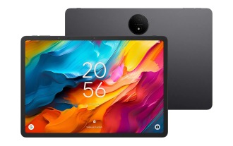 IFA 2024 | TCL의 NXTPAPER 14는 성능 면에서는 Galaxy Tab S10 Ultra와 일치하지 않지만 크기에서는 거의 일치합니다.
Sep 07, 2024 am 06:35 AM
IFA 2024 | TCL의 NXTPAPER 14는 성능 면에서는 Galaxy Tab S10 Ultra와 일치하지 않지만 크기에서는 거의 일치합니다.
Sep 07, 2024 am 06:35 AM
TCL은 두 가지 새로운 스마트폰을 발표하는 것과 함께 NXTPAPER 14라는 새로운 Android 태블릿도 발표했는데, TCL의 거대한 화면 크기는 판매 포인트 중 하나입니다. NXTPAPER 14는 TCL의 시그니처 브랜드인 무광택 LCD 패널 버전 3.0을 갖추고 있습니다.
 Vivo Y300 Pro는 7.69mm의 슬림한 본체에 6,500mAh 배터리를 탑재했습니다.
Sep 07, 2024 am 06:39 AM
Vivo Y300 Pro는 7.69mm의 슬림한 본체에 6,500mAh 배터리를 탑재했습니다.
Sep 07, 2024 am 06:39 AM
Vivo Y300 Pro는 방금 완전히 공개되었으며 대용량 배터리를 갖춘 가장 얇은 중급 Android 휴대폰 중 하나입니다. 정확히 말하면 스마트폰의 두께는 7.69mm에 불과하지만 배터리 용량은 6,500mAh입니다. 최근 출시된 것과 동일한 용량이다.
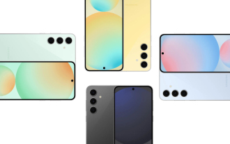 Samsung Galaxy S24 FE는 4가지 색상과 2가지 메모리 옵션으로 예상보다 낮은 가격으로 출시될 예정
Sep 12, 2024 pm 09:21 PM
Samsung Galaxy S24 FE는 4가지 색상과 2가지 메모리 옵션으로 예상보다 낮은 가격으로 출시될 예정
Sep 12, 2024 pm 09:21 PM
삼성전자는 팬에디션(FE) 스마트폰 시리즈를 언제 업데이트할지 아직 힌트를 주지 않았다. 현재 상태로 Galaxy S23 FE는 2023년 10월 초에 출시된 회사의 최신 버전으로 남아 있습니다.
 새로운 보고서는 소문난 삼성 갤럭시 S25, 갤럭시 S25 플러스, 갤럭시 S25 울트라 카메라 업그레이드에 대한 비판적인 평가를 제공합니다.
Sep 12, 2024 pm 12:22 PM
새로운 보고서는 소문난 삼성 갤럭시 S25, 갤럭시 S25 플러스, 갤럭시 S25 울트라 카메라 업그레이드에 대한 비판적인 평가를 제공합니다.
Sep 12, 2024 pm 12:22 PM
최근 아이스 유니버스는 삼성의 차기 플래그십 스마트폰으로 널리 알려진 갤럭시 S25 울트라에 대한 세부 정보를 꾸준히 공개해 왔습니다. 무엇보다도 유출자는 삼성이 카메라 업그레이드를 하나만 가져올 계획이라고 주장했습니다.
 Xiaomi Redmi Note 14 Pro Plus는 Light Hunter 800 카메라를 탑재한 최초의 Qualcomm Snapdragon 7s Gen 3 스마트폰으로 출시됩니다.
Sep 27, 2024 am 06:23 AM
Xiaomi Redmi Note 14 Pro Plus는 Light Hunter 800 카메라를 탑재한 최초의 Qualcomm Snapdragon 7s Gen 3 스마트폰으로 출시됩니다.
Sep 27, 2024 am 06:23 AM
Redmi Note 14 Pro Plus는 이제 작년 Redmi Note 13 Pro Plus(Amazon에서 현재 $375)의 직접적인 후속 제품으로 공식화되었습니다. 예상대로 Redmi Note 14 Pro Plus는 Redmi Note 14 및 Redmi Note 14 Pro와 함께 Redmi Note 14 시리즈를 주도합니다. 리
 iQOO Z9 Turbo Plus: 잠재적으로 강화된 시리즈 플래그십에 대한 예약 시작
Sep 10, 2024 am 06:45 AM
iQOO Z9 Turbo Plus: 잠재적으로 강화된 시리즈 플래그십에 대한 예약 시작
Sep 10, 2024 am 06:45 AM
OnePlus의 자매 브랜드 iQOO는 2023-4년 제품 주기가 거의 끝날 수 있습니다. 그럼에도 불구하고 브랜드는 Z9 시리즈가 아직 끝나지 않았다고 선언했습니다. 최종이자 아마도 최고급인 Turbo+ 변형이 예상대로 발표되었습니다. 티
