jQuery Mobile은 클라이언트 측 코드이지만 Ajax 기술을 기반으로 서버 측과 상호 작용합니다. 따라서 웹 서비스를 보유해야만 jQuery Mobile의 기능을 더 잘 경험할 수 있습니다. 여기서는 웹 서비스 구축 과정을 소개하지 않겠습니다. 친구들은 실제 필요에 따라 스스로 구축할 수 있습니다.
예 1:
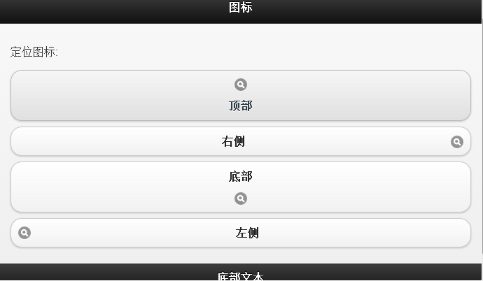
1 2 3 4 5 6 7 8 9 10 11 12 13 14 15 16 17 18 19 20 21 22 23 24 25 26 27 28 29 30 | <!DOCTYPE html>
<html lang="zh-CN">
<head>
<meta charset="UTF-8">
<link rel="stylesheet" href="http://code.jquery.com/mobile/1.3.2/jquery.mobile-1.3.2.min.css">
<script src="http://code.jquery.com/jquery-1.8.3.min.js"></script>
<script src="http://code.jquery.com/mobile/1.3.2/jquery.mobile-1.3.2.min.js"></script>
<title>jqueryMoblie</title>
</head>
<body>
<div data-role="page" id="pageone">
<div data-role="header">
<h1>图标</h1>
</div>
<div data-role="content">
<p>定位图标:</p>
<a href="#link" data-role="button" data-icon="search" data-iconpos="top">顶部</a>
<a href="#link" data-role="button" data-icon="search" data-iconpos="right">右侧</a>
<a href="#link" data-role="button" data-icon="search" data-iconpos="bottom">底部</a>
<a href="#link" data-role="button" data-icon="search" data-iconpos="left">左侧</a>
</div>
<div data-role="footer">
<h1>底部文本</h1>
</div>
</div>
</body>
</html>
|
로그인 후 복사
데모 사진:

예 2:
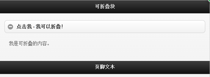
1 2 3 4 5 6 7 8 9 10 11 12 13 14 15 16 17 18 19 20 21 22 23 24 25 26 27 28 | <!DOCTYPE html>
<html>
<head>
<link rel="stylesheet" href="http://code.jquery.com/mobile/1.3.2/jquery.mobile-1.3.2.min.css">
<script src="http://code.jquery.com/jquery-1.8.3.min.js"></script>
<script src="http://code.jquery.com/mobile/1.3.2/jquery.mobile-1.3.2.min.js"></script>
</head>
<body>
<div data-role="page" id="pageone">
<div data-role="header">
<h1>可折叠块</h1>
</div>
<div data-role="content">
<div data-role="collapsible">
<h1>点击我 - 我可以折叠!</h1>
<p>我是可折叠的内容。</p>
</div>
</div>
<div data-role="footer">
<h1>页脚文本</h1>
</div>
</div>
</body>
</html>
|
로그인 후 복사
데모사진
예 3:
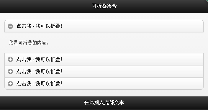
1 2 3 4 5 6 7 8 9 10 11 12 13 14 15 16 17 18 19 20 21 22 23 24 25 26 27 28 29 30 31 32 33 34 35 36 37 38 39 40 41 42 43 44 45 46 47 | <!DOCTYPE html>
<html lang="zh_CN">
<head>
<meta charset="utf-8">
<!-- <link rel="stylesheet" href="http://apps.bdimg.com/libs/jquerymobile/1.4.2/jquery.mobile.min.css">
<script src="http://apps.bdimg.com/libs/jquery/1.10.2/jquery.min.js"></script>
<script src="http://apps.bdimg.com/libs/jquerymobile/1.4.2/jquery.mobile.min.js"></script> -->
<link rel="stylesheet" href="http://code.jquery.com/mobile/1.3.2/jquery.mobile-1.3.2.min.css">
<script src="http://code.jquery.com/jquery-1.8.3.min.js"></script>
<script src="http://code.jquery.com/mobile/1.3.2/jquery.mobile-1.3.2.min.js"></script>
</head>
<body>
<div data-role="page" id="pageone">
<div data-role="header">
<h1>可折叠集合</h1>
</div>
<div data-role="content">
<div data-role="collapsible-set">
<div data-role="collapsible">
<h3>点击我 - 我可以折叠!</h3>
<p>我是可折叠的内容。</p>
</div>
<div data-role="collapsible">
<h3>点击我 - 我可以折叠!</h3>
<p>我是可折叠的内容。</p>
</div>
<div data-role="collapsible">
<h3>点击我 - 我可以折叠!</h3>
<p>我是可折叠的内容。</p>
</div>
<div data-role="collapsible">
<h3>点击我 - 我可以折叠!</h3>
<p>我是可折叠的内容。</p>
</div>
</div>
</div>
<div data-role="footer">
<h1>在此插入底部文本</h1>
</div>
</div>
</body>
</html>
|
로그인 후 복사
데모 사진:
예 4:
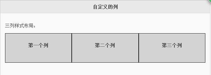
1 2 3 4 5 6 7 8 9 10 11 12 13 14 15 16 17 18 19 20 21 22 23 24 25 26 27 28 29 30 31 32 33 34 35 36 37 38 39 | <html lang="zh_CN">
<head>
<meta charset="utf-8">
<link rel="stylesheet" href="http://apps.bdimg.com/libs/jquerymobile/1.4.2/jquery.mobile.min.css">
<script src="http://apps.bdimg.com/libs/jquery/1.10.2/jquery.min.js"></script>
<script src="http://apps.bdimg.com/libs/jquerymobile/1.4.2/jquery.mobile.min.js"></script>
<style>
.ui-block-a,
.ui-block-b,
.ui-block-c
{
background-color: lightgray;
border: 1px solid black;
height: 100px;
font-weight: bold;
text-align: center;
padding: 30px;
}
</style>
</head>
<body>
<div data-role="page" id="pageone">
<div data-role="header">
<h1>自定义的列</h1>
</div>
<div data-role="content">
<p>三列样式布局:</p>
<div class="ui-grid-b">
<div class="ui-block-a"><span>第一个列</span></div>
<div class="ui-block-b"><span>第二个列</span></div>
<div class="ui-block-c"><span>第三个列</span></div>
</div>
</div>
</div>
</body>
</html>
|
로그인 후 복사
데모사진
예 5:
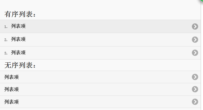
1 2 3 4 5 6 7 8 9 10 11 12 13 14 15 16 17 18 19 20 21 22 23 24 25 26 27 28 29 | <!DOCTYPE html>
<html lang="zh-CN">
<head>
<meta charset="utf-8">
<link rel="stylesheet" href="http://apps.bdimg.com/libs/jquerymobile/1.4.2/jquery.mobile.min.css">
<script src="http://apps.bdimg.com/libs/jquery/1.10.2/jquery.min.js"></script>
<script src="http://apps.bdimg.com/libs/jquerymobile/1.4.2/jquery.mobile.min.js"></script>
</head>
<body>
<div data-role="page" id="pageone">
<div data-role="content">
<h2>有序列表:</h2>
<ol data-role="listview">
<li><a href="#">列表项</a></li>
<li><a href="#">列表项</a></li>
<li><a href="#">列表项</a></li>
</ol>
<h2>无序列表:</h2>
<ul data-role="listview">
<li><a href="#">列表项</a></li>
<li><a href="#">列表项</a></li>
<li><a href="#">列表项</a></li>
</ul>
</div>
</div>
</body>
</html>
|
로그인 후 복사
데모사진
소개 과정에서 실수나 부정확한 내용이 있으면 수정해 주시기 바랍니다. 모두 감사합니다!
다른 튜토리얼과 다르게 이 튜토리얼은 예제를 통해 설명됩니다. 주요 소개는 코드 전체에 분산되어 있습니다.


![[웹 프런트엔드] Node.js 빠른 시작](https://img.php.cn/upload/course/000/000/067/662b5d34ba7c0227.png)


