

HTML5 실습 - CSS3를 사용하여 이미지 스타일을 풍부하게 하는 방법에 대한 자세한 설명(1)

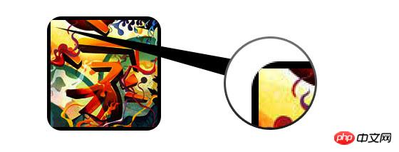
CSS3에서는 box-shadow와 border-radius를 이미지에 직접 사용하면 브라우저가 이를 제대로 렌더링할 수 없습니다. 하지만 이미지를 배경이미지로 사용하면 추가된 스타일 브라우저에서 잘 렌더링할 수 있습니다. 다양한 이미지 스타일 효과를 만들기 위해 상자 그림자, 테두리 반경 및 전환을 사용하는 방법을 소개하겠습니다.
문제
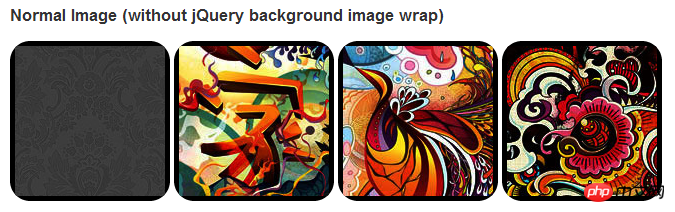
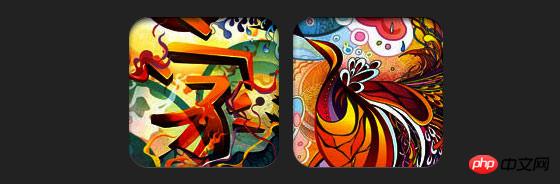
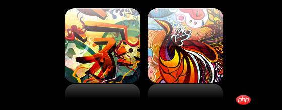
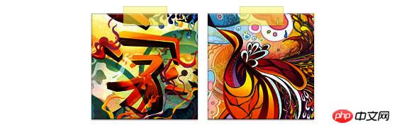
데모를 보면 이미지의 첫 번째 행에 대해 border-radius 및 inline box-shadow를 설정한 것을 알 수 있습니다. Firefox는 이미지의 테두리 반경을 렌더링하지만 인라인 상자 그림자는 렌더링하지 않습니다. 두 효과 모두 Chrome 및 Safari에서 렌더링되지 않습니다.
아아아앙firefox 효과:
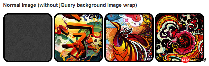
chrome/safari
해결 방법
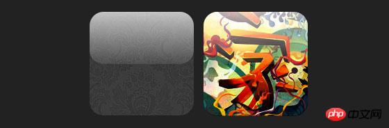
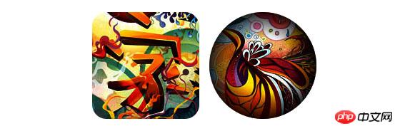
border-radius 및 inline box-shadow가 제대로 작동하려면 이미지를 배경 이미지로 변환해야 합니다.
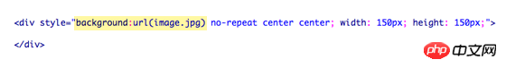
동적 방법
이 작업을 동적으로 완료하려면 각각에 대해 jquery를 사용해야 합니다. image 래퍼에 배경 이미지를 추가합니다. 다음 js 코드는 각 이미지에 범위 패키지를 추가합니다. 범위의 배경 이미지 경로는 이미지의 경로입니다.
코드가 비교적 간단해서 따로 설명할 필요는 없을 것 같습니다. 확실하지 않은 경우 jquery API를 직접 확인할 수 있습니다.
.normal img {
border: solid 5px #000;
-webkit-border-radius: 20px;
-moz-border-radius: 20px;  border-radius: 20px;
-webkit-box-shadow: inset 0 1px 5px rgba(0,0,0,.5);
-moz-box-shadow: inset 0 1px 5px rgba(0,0,0,.5);
box-shadow: inset 0 1px 5px rgba(0,0,0,.5);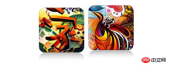
}출력
위 코드는 다음과 같은 결과를 출력합니다.
<script type="text/javascript" src="http://ajax.googleapis.com/ajax/libs/jquery/1.5/jquery.min.js"></script>
<script type="text/javascript">
$(document).ready(function(){
$("img").load(function() {
$(this).wrap(function(){
return '<span class="image-wrap ' + $(this).attr('class') + '" style="position:relative;
display:inline-block; background:url(' + $(this).attr('src') + ') no-repeat center center;
width: ' + $(this).width() + 'px; height: ' + $(this).height() + 'px;" />';
});
$(this).css("opacity","0");
});
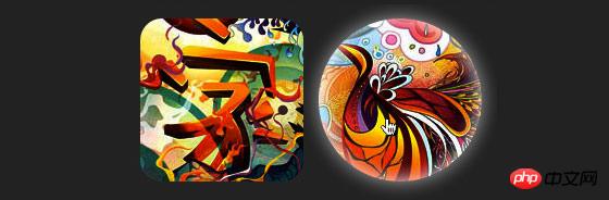
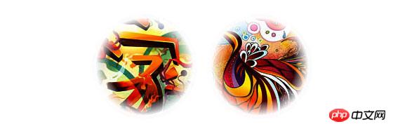
});</script>원형 이미지
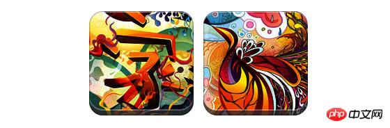
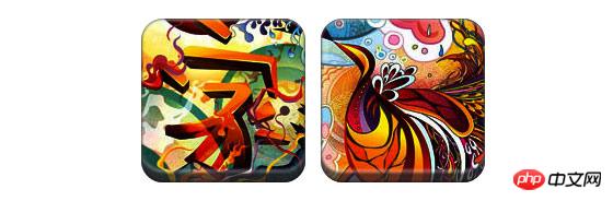
원형 이미지를 구현하기 위해 border-radius를 사용한다는 점을 추가하세요. 효과는 다음과 같습니다:
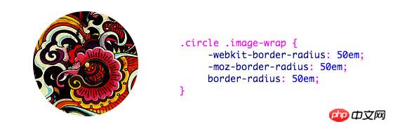
css:
<span class="image-wrap " style="position:relative;
display:inline-block; background:url(image.jpg) no-repeat center center;
width: 150px; height: 150px;">
    <img src="image.jpg" style="opacity: 0;">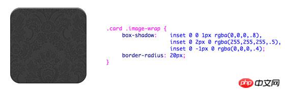
</span>카드 스타일
다음은 여러 인라인 상자를 사용한 카드 스타일 그림입니다. -그림자.
css:
.circle .image-wrap {
    -webkit-border-radius: 50em;
    -moz-border-radius: 50em;
    border-radius: 50em;
}릴리프 스타일
릴리프 효과는 다음과 같습니다.
css:
.card .image-wrap {
    -webkit-box-shadow: inset 0 0 1px rgba(0,0,0,.8), inset 0 2px 0 rgba(255,255,255,.5), inset 0 -1px 0 rgba(0,0,0,.4);
    -moz-box-shadow: inset 0 0 1px rgba(0,0,0,.8), inset 0 2px 0 rgba(255,255,255,.5), inset 0 -1px 0 rgba(0,0,0,.4);
    box-shadow: inset 0 0 1px rgba(0,0,0,.8), inset 0 2px 0 rgba(255,255,255,.5), inset 0 -1px 0 rgba(0,0,0,.4);

    -webkit-border-radius: 20px;
    -moz-border-radius: 20px;
    border-radius: 20px;
}유연한 릴리프 스타일
릴리프 스타일과 비교하여 새로운 스타일은 1px 흐림 속성을 추가합니다.
CSS:
.embossed .image-wrap {
    -webkit-box-shadow: inset 0 0 2px rgba(0,0,0,.8),
    inset 0 2px 0 rgba(255,255,255,.5),
    inset 0 -7px 0 rgba(0,0,0,.6),
    inset 0 -9px 0 rgba(255,255,255,.3);
    -moz-box-shadow: inset 0 0 2px rgba(0,0,0,.8),
    inset 0 2px 0 rgba(255,255,255,.5), inset 0 -7px 0 rgba(0,0,0,.6),
    inset 0 -9px 0 rgba(255,255,255,.3);
    box-shadow: inset 0 0 2px rgba(0,0,0,.8),
    inset 0 2px 0 rgba(255,255,255,.5),
    inset 0 -7px 0 rgba(0,0,0,.6), inset 0 -9px 0 rgba(255,255,255,.3);

    -webkit-border-radius: 20px;
    -moz-border-radius: 20px;
    border-radius: 20px;
}컷아웃 스타일
컷아웃 효과를 얻으려면 포함된 상자 그림자를 사용하세요.
css:
.soft-embossed .image-wrap {
    -webkit-box-shadow: inset 0 0 4px rgba(0,0,0,1),
    inset 0 2px 1px rgba(255,255,255,.5),
    inset 0 -9px 2px rgba(0,0,0,.6),
    inset 0 -12px 2px rgba(255,255,255,.3);
    -moz-box-shadow: inset 0 0 4px rgba(0,0,0,1),
    inset 0 2px 1px rgba(255,255,255,.5),
    inset 0 -9px 2px rgba(0,0,0,.6),
    inset 0 -12px 2px rgba(255,255,255,.3);
    box-shadow: inset 0 0 4px rgba(0,0,0,1),
    inset 0 2px 1px rgba(255,255,255,.5),
    inset 0 -9px 2px rgba(0,0,0,.6),
    inset 0 -12px 2px rgba(255,255,255,.3);

    -webkit-border-radius: 20px;
    -moz-border-radius: 20px;
    border-radius: 20px;
}변환 및 발광
이 예에서는 이미지 패키지에 전환 속성을 추가합니다. 위로 슬라이드하면 둥근 모서리에서 둥근 모서리로 변경됩니다. 그런 다음 여러 개의 상자 그림자를 사용하여 광선 효과를 얻습니다.
css:
.cut-out .image-wrap {
    -webkit-box-shadow: 0 1px 0 rgba(255,255,255,.2),
    inset 0 4px 5px rgba(0,0,0,.6),
    inset 0 1px 0 rgba(0,0,0,.6);
    -moz-box-shadow: 0 1px 0 rgba(255,255,255,.2),
    inset 0 4px 5px rgba(0,0,0,.6),
    inset 0 1px 0 rgba(0,0,0,.6);
    box-shadow: 0 1px 0 rgba(255,255,255,.2),
    inset 0 4px 5px rgba(0,0,0,.6),
    inset 0 1px 0 rgba(0,0,0,.6);

    -webkit-border-radius: 20px;
    -moz-border-radius: 20px;
    border-radius: 20px;
}강조 효과
강조 효과는 요소에 :after 의사 클래스를 추가하여 달성됩니다.
css:
.morphing-glowing .image-wrap {
    -webkit-transition: 1s;
    -moz-transition: 1s;
    transition: 1s;

    -webkit-border-radius: 20px;
    -moz-border-radius: 20px;
    border-radius: 20px;
}.morphing-glowing .image-wrap:hover {
    -webkit-box-shadow: 0 0 20px rgba(255,255,255,.6),
    inset 0 0 20px rgba(255,255,255,1);
    -moz-box-shadow: 0 0 20px rgba(255,255,255,.6),
    inset 0 0 20px rgba(255,255,255,1);
    box-shadow: 0 0 20px rgba(255,255,255,.6),
    inset 0 0 20px rgba(255,255,255,1);

    -webkit-border-radius: 60em;
    -moz-border-radius: 60em;
    border-radius: 60em;
}반사 효과
이 예에서는 반사 효과를 얻기 위해 하이라이트 효과를 아래쪽으로 이동합니다.
css:
.glossy .image-wrap {
    -webkit-box-shadow: inset 0 -1px 0 rgba(0,0,0,.5);
    -moz-box-shadow: inset 0 -1px 0 rgba(0,0,0,.5);
    box-shadow: inset 0 -1px 0 rgba(0,0,0,.5);

    -webkit-border-radius: 20px;
    -moz-border-radius: 20px;
    border-radius: 20px;
}.glossy .image-wrap:after {
    position: absolute;
    content: ' ';
    width: 100%;
    height: 50%;
    top: 0;
    left: 0;

    -webkit-border-radius: 20px;
    -moz-border-radius: 20px;
    border-radius: 20px;

    background: -moz-linear-gradient(top, rgba(255,255,255,0.7) 0%, rgba(255,255,255,.1) 100%);
    background: -webkit-gradient(linear, left top, left bottom, color-stop(0%,rgba(255,255,255,0.7)), color-stop(100%,rgba(255,255,255,.1)));
    background: linear-gradient(top, rgba(255,255,255,0.7) 0%,rgba(255,255,255,.1) 100%);
}하이라이트 및 반사
이 예에서는 :before 및 :after를 사용하여 하이라이트 및 반사 효과를 결합합니다. .
css:
.reflection .image-wrap:after {
    position: absolute;
    content: ' ';
    width: 100%;
    height: 30px;
    bottom: -31px;
    left: 0;

    -webkit-border-top-left-radius: 20px;
    -webkit-border-top-right-radius: 20px;
    -moz-border-radius-topleft: 20px;
    -moz-border-radius-topright: 20px;
    border-top-left-radius: 20px;
    border-top-right-radius: 20px;

    background: -moz-linear-gradient(top, rgba(0,0,0,.3) 0%, rgba(255,255,255,0) 100%);
    background: -webkit-gradient(linear, left top, left bottom, color-stop(0%,rgba(0,0,0,.3)),
    color-stop(100%,rgba(255,255,255,0)));
    background: linear-gradient(top, rgba(0,0,0,.3) 0%,rgba(255,255,255,0) 100%);
}.reflection .image-wrap:hover {
    position: relative;
    top: -8px;
}테이프 스타일
이 예에서는 :after를 사용하여 테이프 효과를 얻습니다.
css:
.glossy-reflection .image-wrap {
    -webkit-box-shadow: inset 0 -1px 0 rgba(0,0,0,.5), inset 0 1px 0 rgba(255,255,255,.6);
    -moz-box-shadow: inset 0 -1px 0 rgba(0,0,0,.5), inset 0 1px 0 rgba(255,255,255,.6);
    box-shadow: inset 0 -1px 0 rgba(0,0,0,.5), inset 0 1px 0 rgba(255,255,255,.6);

    -webkit-transition: 1s;
    -moz-transition: 1s;
    transition: 1s;

    -webkit-border-radius: 20px;
    -moz-border-radius: 20px;
    border-radius: 20px;
}.glossy-reflection .image-wrap:before {
    position: absolute;
    content: ' ';
    width: 100%;
    height: 50%;
    top: 0;
    left: 0;

    -webkit-border-radius: 20px;
    -moz-border-radius: 20px;
    border-radius: 20px;

    background: -moz-linear-gradient(top, rgba(255,255,255,0.7) 0%, rgba(255,255,255,.1) 100%);
    background: -webkit-gradient(linear, left top, left bottom, color-stop(0%,rgba(255,255,255,0.7)), color-stop(100%,rgba(255,255,255,.1)));
    background: linear-gradient(top, rgba(255,255,255,0.7) 0%,rgba(255,255,255,.1) 100%);
}.glossy-reflection .image-wrap:after {
    position: absolute;
    content: ' ';
    width: 100%;
    height: 30px;
    bottom: -31px;
    left: 0;

    -webkit-border-top-left-radius: 20px;
    -webkit-border-top-right-radius: 20px;
    -moz-border-radius-topleft: 20px;
    -moz-border-radius-topright: 20px;
    border-top-left-radius: 20px;
    border-top-right-radius: 20px;

    background: -moz-linear-gradient(top, rgba(230,230,230,.3) 0%, rgba(230,230,230,0) 100%);
    background: -webkit-gradient(linear, left top, left bottom, color-stop(0%,rgba(230,230,230,.3)), color-stop(100%,rgba(230,230,230,0)));
    background: linear-gradient(top, rgba(230,230,230,.3) 0%,rgba(230,230,230,0) 100%);
}변환 및 색상 지정
이 예에서는 다음을 사용합니다. 요소에 대해 마우스가 지나갈 때 방사형 그라데이션 효과를 달성합니다.
CSS:
.tape .image-wrap {
    -webkit-box-shadow: inset 0 0 2px rgba(0,0,0,.7),
    inset 0 2px 0 rgba(255,255,255,.3), inset 0 -1px 0 rgba(0,0,0,.5), 0 1px 3px rgba(0,0,0,.4);
    -moz-box-shadow: inset 0 0 2px rgba(0,0,0,.7),
    inset 0 2px 0 rgba(255,255,255,.3),
    inset 0 -1px 0 rgba(0,0,0,.5), 0 1px 3px rgba(0,0,0,.4);
    box-shadow: inset 0 0 2px rgba(0,0,0,.7), inset 0 2px 0 rgba(255,255,255,.3),
    inset 0 -1px 0 rgba(0,0,0,.5), 0 1px 3px rgba(0,0,0,.4);
}.tape .image-wrap:after {
    position: absolute;
    content: ' ';
    width: 60px;
    height: 25px;
    top: -10px;
    left: 50%;
    margin-left: -30px;
    border: solid 1px rgba(137,130,48,.2);

    background: -moz-linear-gradient(top, rgba(254,243,127,.6) 0%, rgba(240,224,54,.6) 100%);
    background: -webkit-gradient(linear, left top, left bottom, color-stop(0%,rgba(254,243,127,.6)), color-stop(100%,rgba(240,224,54,.6)));
    background: linear-gradient(top, rgba(254,243,127,.6) 0%,rgba(240,224,54,.6) 100%);
    -webkit-box-shadow: inset 0 1px 0 rgba(255,255,255,.3), 0 1px 0 rgba(0,0,0,.2);
}페더 가장자리 원
또한 방사형 그래디언트를 사용하여 페더링 효과를 얻기 위한 마스크를 생성할 수도 있습니다. .
css:
.feather .image-wrap {
    position: relative;

    -webkit-border-radius: 30em;
    -moz-border-radius: 30em;
    border-radius: 30em;
}.feather .image-wrap:after  {
    position: absolute;
    content: ' ';
    width: 100%;
    height: 100%;
    top: 0;
    left: 0;

    background: -webkit-gradient(radial, 50% 50%, 50, 50% 50%, 70, from(rgba(255,255,255,0)), to(rgba(255,255,255,1)));
    background: -moz-radial-gradient(50% 50%, circle, rgba(255,255,255,0) 50px, rgba(255,255,255,1) 70px);
}浏览器兼容性
这种实现方式在大多数支持border-radius, box-shadow, :before and :after特性的浏览器中(例如Chrome, Firefox 和 Safari),都能很好的工作。在不支持新特性的浏览器中,只会显示原始图片。
创造你自己的实现
借助:before 和:after伪类能为图片创造很多种样式,你可以自己尝试创建出新的效果。
위 내용은 HTML5 실습 - CSS3를 사용하여 이미지 스타일을 풍부하게 하는 방법에 대한 자세한 설명(1)의 상세 내용입니다. 자세한 내용은 PHP 중국어 웹사이트의 기타 관련 기사를 참조하세요!

핫 AI 도구

Undresser.AI Undress
사실적인 누드 사진을 만들기 위한 AI 기반 앱

AI Clothes Remover
사진에서 옷을 제거하는 온라인 AI 도구입니다.

Undress AI Tool
무료로 이미지를 벗다

Clothoff.io
AI 옷 제거제

AI Hentai Generator
AI Hentai를 무료로 생성하십시오.

인기 기사
뜨거운 도구

메모장++7.3.1
사용하기 쉬운 무료 코드 편집기

SublimeText3 중국어 버전
중국어 버전, 사용하기 매우 쉽습니다.

스튜디오 13.0.1 보내기
강력한 PHP 통합 개발 환경

드림위버 CS6
시각적 웹 개발 도구

SublimeText3 Mac 버전
신 수준의 코드 편집 소프트웨어(SublimeText3)
뜨거운 주제
 7562
7562
 15
1384
52
84
11
60
19
28
99
15
1384
52
84
11
60
19
28
99

 HTML의 테이블 테두리
Sep 04, 2024 pm 04:49 PM
HTML의 테이블 테두리
Sep 04, 2024 pm 04:49 PM
HTML의 테이블 테두리 안내. 여기에서는 HTML의 테이블 테두리 예제를 사용하여 테이블 테두리를 정의하는 여러 가지 방법을 논의합니다.
 HTML 여백-왼쪽
Sep 04, 2024 pm 04:48 PM
HTML 여백-왼쪽
Sep 04, 2024 pm 04:48 PM
HTML 여백-왼쪽 안내. 여기에서는 HTML margin-left에 대한 간략한 개요와 코드 구현과 함께 예제를 논의합니다.
 HTML의 중첩 테이블
Sep 04, 2024 pm 04:49 PM
HTML의 중첩 테이블
Sep 04, 2024 pm 04:49 PM
HTML의 Nested Table에 대한 안내입니다. 여기에서는 각 예와 함께 테이블 내에 테이블을 만드는 방법을 설명합니다.
 HTML 테이블 레이아웃
Sep 04, 2024 pm 04:54 PM
HTML 테이블 레이아웃
Sep 04, 2024 pm 04:54 PM
HTML 테이블 레이아웃 안내. 여기에서는 HTML 테이블 레이아웃의 값에 대해 예제 및 출력 n 세부 사항과 함께 논의합니다.
 HTML 입력 자리 표시자
Sep 04, 2024 pm 04:54 PM
HTML 입력 자리 표시자
Sep 04, 2024 pm 04:54 PM
HTML 입력 자리 표시자 안내. 여기서는 코드 및 출력과 함께 HTML 입력 자리 표시자의 예를 논의합니다.
 HTML 정렬 목록
Sep 04, 2024 pm 04:43 PM
HTML 정렬 목록
Sep 04, 2024 pm 04:43 PM
HTML 순서 목록에 대한 안내입니다. 여기서는 HTML Ordered 목록 및 유형에 대한 소개와 각각의 예에 대해서도 설명합니다.
 HTML에서 텍스트 이동
Sep 04, 2024 pm 04:45 PM
HTML에서 텍스트 이동
Sep 04, 2024 pm 04:45 PM
HTML에서 텍스트 이동 안내. 여기서는 Marquee 태그가 구문과 함께 작동하는 방식과 구현할 예제에 대해 소개합니다.
 HTML 온클릭 버튼
Sep 04, 2024 pm 04:49 PM
HTML 온클릭 버튼
Sep 04, 2024 pm 04:49 PM
HTML onclick 버튼에 대한 안내입니다. 여기에서는 각각의 소개, 작업, 예제 및 다양한 이벤트의 onclick 이벤트에 대해 설명합니다.
