

HTML은 애니메이션 그림을 구현합니다 - 도라에몽

누구나 어린 시절의 도라에몽, 놀라운 도라에몽으로 가득 찬 작은 배, 무기력하고 슬플 때 곁에 있어 주는 도라에몽, 무기력하고 슬플 때 곁에 있어 주는 도라에몽이 있다고 믿습니다. 마음껏 생각하며 도라야끼를 먹자~ 오늘은 마음속의 도라에몽을 그려보겠습니다~
도라에몽을 정의하는 용기
-
동일 먼저 큰 용기를 정의하여 도라에몽을 그리고 크기를 결정합니다 그리고 위치.
<!-- 哆啦A梦大容器 --><div class="doa"></div>
/*哆啦A梦*/
  .doa{position: relative;top: 100px;}
로그인 후 복사
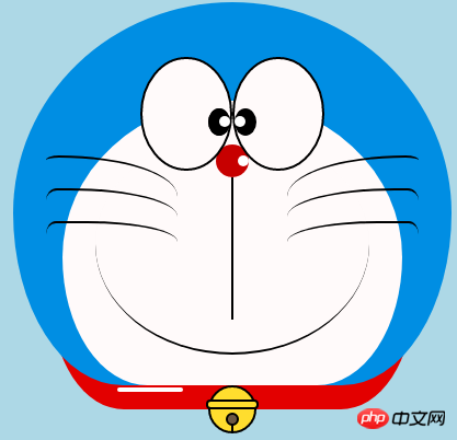
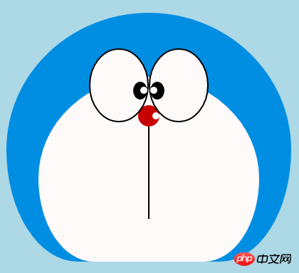
도라에몽의 머리 그리기(얼굴 포함, 얼굴에는 눈과 코 포함)
머리는 여러 부분으로 구성됩니다: 도라에몽의 얼굴과 코, 얼굴에는 눈이 두 개 있고, 안에 눈알과 눈 흰자가 있습니다. 따라서 DOM 중첩의 여러 레이어가 있을 것입니다. 물론 기본 그래픽은 모두 div+border-radius로 구성됩니다.
그린 아이템의 다양한 부분을 해당 위치에 배치하면 됩니다.
내가 이전에 그린 몇 장의 그림을 보면 border-radius가 매우 일반적으로 사용되는 속성이라는 것을 알 수 있습니다. 실제로 div의 거의 모든 변형은 이 속성과 분리될 수 없습니다. 보라색 일반적으로 슬래시 뒤의 내용을 쓰지 않으면 슬래시 부분이 가로 길이, 슬래시가 세로 높이가 됩니다. 기본적으로 앞 슬래시 뒤에 아무것도 쓰지 않으면 가로와 세로 크기가 동일합니다. . 제가 말한 내용이 충분히 상세하지 않다는 것을 알고 있습니다. 제 Xinshen 블로그를 참조하세요. 가을 달은 언제 올까요? CSS3 border-radius에 대해 얼마나 알고 계시나요? , 숙련된 운전사의 안내에 따라 국경 반경을 완전히 이해할 수 있을 것이라고 장담합니다. 빨리 버스에 탑승해 보는 것이 어떨까요?
border-radius: 300px 300px 300px 300px/300px 300px 300px 300px;<!-- 头 --> <div class="head"> <!-- 存放脸部的容器 --> <div class="face"> <!-- 左眼大圈儿 --> <div> <!-- 左眼眼珠(黑色部分) --> <div> <!-- 左眼眼白,黑色里面的白色部分 --> <div></div> </div> </div> <!-- 右眼大圈儿 --> <div> <!--右眼眼珠(黑色部分) --> <div> <!-- 右眼眼白,黑色里面的白色部分 --> <div></div> </div> </div> </div> <!-- 红鼻子部分 --> <div class="nose"> <!-- 红鼻子里面的白圈儿 --> <div></div> </div> <!-- 红鼻子下面的那根黑线,也属于鼻子部分 --> <div class="nose1"></div> </div> .head{ margin: 0 auto; /*头部定义大小并居中显示*/ width: 400px; height: 350px; background: #008ee3; /*头部定义背景颜色*/ position: relative; border-radius: 50% 50% 25% 25% / 55% 55% 45% 45%; /*头部定义四个方向圆角大小*/ } .face{ width: 310px; /*脸部定义大小*/ height: 260px; background: snow; /*脸部定义背景颜色*/ border-radius: 50% 50% 25% 25% / 55% 55% 45% 45%; /*脸部定义四个方向的圆角大小*/ position: relative; /*脸部定义位置,是相对于head的位置*/ top: 90px; left: 45px; } /*左眼眶*/ .face>div:first-child{ width: 80px; /*左眼框定义大小*/ height: 100px; border-radius: 50%; /*左眼框定义与圆角大小*/ border:2px #000 solid; /*定义外边框*/ background: snow; float: left; /*为了使左右两个眼睛能在一排显示*/ position: relative; /*位置是相对于face的位置*/ top:-40px; left: 71px; z-index: 50; } /*右眼眶,画法跟左眼一样*/ .face>div:last-child{ width: 80px; height: 100px; border-radius: 50%; border:2px #000 solid; background: snow; float: left; position: relative; top:-40px; left: 71px; z-index: 50; } /*左眼珠1*/ .face>div:first-child div{ width: 20px; /*定义眼珠的大小*/ height: 25px; background: #000; border-radius: 50%; position: absolute; /*定义眼珠的位置,相对于眼眶的位置*/ top: 45px; left: 60px; } /*左瞳孔*/ .face>div:first-child div div{ width: 10px; /*定义黑色瞳孔的大小*/ height: 10px; background: #ffffff; border-radius: 50%; position: absolute; /*定义黑色瞳孔的位置,相对于眼珠的位置*/ top: 7px; left: 10px; } /*右眼珠和左眼珠画法一样*/ .face>div:last-child div{ width: 20px; height: 25px; background: #000; border-radius: 50%; position: absolute; top: 45px; } /*右瞳孔和左瞳孔的画法一样*/ .face>div:last-child div div{ width: 10px; height: 10px; background: #ffffff; border-radius: 50%; position: absolute; top: 7px; } .nose{ width: 30px; /*定义红鼻子的大小*/ height: 30px; border-radius: 50%; background: #c70000; position: absolute; top: 130px; left: 50%; margin-left: -15px; z-index: 10; } .nose div{ width: 10px; /*定义红鼻子里面白色圈圈的大小*/ height: 10px; border-radius: 50%; position: absolute; background: #ffffff; top: 10px; margin-left: 20px; z-index: 10; } .nose1{ width: 2px; /*定义红鼻子下面的那一条黑线*/ height: 130px; background: #000; position: absolute; top: 160px; left: 50%; margin-left: -1px; z-index: 10; }로그인 후 복사

도라에몽의 머리.png
- 입은 매우 단순해야 하며, 테두리+테두리 반경을 사용하여 구현됩니다.
<div class="mouth"></div>
.mouth{      width: 250px;   /*定义嘴巴的大小*/      height: 200px;      border-radius: 50%;      background: snow;      border-bottom: 2px #000 solid;      margin: -230px auto;      position: relative;  /*定义嘴巴的位置*/
  }
로그인 후 복사
도라에몽 입.png

- 이전 글 [연재3]에서 애니메이션 제작을 위해 실제로 html로 그렸습니다. - 새끼 고양이 수염 그리는 방법은 이미 소개한 바 있습니다. 스마일 애니메이션에서 수염을 그릴 때는 기본 아이디어는 동일하므로 여기서는 자세히 설명하지 않겠습니다.
<!-- 胡须 -->
  <div class="beard">
  <!-- 左边胡须部分 -->
      <div class="left">
      <!-- 第一根胡须 -->
          <div></div>
          <!-- 第二根胡须 -->
          <div></div>
          <!-- 第三根胡须 -->
          <div></div>
      </div>
      <div class="right">
          <div></div>
          <div></div>
          <div></div>
      </div>
      <!-- 脖子部分的小白条部分 -->
      <span></span>
  </div>/*胡须样式*/.beard .left div:first-child{      width: 120px;      height: 40px;      border-top: 2px #000 solid;      border-radius: 10% 90% 10% 90% / 10% 90% 10% 90%;      position: absolute;      left: 50%;      top: 140px;      margin-left: -170px;      z-index: 100;
  }  .beard .left div:nth-child(2){      width: 120px;      height: 40px;      border-top: 2px #000 solid;      border-radius: 10% 90% 10% 90% / 30% 70% 40% 60%;      position: absolute;      left: 50%;      top: 170px;      margin-left: -170px;      z-index: 100;
  }  .beard .left div:last-child{      width: 120px;      height: 40px;      border-top: 2px #000 solid;      border-radius: 10% 90% 10% 90% / 40% 60% 10% 90%;      position: absolute;      left: 50%;      top: 200px;      margin-left: -170px;      z-index: 100;
  }  .beard .right div:first-child{      width: 120px;      height: 40px;      border-top: 2px #000 solid;      border-radius: 90% 10% 90% 10% / 90% 10% 90% 10%;      position: absolute;      left: 50%;      top: 140px;      margin-left: 50px;      z-index: 100;
  }  .beard .right div:nth-child(2){      width: 120px;      height: 40px;      border-top: 2px #000 solid;      border-radius: 90% 10% 90% 10% / 70% 30% 60% 40%;      position: absolute;      left: 50%;      top: 170px;      margin-left: 50px;      z-index: 100;
  }  .beard .right div:last-child{      width: 120px;      height: 40px;      border-top: 2px #000 solid;      border-radius: 90% 10% 90% 10% / 60% 40% 90% 10%;      position: absolute;      left: 50%;      top: 200px;      margin-left: 50px;      z-index: 100;
  }  .beard span{      display: block;      width: 60px;      height: 3.5px;      background: #ffffff;      border-radius: 4px;      position: absolute;      top: 352px;      left: 50%;      margin-left: -105px;
  }
로그인 후 복사
도라에몽 턱수염.png

- 목은 기본 div 변형 후의 모양이고 남는 부분은 숨겨두시면 됩니다. 머리 아래.
- 벨부분은 아주 심플한 기본 그래픽으로 구성되어있습니다.
<!-- 脖 -->
  <div class="neck">
  <!-- 铃铛的圆形 -->
      <div></div>
      <!-- 铃铛的小圆角矩形 -->
      <div></div>
      <!-- 铃铛的小圆形 -->
      <div></div>
      <!-- 铃铛的小竖线 -->
      <div></div>
  </div>
.neck{      width: 330px;      height: 200px;      border-radius: 50% 50% 20% 20% / 50% 50% 50% 50%;      background: #e30000;      margin: 80px auto;      z-index: 100;
  }  .neck div:first-child{      border: 2px #000 solid;      border-radius: 50%;      width: 40px;      height: 40px;      background: #ffdd2e;      position: absolute;      top: 350px;      left: 50%;      margin-left: -22px;      transition: all 1s;
  }  .neck div:nth-child(2){      border: 2px #000 solid;      width: 44px;      height: 5px;      background: #ffdd2e;      position: absolute;      left: 50%;      margin-left: -24px;      top: 363px;      border-radius: 5px;      transition: all 1s;
  }  .neck div:nth-child(3){      width: 8px;      height: 8px;      border: 2px #000 solid;      position: absolute;      background: #6c5844;      border-radius: 50%;      left: 50%;      margin-left: -6px;      top: 375px;      transition: all 1s;
  }  .neck div:nth-child(4){      width: 2px;      height: 8px;      background: #000;      position: absolute;      left: 50%;      margin-left: -1px;      top: 385px;      transition: all 1s;
  }
로그인 후 복사
도라에몽의 목.png

- 도라에몽은 움직일때가 더 귀엽죠,그럼 놔두자 움직이자(전환속성).
- 마우스를 눈 영역으로 이동하고 왼쪽 안구를 왼쪽으로 이동합니다.
- 마우스를 입으로 가져가면 표정이 변합니다.
- 마우스를 벨 부분으로 옮기면 벨이 커집니다.
/*眼睛动效*/.head:hover .face>div:first-child div{      left: 0px;      transition: all 1s;
  }  .head:hover .face>div:first-child div div{      left: 0px;      transition: all 1s;
  }/*嘴巴动效,嘴巴的dom容器下面要加了个空的div容器*/.mouth div:first-child{      width: 82px;      height: 2px;      background: #000;      position: absolute;      z-index: 1000;      top: -25px;      left: 6px;      display: none;
  }  .mouth div:nth-child(2){      width: 82px;      height: 2px;      background: #000;      position: absolute;      z-index: 1000;      top: -25px;      left: 90px;      display: none;
  }  .mouth:hover{      border-radius: 0;      width: 180px;      height: 200px;
  }  .mouth:hover div:first-child,.mouth:hover div:nth-child(2){      display: block;
  }/*铃铛动效*/.neck:hover div:first-child{      width: 60px;      height: 60px;      left: 50%;      margin-left: -30px;
  }  .neck:hover div:nth-child(2){      width: 66px;      height: 7.5px;      left: 50%;      margin-left: -33px;
  }  .neck:hover div:nth-child(3){      width: 12px;      height: 12px;      left: 50%;      margin-left: -6px;      top: 385px;
  }  .neck:hover div:nth-child(4){      width: 2px;      height: 12px;      left: 50%;      margin-left: 1px;      top: 400px;
  }
로그인 후 복사
도라에몽 animation.gif

위 내용은 HTML은 애니메이션 그림을 구현합니다 - 도라에몽의 상세 내용입니다. 자세한 내용은 PHP 중국어 웹사이트의 기타 관련 기사를 참조하세요!

핫 AI 도구

Undresser.AI Undress
사실적인 누드 사진을 만들기 위한 AI 기반 앱

AI Clothes Remover
사진에서 옷을 제거하는 온라인 AI 도구입니다.

Undress AI Tool
무료로 이미지를 벗다

Clothoff.io
AI 옷 제거제

AI Hentai Generator
AI Hentai를 무료로 생성하십시오.

인기 기사
뜨거운 도구

메모장++7.3.1
사용하기 쉬운 무료 코드 편집기

SublimeText3 중국어 버전
중국어 버전, 사용하기 매우 쉽습니다.

스튜디오 13.0.1 보내기
강력한 PHP 통합 개발 환경

드림위버 CS6
시각적 웹 개발 도구

SublimeText3 Mac 버전
신 수준의 코드 편집 소프트웨어(SublimeText3)
뜨거운 주제
 7456
7456
 15
1376
52
77
11
41
19
15
10
15
1376
52
77
11
41
19
15
10

 HTML의 테이블 테두리
Sep 04, 2024 pm 04:49 PM
HTML의 테이블 테두리
Sep 04, 2024 pm 04:49 PM
HTML의 테이블 테두리 안내. 여기에서는 HTML의 테이블 테두리 예제를 사용하여 테이블 테두리를 정의하는 여러 가지 방법을 논의합니다.
 HTML의 중첩 테이블
Sep 04, 2024 pm 04:49 PM
HTML의 중첩 테이블
Sep 04, 2024 pm 04:49 PM
HTML의 Nested Table에 대한 안내입니다. 여기에서는 각 예와 함께 테이블 내에 테이블을 만드는 방법을 설명합니다.
 HTML 여백-왼쪽
Sep 04, 2024 pm 04:48 PM
HTML 여백-왼쪽
Sep 04, 2024 pm 04:48 PM
HTML 여백-왼쪽 안내. 여기에서는 HTML margin-left에 대한 간략한 개요와 코드 구현과 함께 예제를 논의합니다.
 HTML 테이블 레이아웃
Sep 04, 2024 pm 04:54 PM
HTML 테이블 레이아웃
Sep 04, 2024 pm 04:54 PM
HTML 테이블 레이아웃 안내. 여기에서는 HTML 테이블 레이아웃의 값에 대해 예제 및 출력 n 세부 사항과 함께 논의합니다.
 HTML 정렬 목록
Sep 04, 2024 pm 04:43 PM
HTML 정렬 목록
Sep 04, 2024 pm 04:43 PM
HTML 순서 목록에 대한 안내입니다. 여기서는 HTML Ordered 목록 및 유형에 대한 소개와 각각의 예에 대해서도 설명합니다.
 HTML 입력 자리 표시자
Sep 04, 2024 pm 04:54 PM
HTML 입력 자리 표시자
Sep 04, 2024 pm 04:54 PM
HTML 입력 자리 표시자 안내. 여기서는 코드 및 출력과 함께 HTML 입력 자리 표시자의 예를 논의합니다.
 HTML에서 텍스트 이동
Sep 04, 2024 pm 04:45 PM
HTML에서 텍스트 이동
Sep 04, 2024 pm 04:45 PM
HTML에서 텍스트 이동 안내. 여기서는 Marquee 태그가 구문과 함께 작동하는 방식과 구현할 예제에 대해 소개합니다.
 HTML 온클릭 버튼
Sep 04, 2024 pm 04:49 PM
HTML 온클릭 버튼
Sep 04, 2024 pm 04:49 PM
HTML onclick 버튼에 대한 안내입니다. 여기에서는 각각의 소개, 작업, 예제 및 다양한 이벤트의 onclick 이벤트에 대해 설명합니다.
