
1 <style> 2 body{ 3 margin: 0 auto; 4 padding: 0; 5 } 6 nav{ 7 width: 100%; 8 height: 35px; 9 } 10 article{ 11 width: 100%; 12 background-color: #1983D1; 13 } 14 .div2{ 15 width: 100%; 16 height: 30px; 17 line-height: 30px; 18 background-color: #1983D1; 19 } 20 .div2>input{ 21 width: 78%; 22 height: 25px; 23 border: 0; 24 background-color: #2F8DD5; 25 /*border: 1px solid #2F8DD5;*/ 26 border-radius: 5px; 27 margin-left: 1vw;; 28 } 29 /*改变输入框 提示字体颜色*/ 30 input::placeholder{ 31 color: #8DC0E4; 32 } 33 .div2>button{ 34 width: 9%; 35 height: 25px; 36 background-color: #1983D1; 37 border: 0; 38 font-size: 3vw; 39 color: white; 40 } 41 .section1>ul{ 42 list-style: none; 43 display: flex; 44 justify-content:space-around; 45 align-items:center; 46 width: 100%; 47 height: 10vw; 48 margin-left: -30px; 49 } 50 .section1>ul>li{ 51 width: 24%; 52 color: white; 53 font-size: 2.5vw; 54 text-align: center; 55 margin-top: 2px; 56 } 57 .section2{ 58 background-color: white; 59 width: 100%; 60 } 61 62 .section2>ul{ 63 64 list-style: none; 65 display: flex; 66 justify-content:space-around; 67 align-items:center; 68 width: 100%; 69 height: 6rem; 70 margin-left: -30px; 71 } 72 .section2>ul>li{ 73 width: 24%; 74 /*color: white;*/ 75 font-size: 2vw; 76 text-align: center; 77 margin-top: 2px; 78 } 79 .section2>ul>li>span{ 80 font-size: 2.5rem; 81 } 82 .section3{ 83 width: 100%; 84 height: 90px; 85 line-height: 90px; 86 } 87 .section3 img{ 88 width: 20%; 89 height: 90px; 90 margin-top: -10px; 91 margin-left: 2vw; 92 border-radius: 15px; 93 } 94 .section4{ 95 margin-top: -4vw; 96 width: 100%; 97 height: 49vw; 98 } 99 .section4>img{100 width: 100%;101 height: 49vw;102 }103 footer>ul{104 width: 100%;105 height: 50px;106 /*line-height: 98px;*/107 list-style: none;108 display: flex;109 justify-content: space-between;110 margin-left: -1.5vw;111 }112 footer>ul>li{113 width: 24%;114 height: 48px;115 font-size: 3vw;116 text-align: center;117 color: #A9A9A9;118 margin-top: 3vw;119 }120 </style>
부트스트랩 모방 상자 + Alipay 홈페이지

작업이 완료되지 않았습니다. 계속 오세요! 지금 인터넷 상태가 좋지 않아서 제가 입력한 모든 작업이 손실되었습니다.
오늘은 주로 Bootstrap과 HTML5 Case를 결합한 간단한 작은 프로젝트에 대해 이야기하겠습니다.
우선: 제목에서 알 수 있듯이 모바일 단말기이므로 다음 코드 문자열이 필요합니다.
그리고 Bootstrap 모형 상자에는 다음과 같은 플러그인도 있습니다:
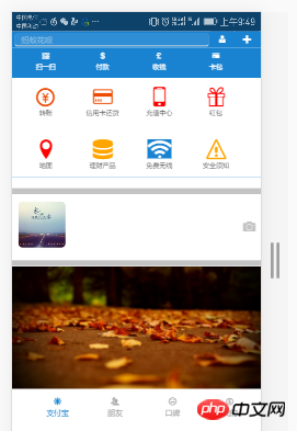
먼저 효과를 살펴보겠습니다. 조금 보기 흉하기 때문에 제안하지 마세요! PC에서 했습니다! 효과를 보기 위해 브라우저의 WEB 응답 형식을 사용했습니다.
흉내 상자의 효과를 다시 살펴보겠습니다.

효과는 이렇습니다!
플러그인이 준비되었습니다. 코드를 입력해 보겠습니다!
먼저 CSS에 대해 말씀드리겠습니다. 저는 Google Chrome을 사용하고 있으며 CSS3 스타일은 일부 하위 버전 브라우저와 호환되지 않으므로 더 번거로울 것입니다! 며칠 안에 호환성 문제에 관한 기사가 준비되었습니다.
1 <style> 2 body{ 3 margin: 0 auto; 4 padding: 0; 5 } 6 nav{ 7 width: 100%; 8 height: 35px; 9 } 10 article{ 11 width: 100%; 12 background-color: #1983D1; 13 } 14 .div2{ 15 width: 100%; 16 height: 30px; 17 line-height: 30px; 18 background-color: #1983D1; 19 } 20 .div2>input{ 21 width: 78%; 22 height: 25px; 23 border: 0; 24 background-color: #2F8DD5; 25 /*border: 1px solid #2F8DD5;*/ 26 border-radius: 5px; 27 margin-left: 1vw;; 28 } 29 /*改变输入框 提示字体颜色*/ 30 input::placeholder{ 31 color: #8DC0E4; 32 } 33 .div2>button{ 34 width: 9%; 35 height: 25px; 36 background-color: #1983D1; 37 border: 0; 38 font-size: 3vw; 39 color: white; 40 } 41 .section1>ul{ 42 list-style: none; 43 display: flex; 44 justify-content:space-around; 45 align-items:center; 46 width: 100%; 47 height: 10vw; 48 margin-left: -30px; 49 } 50 .section1>ul>li{ 51 width: 24%; 52 color: white; 53 font-size: 2.5vw; 54 text-align: center; 55 margin-top: 2px; 56 } 57 .section2{ 58 background-color: white; 59 width: 100%; 60 } 61 62 .section2>ul{ 63 64 list-style: none; 65 display: flex; 66 justify-content:space-around; 67 align-items:center; 68 width: 100%; 69 height: 6rem; 70 margin-left: -30px; 71 } 72 .section2>ul>li{ 73 width: 24%; 74 /*color: white;*/ 75 font-size: 2vw; 76 text-align: center; 77 margin-top: 2px; 78 } 79 .section2>ul>li>span{ 80 font-size: 2.5rem; 81 } 82 .section3{ 83 width: 100%; 84 height: 90px; 85 line-height: 90px; 86 } 87 .section3 img{ 88 width: 20%; 89 height: 90px; 90 margin-top: -10px; 91 margin-left: 2vw; 92 border-radius: 15px; 93 } 94 .section4{ 95 margin-top: -4vw; 96 width: 100%; 97 height: 49vw; 98 } 99 .section4>img{100 width: 100%;101 height: 49vw;102 }103 footer>ul{104 width: 100%;105 height: 50px;106 /*line-height: 98px;*/107 list-style: none;108 display: flex;109 justify-content: space-between;110 margin-left: -1.5vw;111 }112 footer>ul>li{113 width: 24%;114 height: 48px;115 font-size: 3vw;116 text-align: center;117 color: #A9A9A9;118 margin-top: 3vw;119 }120 </style>로그인 후 복사
1 <style> 2 body{ 3 margin: 0 auto; 4 padding: 0; 5 } 6 nav{ 7 width: 100%; 8 height: 35px; 9 } 10 article{ 11 width: 100%; 12 background-color: #1983D1; 13 } 14 .div2{ 15 width: 100%; 16 height: 30px; 17 line-height: 30px; 18 background-color: #1983D1; 19 } 20 .div2>input{ 21 width: 78%; 22 height: 25px; 23 border: 0; 24 background-color: #2F8DD5; 25 /*border: 1px solid #2F8DD5;*/ 26 border-radius: 5px; 27 margin-left: 1vw;; 28 } 29 /*改变输入框 提示字体颜色*/ 30 input::placeholder{ 31 color: #8DC0E4; 32 } 33 .div2>button{ 34 width: 9%; 35 height: 25px; 36 background-color: #1983D1; 37 border: 0; 38 font-size: 3vw; 39 color: white; 40 } 41 .section1>ul{ 42 list-style: none; 43 display: flex; 44 justify-content:space-around; 45 align-items:center; 46 width: 100%; 47 height: 10vw; 48 margin-left: -30px; 49 } 50 .section1>ul>li{ 51 width: 24%; 52 color: white; 53 font-size: 2.5vw; 54 text-align: center; 55 margin-top: 2px; 56 } 57 .section2{ 58 background-color: white; 59 width: 100%; 60 } 61 62 .section2>ul{ 63 64 list-style: none; 65 display: flex; 66 justify-content:space-around; 67 align-items:center; 68 width: 100%; 69 height: 6rem; 70 margin-left: -30px; 71 } 72 .section2>ul>li{ 73 width: 24%; 74 /*color: white;*/ 75 font-size: 2vw; 76 text-align: center; 77 margin-top: 2px; 78 } 79 .section2>ul>li>span{ 80 font-size: 2.5rem; 81 } 82 .section3{ 83 width: 100%; 84 height: 90px; 85 line-height: 90px; 86 } 87 .section3 img{ 88 width: 20%; 89 height: 90px; 90 margin-top: -10px; 91 margin-left: 2vw; 92 border-radius: 15px; 93 } 94 .section4{ 95 margin-top: -4vw; 96 width: 100%; 97 height: 49vw; 98 } 99 .section4>img{100 width: 100%;101 height: 49vw;102 }103 footer>ul{104 width: 100%;105 height: 50px;106 /*line-height: 98px;*/107 list-style: none;108 display: flex;109 justify-content: space-between;110 margin-left: -1.5vw;111 }112 footer>ul>li{113 width: 24%;114 height: 48px;115 font-size: 3vw;116 text-align: center;117 color: #A9A9A9;118 margin-top: 3vw;119 }120 </style>그렇습니다!
<body>
		<nav>
			<img src="1.png" style="width: 100%;height: 35px;" />
		</nav>
		<div class="div1"></div>
		<div class="div2">
			<input type="search" placeholder="   蚂蚁花呗" />
			<button><span class="icon icon-user-tie"></span></button>
			<button data-toggle="modal" data-target="#kuang" data-backdrop="true"><span class="icon icon-plus"></span></button>
		</div>
		<!--模态框-->
		<div class="modal fade modal-sm" id="kuang" style="width: 30%; margin-left: 65%;">
			<div class="modal-dialog modal-sm">
				<div class="modal-content">
					<!--体-->
					<div class="modal-body">
						<ul style="list-style: none; color:#6B6B6B;font-size: 2vw;">
							<li><span class="icon icon-bubbles4" style="margin-left: -3vw;"></span>  发起群聊</li>
							<li><span class="icon icon-user-plus" style="margin-left: -3vw;"></span>  添加朋友</li>
							<li><span class="icon icon-qrcode" style="margin-left: -3vw;"></span>  扫 一 扫</li>
							<li><span class="icon icon-coin-euro" style="margin-left: -3vw;"></span>  我要收款</li>
						</ul>
					</div>
				</div>
			</div>
		</div>
		<article>
			<section class="section1">
				<ul>
					<li>
						<span class="glyphicon glyphicon-qrcode"></span>
						<div>扫一扫</div>
					</li>
					<li>
						<span class="glyphicon glyphicon-usd"></span>
						<div>付款</div>
					</li>
					<li>
						<span class="glyphicon glyphicon-gbp"></span>
						<div>收钱</div>
					</li>
					<li>
						<span class="n glyphicon glyphicon-credit-card"></span>
						<div>卡包</div>
					</li>
				</ul>
			</section>

			<section class="section2">
				<ul>
					<li>
						<span class="icon icon-coin-yen" style="color: #EE4A02;"></span>
						<div>转账</div>
					</li>
					<li>
						<span class="icon icon-credit-card" style="color: #EE4A02;"></span>
						<div>信用卡还贷</div>
					</li>
					<li>
						<span class="icon icon-mobile" style="color: red;"></span>
						<div>充值中心</div>
					</li>
					<li>
						<span class="icon icon-gift" style="color: red;"></span>
						<div>红包</div>
					</li>
				</ul>
				<ul>
					<li>
						<span class="icon icon-location" style="color: red;"></span>
						<div>地图</div>
					</li>
					<li>
						<span class="icon icon-database" style="color: orange;"></span>
						<div>理财产品</div>
					</li>
					<li>
						<span class="icon icon-connection" style="background-color: #1983D1;color: white;"></span>
						<div>免费无线</div>
					</li>
					<li>
						<span class="icon icon-warning" style="color: orange;"></span>
						<div>安全须知</div>
					</li>
				</ul>
			</section>
		</article>
		<hr style="background-color: #C3C3C3;width: 100%; height: 10px;" />

		<section class="section3">
			<img src="2.png" class="img-responsive" />
			<span class="icon icon-camera pull-right" style="margin-top: -11.5vw;font-size: 5vw;margin-right: 2vw;color:#C3C3C3;"></span>
		</section>
		<hr style="background-color: #C3C3C3;width: 100%; height: 10px;" />
		<section class="section4">
			<img src="3.png" class="img-responsive" />
		</section>
		<footer>
			<ul>
				<li style="color: #1983D1;">
					<span class="icon icon-svg"></span>
					<div>支付宝</div>
				</li>
				<li>
					<span class="icon icon-users"></span>
					<div>朋友</div>
				</li>
				<li>
					<span class="icon icon-hipster"></span>
					<div>口碑</div>
				</li>
				<li>
					<span class="icon icon-coin-dollar"></span>
					<div>我的</div>
				</li>
			</ul>
		</footer>

		<script src="../jquery-3.1.1.min.js?1.1.10"></script>
		<script src="../dist/js/bootstrap.js?1.1.10"></script>
	</body>
좋아요! 부트스트랩 흉내내기 박스가 결합된 알리페이 홈페이지입니다!
부트스트랩 튜토리얼
] 이해가 안 되는 부분이 있으면 언제든지 문의해주세요. 댓글 보면 하나씩 답변해드릴게요
위 내용은 부트스트랩 모방 상자 + Alipay 홈페이지의 상세 내용입니다. 자세한 내용은 PHP 중국어 웹사이트의 기타 관련 기사를 참조하세요!

핫 AI 도구

Undresser.AI Undress
사실적인 누드 사진을 만들기 위한 AI 기반 앱

AI Clothes Remover
사진에서 옷을 제거하는 온라인 AI 도구입니다.

Undress AI Tool
무료로 이미지를 벗다

Clothoff.io
AI 옷 제거제

Video Face Swap
완전히 무료인 AI 얼굴 교환 도구를 사용하여 모든 비디오의 얼굴을 쉽게 바꾸세요!

인기 기사
뜨거운 도구

메모장++7.3.1
사용하기 쉬운 무료 코드 편집기

SublimeText3 중국어 버전
중국어 버전, 사용하기 매우 쉽습니다.

스튜디오 13.0.1 보내기
강력한 PHP 통합 개발 환경

드림위버 CS6
시각적 웹 개발 도구

SublimeText3 Mac 버전
신 수준의 코드 편집 소프트웨어(SublimeText3)


 부트 스트랩 검색 창을 얻는 방법
Apr 07, 2025 pm 03:33 PM
부트 스트랩 검색 창을 얻는 방법
Apr 07, 2025 pm 03:33 PM
부트 스트랩을 사용하여 검색 표시 줄의 값을 얻는 방법 : 검색 표시 줄의 ID 또는 이름을 결정하십시오. JavaScript를 사용하여 DOM 요소를 얻으십시오. 요소의 값을 가져옵니다. 필요한 작업을 수행하십시오.
 Vue에서 부트 스트랩을 사용하는 방법
Apr 07, 2025 pm 11:33 PM
Vue에서 부트 스트랩을 사용하는 방법
Apr 07, 2025 pm 11:33 PM
vue.js에서 bootstrap 사용은 5 단계로 나뉩니다 : Bootstrap 설치. main.js.의 부트 스트랩 가져 오기 부트 스트랩 구성 요소를 템플릿에서 직접 사용하십시오. 선택 사항 : 사용자 정의 스타일. 선택 사항 : 플러그인을 사용하십시오.
 부트 스트랩의 수직 중심을 수행하는 방법
Apr 07, 2025 pm 03:21 PM
부트 스트랩의 수직 중심을 수행하는 방법
Apr 07, 2025 pm 03:21 PM
부트 스트랩을 사용하여 수직 센터링을 구현하여 : Flexbox Method : D-Flex, 정당화 컨텐츠 중심 및 정렬 중심 센터 클래스를 사용하여 Flexbox 컨테이너에 요소를 배치하십시오. Align-Items-Center 클래스 방법 : Flexbox를 지원하지 않는 브라우저의 경우 상위 요소의 높이가 정의 된 경우 Align-Items 중심 클래스를 사용하십시오.
 부트 스트랩에 사진을 삽입하는 방법
Apr 07, 2025 pm 03:30 PM
부트 스트랩에 사진을 삽입하는 방법
Apr 07, 2025 pm 03:30 PM
Bootstrap에 이미지를 삽입하는 방법에는 여러 가지가 있습니다. HTML IMG 태그를 사용하여 이미지를 직접 삽입하십시오. 부트 스트랩 이미지 구성 요소를 사용하면 반응 형 이미지와 더 많은 스타일을 제공 할 수 있습니다. 이미지 크기를 설정하고 IMG-Fluid 클래스를 사용하여 이미지를 적응할 수 있도록하십시오. IMG 통과 클래스를 사용하여 테두리를 설정하십시오. 둥근 모서리를 설정하고 IMG 라운드 클래스를 사용하십시오. 그림자를 설정하고 그림자 클래스를 사용하십시오. CSS 스타일을 사용하여 이미지를 조정하고 배치하십시오. 배경 이미지를 사용하여 배경 이미지 CSS 속성을 사용하십시오.
 부트 스트랩에 분할 라인을 작성하는 방법
Apr 07, 2025 pm 03:12 PM
부트 스트랩에 분할 라인을 작성하는 방법
Apr 07, 2025 pm 03:12 PM
부트 스트랩 분할 라인을 만드는 두 가지 방법이 있습니다 : 태그를 사용하여 수평 분할 라인이 생성됩니다. CSS 테두리 속성을 사용하여 사용자 정의 스타일 분할 라인을 만듭니다.
 부트 스트랩을위한 프레임 워크를 설정하는 방법
Apr 07, 2025 pm 03:27 PM
부트 스트랩을위한 프레임 워크를 설정하는 방법
Apr 07, 2025 pm 03:27 PM
부트 스트랩 프레임 워크를 설정하려면 다음 단계를 따라야합니다. 1. CDN을 통해 부트 스트랩 파일 참조; 2. 자신의 서버에서 파일을 다운로드하여 호스팅하십시오. 3. HTML에 부트 스트랩 파일을 포함; 4. 필요에 따라 Sass/Less를 컴파일하십시오. 5. 사용자 정의 파일을 가져옵니다 (선택 사항). 설정이 완료되면 Bootstrap의 그리드 시스템, 구성 요소 및 스타일을 사용하여 반응 형 웹 사이트 및 응용 프로그램을 만들 수 있습니다.

 부트 스트랩 버튼을 사용하는 방법
Apr 07, 2025 pm 03:09 PM
부트 스트랩 버튼을 사용하는 방법
Apr 07, 2025 pm 03:09 PM
부트 스트랩 버튼을 사용하는 방법? 부트 스트랩 CSS를 소개하여 버튼 요소를 만들고 부트 스트랩 버튼 클래스를 추가하여 버튼 텍스트를 추가하십시오.
