

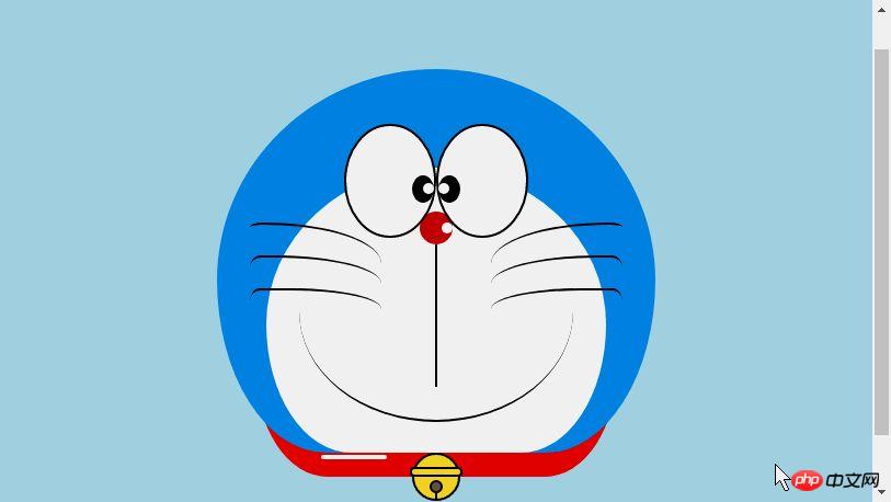
HTML 샘플 코드를 공유하여 애니메이션 도라에몽 만들기

누구나 어린 시절의 도라에몽, 놀라운 도라에몽으로 가득 찬 작은 배, 무기력하고 슬플 때 곁에 있어주는 도라에몽, 무기력하고 슬플 때 곁에 있어주는 도라에몽이 있다고 믿습니다. 엉뚱한 생각을 하며 도라야키를 함께 먹습니다~ 오늘은 마음속의 도라에몽을 그려보겠습니다~

도라에몽을 정의하는 용기
-
동일 먼저 큰 용기를 정의하여 도라에몽을 그리고 결정합니다. 그 크기와 위치.
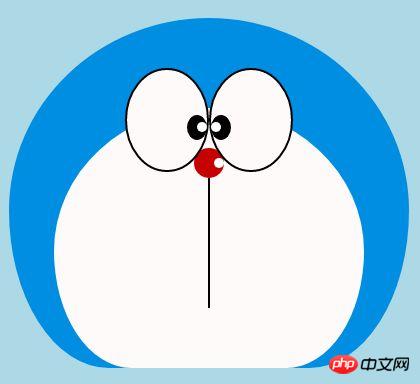
<!-- 哆啦A梦大容器 -->
<p class="doa"></p>
/*哆啦A梦*/
 .doa{position: relative;top: 100px;}
로그인 후 복사 도라에몽의 머리 그리기(얼굴 포함, 얼굴에는 눈과 코 포함)
머리는 여러 부분으로 구성됩니다: 도라에몽의 얼굴과 코, 얼굴에는 눈이 두 개 있고, 안에 눈알과 눈 흰자가 있습니다. 따라서 여러 레이어의 DOM 중첩이 있을 것입니다. 물론 기본 그래픽은 모두 p+border-radius로 구성됩니다.
그린 아이템의 다양한 부분을 해당 위치에 배치하면 됩니다.
내가 이전에 그린 몇 장의 그림을 보면 border-radius가 매우 일반적으로 사용되는 속성이라는 것을 알 수 있습니다. p의 거의 모든 변형은 실제로 border-radius의 실제 모습입니다. -radius: 300px 300px 300px 300px/300px 300px 300px 300px; Jiangzi에서는 일반적으로 슬래시 뒤에 내용을 쓰지 않습니다. 슬래시 부분은 가로 길이이고, 슬래시는 세로 높이입니다. 동일합니다. 제가 말한 내용이 충분히 상세하지 않다는 것을 알고 있습니다. 제 Xinshen 블로그를 참조하세요. 가을 달은 언제 올까요? CSS3 border-radius에 대해 얼마나 알고 계시나요? , 숙련된 운전기사의 안내에 따라 국경 반경을 완벽하게 이해할 수 있도록 몇 분 안에 버스에 탑승해 보는 것은 어떨까요?
<!-- 头 -->
  <p class="head">
 <!-- 存放脸部的容器 -->
 <p class="face">
 <!-- 左眼大圈儿 -->
 <p>
 <!-- 左眼眼珠(黑色部分) -->
 <p>
 <!-- 左眼眼白,黑色里面的白色部分 -->
 <p></p>
 </p>
 </p>
 <!-- 右眼大圈儿 -->
 <p>
 <!--右眼眼珠(黑色部分) -->
 <p>
 <!-- 右眼眼白,黑色里面的白色部分 -->
 <p></p>
 </p>
 </p>
 </p>
 <!-- 红鼻子部分 -->
 <p class="nose">
 <!-- 红鼻子里面的白圈儿 -->
 <p></p>
 </p>
 <!-- 红鼻子下面的那根黑线,也属于鼻子部分 -->
 <p class="nose1"></p>
 </p>
.head{
 margin: 0 auto; /*头部定义大小并居中显示*/
 width: 400px;
 height: 350px;
 background: #008ee3; /*头部定义背景颜色*/
 position: relative;
 border-radius: 50% 50% 25% 25% / 55% 55% 45% 45%; /*头部定义四个方向圆角大小*/
 }
 .face{
 width: 310px; /*脸部定义大小*/
 height: 260px;
 background: snow; /*脸部定义背景颜色*/
 border-radius: 50% 50% 25% 25% / 55% 55% 45% 45%; /*脸部定义四个方向的圆角大小*/
 position: relative; /*脸部定义位置,是相对于head的位置*/
 top: 90px;
 left: 45px;
 }
 /*左眼眶*/
 .face>p:first-child{
 width: 80px; /*左眼框定义大小*/
 height: 100px;
 border-radius: 50%; /*左眼框定义与圆角大小*/
 border:2px #000 solid; /*定义外边框*/
 background: snow;
 float: left; /*为了使左右两个眼睛能在一排显示*/
 position: relative; /*位置是相对于face的位置*/
 top:-40px;
 left: 71px;
 z-index: 50;
 }
 /*右眼眶,画法跟左眼一样*/
 .face>p:last-child{
 width: 80px;
 height: 100px;
 border-radius: 50%;
 border:2px #000 solid;
 background: snow;
 float: left;
 position: relative;
 top:-40px;
 left: 71px;
 z-index: 50;
 }
 /*左眼珠1*/
 .face>p:first-child p{
 width: 20px; /*定义眼珠的大小*/
 height: 25px;
 background: #000;
 border-radius: 50%;
 position: absolute; /*定义眼珠的位置,相对于眼眶的位置*/
 top: 45px;
 left: 60px;
 }
 /*左瞳孔*/
 .face>p:first-child p p{
 width: 10px; /*定义黑色瞳孔的大小*/
 height: 10px;
 background: #ffffff;
 border-radius: 50%;
 position: absolute; /*定义黑色瞳孔的位置,相对于眼珠的位置*/
 top: 7px;
 left: 10px;
 }
 /*右眼珠和左眼珠画法一样*/
 .face>p:last-child p{
 width: 20px;
 height: 25px;
 background: #000;
 border-radius: 50%;
 position: absolute;
 top: 45px;
 }
 /*右瞳孔和左瞳孔的画法一样*/
 .face>p:last-child p p{
 width: 10px;
 height: 10px;
 background: #ffffff;
 border-radius: 50%;
 position: absolute;
 top: 7px;
 }
 .nose{
 width: 30px; /*定义红鼻子的大小*/
 height: 30px;
 border-radius: 50%;
 background: #c70000;
 position: absolute;
 top: 130px;
 left: 50%;
 margin-left: -15px;
 z-index: 10;
 }
 .nose p{
 width: 10px; /*定义红鼻子里面白色圈圈的大小*/
 height: 10px;
 border-radius: 50%;
 position: absolute;
 background: #ffffff;
 top: 10px;
 margin-left: 20px;
 z-index: 10;
 }
 .nose1{
 width: 2px; /*定义红鼻子下面的那一条黑线*/
 height: 130px;
 background: #000;
 position: absolute;
 top: 160px;
 left: 50%;
 margin-left: -1px;
 z-index: 10;
 }
로그인 후 복사
도라에몽의 머리.png
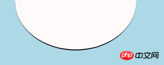
도라에몽 입 그리기
입은 매우 단순해야 하며, Border+border-Radius로 구현을 사용하고 있음을 한눈에 알 수 있습니다.
<p class="mouth"></p>
.mouth{
 width: 250px; /*定义嘴巴的大小*/
 height: 200px;
 border-radius: 50%;
 background: snow;
 border-bottom: 2px #000 solid;
 margin: -230px auto;
 position: relative; /*定义嘴巴的位置*/
 }
로그인 후 복사도라에몽 입.png
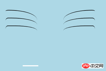
도라에몽 수염 부분 그리기
수염 부분은 애니메이션 제작을 위해 이전 글에서 실제로 그려봤습니다 [연재3] - 수염 그리는 방법은 이미 새끼 고양이 스마일 애니메이션에서 수염을 그릴 때 소개되었으므로 여기서는 자세한 내용을 다루지 않겠습니다. 기본 아이디어는 동일합니다.
<!-- 胡须 -->
  <p class="beard">
 <!-- 左边胡须部分 -->
 <p class="left">
 <!-- 第一根胡须 -->
 <p></p>
 <!-- 第二根胡须 -->
 <p></p>
 <!-- 第三根胡须 -->
 <p></p>
 </p>
 <p class="right">
 <p></p>
 <p></p>
 <p></p>
 </p>
 <!-- 脖子部分的小白条部分 -->
 <span></span>
 </p>
/*胡须样式*/
.beard .left p:first-child{
 width: 120px;
 height: 40px;
 border-top: 2px #000 solid;
 border-radius: 10% 90% 10% 90% / 10% 90% 10% 90%;
 position: absolute;
 left: 50%;
 top: 140px;
 margin-left: -170px;
 z-index: 100;
 }
 .beard .left p:nth-child(2){
 width: 120px;
 height: 40px;
 border-top: 2px #000 solid;
 border-radius: 10% 90% 10% 90% / 30% 70% 40% 60%;
 position: absolute;
 left: 50%;
 top: 170px;
 margin-left: -170px;
 z-index: 100;
 }
 .beard .left p:last-child{
 width: 120px;
 height: 40px;
 border-top: 2px #000 solid;
 border-radius: 10% 90% 10% 90% / 40% 60% 10% 90%;
 position: absolute;
 left: 50%;
 top: 200px;
 margin-left: -170px;
 z-index: 100;
 }

 .beard .right p:first-child{
 width: 120px;
 height: 40px;
 border-top: 2px #000 solid;
 border-radius: 90% 10% 90% 10% / 90% 10% 90% 10%;
 position: absolute;
 left: 50%;
 top: 140px;
 margin-left: 50px;
 z-index: 100;
 }
 .beard .right p:nth-child(2){
 width: 120px;
 height: 40px;
 border-top: 2px #000 solid;
 border-radius: 90% 10% 90% 10% / 70% 30% 60% 40%;
 position: absolute;
 left: 50%;
 top: 170px;
 margin-left: 50px;
 z-index: 100;
 }
 .beard .right p:last-child{
 width: 120px;
 height: 40px;
 border-top: 2px #000 solid;
 border-radius: 90% 10% 90% 10% / 60% 40% 90% 10%;
 position: absolute;
 left: 50%;
 top: 200px;
 margin-left: 50px;
 z-index: 100;
 }
 .beard span{
 display: block;
 width: 60px;
 height: 3.5px;
 background: #ffffff;
 border-radius: 4px;
 position: absolute;
 top: 352px;
 left: 50%;
 margin-left: -105px;
 }
로그인 후 복사도라에몽 턱수염.png
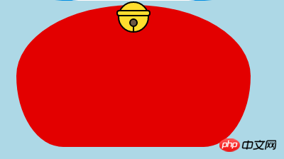
도라에몽의 목부분을 그려주세요(목부분에는 종도 포함되어있습니다)
목은 기본 p변형 후의 모양으로 중복되어 부분적으로 아래로 숨기시면 됩니다 머리.
벨부분은 아주 심플한 기본 그래픽으로 구성되어있습니다.
<!-- 脖 -->
  <p class="neck">
 <!-- 铃铛的圆形 -->
 <p></p>
 <!-- 铃铛的小圆角矩形 -->
 <p></p>
 <!-- 铃铛的小圆形 -->
 <p></p>
 <!-- 铃铛的小竖线 -->
 <p></p>
 </p>
.neck{
 width: 330px;
 height: 200px;
 border-radius: 50% 50% 20% 20% / 50% 50% 50% 50%;
 background: #e30000;
 margin: 80px auto;
 z-index: 100;
 }
 .neck p:first-child{
 border: 2px #000 solid;
 border-radius: 50%;
 width: 40px;
 height: 40px;
 background: #ffdd2e;
 position: absolute;
 top: 350px;
 left: 50%;
 margin-left: -22px;
 transition: all 1s;
 }
 .neck p:nth-child(2){
 border: 2px #000 solid;
 width: 44px;
 height: 5px;
 background: #ffdd2e;
 position: absolute;
 left: 50%;
 margin-left: -24px;
 top: 363px;
 border-radius: 5px;
 transition: all 1s;
 }
 .neck p:nth-child(3){
 width: 8px;
 height: 8px;
 border: 2px #000 solid;
 position: absolute;
 background: #6c5844;
 border-radius: 50%;
 left: 50%;
 margin-left: -6px;
 top: 375px;
 transition: all 1s;
 }
 .neck p:nth-child(4){
 width: 2px;
 height: 8px;
 background: #000;
 position: absolute;
 left: 50%;
 margin-left: -1px;
 top: 385px;
 transition: all 1s;
 }
로그인 후 복사도라에몽의 목.png
도라에몽의 다이나믹한 효과 완성
도라에몽은 움직일때가 더 귀엽죠?
마우스를 눈 영역으로 이동하고 왼쪽 안구를 왼쪽으로 이동합니다.
마우스를 입으로 가져가면 표정이 변합니다.
마우스를 벨 부분으로 옮기면 벨이 커집니다.
/*眼睛动效*/
.head:hover .face>p:first-child p{
 left: 0px;
 transition: all 1s;
 }
 .head:hover .face>p:first-child p p{
 left: 0px;
 transition: all 1s;
 }
/*嘴巴动效,嘴巴的dom容器下面要加了个空的p容器*/
.mouth p:first-child{
 width: 82px;
 height: 2px;
 background: #000;
 position: absolute;
 z-index: 1000;
 top: -25px;
 left: 6px;
 display: none;
 }
 .mouth p:nth-child(2){
 width: 82px;
 height: 2px;
 background: #000;
 position: absolute;
 z-index: 1000;
 top: -25px;
 left: 90px;
 display: none;
 }
 .mouth:hover{
 border-radius: 0;
 width: 180px;
 height: 200px;
 }
 .mouth:hover p:first-child,.mouth:hover p:nth-child(2){
 display: block;
 }
/*铃铛动效*/
.neck:hover p:first-child{
 width: 60px;
 height: 60px;
 left: 50%;
 margin-left: -30px;
 }
 .neck:hover p:nth-child(2){
 width: 66px;
 height: 7.5px;
 left: 50%;
 margin-left: -33px;
 }
 .neck:hover p:nth-child(3){
 width: 12px;
 height: 12px;
 left: 50%;
 margin-left: -6px;
 top: 385px;
 }
 .neck:hover p:nth-child(4){
 width: 2px;
 height: 12px;
 left: 50%;
 margin-left: 1px;
 top: 400px;
 }
로그인 후 복사
위 내용은 HTML 샘플 코드를 공유하여 애니메이션 도라에몽 만들기의 상세 내용입니다. 자세한 내용은 PHP 중국어 웹사이트의 기타 관련 기사를 참조하세요!

핫 AI 도구

Undresser.AI Undress
사실적인 누드 사진을 만들기 위한 AI 기반 앱

AI Clothes Remover
사진에서 옷을 제거하는 온라인 AI 도구입니다.

Undress AI Tool
무료로 이미지를 벗다

Clothoff.io
AI 옷 제거제

AI Hentai Generator
AI Hentai를 무료로 생성하십시오.

인기 기사
뜨거운 도구

메모장++7.3.1
사용하기 쉬운 무료 코드 편집기

SublimeText3 중국어 버전
중국어 버전, 사용하기 매우 쉽습니다.

스튜디오 13.0.1 보내기
강력한 PHP 통합 개발 환경

드림위버 CS6
시각적 웹 개발 도구

SublimeText3 Mac 버전
신 수준의 코드 편집 소프트웨어(SublimeText3)
뜨거운 주제
 7315
7315
 9
1625
14
1348
46
1260
25
1207
29
9
1625
14
1348
46
1260
25
1207
29