

CSS3+html5를 사용하여 단계별 등록 로그인 양식을 구현하는 방법의 예

이제 주로 사용자 경험을 개선하기 위해 단계별 로그인 및 등록 양식이 많이 있습니다. 사용자는 해당 양식 정보를 선택적으로 입력할 수 있으므로 사용자는 여러 양식을 보고 단념하지 않습니다. 오늘 제가 여러분과 공유하는 것은 HTML5와 CSS3를 기반으로 한 단계별 등록 및 로그인 양식입니다. 말할 필요도 없이 매우 아름답습니다. DEMO만 봐도 알 수 있습니다.
여기 온라인 시연이 있습니다. 효과를 먼저 확인하실 수 있습니다.
다음으로 구현 과정을 살펴보겠습니다. 코드는 다소 복잡하며 주로 HTML 코드, CSS3 코드 및 Javascript 코드로 구성됩니다.
HTML 코드:
<form id="msform">
<!-- progressbar -->
<ul id="progressbar">
<li>Account Setup</li>
<li>Social Profiles</li>
<li>Personal Details</li>
</ul>
<!-- fieldsets -->
<fieldset>
<h2 id="Create-nbsp-your-nbsp-account">Create your account</h2>
<h3 id="This-nbsp-is-nbsp-step-nbsp">This is step 1</h3>
<input type="text" name="email" placeholder="Email" />
<input type="password" name="pass" placeholder="Password" />
<input type="password" name="cpass" placeholder="Confirm Password" />
<input type="button" name="next" value="Next" />
</fieldset>
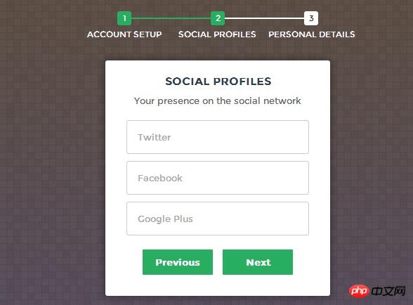
<fieldset>
<h2 id="Social-nbsp-Profiles">Social Profiles</h2>
<h3 id="Your-nbsp-presence-nbsp-on-nbsp-the-nbsp-social-nbsp-network">Your presence on the social network</h3>
<input type="text" name="twitter" placeholder="Twitter" />
<input type="text" name="facebook" placeholder="Facebook" />
<input type="text" name="gplus" placeholder="Google Plus" />
<input type="button" name="previous" value="Previous" />
<input type="button" name="next" value="Next" />
</fieldset>
<fieldset>
<h2 id="Personal-nbsp-Details">Personal Details</h2>
<h3 id="We-nbsp-will-nbsp-never-nbsp-sell-nbsp-it">We will never sell it</h3>
<input type="text" name="fname" placeholder="First Name" />
<input type="text" name="lname" placeholder="Last Name" />
<input type="text" name="phone" placeholder="Phone" />
<textarea name="address" placeholder="Address"></textarea>
<input type="button" name="previous" value="Previous" />
<input type="submit" name="submit" value="Submit" />
</fieldset></form>HTML 코드는 많이 보이지만 매우 간단하며 주로 양식을 설명합니다.
CSS 코드:
/*form styles*/#msform {
    width: 400px;
    margin: 50px auto;
    text-align: center;
    position: relative;
}#msform fieldset {
    background: white;
    border: 0 none;
    border-radius: 3px;
    box-shadow: 0 0 15px 1px rgba(0, 0, 0, 0.4);
    padding: 20px 30px;

    box-sizing: border-box;
    width: 80%;
    margin: 0 10%;    /*stacking fieldsets above each other*/
    position: absolute;
}/*Hide all except first fieldset*/#msform fieldset:not(:first-of-type) {
    display: none;
}/*inputs*/#msform input, #msform textarea {
    padding: 15px;
    border: 1px solid #ccc;
    border-radius: 3px;
    margin-bottom: 10px;
    width: 100%;
    box-sizing: border-box;
    font-family: montserrat;
    color: #2C3E50;
    font-size: 13px;
}/*buttons*/#msform .action-button {
    width: 100px;
    background: #27AE60;
    font-weight: bold;
    color: white;
    border: 0 none;
    border-radius: 1px;
    cursor: pointer;
    padding: 10px 5px;
    margin: 10px 5px;
}#msform .action-button:hover, #msform .action-button:focus {
    box-shadow: 0 0 0 2px white, 0 0 0 3px #27AE60;
}/*headings*/.fs-title {
    font-size: 15px;
    text-transform: uppercase;
    color: #2C3E50;
    margin-bottom: 10px;
}.fs-subtitle {
    font-weight: normal;
    font-size: 13px;
    color: #666;
    margin-bottom: 20px;
}/*progressbar*/#progressbar {
    margin-bottom: 30px;
    overflow: hidden;    /*CSS counters to number the steps*/
    counter-reset: step;
}#progressbar li {
    list-style-type: none;
    color: white;
    text-transform: uppercase;
    font-size: 9px;
    width: 33.33%;
    float: left;
    position: relative;
}#progressbar li:before {
    content: counter(step);
    counter-increment: step;
    width: 20px;
    line-height: 20px;
    display: block;
    font-size: 10px;
    color: #333;
    background: white;
    border-radius: 3px;
    margin: 0 auto 5px auto;
}/*progressbar connectors*/#progressbar li:after {
    content: '';
    width: 100%;
    height: 2px;
    background: white;
    position: absolute;
    left: -50%;
    top: 9px;
    z-index: -1; /*put it behind the numbers*/}#progressbar li:first-child:after {    /*connector not needed before the first step*/
    content: none;
}/*marking active/completed steps green*//*The number of the step and the connector before it = green*/#progressbar li.active:before,  #progressbar li.active:after{
    background: #27AE60;
    color: white;
}여기서 양식을 렌더링하기 위한 CSS 코드를 게시했는데, 이는 양식을 매우 신선하고 자연스럽게 보이게 합니다. 주목해야 할 또 다른 점은 여기서 CSS3의 :before 속성을 사용한다는 것입니다.
마지막은 등록 양식의 단계 점프를 구현할 수 있는 Javascript 코드입니다.
Javascript 코드:
var current_fs, next_fs, previous_fs; //fieldsets
var left, opacity, scale; //fieldset properties which we will animate
var animating; //flag to prevent quick multi-click glitches
$(".next").click(function(){    if(animating) return false;
    animating = true;
    current_fs = $(this).parent();
    next_fs = $(this).parent().next();    //activate next step on progressbar using the index of next_fs
    $("#progressbar li").eq($("fieldset").index(next_fs)).addClass("active");    //show the next fieldset    next_fs.show();
    //hide the current fieldset with style
    current_fs.animate({opacity: 0}, {
        step: function(now, mx) {            //as the opacity of current_fs reduces to 0 - stored in "now"
            //1. scale current_fs down to 80%
            scale = 1 - (1 - now) * 0.2;            //2. bring next_fs from the right(50%)
            left = (now * 50)+"%";            //3. increase opacity of next_fs to 1 as it moves in
            opacity = 1 - now;
            current_fs.css({'transform': 'scale('+scale+')'});
            next_fs.css({'left': left, 'opacity': opacity});
        },
        duration: 800,
        complete: function(){
            current_fs.hide();
            animating = false;
        },
        //this comes from the custom easing plugin
        easing: 'easeInOutBack'
    });
});

$(".previous").click(function(){    if(animating) return false;
    animating = true;

    current_fs = $(this).parent();
    previous_fs = $(this).parent().prev();    //de-activate current step on progressbar
    $("#progressbar li").eq($("fieldset").index(current_fs)).removeClass("active");    //show the previous fieldset    previous_fs.show();
    //hide the current fieldset with style
    current_fs.animate({opacity: 0}, {
        step: function(now, mx) {            //as the opacity of current_fs reduces to 0 - stored in "now"
            //1. scale previous_fs from 80% to 100%
            scale = 0.8 + (1 - now) * 0.2;            //2. take current_fs to the right(50%) - from 0%
            left = ((1-now) * 50)+"%";            //3. increase opacity of previous_fs to 1 as it moves in
            opacity = 1 - now;
            current_fs.css({'left': left});
            previous_fs.css({'transform': 'scale('+scale+')', 'opacity': opacity});
        },
        duration: 800,
        complete: function(){
            current_fs.hide();
            animating = false;
        },
        //this comes from the custom easing plugin
        easing: 'easeInOutBack'
    });
});

$(".submit").click(function(){    return false;
})여기서 jQuery 코드를 사용하는 것이 매우 간단하다는 것을 알 수 있습니다. 주로 다음, 이전, 제출의 3가지 이벤트가 있습니다. 동시에 jQuery는 다음 및 이전 이벤트 동안 페이드 인 및 페이드 아웃 애니메이션 효과를 달성하는 데 사용됩니다.
위 내용은 CSS3+html5를 사용하여 단계별 등록 로그인 양식을 구현하는 방법의 예의 상세 내용입니다. 자세한 내용은 PHP 중국어 웹사이트의 기타 관련 기사를 참조하세요!

핫 AI 도구

Undresser.AI Undress
사실적인 누드 사진을 만들기 위한 AI 기반 앱

AI Clothes Remover
사진에서 옷을 제거하는 온라인 AI 도구입니다.

Undress AI Tool
무료로 이미지를 벗다

Clothoff.io
AI 옷 제거제

AI Hentai Generator
AI Hentai를 무료로 생성하십시오.

인기 기사
뜨거운 도구

메모장++7.3.1
사용하기 쉬운 무료 코드 편집기

SublimeText3 중국어 버전
중국어 버전, 사용하기 매우 쉽습니다.

스튜디오 13.0.1 보내기
강력한 PHP 통합 개발 환경

드림위버 CS6
시각적 웹 개발 도구

SublimeText3 Mac 버전
신 수준의 코드 편집 소프트웨어(SublimeText3)
뜨거운 주제
 7439
7439
 15
1369
52
76
11
32
19
15
1369
52
76
11
32
19

 부트 스트랩 목록에서 기본 스타일을 제거하는 방법은 무엇입니까?
Apr 07, 2025 am 10:18 AM
부트 스트랩 목록에서 기본 스타일을 제거하는 방법은 무엇입니까?
Apr 07, 2025 am 10:18 AM
부트 스트랩 목록의 기본 스타일은 CSS 재정의 상태에서 제거 할 수 있습니다. 보다 구체적인 CSS 규칙 및 선택기를 사용하여 부트 스트랩 기본 스타일을 우선적으로 "근접성 원리"및 "가중치 원리"를 따르십시오. 스타일 충돌을 피하기 위해보다 타겟팅 된 선택기를 사용할 수 있습니다. 재정의가 실패한 경우 사용자 정의 CS의 무게를 조정하십시오. 동시에 성능 최적화에주의를 기울이고, 과도하게 사용하지 않으며, 간결하고 효율적인 CSS 코드를 작성하십시오.

 부트 스트랩에서 파일을 업로드하는 방법
Apr 07, 2025 pm 01:09 PM
부트 스트랩에서 파일을 업로드하는 방법
Apr 07, 2025 pm 01:09 PM
파일 업로드 기능은 Bootstrap을 통해 구현할 수 있습니다. 단계는 다음과 같습니다. 부트 스트랩 CSS 및 JavaScript 파일을 소개합니다. 파일 입력 필드를 만듭니다. 파일 업로드 버튼을 만듭니다. 파일 업로드를 처리합니다 (FormData를 사용하여 데이터를 수집 한 다음 서버로 전송); 사용자 정의 스타일 (선택 사항).
 부트 스트랩 버튼을 사용하는 방법
Apr 07, 2025 pm 03:09 PM
부트 스트랩 버튼을 사용하는 방법
Apr 07, 2025 pm 03:09 PM
부트 스트랩 버튼을 사용하는 방법? 부트 스트랩 CSS를 소개하여 버튼 요소를 만들고 부트 스트랩 버튼 클래스를 추가하여 버튼 텍스트를 추가하십시오.
 부트 스트랩 목록의 중첩을 구현하는 방법은 무엇입니까?
Apr 07, 2025 am 10:27 AM
부트 스트랩 목록의 중첩을 구현하는 방법은 무엇입니까?
Apr 07, 2025 am 10:27 AM
부트 스트랩의 중첩 목록은 스타일을 제어하기 위해 부트 스트랩의 그리드 시스템을 사용해야합니다. 먼저 외부 층을 사용하십시오 & lt; ul & gt; 및 & lt; li & gt; 목록을 만들려면 & lt; div class = "row & gt; & lt; div class = "col-md-6"& gt; & gt; 내부 레이어 목록에 내부 레이어 목록이 행 너비의 절반을 차지하도록 지정합니다. 이런 식으로 내부 목록은 올바른 목록을 가질 수 있습니다.
 부트 스트랩 목록의 크기를 변경하는 방법은 무엇입니까?
Apr 07, 2025 am 10:45 AM
부트 스트랩 목록의 크기를 변경하는 방법은 무엇입니까?
Apr 07, 2025 am 10:45 AM
부트 스트랩 목록의 크기는 목록 자체가 아니라 목록이 포함 된 컨테이너의 크기에 따라 다릅니다. Bootstrap의 그리드 시스템 또는 Flexbox를 사용하면 컨테이너의 크기를 제어하여 목록 항목을 간접적으로 크기로 조정할 수 있습니다.
 부트 스트랩을 레이아웃하는 방법
Apr 07, 2025 pm 02:24 PM
부트 스트랩을 레이아웃하는 방법
Apr 07, 2025 pm 02:24 PM
부트 스트랩을 사용하여 웹 사이트를 레이아웃하려면 그리드 시스템을 사용하여 페이지를 컨테이너, 행 및 열로 나누어야합니다. 먼저 컨테이너를 추가 한 다음 행에 행을 추가하고 행 내 열을 추가 한 다음 마지막으로 열에 내용을 추가하십시오. 부트 스트랩의 반응 형 레이아웃 함수는 중단 점 (XS, SM, MD, LG, XL)에 따라 레이아웃을 자동으로 조정합니다. 응답 형 클래스를 사용하여 다른 화면 크기의 다른 레이아웃을 달성 할 수 있습니다.
 부트 스트랩에 사진을 삽입하는 방법
Apr 07, 2025 pm 03:30 PM
부트 스트랩에 사진을 삽입하는 방법
Apr 07, 2025 pm 03:30 PM
Bootstrap에 이미지를 삽입하는 방법에는 여러 가지가 있습니다. HTML IMG 태그를 사용하여 이미지를 직접 삽입하십시오. 부트 스트랩 이미지 구성 요소를 사용하면 반응 형 이미지와 더 많은 스타일을 제공 할 수 있습니다. 이미지 크기를 설정하고 IMG-Fluid 클래스를 사용하여 이미지를 적응할 수 있도록하십시오. IMG 통과 클래스를 사용하여 테두리를 설정하십시오. 둥근 모서리를 설정하고 IMG 라운드 클래스를 사용하십시오. 그림자를 설정하고 그림자 클래스를 사용하십시오. CSS 스타일을 사용하여 이미지를 조정하고 배치하십시오. 배경 이미지를 사용하여 배경 이미지 CSS 속성을 사용하십시오.
