

Angular에서 모달 상자를 표시하는 두 가지 방법

이 글은 Angular에서 모달 상자를 팝업하는 두 가지 방법을 주로 소개합니다. 매우 훌륭하고 참고할 가치가 있습니다. 필요한 친구들이 모두 참고할 수 있기를 바랍니다.
블로그를 시작하기 전에 먼저 ngx-bootstrap-modal을 설치해야 합니다
npm install ngx-bootstrap-modal --save
그렇지 않으면 모달 박스 효과가 보기 어렵고 토하고 싶을 것입니다
1. 팝업 방법 1(이 방법은 다음에서 따옴) https://github.com/cipchk/ngx-bootstrap-modal)
1.alert 팝업 상자
(1)demo 디렉터리
---------app.comComponent.ts
- ------- app.comComponent.html
---------app.module.ts
---------세부정보(폴더)
--------- -----detail .comComponent.ts
------------detail.comComponent.html
(2)데모 코드
app.module.ts 필요한 BootstrapModalModule 및 ModalModule을 가져옵니다. 그런 다음 등록하세요
//app.module.ts
import { BrowserModule } from '@angular/platform-browser';
import { NgModule } from '@angular/core';
//这种模态框只需要导入下面这两个
import { BootstrapModalModule } from 'ngx-bootstrap-modal';
import { ModalModule } from 'ngx-bootstrap/modal';
import { AppComponent } from './app.component';
import { DetailComponent } from './detail/detail.component';
@NgModule({
 declarations: [
 AppComponent,
 DetailComponent
 ],
 imports: [
 BrowserModule,
 BootstrapModalModule
 ],
 providers: [],
 entryComponents: [
 DetailComponent
 ],
 bootstrap: [AppComponent]
})
export class AppModule { }app.comComponent.html 모달 상자를 팝업할 수 있는 버튼을 만듭니다
<p class="container">
 <p class="row">
 <button type="button" class="btn btn-primary" (click)="showAlert()">alert模态框</button>
 </p>
</p>
app.comComponent.ts 이 버튼의 동작을 작성합니다. showAlert()
import { Component } from '@angular/core';
import { DialogService } from "ngx-bootstrap-modal";
import { DetailComponent } from './detail/detail.component'
@Component({
 selector: 'app-root',
 templateUrl: './app.component.html',
 styleUrls: ['./app.component.css']
})
export class AppComponent {
 title = 'app';
 constructor(public dialogService: DialogService) {
 }
 showAlert() {
  this.dialogService.addDialog(DetailComponent, { title: 'Alert title!', message: 'Alert message!!!' });
 }
}detail.comComponent.html 레이아웃 작성 경고 팝업 상자
<p class="modal-dialog">
 <p class="modal-content">
  <p class="modal-header">
   <button type="button" class="close" (click)="close()" >×</button>
   <h4 class="modal-title">{{title}}</h4>
  </p>
  <p class="modal-body">
   这是alert弹框
  </p>
  <p class="modal-footer">
   <button type="button" class="btn btn-primary" (click)="close()">取消</button>
   <button type="button" class="btn btn-default">确定</button>
  </p>
 </p>
</p>detail.comComponent .ts의 모달 상자 구성 요소를 만들려면 구성 요소를 만들어야 하며, 그런 다음 ngx-bootstrap-model이 시작을 안내하는 데 도움이 됩니다
이 구성 요소의 경우 상속해야 합니다. 두 개의 매개변수를 포함하는 DialogComponent
T 모달 상자 유형에 전달되는 외부 매개변수.
T1 모달 상자 반환 값 유형.
따라서 DialogService는 DialogComponent의 생성자 매개변수여야 합니다.
import { Component } from '@angular/core';
import { DialogComponent, DialogService } from 'ngx-bootstrap-modal';
export interface AlertModel {
 title: string;
 message: string;
}
@Component({
 selector: 'alert',
 templateUrl: './detail.component.html',
 styleUrls: ['./detail.component.css']
})
export class DetailComponent extends DialogComponent<AlertModel, null> implements AlertModel {
 title: string;
 message: string;
 constructor(dialogService: DialogService) {
 super(dialogService);
 }
}2.팝업 상자 확인
(1)데모 디렉토리
---------app.comComponent.ts
---------app.comComponent.html
--- -- ---app.module.ts
---------confirm(폴더)
------------confirm.comComponent.ts
--------- - ---confirm.comComponent.html
(2)demo code
app.module.ts는 필요한 BootstrapModalModule 및 ModalModule을 가져온 다음 경고 팝업 상자와 동일하므로 등록합니다. 방법 1의 팝업 방법
//app.module.ts
import { BrowserModule } from '@angular/platform-browser';
import { NgModule } from '@angular/core';
//这种模态框只需要导入下面这两个
import { BootstrapModalModule } from 'ngx-bootstrap-modal';
import { ModalModule } from 'ngx-bootstrap/modal';
import { AppComponent } from './app.component';
import { DetailComponent } from './detail/detail.component';
@NgModule({
 declarations: [
 AppComponent,
 DetailComponent
 ],
 imports: [
 BrowserModule,
 BootstrapModalModule
 ],
 providers: [],
 entryComponents: [
 DetailComponent
 ],
 bootstrap: [AppComponent]
})
export class AppModule { }app.comComponent.html 모달 상자를 팝업할 수 있는 버튼 만들기
<p class="container">
 <p class="row">
 <button type="button" class="btn btn-primary" (click)="showConfirm()">modal模态框</button>
 </p>
</p>
app.comComponent.ts 이 버튼의 showConfirm() 액션을 작성하세요
import { Component } from '@angular/core';
import { DialogService } from "ngx-bootstrap-modal";
import { ConfirmComponent } from './confirm/confirm.component'
@Component({
 selector: 'app-root',
 templateUrl: './app.component.html',
 styleUrls: ['./app.component.css']
})
export class AppComponent {
 title = 'app';
 constructor(public dialogService: DialogService,private modalService: BsModalService) {
 }
 showConfirm() {
  this.dialogService.addDialog(ConfirmComponent, {
   title: 'Confirmation',
   message: 'bla bla'
  })
   .subscribe((isConfirmed) => {
   });
 }
}confirm.comComponent .html 확인 팝업 상자의 레이아웃 작성
<p class="modal-dialog">
 <p class="modal-content">
  <p class="modal-header">
   <button type="button" class="close" (click)="close()" >×</button>
   <h4 class="modal-title">{{title}}</h4>
  </p>
  <p class="modal-body">
   这是confirm弹框
  </p>
  <p class="modal-footer">
   <button type="button" class="btn btn-primary" (click)="close()">取消</button>
   <button type="button" class="btn btn-default">确定</button>
  </p>
 </p>
</p>verify.comComponent.ts는 모달 상자 구성 요소를 생성합니다
import { Component } from '@angular/core';
import { DialogComponent, DialogService } from 'ngx-bootstrap-modal';
export interface ConfirmModel {
 title:string;
 message:any;
}
@Component({
 selector: 'confirm',
 templateUrl: './confirm.component.html',
 styleUrls: ['./confirm.component.css']
})
export class ConfirmComponent extends DialogComponent<ConfirmModel, boolean> implements ConfirmModel {
 title: string;
 message: any;
 constructor(dialogService: DialogService) {
 super(dialogService);
 }
 confirm() {
 // on click on confirm button we set dialog result as true,
 // ten we can get dialog result from caller code
 this.close(true);
 }
 cancel() {
 this.close(false);
 }
}3. 내장 팝업 상자
(1)데모 디렉터리
---- ---app.comComponent.ts
------ -app.comComponent.html
---------app.module.ts
(2)데모 코드
내장 팝업 상자에는 세 가지 형태의 경고 확인 프롬프트도 포함되어 있으며 모두 일부 내장 스타일이 있습니다
app .module.ts
import { BrowserModule } from '@angular/platform-browser';
import { NgModule } from '@angular/core';
import { BootstrapModalModule } from 'ngx-bootstrap-modal';
import { ModalModule } from 'ngx-bootstrap/modal';
import { AppComponent } from './app.component';
@NgModule({
 declarations: [
 AppComponent
 ],
 imports: [
 BrowserModule,
 BootstrapModalModule,
 ModalModule.forRoot()
 ],
 providers: [],
 bootstrap: [AppComponent]
})
export class AppModule { }app.comComponent.html은 매우 간단합니다. 단 하나의 버튼
<p class="container">
 <p class="row">
 <button type="button" class="btn btn-default" (click)="show()">内置</button>
 </p>
</p>
app.comComponent.ts입니다. 매우 간단합니다. 구성 요소의 레이아웃을 작성할 필요도 없으며 아이콘, 크기 등과 같은 일부 매개변수만 전달하면 됩니다.
import { Component } from '@angular/core';
import { DialogService, BuiltInOptions } from "ngx-bootstrap-modal";
@Component({
 selector: 'app-root',
 templateUrl: './app.component.html',
 styleUrls: ['./app.component.css']
})
export class AppComponent {
 title = 'app';
 constructor(public dialogService: DialogService) {
 }
 show(){
  this.dialogService.show(<BuiltInOptions>{
   content: '保存成功',
   icon: 'success',
   size: 'sm',
   showCancelButton: false
  })
 }
}2. 팝업 방법 2(이 방법은 https://에서 제공됩니다. valor-software.com/ngx-bootstrap/#/modals)
이전 방법과 동일하게 먼저 ngx-bootstrap-modal을 설치한 다음 부트스트랩 스타일 Table
1.demo 디렉터리를 가져옵니다
--- -----app.comComponent.ts
---------app.comComponent.html
---------app.module.ts
2.데모 코드
app.module. ts는 해당 모듈을 가져와서 등록합니다
//app.module.ts
import { BrowserModule } from '@angular/platform-browser';
import { NgModule } from '@angular/core';
import { ModalModule } from 'ngx-bootstrap/modal';
import { AppComponent } from './app.component';
@NgModule({
 declarations: [
 AppComponent
 ],
 imports: [
 BrowserModule,
 ModalModule.forRoot()
 ],
 providers: [],
 entryComponents: [
 ],
 bootstrap: [AppComponent]
})
export class AppModule { }app.comComponent.ts
import { Component,TemplateRef } from '@angular/core';
import { BsModalService } from 'ngx-bootstrap/modal';
import { BsModalRef } from 'ngx-bootstrap/modal/modal-options.class';
@Component({
 selector: 'app-root',
 templateUrl: './app.component.html',
 styleUrls: ['./app.component.css']
})
export class AppComponent {
 title = 'app';
 public modalRef: BsModalRef;
 constructor(private modalService: BsModalService) {
 }
 showSecond(template: TemplateRef<any>){//传入的是一个组件
  this.modalRef = this.modalService.show(template,{class: 'modal-lg'});//在这里通过BsModalService里面的show方法把它显示出来
 };
}app.comComponent.html
<p class="container">
 <p class="row">
 <button type="button" class="btn btn-success" (click)="showSecond(Template)">第二种弹出方式</button>
 </p>
</p>
<!--第二种弹出方法的组件-->
<template #Template>
 <p class="modal-header tips-modal-header">
 <h4 class="modal-title pull-left">第二种模态框</h4>
 <button type="button" class="close pull-right" aria-label="Close" (click)="modalRef.hide()">
  <span aria-hidden="true">×</span>
 </button>
 </p>
 <p class="modal-body tips-modal-body">
 <p class="tips-contain"><span>第二种模态框弹出方式</span></p>
 </p>
 <p class="modal-footer">
  <button type="button" class="btn btn-default" (click)="modalRef.hide()">确定</button>
  <button type="button" class="btn btn-default" (click)="modalRef.hide()">取消</button>
 </p>
</template>
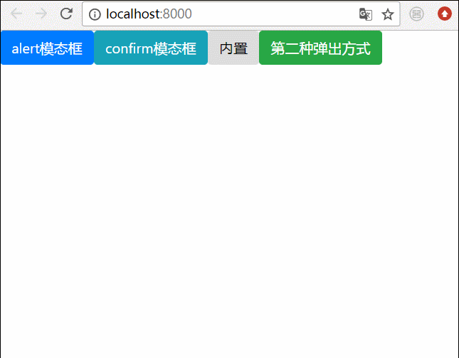
3. 최종 효과
위의 모든 항목을 결합합니다. 모든 팝업 상자를 함께 작성하고 효과는 이렇습니다
관련 권장 사항:
BootStrap 모달 상자가 세로 중앙에 있지 않은 문제를 해결하는 방법
bootstrap 모달 상자 중첩, tabindex 속성 및 그림자 제거 방법
bootstrap3-dialog-master 모달박스 사용법에 대한 자세한 설명
위 내용은 Angular에서 모달 상자를 표시하는 두 가지 방법의 상세 내용입니다. 자세한 내용은 PHP 중국어 웹사이트의 기타 관련 기사를 참조하세요!

핫 AI 도구

Undresser.AI Undress
사실적인 누드 사진을 만들기 위한 AI 기반 앱

AI Clothes Remover
사진에서 옷을 제거하는 온라인 AI 도구입니다.

Undress AI Tool
무료로 이미지를 벗다

Clothoff.io
AI 옷 제거제

Video Face Swap
완전히 무료인 AI 얼굴 교환 도구를 사용하여 모든 비디오의 얼굴을 쉽게 바꾸세요!

인기 기사
뜨거운 도구

메모장++7.3.1
사용하기 쉬운 무료 코드 편집기

SublimeText3 중국어 버전
중국어 버전, 사용하기 매우 쉽습니다.

스튜디오 13.0.1 보내기
강력한 PHP 통합 개발 환경

드림위버 CS6
시각적 웹 개발 도구

SublimeText3 Mac 버전
신 수준의 코드 편집 소프트웨어(SublimeText3)
뜨거운 주제
 7677
7677
 15
1393
52
1207
24
91
11
73
19
15
1393
52
1207
24
91
11
73
19

 Ubuntu 24.04에 Angular를 설치하는 방법
Mar 23, 2024 pm 12:20 PM
Ubuntu 24.04에 Angular를 설치하는 방법
Mar 23, 2024 pm 12:20 PM
Angular.js는 동적 애플리케이션을 만들기 위해 자유롭게 액세스할 수 있는 JavaScript 플랫폼입니다. HTML 구문을 템플릿 언어로 확장하여 애플리케이션의 다양한 측면을 빠르고 명확하게 표현할 수 있습니다. Angular.js는 코드를 작성, 업데이트 및 테스트하는 데 도움이 되는 다양한 도구를 제공합니다. 또한 라우팅 및 양식 관리와 같은 많은 기능을 제공합니다. 이 가이드에서는 Ubuntu24에 Angular를 설치하는 방법에 대해 설명합니다. 먼저 Node.js를 설치해야 합니다. Node.js는 서버 측에서 JavaScript 코드를 실행할 수 있게 해주는 ChromeV8 엔진 기반의 JavaScript 실행 환경입니다. Ub에 있으려면
 각도 학습 상태 관리자 NgRx에 대한 자세한 설명
May 25, 2022 am 11:01 AM
각도 학습 상태 관리자 NgRx에 대한 자세한 설명
May 25, 2022 am 11:01 AM
이 글은 Angular의 상태 관리자 NgRx에 대한 심층적인 이해를 제공하고 NgRx 사용 방법을 소개하는 글이 될 것입니다.
 Angular의 서버 측 렌더링(SSR)을 탐색하는 기사
Dec 27, 2022 pm 07:24 PM
Angular의 서버 측 렌더링(SSR)을 탐색하는 기사
Dec 27, 2022 pm 07:24 PM
앵귤러 유니버셜(Angular Universal)을 아시나요? 웹사이트가 더 나은 SEO 지원을 제공하는 데 도움이 될 수 있습니다!
 프론트엔드 개발에 PHP와 Angular를 사용하는 방법
May 11, 2023 pm 04:04 PM
프론트엔드 개발에 PHP와 Angular를 사용하는 방법
May 11, 2023 pm 04:04 PM
인터넷의 급속한 발전과 함께 프론트엔드 개발 기술도 지속적으로 개선되고 반복되고 있습니다. PHP와 Angular는 프런트엔드 개발에 널리 사용되는 두 가지 기술입니다. PHP는 양식 처리, 동적 페이지 생성, 액세스 권한 관리와 같은 작업을 처리할 수 있는 서버측 스크립팅 언어입니다. Angular는 단일 페이지 애플리케이션을 개발하고 구성 요소화된 웹 애플리케이션을 구축하는 데 사용할 수 있는 JavaScript 프레임워크입니다. 이 기사에서는 프론트엔드 개발에 PHP와 Angular를 사용하는 방법과 이들을 결합하는 방법을 소개합니다.
 각도에서 monaco-editor를 사용하는 방법에 대한 간략한 분석
Oct 17, 2022 pm 08:04 PM
각도에서 monaco-editor를 사용하는 방법에 대한 간략한 분석
Oct 17, 2022 pm 08:04 PM
각도에서 모나코 편집기를 사용하는 방법은 무엇입니까? 다음 글은 최근 비즈니스에서 사용되는 Monaco-Editor의 활용 사례를 기록한 글입니다.
 Angular의 독립 구성요소에 대한 간략한 분석 및 사용 방법 알아보기
Jun 23, 2022 pm 03:49 PM
Angular의 독립 구성요소에 대한 간략한 분석 및 사용 방법 알아보기
Jun 23, 2022 pm 03:49 PM
이 기사에서는 Angular의 독립 구성 요소, Angular에서 독립 구성 요소를 만드는 방법, 기존 모듈을 독립 구성 요소로 가져오는 방법을 안내합니다.
 Angular 구성 요소 및 해당 표시 속성: 비블록 기본값 이해
Mar 15, 2024 pm 04:51 PM
Angular 구성 요소 및 해당 표시 속성: 비블록 기본값 이해
Mar 15, 2024 pm 04:51 PM
Angular 프레임워크의 구성 요소에 대한 기본 표시 동작은 블록 수준 요소에 대한 것이 아닙니다. 이 디자인 선택은 구성 요소 스타일의 캡슐화를 촉진하고 개발자가 각 구성 요소가 표시되는 방법을 의식적으로 정의하도록 장려합니다. CSS 속성 표시를 명시적으로 설정하면 Angular 구성 요소의 표시를 완전히 제어하여 원하는 레이아웃과 응답성을 얻을 수 있습니다.
 프로젝트가 너무 크면 어떻게 해야 하나요? Angular 프로젝트를 합리적으로 분할하는 방법은 무엇입니까?
Jul 26, 2022 pm 07:18 PM
프로젝트가 너무 크면 어떻게 해야 하나요? Angular 프로젝트를 합리적으로 분할하는 방법은 무엇입니까?
Jul 26, 2022 pm 07:18 PM
Angular 프로젝트가 너무 큽니다. 합리적으로 분할하는 방법은 무엇입니까? 다음 글에서는 Angular 프로젝트를 합리적으로 분할하는 방법을 소개하겠습니다. 도움이 되셨으면 좋겠습니다!
