

6가지 CSS 3열 레이아웃 방법의 예

이 기사에서는 주로 CSS 3열 레이아웃 방법의 6가지 예를 공유합니다. 레이아웃에 관해서는 사람들이 저에게 CSS 위치 지정의 가치와 위치 지정에 대해 먼저 생각해야 합니다. 그게 무슨 뜻이야? 어... 머리 긁적.gif 이제 본질로 돌아가서 정의를 살펴보는 시간이다.
Positioning
position에는 정적, 상대, 절대, 고정, 고정 및 상속의 6가지 속성 값이 있습니다.
static(기본값): 요소 상자가 정상적으로 생성됩니다. 블록 수준 요소는 문서 흐름의 일부로 직사각형 상자를 만들고, 인라인 요소는 상위 요소 내에 배치되는 하나 이상의 선 상자를 만듭니다.
relative: 요소 상자는 일반 문서 흐름에서 이전 위치를 기준으로 오프셋되며 원래 위치는 여전히 점유되어 있습니다. 오프셋이 발생하면 다른 요소가 포함될 수 있습니다.
절대: 요소 상자는 더 이상 문서 위치를 차지하지 않으며 포함 블록을 기준으로 오프셋됩니다(소위 포함 블록은 가장 가까운 외부 요소의 위치가 정적이 아닌 요소입니다).
수정됨: 요소 상자는 더 이상 문서 흐름 위치를 차지하지 않으며 뷰포트를 기준으로 배치됩니다.
sticky: CSS3의 새로운 속성 값인 고정 위치 지정은 상대 속성과 고정 속성의 혼합과 동일합니다. 처음에는 원래 위치를 기준으로 오프셋된 상대 위치로 처리됩니다. 특정 임계값을 초과하면 뷰포트를 기준으로 위치가 지정되는 고정 위치 지정으로 처리됩니다.
3열 레이아웃
3열 레이아웃 중 하나는 너비가 가변적입니다. PC 측에서 가장 일반적으로 사용되는 레이아웃 중 하나이며, 다른 루틴은 다음과 같습니다. 같은.
방법 1: 부동 레이아웃
단점: 포함 영역의 너비가 왼쪽 상자와 오른쪽 상자의 합보다 작으면 오른쪽 테두리가 압축됩니다.
<style>
    .tree-columns-layout.float .left {
        float: left;
        width: 300px;
        background-color: #a00;
    }

    .tree-columns-layout.float .right {
        float: right;
        width: 300px;
        background-color: #0aa;
    }

    .tree-columns-layout.float .center {
        /* left: 300px;
        right: 300px; */
        margin: 0 300px;
        background-color: #aa0;
        overflow: auto;
    }
</style>
<section class="tree-columns-layout float">
    <article class="left">
        <h1>我是浮动布局左框</h1>
    </article>
    <article class="right">
        <h1>我是浮动布局右框</h1>
    </article>
    <article class="center">
        <h1>我是浮动布局中间框</h1>
    </article>
</section>방법 2: 위치 지정 레이아웃
단점: 부모는 비정적 위치 지정이 필요합니다. 그렇지 않은 경우 왼쪽 및 오른쪽 프레임이 쉽게 오프셋됩니다.
<style>
    .tree-columns-layout.position {
        position: relative;
    }

    .tree-columns-layout.position .left {
        position: absolute;
        left: 0;
        top: 0;
        width: 300px;
        background-color: #a00;
    }

    .tree-columns-layout.position .right {
        position: absolute;
        right: 0;
        top: 0;
        width: 300px;
        background-color: #0aa;
    }

    .tree-columns-layout.position .center {
        margin: 0 300px;
        background-color: #aa0;
        overflow: auto;
    }
</style>
<section class="tree-columns-layout position">
    <article class="left">
        <h1>我是浮动定位左框</h1>
    </article>
    <article class="center">
        <h1>我是浮动定位中间框</h1>
    </article>
    <article class="right">
        <h1>我是浮动定位右框</h1>
    </article>
</section>방법 3: 테이블 레이아웃
단점: 단점 없음, 테이블 공포
<style>
    .tree-columns-layout.table {
        display: table;
        width: 100%;
    }

    .tree-columns-layout.table > article {
        display: table-cell;
    }

    .tree-columns-layout.table .left {
        width: 300px;
        background-color: #a00;
    }

    .tree-columns-layout.table .center {
        background-color: #aa0;
    }

    .tree-columns-layout.table .right {
        width: 300px;
        background-color: #0aa;
    }

</style>
<section class="tree-columns-layout table">
    <article class="left">
        <h1>我是表格布局左框</h1>
    </article>
    <article class="center">
        <h1>我是表格布局中间框</h1>
    </article>
    <article class="right">
        <h1>我是表格布局右框</h1>
    </article>
</section>방법 4: 유연한 탄력적 레이아웃
단점: 호환성
<style>
    .tree-columns-layout.flex {
        display: flex;
    }

    .tree-columns-layout.flex .left {
        width: 300px;
        flex-shrink: 0; /* 不缩小 */
        background-color: #a00;
    }

    .tree-columns-layout.flex .center {
        flex-grow: 1; /* 增大 */
        background-color: #aa0;
    }

    .tree-columns-layout.flex .right {
        flex-shrink: 0; /* 不缩小 */
        width: 300px;
        background-color: #0aa;
    }
</style>
<section class="tree-columns-layout flex">
    <article class="left">
        <h1>我是flex弹性布局左框</h1>
    </article>
    <article class="center">
        <h1>我是flex弹性布局中间框</h1>
    </article>
    <article class="right">
        <h1>我是flex弹性布局右框</h1>
    </article>
</section>방법 5: 그리드 레이아웃
단점: Firefox 52, Safari 10.1, Chrome 57, Opera 44와의 호환성
<style>
    .tree-columns-layout.grid {
        display: grid;
        grid-template-columns: 300px 1fr 300px;
    }

    .tree-columns-layout.grid .left {
        background-color: #a00;
    }

    .tree-columns-layout.grid .center {
        background-color: #aa0;
    }

    .tree-columns-layout.grid .right {
        background-color: #0aa;
    }
</style>
<section class="tree-columns-layout grid">
    <article class="left">
        <h1>我是grid栅格布局左框</h1>
    </article>
    <article class="center">
        <h1>我是grid栅格布局中间框</h1>
    </article>
    <article class="right">
        <h1>我是grid栅格布局右框</h1>
    </article>
</section>방법 6: 성배 레이아웃
단점: 추가해야 함 추가 태그 레이어, html 순서가 잘못되어 레이아웃 상자의 여백 속성을 차지합니다
<style>
    .tree-columns-layout.cup:after {
        clear: both;
        content: "";
        display: table;
    }

    .tree-columns-layout.cup .center {
        width: 100%;
        float: left;
    }

    .tree-columns-layout.cup .center > p {
        margin: 0 300px;
        overflow: auto;
        background-color: #aa0;
    }

    .tree-columns-layout.cup .left {
        width: 300px;
        float: left;
        margin-left: -100%;
        background-color: #a00;
    }

    .tree-columns-layout.cup .right {
        width: 300px;
        float: left;
        margin-left: -300px;
        background-color: #0aa;
    }
</style>
<section class="tree-columns-layout cup">
    <article class="center">
        <p>
            <h1>我是圣杯布局中间框</h1>
        </p>
    </article>
    <article class="left">
        <h1>我是圣杯布局左框</h1>
    </article>
    <article class="right">
        <h1>我是圣杯布局右框</h1>
    </article>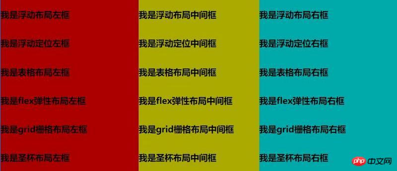
</section>성취 효과:
관련 권장 사항:
높이를 알고 왼쪽과 오른쪽 너비를 고정하는 3열 레이아웃을 구현하는 5가지 방법 방법
위 내용은 6가지 CSS 3열 레이아웃 방법의 예의 상세 내용입니다. 자세한 내용은 PHP 중국어 웹사이트의 기타 관련 기사를 참조하세요!

핫 AI 도구

Undresser.AI Undress
사실적인 누드 사진을 만들기 위한 AI 기반 앱

AI Clothes Remover
사진에서 옷을 제거하는 온라인 AI 도구입니다.

Undress AI Tool
무료로 이미지를 벗다

Clothoff.io
AI 옷 제거제

Video Face Swap
완전히 무료인 AI 얼굴 교환 도구를 사용하여 모든 비디오의 얼굴을 쉽게 바꾸세요!

인기 기사
뜨거운 도구

메모장++7.3.1
사용하기 쉬운 무료 코드 편집기

SublimeText3 중국어 버전
중국어 버전, 사용하기 매우 쉽습니다.

스튜디오 13.0.1 보내기
강력한 PHP 통합 개발 환경

드림위버 CS6
시각적 웹 개발 도구

SublimeText3 Mac 버전
신 수준의 코드 편집 소프트웨어(SublimeText3)


 Vue에서 부트 스트랩을 사용하는 방법
Apr 07, 2025 pm 11:33 PM
Vue에서 부트 스트랩을 사용하는 방법
Apr 07, 2025 pm 11:33 PM
vue.js에서 bootstrap 사용은 5 단계로 나뉩니다 : Bootstrap 설치. main.js.의 부트 스트랩 가져 오기 부트 스트랩 구성 요소를 템플릿에서 직접 사용하십시오. 선택 사항 : 사용자 정의 스타일. 선택 사항 : 플러그인을 사용하십시오.
 HTML, CSS 및 JavaScript 이해 : 초보자 안내서
Apr 12, 2025 am 12:02 AM
HTML, CSS 및 JavaScript 이해 : 초보자 안내서
Apr 12, 2025 am 12:02 AM
WebDevelopmentReliesonHtml, CSS 및 JavaScript : 1) HtmlStructuresContent, 2) CSSSTYLESIT, 및 3) JAVASCRIPTADDSINGINTERACTIVITY, BASISOFMODERNWEBEXPERIENCES를 형성합니다.
 HTML, CSS 및 JavaScript의 역할 : 핵심 책임
Apr 08, 2025 pm 07:05 PM
HTML, CSS 및 JavaScript의 역할 : 핵심 책임
Apr 08, 2025 pm 07:05 PM
HTML은 웹 구조를 정의하고 CSS는 스타일과 레이아웃을 담당하며 JavaScript는 동적 상호 작용을 제공합니다. 세 사람은 웹 개발에서 의무를 수행하고 화려한 웹 사이트를 공동으로 구축합니다.
 부트 스트랩에 사진을 삽입하는 방법
Apr 07, 2025 pm 03:30 PM
부트 스트랩에 사진을 삽입하는 방법
Apr 07, 2025 pm 03:30 PM
Bootstrap에 이미지를 삽입하는 방법에는 여러 가지가 있습니다. HTML IMG 태그를 사용하여 이미지를 직접 삽입하십시오. 부트 스트랩 이미지 구성 요소를 사용하면 반응 형 이미지와 더 많은 스타일을 제공 할 수 있습니다. 이미지 크기를 설정하고 IMG-Fluid 클래스를 사용하여 이미지를 적응할 수 있도록하십시오. IMG 통과 클래스를 사용하여 테두리를 설정하십시오. 둥근 모서리를 설정하고 IMG 라운드 클래스를 사용하십시오. 그림자를 설정하고 그림자 클래스를 사용하십시오. CSS 스타일을 사용하여 이미지를 조정하고 배치하십시오. 배경 이미지를 사용하여 배경 이미지 CSS 속성을 사용하십시오.
 부트 스트랩에 분할 라인을 작성하는 방법
Apr 07, 2025 pm 03:12 PM
부트 스트랩에 분할 라인을 작성하는 방법
Apr 07, 2025 pm 03:12 PM
부트 스트랩 분할 라인을 만드는 두 가지 방법이 있습니다 : 태그를 사용하여 수평 분할 라인이 생성됩니다. CSS 테두리 속성을 사용하여 사용자 정의 스타일 분할 라인을 만듭니다.
 부트 스트랩을위한 프레임 워크를 설정하는 방법
Apr 07, 2025 pm 03:27 PM
부트 스트랩을위한 프레임 워크를 설정하는 방법
Apr 07, 2025 pm 03:27 PM
부트 스트랩 프레임 워크를 설정하려면 다음 단계를 따라야합니다. 1. CDN을 통해 부트 스트랩 파일 참조; 2. 자신의 서버에서 파일을 다운로드하여 호스팅하십시오. 3. HTML에 부트 스트랩 파일을 포함; 4. 필요에 따라 Sass/Less를 컴파일하십시오. 5. 사용자 정의 파일을 가져옵니다 (선택 사항). 설정이 완료되면 Bootstrap의 그리드 시스템, 구성 요소 및 스타일을 사용하여 반응 형 웹 사이트 및 응용 프로그램을 만들 수 있습니다.

 부트 스트랩 버튼을 사용하는 방법
Apr 07, 2025 pm 03:09 PM
부트 스트랩 버튼을 사용하는 방법
Apr 07, 2025 pm 03:09 PM
부트 스트랩 버튼을 사용하는 방법? 부트 스트랩 CSS를 소개하여 버튼 요소를 만들고 부트 스트랩 버튼 클래스를 추가하여 버튼 텍스트를 추가하십시오.
