

CSS3의 새로운 색상 모드는 무엇입니까

css에는 3가지 새로운 색상 모드가 추가되었습니다. 1. "rgba(255,0,0,0.5)"와 같은 RGB 모드에 알파 투명도를 추가하는 RGBA 모드 2. "hsl( 360)과 같은 HSL 모드 ,50%,50%)"; 3. HSL 모드에 알파 투명도를 추가하는 HSLA 모드.

이 튜토리얼의 운영 환경: Windows 7 시스템, CSS3 버전, Dell G3 컴퓨터.
1. CSS1&2 색상 표현 방식(W3C 표준)
1. 색상명 방식 (색상 키워드를 사용하여 해당 색상을 표현합니다.)
예: red(빨간색), blue( 파란색), 분홍색(핑크)
장점: 특정 색상에 대해 편리하고 빠르고 정확합니다.
단점:
제한된 색상 수를 나타냅니다.
투명 색상을 지원하지 않습니다.
2. HEX 모드 16진수 모드(16진수를 사용하여 색상 표현)
Syntax:
#RRGGBB 或 #RGB
값:
RR: 빨간색 값입니다. 16진수 양의 정수
GG: 녹색 값입니다. 16진수 양의 정수
BB: 파란색 값. 16진수 양의 정수
값 범위: 00-FF
예: #FF0000 빨간색 #FFFF00 노란색. #FF0000红色 #FFFF00 黄色。
优点:表示颜色种类多,使用较方便
缺点:
16进制单位换算很成问题
不支持透明颜色。
特定颜色需要工具配合或者一定的颜色调配知识
3、RGB方式 三原色配色方式
语法:
RGB(R,G,B)
取值:
R: 红色值。正整数 | 百分数
G: 绿色值。正整数 | 百分数
B: 蓝色值。正整数 | 百分数
取值范围:0~255或者0%~100%
例如:rgb(255,0,0)红色 rgb(255,255,0)黄色
优点:表示颜色种类多,使用较方便
缺点:
不支持透明颜色
特定颜色需要工具配合或者一定的颜色调配知识
二、CSS3 新增颜色表示方式
1、RGBA模式
此色彩模式与RGB相同,只是在RGB模式上新增了Alpha透明度。
语法:
RGBA(R,G,B,A)
取值:
R: 红色值。正整数 | 百分数
G: 绿色值。正整数 | 百分数
B: 蓝色值。正整数 | 百分数
A: Alpha透明度。取值0~1之间。
例如:rgba(255,0,0,0.5)半透明红色
<style type="text/css">
    body{background:rgba(255,0,0,1)}
    div{width:300px;
        height:300px;
        background:rgba(0,0,255,0.4);
        position:absolute;
        top:0;
        left:0;
    }
</style>
<body>
    猜猜我在哪里
    <div></div>
</body>2、HSL模式(色轮模式没有透明度)
语法:
HSL(H,S,L)
取值:
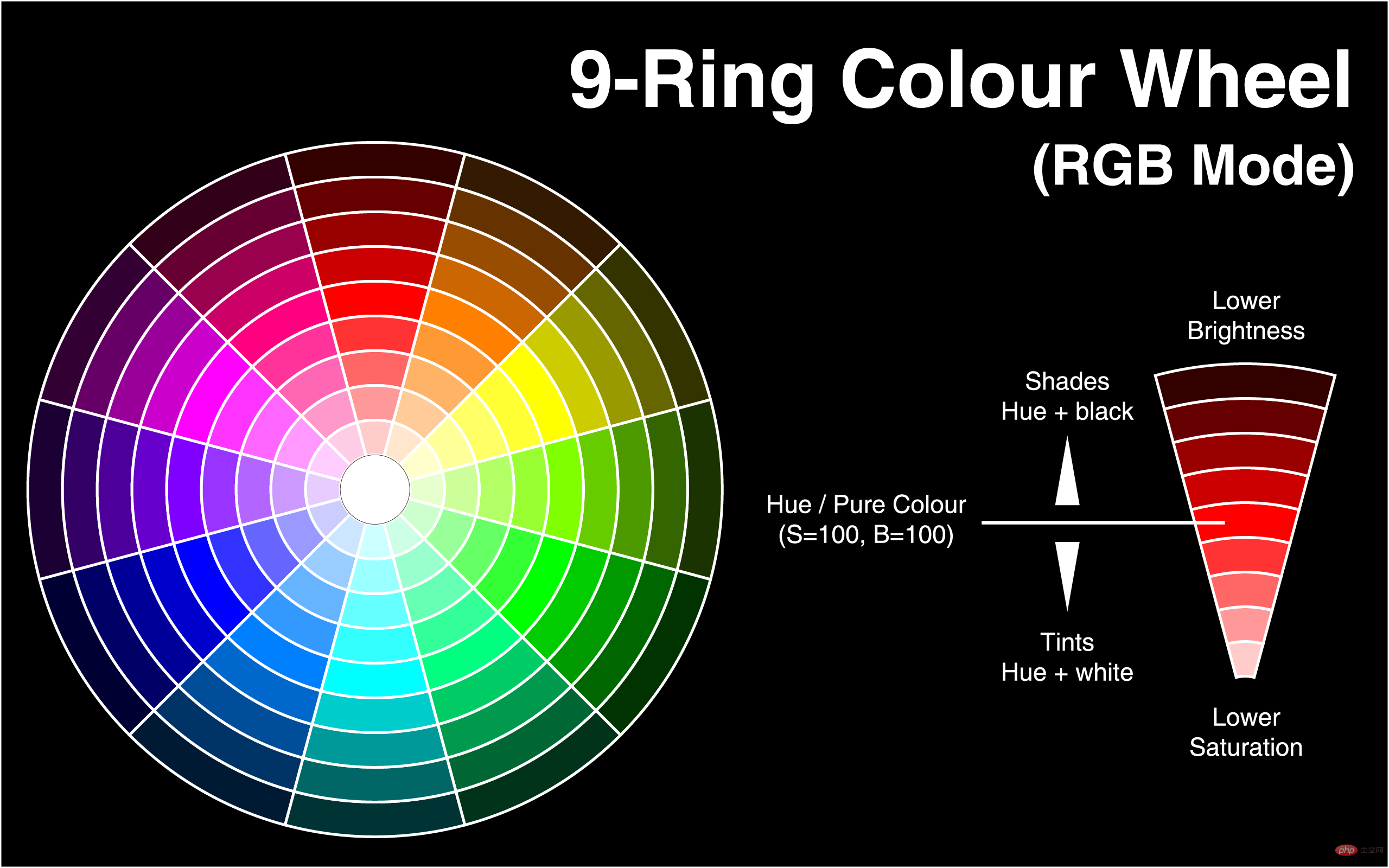
H: Hue(色调)。–0(或360)表示红色,120表示绿色,240表示蓝色,也可取其他数值来指定颜色。取值为:0 - 360
S: Saturation(饱和度)。取值为:0.0% - 100.0%
L: Lightness(亮度)。取值为:0.0% - 100.0%
例如:hsl(360,50%,50%) 红色
<style type="text/css">
    body{background:rgba(0,0,255,0.5);}
    div{width:300px;
        height:300px;
        background:hsl(140,50%,50%);
        position:absolute;
        top:0;
        left:0;
    }
</style>
<body>
    <div></div>
</body>3、HSLA模式(色轮模式有透明度)
语法:
HSLA(H,S,L,A)
取值:
H: Hue(色调)。–0(或360)表示红色,120表示绿色,240表示蓝色,也可取其他数值来指定颜色。取值为:0 - 360
S: Saturation(饱和度)。取值为:0.0% - 100.0%
L: Lightness(亮度)。取值为:0.0% - 100.0%
A: Alpha透明度。取值0~1之间。
例如:hsl(360,50%,50%,0.5
투명 색상은 지원하지 않습니다. 특정 색상에는 도구 조정 또는 특정 색상 혼합 지식이 필요합니다
3. RGB 방식 3원색 매칭 방식
Syntax
:
<style>
        body{background:HSL(0,100%,50%)}
        div{width:300px;
            height:300px;
            background:HSLA(230,100%,50%,0);
            position:absolute;
            top:0;
            left:0;
        }
    </style>
    </head>
    <body>
        猜猜我在哪里
        <div></div>
</body>값: R: 빨간색 값. 양의 정수 | 백분율
G: 녹색 값. 양의 정수 | 백분율 B: 파란색 값. 양의 정수 | 퍼센트 🎜값 범위: 🎜0~255 또는 0%~100%🎜🎜예:rgb(255,0,0)빨간색rgb(255,255,0) 노란색🎜🎜장점: 다양한 색상을 표현하고 사용하기 더 편리합니다🎜🎜단점: 🎜🎜투명 색상을 지원하지 않습니다.🎜🎜 특정 색상은 도구 조정이나 특정 색상 혼합 지식이 필요합니다🎜🎜🎜🎜 2 . CSS3 표현의 새로운 색상 🎜🎜🎜🎜🎜🎜 1. RGBA 모드 🎜🎜🎜🎜 이 색상 모드는 RGB 모드에 알파 투명도가 추가된다는 점을 제외하면 RGB와 동일합니다. 🎜🎜구문: 🎜<style type="text/css">
body{background:hsl(270,100%,50%)}
p{
font-size:50px;
font-family:"黑体";
/*浏览器私有属性*/
-webkit-text-fill-color:transparent;/*设置文本透明*/
/*使用rgba(0,0,0,0);也可以实现全透明模式*/
-webkit-text-stroke:2px yellow;/*将文本设置透明,再设置个边框后就实现镂空字了*/
/*W3C标准属性*/
/*text-fill-color:transparent;*/
/*text-stroke:2px yellow;*/
}
</style>
<body>
<p>2012年过去了,最忙的是元芳,你怎么看?</p>
</body>rgba(255,0,0,0.5) 반투명 빨간색🎜<style>
body{background:red}
div{background:blue;
width:300px;
height:300px;
opacity:0.5;
position:absolute;
top:0;
left:0
}
</style>
</head>
<body>
看到我你就成功了
<div></div>
</body>background-image: -ms-linear-gradient(top, #D35644 0%, #31264D 100%) !important;/* Mozilla Firefox */
background-image: -moz-linear-gradient(top, #D35644 0%, #31264D 100%) !important;/* Opera */
background-image: -o-linear-gradient(top, #D35644 0%, #31264D 100%) !important;/* Webkit (Safari/Chrome 10) */
background-image: -webkit-gradient(linear, left bottom, left top, color-stop(0, #D35644), color-stop(1, #31264D)) !important;/* Webkit (Chrome 11+) */
background-image: -webkit-linear-gradient(top, #D35644 0%, #31264D 100%) !important;/* W3C Markup, IE10 Release Preview */
background-image: linear-gradient(to bottom, #D35644 0%, #31264D 100%) !important; }hsl(360,50%,50%) Red🎜🎜 🎜
🎜<style>
div{height:30px}
div:nth-child(1){background:HSLA(120,100%,50%,0.1)}
div:nth-child(2){background:HSLA(120,100%,50%,0.2)}
div:nth-child(3){background:HSLA(120,100%,50%,0.3)}
div:nth-child(4){background:HSLA(120,100%,50%,0.4)}
div:nth-child(5){background:HSLA(120,100%,50%,0.5)}
div:nth-child(6){background:HSLA(120,100%,50%,0.6)}
div:nth-child(7){background:HSLA(120,100%,50%,0.7)}
div:nth-child(8){background:HSLA(120,100%,50%,0.8)}
div:nth-child(9){background:HSLA(120,100%,50%,0.9)}
div:nth-child(10){background:HSLA(120,100%,50%,1.0)}
</style>
</head>
<body>
<div></div>
<div></div>
<div></div>
<div></div>
<div></div>
<div></div>
<div></div>
<div></div>
<div></div>
<div></div>
</body><style>
div{height:30px}
div:nth-child(1){background:HSLA(120,100%,50%,1)}
div:nth-child(2){background:HSLA(120,90%,50%,1)}
div:nth-child(3){background:HSLA(120,80%,50%,1)}
div:nth-child(4){background:HSLA(120,70%,50%,1)}
div:nth-child(5){background:HSLA(120,60%,50%,1)}
div:nth-child(6){background:HSLA(120,50%,50%,1)}
div:nth-child(7){background:HSLA(120,40%,50%,1)}
div:nth-child(8){background:HSLA(120,30%,50%,1)}
div:nth-child(9){background:HSLA(120,20%,50%,1)}
div:nth-child(10){background:HSLA(120,10%,50%,1)}
</style>
</head>
<body>
<div></div>
<div></div>
<div></div>
<div></div>
<div></div>
<div></div>
<div></div>
<div></div>
<div></div>
<div></div>
</body>
</html>hsl(360,50%,50%,0.5) red🎜<style>
div{height:30px}
div:nth-child(1){background:HSLA(120,100%,100%,1)}
div:nth-child(2){background:HSLA(120,100%,90%,1)}
div:nth-child(3){background:HSLA(120,100%,80%,1)}
div:nth-child(4){background:HSLA(120,100%,70%,1)}
div:nth-child(5){background:HSLA(120,100%,60%,1)}
div:nth-child(6){background:HSLA(120,100%,50%,1)}
div:nth-child(7){background:HSLA(120,100%,40%,1)}
div:nth-child(8){background:HSLA(120,100%,30%,1)}
div:nth-child(9){background:HSLA(120,100%,20%,1)}
div:nth-child(10){background:HSLA(120,100%,10%,1)}
</style>
</head>
<body>
<div></div>
<div></div>
<div></div>
<div></div>
<div></div>
<div></div>
<div></div>
<div></div>
<div></div>
<div></div>
</body><style>
#div1 { width:200px; height:200px; border:1px solid #333;
background:-moz-linear-gradient(top, red, yellow);
background:-webkit-linear-gradient(top, red, yellow);
background:-ms-linear-gradient(top, red, yellow);
background:linear-gradient(top, red, yellow);
-ms-filter:"progid:DXImageTransform.Microsoft.gradient (GradientType=0, startColorstr=red, endColorstr=yellow)";
+background:#f9f9f9;/*兼容IE9,8,7*/
}
</style>
</head>
<body>
<div id="div1"></div>
</body>注意:对于尚不支持opacity属性的IE浏览器
滤镜:filter:alpha(opacity=50) 仅限IE
<style>
    body{background:red}
    div{background:blue;
        width:300px;
        height:300px;
        opacity:0.5;
        position:absolute;
        top:0;
        left:0
    }
</style>
</head>
<body>
    看到我你就成功了
    <div></div>
</body>四、CSS3 颜色使用实例
background-image: -ms-linear-gradient(top, #D35644 0%, #31264D 100%) !important;/* Mozilla Firefox */
     background-image: -moz-linear-gradient(top, #D35644 0%, #31264D 100%) !important;/* Opera */
     background-image: -o-linear-gradient(top, #D35644 0%, #31264D 100%) !important;/* Webkit (Safari/Chrome 10) */
     background-image: -webkit-gradient(linear, left bottom, left top, color-stop(0, #D35644), color-stop(1, #31264D)) !important;/* Webkit (Chrome 11+) */
     background-image: -webkit-linear-gradient(top, #D35644 0%, #31264D 100%) !important;/* W3C Markup, IE10 Release Preview */
background-image: linear-gradient(to bottom, #D35644 0%, #31264D 100%) !important; }1、模拟渐变效果
使用透明度来模拟渐变
<style>
    div{height:30px}
    div:nth-child(1){background:HSLA(120,100%,50%,0.1)}
    div:nth-child(2){background:HSLA(120,100%,50%,0.2)}
    div:nth-child(3){background:HSLA(120,100%,50%,0.3)}
    div:nth-child(4){background:HSLA(120,100%,50%,0.4)}
    div:nth-child(5){background:HSLA(120,100%,50%,0.5)}
    div:nth-child(6){background:HSLA(120,100%,50%,0.6)}
    div:nth-child(7){background:HSLA(120,100%,50%,0.7)}
    div:nth-child(8){background:HSLA(120,100%,50%,0.8)}
    div:nth-child(9){background:HSLA(120,100%,50%,0.9)}
    div:nth-child(10){background:HSLA(120,100%,50%,1.0)}
</style>
</head>
<body>
    <div></div>
    <div></div>
    <div></div>
    <div></div>
    <div></div>
    <div></div>
    <div></div>
    <div></div>
    <div></div>
    <div></div>
</body>使用饱和度模拟渐变
<style>
            div{height:30px}
            div:nth-child(1){background:HSLA(120,100%,50%,1)}
            div:nth-child(2){background:HSLA(120,90%,50%,1)}
            div:nth-child(3){background:HSLA(120,80%,50%,1)}
            div:nth-child(4){background:HSLA(120,70%,50%,1)}
            div:nth-child(5){background:HSLA(120,60%,50%,1)}
            div:nth-child(6){background:HSLA(120,50%,50%,1)}
            div:nth-child(7){background:HSLA(120,40%,50%,1)}
            div:nth-child(8){background:HSLA(120,30%,50%,1)}
            div:nth-child(9){background:HSLA(120,20%,50%,1)}
            div:nth-child(10){background:HSLA(120,10%,50%,1)}
        </style>
    </head>
    <body>
        <div></div>
        <div></div>
        <div></div>
        <div></div>
        <div></div>
        <div></div>
        <div></div>
        <div></div>
        <div></div>
        <div></div>
    </body>
</html>使用亮度来实现模拟渐变
<style>
    div{height:30px}
    div:nth-child(1){background:HSLA(120,100%,100%,1)}
    div:nth-child(2){background:HSLA(120,100%,90%,1)}
    div:nth-child(3){background:HSLA(120,100%,80%,1)}
    div:nth-child(4){background:HSLA(120,100%,70%,1)}
    div:nth-child(5){background:HSLA(120,100%,60%,1)}
    div:nth-child(6){background:HSLA(120,100%,50%,1)}
    div:nth-child(7){background:HSLA(120,100%,40%,1)}
    div:nth-child(8){background:HSLA(120,100%,30%,1)}
    div:nth-child(9){background:HSLA(120,100%,20%,1)}
    div:nth-child(10){background:HSLA(120,100%,10%,1)}
</style>
</head>
<body>
    <div></div>
    <div></div>
    <div></div>
    <div></div>
    <div></div>
    <div></div>
    <div></div>
    <div></div>
    <div></div>
    <div></div>
</body>使用背景颜色:
<style>
#div1 { width:200px; height:200px; border:1px solid #333;
background:-moz-linear-gradient(top, red, yellow);
background:-webkit-linear-gradient(top, red, yellow);
background:-ms-linear-gradient(top, red, yellow);
background:linear-gradient(top, red, yellow);
-ms-filter:"progid:DXImageTransform.Microsoft.gradient (GradientType=0, startColorstr=red, endColorstr=yellow)";
+background:#f9f9f9;/*兼容IE9,8,7*/
}
</style>

</head>

<body>

<div id="div1"></div>

</body>更多编程相关知识,请访问:编程视频!!
위 내용은 CSS3의 새로운 색상 모드는 무엇입니까의 상세 내용입니다. 자세한 내용은 PHP 중국어 웹사이트의 기타 관련 기사를 참조하세요!

핫 AI 도구

Undresser.AI Undress
사실적인 누드 사진을 만들기 위한 AI 기반 앱

AI Clothes Remover
사진에서 옷을 제거하는 온라인 AI 도구입니다.

Undress AI Tool
무료로 이미지를 벗다

Clothoff.io
AI 옷 제거제

AI Hentai Generator
AI Hentai를 무료로 생성하십시오.

인기 기사
뜨거운 도구

메모장++7.3.1
사용하기 쉬운 무료 코드 편집기

SublimeText3 중국어 버전
중국어 버전, 사용하기 매우 쉽습니다.

스튜디오 13.0.1 보내기
강력한 PHP 통합 개발 환경

드림위버 CS6
시각적 웹 개발 도구

SublimeText3 Mac 버전
신 수준의 코드 편집 소프트웨어(SublimeText3)
뜨거운 주제
 7517
7517
 15
1378
52
79
11
53
19
21
66
15
1378
52
79
11
53
19
21
66

 순수한 CSS3로 물결 효과를 얻는 방법은 무엇입니까? (코드 예)
Jun 28, 2022 pm 01:39 PM
순수한 CSS3로 물결 효과를 얻는 방법은 무엇입니까? (코드 예)
Jun 28, 2022 pm 01:39 PM
순수한 CSS3로 물결 효과를 얻는 방법은 무엇입니까? 이 기사에서는 SVG 및 CSS 애니메이션을 사용하여 물결 효과를 만드는 방법을 소개합니다. 도움이 되길 바랍니다.
 CSS를 능숙하게 사용하여 다양한 이상한 모양의 버튼 구현(코드 포함)
Jul 19, 2022 am 11:28 AM
CSS를 능숙하게 사용하여 다양한 이상한 모양의 버튼 구현(코드 포함)
Jul 19, 2022 am 11:28 AM
이 글에서는 CSS를 활용하여 자주 나타나는 다양한 모양의 버튼을 쉽게 구현하는 방법을 알려드리겠습니다. 도움이 되셨으면 좋겠습니다.
 공간을 차지하지 않고 CSS에서 요소를 숨기는 방법
Jun 01, 2022 pm 07:15 PM
공간을 차지하지 않고 CSS에서 요소를 숨기는 방법
Jun 01, 2022 pm 07:15 PM
두 가지 방법: 1. 표시 속성을 사용하여 요소에 "display:none;" 스타일을 추가합니다. 2. 요소를 숨기려면 위치 및 상단 속성을 사용하여 요소의 절대 위치를 설정하세요. 요소에 "position:absolute;top:-9999px;" 스타일을 추가하세요.
 RGB 색상 모드란 무엇입니까?
Feb 28, 2023 pm 04:01 PM
RGB 색상 모드란 무엇입니까?
Feb 28, 2023 pm 04:01 PM
RGB 색상 모드는 화면 표시 모드로, RGB 색상 모드는 화면의 빨간색, 녹색, 파란색 발광 전극을 전자총으로 쳐서 색상을 생성합니다. 컴퓨터는 일반적으로 32비트 색상을 표시할 수 있습니다. 약 백만 가지 이상의 색상이 있습니다. RGB 색상 모드는 빨간색, 파란색, 녹색의 세 가지 기본 색상을 사용하여 서로 다른 방식으로 중첩하고 혼합하여 다른 색상을 생성하는 색상 표준화 모드입니다. 보이는 모든 색상을 형성합니다.
 CSS3에서 레이스 테두리를 구현하는 방법
Sep 16, 2022 pm 07:11 PM
CSS3에서 레이스 테두리를 구현하는 방법
Sep 16, 2022 pm 07:11 PM
CSS에서는 border-image 속성을 사용하여 레이스 테두리를 만들 수 있습니다. border-image 속성은 이미지를 사용하여 테두리를 생성할 수 있습니다. 즉, 배경 이미지를 레이스 스타일로 지정하기만 하면 됩니다. "border-image: url(이미지 경로)은 이미지 테두리 너비가 안쪽으로 반복되는지 여부입니다.
 텍스트 캐러셀과 이미지 캐러셀도 순수 CSS를 사용하여 구현할 수 있다는 것이 밝혀졌습니다!
Jun 10, 2022 pm 01:00 PM
텍스트 캐러셀과 이미지 캐러셀도 순수 CSS를 사용하여 구현할 수 있다는 것이 밝혀졌습니다!
Jun 10, 2022 pm 01:00 PM
텍스트 회전판과 이미지 회전판을 만드는 방법은 무엇입니까? 누구나 가장 먼저 생각하는 것은 js를 사용할지 여부입니다. 실제로 순수 CSS를 사용하여 구현하는 방법도 모두에게 도움이 되기를 바랍니다.
 CSS3에서 마우스를 클릭하여 이미지를 확대하는 방법
Apr 25, 2022 pm 04:52 PM
CSS3에서 마우스를 클릭하여 이미지를 확대하는 방법
Apr 25, 2022 pm 04:52 PM
구현 방법: 1. ":active" 선택기를 사용하여 그림에 대한 마우스 클릭 상태를 선택합니다. 2. 변환 속성과 scale() 함수를 사용하여 그림 확대 효과를 얻습니다. 구문은 "img:active {transform; : scale(x축 배율, y축 배율);}".
 CSS3에서 애니메이션 회전 속도를 설정하는 방법
Apr 28, 2022 pm 04:32 PM
CSS3에서 애니메이션 회전 속도를 설정하는 방법
Apr 28, 2022 pm 04:32 PM
CSS3에서는 "animation-timing-function" 속성을 사용하여 애니메이션 회전 속도를 설정할 수 있습니다. 이 속성은 애니메이션이 순환을 완료하는 방법을 지정하고 애니메이션의 속도 곡선을 설정하는 데 사용됩니다. 애니메이션 타이밍 기능: 속도 속성 값;}".
