

CSS3 삼각형을 지속적으로 확대하는 방법

이 글에서는 CSS3 삼각형을 지속적으로 확대하는 방법을 소개합니다. 도움이 필요한 친구들이 모두 참고할 수 있기를 바랍니다.

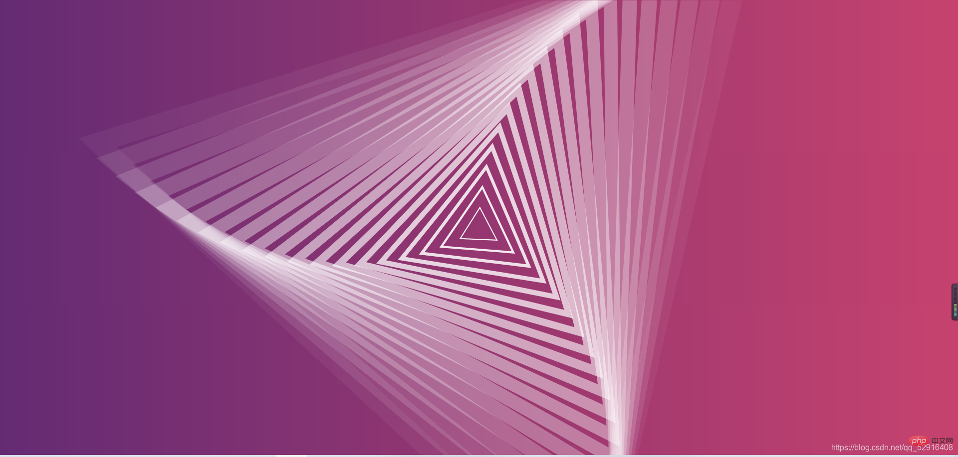
CSS3 삼각형 연속 확대 효과
사진 미리보기
index.html code
<!DOCTYPE html><html lang="en">
	<head>
		<meta charset="UTF-8">
		<title>CSS3三角形不断放大特效</title>
		<link rel="stylesheet" href="css/style.css">
	</head>
	<body>
		<p class="wrapper">
			<svg class="triangle-canvas" viewBox="0 0 1000 1000" xmlns="http://www.w3.org/2000/svg">
				<polygon class="triangle triangle-1" points="500,200 759,650 241,650" />
				<polygon class="triangle triangle-2" points="500,200 759,650 241,650" />
				<polygon class="triangle triangle-3" points="500,200 759,650 241,650" />
				<polygon class="triangle triangle-4" points="500,200 759,650 241,650" />
				<polygon class="triangle triangle-5" points="500,200 759,650 241,650" />
				<polygon class="triangle triangle-6" points="500,200 759,650 241,650" />
				<polygon class="triangle triangle-7" points="500,200 759,650 241,650" />
				<polygon class="triangle triangle-8" points="500,200 759,650 241,650" />
				<polygon class="triangle triangle-9" points="500,200 759,650 241,650" />
				<polygon class="triangle triangle-10" points="500,200 759,650 241,650" />
				<polygon class="triangle triangle-11" points="500,200 759,650 241,650" />
				<polygon class="triangle triangle-12" points="500,200 759,650 241,650" />
				<polygon class="triangle triangle-13" points="500,200 759,650 241,650" />
				<polygon class="triangle triangle-14" points="500,200 759,650 241,650" />
				<polygon class="triangle triangle-15" points="500,200 759,650 241,650" />
				<polygon class="triangle triangle-16" points="500,200 759,650 241,650" />
				<polygon class="triangle triangle-17" points="500,200 759,650 241,650" />
				<polygon class="triangle triangle-18" points="500,200 759,650 241,650" />
				<polygon class="triangle triangle-19" points="500,200 759,650 241,650" />
				<polygon class="triangle triangle-20" points="500,200 759,650 241,650" />
			</svg>
		</p>
	</body></html>
style.css code
html {
	height: 100%;}body {
	padding: 0;
	margin: 0;
	height: 100%;
	background: #642B73;
	/* fallback for old browsers */
	/* Chrome 10-25, Safari 5.1-6 */
	background: linear-gradient(to left, #C6426E, #642B73);
	/* W3C, IE 10+/ Edge, Firefox 16+, Chrome 26+, Opera 12+, Safari 7+ */}.wrapper {
	overflow: hidden;
	position: absolute;
	top: 0;
	left: 0;
	width: 100%;
	height: 100%;}.triangle-canvas {
	position: absolute;
	left: 50%;
	top: 50%;
	width: 100%;
	height: 100%;
	-webkit-transform: translate(-50%, -50%);
	transform: translate(-50%, -50%);}.triangle {
	fill: none;
	stroke: #fff;
	stroke-width: 15;
	-webkit-transform-origin: center center;
	transform-origin: center center;
	-webkit-animation: triangle-animation 10s linear infinite;
	animation: triangle-animation 10s linear infinite;}.triangle-1 {
	-webkit-animation-delay: 0s;
	animation-delay: 0s;}.triangle-2 {
	-webkit-animation-delay: -0.5s;
	animation-delay: -0.5s;}.triangle-3 {
	-webkit-animation-delay: -1s;
	animation-delay: -1s;}.triangle-4 {
	-webkit-animation-delay: -1.5s;
	animation-delay: -1.5s;}.triangle-5 {
	-webkit-animation-delay: -2s;
	animation-delay: -2s;}.triangle-6 {
	-webkit-animation-delay: -2.5s;
	animation-delay: -2.5s;}.triangle-7 {
	-webkit-animation-delay: -3s;
	animation-delay: -3s;}.triangle-8 {
	-webkit-animation-delay: -3.5s;
	animation-delay: -3.5s;}.triangle-9 {
	-webkit-animation-delay: -4s;
	animation-delay: -4s;}.triangle-10 {
	-webkit-animation-delay: -4.5s;
	animation-delay: -4.5s;}.triangle-11 {
	-webkit-animation-delay: -5s;
	animation-delay: -5s;}.triangle-12 {
	-webkit-animation-delay: -5.5s;
	animation-delay: -5.5s;}.triangle-13 {
	-webkit-animation-delay: -6s;
	animation-delay: -6s;}.triangle-14 {
	-webkit-animation-delay: -6.5s;
	animation-delay: -6.5s;}.triangle-15 {
	-webkit-animation-delay: -7s;
	animation-delay: -7s;}.triangle-16 {
	-webkit-animation-delay: -7.5s;
	animation-delay: -7.5s;}.triangle-17 {
	-webkit-animation-delay: -8s;
	animation-delay: -8s;}.triangle-18 {
	-webkit-animation-delay: -8.5s;
	animation-delay: -8.5s;}.triangle-19 {
	-webkit-animation-delay: -9s;
	animation-delay: -9s;}.triangle-20 {
	-webkit-animation-delay: -9.5s;
	animation-delay: -9.5s;}@-webkit-keyframes triangle-animation {
	0% {
		-webkit-transform: scale(0) rotate(0deg);
		transform: scale(0) rotate(0deg);
		opacity: 1;
	}

	100% {
		-webkit-transform: scale(3) rotate(45deg);
		transform: scale(3) rotate(45deg);
		opacity: 0;
	}}@keyframes triangle-animation {
	0% {
		-webkit-transform: scale(0) rotate(0deg);
		transform: scale(0) rotate(0deg);
		opacity: 1;
	}

	100% {
		-webkit-transform: scale(3) rotate(45deg);
		transform: scale(3) rotate(45deg);
		opacity: 0;
}}추천 학습: css 비디오 튜토리얼
위 내용은 CSS3 삼각형을 지속적으로 확대하는 방법의 상세 내용입니다. 자세한 내용은 PHP 중국어 웹사이트의 기타 관련 기사를 참조하세요!

핫 AI 도구

Undresser.AI Undress
사실적인 누드 사진을 만들기 위한 AI 기반 앱

AI Clothes Remover
사진에서 옷을 제거하는 온라인 AI 도구입니다.

Undress AI Tool
무료로 이미지를 벗다

Clothoff.io
AI 옷 제거제

AI Hentai Generator
AI Hentai를 무료로 생성하십시오.

인기 기사
뜨거운 도구

메모장++7.3.1
사용하기 쉬운 무료 코드 편집기

SublimeText3 중국어 버전
중국어 버전, 사용하기 매우 쉽습니다.

스튜디오 13.0.1 보내기
강력한 PHP 통합 개발 환경

드림위버 CS6
시각적 웹 개발 도구

SublimeText3 Mac 버전
신 수준의 코드 편집 소프트웨어(SublimeText3)
뜨거운 주제
 7564
7564
 15
1386
52
87
11
61
19
28
101
15
1386
52
87
11
61
19
28
101

 순수한 CSS3로 물결 효과를 얻는 방법은 무엇입니까? (코드 예)
Jun 28, 2022 pm 01:39 PM
순수한 CSS3로 물결 효과를 얻는 방법은 무엇입니까? (코드 예)
Jun 28, 2022 pm 01:39 PM
순수한 CSS3로 물결 효과를 얻는 방법은 무엇입니까? 이 기사에서는 SVG 및 CSS 애니메이션을 사용하여 물결 효과를 만드는 방법을 소개합니다. 도움이 되길 바랍니다.
 CSS를 능숙하게 사용하여 다양한 이상한 모양의 버튼 구현(코드 포함)
Jul 19, 2022 am 11:28 AM
CSS를 능숙하게 사용하여 다양한 이상한 모양의 버튼 구현(코드 포함)
Jul 19, 2022 am 11:28 AM
이 글에서는 CSS를 활용하여 자주 나타나는 다양한 모양의 버튼을 쉽게 구현하는 방법을 알려드리겠습니다. 도움이 되셨으면 좋겠습니다.
 행렬식을 사용하여 삼각형의 면적을 계산하는 Java 프로그램
Aug 31, 2023 am 10:17 AM
행렬식을 사용하여 삼각형의 면적을 계산하는 Java 프로그램
Aug 31, 2023 am 10:17 AM
소개 행렬식을 이용하여 삼각형의 면적을 계산하는 자바 프로그램은 세 꼭지점의 좌표를 주어 삼각형의 면적을 계산할 수 있는 간결하고 효율적인 프로그램이다. 이 프로그램은 Java에서 기본 산술 및 대수 계산을 사용하는 방법과 Scanner 클래스를 사용하여 사용자 입력을 읽는 방법을 보여주기 때문에 기하학을 배우거나 작업하는 모든 사람에게 유용합니다. 프로그램은 사용자에게 삼각형의 세 점 좌표를 묻는 메시지를 표시하고 이를 읽어 좌표 행렬의 행렬식을 계산하는 데 사용합니다. 행렬식의 절대값을 사용하여 면적이 항상 양수인지 확인한 다음 공식을 사용하여 삼각형의 면적을 계산하여 사용자에게 표시합니다. 이 프로그램은 다양한 형식의 입력을 받아들이거나 추가 계산을 수행하도록 쉽게 수정할 수 있으므로 기하학적 계산을 위한 다용도 도구가 됩니다. 행렬식의 순위
 공간을 차지하지 않고 CSS에서 요소를 숨기는 방법
Jun 01, 2022 pm 07:15 PM
공간을 차지하지 않고 CSS에서 요소를 숨기는 방법
Jun 01, 2022 pm 07:15 PM
두 가지 방법: 1. 표시 속성을 사용하여 요소에 "display:none;" 스타일을 추가합니다. 2. 요소를 숨기려면 위치 및 상단 속성을 사용하여 요소의 절대 위치를 설정하세요. 요소에 "position:absolute;top:-9999px;" 스타일을 추가하세요.
 CSS3에서 레이스 테두리를 구현하는 방법
Sep 16, 2022 pm 07:11 PM
CSS3에서 레이스 테두리를 구현하는 방법
Sep 16, 2022 pm 07:11 PM
CSS에서는 border-image 속성을 사용하여 레이스 테두리를 만들 수 있습니다. border-image 속성은 이미지를 사용하여 테두리를 생성할 수 있습니다. 즉, 배경 이미지를 레이스 스타일로 지정하기만 하면 됩니다. "border-image: url(이미지 경로)은 이미지 테두리 너비가 안쪽으로 반복되는지 여부입니다.
 텍스트 캐러셀과 이미지 캐러셀도 순수 CSS를 사용하여 구현할 수 있다는 것이 밝혀졌습니다!
Jun 10, 2022 pm 01:00 PM
텍스트 캐러셀과 이미지 캐러셀도 순수 CSS를 사용하여 구현할 수 있다는 것이 밝혀졌습니다!
Jun 10, 2022 pm 01:00 PM
텍스트 회전판과 이미지 회전판을 만드는 방법은 무엇입니까? 누구나 가장 먼저 생각하는 것은 js를 사용할지 여부입니다. 실제로 순수 CSS를 사용하여 구현하는 방법도 모두에게 도움이 되기를 바랍니다.
 CSS3에서 마우스를 클릭하여 이미지를 확대하는 방법
Apr 25, 2022 pm 04:52 PM
CSS3에서 마우스를 클릭하여 이미지를 확대하는 방법
Apr 25, 2022 pm 04:52 PM
구현 방법: 1. ":active" 선택기를 사용하여 그림에 대한 마우스 클릭 상태를 선택합니다. 2. 변환 속성과 scale() 함수를 사용하여 그림 확대 효과를 얻습니다. 구문은 "img:active {transform; : scale(x축 배율, y축 배율);}".
 CSS3에서 애니메이션 회전 속도를 설정하는 방법
Apr 28, 2022 pm 04:32 PM
CSS3에서 애니메이션 회전 속도를 설정하는 방법
Apr 28, 2022 pm 04:32 PM
CSS3에서는 "animation-timing-function" 속성을 사용하여 애니메이션 회전 속도를 설정할 수 있습니다. 이 속성은 애니메이션이 순환을 완료하는 방법을 지정하고 애니메이션의 속도 곡선을 설정하는 데 사용됩니다. 애니메이션 타이밍 기능: 속도 속성 값;}".
