

비정상적인 데이터를 제거하는 네 가지 방법은 무엇입니까?

비정상 데이터를 제거하는 네 가지 방법은 다음과 같습니다. 1. "격리 포리스트", 2. DBSCAN, 3. OneClassSVM, 4. 샘플의 비정상성을 반영하기 위해 수치 점수를 계산합니다.

이 튜토리얼의 운영 환경: Windows 7 시스템, Dell G3 컴퓨터.
이상치 검출 이상점 식별 방법
1. 격리 숲 격리 숲
1.1 테스트 샘플 예
파일 test.pkl
1.2 격리 숲 데모
격리 숲 원리
를 무작위로 나누어 설정 랜덤 포레스트로 하고, 소수의 분할 후에 나누어질 수 있는 점을 비정상 점으로 간주한다.
# 参考https://blog.csdn.net/ye1215172385/article/details/79762317
# 官方例子https://scikit-learn.org/stable/auto_examples/ensemble/plot_isolation_forest.html#sphx-glr-auto-examples-ensemble-plot-isolation-forest-py
import numpy as np
import matplotlib.pyplot as plt
from sklearn.ensemble import IsolationForest

rng = np.random.RandomState(42)

# 构造训练样本
n_samples = 200  #样本总数
outliers_fraction = 0.25  #异常样本比例
n_inliers = int((1. - outliers_fraction) * n_samples)
n_outliers = int(outliers_fraction * n_samples)

X = 0.3 * rng.randn(n_inliers // 2, 2)
X_train = np.r_[X + 2, X - 2]   #正常样本
X_train = np.r_[X_train, np.random.uniform(low=-6, high=6, size=(n_outliers, 2))]  #正常样本加上异常样本

# 构造模型并拟合
clf = IsolationForest(max_samples=n_samples, random_state=rng, contamination=outliers_fraction)
clf.fit(X_train)
# 计算得分并设置阈值
scores_pred = clf.decision_function(X_train)
threshold = np.percentile(scores_pred, 100 * outliers_fraction)  #根据训练样本中异常样本比例,得到阈值,用于绘图

# plot the line, the samples, and the nearest vectors to the plane
xx, yy = np.meshgrid(np.linspace(-7, 7, 50), np.linspace(-7, 7, 50))
Z = clf.decision_function(np.c_[xx.ravel(), yy.ravel()])
Z = Z.reshape(xx.shape)

plt.title("IsolationForest")
# plt.contourf(xx, yy, Z, cmap=plt.cm.Blues_r)
plt.contourf(xx, yy, Z, levels=np.linspace(Z.min(), threshold, 7), cmap=plt.cm.Blues_r)  #绘制异常点区域,值从最小的到阈值的那部分
a = plt.contour(xx, yy, Z, levels=[threshold], linewidths=2, colors='red')  #绘制异常点区域和正常点区域的边界
plt.contourf(xx, yy, Z, levels=[threshold, Z.max()], colors='palevioletred')  #绘制正常点区域,值从阈值到最大的那部分

b = plt.scatter(X_train[:-n_outliers, 0], X_train[:-n_outliers, 1], c='white',
                    s=20, edgecolor='k')
c = plt.scatter(X_train[-n_outliers:, 0], X_train[-n_outliers:, 1], c='black',
                    s=20, edgecolor='k')
plt.axis('tight')
plt.xlim((-7, 7))
plt.ylim((-7, 7))
plt.legend([a.collections[0], b, c],
           ['learned decision function', 'true inliers', 'true outliers'],
           loc="upper left")
plt.show()1.3 직접 수정하면 X_train을 필요한 데이터로 변경할 수 있습니다.
여기에는 표준화가 없습니다. 먼저 표준화한 다음 sklearn.preprocessing import StandardScaler
import numpy as np
import matplotlib.pyplot as plt
from sklearn.ensemble import IsolationForest
from scipy import stats

rng = np.random.RandomState(42)


X_train =  X_train_demo.values
outliers_fraction = 0.1
n_samples = 500
# 构造模型并拟合
clf = IsolationForest(max_samples=n_samples, random_state=rng, contamination=outliers_fraction)
clf.fit(X_train)
# 计算得分并设置阈值
scores_pred = clf.decision_function(X_train)
threshold = stats.scoreatpercentile(scores_pred, 100 * outliers_fraction)  #根据训练样本中异常样本比例,得到阈值,用于绘图

# plot the line, the samples, and the nearest vectors to the plane
range_max_min0 = (X_train[:,0].max()-X_train[:,0].min())*0.2
range_max_min1 = (X_train[:,1].max()-X_train[:,1].min())*0.2
xx, yy = np.meshgrid(np.linspace(X_train[:,0].min()-range_max_min0, X_train[:,0].max()+range_max_min0, 500),
                     np.linspace(X_train[:,1].min()-range_max_min1, X_train[:,1].max()+range_max_min1, 500))
Z = clf.decision_function(np.c_[xx.ravel(), yy.ravel()])
Z = Z.reshape(xx.shape)

plt.title("IsolationForest")
# plt.contourf(xx, yy, Z, cmap=plt.cm.Blues_r)
plt.contourf(xx, yy, Z, levels=np.linspace(Z.min(), threshold, 7), cmap=plt.cm.Blues_r)  #绘制异常点区域,值从最小的到阈值的那部分
a = plt.contour(xx, yy, Z, levels=[threshold], linewidths=2, colors='red')  #绘制异常点区域和正常点区域的边界
plt.contourf(xx, yy, Z, levels=[threshold, Z.max()], colors='palevioletred')  #绘制正常点区域,值从阈值到最大的那部分


is_in = clf.predict(X_train)>0
b = plt.scatter(X_train[is_in, 0], X_train[is_in, 1], c='white',
                    s=20, edgecolor='k')
c = plt.scatter(X_train[~is_in, 0], X_train[~is_in, 1], c='black',
                    s=20, edgecolor='k')
plt.axis('tight')
plt.xlim((X_train[:,0].min()-range_max_min0, X_train[:,0].max()+range_max_min0,))
plt.ylim((X_train[:,1].min()-range_max_min1, X_train[:,1].max()+range_max_min1,))
plt.legend([a.collections[0], b, c],
           ['learned decision function', 'inliers', 'outliers'],
           loc="upper left")
plt.show()1.4 핵심 코드에서 표준화를 기반으로 이상값을 제거할 수 있습니다.
1.4.1 샘플 샘플import numpy as np
# 构造训练样本
n_samples = 200 #样本总数
outliers_fraction = 0.25 #异常样本比例
n_inliers = int((1. - outliers_fraction) * n_samples)
n_outliers = int(outliers_fraction * n_samples)
X = 0.3 * rng.randn(n_inliers // 2, 2)
X_train = np.r_[X + 2, X - 2] #正常样本
X_train = np.r_[X_train, np.random.uniform(low=-6, high=6, size=(n_outliers, 2))] #正常样本加上异常样本
로그인 후 복사
1.4.2 핵심 코드 구현clf = IsolationForest(max_samples=0.8, 오염=0.25)import numpy as np # 构造训练样本 n_samples = 200 #样本总数 outliers_fraction = 0.25 #异常样本比例 n_inliers = int((1. - outliers_fraction) * n_samples) n_outliers = int(outliers_fraction * n_samples) X = 0.3 * rng.randn(n_inliers // 2, 2) X_train = np.r_[X + 2, X - 2] #正常样本 X_train = np.r_[X_train, np.random.uniform(low=-6, high=6, size=(n_outliers, 2))] #正常样本加上异常样本
from sklearn.ensemble import IsolationForest
# fit the model
# max_samples 构造一棵树使用的样本数,输入大于1的整数则使用该数字作为构造的最大样本数目,
# 如果数字属于(0,1]则使用该比例的数字作为构造iforest
# outliers_fraction 多少比例的样本可以作为异常值
clf = IsolationForest(max_samples=0.8, contamination=0.25)
clf.fit(X_train)
# y_pred_train = clf.predict(X_train)
scores_pred = clf.decision_function(X_train)
threshold = np.percentile(scores_pred, 100 * outliers_fraction)  #根据训练样本中异常样本比例,得到阈值,用于绘图

## 以下两种方法的筛选结果,完全相同
X_train_predict1 = X_train[clf.predict(X_train)==1]
X_train_predict2 = X_train[scores_pred>=threshold,:]
# 其中,1的表示非异常点,-1的表示为异常点
clf.predict(X_train)
array([ 1,  1,  1,  1,  1,  1,  1,  1,  1,  1,  1,  1,  1,  1,  1,  1,  1,
        1,  1,  1,  1,  1,  1,  1,  1,  1,  1,  1,  1,  1,  1,  1,  1,  1,
        1,  1,  1,  1,  1,  1,  1,  1,  1,  1,  1,  1,  1,  1,  1,  1,  1,
        1,  1,  1,  1,  1,  1,  1,  1,  1,  1,  1,  1,  1,  1,  1,  1, -1,
        1,  1,  1,  1,  1,  1,  1,  1,  1,  1,  1,  1,  1,  1,  1,  1,  1,
        1,  1,  1,  1,  1,  1,  1,  1,  1,  1,  1,  1,  1,  1,  1,  1,  1,
        1,  1,  1,  1,  1,  1,  1,  1,  1,  1,  1,  1,  1,  1,  1,  1,  1,
        1,  1,  1,  1,  1,  1,  1,  1,  1,  1,  1,  1,  1,  1,  1,  1,  1,
        1,  1,  1,  1,  1,  1,  1,  1,  1,  1,  1,  1,  1,  1, -1, -1, -1,
       -1, -1, -1, -1, -1, -1, -1,  1, -1, -1, -1, -1, -1, -1, -1, -1, -1,
       -1, -1, -1, -1, -1, -1, -1, -1, -1, -1, -1, -1, -1, -1, -1, -1, -1,
-1, -1, -1, -1, -1, -1, -1, -1, -1, -1, -1, -1, -1])# 参考https://blog.csdn.net/hb707934728/article/details/71515160
#
# 官方示例 https://scikit-learn.org/stable/auto_examples/cluster/plot_dbscan.html#sphx-glr-auto-examples-cluster-plot-dbscan-py
import numpy as np
import matplotlib.pyplot as plt
import matplotlib.colors
import sklearn.datasets as ds
from sklearn.cluster import DBSCAN
from sklearn.preprocessing import StandardScaler
def expand(a, b):
d = (b - a) * 0.1
return a-d, b+d
if __name__ == "__main__":
N = 1000
centers = [[1, 2], [-1, -1], [1, -1], [-1, 1]]
#scikit中的make_blobs方法常被用来生成聚类算法的测试数据,直观地说,make_blobs会根据用户指定的特征数量、
# 中心点数量、范围等来生成几类数据,这些数据可用于测试聚类算法的效果。
#函数原型:sklearn.datasets.make_blobs(n_samples=100, n_features=2,
# centers=3, cluster_std=1.0, center_box=(-10.0, 10.0), shuffle=True, random_state=None)[source]
#参数解析:
# n_samples是待生成的样本的总数。
#
# n_features是每个样本的特征数。
#
# centers表示类别数。
#
# cluster_std表示每个类别的方差,例如我们希望生成2类数据,其中一类比另一类具有更大的方差,可以将cluster_std设置为[1.0, 3.0]。
data, y = ds.make_blobs(N, n_features=2, centers=centers, cluster_std=[0.5, 0.25, 0.7, 0.5], random_state=0)
data = StandardScaler().fit_transform(data)
# 数据1的参数:(epsilon, min_sample)
params = ((0.2, 5), (0.2, 10), (0.2, 15), (0.3, 5), (0.3, 10), (0.3, 15))
plt.figure(figsize=(12, 8), facecolor='w')
plt.suptitle(u'DBSCAN clustering', fontsize=20)
for i in range(6):
eps, min_samples = params[i]
#参数含义:
#eps:半径,表示以给定点P为中心的圆形邻域的范围
#min_samples:以点P为中心的邻域内最少点的数量
#如果满足,以点P为中心,半径为EPS的邻域内点的个数不少于MinPts,则称点P为核心点
model = DBSCAN(eps=eps, min_samples=min_samples)
model.fit(data)
y_hat = model.labels_
core_indices = np.zeros_like(y_hat, dtype=bool) # 生成数据类型和数据shape和指定array一致的变量
core_indices[model.core_sample_indices_] = True # model.core_sample_indices_ border point位于y_hat中的下标
# 统计总共有积累,其中为-1的为未分类样本
y_unique = np.unique(y_hat)
n_clusters = y_unique.size - (1 if -1 in y_hat else 0)
print (y_unique, '聚类簇的个数为:', n_clusters)
plt.subplot(2, 3, i+1) # 对第几个图绘制,2行3列,绘制第i+1个图
# plt.cm.spectral https://blog.csdn.net/robin_Xu_shuai/article/details/79178857
clrs = plt.cm.Spectral(np.linspace(0, 0.8, y_unique.size)) #用于给画图灰色
for k, clr in zip(y_unique, clrs):
cur = (y_hat == k)
if k == -1:
# 用于绘制未分类样本
plt.scatter(data[cur, 0], data[cur, 1], s=20, c='k')
continue
# 绘制正常节点
plt.scatter(data[cur, 0], data[cur, 1], s=30, c=clr, edgecolors='k')
# 绘制边缘点
plt.scatter(data[cur & core_indices][:, 0], data[cur & core_indices][:, 1], s=60, c=clr, marker='o', edgecolors='k')
x1_min, x2_min = np.min(data, axis=0)
x1_max, x2_max = np.max(data, axis=0)
x1_min, x1_max = expand(x1_min, x1_max)
x2_min, x2_max = expand(x2_min, x2_max)
plt.xlim((x1_min, x1_max))
plt.ylim((x2_min, x2_max))
plt.grid(True)
plt.title(u'$epsilon$ = %.1f m = %d clustering num %d'%(eps, min_samples, n_clusters), fontsize=16)
plt.tight_layout()
plt.subplots_adjust(top=0.9)
plt.show()
[-1 0 1 2 3] 聚类簇的个数为: 4
[-1 0 1 2 3] 聚类簇的个数为: 4
[-1 0 1 2 3 4] 聚类簇的个数为: 5
[-1 0] 聚类簇的个数为: 1
[-1 0 1] 聚类簇的个数为: 2
[-1 0 1 2 3] 聚类簇的个数为: 4로그인 후 복사
# 参考https://blog.csdn.net/hb707934728/article/details/71515160
#
# 官方示例 https://scikit-learn.org/stable/auto_examples/cluster/plot_dbscan.html#sphx-glr-auto-examples-cluster-plot-dbscan-py

import numpy as np

import matplotlib.pyplot as plt
import matplotlib.colors

import sklearn.datasets as ds
from sklearn.cluster import DBSCAN
from sklearn.preprocessing import StandardScaler


def expand(a, b):
    d = (b - a) * 0.1
    return a-d, b+d


if __name__ == "__main__":
    N = 1000
    centers = [[1, 2], [-1, -1], [1, -1], [-1, 1]]
    #scikit中的make_blobs方法常被用来生成聚类算法的测试数据,直观地说,make_blobs会根据用户指定的特征数量、
    # 中心点数量、范围等来生成几类数据,这些数据可用于测试聚类算法的效果。
    #函数原型:sklearn.datasets.make_blobs(n_samples=100, n_features=2,
    # centers=3, cluster_std=1.0, center_box=(-10.0, 10.0), shuffle=True, random_state=None)[source]
    #参数解析:
    # n_samples是待生成的样本的总数。
    #
    # n_features是每个样本的特征数。
    #
    # centers表示类别数。
    #
    # cluster_std表示每个类别的方差,例如我们希望生成2类数据,其中一类比另一类具有更大的方差,可以将cluster_std设置为[1.0, 3.0]。
    data, y = ds.make_blobs(N, n_features=2, centers=centers, cluster_std=[0.5, 0.25, 0.7, 0.5], random_state=0)
    data = StandardScaler().fit_transform(data)
    # 数据1的参数:(epsilon, min_sample)
    params = ((0.2, 5), (0.2, 10), (0.2, 15), (0.3, 5), (0.3, 10), (0.3, 15))

    plt.figure(figsize=(12, 8), facecolor='w')
    plt.suptitle(u'DBSCAN clustering', fontsize=20)

    for i in range(6):
        eps, min_samples = params[i]
        #参数含义:
        #eps:半径,表示以给定点P为中心的圆形邻域的范围
        #min_samples:以点P为中心的邻域内最少点的数量
        #如果满足,以点P为中心,半径为EPS的邻域内点的个数不少于MinPts,则称点P为核心点
        model = DBSCAN(eps=eps, min_samples=min_samples)
        model.fit(data)
        y_hat = model.labels_

        core_indices = np.zeros_like(y_hat, dtype=bool)  # 生成数据类型和数据shape和指定array一致的变量
        core_indices[model.core_sample_indices_] = True  # model.core_sample_indices_ border point位于y_hat中的下标

        # 统计总共有积累,其中为-1的为未分类样本
        y_unique = np.unique(y_hat)
        n_clusters = y_unique.size - (1 if -1 in y_hat else 0)
        print (y_unique, '聚类簇的个数为:', n_clusters)

        plt.subplot(2, 3, i+1) # 对第几个图绘制,2行3列,绘制第i+1个图
        # plt.cm.spectral https://blog.csdn.net/robin_Xu_shuai/article/details/79178857
        clrs = plt.cm.Spectral(np.linspace(0, 0.8, y_unique.size)) #用于给画图灰色
        for k, clr in zip(y_unique, clrs):
            cur = (y_hat == k)
            if k == -1:
                # 用于绘制未分类样本
                plt.scatter(data[cur, 0], data[cur, 1], s=20, c='k')
                continue
            # 绘制正常节点
            plt.scatter(data[cur, 0], data[cur, 1], s=30, c=clr, edgecolors='k')
            # 绘制边缘点
            plt.scatter(data[cur & core_indices][:, 0], data[cur & core_indices][:, 1], s=60, c=clr, marker='o', edgecolors='k')
        x1_min, x2_min = np.min(data, axis=0)
        x1_max, x2_max = np.max(data, axis=0)
        x1_min, x1_max = expand(x1_min, x1_max)
        x2_min, x2_max = expand(x2_min, x2_max)
        plt.xlim((x1_min, x1_max))
        plt.ylim((x2_min, x2_max))
        plt.grid(True)
        plt.title(u'$epsilon$ = %.1f m = %d clustering num %d'%(eps, min_samples, n_clusters), fontsize=16)
    plt.tight_layout()
    plt.subplots_adjust(top=0.9)
    plt.show()
[-1  0  1  2  3] 聚类簇的个数为: 4
[-1  0  1  2  3] 聚类簇的个数为: 4
[-1  0  1  2  3  4] 聚类簇的个数为: 5
[-1  0] 聚类簇的个数为: 1
[-1  0  1] 聚类簇的个数为: 2
[-1  0  1  2  3] 聚类簇的个数为: 4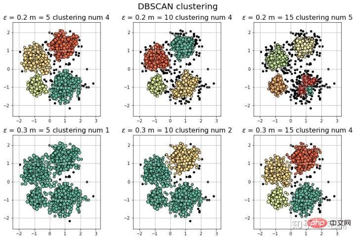
#
# 参考https://blog.csdn.net/hb707934728/article/details/71515160
#
# 官方示例 https://scikit-learn.org/stable/auto_examples/cluster/plot_dbscan.html#sphx-glr-auto-examples-cluster-plot-dbscan-py

import numpy as np

import matplotlib.pyplot as plt
import matplotlib.colors

import sklearn.datasets as ds
from sklearn.cluster import DBSCAN
from sklearn.preprocessing import StandardScaler


def expand(a, b):
    d = (b - a) * 0.1
    return a-d, b+d


if __name__ == "__main__":
    N = 1000
    data = X_train_demo.values
    # 数据1的参数:(epsilon, min_sample)
    params = ((0.2, 5), (0.2, 10), (0.2, 15), (0.2, 20), (0.2, 25), (0.2, 30))

    plt.figure(figsize=(12, 8), facecolor='w')
    plt.suptitle(u'DBSCAN clustering', fontsize=20)

    for i in range(6):
        eps, min_samples = params[i]
        #参数含义:
        #eps:半径,表示以给定点P为中心的圆形邻域的范围
        #min_samples:以点P为中心的邻域内最少点的数量
        #如果满足,以点P为中心,半径为EPS的邻域内点的个数不少于MinPts,则称点P为核心点
        model = DBSCAN(eps=eps, min_samples=min_samples)
        model.fit(data)
        y_hat = model.labels_

        core_indices = np.zeros_like(y_hat, dtype=bool)  # 生成数据类型和数据shape和指定array一致的变量
        core_indices[model.core_sample_indices_] = True  # model.core_sample_indices_ border point位于y_hat中的下标

        # 统计总共有积累,其中为-1的为未分类样本
        y_unique = np.unique(y_hat)
        n_clusters = y_unique.size - (1 if -1 in y_hat else 0)
        print (y_unique, '聚类簇的个数为:', n_clusters)

        plt.subplot(2, 3, i+1) # 对第几个图绘制,2行3列,绘制第i+1个图
        # plt.cm.spectral https://blog.csdn.net/robin_Xu_shuai/article/details/79178857
        clrs = plt.cm.Spectral(np.linspace(0, 0.8, y_unique.size)) #用于给画图灰色
        for k, clr in zip(y_unique, clrs):
            cur = (y_hat == k)
            if k == -1:
                # 用于绘制未分类样本
                plt.scatter(data[cur, 0], data[cur, 1], s=20, c='k')
                continue
            # 绘制正常节点
            plt.scatter(data[cur, 0], data[cur, 1], s=30, c=clr, edgecolors='k')
            # 绘制边缘点
            plt.scatter(data[cur & core_indices][:, 0], data[cur & core_indices][:, 1], s=60, c=clr, marker='o', edgecolors='k')
        x1_min, x2_min = np.min(data, axis=0)
        x1_max, x2_max = np.max(data, axis=0)
        x1_min, x1_max = expand(x1_min, x1_max)
        x2_min, x2_max = expand(x2_min, x2_max)
        plt.xlim((x1_min, x1_max))
        plt.ylim((x2_min, x2_max))
        plt.grid(True)
        plt.title(u'$epsilon$ = %.1f m = %d clustering num %d'%(eps, min_samples, n_clusters), fontsize=14)
    plt.tight_layout()
    plt.subplots_adjust(top=0.9)
    plt.show()
로그인 후 복사
#
# 参考https://blog.csdn.net/hb707934728/article/details/71515160
#
# 官方示例 https://scikit-learn.org/stable/auto_examples/cluster/plot_dbscan.html#sphx-glr-auto-examples-cluster-plot-dbscan-py
import numpy as np
import matplotlib.pyplot as plt
import matplotlib.colors
import sklearn.datasets as ds
from sklearn.cluster import DBSCAN
from sklearn.preprocessing import StandardScaler
def expand(a, b):
d = (b - a) * 0.1
return a-d, b+d
if __name__ == "__main__":
N = 1000
data = X_train_demo.values
# 数据1的参数:(epsilon, min_sample)
params = ((0.2, 5), (0.2, 10), (0.2, 15), (0.2, 20), (0.2, 25), (0.2, 30))
plt.figure(figsize=(12, 8), facecolor='w')
plt.suptitle(u'DBSCAN clustering', fontsize=20)
for i in range(6):
eps, min_samples = params[i]
#参数含义:
#eps:半径,表示以给定点P为中心的圆形邻域的范围
#min_samples:以点P为中心的邻域内最少点的数量
#如果满足,以点P为中心,半径为EPS的邻域内点的个数不少于MinPts,则称点P为核心点
model = DBSCAN(eps=eps, min_samples=min_samples)
model.fit(data)
y_hat = model.labels_
core_indices = np.zeros_like(y_hat, dtype=bool) # 生成数据类型和数据shape和指定array一致的变量
core_indices[model.core_sample_indices_] = True # model.core_sample_indices_ border point位于y_hat中的下标
# 统计总共有积累,其中为-1的为未分类样本
y_unique = np.unique(y_hat)
n_clusters = y_unique.size - (1 if -1 in y_hat else 0)
print (y_unique, '聚类簇的个数为:', n_clusters)
plt.subplot(2, 3, i+1) # 对第几个图绘制,2行3列,绘制第i+1个图
# plt.cm.spectral https://blog.csdn.net/robin_Xu_shuai/article/details/79178857
clrs = plt.cm.Spectral(np.linspace(0, 0.8, y_unique.size)) #用于给画图灰色
for k, clr in zip(y_unique, clrs):
cur = (y_hat == k)
if k == -1:
# 用于绘制未分类样本
plt.scatter(data[cur, 0], data[cur, 1], s=20, c='k')
continue
# 绘制正常节点
plt.scatter(data[cur, 0], data[cur, 1], s=30, c=clr, edgecolors='k')
# 绘制边缘点
plt.scatter(data[cur & core_indices][:, 0], data[cur & core_indices][:, 1], s=60, c=clr, marker='o', edgecolors='k')
x1_min, x2_min = np.min(data, axis=0)
x1_max, x2_max = np.max(data, axis=0)
x1_min, x1_max = expand(x1_min, x1_max)
x2_min, x2_max = expand(x2_min, x2_max)
plt.xlim((x1_min, x1_max))
plt.ylim((x2_min, x2_max))
plt.grid(True)
plt.title(u'$epsilon$ = %.1f m = %d clustering num %d'%(eps, min_samples, n_clusters), fontsize=14)
plt.tight_layout()
plt.subplots_adjust(top=0.9)
plt.show()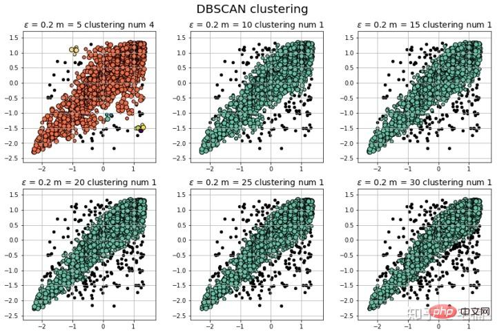
from sklearn.cluster import DBSCAN
from sklearn import metrics
data = X_train_demo.values
eps, min_samples = 0.2, 10
# eps为领域的大小,min_samples为领域内最小点的个数
model = DBSCAN(eps=eps, min_samples=min_samples) # 构造分类器
model.fit(data) # 拟合
labels = model.labels_ # 获取类别标签,-1表示未分类
# 获取其中的core points
core_indices = np.zeros_like(labels, dtype=bool)  # 生成数据类型和数据shape和指定array一致的变量
core_indices[model.core_sample_indices_] = True  # model.core_sample_indices_ border point位于labels中的下标
core_point = data[core_indices]
# 获取非异常点
normal_point = data[labels>=0]
# 绘制剔除了异常值后的图
plt.scatter(normal_point[:,0],normal_point[:,1],edgecolors='k')
plt.show()
2.4.1 필터 기능
def filter_data(data0, params):
    from sklearn.cluster import DBSCAN
    from sklearn import metrics
    scaler = StandardScaler()
    scaler.fit(data0)
    data = scaler.transform(data0)

    eps, min_samples = params
    # eps为领域的大小,min_samples为领域内最小点的个数
    model = DBSCAN(eps=eps, min_samples=min_samples) # 构造分类器
    model.fit(data) # 拟合
    labels = model.labels_ # 获取类别标签,-1表示未分类
    # 获取其中的core points
    core_indices = np.zeros_like(labels, dtype=bool)  # 生成数据类型和数据shape和指定array一致的变量
    core_indices[model.core_sample_indices_] = True  # model.core_sample_indices_ border point位于labels中的下标
    core_point = data[core_indices]
    # 获取非异常点
    normal_point = data0[labels>=0]
    return normal_point
로그인 후 복사
2.4.2 분류 결과 측정 (마크다운 형식 변환이 너무 귀찮아서 직접 스크린샷을 찍었습니다::>_<::)def filter_data(data0, params):
from sklearn.cluster import DBSCAN
from sklearn import metrics
scaler = StandardScaler()
scaler.fit(data0)
data = scaler.transform(data0)
eps, min_samples = params
# eps为领域的大小,min_samples为领域内最小点的个数
model = DBSCAN(eps=eps, min_samples=min_samples) # 构造分类器
model.fit(data) # 拟合
labels = model.labels_ # 获取类别标签,-1表示未分类
# 获取其中的core points
core_indices = np.zeros_like(labels, dtype=bool) # 生成数据类型和数据shape和指定array一致的变量
core_indices[model.core_sample_indices_] = True # model.core_sample_indices_ border point位于labels中的下标
core_point = data[core_indices]
# 获取非异常点
normal_point = data0[labels>=0]
return normal_point
# 轮廓系数
metrics.silhouette_score(data, labels, metric='euclidean')
[out]0.13250260550638607
# Calinski-Harabaz Index 系数
metrics.calinski_harabaz_score(data, labels,)
[out]16.414158842632794
# reference:https://scikit-learn.org/stable/auto_examples/svm/plot_oneclass.html#sphx-glr-auto-examples-svm-plot-oneclass-py

import numpy as np
import matplotlib.pyplot as plt
import matplotlib.font_manager
from sklearn import svm

xx, yy = np.meshgrid(np.linspace(-5, 5, 500), np.linspace(-5, 5, 500))
# Generate train data
X = 0.3 * np.random.randn(100, 2)
X_train = np.r_[X + 2, X - 2]
# Generate some regular novel observations
X = 0.3 * np.random.randn(20, 2)
X_test = np.r_[X + 2, X - 2]
# Generate some abnormal novel observations
X_outliers = np.random.uniform(low=-4, high=4, size=(20, 2))

# fit the model
clf = svm.OneClassSVM(nu=0.1, kernel="rbf", gamma=0.1)
clf.fit(X_train)
y_pred_train = clf.predict(X_train)
y_pred_test = clf.predict(X_test)
y_pred_outliers = clf.predict(X_outliers)
n_error_train = y_pred_train[y_pred_train == -1].size
n_error_test = y_pred_test[y_pred_test == -1].size
n_error_outliers = y_pred_outliers[y_pred_outliers == 1].size

# plot the line, the points, and the nearest vectors to the plane
Z = clf.decision_function(np.c_[xx.ravel(), yy.ravel()])
Z = Z.reshape(xx.shape)

plt.title("Novelty Detection")
plt.contourf(xx, yy, Z, levels=np.linspace(Z.min(), 0, 7), cmap=plt.cm.PuBu)
a = plt.contour(xx, yy, Z, levels=[0], linewidths=2, colors='darkred')
plt.contourf(xx, yy, Z, levels=[0, Z.max()], colors='palevioletred')

s = 40
b1 = plt.scatter(X_train[:, 0], X_train[:, 1], c='white', s=s, edgecolors='k')
b2 = plt.scatter(X_test[:, 0], X_test[:, 1], c='blueviolet', s=s,
                 edgecolors='k')
c = plt.scatter(X_outliers[:, 0], X_outliers[:, 1], c='gold', s=s,
                edgecolors='k')
plt.axis('tight')
plt.xlim((-5, 5))
plt.ylim((-5, 5))
plt.legend([a.collections[0], b1, b2, c],
           ["learned frontier", "training observations",
            "new regular observations", "new abnormal observations"],
           loc="upper left",
           prop=matplotlib.font_manager.FontProperties(size=11))
plt.xlabel(
    "error train: %d/200 ; errors novel regular: %d/40 ; "
    "errors novel abnormal: %d/40"
    % (n_error_train, n_error_test, n_error_outliers))
plt.show() 3.2 핵심 코드
from sklearn import svm
X_train = X_train_demo.values
# 构造分类器
clf = svm.OneClassSVM(nu=0.2, kernel="rbf", gamma=0.2)
clf.fit(X_train)
# 预测,结果为-1或者1
labels = clf.predict(X_train)
# 分类分数
score = clf.decision_function(X_train) # 获取置信度
# 获取正常点
X_train_normal = X_train[labels>0]
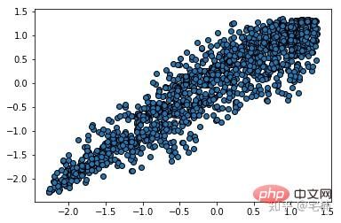
아웃라이어 제거 전
 아웃라이어 제거 후
plt.scatter(X_train_normal[:,0],X_train_normal[:,1])
plt.show()
 4. LOF(Local Outlier Factor)
LOF는 샘플의 이상치를 계산하여 반영합니다. 수치적인 점수 . 이 값의 일반적인 의미는 다음과 같습니다.
샘플 포인트 주변 샘플 포인트의 평균 밀도가 샘플 포인트의 밀도보다 높습니다. 비율이 1보다 클수록 점 위치의 밀도는 주변 샘플 위치의 밀도보다 작습니다.
#
# 参考https://blog.csdn.net/hb707934728/article/details/71515160
#
# 官方示例 https://scikit-learn.org/stable/auto_examples/cluster/plot_dbscan.html#sphx-glr-auto-examples-cluster-plot-dbscan-py

import numpy as np

import matplotlib.pyplot as plt
import matplotlib.colors

from sklearn.neighbors import LocalOutlierFactor

def expand(a, b):
    d = (b - a) * 0.1
    return a-d, b+d


if __name__ == "__main__":
    N = 1000
    data = X_train_demo.values
    # 数据1的参数:(epsilon, min_sample)
    params = ((0.01, 5), (0.05, 10), (0.1, 15), (0.15, 20), (0.2, 25), (0.25, 30))

    plt.figure(figsize=(12, 8), facecolor='w')
    plt.suptitle(u'DBSCAN clustering', fontsize=20)

    for i in range(6):
        outliers_fraction, min_samples = params[i]
        #参数含义:
        #eps:半径,表示以给定点P为中心的圆形邻域的范围
        #min_samples:以点P为中心的邻域内最少点的数量
        #如果满足,以点P为中心,半径为EPS的邻域内点的个数不少于MinPts,则称点P为核心点

        model = LocalOutlierFactor(n_neighbors=min_samples, contamination=outliers_fraction)
        y_hat = model.fit_predict(X_train)

        # 统计总共有积累,其中为-1的为未分类样本
        y_unique = np.unique(y_hat)

        # clrs = []
        # for c in np.linspace(16711680, 255, y_unique.size):
        #     clrs.append('#%06x' % c)
        plt.subplot(2, 3, i+1) # 对第几个图绘制,2行3列,绘制第i+1个图
        # plt.cm.spectral https://blog.csdn.net/robin_Xu_shuai/article/details/79178857
        clrs = plt.cm.Spectral(np.linspace(0, 0.8, y_unique.size)) #用于给画图灰色
        for k, clr in zip(y_unique, clrs):
            cur = (y_hat == k)
            if k == -1:
                # 用于绘制未分类样本
                plt.scatter(data[cur, 0], data[cur, 1], s=20, c='k')
                continue
            # 绘制正常节点
            plt.scatter(data[cur, 0], data[cur, 1], s=30, c=clr, edgecolors='k')
        x1_max, x2_max = np.max(data, axis=0)
        x1_min, x2_min = np.min(data, axis=0)
        x1_min, x1_max = expand(x1_min, x1_max)
        x2_min, x2_max = expand(x2_min, x2_max)
        plt.xlim((x1_min, x1_max))
        plt.ylim((x2_min, x2_max))
        plt.grid(True)
        plt.title(u'outliers_fraction = %.1f min_samples = %d'%(outliers_fraction, min_samples), fontsize=12)
    plt.tight_layout()
    plt.subplots_adjust(top=0.9)
plt.show()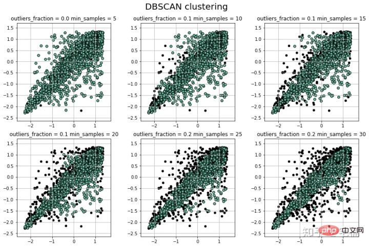 4.1 핵심코드
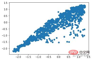
from sklearn.neighbors import LocalOutlierFactor
X_train = X_train_demo.values
# 构造分类器
## 25个样本点为一组,异常值点比例为0.2
clf = LocalOutlierFactor(n_neighbors=25, contamination=0.2)
# 预测,结果为-1或者1
labels = clf.fit_predict(X_train)
# 获取正常点
X_train_normal = X_train[labels>0]
이상치 제거 전
plt.scatter(X_train[:,0],X_train[:,1])
plt.show()
이상치 제거 후
plt.scatter(X_train_normal[:,0],X_train_normal[:,1])
plt.show()
 더 많은 컴퓨터 관련 지식은
위 내용은 비정상적인 데이터를 제거하는 네 가지 방법은 무엇입니까?의 상세 내용입니다. 자세한 내용은 PHP 중국어 웹사이트의 기타 관련 기사를 참조하세요!

핫 AI 도구

Undresser.AI Undress
사실적인 누드 사진을 만들기 위한 AI 기반 앱

AI Clothes Remover
사진에서 옷을 제거하는 온라인 AI 도구입니다.

Undress AI Tool
무료로 이미지를 벗다

Clothoff.io
AI 옷 제거제

Video Face Swap
완전히 무료인 AI 얼굴 교환 도구를 사용하여 모든 비디오의 얼굴을 쉽게 바꾸세요!

인기 기사
뜨거운 도구

메모장++7.3.1
사용하기 쉬운 무료 코드 편집기

SublimeText3 중국어 버전
중국어 버전, 사용하기 매우 쉽습니다.

스튜디오 13.0.1 보내기
강력한 PHP 통합 개발 환경

드림위버 CS6
시각적 웹 개발 도구

SublimeText3 Mac 버전
신 수준의 코드 편집 소프트웨어(SublimeText3)
뜨거운 주제
 7814
7814
 15
1646
14
1402
52
1300
25
1238
29
15
1646
14
1402
52
1300
25
1238
29