

Ditulis oleh Emmanuel Odioko✏️
Untuk masa yang lama, sokongan terhad untuk fungsi matematik menjadikan penciptaan animasi CSS berasaskan masa lebih mencabar. Animasi tradisional bergantung pada bingkai utama dan tempoh yang tidak mempunyai fleksibiliti kemas kini berasaskan masa berdasarkan pengiraan yang kompleks. Dengan pengenalan fungsi CSS seperti mod(), round(), dan fungsi trigonometri, pembangun kini boleh meneroka cara untuk menguasai animasi berasaskan masa dalam CSS.
Untuk memanfaatkan bahagian ini sepenuhnya tentang animasi berasaskan masa dalam CSS menggunakan fungsi CSS baharu, anda harus mempunyai pemahaman yang baik tentang animasi dan peralihan CSS. Anda seharusnya dapat mengetahui cara membuat animasi menggunakan @keyframes dan mengawal masanya. Anda juga harus mempunyai pemahaman asas tentang JavaScript yang lebih memfokuskan pada keupayaan untuk memanipulasi elemen DOM dan bertindak balas kepada acara pengguna.
Akhir sekali, pemahaman tentang fungsi CSS baharu seperti calc(), dan kesediaan untuk meneroka ciri baru muncul seperti mod(), fungsi trigonometri termasuk sin() dan cos(), dan round() akan menjadi asas yang baik.
Apabila anda selesai membaca artikel ini, anda akan memahami cara animasi dilaksanakan secara tradisional pada kanvas HTML menggunakan JavaScript dan cara ia dibandingkan dengan fungsi CSS yang lebih baharu. Kami akan memahami kemudahan menggunakan mod(),round(), dan fungsi trigonometri berbanding bingkai utama CSS tradisional.
Animasi berasaskan masa bukanlah sesuatu yang baharu — ia telah wujud selama lebih sedekad. Ada yang rumit untuk digunakan, manakala yang lain tidak. Anda tahu fail CSS yang pengiraan matematik adalah utama? Animasi berasaskan masa adalah sebahagian daripadanya.
Seperti namanya, animasi ini berkait rapat dengan masa, kerana sifat elemen, seperti kedudukan, saiz, warna, kelegapan, dll., berubah mengikut masa. Animasi berasaskan masa CSS menghasilkan peralihan yang lancar meningkatkan rasa aplikasi web dan memberikan pengalaman pengguna yang lebih baik.
Animasi CSS berasaskan masa terutamanya terdiri daripada garis masa mula dan tamat yang ditentukan serta titik interpolasi. Interpolasi di sini merujuk kepada pengiraan nilai perantaraan antara permulaan dan penghujung animasi dalam tempoh tertentu semasa animasi berjalan. Sebab interpolasi adalah untuk menyediakan peralihan yang lancar dari keadaan awal ke keadaan akhir.
Animasi berasaskan masa berlaku dengan gabungan kedua-dua pembolehubah CSS dan beberapa fungsi matematik. Perpaduan ini membolehkan pembangun mencipta animasi yang berubah dari semasa ke semasa dan menghasilkan animasi yang lebih fleksibel yang hanya boleh diimpikan oleh animasi kerangka utama. Mari kita pecahkan konsep utama dan cara ia berfungsi.
Dalam bahagian ini, kami akan memecahkan struktur umum untuk mencipta animasi berasaskan masa kepada komponen utama.
Keadaan awal mentakrifkan sifat permulaan elemen sebelum animasi bermula. Ini boleh menjadi kedudukan, saiz, warna, kelegapan, dll. Contoh di bawah:
.box {
  opacity: 0;
  transform: translateY(-20px);
}
Dalam kod di atas, kita mempunyai keadaan awal untuk elemen dengan kotak kelas yang mentakrifkan kelegapan dan mengubah sifatnya.
Pencetus animasi menentukan acara yang memulakan animasi. Pencetus biasa termasuk interaksi pengguna seperti klik atau tuding, peristiwa pemuatan halaman atau keadaan khusus dalam aplikasi seperti penyempurnaan tindakan oleh pengguna.
Sifat animasi termasuk tempoh animasi, fungsi pemasaan, kelewatan, kiraan lelaran, arah dan mod isian. Animasi mungkin mempunyai beberapa atau semua sifat ini. Contoh pencetus dengan pemilih tuding ditunjukkan di bawah:
.box:hover {
  animation: fadeIn 1s ease-in-out forwards;
}
Ini menunjukkan penambahan animasi fadeIn yang dicetuskan apabila elemen dengan kotak kelas dilegar dan bertahan selama satu saat. Tingkah laku animasi dan masa juga ditentukan. Baca artikel ini untuk mendapatkan maklumat lanjut tentang animasi dan fungsi pemasaan peralihan.
Seperti yang dinyatakan sebelum ini, ini adalah keadaan perantaraan animasi di pelbagai titik sepanjang garis masa. Setiap kerangka utama menentukan sifat elemen pada masa tertentu, membenarkan peralihan beransur-ansur antara keadaan awal dan akhir. Contoh pelaksanaan titik interpolasi ialah sifat kerangka utama CSS:
@keyframes fadeIn {
  0% {
    opacity: 0;
    transform: translateY(-20px);
  }
  100% {
    opacity: 1;
    transform: translateY(0);
  }
}
Contoh di atas menggunakan bingkai utama untuk menentukan sifat animasi fadeIn pada sifar dan 100 peratus kemajuan animasi.
Time-based animation has become increasingly essential in web applications as it helps with better user experience. The usage of these animations ranges from subtle micro-interactions to significant site transitions, giving web apps a more dynamic feel. Below are common use cases of these animations.
Micro-interactions are small, often subtle, and reusable animations that occur in response to user actions. These brief animations provide feedback. You may have come across animations such as pop-up warnings, loading spinners indicating ongoing processes, or a button indicating a click action. All of these are micro-interactions and consist of time-based animations.  Image source: https://userpilot.com/blog/micro-interaction-examples/[/caption]
In the image above, we have a submit button which shows a loader and a tick when the user clicks on it. The essence of these micro interactions is to commit to the user the process of the submission and the success of the operation.
Site transitions are used to indicate state or page changes on a web application to create a fluid user experience using effects such as fading, sliding, or scaling elements. With time-based animations, these transitions are possible. Common transition effect applications are toggling navigation and side menus, parallax animations, opening and closing of modals, etc.
Image source: https://medium.com/@9cv9official/create-a-beautiful-hover-triggered-expandable-sidebar-with-simple-html-css-and-javascript-9f5f80a908d1[/caption] Image source: https://medium.com/@9cv9official/create-a-beautiful-hover-triggered-expandable-sidebar-with-simple-html-css-and-javascript-9f5f80a908d1
In the GIF above, there is a sidebar which uses a transition animation to expand the sidebar on a mouse hover event.
Let’s get into the new mathematical CSS functions mod(), round(), and the trigonometric functions sin(), cos() and tan() while discussing each in detail.
Like the JavaScript modulo operator %, this function returns the remainder after an arithmetic modulus operation has been carried out on two operands. In essence, the modulus is the leftover value after the dividend is divided by the other operand, the divisor, and no more division can occur. In JavaScript, using the modulo operator will take the following form:10%4.
This operation would leave behind a Modulus of 2 as 10 is only divisible by the divisor 4 twice, leaving behind a remainder of 2. Similarly, the CSS Mod function would perform the same function with the following syntax instead: mod(10, 4).
It is also important to note that the modulus takes the sign of the divisor. As such, the result of mod(10, -4) would be -2 instead.
The mod() function primarily accepts two sets of parameters mod(dividend, divisor) which are essentially two comma-separated values. These operands must be of the same dimension for them to be valid and can take a variety of values as parameters thereby improving the range of its application. Operands passed to mod() can be numbers, percentages, or dimensions.
Mod() can also take in the unit of its operands (e.g. px, rem, vh, deg) and can also handle mathematical calculations as dividend or divisor. Below are some examples showing the use of this CSS function:
/* using <numbers> without units */
scale: mod(18, 7); /* result is 4 */

/* <percentage> and <dimension>  with units  */
height: mod(100vh, 30vh); /* result is 10vh */
width: mod(500px, 200px); /* result is 100px */
transform: rotate(mod(90deg, 20deg)); /* result is 10deg */

/* negative <percentage> and <dimension>  with units  */
height: mod(18rem, -4rem); /* result is 2rem */
rotate: mod (180deg, -100deg); /* result is 80deg */

/* working with calculations */
width: mod(40px*2, 15px); /* result is 5px */
transform: scale(mod(2*3, 1.8)); /* result is 0.6 */
rotate: mod(10turn, 8turn/2); /* result is 2turn */
The code block above shows different applications of the mod() in CSS styles.
While the examples shown use known values, time-based functions are expected to be used with CSS variables which are dynamic and make it possible for the styles to change values depending on the variable passed to the function. The outcome of the operation is then dependent on the calculation using the specified variables, and can produce a wider range of outcomes compared to when hardcoded values are used.
Below you’ll find the general syntax for all possibilities of mod() as illustrated by MDN:
<mod()> =
  mod( <calc-sum> , <calc-sum> )

<calc-sum> =
  <calc-product> [ [ '+' | '-' ] <calc-product> ]*

<calc-product> =
  <calc-value> [ [ '*' | '/' ] <calc-value> ]*

<calc-value> =
  <number>        |
  <dimension>     |
  <percentage>    |
  <calc-keyword>  |
  ( <calc-sum> )

<calc-keyword> =
  e          |
  pi         |
  infinity   |
  -infinity  |
  NaN
In the syntax above, calc-sum represents the operands of the modulus operation. The syntax also shows the types of values calc-sum can contain and the possibility of negative and positive values. Furthermore, the syntax above also shows the possible calc-keywords e, pi, infinity, -infinity, and NaN.
The CSS round() function value is based on a specified rounding strategy. Note that strategy refers to the pattern of rounding the value such as rounding up or down, rounding to zero, rounding to the nearest occurrence of a number, etc..
The syntax for applying the CSS round() is given below:
round(<rounding-strategy>, valueToRound, roundingInterval)
Here's a breakdown of the CSS round() function into smaller bits and highlights of the functions of each keyword and the possible values they can take.
The rounding strategy is the type of technique that would be used to round a specified value. This is optional (defaults to nearest if unspecified), and can be one of the following:
This is the value we intend to round using the function, and it can be a
The rounding interval refers to the interval a value is rounded with a reference to. This entry can be a
Below is an example illustrating the use of the CSS round() function:
<!DOCTYPE html>
<html lang="en">
<head>
  <meta charset="UTF-8">
  <meta name="viewport" content="width=device-width, initial-scale=1.0">
  <title>Document</title>
  <style>
    body{
      display: flex;
      justify-content: center;
      align-items: center;
      height: 100vh;
      margin: 0;
    }

    /* using the round() function */
    .ball {
      width: 100px;
      height: 100px;
      background-color: red;
      color: white;
      text-align: center;
      line-height: 100px;
      margin: 10px;
    }
    .ball-1{
        border-radius: round(down, 70%, var(--rounding-interval)); /*rounded down to the interval of 50% */
    }

    .ball-2{
        border-radius: round(up, 70%, var(--rounding-interval2)); /* rounded up to interval of 100% */
    }

    .ball-3{
        border-radius: round(nearest, 15%, var(--rounding-interval3)); /* rounded to the nearest interval 25% */
    }

  </style>
</head>
<body>
    <!-- rounded containers -->
  <div class="ball ball-1" style="--rounding-interval:50%;">rounded 50%</div>
  <div class="ball ball-2" style="--rounding-interval2:100%;"> rounded 100%</div>
  <div class="ball ball-3" style="--rounding-interval3:25%;"> rounded 25%</div>
</body>
</html>
In this example, we used round() and CSS variables to round values to a specified roundingInterval in the style of each element. Below is the outcome of this example: 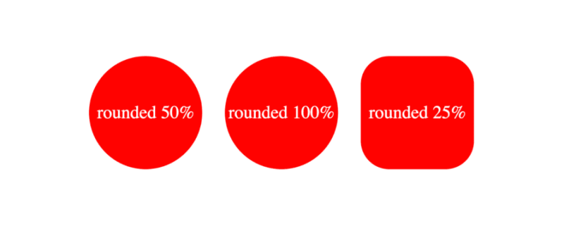 The formal syntax of the CSS round() function according to MDN docs is given by the following:
<round()> =
  round( <rounding-strategy>? , <calc-sum> , <calc-sum>? )

<rounding-strategy> =
  nearest  |
  up       |
  down     |
  to-zero

<calc-sum> =
  <calc-product> [ [ '+' | '-' ] <calc-product> ]*

<calc-product> =
  <calc-value> [ [ '*' | '/' ] <calc-value> ]*

<calc-value> =
  <number>        |
  <dimension>     |
  <percentage>    |
  <calc-keyword>  |
  ( <calc-sum> )

<calc-keyword> =
  e          |
  pi         |
  infinity   |
  -infinity  |
  NaN
In the syntax above, rounding-strategy is the intended rounding pattern and calc-sum represents the operands. The formula also shows the possible entries for rounding-strategy and calc-sum. Finally, it outlines the possible calc-keywords e, pi, infinity, -infinity, and NaN.
The CSS trigonometric functions perform the same operations as in mathematics, as such, the sin() function returns the sine of a number as a value between the range of -1 and 1, cos() returns the cosine of a value, and tan() returns the tangent of a specified value.
Arguments passed to these functions must be either a number or an angle, and they will be treated as radians. Units such as deg and turn represent angle and can be used with arguments here.
Example applications of these functions are shown below:
scale: sin(45deg); /* result is 0.7071067811865475 */
rotate: cos(30deg); /* result is 0.8660254037844387 */
height: calc(50px * tan(30deg)); /* result is 28.86751345948129px */
All trigonometric CSS functions bear similarity, taking in only a single parameter that is resolved to an angle.
Sin() takes in only one parameter which must be a number or angle, or a mathematical expression that resolves to either of them. The syntax of sin() is as follows: \
sin(angle)
The formal syntax of sin() is shown below: \
<sin()> =
  sin( <calc-sum> )

<calc-sum> =
  <calc-product> [ [ '+' | '-' ] <calc-product> ]*

<calc-product> =
  <calc-value> [ [ '*' | '/' ] <calc-value> ]*

<calc-value> =
  <number>        |
  <dimension>     |
  <percentage>    |
  <calc-keyword>  |
  ( <calc-sum> )

<calc-keyword> =
  e          |
  pi         |
  infinity   |
  -infinity  |
  NaN
The syntax above shows the possible values for calc-sum and calc-keyword.
The parameter of cos() is either a number, an angle, or contains a single calculation that must resolve to either type.
As such, the syntax for cos() is the following:
cos(angle)
The formal syntax of all possibilities of cos() is below:
<cos()> =
  cos( <calc-sum> )

<calc-sum> =
  <calc-product> [ [ '+' | '-' ] <calc-product> ]*

<calc-product> =
  <calc-value> [ [ '*' | '/' ] <calc-value> ]*

<calc-value> =
  <number>        |
  <dimension>     |
  <percentage>    |
  <calc-keyword>  |
  ( <calc-sum> )

<calc-keyword> =
  e          |
  pi         |
  infinity   |
  -infinity  |
  NaN
Where calc-sum is the parameter, calc-value is the allowed types of parameters, and calc-keywords are possible units that can be added to the mathematical expression.
The tan() function also takes a number, an angle, or a single calculation that must resolve to either type, similar to the other trigonometric functions. The syntax of tan() is given by the following:
tan(angle)
The formal syntax of this function is shown below:
<tan()> =
  tan( <calc-sum> )

<calc-sum> =
  <calc-product> [ [ '+' | '-' ] <calc-product> ]*

<calc-product> =
  <calc-value> [ [ '*' | '/' ] <calc-value> ]*

<calc-value> =
  <number>        |
  <dimension>     |
  <percentage>    |
  <calc-keyword>  |
  ( <calc-sum> )

<calc-keyword> =
  e          |
  pi         |
  infinity   |
  -infinity  |
  NaN
This syntax shows all possible values of calc-sum, the operand, and the calc-keyword.
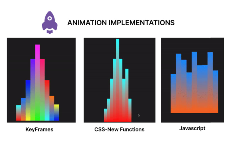
In this section, we will create an animation using CSS functions, keyframes for an alternative, and JavaScript for a second alternative. In the end, we will compare the code and contrast the approaches to determine the benefits of usingCSS functions in creating CSS animations over other options.
Let's start by creating our music beat bar animation using CSS functions. This animation focuses on animating multiple bars, changing the property of the height and background colors using values generated with CSS functions:
<!DOCTYPE html>
<html lang="en">

<head>
  <meta charset="UTF-8">
  <meta name="viewport" content="width=device-width, initial-scale=1.0">
  <title>Beats Bar Animation with CSS Functions</title>
  <style>
    :root {
      /* change the value of --t infinitely */
      animation: animate-time 1000ms linear infinite;
    }

    @keyframes animate-time {
      from {
        --t: 0;
      }

      to {
        --t: 100000;
      }
    }

    body {
      display: flex;
      justify-content: center;
      align-items: center;
      height: 100vh;
      background-color: #222;
      margin: 0;
    }

    .container {
      height: 500px;
      width: 250px;
      position: relative;
      display: flex;
      gap: 10px;
    }

    .bar {
      position: absolute;
      bottom: 0;
      width: 20px;
      height: 20px;
      --frequency: 1;
      --time: calc(var(--t) / 1000 / var(--frequency));
      --rounded-time: round(nearest, var(--time));
      /* Adjust frequency of animation */
      --amplitude: 30px;
      /* base height */
      --base-height: 20px;
      /* Transition for smooth height change */
      transition: height 0.5s ease-in-out, background 1s ease-in-out;
      /* Calculate dynamic hue using mod and round */
      --hue: mod(round(nearest, calc(var(--time) * 10)), 360);
      --alpha: calc(0.5 + 0.5 * cos(calc(var(--time) * 1turn)));
      /* Apply dynamic linear gradient background */
      background: linear-gradient(to top,
          hsla(var(--hue), 100%, 50%, var(--alpha)),
          hsla(calc(var(--hue) + 180), 100%, 50%, var(--alpha)));
    }

    .bar1 {
      /* Calculate height based on rounded time */
      height: calc(var(--base-height) + var(--amplitude) * var(--rounded-time)/46 * var(--index-a));
      margin-left: 10px;
    }

    .bar2 {
      /* Calculate height based on rounded time */
      height: calc(var(--base-height) + var(--amplitude) * var(--rounded-time)/46 * var(--index-b));
      margin-left: 30px;
    }

    .bar3 {
      /* Calculate height based on rounded time */
      height: calc(var(--base-height) + var(--amplitude) * var(--rounded-time)/46 * var(--index-c));
      margin-left: 50px;
    }

    .bar4 {
      /* Calculate height based on rounded time */
      height: calc(var(--base-height) + var(--amplitude) * var(--rounded-time)/46 * var(--index-d));
      margin-left: 70px;
    }

    .bar5 {
      /* Calculate height based on rounded time */
      height: calc(var(--base-height) + var(--amplitude) * var(--rounded-time)/46 * var(--index-e));
      margin-left: 90px;
    }

    .bar6 {
      /* Calculate height based on rounded time */
      height: calc(var(--base-height) + var(--amplitude) * var(--rounded-time)/46 * var(--index-f));
      margin-left: 110px;
    }

    .bar7 {
      /* Calculate height based on rounded time */
      height: calc(var(--base-height) + var(--amplitude) * var(--rounded-time)/46 * var(--index-g));
      margin-left: 130px;
    }

    .bar8 {
      /* Calculate height based on rounded time */
      height: calc(var(--base-height) + var(--amplitude) * var(--rounded-time)/46 * var(--index-h));
      margin-left: 150px;
    }

    .bar9 {
      /* Calculate height based on rounded time */
      height: calc(var(--base-height) + var(--amplitude) * var(--rounded-time)/46 * var(--index-i));
      margin-left: 170px;
    }
  </style>
</head>

<body>
  <div class="container">
    <div class="bar bar1" style="--index-a: 1;"></div>
    <div class="bar bar2" style="--index-b: 2;"></div>
    <div class="bar bar3" style="--index-c: 4;"></div>
    <div class="bar bar4" style="--index-d: 6;"></div>
    <div class="bar bar5" style="--index-e: 8;"></div>
    <div class="bar bar6" style="--index-f: 6;"></div>
    <div class="bar bar7" style="--index-g: 4;"></div>
    <div class="bar bar8" style="--index-h: 5;"></div>
    <div class="bar bar9" style="--index-i: 2;"></div>
  </div>
</body>

</html>
Here’s a breakdown of the code block above:
The code above produces the following animation: 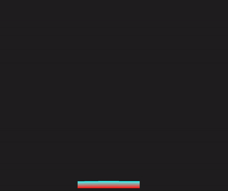
In this section, we will rebuild the sound bar animation, but we’ll use animations and CSS keyframes instead:
<!DOCTYPE html>
<html lang="en">

<head>
  <meta charset="UTF-8">
  <meta name="viewport" content="width=device-width, initial-scale=1.0">
  <title>Beats Bar Animation with CSS Keyframes</title>
  <style>
    body {
      display: flex;
      justify-content: center;
      align-items: center;
      height: 100vh;
      background-color: #222;
      margin: 0;
    }

    .container {
      height: 500px;
      width: 250px;
      position: relative;
      display: flex;
      gap: 10px;
    }

    .bar {
      position: absolute;
      bottom: 0;
      width: 20px;
      height: 20px;
      --amplitude: 30px;
      --base-height: 20px;
      --frequency: 1;
      transition: height 0.5s ease-in-out;
      animation: bounce 1s infinite;
    }

    @keyframes bounce {

      0%,
      100% {
        height: calc(var(--base-height) + var(--amplitude) * 0.5);
      }

      50% {
        height: calc(var(--base-height) + var(--amplitude));
      }
    }

    .bar1 {
      animation: bounce1 1s infinite, colorChange1 2s infinite;
      margin-left: 10px;
    }

    .bar2 {
      animation: bounce2 1s infinite, colorChange2 2s infinite;
      margin-left: 30px;
    }

    .bar3 {
      animation: bounce3 1s infinite, colorChange3 2s infinite;
      margin-left: 50px;
    }

    .bar4 {
      animation: bounce4 1s infinite, colorChange4 2s infinite;
      margin-left: 70px;
    }

    .bar5 {
      animation: bounce5 1s infinite, colorChange5 2s infinite;
      margin-left: 90px;
    }

    .bar6 {
      animation: bounce6 1s infinite, colorChange6 2s infinite;
      margin-left: 110px;
    }

    .bar7 {
      animation: bounce7 1s infinite, colorChange7 2s infinite;
      margin-left: 130px;
    }

    .bar8 {
      animation: bounce8 1s infinite, colorChange8 2s infinite;
      margin-left: 150px;
    }

    .bar9 {
      animation: bounce9 1s infinite, colorChange9 2s infinite;
      margin-left: 170px;
    }

    @keyframes colorChange1 {

      0%,
      100% {
        background: linear-gradient(to top, hsla(0, 100%, 50%, 1), hsla(180, 100%, 50%, 1));
      }

      50% {
        background: linear-gradient(to top, hsla(180, 100%, 50%, 1), hsla(360, 100%, 50%, 1));
      }
    }

    @keyframes colorChange2 {

      0%,
      100% {
        background: linear-gradient(to top, hsla(30, 100%, 50%, 1), hsla(210, 100%, 50%, 1));
      }

      50% {
        background: linear-gradient(to top, hsla(210, 100%, 50%, 1), hsla(390, 100%, 50%, 1));
      }
    }

    @keyframes colorChange3 {

      0%,
      100% {
        background: linear-gradient(to top, hsla(60, 100%, 50%, 1), hsla(240, 100%, 50%, 1));
      }

      50% {
        background: linear-gradient(to top, hsla(240, 100%, 50%, 1), hsla(420, 100%, 50%, 1));
      }
    }

    @keyframes colorChange4 {

      0%,
      100% {
        background: linear-gradient(to top, hsla(90, 100%, 50%, 1), hsla(270, 100%, 50%, 1));
      }

      50% {
        background: linear-gradient(to top, hsla(270, 100%, 50%, 1), hsla(450, 100%, 50%, 1));
      }
    }

    @keyframes colorChange5 {

      0%,
      100% {
        background: linear-gradient(to top, hsla(120, 100%, 50%, 1), hsla(300, 100%, 50%, 1));
      }

      50% {
        background: linear-gradient(to top, hsla(300, 100%, 50%, 1), hsla(480, 100%, 50%, 1));
      }
    }

    @keyframes colorChange6 {

      0%,
      100% {
        background: linear-gradient(to top, hsla(150, 100%, 50%, 1), hsla(330, 100%, 50%, 1));
      }

      50% {
        background: linear-gradient(to top, hsla(330, 100%, 50%, 1), hsla(510, 100%, 50%, 1));
      }
    }

    @keyframes colorChange7 {

      0%,
      100% {
        background: linear-gradient(to top, hsla(180, 100%, 50%, 1), hsla(360, 100%, 50%, 1));
      }

      50% {
        background: linear-gradient(to top, hsla(360, 100%, 50%, 1), hsla(540, 100%, 50%, 1));
      }
    }

    @keyframes colorChange8 {

      0%,
      100% {
        background: linear-gradient(to top, hsla(210, 100%, 50%, 1), hsla(390, 100%, 50%, 1));
      }

      50% {
        background: linear-gradient(to top, hsla(390, 100%, 50%, 1), hsla(570, 100%, 50%, 1));
      }
    }

    @keyframes colorChange9 {

      0%,
      100% {
        background: linear-gradient(to top, hsla(240, 100%, 50%, 1), hsla(420, 100%, 50%, 1));
      }

      50% {
        background: linear-gradient(to top, hsla(420, 100%, 50%, 1), hsla(600, 100%, 50%, 1));
      }
    }

    @keyframes bounce1 {

      0%,
      100% {
        height: calc(var(--base-height) + var(--amplitude) * 0.5);
      }

      50% {
        height: calc(var(--base-height) + var(--amplitude) * 1.5);
      }
    }

    @keyframes bounce2 {

      0%,
      100% {
        height: calc(var(--base-height) + var(--amplitude) * 1.5);
      }

      50% {
        height: calc(var(--base-height) + var(--amplitude) * 2.5);
      }
    }

    @keyframes bounce3 {

      0%,
      100% {
        height: calc(var(--base-height) + var(--amplitude) * 2.5);
      }

      50% {
        height: calc(var(--base-height) + var(--amplitude) * 5);
      }
    }

    @keyframes bounce4 {

      0%,
      100% {
        height: calc(var(--base-height) + var(--amplitude) * 4.5);
      }

      50% {
        height: calc(var(--base-height) + var(--amplitude) * 8);
      }
    }

    @keyframes bounce5 {

      0%,
      100% {
        height: calc(var(--base-height) + var(--amplitude) * 6.5);
      }

      50% {
        height: calc(var(--base-height) + var(--amplitude) * 10);
      }
    }

    @keyframes bounce6 {

      0%,
      100% {
        height: calc(var(--base-height) + var(--amplitude) * 4.5);
      }

      50% {
        height: calc(var(--base-height) + var(--amplitude) * 8);
      }
    }

    @keyframes bounce7 {

      0%,
      100% {
        height: calc(var(--base-height) + var(--amplitude) * 2.5);
      }

      50% {
        height: calc(var(--base-height) + var(--amplitude) * 5);
      }
    }

    @keyframes bounce8 {

      0%,
      100% {
        height: calc(var(--base-height) + var(--amplitude) * 1.4);
      }

      50% {
        height: calc(var(--base-height) + var(--amplitude) * 2.8);
      }
    }

    @keyframes bounce9 {

      0%,
      100% {
        height: calc(var(--base-height) + var(--amplitude) * 0.5);
      }

      50% {
        height: calc(var(--base-height) + var(--amplitude) * 1.6);
      }
    }
  </style>
</head>

<body>
  <div class="container">
    <div class="bar bar1"></div>
    <div class="bar bar2"></div>
    <div class="bar bar3"></div>
    <div class="bar bar4"></div>
    <div class="bar bar5"></div>
    <div class="bar bar6"></div>
    <div class="bar bar7"></div>
    <div class="bar bar8"></div>
    <div class="bar bar9"></div>
  </div>
</body>

</html>
In the code above, we have styles for the body, container, and bar elements. We added an initial fallback animation state bounce and defined the animation properties with keyframes. Furthermore, we had to create separate keyframes animations for each bar’s height and background color change. The output of this animation is shown below: 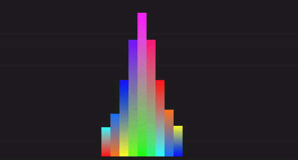
Here, we will demonstrate how we can work with HTML, CSS, and JavaScript to recreate the animation in the previous section:
<!DOCTYPE html>
<html lang="en">

<head>
  <meta charset="UTF-8">
  <meta name="viewport" content="width=device-width, initial-scale=1.0">
  <title>Beats Bar Animation with JavaScript</title>
  <style>
    body {
      display: flex;
      justify-content: center;
      align-items: center;
      height: 100vh;
      background-color: #222;
      margin: 0;
    }

    .container {
      display: flex;
      gap: 0;
      position: relative;
    }

    .bar {
      width: 20px;
      position: absolute;
      bottom: 0;
      transition: height 0.1s ease-in-out, background 0.1s ease-in-out;
    }

    .bar1 {
      left: 0;
    }

    .bar2 {
      left: 20px;
    }

    .bar3 {
      left: 40px;
    }

    .bar4 {
      left: 60px;
    }

    .bar5 {
      left: 80px;
    }

    .bar6 {
      left: 100px;
    }

    .bar7 {
      left: 120px;
    }

    .bar8 {
      left: 140px;
    }

    .bar9 {
      left: 160px;
    }
  </style>
</head>

<body>
  <div class="container">
    <div class="bar bar1" data-index="1"></div>
    <div class="bar bar2" data-index="2"></div>
    <div class="bar bar3" data-index="3"></div>
    <div class="bar bar4" data-index="4"></div>
    <div class="bar bar5" data-index="5"></div>
    <div class="bar bar6" data-index="6"></div>
    <div class="bar bar7" data-index="7"></div>
    <div class="bar bar8" data-index="8"></div>
    <div class="bar bar9" data-index="9"></div>
  </div>

  <script>
    const bars = document.querySelectorAll('.bar');
    const baseHeight = 100; // Base height of bars
    const amplitude = 150; // Amplitude of height changes
    const frequency = 2; // Frequency of the animation
    const animationSpeed = 0.1; // Speed of the animation

    function animateBars() {
      const currentTime = Date.now() / 1000; // Get the current time in seconds we will use this as a flux value

      bars.forEach((bar, index) => {
        // Calculate the height of the bar based on the current time
        const timeOffset = index * frequency;
        const height = baseHeight + amplitude * Math.abs(Math.sin(currentTime * frequency + timeOffset));
        bar.style.height = `${height}px`;

        const hue = (currentTime * 50) % 360; // Dynamic hue based on time
        const alpha = 1; // alpha of 1 to avoid transparency at any point
        // Set the background color of the bar using a linear gradient
        bar.style.background = `linear-gradient(to top, hsla(${hue}, 100%, 50%, ${alpha}), hsla(${(hue + 180) % 360}, 100%, 50%, ${alpha}))`;
      });

      requestAnimationFrame(animateBars);
    }

    function initializeBars() {
      // Set the initial height and color of the bars
      bars.forEach((bar, index) => {
        const initialHeight = baseHeight + amplitude * Math.abs(Math.sin(index * frequency));
        bar.style.height = `${initialHeight}px`;

        const initialHue = (index * 50) % 360; // Initial hue based on index
        const initialAlpha = 1; // Set initial alpha to 1 to avoid transparency
        bar.style.background = `linear-gradient(to top, hsla(${initialHue}, 100%, 50%, ${initialAlpha}), hsla(${(initialHue + 180) % 360}, 100%, 50%, ${initialAlpha}))`;
      });
    }

    // Initialize the bars with their initial heights and colors
    initializeBars();

    // Start the animation
    animateBars();
  </script>
</body>

</html>
In the code above, we styled the elements with CSS and created the HTML structure. We used JavaScript to select all elements with the class bar and also declared the variables. Next, we used a set of mathematical calculations to offset the bar height property and apply visual changes to the background gradient. The result is shown in the GIF below: 
Let’s compare these different methods using certain technical aspects:
| Technical aspect | CSS functions | Keyframes | JavaScript |
|---|---|---|---|
| Code length | Generally shorter, making use of variables and functions | Can be lengthy depending on the number of keyframes and the interpolation points defined | The length depends on factors such as the elements to be manipulated, the logic, and properties to be applied. |
| Ease of implementation | Simple for dynamic, repetitive patterns | Simple for predefined animations | Complex logic handling and interaction |
| Performance | High performance, offloaded to the GPU, and less CPU-intensive | High performance, offloaded to the GPU, less CPU intensive | Can be less performant, dependent on the JavaScript engine and the amount of JavaScript to be executed on the web |
| Control | Dynamic and flexible | Static, predefined frames | Highly dynamic and interactive |
| Maintenance | Easy to maintain, concise syntax | Easy to maintain but can get verbose | Can become complex and harder to maintain, and make changes to the logic |
| Animation types | Best for simple, repetitive, mathematical animations | Great for detailed, multi-step animations | Best for interactive and responsive animations |
| Reusability | High reusability with CSS variables since mathematical functions can create different values for the same variable | Moderate, requires duplication for different animations | High reusability with functions and logic |
| Browser compatibility | `Mod()` and `Round()` are not compatible with Opera and Samsung browsers, the rest are fine | Keyframes have been around for a while, so it will be compatible for time-based animations | JavaScript is compatible with all browsers for time-based animations |
Daripada perkara di atas, kita dapat melihat bahawa fungsi CSS apabila digunakan untuk animasi cemerlang pada kesederhanaan, kebolehgunaan semula kod, kawalan dan prestasi berbanding dengan pelaksanaan lain.
Semasa artikel itu, kami membincangkan animasi berasaskan masa daripada mod(), hingga bulat() dan kemudian fungsi Trigonometrik.
Kami juga membandingkan fungsi ini dengan bingkai utama dan Javascript, dan kami telah dapat melihat bahawa animasi berasaskan masa berkembang kebanyakannya daripada kesederhanaan, kebolehgunaan semula yang dipertingkatkan dan pengoptimuman prestasi kerana ia ringan dan kurang berkemungkinan memberi kesan kepada prestasi berbanding kompleks animasi.
Ini, seterusnya, membantu meningkatkan pengalaman pengguna. Teruskan meneroka fungsi ini dan teruskan pengekodan!!
Memandangkan bahagian hadapan web semakin kompleks, ciri tamak sumber menuntut lebih banyak lagi daripada penyemak imbas. Jika anda berminat untuk memantau dan menjejaki penggunaan CPU pihak pelanggan, penggunaan memori dan banyak lagi untuk semua pengguna anda dalam pengeluaran, cuba LogRocket.
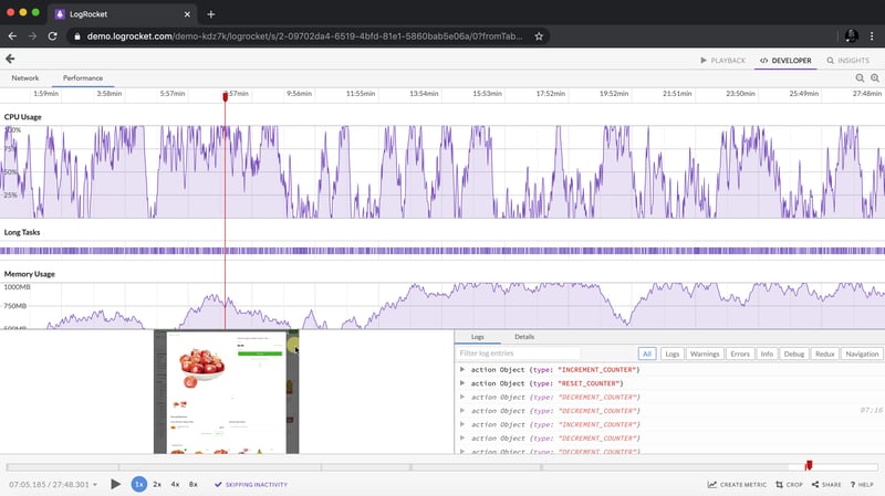
LogRocket adalah seperti DVR untuk apl web dan mudah alih, merakam semua yang berlaku dalam apl web, apl mudah alih atau tapak web anda. Daripada meneka sebab masalah berlaku, anda boleh mengagregat dan melaporkan metrik prestasi bahagian hadapan utama, memainkan semula sesi pengguna bersama-sama dengan keadaan aplikasi, log permintaan rangkaian dan secara automatik memaparkan semua ralat.
Modenkan cara anda menyahpepijat web dan apl mudah alih — mula memantau secara percuma.
Atas ialah kandungan terperinci Mengoptimumkan animasi berasaskan masa CSS dengan fungsi CSS baharu. Untuk maklumat lanjut, sila ikut artikel berkaitan lain di laman web China PHP!
 Apakah alat semakan nama domain terbalik IP?
 Perisian apakah itu ae
 Apakah yang ditunjukkan oleh pihak lain selepas disekat di WeChat?
 Alih keluar baris pengepala
 Pengenalan kepada perisian tengah laravel
 Apakah yang perlu saya lakukan jika gpedit.msc tidak boleh dibuka?
 Apa yang perlu dilakukan jika css tidak boleh dimuatkan
 Sebab utama mengapa komputer menggunakan binari


![[Web front-end] Permulaan pantas Node.js](https://img.php.cn/upload/course/000/000/067/662b5d34ba7c0227.png)


