

纯HTML5+CSS3制作生日蛋糕(代码易懂)

废话不多说,先给大家展示下效果图: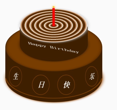
蛋糕分为三个部分,底部蛋糕,顶层蛋糕和蜡烛部分。HTML的布局结构也是按照这三部分布局的。另外就是使用CSS定位和CSS3的rotate,内外阴影等效果调整部分DOM元素样式。比较简单,相信码农都懂的。
不赘述其它有的没的了。
下面给出完整的的HTML代码和CSS代码
<!DOCTYPE html>
<html>
<head lang="en">
    <meta charset="UTF-8">
    <title></title>
    <style>
        .birthday .container{
            width:600px;
            height:600px;
            margin:0px auto;
            background: #fafafa;
            border-radius:5px;
            position: relative;
        }
        /**
       ** 顶层的
       **/
        .birthday .top-one{
            position: absolute;
            width:280px;
            height: 280px;
            bottom: 200px;
            left:160px;
        }
        .birthday .top-one .bottom{
            position: absolute;
            width:280px;
            height: 280px;
            bottom:-30px;
            border:1px solid #3e2001;
            border-radius: 140px;
            transform: rotateX(60deg);
            z-index: 4;
            background: #3e2001;
            box-shadow: 0px 0px 20px #3e2001;
        }
        .birthday .top-one .top{
            position: absolute;
            width:280px;
            height: 280px;
            top:-50px;
            border-radius: 140px;
            background: #FFFFFF;
            transform: rotateX(60deg);
            box-shadow: 2px 2px 20px #b7b7b7;
            z-index: 6;
            background: -webkit-repeating-radial-gradient(circle, #783d01, #3e2001 10px, #914909 10px,white 20px);
            background: -moz-repeating-radial-gradient(circle, #783d01, #3e2001 10px,#914909 10px,white 20px);
        }
        .birthday .top-one .side{
            position: absolute;
            top:95px;
            width:280px;
            height: 70px;
            border:1px solid #3e2001;
            border-top-width: 0px;
            border-bottom-width: 0px;
            background: #FFFFFF;
            z-index: 5;
            background: #3e2001;
        }
        /**
        ** 底层的
        **/
        .birthday .bottom-one{
            position: absolute;
            width:400px;
            height: 400px;
            bottom: 0px;
            left:100px;
        }
        .birthday .bottom-one .bottom{
            position: absolute;
            width:400px;
            height: 400px;
            bottom:-30px;
            border:1px solid #914909;
            border-radius: 200px;
            transform: rotateX(60deg);
            box-shadow: 2px 2px 20px #914909;
            z-index: 1;
            background: #3e2001;
            overflow: hidden;
        }
        .birthday .bottom-one .line{
            position: absolute;
            width:400px;
            height: 400px;
            border-radius: 200px;
            z-index: 1;
        }
        .birthday .bottom-one .line1{
            bottom: 30px;
            border:5px solid #783d01;
            left:-5px;
            z-index: 1;
        }
        .birthday .bottom-one .top{
            position: absolute;
            width:400px;
            height: 400px;
            top:-100px;
            border:1px solid #3e2001;
            border-radius: 200px;
            background: #FFFFFF;
            transform: rotateX(60deg);
            z-index: 3;
            background: #783d01;
            box-shadow: inset 0px 0px 20px #3e2001;
        }
        .birthday .bottom-one .side{
            position: absolute;
            top:100px;
            width:400px;
            height: 130px;
            border:1px solid #3e2001;
            border-top-width: 0px;
            border-bottom-width: 0px;
            background: #3e2001;
            z-index: 2;
        }
        /**
        ** 底层的文字
        **/
        .birthday .flower{
            position: relative;
            text-align: justify;
            z-index: 9;
            top:200px;
            font-size: 32px;
            font-family: "Helvetica Neue", "Noto Sans CJK SC", "Source Han Sans CN";
            color:#FFFFFF;
            font-weight: bold;
        }
        .birthday .flower:after{
            content:"";
            display:inline-block;
            position: relative;
            width:100%;
        }
        .birthday .flower i{
            position: relative;
            width:80px;
            line-height: 80px;
            display: inline-block;
            border-radius: 50%;
            border:2px solid #783d01;
            text-align: center;
        }
        /**
        ** 顶层的文字
        **/
        .birthday .top-one .text{
            width:100%;
            text-align: center;
            position: absolute;
            top:165px;
            z-index: 9;
            margin:0px auto;
            font-size: 30px;
            color:#FFFFFF;
            transform: rotateX(60deg) skew(10deg,20deg);
        }
        /**
         ** 蜡烛
        **/
        .birthday .candle{
            width:10px;
            height:80px;
            margin:0px auto;
            position: absolute;
            left:295px;
            top:130px;
            z-index: 9;
        }
        .birthday .candle .body{
            width:10px;
            height:70px;
            margin:0px auto;
            background: red;
            border-bottom-width: 0px;
        }
        .birthday .candle .top{
            width:10px;
            height: 10px;
            border-radius: 5px;
            transform: rotateX(60deg);
            position: relative;
            top:5px;
            background: red;
        }
        .birthday .candle .bottom{
            width:10px;
            height: 10px;
            border-radius: 5px;
            transform: rotateX(60deg);
            position: relative;
            bottom:5px;
            background: red;
            box-shadow: 1px 1px 10px red;
        }
        .birthday .candle .fire{
            position: absolute;
            width:6px;
            height: 6px;
            left:2px;
            transform: rotate(45deg);
            background: #ffd507;
            box-shadow: 0px 0px 20px #ffff00, 2px 2px 10px red;
        }
    </style>
</head>
<body>
    <p class="birthday">
        <p class="container">
            <p class="candle">
                <p class="fire"></p>
                <p class="top"></p>
                <p class="body"></p>
                <p class="bottom"></p>
            </p>
            <p class="top-one">
                <p class="top"></p>
                <p class="side"></p>
                <p class="bottom"></p>
                <p class="text">
                    Happy Birthday
                </p>
            </p>
            <p class="bottom-one">
                <p class="top"></p>
                <p class="side"></p>
                <p class="bottom">
                    <p class="line line1"></p>
                </p>
                <p class="flower">
                    <i style="top:-20px;transform: rotateY(50deg)">生</i>
                    <i style="top:15px;transform: rotateY(30deg)">日</i>
                    <i style="top:15px;transform: rotateY(30deg)">快</i>
                    <i style="top:-20px;transform: rotateY(50deg)">乐</i>
                </p>
            </p>
        </p>
    </p>
</body>
</html>以上就是纯HTML5+CSS3制作生日蛋糕(代码易懂) 的内容,更多相关内容请关注PHP中文网(www.php.cn)!

Alat AI Hot

Undresser.AI Undress
Apl berkuasa AI untuk mencipta foto bogel yang realistik

AI Clothes Remover
Alat AI dalam talian untuk mengeluarkan pakaian daripada foto.

Undress AI Tool
Gambar buka pakaian secara percuma

Clothoff.io
Penyingkiran pakaian AI

Video Face Swap
Tukar muka dalam mana-mana video dengan mudah menggunakan alat tukar muka AI percuma kami!

Artikel Panas
Alat panas

Notepad++7.3.1
Editor kod yang mudah digunakan dan percuma

SublimeText3 versi Cina
Versi Cina, sangat mudah digunakan

Hantar Studio 13.0.1
Persekitaran pembangunan bersepadu PHP yang berkuasa

Dreamweaver CS6
Alat pembangunan web visual

SublimeText3 versi Mac
Perisian penyuntingan kod peringkat Tuhan (SublimeText3)
Topik panas
 1392
1392
 52
52

 Sempadan Jadual dalam HTML
Sep 04, 2024 pm 04:49 PM
Sempadan Jadual dalam HTML
Sep 04, 2024 pm 04:49 PM
Panduan untuk Sempadan Jadual dalam HTML. Di sini kita membincangkan pelbagai cara untuk menentukan sempadan jadual dengan contoh Sempadan Jadual dalam HTML.
 Jadual Bersarang dalam HTML
Sep 04, 2024 pm 04:49 PM
Jadual Bersarang dalam HTML
Sep 04, 2024 pm 04:49 PM
Ini ialah panduan untuk Nested Table dalam HTML. Di sini kita membincangkan cara membuat jadual dalam jadual bersama-sama dengan contoh masing-masing.
 HTML jidar-kiri
Sep 04, 2024 pm 04:48 PM
HTML jidar-kiri
Sep 04, 2024 pm 04:48 PM
Panduan untuk HTML margin-kiri. Di sini kita membincangkan gambaran keseluruhan ringkas tentang HTML margin-left dan Contoh-contohnya bersama-sama dengan Pelaksanaan Kodnya.
 Susun Atur Jadual HTML
Sep 04, 2024 pm 04:54 PM
Susun Atur Jadual HTML
Sep 04, 2024 pm 04:54 PM
Panduan untuk Susun Atur Jadual HTML. Di sini kita membincangkan Nilai Susun Atur Jadual HTML bersama-sama dengan contoh dan output n perincian.
 Pemegang Tempat Input HTML
Sep 04, 2024 pm 04:54 PM
Pemegang Tempat Input HTML
Sep 04, 2024 pm 04:54 PM
Panduan untuk Pemegang Tempat Input HTML. Di sini kita membincangkan Contoh Pemegang Tempat Input HTML bersama-sama dengan kod dan output.
 Memindahkan Teks dalam HTML
Sep 04, 2024 pm 04:45 PM
Memindahkan Teks dalam HTML
Sep 04, 2024 pm 04:45 PM
Panduan untuk Memindahkan Teks dalam HTML. Di sini kita membincangkan pengenalan, cara teg marquee berfungsi dengan sintaks dan contoh untuk dilaksanakan.
 Senarai Tertib HTML
Sep 04, 2024 pm 04:43 PM
Senarai Tertib HTML
Sep 04, 2024 pm 04:43 PM
Panduan kepada Senarai Tertib HTML. Di sini kami juga membincangkan pengenalan senarai dan jenis Tertib HTML bersama-sama dengan contoh mereka masing-masing
 Butang onclick HTML
Sep 04, 2024 pm 04:49 PM
Butang onclick HTML
Sep 04, 2024 pm 04:49 PM
Panduan untuk Butang onclick HTML. Di sini kita membincangkan pengenalan, kerja, contoh dan onclick Event masing-masing dalam pelbagai acara.
