

HTML5实践-如何使用css3丰富图片样式的详解(一)

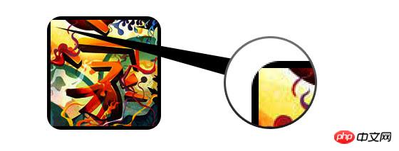
在css3中,直接在图片上使用box-shadow 和 border-radius,浏览器并不能很好的渲染。但是如果把图片作为background-image,添加的样式浏览器可以很好的渲染。我将会介绍如何使用box-shadow, border-radius 和 transition创建不同图片样式效果。
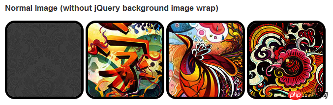
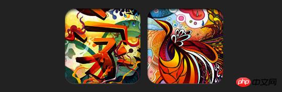
问题
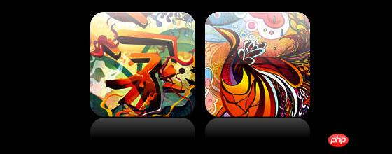
通过查看demo能注意到,我们为第一行图片设置了border-radius 和 内嵌box-shadow。firefox渲染了图片的border-radius,但是没有渲染内嵌box-shadow。chrome和Safari两种效果都没有渲染。
.normal img {
border: solid 5px #000;
-webkit-border-radius: 20px;
-moz-border-radius: 20px;  border-radius: 20px;
-webkit-box-shadow: inset 0 1px 5px rgba(0,0,0,.5);
-moz-box-shadow: inset 0 1px 5px rgba(0,0,0,.5);
box-shadow: inset 0 1px 5px rgba(0,0,0,.5);
}firefox效果:
chrome/safari
变通方案
为了使border-radius 和 内嵌box-shadow能够正常工作,我们需要把图片转换成background-image的方式。
动态方式
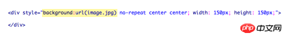
为了动态完成这一工作,我们需要借助jquery为每一个图片添加背景图片的包装。下面的js代码为每一个图片添加了一个span的包装,span的背景图片路径就是图片的路径。
代码比较简单,我想就没有讲解的必要了。不清楚了可以直接去查jquery的api。
<script type="text/javascript" src="http://ajax.googleapis.com/ajax/libs/jquery/1.5/jquery.min.js"></script>
<script type="text/javascript">
$(document).ready(function(){
$("img").load(function() {
$(this).wrap(function(){
return '<span class="image-wrap ' + $(this).attr('class') + '" style="position:relative;
display:inline-block; background:url(' + $(this).attr('src') + ') no-repeat center center;
width: ' + $(this).width() + 'px; height: ' + $(this).height() + 'px;" />';
});
$(this).css("opacity","0");
});
});</script>输出
上面的代码会输出如下结果:
<span class="image-wrap " style="position:relative;
display:inline-block; background:url(image.jpg) no-repeat center center;
width: 150px; height: 150px;">
<img src="image.jpg" style="opacity: 0;">
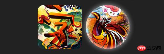
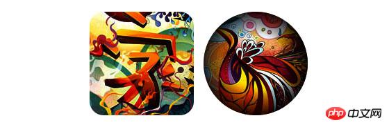
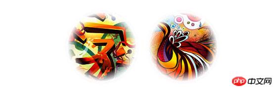
</span>圆形图片
添加我们使用border-radius来实现圆形图片的效果,效果如下:
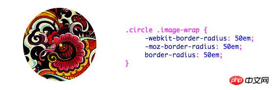
css:
.circle .image-wrap {
    -webkit-border-radius: 50em;
    -moz-border-radius: 50em;
    border-radius: 50em;
}卡片风格
下面是卡片风格的图片,使用了多个内嵌box-shadow。
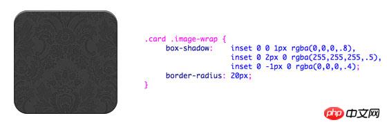
css:
.card .image-wrap {
    -webkit-box-shadow: inset 0 0 1px rgba(0,0,0,.8), inset 0 2px 0 rgba(255,255,255,.5), inset 0 -1px 0 rgba(0,0,0,.4);
    -moz-box-shadow: inset 0 0 1px rgba(0,0,0,.8), inset 0 2px 0 rgba(255,255,255,.5), inset 0 -1px 0 rgba(0,0,0,.4);
    box-shadow: inset 0 0 1px rgba(0,0,0,.8), inset 0 2px 0 rgba(255,255,255,.5), inset 0 -1px 0 rgba(0,0,0,.4);

    -webkit-border-radius: 20px;
    -moz-border-radius: 20px;
    border-radius: 20px;
}浮雕风格
下面是浮雕效果。
css:
.embossed .image-wrap {
    -webkit-box-shadow: inset 0 0 2px rgba(0,0,0,.8),
    inset 0 2px 0 rgba(255,255,255,.5),
    inset 0 -7px 0 rgba(0,0,0,.6),
    inset 0 -9px 0 rgba(255,255,255,.3);
    -moz-box-shadow: inset 0 0 2px rgba(0,0,0,.8),
    inset 0 2px 0 rgba(255,255,255,.5), inset 0 -7px 0 rgba(0,0,0,.6),
    inset 0 -9px 0 rgba(255,255,255,.3);
    box-shadow: inset 0 0 2px rgba(0,0,0,.8),
    inset 0 2px 0 rgba(255,255,255,.5),
    inset 0 -7px 0 rgba(0,0,0,.6), inset 0 -9px 0 rgba(255,255,255,.3);

    -webkit-border-radius: 20px;
    -moz-border-radius: 20px;
    border-radius: 20px;
}柔性浮雕风格
相对于浮雕样式,新样式添加了1px blur属性。
css:
.soft-embossed .image-wrap {
    -webkit-box-shadow: inset 0 0 4px rgba(0,0,0,1),
    inset 0 2px 1px rgba(255,255,255,.5),
    inset 0 -9px 2px rgba(0,0,0,.6),
    inset 0 -12px 2px rgba(255,255,255,.3);
    -moz-box-shadow: inset 0 0 4px rgba(0,0,0,1),
    inset 0 2px 1px rgba(255,255,255,.5),
    inset 0 -9px 2px rgba(0,0,0,.6),
    inset 0 -12px 2px rgba(255,255,255,.3);
    box-shadow: inset 0 0 4px rgba(0,0,0,1),
    inset 0 2px 1px rgba(255,255,255,.5),
    inset 0 -9px 2px rgba(0,0,0,.6),
    inset 0 -12px 2px rgba(255,255,255,.3);

    -webkit-border-radius: 20px;
    -moz-border-radius: 20px;
    border-radius: 20px;
}抠图风格
使用内嵌box-shadow就可以实现抠图效果。
css:
.cut-out .image-wrap {
    -webkit-box-shadow: 0 1px 0 rgba(255,255,255,.2),
    inset 0 4px 5px rgba(0,0,0,.6),
    inset 0 1px 0 rgba(0,0,0,.6);
    -moz-box-shadow: 0 1px 0 rgba(255,255,255,.2),
    inset 0 4px 5px rgba(0,0,0,.6),
    inset 0 1px 0 rgba(0,0,0,.6);
    box-shadow: 0 1px 0 rgba(255,255,255,.2),
    inset 0 4px 5px rgba(0,0,0,.6),
    inset 0 1px 0 rgba(0,0,0,.6);

    -webkit-border-radius: 20px;
    -moz-border-radius: 20px;
    border-radius: 20px;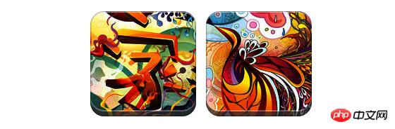
}变形和发光
在这个例子中我们为图片包装添加transition属性,鼠标滑过的时候,他会从圆角变为圆形。然后我们使用多个box-shadow实现发光效果。
css:
.morphing-glowing .image-wrap {
    -webkit-transition: 1s;
    -moz-transition: 1s;
    transition: 1s;

    -webkit-border-radius: 20px;
    -moz-border-radius: 20px;
    border-radius: 20px;
}.morphing-glowing .image-wrap:hover {
    -webkit-box-shadow: 0 0 20px rgba(255,255,255,.6),
    inset 0 0 20px rgba(255,255,255,1);
    -moz-box-shadow: 0 0 20px rgba(255,255,255,.6),
    inset 0 0 20px rgba(255,255,255,1);
    box-shadow: 0 0 20px rgba(255,255,255,.6),
    inset 0 0 20px rgba(255,255,255,1);

    -webkit-border-radius: 60em;
    -moz-border-radius: 60em;
    border-radius: 60em;
}高光效果
高光的效果是通过为元素添加 :after 伪类实现的。
css:
.glossy .image-wrap {
    -webkit-box-shadow: inset 0 -1px 0 rgba(0,0,0,.5);
    -moz-box-shadow: inset 0 -1px 0 rgba(0,0,0,.5);
    box-shadow: inset 0 -1px 0 rgba(0,0,0,.5);

    -webkit-border-radius: 20px;
    -moz-border-radius: 20px;
    border-radius: 20px;
}.glossy .image-wrap:after {
    position: absolute;
    content: ' ';
    width: 100%;
    height: 50%;
    top: 0;
    left: 0;

    -webkit-border-radius: 20px;
    -moz-border-radius: 20px;
    border-radius: 20px;

    background: -moz-linear-gradient(top, rgba(255,255,255,0.7) 0%, rgba(255,255,255,.1) 100%);
    background: -webkit-gradient(linear, left top, left bottom, color-stop(0%,rgba(255,255,255,0.7)), color-stop(100%,rgba(255,255,255,.1)));
    background: linear-gradient(top, rgba(255,255,255,0.7) 0%,rgba(255,255,255,.1) 100%);
}倒影效果
在这个例子中,我们将高光效果移到底部就实现倒影效果。
css:
.reflection .image-wrap:after {
    position: absolute;
    content: ' ';
    width: 100%;
    height: 30px;
    bottom: -31px;
    left: 0;

    -webkit-border-top-left-radius: 20px;
    -webkit-border-top-right-radius: 20px;
    -moz-border-radius-topleft: 20px;
    -moz-border-radius-topright: 20px;
    border-top-left-radius: 20px;
    border-top-right-radius: 20px;

    background: -moz-linear-gradient(top, rgba(0,0,0,.3) 0%, rgba(255,255,255,0) 100%);
    background: -webkit-gradient(linear, left top, left bottom, color-stop(0%,rgba(0,0,0,.3)),
    color-stop(100%,rgba(255,255,255,0)));
    background: linear-gradient(top, rgba(0,0,0,.3) 0%,rgba(255,255,255,0) 100%);
}.reflection .image-wrap:hover {
    position: relative;
    top: -8px;
}高光和倒影
本例我们使用:before 和 :after 将高光和倒影效果组合起来。
css:
.glossy-reflection .image-wrap {
    -webkit-box-shadow: inset 0 -1px 0 rgba(0,0,0,.5), inset 0 1px 0 rgba(255,255,255,.6);
    -moz-box-shadow: inset 0 -1px 0 rgba(0,0,0,.5), inset 0 1px 0 rgba(255,255,255,.6);
    box-shadow: inset 0 -1px 0 rgba(0,0,0,.5), inset 0 1px 0 rgba(255,255,255,.6);

    -webkit-transition: 1s;
    -moz-transition: 1s;
    transition: 1s;

    -webkit-border-radius: 20px;
    -moz-border-radius: 20px;
    border-radius: 20px;
}.glossy-reflection .image-wrap:before {
    position: absolute;
    content: ' ';
    width: 100%;
    height: 50%;
    top: 0;
    left: 0;

    -webkit-border-radius: 20px;
    -moz-border-radius: 20px;
    border-radius: 20px;

    background: -moz-linear-gradient(top, rgba(255,255,255,0.7) 0%, rgba(255,255,255,.1) 100%);
    background: -webkit-gradient(linear, left top, left bottom, color-stop(0%,rgba(255,255,255,0.7)), color-stop(100%,rgba(255,255,255,.1)));
    background: linear-gradient(top, rgba(255,255,255,0.7) 0%,rgba(255,255,255,.1) 100%);
}.glossy-reflection .image-wrap:after {
    position: absolute;
    content: ' ';
    width: 100%;
    height: 30px;
    bottom: -31px;
    left: 0;

    -webkit-border-top-left-radius: 20px;
    -webkit-border-top-right-radius: 20px;
    -moz-border-radius-topleft: 20px;
    -moz-border-radius-topright: 20px;
    border-top-left-radius: 20px;
    border-top-right-radius: 20px;

    background: -moz-linear-gradient(top, rgba(230,230,230,.3) 0%, rgba(230,230,230,0) 100%);
    background: -webkit-gradient(linear, left top, left bottom, color-stop(0%,rgba(230,230,230,.3)), color-stop(100%,rgba(230,230,230,0)));
    background: linear-gradient(top, rgba(230,230,230,.3) 0%,rgba(230,230,230,0) 100%);
}胶带风格
在这个例子中,我们使用:after来实现胶带的效果。
css:
.tape .image-wrap {
    -webkit-box-shadow: inset 0 0 2px rgba(0,0,0,.7),
    inset 0 2px 0 rgba(255,255,255,.3), inset 0 -1px 0 rgba(0,0,0,.5), 0 1px 3px rgba(0,0,0,.4);
    -moz-box-shadow: inset 0 0 2px rgba(0,0,0,.7),
    inset 0 2px 0 rgba(255,255,255,.3),
    inset 0 -1px 0 rgba(0,0,0,.5), 0 1px 3px rgba(0,0,0,.4);
    box-shadow: inset 0 0 2px rgba(0,0,0,.7), inset 0 2px 0 rgba(255,255,255,.3),
    inset 0 -1px 0 rgba(0,0,0,.5), 0 1px 3px rgba(0,0,0,.4);
}.tape .image-wrap:after {
    position: absolute;
    content: ' ';
    width: 60px;
    height: 25px;
    top: -10px;
    left: 50%;
    margin-left: -30px;
    border: solid 1px rgba(137,130,48,.2);

    background: -moz-linear-gradient(top, rgba(254,243,127,.6) 0%, rgba(240,224,54,.6) 100%);
    background: -webkit-gradient(linear, left top, left bottom, color-stop(0%,rgba(254,243,127,.6)), color-stop(100%,rgba(240,224,54,.6)));
    background: linear-gradient(top, rgba(254,243,127,.6) 0%,rgba(240,224,54,.6) 100%);
    -webkit-box-shadow: inset 0 1px 0 rgba(255,255,255,.3), 0 1px 0 rgba(0,0,0,.2);
}变形和着色
在这个例子中,我们在元素上使用:after,当鼠标进过的时候实现径向渐变的效果。
css:
.morphing-tinting .image-wrap {
    position: relative;

    -webkit-transition: 1s;
    -moz-transition: 1s;
    transition: 1s;

    -webkit-border-radius: 20px;
    -moz-border-radius: 20px;
    border-radius: 20px;
}.morphing-tinting .image-wrap:hover {
    -webkit-border-radius: 30em;
    -moz-border-radius: 30em;
    border-radius: 30em;
}.morphing-tinting .image-wrap:after {
    position: absolute;
    content: ' ';
    width: 100%;
    height: 100%;
    top: 0;
    left: 0;

    -webkit-transition: 1s;
    -moz-transition: 1s;
    transition: 1s;

    -webkit-border-radius: 30em;
    -moz-border-radius: 30em;
    border-radius: 30em;
}.morphing-tinting .image-wrap:hover:after  {
    background: -webkit-gradient(radial, 50% 50%, 40, 50% 50%, 80, from(rgba(0,0,0,0)), to(rgba(0,0,0,1)));
    background: -moz-radial-gradient(50% 50%, circle, rgba(0,0,0,0) 40px, rgba(0,0,0,1) 80px);
}羽化边缘圆形
我们同样可以使用径向渐变产生遮罩,实现羽化的效果。
css:
.feather .image-wrap {
    position: relative;

    -webkit-border-radius: 30em;
    -moz-border-radius: 30em;
    border-radius: 30em;
}.feather .image-wrap:after  {
    position: absolute;
    content: ' ';
    width: 100%;
    height: 100%;
    top: 0;
    left: 0;

    background: -webkit-gradient(radial, 50% 50%, 50, 50% 50%, 70, from(rgba(255,255,255,0)), to(rgba(255,255,255,1)));
    background: -moz-radial-gradient(50% 50%, circle, rgba(255,255,255,0) 50px, rgba(255,255,255,1) 70px);
}浏览器兼容性
这种实现方式在大多数支持border-radius, box-shadow, :before and :after特性的浏览器中(例如Chrome, Firefox 和 Safari),都能很好的工作。在不支持新特性的浏览器中,只会显示原始图片。
创造你自己的实现
借助:before 和:after伪类能为图片创造很多种样式,你可以自己尝试创建出新的效果。
Atas ialah kandungan terperinci HTML5实践-如何使用css3丰富图片样式的详解(一). Untuk maklumat lanjut, sila ikut artikel berkaitan lain di laman web China PHP!

Alat AI Hot

Undresser.AI Undress
Apl berkuasa AI untuk mencipta foto bogel yang realistik

AI Clothes Remover
Alat AI dalam talian untuk mengeluarkan pakaian daripada foto.

Undress AI Tool
Gambar buka pakaian secara percuma

Clothoff.io
Penyingkiran pakaian AI

AI Hentai Generator
Menjana ai hentai secara percuma.

Artikel Panas
Alat panas

Notepad++7.3.1
Editor kod yang mudah digunakan dan percuma

SublimeText3 versi Cina
Versi Cina, sangat mudah digunakan

Hantar Studio 13.0.1
Persekitaran pembangunan bersepadu PHP yang berkuasa

Dreamweaver CS6
Alat pembangunan web visual

SublimeText3 versi Mac
Perisian penyuntingan kod peringkat Tuhan (SublimeText3)
Topik panas
 1382
1382
 52
52

 Sempadan Jadual dalam HTML
Sep 04, 2024 pm 04:49 PM
Sempadan Jadual dalam HTML
Sep 04, 2024 pm 04:49 PM
Panduan untuk Sempadan Jadual dalam HTML. Di sini kita membincangkan pelbagai cara untuk menentukan sempadan jadual dengan contoh Sempadan Jadual dalam HTML.
 HTML jidar-kiri
Sep 04, 2024 pm 04:48 PM
HTML jidar-kiri
Sep 04, 2024 pm 04:48 PM
Panduan untuk HTML margin-kiri. Di sini kita membincangkan gambaran keseluruhan ringkas tentang HTML margin-left dan Contoh-contohnya bersama-sama dengan Pelaksanaan Kodnya.
 Jadual Bersarang dalam HTML
Sep 04, 2024 pm 04:49 PM
Jadual Bersarang dalam HTML
Sep 04, 2024 pm 04:49 PM
Ini ialah panduan untuk Nested Table dalam HTML. Di sini kita membincangkan cara membuat jadual dalam jadual bersama-sama dengan contoh masing-masing.
 Susun Atur Jadual HTML
Sep 04, 2024 pm 04:54 PM
Susun Atur Jadual HTML
Sep 04, 2024 pm 04:54 PM
Panduan untuk Susun Atur Jadual HTML. Di sini kita membincangkan Nilai Susun Atur Jadual HTML bersama-sama dengan contoh dan output n perincian.
 Pemegang Tempat Input HTML
Sep 04, 2024 pm 04:54 PM
Pemegang Tempat Input HTML
Sep 04, 2024 pm 04:54 PM
Panduan untuk Pemegang Tempat Input HTML. Di sini kita membincangkan Contoh Pemegang Tempat Input HTML bersama-sama dengan kod dan output.
 Senarai Tertib HTML
Sep 04, 2024 pm 04:43 PM
Senarai Tertib HTML
Sep 04, 2024 pm 04:43 PM
Panduan kepada Senarai Tertib HTML. Di sini kami juga membincangkan pengenalan senarai dan jenis Tertib HTML bersama-sama dengan contoh mereka masing-masing
 Memindahkan Teks dalam HTML
Sep 04, 2024 pm 04:45 PM
Memindahkan Teks dalam HTML
Sep 04, 2024 pm 04:45 PM
Panduan untuk Memindahkan Teks dalam HTML. Di sini kita membincangkan pengenalan, cara teg marquee berfungsi dengan sintaks dan contoh untuk dilaksanakan.
 Butang onclick HTML
Sep 04, 2024 pm 04:49 PM
Butang onclick HTML
Sep 04, 2024 pm 04:49 PM
Panduan untuk Butang onclick HTML. Di sini kita membincangkan pengenalan, kerja, contoh dan onclick Event masing-masing dalam pelbagai acara.
