

html实现一个动图--哆啦A梦
Jun 24, 2017 am 11:39 AM我相信每个人的童年都有一个哆啦a梦,一个小小的肚皮里装满了不可思议的哆啦a梦,一个在你无助伤心的时候陪在你身边的哆啦a梦,一个陪你胡思乱想陪你吃铜锣烧的哆啦a梦~今天我们就来画一个我们心中的哆啦a梦吧~

定义哆啦a梦的容器
-
千篇一律先定义一个画哆啦a梦的大容器,确定它的大小和位置。
<!-- 哆啦A梦大容器 --><div class="doa"></div>
/*哆啦A梦*/
  .doa{position: relative;top: 100px;}
Salin selepas log masuk
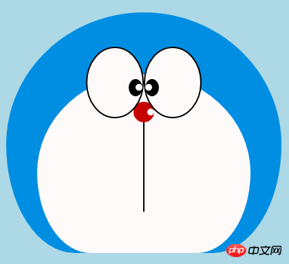
画哆啦a梦的头部(包括脸,脸部包括眼睛和鼻子)
头部包含好几块部分:哆啦a梦的脸部和鼻子,脸部又包括两只眼睛,两只眼睛里面还有眼珠和眼白部分,所以会有好几层的dom嵌套,当然基本图形都是由div+border-radius拼凑而成。
将画好的各个部位品拼凑到相应的位置上即可。
看我前面画的几个图画就知道border-radius是一个非常常用的属性,几乎div的每一次变形都离不开它,其实border-radius的真面目应该是
border-radius: 300px 300px 300px 300px/300px 300px 300px 300px;酱紫的,我们一般不写斜杠后面的内容,斜杠切面是水平长度,斜杠后面是垂直高度,前杠后面默认不写就是水平和垂直大小是一样的。我知道我这样说不够详细,可以参考我鑫神的博客秋月何时了,CSS3 border-radius知多少?,保证你分分钟在老司机的带领下彻底弄懂border-radius,还不快上车?<!-- 头 --> <div class="head"> <!-- 存放脸部的容器 --> <div class="face"> <!-- 左眼大圈儿 --> <div> <!-- 左眼眼珠(黑色部分) --> <div> <!-- 左眼眼白,黑色里面的白色部分 --> <div></div> </div> </div> <!-- 右眼大圈儿 --> <div> <!--右眼眼珠(黑色部分) --> <div> <!-- 右眼眼白,黑色里面的白色部分 --> <div></div> </div> </div> </div> <!-- 红鼻子部分 --> <div class="nose"> <!-- 红鼻子里面的白圈儿 --> <div></div> </div> <!-- 红鼻子下面的那根黑线,也属于鼻子部分 --> <div class="nose1"></div> </div> .head{ margin: 0 auto; /*头部定义大小并居中显示*/ width: 400px; height: 350px; background: #008ee3; /*头部定义背景颜色*/ position: relative; border-radius: 50% 50% 25% 25% / 55% 55% 45% 45%; /*头部定义四个方向圆角大小*/ } .face{ width: 310px; /*脸部定义大小*/ height: 260px; background: snow; /*脸部定义背景颜色*/ border-radius: 50% 50% 25% 25% / 55% 55% 45% 45%; /*脸部定义四个方向的圆角大小*/ position: relative; /*脸部定义位置,是相对于head的位置*/ top: 90px; left: 45px; } /*左眼眶*/ .face>div:first-child{ width: 80px; /*左眼框定义大小*/ height: 100px; border-radius: 50%; /*左眼框定义与圆角大小*/ border:2px #000 solid; /*定义外边框*/ background: snow; float: left; /*为了使左右两个眼睛能在一排显示*/ position: relative; /*位置是相对于face的位置*/ top:-40px; left: 71px; z-index: 50; } /*右眼眶,画法跟左眼一样*/ .face>div:last-child{ width: 80px; height: 100px; border-radius: 50%; border:2px #000 solid; background: snow; float: left; position: relative; top:-40px; left: 71px; z-index: 50; } /*左眼珠1*/ .face>div:first-child div{ width: 20px; /*定义眼珠的大小*/ height: 25px; background: #000; border-radius: 50%; position: absolute; /*定义眼珠的位置,相对于眼眶的位置*/ top: 45px; left: 60px; } /*左瞳孔*/ .face>div:first-child div div{ width: 10px; /*定义黑色瞳孔的大小*/ height: 10px; background: #ffffff; border-radius: 50%; position: absolute; /*定义黑色瞳孔的位置,相对于眼珠的位置*/ top: 7px; left: 10px; } /*右眼珠和左眼珠画法一样*/ .face>div:last-child div{ width: 20px; height: 25px; background: #000; border-radius: 50%; position: absolute; top: 45px; } /*右瞳孔和左瞳孔的画法一样*/ .face>div:last-child div div{ width: 10px; height: 10px; background: #ffffff; border-radius: 50%; position: absolute; top: 7px; } .nose{ width: 30px; /*定义红鼻子的大小*/ height: 30px; border-radius: 50%; background: #c70000; position: absolute; top: 130px; left: 50%; margin-left: -15px; z-index: 10; } .nose div{ width: 10px; /*定义红鼻子里面白色圈圈的大小*/ height: 10px; border-radius: 50%; position: absolute; background: #ffffff; top: 10px; margin-left: 20px; z-index: 10; } .nose1{ width: 2px; /*定义红鼻子下面的那一条黑线*/ height: 130px; background: #000; position: absolute; top: 160px; left: 50%; margin-left: -1px; z-index: 10; }Salin selepas log masuk
 哆啦a梦的头部.png
画哆啦a梦的嘴巴部分
嘴巴应该是很简单的了吧,看一眼就知道是是用边框+border-radius实现的。
<div class="mouth"></div>
.mouth{      width: 250px;   /*定义嘴巴的大小*/      height: 200px;      border-radius: 50%;      background: snow;      border-bottom: 2px #000 solid;      margin: -230px auto;      position: relative;  /*定义嘴巴的位置*/
  }
Salin selepas log masuk哆啦a梦的嘴巴.png

画哆啦a梦的胡须部分
胡须部分其实在上一篇文章画html打造动画【连载3】- 小猫笑脸动画里面画胡须的时候就已经介绍了画胡须的方法,在这里就不赘述了,基本思路都是一样的。
<!-- 胡须 -->
  <div class="beard">
  <!-- 左边胡须部分 -->
      <div class="left">
      <!-- 第一根胡须 -->
          <div></div>
          <!-- 第二根胡须 -->
          <div></div>
          <!-- 第三根胡须 -->
          <div></div>
      </div>
      <div class="right">
          <div></div>
          <div></div>
          <div></div>
      </div>
      <!-- 脖子部分的小白条部分 -->
      <span></span>
  </div>/*胡须样式*/.beard .left div:first-child{      width: 120px;      height: 40px;      border-top: 2px #000 solid;      border-radius: 10% 90% 10% 90% / 10% 90% 10% 90%;      position: absolute;      left: 50%;      top: 140px;      margin-left: -170px;      z-index: 100;
  }  .beard .left div:nth-child(2){      width: 120px;      height: 40px;      border-top: 2px #000 solid;      border-radius: 10% 90% 10% 90% / 30% 70% 40% 60%;      position: absolute;      left: 50%;      top: 170px;      margin-left: -170px;      z-index: 100;
  }  .beard .left div:last-child{      width: 120px;      height: 40px;      border-top: 2px #000 solid;      border-radius: 10% 90% 10% 90% / 40% 60% 10% 90%;      position: absolute;      left: 50%;      top: 200px;      margin-left: -170px;      z-index: 100;
  }  .beard .right div:first-child{      width: 120px;      height: 40px;      border-top: 2px #000 solid;      border-radius: 90% 10% 90% 10% / 90% 10% 90% 10%;      position: absolute;      left: 50%;      top: 140px;      margin-left: 50px;      z-index: 100;
  }  .beard .right div:nth-child(2){      width: 120px;      height: 40px;      border-top: 2px #000 solid;      border-radius: 90% 10% 90% 10% / 70% 30% 60% 40%;      position: absolute;      left: 50%;      top: 170px;      margin-left: 50px;      z-index: 100;
  }  .beard .right div:last-child{      width: 120px;      height: 40px;      border-top: 2px #000 solid;      border-radius: 90% 10% 90% 10% / 60% 40% 90% 10%;      position: absolute;      left: 50%;      top: 200px;      margin-left: 50px;      z-index: 100;
  }  .beard span{      display: block;      width: 60px;      height: 3.5px;      background: #ffffff;      border-radius: 4px;      position: absolute;      top: 352px;      left: 50%;      margin-left: -105px;
  }
Salin selepas log masuk哆啦a梦的胡须.png

画哆啦a梦的脖子部分(脖子部分包括铃铛)
脖子就是基本div变形之后的图形,多余的部分隐藏到头部下面就可以了。
铃铛部分是各个很简单的基本图形组成。
<!-- 脖 -->
  <div class="neck">
  <!-- 铃铛的圆形 -->
      <div></div>
      <!-- 铃铛的小圆角矩形 -->
      <div></div>
      <!-- 铃铛的小圆形 -->
      <div></div>
      <!-- 铃铛的小竖线 -->
      <div></div>
  </div>
.neck{      width: 330px;      height: 200px;      border-radius: 50% 50% 20% 20% / 50% 50% 50% 50%;      background: #e30000;      margin: 80px auto;      z-index: 100;
  }  .neck div:first-child{      border: 2px #000 solid;      border-radius: 50%;      width: 40px;      height: 40px;      background: #ffdd2e;      position: absolute;      top: 350px;      left: 50%;      margin-left: -22px;      transition: all 1s;
  }  .neck div:nth-child(2){      border: 2px #000 solid;      width: 44px;      height: 5px;      background: #ffdd2e;      position: absolute;      left: 50%;      margin-left: -24px;      top: 363px;      border-radius: 5px;      transition: all 1s;
  }  .neck div:nth-child(3){      width: 8px;      height: 8px;      border: 2px #000 solid;      position: absolute;      background: #6c5844;      border-radius: 50%;      left: 50%;      margin-left: -6px;      top: 375px;      transition: all 1s;
  }  .neck div:nth-child(4){      width: 2px;      height: 8px;      background: #000;      position: absolute;      left: 50%;      margin-left: -1px;      top: 385px;      transition: all 1s;
  }
Salin selepas log masuk哆啦a梦的脖子.png

完成哆啦a梦的动态效果
动起来的哆啦a梦才比较萌对吧,那我们就让它动起来吧(transition属性)。
鼠标移动到眼睛部位左眼珠移动到左边。
鼠标移动到嘴巴部位,脸部表情变化。
鼠标移动到铃铛部分,铃铛变大。
/*眼睛动效*/.head:hover .face>div:first-child div{      left: 0px;      transition: all 1s;
  }  .head:hover .face>div:first-child div div{      left: 0px;      transition: all 1s;
  }/*嘴巴动效,嘴巴的dom容器下面要加了个空的div容器*/.mouth div:first-child{      width: 82px;      height: 2px;      background: #000;      position: absolute;      z-index: 1000;      top: -25px;      left: 6px;      display: none;
  }  .mouth div:nth-child(2){      width: 82px;      height: 2px;      background: #000;      position: absolute;      z-index: 1000;      top: -25px;      left: 90px;      display: none;
  }  .mouth:hover{      border-radius: 0;      width: 180px;      height: 200px;
  }  .mouth:hover div:first-child,.mouth:hover div:nth-child(2){      display: block;
  }/*铃铛动效*/.neck:hover div:first-child{      width: 60px;      height: 60px;      left: 50%;      margin-left: -30px;
  }  .neck:hover div:nth-child(2){      width: 66px;      height: 7.5px;      left: 50%;      margin-left: -33px;
  }  .neck:hover div:nth-child(3){      width: 12px;      height: 12px;      left: 50%;      margin-left: -6px;      top: 385px;
  }  .neck:hover div:nth-child(4){      width: 2px;      height: 12px;      left: 50%;      margin-left: 1px;      top: 400px;
  }
Salin selepas log masuk哆啦a梦动图.gif

Atas ialah kandungan terperinci html实现一个动图--哆啦A梦. Untuk maklumat lanjut, sila ikut artikel berkaitan lain di laman web China PHP!

Artikel Panas

Alat panas Tag

Artikel Panas

Tag artikel panas

Notepad++7.3.1
Editor kod yang mudah digunakan dan percuma

SublimeText3 versi Cina
Versi Cina, sangat mudah digunakan

Hantar Studio 13.0.1
Persekitaran pembangunan bersepadu PHP yang berkuasa

Dreamweaver CS6
Alat pembangunan web visual

SublimeText3 versi Mac
Perisian penyuntingan kod peringkat Tuhan (SublimeText3)
Topik panas


 Bagaimana anda menghuraikan dan memproses HTML/XML dalam PHP?
Feb 07, 2025 am 11:57 AM
Bagaimana anda menghuraikan dan memproses HTML/XML dalam PHP?
Feb 07, 2025 am 11:57 AM
Bagaimana anda menghuraikan dan memproses HTML/XML dalam PHP?

