

纯CSS定制文本省略的方法大全

本文主要介绍了纯CSS定制文本省略的方法大全,小编觉得挺不错的,现在分享给大家,也给大家做个参考。一起跟随小编过来看看吧,希望能帮助到大家。
WeTest导读
拿到设计MM的设计稿,Oh NO,点点点后面又双叒叕加内容了,弹丸之地,劳心费神啊!!可怜我们UI开发GG每次苦口婆心说,微臣不是不做,是办不到啊!很是愧疚。而现在,自从用了定制多行省略,腰不酸了,手也不疼了,接起需求来,毫不费劲!
一、什么是多行省略?
当字数多到一定程度就显示省略号点点点。最初只是简单的点点点,之后花样越来越多,点点点加下箭头,点点点加更多,点点点加更多加箭头...。多行省略就是大段文字后面的花式点点点。
同行这么做:
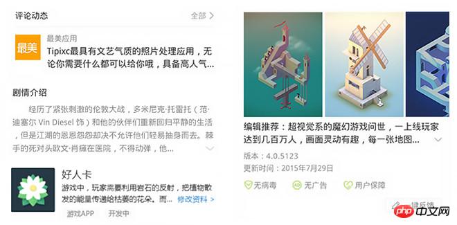
1.Google Plus用透明到白色的渐变遮罩,渐变遮罩在文字超出的时候才显示,但无法挤出文字,且背景只能纯色,不理想。
2.豌豆荚则更简单粗暴换行显示,换行显示则文字未超出时依然显示 ...xxx,更不理想!
我们这样做:
在QQ浏览器的页面用了一个原创的mod-more UI组件,实现了定制的多行省略,还是纯CSS的,领先同行一大截,赞!赞!赞!只可惜,mod-more组件的高度是固定的。对mod-more进一步进化,完美自适应高度,而且代码简化易用。
二、怎么做到的?
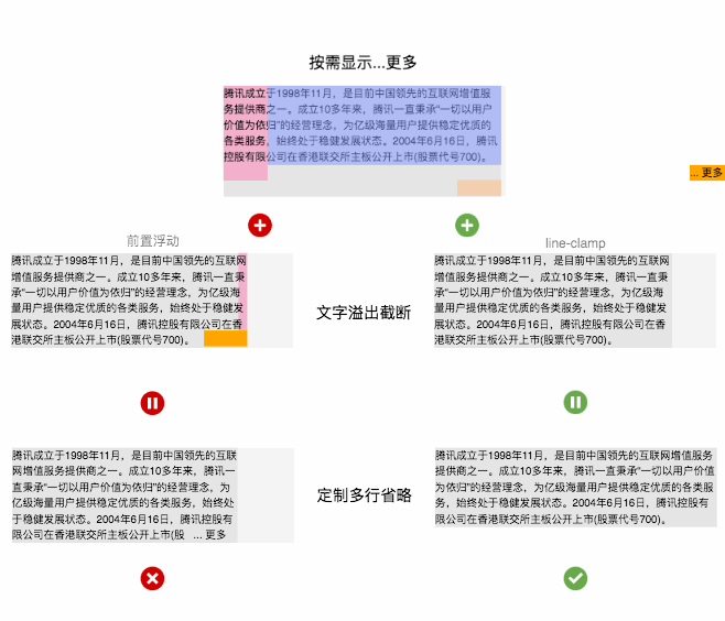
定制多行省略 = 按需显示...更多 + 文字溢出截断,按需显示...更多是用浮动特性实现,文字溢出阶段可以用前置浮动和line-clamp实现,QQ浏览器现有方案就是前置浮动,但缺点是高度固定,使用line-clamp则自适应高度,完美!限于篇幅,这里只提line-clamp的实现方案,QQ浏览器将在下阶段升级至该方案。
原理详解!
按需显示...更多
<!doctype html>
<html>
<body>
<style>
@-webkit-keyframes width-change {0%,100%{width: 320px} 50%{width:260px}}
</style>
<p style="font-size:12px;line-height: 18px;-webkit-animation: width-change 8s ease infinite;background: rgb(230, 230, 230);">
<p style="float:right;margin-left: -50px;width:100%;position:relative;background: hsla(229, 100%, 75%, 0.5);">
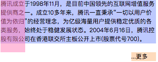
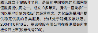
腾讯成立于1998年11月,是目前中国领先的互联网增值服务提供商之一。成立10多年来,腾讯一直秉承“一切以用户价值为依归”的经营理念,为亿级海量用户提供稳定优质的各类服务,始终处于稳健发展状态。2004年6月16日,腾讯控股有限公司在香港联交所主板公开上市(股票代号700)。
</p>
<p style="float:right;position:relative;width:50px;height: 108px;color:transparent;background: hsla(334, 100%, 75%, 0.5);">placeholder</p>
<p style="float:right;width:50px;height:18px;position: relative;background: hsla(27, 100%, 75%, 0.5);">...更多</p>
</p>
</body>
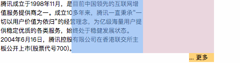
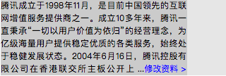
</html>利用右浮动原理——右浮动元素从右到左依次排列,不够空间则换行。蓝色块、粉色块、橙色块依次右浮动,蓝色块高度小于6行文字时,橙色块在右边,蓝色块高度大于6行文字时,左下角刚好够橙色块排列的空间,于是橙色块就到左边了
<!doctype html>
<html>
<body>
<style>
@-webkit-keyframes width-change {0%,100%{width: 320px} 50%{width:260px}}
</style>
<p style="font-size:12px;line-height: 18px;-webkit-animation: width-change 8s ease infinite;background: rgb(230, 230, 230);">
<p style="float:right;margin-left: -50px;width:100%;position:relative;background: hsla(229, 100%, 75%, 0.5);">
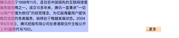
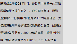
腾讯成立于1998年11月,是目前中国领先的互联网增值服务提供商之一。成立10多年来,腾讯一直秉承“一切以用户价值为依归”的经营理念,为亿级海量用户提供稳定优质的各类服务,始终处于稳健发展状态。2004年6月16日,腾讯控股有限公司在香港联交所主板公开上市(股票代号700)。
</p>
<p style="float:right;position:relative;width:50px;height: 108px;color:transparent;background: hsla(334, 100%, 75%, 0.5);">placeholder</p>
<p style="float:right;width:50px;height:18px;position: relative;background: hsla(27, 100%, 75%, 0.5);left: 100%;-webkit-transform: translate(-100%,-100%);">...更多</p>
</p>
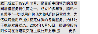
</body>
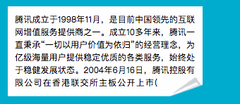
</html>进一步将橙色块偏移到正确位置就大功告成了!细心的同学会发现,将橙色块加上渐变底就是Google Plus在用的方案。
文字溢出截断
<!DOCTYPE html>
<html>
<body>
<style>
@-webkit-keyframes width-change {0%,100%{width: 320px} 50%{width:260px}}
</style>
<p style="font-size: 12px;display: -webkit-box;-webkit-box-orient: vertical;-webkit-line-clamp: 6;color: red;line-height: 18px;position: relative;-webkit-animation: width-change 8s ease infinite;background: rgb(230, 230, 230);">
<p style="color:#000;display: inline;vertical-align: top;background: rgb(204, 204, 204);">
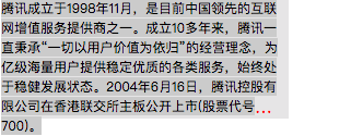
腾讯成立于1998年11月,是目前中国领先的互联网增值服务提供商之一。成立10多年来,腾讯一直秉承“一切以用户价值为依归”的经营理念,为亿级海量用户提供稳定优质的各类服务,始终处于稳健发展状态。2004年6月16日,腾讯控股有限公司在香港联交所主板公开上市(股票代号700)。</p>
</p>
</body>
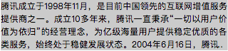
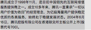
</html>-webkit-line-clamp是webkit内核的私有css属性,用于进行多行省略,在安卓和ios上全支持。但它固定使用省略号,无法直接扩展。而且自带了溢出截断逻辑,作用于容器高度。仔细考察可发现它使用的省略号是单字符…,可以用文字css属性如font-size,letter-spacing,color等控制。
<!DOCTYPE html><html><body>
<style>@-webkit-keyframes width-change {0%,100%{width: 320px} 50%{width:260px}}/*测试*/</style>
<p style="font-size: 36px;letter-spacing: 28px;display: -webkit-box;-webkit-box-orient: vertical;-webkit-line-clamp: 6;color: red;line-height: 18px;position: relative;-webkit-animation: width-change 8s ease infinite;background: rgb(230, 230, 230);">
<p style="color:#000;display: inline;font-size: 12px;vertical-align: top;letter-spacing: 0;background: rgb(204, 204, 204);">
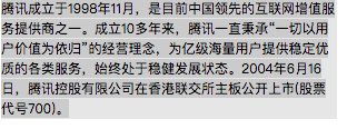
腾讯成立于1998年11月,是目前中国领先的互联网增值服务提供商之一。成立10多年来,腾讯一直秉承“一切以用户价值为依归”的经营理念,为亿级海量用户提供稳定优质的各类服务,始终处于稳健发展状态。2004年6月16日,腾讯控股有限公司在香港联交所主板公开上市(股票代号700)。
</p>
</p>
</body>
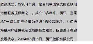
</html>设置外容器的font-size、letter-spacing、color,并在子容器里恢复就可以单独设置省略号。这里外容器设置font-size的值等于2倍行高(余下要撑开的宽度可用letter-spacing补足,也可仅用font-size撑开全部的宽度),color为transparent就可以让line-clamp既挤出文字又不截断容器高度,外容器高度达到7行而不是默认表现的6行,从而达到需要的溢出截断效果
合体!定制多行省略
<!DOCTYPE html><html><body>
<style>@-webkit-keyframes width-change {0%,100%{width: 320px} 50%{width:260px}}/*测试*/</style>
<p style="position: relative;line-height:18px;-webkit-animation: width-change 8s ease infinite;max-height: 108px;">
    <p style="font-size: 36px;letter-spacing: 28px;display: -webkit-box;-webkit-box-orient: vertical;-webkit-line-clamp: 6;color: transparent;line-height: 18px;position: relative;">
        <p style="font-size:12px;color: #000;display: inline;vertical-align: top;letter-spacing: 0;">
        腾讯成立于1998年11月,是目前中国领先的互联网增值服务提供商之一。成立10多年来,腾讯一直秉承“一切以用户价值为依归”的经营理念,为亿级海量用户提供稳定优质的各类服务,始终处于稳健发展状态。2004年6月16日,腾讯控股有限公司在香港联交所主板公开上市(股票代号700)。
        </p>
        <p style="position:absolute;top: 0;left: 50%;width: 100%;height: 100%;letter-spacing: 0;color: #000;font-size: 12px;background: rgba(173, 216, 230, 0.5);">
            <p style="float: right;width: 50%;height: 100%;background: rgba(255, 192, 203, 0.5);"></p>
            <p style="float: right;width: 50%;height: 108px;background: hsla(223, 100%, 50%, 0.19);"></p>
            <p style="float: right;width: 50px;height: 18px;position: relative;background: rgba(255, 165, 0, 0.5);" class="">... 更多</p>
        </p>
    </p>
</p>
</body></html>将-webkit-line-clamp实现的文字溢出截断代码为主体,叠加绝对定位同步的按需显示...更多结构。因为绝对定位,这里使用百分比简化代码。最外包一层结构限制最大高度。
<!DOCTYPE html><html><body>
<style>
/*
 * 行高 h
 * 最大行数 n
 * ...更多容器的宽 w
 * 字号 f
 */

@-webkit-keyframes width-change {0%,100%{width: 320px} 50%{width:260px}}
.ellipsis {
    position: relative;
    background: rgb(230, 230, 230);
    width: 260px;
    max-height: 108px; /* h*n */
    line-height: 18px; /* h */
    overflow: hidden;
    -webkit-animation: width-change 8s ease infinite;
}
.ellipsis-container {
    position: relative;
    display: -webkit-box;
    -webkit-box-orient: vertical;
    -webkit-line-clamp: 6; /* n */
    font-size: 50px; /* w */
    color: transparent;
}
.ellipsis-content {
    color: #000;
    display: inline;
    vertical-align: top;
    font-size: 12px; /* f */
}
.ellipsis-ghost {
    position:absolute;
    z-index: 1;
    top: 0;
    left: 50%;
    width: 100%;
    height: 100%;
    color: #000;
}
.ellipsis-ghost:before {
    content: "";
    display: block;
    float: right;
    width: 50%;
    height: 100%;
}
.ellipsis-placeholder {
    content: "";
    display: block;
    float: right;
    width: 50%;
    height: 108px; /* h*n */
}
.ellipsis-more {
    position: relative;
    float: right;
    font-size: 12px; /* f */
    width: 50px; /* w */
    height: 18px; /* h */
    margin-top: -18px; /* -h */
}
</style>
<p class="ellipsis">
    <p class="ellipsis-container">
        <p class="ellipsis-content">
 腾讯成立于1998年11月,是目前中国领先的互联网增值服务提供商之一。成立10多年来,腾讯一直秉承“一切以用户价值为依归”的经营理念,为亿级海量用户提供稳定优质的各类服务,始终处于稳健发展状态。2004年6月16日,腾讯控股有限公司在香港联交所主板公开上市(股票代号700)。</p>
        <p class="ellipsis-ghost">
            <p class="ellipsis-placeholder"></p>
            <p class="ellipsis-more">...更多</p>
        </p>
    </p>
</p>
</body></html>将橙色块偏移到正确位置,梳理了下代码,最终实现了自适应高度的定制多行省略,完美!从此妈妈再也不担心我在省略号后面加东西改东西了!恭喜你击败99%的同行了!
三、为什么这么做?
line-clamp有3宗罪
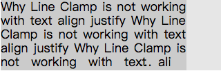
和 text-align:justify 一起用会使省略号和文字相叠
超出截断后会截掉部分行高
省略号出现在单词中间
定制省略当然某问题啦
ext-align:justify时如期所示,没问题!
截断时如期所示,也没问题!
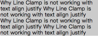
省略号在有单词时如期显示,依然没问题!
更别说点点点花样增改
简单增改文字加链接只是小case
用折角还是其他图片表示文本溢出可以增添趣味
溢出时显示溢出字数增加了实用用途
相关推荐:
Atas ialah kandungan terperinci 纯CSS定制文本省略的方法大全. Untuk maklumat lanjut, sila ikut artikel berkaitan lain di laman web China PHP!

Alat AI Hot

Undresser.AI Undress
Apl berkuasa AI untuk mencipta foto bogel yang realistik

AI Clothes Remover
Alat AI dalam talian untuk mengeluarkan pakaian daripada foto.

Undress AI Tool
Gambar buka pakaian secara percuma

Clothoff.io
Penyingkiran pakaian AI

AI Hentai Generator
Menjana ai hentai secara percuma.

Artikel Panas
Alat panas

Notepad++7.3.1
Editor kod yang mudah digunakan dan percuma

SublimeText3 versi Cina
Versi Cina, sangat mudah digunakan

Hantar Studio 13.0.1
Persekitaran pembangunan bersepadu PHP yang berkuasa

Dreamweaver CS6
Alat pembangunan web visual

SublimeText3 versi Mac
Perisian penyuntingan kod peringkat Tuhan (SublimeText3)
Topik panas
 1377
1377
 52
52

 Cara memasukkan gambar di bootstrap
Apr 07, 2025 pm 03:30 PM
Cara memasukkan gambar di bootstrap
Apr 07, 2025 pm 03:30 PM
Terdapat beberapa cara untuk memasukkan imej dalam bootstrap: masukkan imej secara langsung, menggunakan tag HTML IMG. Dengan komponen imej bootstrap, anda boleh memberikan imej yang responsif dan lebih banyak gaya. Tetapkan saiz imej, gunakan kelas IMG-cecair untuk membuat imej boleh disesuaikan. Tetapkan sempadan, menggunakan kelas IMG-Sempadan. Tetapkan sudut bulat dan gunakan kelas IMG-bulat. Tetapkan bayangan, gunakan kelas bayangan. Saiz semula dan letakkan imej, menggunakan gaya CSS. Menggunakan imej latar belakang, gunakan harta CSS imej latar belakang.
 Cara Menyiapkan Kerangka untuk Bootstrap
Apr 07, 2025 pm 03:27 PM
Cara Menyiapkan Kerangka untuk Bootstrap
Apr 07, 2025 pm 03:27 PM
Untuk menubuhkan rangka kerja bootstrap, anda perlu mengikuti langkah -langkah ini: 1. Rujuk fail bootstrap melalui CDN; 2. Muat turun dan tuan rumah fail pada pelayan anda sendiri; 3. Sertakan fail bootstrap di HTML; 4. Menyusun sass/kurang seperti yang diperlukan; 5. Import fail tersuai (pilihan). Setelah persediaan selesai, anda boleh menggunakan sistem grid Bootstrap, komponen, dan gaya untuk membuat laman web dan aplikasi yang responsif.
 Cara menggunakan butang bootstrap
Apr 07, 2025 pm 03:09 PM
Cara menggunakan butang bootstrap
Apr 07, 2025 pm 03:09 PM
Bagaimana cara menggunakan butang bootstrap? Perkenalkan CSS bootstrap untuk membuat elemen butang dan tambahkan kelas butang bootstrap untuk menambah teks butang
 Cara Menulis Garis Pecah Di Bootstrap
Apr 07, 2025 pm 03:12 PM
Cara Menulis Garis Pecah Di Bootstrap
Apr 07, 2025 pm 03:12 PM
Terdapat dua cara untuk membuat garis perpecahan bootstrap: menggunakan tag, yang mewujudkan garis perpecahan mendatar. Gunakan harta sempadan CSS untuk membuat garis perpecahan gaya tersuai.
 Cara mengubah saiz bootstrap
Apr 07, 2025 pm 03:18 PM
Cara mengubah saiz bootstrap
Apr 07, 2025 pm 03:18 PM
Untuk menyesuaikan saiz unsur-unsur dalam bootstrap, anda boleh menggunakan kelas dimensi, yang termasuk: menyesuaikan lebar: .col-, .w-, .mw-adjust ketinggian: .h-, .min-h-, .max-h-
 Cara melihat tarikh bootstrap
Apr 07, 2025 pm 03:03 PM
Cara melihat tarikh bootstrap
Apr 07, 2025 pm 03:03 PM
Jawapan: Anda boleh menggunakan komponen pemetik tarikh bootstrap untuk melihat tarikh di halaman. Langkah -langkah: Memperkenalkan rangka kerja bootstrap. Buat kotak input pemilih Tarikh dalam HTML. Bootstrap secara automatik akan menambah gaya kepada pemilih. Gunakan JavaScript untuk mendapatkan tarikh yang dipilih.
 Peranan HTML, CSS, dan JavaScript: Tanggungjawab Teras
Apr 08, 2025 pm 07:05 PM
Peranan HTML, CSS, dan JavaScript: Tanggungjawab Teras
Apr 08, 2025 pm 07:05 PM
HTML mentakrifkan struktur web, CSS bertanggungjawab untuk gaya dan susun atur, dan JavaScript memberikan interaksi dinamik. Ketiga melaksanakan tugas mereka dalam pembangunan web dan bersama -sama membina laman web yang berwarna -warni.
 Cara menggunakan bootstrap di vue
Apr 07, 2025 pm 11:33 PM
Cara menggunakan bootstrap di vue
Apr 07, 2025 pm 11:33 PM
Menggunakan bootstrap dalam vue.js dibahagikan kepada lima langkah: Pasang bootstrap. Import bootstrap di main.js. Gunakan komponen bootstrap secara langsung dalam templat. Pilihan: Gaya tersuai. Pilihan: Gunakan pemalam.
