

使用vue和react来实现展开收起等效果
Jun 05, 2018 pm 04:26 PM这篇文章主要介绍了vue和react等项目中更简单的实现展开收起更多等效果示例,具有一定的参考价值,感兴趣的小伙伴们可以参考一下
前言
本文题目中虽然写有vue和react,但是并非vue和react相关知识,而是最基本的html5和css3的一些知识,之所以写vue,是因为我最近项目中用到了类似效果,我用vue相关知识实现并不雅观,用html5和css3实现,则更加完美。
项目案例
项目中有如下效果:
好多展开收起,对于这个的实现,我一开始用了vue一些比较挫的dom操作,就是父元素toggleClass一个类名,进行子元素的显示和隐藏。
由于这个方法是通用方法,项目中好多地方使用,代码大概如下:
toggleShow() {
 let target = window.event.srcElement;
 if (target.nodeName == "SPAN") {
  target.parentNode.parentNode.classList.toggle("toggleclass");
  target.classList.toggle("el-icon-arrow-right");
 } else {
  target.parentNode.classList.toggle("toggleclass");
  target.children[0].classList.toggle("el-icon-arrow-right");
 }
}这样写,既不友好,后期又难以维护。最近重构项目的时候,把这些地方都重构了,用了今天介绍的方法!更多重构要点,请点击vue项目重构技术要点 这篇文章。
html5和css3实现展开收起
代码如下:
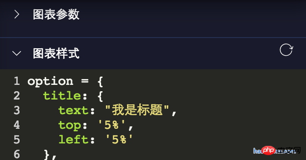
<details class="haorooms" open>
  <summary>图表参数</summary>
  <content>这里是包含的p等其他展示元素</content>
</details>
css代码
.haorooms{position:relative}
.haorooms summary{
  -webkit-user-select: none;
  -moz-user-select: none;
  -ms-user-select: none;
  user-select: none;
  outline: 0;
}
/* 自定义的三角 */
.haorooms summary::after {
  content: '';
  position: absolute;
  left:0;
  top:0;
  width: 15px; height: 15px;
  background: url(./haorooms.png) no-repeat; /* 自定义的三角图片 */
  background-size: 100% 100%;
  transition: transform .2s;
}
.haorooms:not([open]) summary::after {
  transform: rotate(90deg);
}
/* 隐藏默认三角 */
.haorooms ::-webkit-details-marker {
  display: none;
}
.haorooms ::-moz-list-bullet {
  font-size: 0;
}代码解释
html5的detail和summary本身就是一个展开收起的效果。假如不了解, 可以查看 。
隐藏默认三角如下:
.haorooms ::-webkit-details-marker {
  display: none;
}
.haorooms ::-moz-list-bullet {
  font-size: 0;
}details和summary的ui优化
张鑫旭有篇文章,对details和summary介绍的很详细
对应其UI的优化,主要有如下几个方面:
1、小三角的优化,包括颜色、隐藏、位置、替换。
2、outline轮廓的去除
小三角颜色修改
.haorooms ::-webkit-details-marker {
  color: gray;
}
.haorooms ::-moz-list-bullet {
  color: gray;
}小三角位置修改-右侧显示
.haorooms summary {
  width: -moz-fit-content;
  width: fit-content;
  direction: rtl;
}
.haorooms ::-webkit-details-marker {
  direction: ltr;
}
.haorooms ::-moz-list-bullet {
  direction: ltr;
}outline轮廓的去除
我上面用的是
-webkit-user-select: none;
    -moz-user-select: none;
    -ms-user-select: none;
    user-select: none;
outline: 0;这样对无障碍访问非常不友好,优化方案可以看张鑫旭大神的做法。
details和summary其他应用
1、更多效果
<details>
  <summary>
    <p>测试内容测试内容</p>
    <p class="more">
      <p>haorooms测试内容测试内容...</p>
    </p>
    <a>更多</a>
  </summary>
</details>css代码
::-webkit-details-marker {
  display: none;
}
::-moz-list-bullet {
  font-size: 0;
  float: left;
}
summary {
  user-select: none;
  outline: 0;
}
.more {
  display: none;
}
[open] .more {
  display: block;
}
[open] summary a {
  font-size: 0;
}
[open] summary a::before {
  content: '收起';
  font-size: 14px;
}2、悬浮菜单效果
CSS代码:
/* 隐藏默认三角 */
::-webkit-details-marker {
  display: none;
}
::-moz-list-bullet {
  font-size: 0;
  float: left;
}
summary {
  display: inline-block;
  padding: 5px 28px;
  text-indent: -15px;
  user-select: none;
  position: relative;
  z-index: 1;
}
summary::after {
  content: '';
  position: absolute;
  width: 12px; height: 12px;
  margin: 4px 0 0 .5ch;
  background: url(./arrow-on.svg) no-repeat;
  background-size: 100% 100%;
  transition: transform .2s;
}
[open] summary,
summary:hover {
  background-color: #fff;
  box-shadow: inset 1px 0 #ddd, inset -1px 0 #ddd;
}
[open] summary::after {
  transform: rotate(180deg);
}
.box {
  position: absolute;
  border: 1px solid #ddd;
  background-color: #fff;
  min-width: 100px;
  padding: 5px 0;
  margin-top: -1px;
}
.box a {
  display: block;
  padding: 5px 10px;
  color: inherit;
}
.box a:hover {
  background-color: #f0f0f0;
}
.box sup {
  position: absolute;
  color: #cd0000;
  font-size: 12px;
  margin-top: -.25em;
}HTML代码:
<p class="bar">
  <details>
    <summary>我的消息</summary>
    <p class="box">
      <a href>我的回答<sup>12</sup></a>
      <a href>我的私信</a>
      <a href>未评价订单<sup>2</sup></a>
      <a href>我的关注</a>
    </p>
  </details>
</p>
<p>这里放一段文字表明上面的是悬浮效果。</p>3、树形菜单效果
CSS代码:
/* 隐藏默认三角 */
::-webkit-details-marker {
  display: none;
}
::-moz-list-bullet {
  font-size: 0;
  float: left;
}
details {
  padding-left: 20px;
}
summary::before {
  content: '';
  display: inline-block;
  width: 12px; height: 12px;
  border: 1px solid #999;
  background: linear-gradient(to right, #999, #999) no-repeat center, linear-gradient(to top, #999, #999) no-repeat center;
  background-size: 2px 10px, 10px 2px;
  vertical-align: -2px;
  margin-right: 6px;
  margin-left: -20px;
}
[open] > summary::before {
  background: linear-gradient(to right, #999, #999) no-repeat center;
  background-size: 10px 2px;
}HTML代码:
<details>
  <summary>我的视频</summary>
  <details>
    <summary>爆肝工程师的异世界狂想曲</summary>
    <p>tv1-720p.mp4</p>
    <p>tv2-720p.mp4</p>
    ...
    <p>tv10-720p.mp4</p>
  </details>
  <details>
    <summary>七大罪</summary>
    <p>七大罪B站00合集.mp4</p>
  </details>
  <p>珍藏动漫网盘地址.txt</p>
  <p>我们的小美好.mp4</p>
</details>上面是我整理给大家的,希望今后会对大家有帮助。
相关文章:
Atas ialah kandungan terperinci 使用vue和react来实现展开收起等效果. Untuk maklumat lanjut, sila ikut artikel berkaitan lain di laman web China PHP!

Artikel Panas

Alat panas Tag

Artikel Panas

Tag artikel panas

Notepad++7.3.1
Editor kod yang mudah digunakan dan percuma

SublimeText3 versi Cina
Versi Cina, sangat mudah digunakan

Hantar Studio 13.0.1
Persekitaran pembangunan bersepadu PHP yang berkuasa

Dreamweaver CS6
Alat pembangunan web visual

SublimeText3 versi Mac
Perisian penyuntingan kod peringkat Tuhan (SublimeText3)
Topik panas


 Pertempuran praktikal: Bangunkan pemalam dalam vscode yang menyokong fail vue untuk melompat ke definisi
Nov 16, 2022 pm 08:43 PM
Pertempuran praktikal: Bangunkan pemalam dalam vscode yang menyokong fail vue untuk melompat ke definisi
Nov 16, 2022 pm 08:43 PM
Pertempuran praktikal: Bangunkan pemalam dalam vscode yang menyokong fail vue untuk melompat ke definisi
 Gunakan vue-cropper untuk memangkas imej dalam projek vue
Oct 31, 2022 pm 07:16 PM
Gunakan vue-cropper untuk memangkas imej dalam projek vue
Oct 31, 2022 pm 07:16 PM
Gunakan vue-cropper untuk memangkas imej dalam projek vue
 Mari kita bercakap secara mendalam tentang reactive() dalam vue3
Jan 06, 2023 pm 09:21 PM
Mari kita bercakap secara mendalam tentang reactive() dalam vue3
Jan 06, 2023 pm 09:21 PM
Mari kita bercakap secara mendalam tentang reactive() dalam vue3
 Penjelasan grafik terperinci tentang cara mengintegrasikan editor kod Ace dalam projek Vue
Apr 24, 2023 am 10:52 AM
Penjelasan grafik terperinci tentang cara mengintegrasikan editor kod Ace dalam projek Vue
Apr 24, 2023 am 10:52 AM
Penjelasan grafik terperinci tentang cara mengintegrasikan editor kod Ace dalam projek Vue
 Terokai cara menulis ujian unit dalam Vue3
Apr 25, 2023 pm 07:41 PM
Terokai cara menulis ujian unit dalam Vue3
Apr 25, 2023 pm 07:41 PM
Terokai cara menulis ujian unit dalam Vue3
 Analisis ringkas tentang cara mengendalikan pengecualian dalam komponen dinamik Vue3
Dec 02, 2022 pm 09:11 PM
Analisis ringkas tentang cara mengendalikan pengecualian dalam komponen dinamik Vue3
Dec 02, 2022 pm 09:11 PM
Analisis ringkas tentang cara mengendalikan pengecualian dalam komponen dinamik Vue3
 Apakah perbezaan antara komponenisasi dan modularisasi dalam vue
Dec 15, 2022 pm 12:54 PM
Apakah perbezaan antara komponenisasi dan modularisasi dalam vue
Dec 15, 2022 pm 12:54 PM
Apakah perbezaan antara komponenisasi dan modularisasi dalam vue
 Perbincangan mendalam tentang cara vite menghurai fail .env
Jan 24, 2023 am 05:30 AM
Perbincangan mendalam tentang cara vite menghurai fail .env
Jan 24, 2023 am 05:30 AM
Perbincangan mendalam tentang cara vite menghurai fail .env
