
下面我就为大家分享一篇响应式框架Bootstrap栅格系统的实例,具有很好的参考价值,希望对大家有所帮助。
实例如下:
<!DOCTYPE html>
<html>
<head lang="en">
<meta charset="UTF-8">
<title></title>
<meta name="viewport" content="width=device-width, initial-scale=1">
<link rel="stylesheet" href="css/bootstrap.min.css" rel="external nofollow" />
<script language="JavaScript" src="js/jquery-3.js"></script>
<style type="text/css">
*{
top: 0px;
padding: 0px;
text-decoration: none;
list-style-type: none;
}
.top-styl{
height: 50px;
border: 1px solid red;
background-color: #000000;
}
.img-styl{
width: 174px;
height: 50px;
background: url("imges/logo.png")no-repeat 0px 3px;
background-size: contain;
float: left;
}
.sousuo-styl{
width: 187px;
float: left;
}
.top-search-input{
width: 150px;
padding: 0 5px;
height: 30px;
border: 0;
background: #363636;
float: left;
color: #ccc;
}
.top-search-submit{
width: 30px;
height: 30px;
border: 0;
background: green url("imges/zoom.gif")center center no-repeat;
float: left;
cursor: pointer; //光标指针
}
.dao-styll{
float: left;
font-size: 16px;
width: 329px;
margin-left: 33px;
margin-top: 11px;
}
.dao-styll li{
float: left;
position: relative; //相对定位
text-align: center;
padding: 0 7px;
}
.dao-styll >li:hover{
background-color: #999;
}
.dao-styll >li >a{
color: #FFF;
width: 100%;
height: 34px;
text-decoration: none; //取消下划线
}
.dz-styl{
float: right;
margin: -19px -9px 6px 21px;
}
.imgs-styl{
padding: 11px 0px 0px 114px;
float: right;
margin: 0px -98px -3px 8px;
}
.green-styl{
color: green;
}
.zc-styl{
color: white;
}
a{
text-decoration: none;
}
</style>
</head>
<body>
<p class="container-fluid"> //fluid表示用 百分比
<p class="row"> //row 行
<p class="top-styl col-md-12"> //col-md-12 每行桌面占12列
<p class="row">
<p class=" col-md-offset-1 col-md-9"> //col-md-offset-1 列偏移1列
<p class="row">
<p class="col-md-3 col-xs-4">
<p class="img-styl"></p>
</p>
<p class="col-md-3 ">
<p class="sousuo-styl" style="padding-left: 7px; margin: 8px auto;">
<input class="top-search-input" value="" type="text"><input
class="top-search-submit" type="submit" value="" />
</p>
</p>
<p class="col-md-4 hidden-xs" style="padding: 0px">
<ul class="dao-styll">
<li class=""><a href="#" rel="external nofollow" rel="external nofollow" rel="external nofollow" rel="external nofollow" rel="external nofollow" rel="external nofollow" >风格</a>
</li>
<li class=""><a href="#" rel="external nofollow" rel="external nofollow" rel="external nofollow" rel="external nofollow" rel="external nofollow" rel="external nofollow" >造型师</a></li>
<li class=""><a href="#" rel="external nofollow" rel="external nofollow" rel="external nofollow" rel="external nofollow" rel="external nofollow" rel="external nofollow" >众分享</a>
</li>
<li class=""><a href="#" rel="external nofollow" rel="external nofollow" rel="external nofollow" rel="external nofollow" rel="external nofollow" rel="external nofollow" >我的美丽衣橱</a></li>
</ul>
</p>
<p class="col-md-2">
<p class="imgs-styl">
<img src="imges/sina.gif">
</p>
<p class="dz-styl">
<span><a href="#" rel="external nofollow" rel="external nofollow" rel="external nofollow" rel="external nofollow" rel="external nofollow" rel="external nofollow" class="green-styl">登录</a> | </span><span>
<a href="#" rel="external nofollow" rel="external nofollow" rel="external nofollow" rel="external nofollow" rel="external nofollow" rel="external nofollow" class="zc-styl">注册</a></span>
</p>
</p>
</p>
</p>
</p>
</p>
</p>
<p class="row">
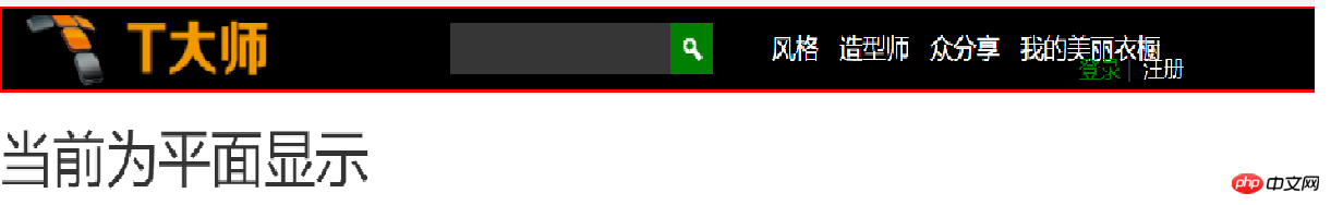
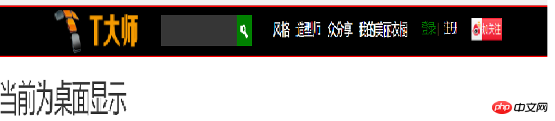
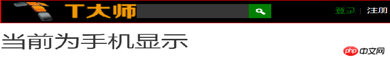
<p class="visible-md"><h1>当前为桌面显示</h1></p> //visible默认占满整行
<p class="visible-sm"><h1>当前为平面显示</h1></p>
<p class="visible-xs"><h1>当前为手机显示</h1></p>
</p>
</p>
</body>
</html>效果显示图:
上面是我整理给大家的,希望今后会对大家有帮助。
相关文章:
使用casperjs和resemble.js如何实现像素对比(详细教程)
使用async-validator如何编写Form组件(详细教程)
Atas ialah kandungan terperinci Bootstrap栅格系统(详细教程). Untuk maklumat lanjut, sila ikut artikel berkaitan lain di laman web China PHP!
 Apa yang boleh dilakukan oleh rakan TikTok?
 Platform dagangan mata wang digital
 Pengenalan kepada maksud += dalam bahasa C
 Senarai harga peringkat Douyin 1-75
 penggunaan nod induk
 Batalkan kata laluan hidupkan kuasa dalam xp
 Bagaimana untuk memotong gambar panjang pada telefon bimbit Huawei
 Perisian penciptaan laman web
 Cara menggunakan fungsi frekuensi


![[Web front-end] Permulaan pantas Node.js](https://img.php.cn/upload/course/000/000/067/662b5d34ba7c0227.png)


