
 Web Front-end
HTML Tutorial
CSS3 image flip switching case and analysis of important attributes
Web Front-end
HTML Tutorial
CSS3 image flip switching case and analysis of important attributes
CSS3 image flip switching case and analysis of important attributes

Image flip switching, without using CSS3, generally use JS to implement animation, and simultaneously operate the width and left, or height and top of the element to simulate the flip effect, and change the src or z-index when appropriate. Picture switching.
I accidentally discovered the CSS3 solution, http://www.webhek.com/css-flip/. Learn it quickly and summarize it as follows
First upload the code (most of them are copied from the above link, there are big compatibility issues, use with caution)
HTML:
<span style="color: #0000ff;"><</span><span style="color: #800000;">div </span><span style="color: #ff0000;">class</span><span style="color: #0000ff;">="flip-container"</span><span style="color: #0000ff;">></span>
    <span style="color: #0000ff;"><</span><span style="color: #800000;">div </span><span style="color: #ff0000;">class</span><span style="color: #0000ff;">="flipper"</span><span style="color: #0000ff;">></span>
        <span style="color: #0000ff;"><</span><span style="color: #800000;">div </span><span style="color: #ff0000;">class</span><span style="color: #0000ff;">="front"</span><span style="color: #0000ff;">></span>here is content : AA<span style="color: #0000ff;"></</span><span style="color: #800000;">div</span><span style="color: #0000ff;">></span>
        <span style="color: #0000ff;"><</span><span style="color: #800000;">div </span><span style="color: #ff0000;">class</span><span style="color: #0000ff;">="back"</span><span style="color: #0000ff;">></span>here is content : BB<span style="color: #0000ff;"></</span><span style="color: #800000;">div</span><span style="color: #0000ff;">></span>
    <span style="color: #0000ff;"></</span><span style="color: #800000;">div</span><span style="color: #0000ff;">></span>
<span style="color: #0000ff;"></</span><span style="color: #800000;">div</span><span style="color: #0000ff;">></span> CSS:
<span style="color: #800000;">.flip-container </span>{<span style="color: #ff0000;">
    margin</span>:<span style="color: #0000ff;"> 30px</span>;<span style="color: #ff0000;">
    display</span>:<span style="color: #0000ff;"> inline-block</span>;<span style="color: #ff0000;">
    border</span>:<span style="color: #0000ff;"> 1px solid #aaa</span>;<span style="color: #ff0000;">
    -webkit-perspective</span>:<span style="color: #0000ff;"> 500</span>;<span style="color: #ff0000;">
    -moz-perspective</span>:<span style="color: #0000ff;"> 500</span>;<span style="color: #ff0000;">
    -ms-perspective</span>:<span style="color: #0000ff;"> 500</span>;<span style="color: #ff0000;">
    perspective</span>:<span style="color: #0000ff;"> 500</span>;<span style="color: #ff0000;">
    -ms-transform</span>:<span style="color: #0000ff;"> perspective(500px)</span>;<span style="color: #ff0000;">
    -moz-transform</span>:<span style="color: #0000ff;"> perspective(500px)</span>; <span style="color: #008000;">/*</span><span style="color: #008000;">重要</span><span style="color: #008000;">*/</span><span style="color: #ff0000;">
    transform-style</span>:<span style="color: #0000ff;"> preserve-3d</span>; <span style="color: #008000;">/*</span><span style="color: #008000;">重要</span><span style="color: #008000;">*/</span>
}<span style="color: #800000;">
.flipper </span>{<span style="color: #ff0000;">
    position</span>:<span style="color: #0000ff;"> relative</span>;<span style="color: #ff0000;">
    width</span>:<span style="color: #0000ff;"> 200px</span>;<span style="color: #ff0000;">
    height</span>:<span style="color: #0000ff;"> 200px</span>;<span style="color: #ff0000;">
    transition</span>:<span style="color: #0000ff;"> 0.6s</span>;<span style="color: #ff0000;">
    transform-style</span>:<span style="color: #0000ff;"> preserve-3d</span>; <span style="color: #008000;">/*</span><span style="color: #008000;">重要</span><span style="color: #008000;">*/</span>
}
<span style="color: #008000;">/*</span><span style="color: #008000;"> 触发翻转 </span><span style="color: #008000;">*/</span><span style="color: #800000;">
.flip-container:hover .flipper</span>{<span style="color: #ff0000;">
    transform</span>:<span style="color: #0000ff;"> rotateY(180deg)</span>;

}<span style="color: #800000;">
.front ,.back</span>{<span style="color: #ff0000;">
    position</span>:<span style="color: #0000ff;"> absolute</span>;<span style="color: #ff0000;">
    left</span>:<span style="color: #0000ff;"> 0</span>;<span style="color: #ff0000;">
    top</span>:<span style="color: #0000ff;"> 0</span>;<span style="color: #ff0000;">
    backface-visibility</span>:<span style="color: #0000ff;"> hidden</span>;  <span style="color: #008000;">/*</span><span style="color: #008000;">重要</span><span style="color: #008000;">*/</span><span style="color: #ff0000;">
    width</span>:<span style="color: #0000ff;"> 100%</span>;<span style="color: #ff0000;">
    height</span>:<span style="color: #0000ff;"> 100%</span>;
}<span style="color: #800000;">
.front </span>{<span style="color: #ff0000;">
    transform</span>:<span style="color: #0000ff;"> rotateY(0deg)</span>;<span style="color: #ff0000;">
    z-index</span>:<span style="color: #0000ff;"> 2</span>;<span style="color: #ff0000;">
    background</span>:<span style="color: #0000ff;"> red</span>;
}<span style="color: #800000;">
.back </span>{<span style="color: #ff0000;">
    transform</span>:<span style="color: #0000ff;"> rotateY(-180deg)</span>;<span style="color: #ff0000;">
    background</span>:<span style="color: #0000ff;"> green</span>;
}- Set the perspective attribute of the entire animation area on the outermost container element.
- When the outer container element encounters a mouseover event, the container storing the card inside rotates 180 degrees. This is also where the rotation speed is controlled. If you set the rotation value to -180deg, it is reverse rotation.
- means that the elements on the front and back of the card must be absolutely positioned so that they block each other in the same position. Their backface-visibility property is set to hidden so that the back of each card is not visible when flipped.
- Set the front of the card to a higher z-index value than the back, so that the front of the card is on top.
- Rotate the back card 180 degrees so that it plays the role of the back.
End of copying, there are important comments in CSS that require special attention.
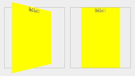
Theperspective property defines the distance of the 3D element from the view, in pixels. The intuitive phenomenon is that the inner element will overflow the outer border when flipped. If it is not written, or the attribute value is 0, it will only change within the outer border.
And special attention needs to be paid to the attribute value to adapt to the width and height of the element that needs to be flipped. Too little will overflow and it will be exaggerated. Too much will have little difference from setting it to 0. The difference effect is shown in the picture below
transform-style: preserve-3d; The transform-style attribute specifies how to render nested elements in 3D space (copied from w3cschool).
Both flip-container and flipper need to be set. If flip-container is not set, the overflow 3D effect will be missing. If flipper is not set, after the container is flipped, we will still see the back of the front. Backface-visibility: hidden cannot reflect the effect.
What’s more annoying is that transform-style is not supported even in IE11.
So there is another solution that is compatible with IE, which is not to flip the container, but to flip the front and back at the same time. Fortunately, IE still supports backface-visibility: hidden, so the flipping effect is the same as the previous solution.
HTML is as follows:
<span style="color: #0000ff;"><</span><span style="color: #800000;">div </span><span style="color: #ff0000;">class</span><span style="color: #0000ff;">="flip-container"</span><span style="color: #0000ff;">></span>
    <span style="color: #0000ff;"><</span><span style="color: #800000;">div </span><span style="color: #ff0000;">class</span><span style="color: #0000ff;">="front"</span><span style="color: #0000ff;">></span>here is content : AA<span style="color: #0000ff;"></</span><span style="color: #800000;">div</span><span style="color: #0000ff;">></span>
    <span style="color: #0000ff;"><</span><span style="color: #800000;">div </span><span style="color: #ff0000;">class</span><span style="color: #0000ff;">="back"</span><span style="color: #0000ff;">></span>here is content : BB<span style="color: #0000ff;"></</span><span style="color: #800000;">div</span><span style="color: #0000ff;">></span>
<span style="color: #0000ff;"></</span><span style="color: #800000;">div</span><span style="color: #0000ff;">></span> Since the front and back are flipped directly, the flipper becomes redundant and the flipper is removed.
The CSS code is as follows (after many tests, we tried our best to support various browsers, and downgraded browsers that did not support CSS3 flip, retaining the switching effect)
<span style="color: #800000;">.flip-container </span>{<span style="color: #ff0000;">
    -webkit-perspective</span>:<span style="color: #0000ff;"> 500</span>;<span style="color: #ff0000;">
    -moz-perspective</span>:<span style="color: #0000ff;"> 500</span>;<span style="color: #ff0000;">
    -ms-perspective</span>:<span style="color: #0000ff;"> 500</span>;<span style="color: #ff0000;">
    perspective</span>:<span style="color: #0000ff;"> 500</span>;<span style="color: #ff0000;">
    -ms-transform</span>:<span style="color: #0000ff;"> perspective(500px)</span>;<span style="color: #ff0000;">
    -moz-transform</span>:<span style="color: #0000ff;"> perspective(500px)</span>;<span style="color: #ff0000;">
    -moz-transform-style</span>:<span style="color: #0000ff;"> preserve-3d</span>;<span style="color: #ff0000;">
    -ms-transform-style</span>:<span style="color: #0000ff;"> preserve-3d</span>;<span style="color: #ff0000;">
    margin</span>:<span style="color: #0000ff;"> 30px</span>;<span style="color: #ff0000;">
    display</span>:<span style="color: #0000ff;"> inline-block</span>;<span style="color: #ff0000;">
    border</span>:<span style="color: #0000ff;"> 1px solid #aaa</span>;<span style="color: #ff0000;">
    position</span>:<span style="color: #0000ff;"> relative</span>;
}
<span style="color: #008000;">/*</span><span style="color: #008000;">由于内层绝对定位导致高度缺少,这里显式设置了宽高</span><span style="color: #008000;">*/</span><span style="color: #800000;">
.flip-container, .front, .back </span>{<span style="color: #ff0000;">
    width</span>:<span style="color: #0000ff;"> 200px</span>;<span style="color: #ff0000;">
    height</span>:<span style="color: #0000ff;"> 200px</span>;
}<span style="color: #800000;">

.flip-container:hover .front </span>{<span style="color: #ff0000;">
    -webkit-transform</span>:<span style="color: #0000ff;"> rotateY(180deg)</span>;<span style="color: #ff0000;">
    -moz-transform</span>:<span style="color: #0000ff;"> rotateY(180deg)</span>;<span style="color: #ff0000;">
    -o-transform</span>:<span style="color: #0000ff;"> rotateY(180deg)</span>;<span style="color: #ff0000;">
    -ms-transform</span>:<span style="color: #0000ff;"> rotateY(180deg)</span>;<span style="color: #ff0000;">
    transform</span>:<span style="color: #0000ff;"> rotateY(180deg)</span>;
}<span style="color: #800000;">
.flip-container:hover .back </span>{<span style="color: #ff0000;">
    -webkit-transform</span>:<span style="color: #0000ff;"> rotateY(0deg)</span>;<span style="color: #ff0000;">
    -moz-transform</span>:<span style="color: #0000ff;"> rotateY(0deg)</span>;<span style="color: #ff0000;">
    -o-transform</span>:<span style="color: #0000ff;"> rotateY(0deg)</span>;<span style="color: #ff0000;">
    -ms-transform</span>:<span style="color: #0000ff;"> rotateY(0deg)</span>;<span style="color: #ff0000;">
    transform</span>:<span style="color: #0000ff;"> rotateY(0deg)</span>;<span style="color: #ff0000;">
    z-index</span>:<span style="color: #0000ff;"> 3</span>; <span style="color: #008000;">/*</span><span style="color: #008000;"> 降级处理不支持CSS3的浏览器,只是简单的将back上升盖住front </span><span style="color: #008000;">*/</span>
}<span style="color: #800000;">

.front, .back </span>{<span style="color: #ff0000;">
    -webkit-backface-visibility</span>:<span style="color: #0000ff;"> hidden</span>;<span style="color: #ff0000;">
    -moz-backface-visibility</span>:<span style="color: #0000ff;"> hidden</span>;<span style="color: #ff0000;">
    -ms-backface-visibility</span>:<span style="color: #0000ff;"> hidden</span>;<span style="color: #ff0000;">
    backface-visibility</span>:<span style="color: #0000ff;"> hidden</span>;<span style="color: #ff0000;">
    -webkit-transition</span>:<span style="color: #0000ff;"> 0.6s</span>;<span style="color: #ff0000;">
    -moz-transition</span>:<span style="color: #0000ff;"> 0.6s</span>;<span style="color: #ff0000;">
    -o-transition</span>:<span style="color: #0000ff;"> 0.6s</span>;<span style="color: #ff0000;">
    -ms-transition</span>:<span style="color: #0000ff;"> 0.6s</span>;<span style="color: #ff0000;">
    transition</span>:<span style="color: #0000ff;"> 0.6s</span>;<span style="color: #ff0000;">
    position</span>:<span style="color: #0000ff;"> absolute</span>;<span style="color: #ff0000;">
    top</span>:<span style="color: #0000ff;"> 0px</span>;<span style="color: #ff0000;">
    left</span>:<span style="color: #0000ff;"> 0px</span>;
}<span style="color: #800000;">
.front </span>{<span style="color: #ff0000;">
    background</span>:<span style="color: #0000ff;"> red</span>;<span style="color: #ff0000;">
    z-index</span>:<span style="color: #0000ff;"> 2</span>;
}<span style="color: #800000;">
.back </span>{<span style="color: #ff0000;">
    background</span>:<span style="color: #0000ff;"> green</span>;<span style="color: #ff0000;">
    -webkit-transform</span>:<span style="color: #0000ff;"> rotateY(-180deg)</span>;<span style="color: #ff0000;">
    -moz-transform</span>:<span style="color: #0000ff;"> rotateY(-180deg)</span>;<span style="color: #ff0000;">
    -o-transform</span>:<span style="color: #0000ff;"> rotateY(-180deg)</span>;<span style="color: #ff0000;">
    -ms-transform</span>:<span style="color: #0000ff;"> rotateY(-180deg)</span>;<span style="color: #ff0000;">
    transform</span>:<span style="color: #0000ff;"> rotateY(-180deg)</span>;
}There may be a lot of unnecessary compatibility code in the above, and the level is limited. Welcome to exchange more concise writing methods.
There is also a little TIPS. When using hover to trigger element flipping in other situations, you should use it as follows. The parent element with fixed width and height triggers, and the child element flips
<span style="color: #800000;">.outer </span>{<span style="color: #ff0000;">
    width</span>:<span style="color: #0000ff;"> 200px</span>;<span style="color: #ff0000;">
    height</span>:<span style="color: #0000ff;"> 200px</span>;
}<span style="color: #800000;">
.inner </span>{<span style="color: #ff0000;">
    transition</span>:<span style="color: #0000ff;"> 0.6s</span>;
}<span style="color: #800000;">
.outer:hover .inner</span>{<span style="color: #ff0000;">
    transform</span>:<span style="color: #0000ff;"> rotateY(180deg)</span>;
}Triggering the flip directly on the element hover as follows will have a big usage problem, because during the flipping process of the element, the element area becomes smaller and the cursor is separated from the element, so the element is restored and the hover is triggered to become smaller, causing unsmoothness
<span style="color: #800000;">.inner </span>{<span style="color: #ff0000;">
    width</span>:<span style="color: #0000ff;"> 200px</span>;<span style="color: #ff0000;">
    height</span>:<span style="color: #0000ff;"> 200px</span>;<br>  transition: 0.6s;
}<span style="color: #800000;">
.inner:hover</span>{<span style="color: #ff0000;">
    transform</span>:<span style="color: #0000ff;"> rotateY(180deg)</span>;
}
Hot AI Tools

Undresser.AI Undress
AI-powered app for creating realistic nude photos

AI Clothes Remover
Online AI tool for removing clothes from photos.

Undress AI Tool
Undress images for free

Clothoff.io
AI clothes remover

Video Face Swap
Swap faces in any video effortlessly with our completely free AI face swap tool!

Hot Article
Hot Tools

Notepad++7.3.1
Easy-to-use and free code editor

SublimeText3 Chinese version
Chinese version, very easy to use

Zend Studio 13.0.1
Powerful PHP integrated development environment

Dreamweaver CS6
Visual web development tools

SublimeText3 Mac version
God-level code editing software (SublimeText3)
Hot Topics
 1670
1670
 14
1428
52
1329
25
1276
29
1256
24
14
1428
52
1329
25
1276
29
1256
24

 HTML: The Structure, CSS: The Style, JavaScript: The Behavior
Apr 18, 2025 am 12:09 AM
HTML: The Structure, CSS: The Style, JavaScript: The Behavior
Apr 18, 2025 am 12:09 AM
The roles of HTML, CSS and JavaScript in web development are: 1. HTML defines the web page structure, 2. CSS controls the web page style, and 3. JavaScript adds dynamic behavior. Together, they build the framework, aesthetics and interactivity of modern websites.
 The Future of HTML, CSS, and JavaScript: Web Development Trends
Apr 19, 2025 am 12:02 AM
The Future of HTML, CSS, and JavaScript: Web Development Trends
Apr 19, 2025 am 12:02 AM
The future trends of HTML are semantics and web components, the future trends of CSS are CSS-in-JS and CSSHoudini, and the future trends of JavaScript are WebAssembly and Serverless. 1. HTML semantics improve accessibility and SEO effects, and Web components improve development efficiency, but attention should be paid to browser compatibility. 2. CSS-in-JS enhances style management flexibility but may increase file size. CSSHoudini allows direct operation of CSS rendering. 3.WebAssembly optimizes browser application performance but has a steep learning curve, and Serverless simplifies development but requires optimization of cold start problems.
 The Future of HTML: Evolution and Trends in Web Design
Apr 17, 2025 am 12:12 AM
The Future of HTML: Evolution and Trends in Web Design
Apr 17, 2025 am 12:12 AM
The future of HTML is full of infinite possibilities. 1) New features and standards will include more semantic tags and the popularity of WebComponents. 2) The web design trend will continue to develop towards responsive and accessible design. 3) Performance optimization will improve the user experience through responsive image loading and lazy loading technologies.
 HTML: Building the Structure of Web Pages
Apr 14, 2025 am 12:14 AM
HTML: Building the Structure of Web Pages
Apr 14, 2025 am 12:14 AM
HTML is the cornerstone of building web page structure. 1. HTML defines the content structure and semantics, and uses, etc. tags. 2. Provide semantic markers, such as, etc., to improve SEO effect. 3. To realize user interaction through tags, pay attention to form verification. 4. Use advanced elements such as, combined with JavaScript to achieve dynamic effects. 5. Common errors include unclosed labels and unquoted attribute values, and verification tools are required. 6. Optimization strategies include reducing HTTP requests, compressing HTML, using semantic tags, etc.
 HTML vs. CSS vs. JavaScript: A Comparative Overview
Apr 16, 2025 am 12:04 AM
HTML vs. CSS vs. JavaScript: A Comparative Overview
Apr 16, 2025 am 12:04 AM
The roles of HTML, CSS and JavaScript in web development are: HTML is responsible for content structure, CSS is responsible for style, and JavaScript is responsible for dynamic behavior. 1. HTML defines the web page structure and content through tags to ensure semantics. 2. CSS controls the web page style through selectors and attributes to make it beautiful and easy to read. 3. JavaScript controls web page behavior through scripts to achieve dynamic and interactive functions.
 HTML vs. CSS and JavaScript: Comparing Web Technologies
Apr 23, 2025 am 12:05 AM
HTML vs. CSS and JavaScript: Comparing Web Technologies
Apr 23, 2025 am 12:05 AM
HTML, CSS and JavaScript are the core technologies for building modern web pages: 1. HTML defines the web page structure, 2. CSS is responsible for the appearance of the web page, 3. JavaScript provides web page dynamics and interactivity, and they work together to create a website with a good user experience.
 HTML: Is It a Programming Language or Something Else?
Apr 15, 2025 am 12:13 AM
HTML: Is It a Programming Language or Something Else?
Apr 15, 2025 am 12:13 AM
HTMLisnotaprogramminglanguage;itisamarkuplanguage.1)HTMLstructuresandformatswebcontentusingtags.2)ItworkswithCSSforstylingandJavaScriptforinteractivity,enhancingwebdevelopment.
 What is the difference between <strong>, <b> tags and <em>, <i> tags?
Apr 28, 2025 pm 05:42 PM
What is the difference between <strong>, <b> tags and <em>, <i> tags?
Apr 28, 2025 pm 05:42 PM
The article discusses the differences between HTML tags , , , and , focusing on their semantic vs. presentational uses and their impact on SEO and accessibility.
