In CSS 3, the CSS Flexible Box module is a very important module, which is used to implement page layout processing in a very flexible way.
Although other CSS style attributes can be used to implement page layout processing, if you use the flexible box layout technology defined in the CSS Flexible Box module, you can automatically adjust the display mode of each local area in the page according to the screen size or browser window size. That is to achieve very flexible layout processing.
Although the CSS Flexible Box module has been announced for several years, the content defined in the module has undergone several major revisions since its initial release. The official version currently announced is ◦CSS Flexible Box Layout Module - W3C Candidate Recommendation, 18 September 2012.
So far, browsers from Opera 12.10 and above, IE 11 and above, Chrome 21 and above, and Firefox 22 and above all support this latest version.
Start learning the latest version of flexbox layout from the sample page
Next, start learning the latest version of flexbox layout from a sample page. The code in the body element in this example page is as follows.
<body>
<div id="main">
    <div class="content">
        <section>
            <h1>section 1</h1>
            <p>示例文字</p>
        </section>
        <section>
            <h1>section 2</h1>
            <p>示例文字</p>
        </section>
        <section>
            <h1>section 3</h1>
            <p>示例文字</p>
        </section>
        <section>
            <h1>section 4</h1>
            <p>示例文字</p>
        </section>
    </div>
    <div class="content">
        <section>
            <h1>section 5</h1>
            <p>示例文字</p>
            <section>
                <h1>section 6</h1>
                <p>示例文字</p>
            </section>
            <section>
                <h1>section 7</h1>
                <p>示例文字</p>
            </section>
            <section>
                <h1>section 8</h1>
                <p>示例文字</p>
            </section>
    </div>
    <div class="content">
        <section>
            <h1>section 9</h1>
            <p>示例文字</p>
        </section>
        <section>
            <h1>section 10</h1>
            <p>示例文字</p>
        </section>
        <section>
            <h1>section 11</h1>
            <p>示例文字</p>
        </section>
        <section>
            <h1>section 12</h1>
            <p>示例文字</p>
        </section>
    </div>
</div>
</body>Next, first specify the border style for each div element and section element in the page. The code is as follows.
<style>
#main {
    border: 1px dotted #f0f;
    padding: 1em;
}
.content {
    border: 1px dotted #0ff;
    padding: 1em;
}
section {
    border: 1px dotted #f00;
    padding: 1em;
}
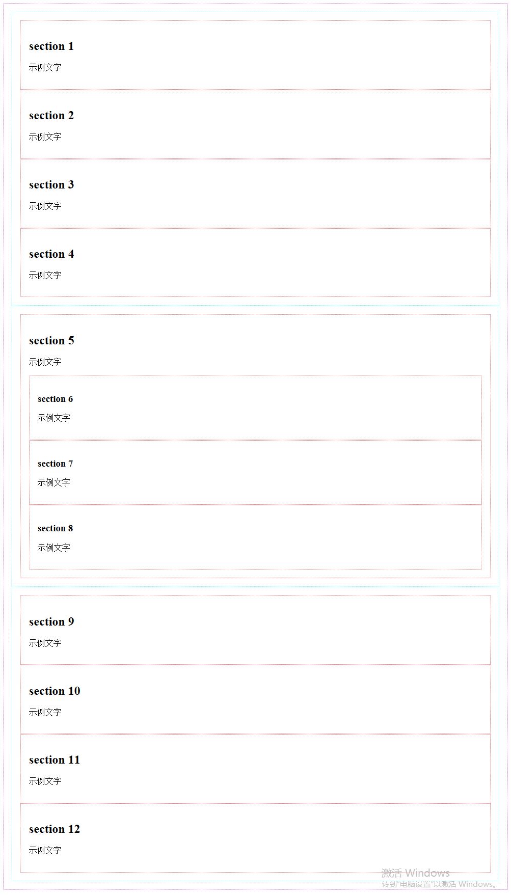
</style>Open the sample page so far in the browser. The elements on the page are arranged vertically from top to bottom, as shown in the figure below.
Use the flex box layout on the sample page
The way to specify the flex box layout is to use the display:flex; style attribute on the container element of the element that needs to be laid out. In the CSS Flexible Box module, each element in the container element is called a "Flex item", and the container element is called a "Flex container".
One of the main differences between flexible box layout and layout using float and other style attributes is that when using float and other style attributes, you need to specify style attributes for each element in the container. When using flexible box layout, you only need to Specify style attributes on container elements.
Next, we first use flexible box layout for all div elements with the style class name content. The container elements of these div elements are div elements with the id attribute value as main. Modify the style code of this element as follows:
#main {
    border: 1px dotted #f0f;
    padding: 1em;
    display: flex;
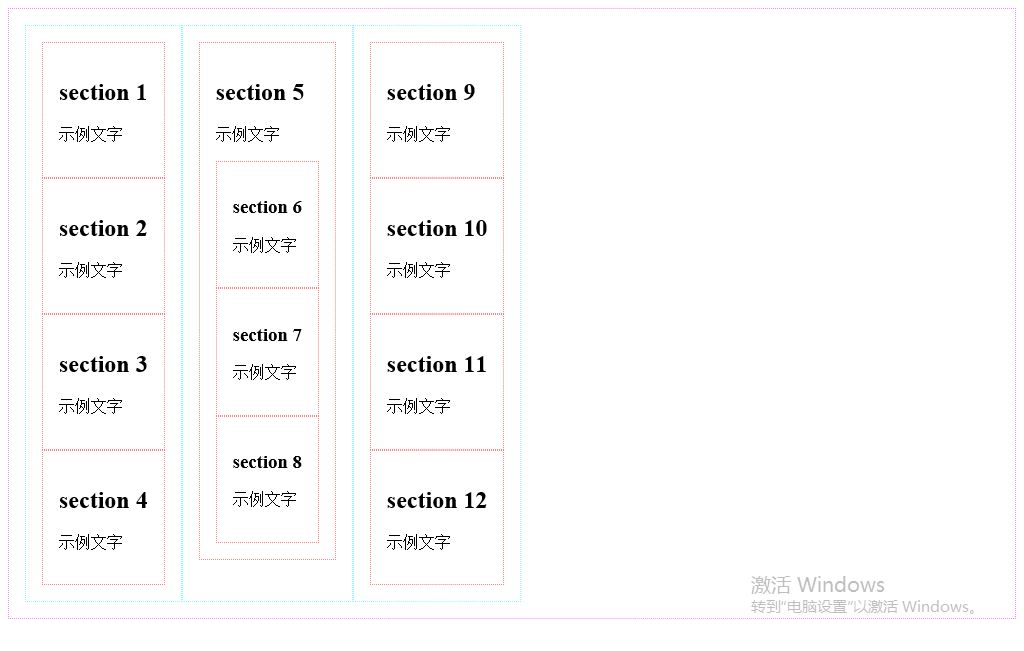
}Open the sample page in the browser, and the arrangement of all div elements with the style class name content in the page is modified to horizontal arrangement, as shown in the figure below.
Set the arrangement direction of elements
You can control the arrangement direction of all sub-elements in the container by using the flex-direction style attribute. The specified values are as follows.
row: horizontal arrangement (default value)
row-reverse: horizontal reverse arrangement
column: vertical arrangement
column-reverse: vertical reverse arrangement
Modify the style code of the div element whose id attribute value is main As shown below:
#main {
    border: 1px dotted #f0f;
    padding: 1em;
    display: flex;
    flex-direction: row-reverse;
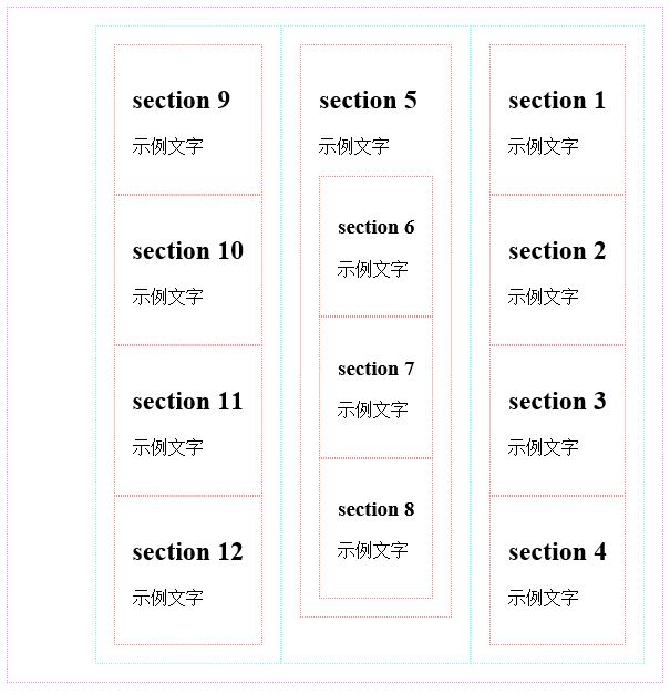
}Open the sample page in the browser. The arrangement of all div elements with the style class name content on the page is modified to start from the right end of the container element, that is, the div element with the id attribute value as main. arranged as shown in the figure below.
Next, first restore the arrangement of all div elements with the style class name content to horizontal and forward arrangement, and modify the style code of the div element with the id attribute value as main as follows:
#main {
    border: 1px dotted #f0f;
    padding: 1em;
    display: flex;
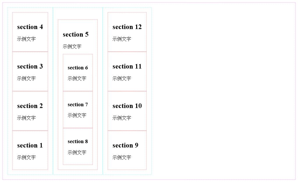
}Then adjust all styles The div element with the class name content specifies the flex-direction: column-reverse; style attribute. The code is as follows:
.content {
    border: 1px dotted #0ff;
    padding: 1em;
    display: flex;
    flex-direction: column-reverse;
}Open the sample page in the browser, and the arrangement of all section sub-elements of all content div elements in the page It is modified to be arranged vertically in reverse direction (excluding the section grandchild elements in the section sub-element), as shown in the figure below.
使用order样式属性指定排列顺序
使用弹性盒布局的时候,可以通过order属性来改变各元素的显示顺序。可以在每个元素的样式中加入order属性,该属性使用一个表示序号的整数属性值,浏览器在显示的时候根据该序号从小到大来显示这些元素。
接下来首先设置所有样式类名为content的div元素的所有section子元素的排列方式为纵向正向排列,修改所有样式类名为content的div元素的样式代码如下所示:
.content {
    border: 1px dotted #0ff;
    padding: 1em;
    display: flex;
    flex-direction: column;
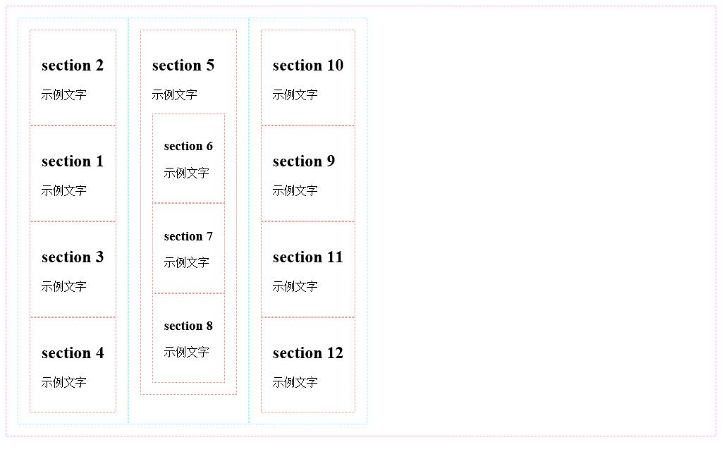
}接下来通过将所有样式类名为content的div元素中的第2个section子元素的order样式属性值设置为-1的方法设置这些section子元素被优先显示在其他section子元素之前,代码如下所示:
.content section:nth-child(2) {
    order: -1;
}在浏览器中打开示例页面,页面中所有样式类名为content的div元素中的第2个section子元素被显示在其他section子元素之前,如下图所示。
设置元素宽度及高度
接下来首先介绍如何设置被横向排列的每一个元素的宽度。
可以通过flex属性值的使用使所有子元素的总宽度等于容器宽度。
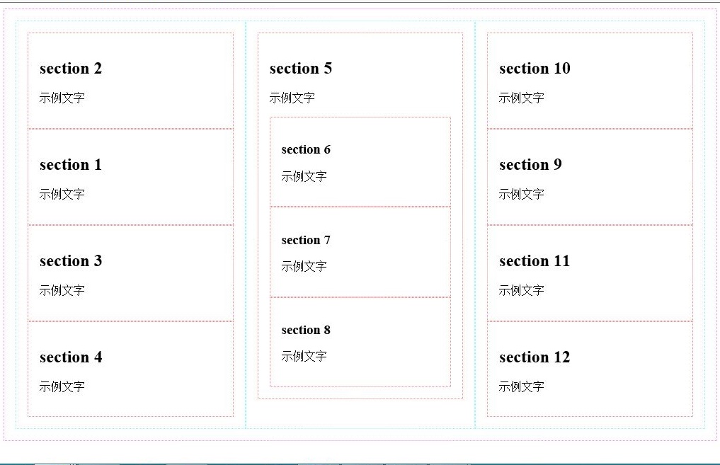
接下来通过将所有样式类名为content的div元素的flex属性值设置为1的方法使所有样式类名为content的div元素的总宽度等于容器元素,即id属性值为main的div元素的宽度,代码如下所示。当所有样式类名为content的div元素的flex属性值都被设置为1时,这些div元素的宽度均等。
.content {
    border: 1px dotted #0ff;
    padding: 1em;
    display: flex;
    flex-direction: column;
    flex:1;
}在浏览器中打开示例页面,所有样式类名为content的div元素的宽度自动增长,这些元素的总宽度等于容器元素,即id属性值为main的div元素的宽度,每一个样式类名为content的div元素的宽度均等,如下图所示。
接下来,我们设置第二个样式类名为content的div元素的flex属性值为2,代码如下所示。
.content:nth-child(2) {
    flex:2;
}为了更清晰地计算元素宽度,我们取消所有元素的边框设置及内边距设置,修改后的完整样式代码如下所示。
<style>
#main {
    display: flex;
}
.content {
    display: flex;
    flex-direction: column;
    flex:1;
}
.content section:nth-child(2) {
    order: -1;
}
.content:nth-child(2) {
    flex:2;
}
</style>在浏览器中打开示例页面,第二个样式类名为content的div元素宽度为其他样式类名为content的div元素宽度的两倍,假设这些元素的容器元素,即id属性值为main的div元素的宽度等于600px,则第一个与第三个样式类名为content的div元素宽度的宽度均等于150px,第二个样式类名为content的div元素宽度的宽度等于300px。
可以使用flex-grow属性来指定元素宽度,但是该样式属性对于元素宽度的计算方法与flex样式属性对于元素宽度的计算方法有所不同。
接下来指定所有样式类名为content的div元素的flex-grow样式属性值为1,宽度为150px,指定第二个样式类名为content的div元素的flex-grow样式属性值为为3。修改后的完整样式代码如下所示。
<style>
#main {
    display: flex;
}
.content {
    display: flex;
    flex-direction: column;
    width:150px;
    flex-grow:1;
}
.content section:nth-child(2) {
    order: -1;
}
.content:nth-child(2) {
    flex-grow:3;
}
</style>在浏览器中打开示例页面,假设这些元素的容器元素,即id属性值为main的div元素的宽度等于600,则第一个与第三个样式类名为content的div元素宽度的宽度均等于180px,第二个样式类名为content的div元素宽度的宽度等于240px。对于每个样式类名为content的div元素宽度的计算步骤如下所示:
600(容器宽度)-150*3(三个样式类名为content的div元素宽度的总宽度)=150
150/5(三个样式类名为content的div元素宽度的flex-grow样式属性值的总和)=30
第一个与第三个样式类名为content的div元素宽度的宽度均等于150(其width样式属性值+)+30*1(其flew-grow样式属性值)=180px
第二个样式类名为content的div元素宽度的宽度等于150(其width样式属性值+)+30*3(其flew-grow样式属性值)=240px
可以使用flex-shrink属性来指定元素宽度,该样式属性与flex-grow样式属性的区别在于:当子元素的width样式属性值的总和小于容器元素的宽度值时,必须通过flex-grow样式属性来调整子元素宽度,当子元素的width样式属性值的总和大于容器元素的宽度值时,必须通过flex-shrink样式属性来调整子元素宽度。
接下来指定所有样式类名为content的div元素的flex-shrink样式属性值为1,宽度为250px,指定第二个样式类名为content的div元素的flex-shrink样式属性值为为3。修改后的完整样式代码如下所示。
<style>
#main {
    display: flex;
}
.content {
    display: flex;
    flex-direction: column;
    width:250px;
    flex-shrink:1;
}
.content section:nth-child(2) {
    order: -1;
}
.content:nth-child(2) {
    flex-shrink:3;
}
</style>在浏览器中打开示例页面,假设这些元素的容器元素,即id属性值为main的div元素的宽度等于600,则第一个与第三个样式类名为content的div元素宽度的宽度均等于220px,第二个样式类名为content的div元素宽度的宽度等于160px。对于每个样式类名为content的div元素宽度的计算步骤如下所示:
250*3(三个样式类名为content的div元素宽度的总宽度)-600(容器宽度)=150
150/5(三个样式类名为content的div元素宽度的flex-shrink样式属性值的总和)=30
第一个与第三个样式类名为content的div元素宽度的宽度均等于250(其width样式属性值+)-30*1(其flew-shrink样式属性值)=220px
第二个样式类名为content的div元素宽度的宽度等于250(其width样式属性值+)-30*3(其flew-grow样式属性值)=160px
在使用flex-grow样式属性或flex-shrink样式属性调整子元素宽度时,也可以使用flex-basis样式属性指定调整前的子元素宽度,该样式属性与width样式属性的作用完全相同。
可以将flex-grow、flex-shrink以及flex-basis样式属性值合并写入flex样式属性中,方法如下所示。
flex:flex-grow样式属性值 flex-shrink样式属性值 flex-basis样式属性值;
在使用flex样式属性值时,flex-grow、flex-shrink以及flex-basis样式属性值均为可选用样式属性值,当不指定flex-grow、flex-shrink样式属性值时,默认样式属性值均为1,当不指定flex-basis样式属性值时,默认样式属性值为0px。
修改本示例中的样式代码如下所示:
<style>
#main {
    display: flex;
}
.content {
    display: flex;
    flex-direction: column;
    width:250px;
    flex:250px;
}
.content section:nth-child(2) {
    order: -1;
}
.content:nth-child(2) {
    flex:1 3 250px;
}
</style>在浏览器中打开示例页面,假设这些元素的容器元素,即id属性值为main的div元素的宽度等于600,则第一个与第三个样式类名为content的div元素宽度的宽度均等于220px,第二个样式类名为content的div元素宽度的宽度等于160px。
在子元素为横向排列时,flex、flex-grow、flex-shrink以及flex-basis样式属性均用于指定或调整子元素宽度,当子元素为纵向排列时,flex、flex-grow、flex-shrink以及flex-basis样式属性均用于指定或调整子元素高度。
单行布局与多行布局
可以使用flex-wrap样式属性来指定单行布局或多行布局,可指定样式属性值如下所示:
nowrap:不换行
wrap:换行
wrap-reverse:虽然换行,但是换行方向与使用wrap样式属性值时的换行方向相反
接下来首先恢复页面内各div元素的边框与内边距(padding)的指定,同时指定所有样式类名为content的div元素的宽度为250px,代码如下所示。
<style>
#main {
    border: 1px dotted #f0f;
    padding: 1em;
    display: flex;
}
.content {
    border: 1px dotted #0ff;
    padding: 1em;
    display: flex;
    flex-direction: column;
    flex:250px;
}
section {
    border: 1px dotted #f00;
    padding: 1em;
}
.content section:nth-child(2) {
    order: -1;
}
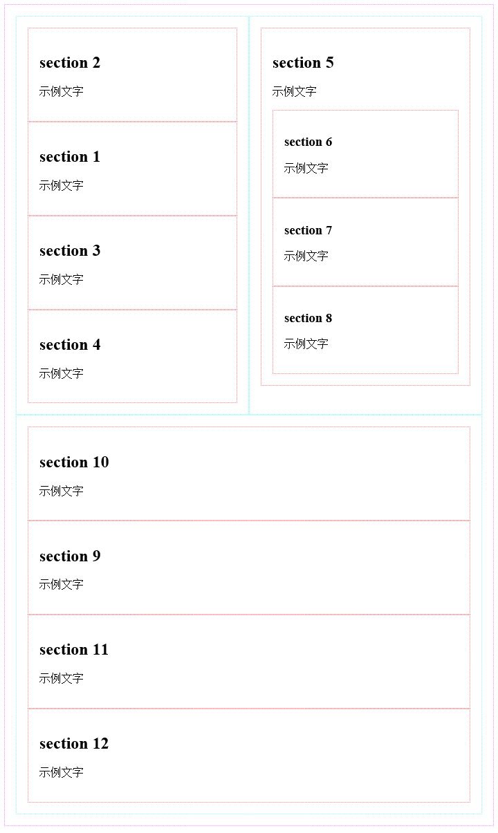
</style>然后指定容器元素,即id属性值为main的div元素的flex-wrap样式属性值为wrap,以指定允许对所有样式类名为content的div元素进行换行布局,代码如下所示。
#main {
    border: 1px dotted #f0f;
    padding: 1em;
    display: flex;
    flex-wrap: wrap;
}在浏览器中打开示例页面,当浏览器窗口宽度不足以容纳三个样式类名为content的div元素时,最右边的样式类名为content的div元素被换行显示,如下图所示。
可以将flex-direction样式属性值与flex-wrap样式属性值合并书写在flex-flow样式属性中。以下两段代码的作用完全相同。
//使用flex-direction样式属性与flex-wrap样式属性
.content {
    flex-direction: row;
    flex-wrap: wrap;
}
//使用flex-flow样式属性
.content {
    flex-flow: row wrap;
}弹性盒布局中的一些专用术语
接下来首先介绍弹性盒布局中的一些专用术语,在进行布局时这些术语的含义如下图所示。
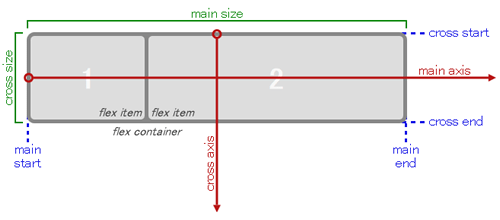
main axis: The axis used as the layout benchmark when laying out. It is the horizontal axis when laying out horizontally, and the vertical axis when laying out vertically.
main-start / main-end: The starting point and end point of layout when performing layout. In horizontal layout, it is the left and right ends of the container, and in vertical layout, it is the top and bottom of the container.
cross axis: The axis that intersects vertically with the main axis. It is the vertical axis in horizontal layout and the horizontal axis in vertical layout.
cross-start / cross-end: the starting point and end point of the cross axis. In horizontal layout, it is the top and bottom of the container, and in vertical layout, it is the left and right ends of the container. When specifying the flex-wrap attribute value as wrap and performing horizontal multi-line layout, layout in the direction from cross-start to cross-end, that is, from top to bottom. When specifying the flex-wrap attribute value as wrap-reverse and performing horizontal multi-line layout, When laying out rows, follow the direction from cross-end to cross-start, that is, layout from bottom to top.
justify-content attribute
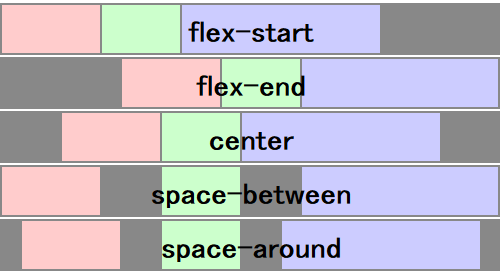
Justify-content attribute is used to specify how to layout the main axis direction of the container except for the child elements (the main axis axis direction is horizontal during horizontal layout, and the main axis axis direction is vertical during vertical layout) direction).
When the flex-grow attribute value is not 0, each child element automatically fills the container in the main axis direction, so the justify-content attribute value is invalid.
The justify-content attribute value can be specified as follows:
flex-start: Layout all child elements starting from main-start (default value).
flex-end: Layout all child elements starting from main-end.
center: Layout all child elements in the center.
space-between: Lay out the first child element at main-start, place the last child element at main-end, and distribute the blank space evenly between all child elements.
space-around: Evenly distribute the white space in the following places: between main-start and the first child element, between each child element and child elements, and between the last child element and main-end.
The difference between the above attribute values is as shown in the figure below (gray represents the blank part).
The align-items attribute and the align-self attribute
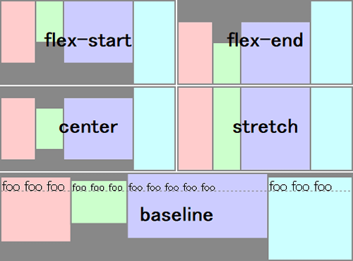
The align-items attribute is similar to the justify-content attribute, used to specify the alignment of child elements, but the align-items attribute specifies the cross axis direction (horizontal The cross axis direction is vertical during layout, and the cross axis direction is horizontal during vertical layout). The attribute values that can be specified are as follows.
flex-start: Layout all child elements starting from cross-start (default value).
flex-end: layout all child elements starting from cross-end.
center: Layout all child elements in the center.
baseline: If the layout direction of the child element is inconsistent with the layout direction of the container, the effect of this value is equivalent to the effect of the flex-start attribute value. If the layout direction of the child elements is consistent with the layout direction of the container, the content in all child elements is aligned along the baseline.
stretch: The height of all child elements in the same row is adjusted to the maximum. If no child element height is specified, the height of all child elements is adjusted to be closest to the container height (when the element border and padding are taken into account, when the border width and padding are both 0, they are equal to the container height).
The difference between the above attribute values is as shown in the figure below (gray represents the blank part).
The difference between the align-self attribute and the align-items attribute is that align-items is specified as a style attribute of the container element and is used to specify the alignment of all child elements, while the align-self attribute is specified as a certain Style attributes of child elements used to specify the alignment of these child elements individually. For example, after specifying the align-items attribute value of the container element as center (center alignment), you can specify the align-self attribute value of the first child element as flex-start (aligning at the cross-start end). The values that can be specified are as follows:
auto: Inherit the align-items attribute value of the parent element
flex-start
flex-end
center
baseline
stretch
align-content attribute
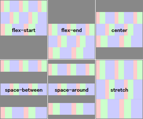
When doing multi-line layout, you can use the align-content attribute to specify the alignment of each line. The difference between this attribute and the align-items attribute is that the align-items attribute is used to specify the alignment of child elements, while the align-content attribute is used to specify the row alignment. The attribute values that can be specified are as follows:
flex-start: Layout all rows starting from cross-start.
flex-end: layout all rows starting from cross-end.
center: Layout all rows in the center.
space-between: Lay out the first line at cross-start, lay out the last line at cross-end, and distribute the blank parts evenly between the lines.
space-around: Evenly distribute the white space in the following places: between cross-start and the first line, between each line, and between the last line and cross-end.
The difference between the above attribute values is as shown in the figure below (gray represents the blank part).
