
As a coder, my art foundation is weak. We can refer to some mature web PS tutorials to improve our design capabilities. To paraphrase a sentence, "If you are familiar with three hundred Tang poems, you can recite them even if you don't know how to compose them."
The tutorials in this series come from online PS tutorials, all from abroad, and all in English. I try to translate these excellent tutorials. Due to limited translation capabilities, the details of the translation still need to be worked out. I hope that netizens will give you some advice.
Convention:
1. The software used in this article is Photoshop CS5 version
2. The screenshots of the original tutorial are in English. I took them again based on the re-production. Chinese version of Figure
3. Some operations in the original text do not give parameters. I measured some parameters through repeated testing, which are shown in red text. For some wrong parameters, the correct parameters are displayed directly in red text
For example: (90, 22, 231, 77) , indicating that the coordinates of the upper left corner of the rectangle are (90, 22) , width 231, height 77
For example: (90,22), indicating that the coordinates of the upper left corner of the rectangle are (90,22), the other two parameters of the rectangle have been specified in the tutorial
4. My own experience will be attached at the end of the tutorial. Some are optimizations of some steps in the tutorial, etc.
Let's start the tutorial.
Open Photoshop and create a new document (Ctrl + N) and as a foreground color choose: #e6e5e5
Let's start the tutorial
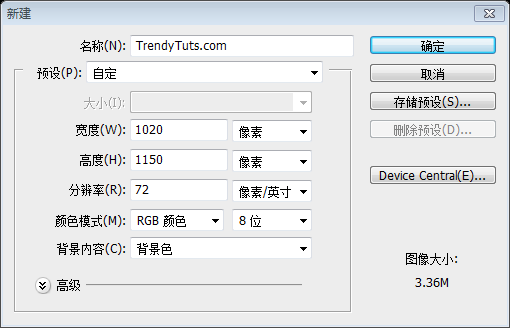
Open PS to create a new document (Ctrl + N),Size: 1020px*1150px, set the background color: #e6e5e5
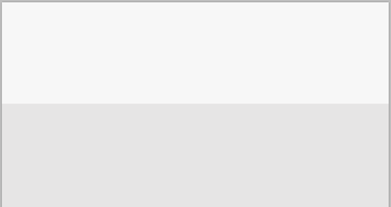
Next select Rectangle Tool and create a shape on the top of the document. Dimensions 1020 by 268px, color: #f7f7f7
Next select Rectangle Tool Create a rectangle (0,0) at the top of the document. Size: 1020px*268px, Color: #f7f7f7
Step 1 Creating the top area
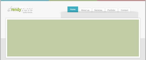
Having Rectangle Tool selected, create a similar shape. Color (blue) #3fadbf, dimensions: 340 by 4px.I will duplicate this shape 2 more times and I will move them to the right. For the second shape I have used this color (green) #a3b76b and for the third one (that pinky one) #bf7678.On the left side, a little bit down, I will add my logo. Here you should add your own logo. Here is my result:#Step 1: Create the top area
SelectRectangle Tool, create a rectangle (blue) (0, 0), color: #3fadbf, size: 340px*4px
Copy this rectangle twice and move it to the right. The color of the second rectangle (green) (340, 0): #a3b76b, the color of the third rectangle (pink) (680, 0): #bf7678 A little below the left side, I want Add my logo. You can also add your own LOGO here. This is my result
Home navigation item(471,43)
, color: #3fadbf, size: 75px*47px. No layer stylesRemaining navigation items (About Us(555,54,83,36)
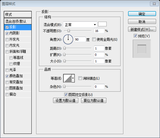
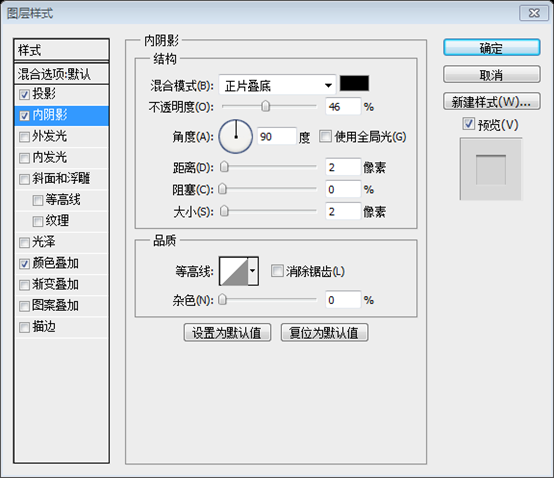
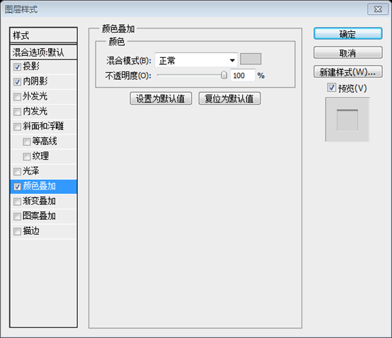
, Services(648,54,83,36), Portfolio (740, 54, 83, 36) , Contact (832, 54, 83, 36) ), Color: #a4a4a4, I will add as follows Layer style, drop shadow color: #ababab
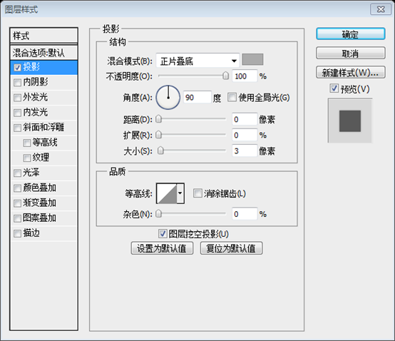

After you will apply this layer styles you should have something similar with me.
Next I will create a shadow at the bottom of the navigation. To create the shadow you will need to select Ellipse Tool, than create a similar shape.
After you add a layer style close to mine.
Next, add a shadow to the bottom of the navigation bar. To create the shadow, select the Ellipse Tool and add a similar shape (424, 86, 254, 8)

, select radius 7px.
Now select Rectangle Tool and create a similar shape. Color: #ebebeb, dimensions: 546 by 42px. Make sure that you cover a small partition of the navigation tabs. Here is my result:
Rectangle Tool
Create Rectangle(424,84)
, Color: #ebebeb, Size: 546px*42px, Make sure to cover a small part of the navigation bar, here is my result
 Step 2 Creating Featured Area
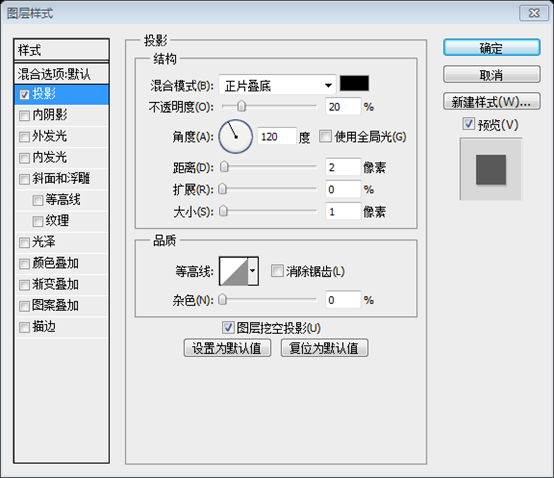
With Rectangle Tool I will create this shape. Dimensions: 951 by 282px and I will apply this layer styles:
Step 2: Create a featured area
UseRectangle ToolCreate a rectangle (35, 126), size: 951px*282px (recommended size is 950px*282px)
, color: white. Add the following layer style:
Next I will create another shape, just above the shape created on previous step. Dimensions: 930 by 262px, color: #c2cda6
(45,136)
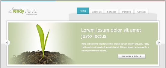
, above the previous rectangle. Size: 930px*262px, Color: #c2cda6##Now from my stock images, I will add this image in Photoshop:
 Now add the following image from my gallery to PS
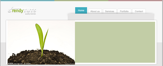
As you can see, the image has a white background. We still have to do some work to make it look better. First make sure that on the Layers panel, the picture layer is above the green layer. When your picture layer is on top of the green layer, right-click on the picture layer and select Create Clipping Mask. It will look like the one shown below
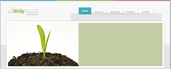
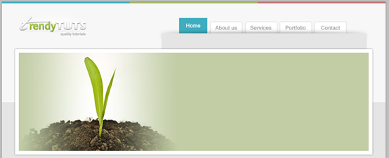
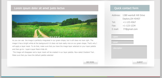
As you can see the image is perfectly integrated in our green shape, but it still does not look right. The image it has a bright white at the background it it does not look really nice on our green shape. That's why I will apply a layer mask. To do that, make sure that you have the image layer selected on your layer palette and then go to : Layer>Layer Mask>Hide All. The image will disappear and a layer mask will be created in our layer palette. Now select Gradient Tool . Make sure that you have the default palette selected (black and white )and with your mouse drag a similar line. From left to the right.As you can see on the right side we will need to create the same thing in order to have a nice image. To repeat the same step, don't forget to apply the layer mask . Right click on that black thumbnail and choose “Apply layer mask” Then repeat the same step once again (but this time for the right edge of the image)
As you can see, the picture is complete Appears in the green rectangle, but still doesn't look good enough. The image has a bright white background, which looks a bit harsh among the green rectangles. So add a layer mask. So, make sure the image layer is selected on the Layers panel, then click: Layer > Layer Mask > Hide All. The image will be hidden and a layer mask will appear on the Layers panel. Now select the Gradient Tool. Make sure the default gradient (black and white) is selected and drag a straight line from left to right with your mouse. As you can see, do the same thing on the right side to get a perfect image. Repeat the same process and don't forget to add a layer mask. Right-click on the black thumbnail, select "Apply Layer Mask", and then repeat the operation (but this time starting from the right side of the image)
After testing, the picture After adding a mask to a layer for the first time, the "Apply Layer Mask" option is gray and no more masks can be added. Therefore, in this step, after adding the layer mask, select the black-white-black gradient and drag the gradient once.
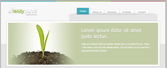
Next on the right side, with Type Tool I will add some text
On the right side of the picture, Use the Text Tool to add some text
Add the following layer style to the title text on the right side
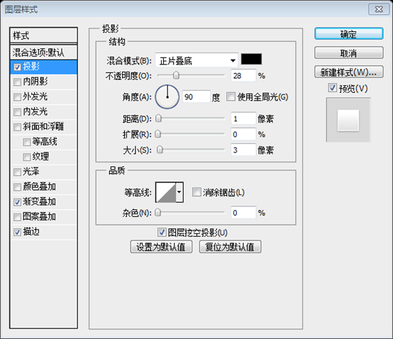
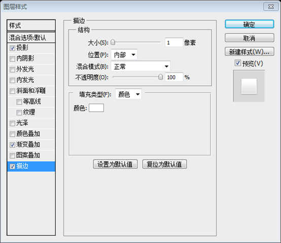
Then I will select Rectangle Tool and I will create this shape. I will apply this layer styles:
Next useRectangle Tool Create a rectangle (727, 335, 170, 25) . And add the following layer style:
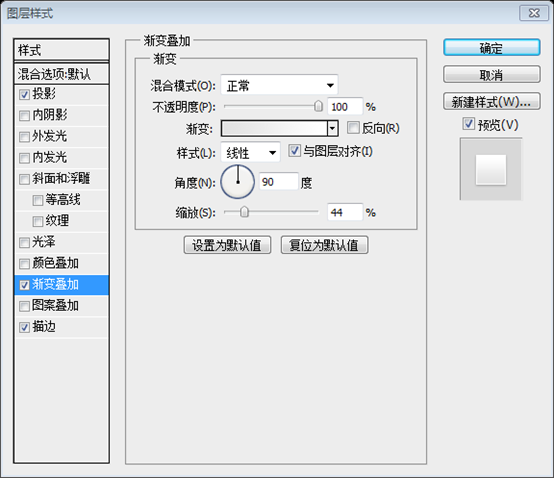
Gradient Overlay: The gradient color is: #e2e2e2, #ffffff
And with type tool I will add some text.
And with Text ToolAdd some text
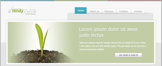
Now the final step would be to add some buttons for the featured area.
I will select Ellipse Tool and I will create this shape:
Finally add some buttons to the featured area
Create a circle using the Ellipse Tool(21, 245, 35, 35) :
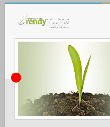
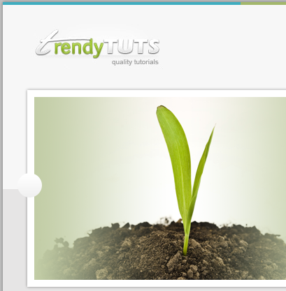
And I will apply this layer styles:
And add the following layer styles to the circle:
Gradient overlay color: #f0f0f0,#ffffff

Pen tool
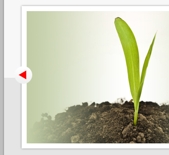
When After you complete the triangle, right-click on it (making sure the Pen tool is still selected) and select "Convert to Selection" Using thePaint Bucket Tool, press Ctrl+Shift+Alt+N (New) on your keyboard layer), then fill the selection with a bold color. This is my result
Just use the Polygon Tool. Select the Polygon Tool, select the number of sides as 3, then hold down Shift and draw an equilateral triangle.
Step 3 Creating the middle area
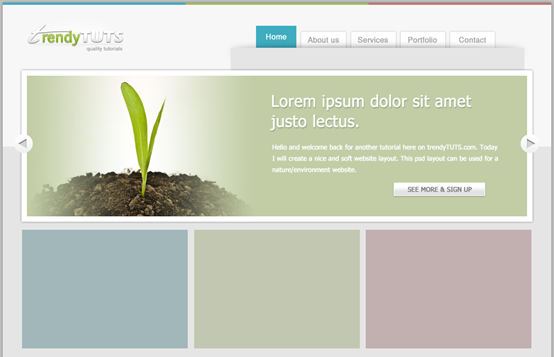
Well, this area it's really easy to create. First I select Rectangle Tool and I will create 3 shapes. Each shape has the following dimensions: 308 by 221px. Colors: for the first shape (soft blue) #a1b7ba, the second one (soft green) #c1c7b0, the third one (pinky) #c2afaf
Step 3: Create the middle area
Okay, this part of the area is easy Make. First select the Rectangle Tool to create 3 rectangles. Dimensions of each rectangle: 308px*221px. Color: The first rectangle (36,423) (soft blue) #a1b7ba, the second (356,423) (soft green) #c1c7b0, the third (675,423)(PINK)#c2afaf
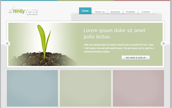
Now create a new layer in my layers panel (to do this, press Ctrl+Shift+Alt+N on your keyboard ), then select a soft brush, make sure the foreground color is set to white, then adjust the Opacity to 13% and the brush size to 200%
(should be 200px), then on each rectangle Click several times
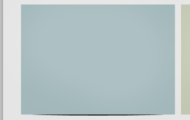
Then I will select Ellipse Tool and I will create this shape (the black one, at the bottom of the rectangle)Select
Ellipse ToolCreate the following ellipse( 36, 638, 308, 8) (black, at the bottom of the rectangle)
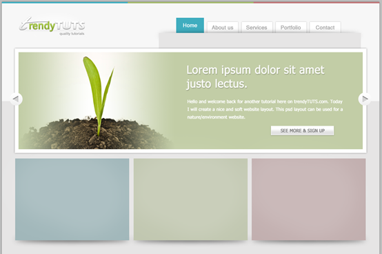
Filter> Blur>Gaussian Blur
), Radius: 7px. Do the same steps for the two rectangles on the right. This is my result:
Line Tool
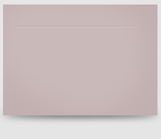
and add 2 straight lines to each rectangle. This straight line acts as a separator between the title and the content. Size of each line: 244px*1pxAnd here are the colors. For the first one: first shape (the darker one) : #b2bdbf the second one #d3dbdc
Line color settings. The first rectangle: the first straight line
(60, 466)
(should be #93a1a3 is more appropriate) , the second straight line: # d3dbdc (should be #c8d9db more appropriate)
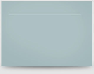
##The second one : first shape (the darker one): #abb09f the second one #e0e5d1The second rectangle: the first straight line
(380,466)(darker one):#abb09f, the second one Straight line: #e0e5d1
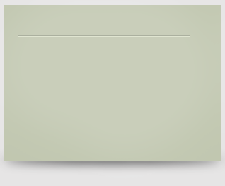
The third one : first shape (the darker one) : # b09fa0 the second one # e3d4d5
The third rectangle: first The first straight line (699, 466) (the dark one): #b09fa0, the second straight line: #e3d4d5
A digression here, why do the colors of the two straight lines of the first rectangle need to be corrected? The reason is that the original colors are inconsistent. Take a look at the two pictures below. The left picture is the corrected effect, and the right picture is the original color

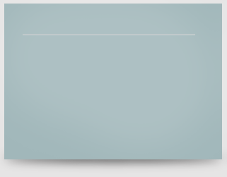
Obviously, the original color on the right is inconsistent.
How to correct it? Look at the analysis process below
First convert the colors of the rectangle and the two straight lines into HSV mode. For related content, please refer to my "Color in the Computer" series of articles
First rectangle:
Rectangle: #a1b7ba, HSV: (187, 13, 73)
Dark line: #b2bdbf, HSV: (189, 7, 75)
Light line: #d3dbdc, HSV: (187, 4, 86)
Second rectangle:
Rectangle: #c1c7b0, HSV: (76, 12, 78)
Dark line: #abb09f, HSV: (78, 10, 69)
Light line: #e0e5d1, HSV: (75, 9, 90 )
Third rectangle:
Rectangle: #c2afaf, HSV: (0, 10, 76)
Dark line: #b09fa0, HSV: (356, 10, 69)
Light line: #e3d4d5, HSV: (356, 7, 89)
The colors of the straight lines of the latter two rectangles are still coordinated, so analyzing the colors of the latter two straight lines
can be seen
The H component of the dark line is almost the same as the H component of the rectangle, the S component is also similar, and the V component is about 10 less.
The sum of the H component of the light line The H component of the rectangle is almost the same, the S component is slightly less, and the V component is about 10 more
Note: The H component represents the hue of the color, and the hue is a ring, 0 is 360 , so the difference between 0 and 356 is 4, which is almost the same. Therefore, according to the above rules, it is found that the color of the straight line of the first rectangle is inconsistent, and it is adjusted according to the above rules.
The color of the dark line is adjusted to: #93a1a3, HSV: (189, 10, 64)
The color of the light line is adjusted to: #c8d9a6, HSV: (187, 9, 83)
I read an article before, I forgot the source, about how to quickly make similar dividing lines
The dark line is based on the background color, the H and S components are unchanged, and the H component is reduced by about 10%
The light color is based on the background color, and the H and S components are not. Move, the H component increases by about 10%
The light color is next to the dark color, and the light color is below the dark color
Next with Type Tool I will add some text and from Premium Files I will use “Weather Vector Icons” and ” Vector Trees Icons” . , Weather Vector Icons and Vector Trees Icons will be used.
Here’s my result
This is my result

Step 4 Creating the content area and the Footer
Step 4: Creating the content area and the page Foot
To create the content area, select first Rectangle Tool and create a similar shape:
To create the content area, selectRectangle Tool, create a rectangle (38, 658, 944, 426), color: white :
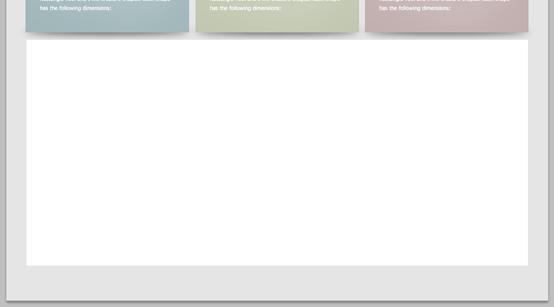
As with the previous operation of adding shadows, first use the Ellipse Tool to create an ellipse (38, 1076, 944, 8), then click: Filter> Blur> Gaussian Blur , Radius: 7px

Having Rectangle Tool selected create another shape at the bottom of the previous shape. This one it will be used for footer
Use the Rectangle Tool to create another rectangle (0, 1038, 1020, 112) at the bottom of the rectangle, color: #efefef. This rectangle is used to make the footer part

Add three rectangles at the bottom:
Rectangle (0, 1147, 340, 3), color: #3fadbf
Rectangle (340, 1147, 340, 3), color: #a3b76b
Rectangle (680, 1147, 340, 3), color: #bf7678

Ellipse Tool to create the following ellipse(664, 670, 12, 400)
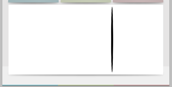
Filter> Blur> Gaussian Blur) with a radius of 50px. Select the Rectangular Selection Tool and create the following selection
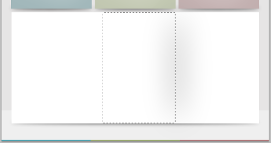
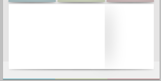
Then with Type Tool I will add some text, I will create some buttons in the same way I have do it for the Featured Area The methods of buttons in Area are the same.
This step is very simple to write, so the supplement here is relatively complete
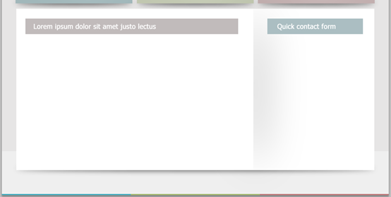
Use the Rectangle Tool to add a rectangle (62, 684, 561, 41), color: #c1bbbb, and a rectangle (700, 684, 251, 41), color: #abbec2
And add the corresponding text
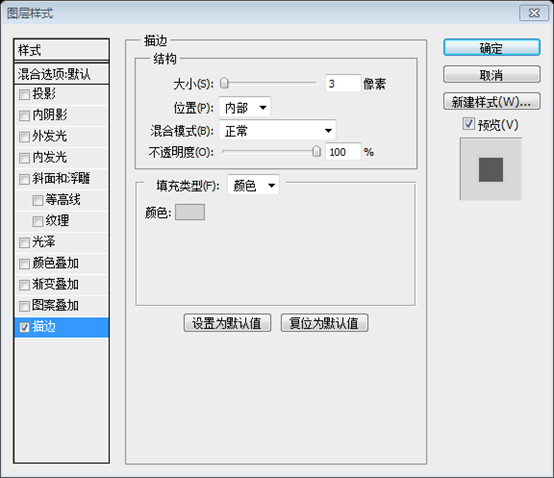
Add a picture, add the following Stroke layer style, stroke color: #d4d4d4
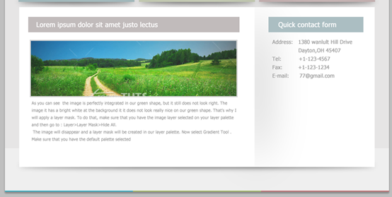
Add some text below the image and on the right Also add some text under the rectangle on the side
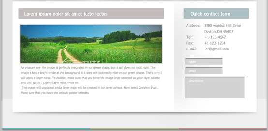
Under the text on the right side, add three rectangles, namely ( 707, 876, 142, 25), (707, 913, 142, 25), (707, 948, 228, 84), the layer style copies the triangle layer style in the Featured Area, and adds the corresponding text
Use the Rectangle Tool to add two rectangles, namely (527, 1042, 93, 25 ), (843, 1042, 93, 25), the layer style copies the layer style of the button in the Featured Area, and adds the corresponding text
Finally, add copyright information in the lower left corner

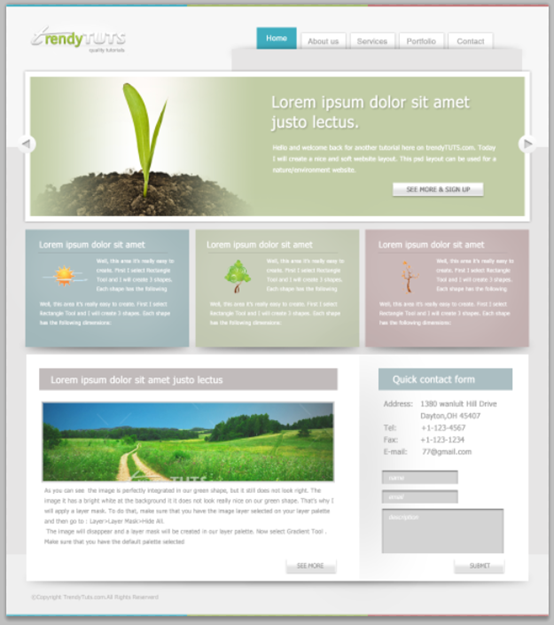
The final result is as follows:
Postscript:
This tutorial uses soft colors. In fact, red, green and blue colors are used. The soft colors of the three colors are all Well chosen. It can be used as a reference in the future.
For more PS web design tutorials


